“All Hacks Great & Small” Magazine
This magazine features 18 pages of tips and tricks for the DIY enthusiast on a limited budget; with topics ranging from hobbies, arts, and crafts to home repair and recipes. Beyond laying out the magazine, I also wrote all of the copy, created four full-page advertisements, drew all the illustrations in Adobe Illustrator, and used my own photographs. I took on this project as an effective means of gaining a deeper understanding of the various Adobe Creative programs through hands-on practical experience. The trials and errors have been great learning tools.
Link to Magazine: https://issuu.com/weatheredoakmedia/docs/all_hacks_great_small_magazine
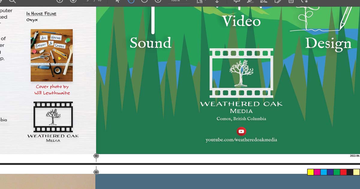
This project also provided an opportunity to develop my personal brand, Weathered Oak Media. I have created a full-page advertisement and publisher’s mark within the magazine. My Weathered Oak Media advert was a labor of love for me as I aspire to take my brand farther in future courses. If you would like to see more of my work, I invite you to please visit my Weathered Oak Media YouTube channel at the link provided here.
Process
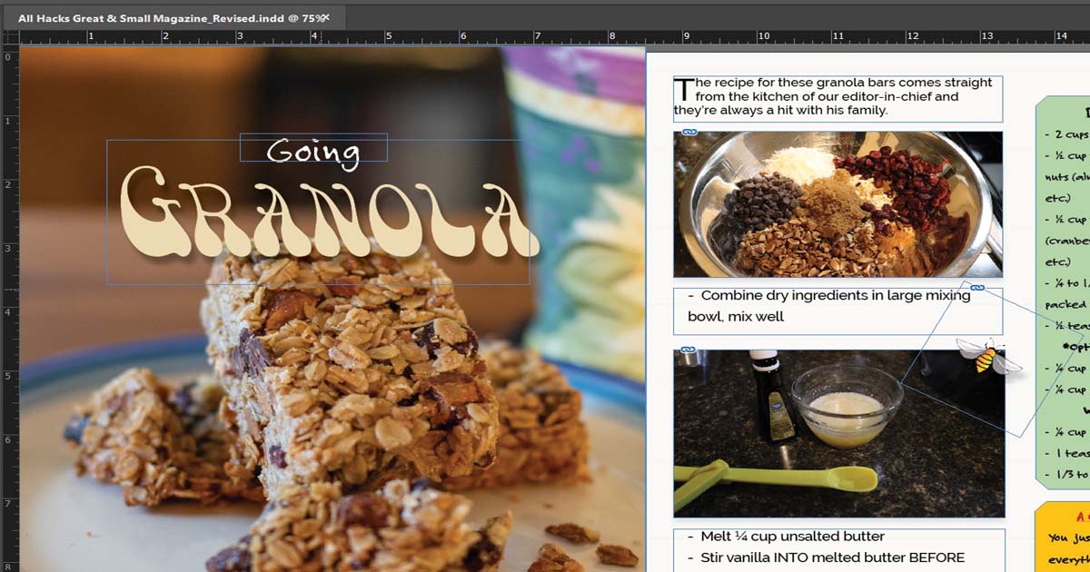
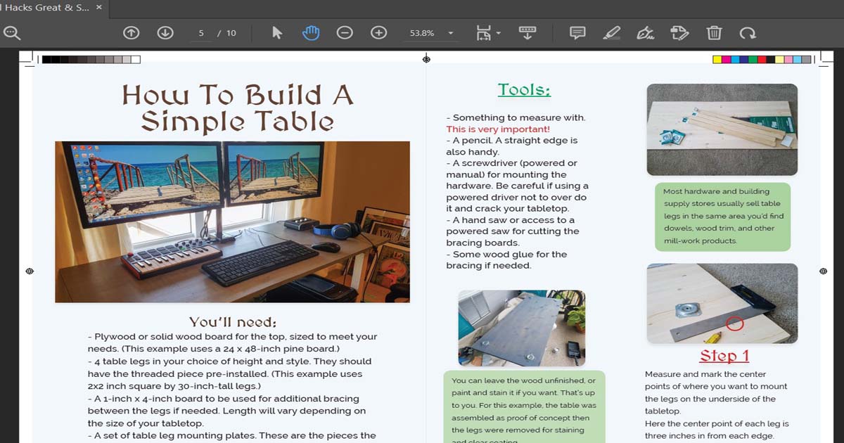
Once I had solidified the idea for the magazine, I started searching through my personal archives for photos of projects I had done over the years. I then wrote step-by-step articles based on the images. Some photos required additional editing in Photoshop or Lightroom. For example; the featured article for the granola bars is my own personal recipe, and I made a batch during the production of the magazine. Photos from that day were placed in when I arranged the magazine’s content. I drew the decorative bees, thermometer, and clock face in Illustrator.
As this is a DIY magazine, anything that looks like it was put together at the last minute only adds to the overall theme of the publication.
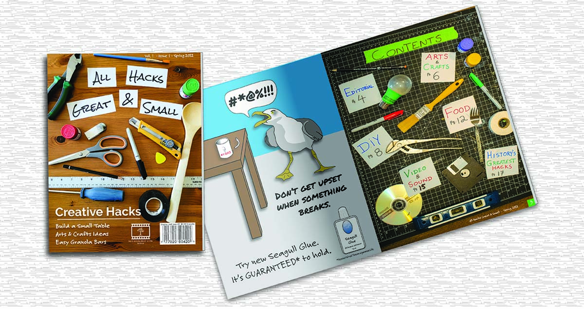
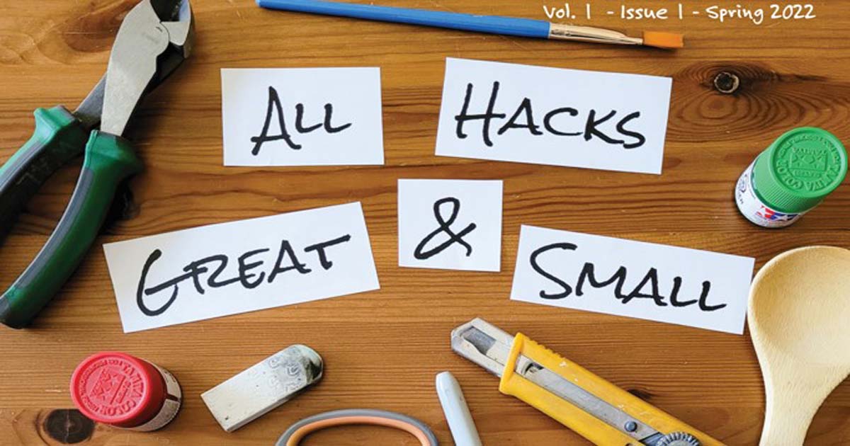
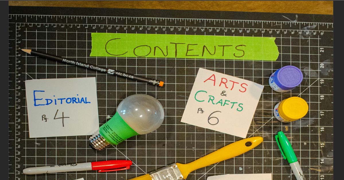
The cover and the Table of Contents (T.O.C) page took some time as both images consist of top-down overhead photos of handwritten words on small pieces of paper arranged among household items. The cover was arranged on my coffee table and shot with my phone, while the T.O.C page was set up on a cutting mat on my kitchen table and shot with a DSLR camera.
I chose to shoot the cover and T.O.C this way because it was a little different from what one normally sees in the magazine racks. Most magazines feature covers with all the text written in their editing program with a typeface of their choice, but I have not seen many cases of handwritten titles. The biggest challenge was sizing everything and composing the shots correctly so that my writing could be read in the images because this could not be fixed in post. I am pleased with the result.
Colours from the cover and T.O.C carry throughout the magazine and are in an Earth Tone palette with highlights of blue, green, and red here and there. All content and advertisements are in full CMYK colour.
I went for primarily handwritten style typefaces such as “Felt Tip” and “Permanent Marker” for headlines and side bars. I used “Raleway” as the main body text as it’s a classic and it’s easy to read in various weights. Some articles use display fonts for the titles such as “Viking”, “Adorn Copperplate”, “Medieval Sharp” and others.
There are 18 pages total. Page sizes are 8.5” x 11” in portrait format. Margins are 0.375” all around and there’s a bleed of 0.125” all around.
Page 1 is the front cover and page 18 is the back cover. Facing pages: Red square page furniture (even page numbers) on the left, green (odd page numbers) on the right. Port & starboard. No page furniture on full-page images and adverts.
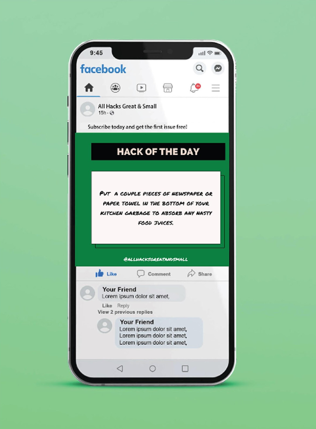
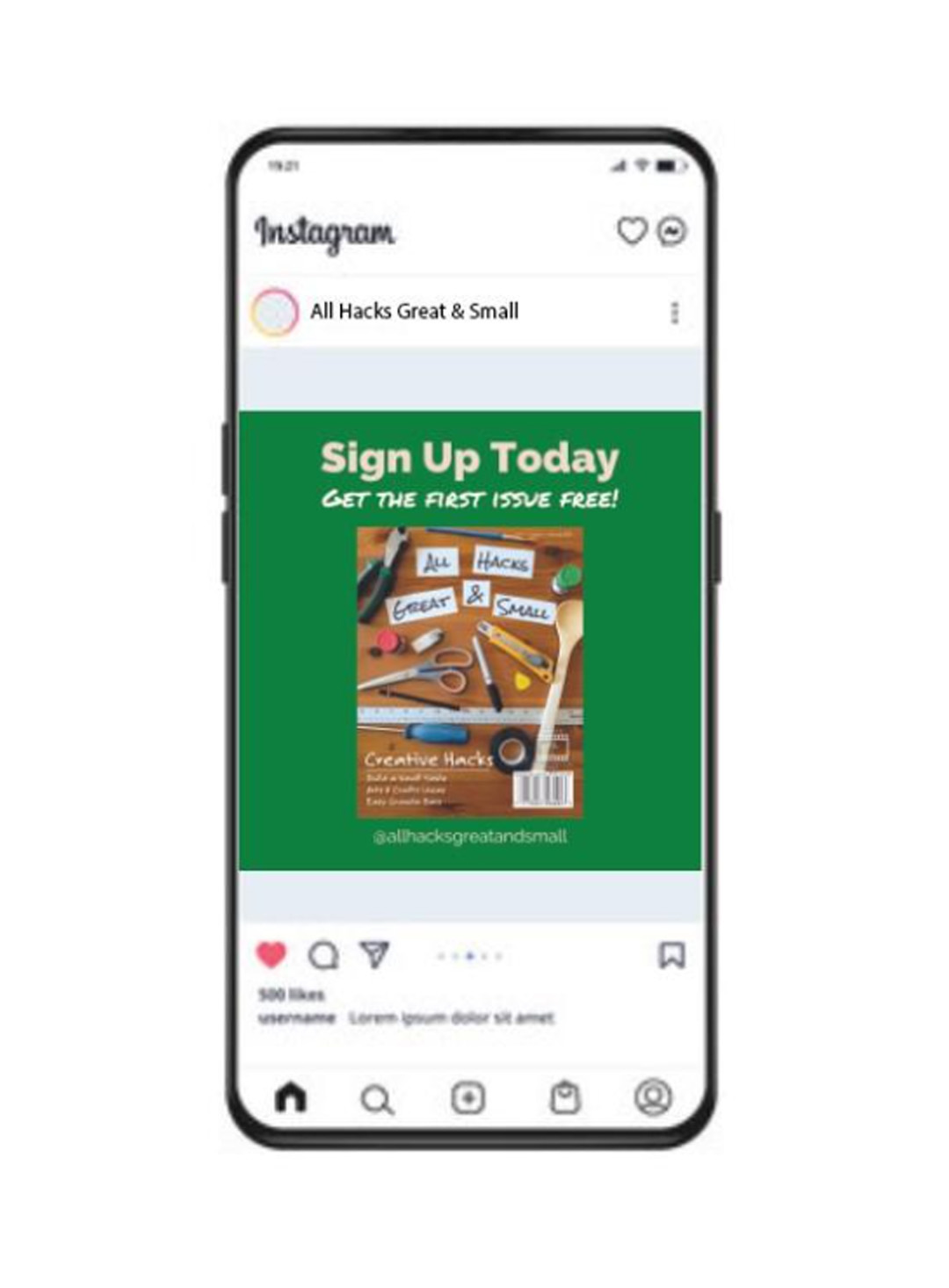
Social Media
My social media plan will be primarily a series of daily Instagram and Facebook posts. Each post will feature just one small helpful hint taken from the magazine followed by a prompt for the viewer to “Like and Follow for More” and an incentive to subscribe to a regular publication. This is a common strategy used by a lot of specialty publications and it can be very effective.