MARS Wildlife Rescue
MARS Wildlife Rescue (Mountainaire Avian Rescue Society) is a rehabilitation centre located in Merville on Vancouver Island, BC. MARS is focused on the care of injured, orphaned, and ill wild animals—especially birds—and works to rehabilitate each one and return them to their natural habitats. Through its Interpretive Centre, the organization educates the public on local wildlife, conservation, and the impact of human activity on ecosystems. As a not-for-profit, MARS relies on community donations and volunteers to support its mission.
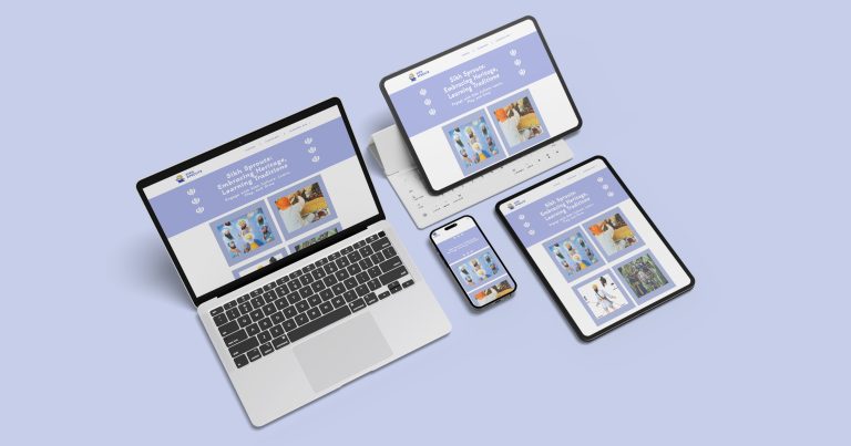
This rebranding project launches alongside the separate development of a new website for MARS. The updated visual identity reflects the island’s rustic charm, creating a look that feels professional but also friendly and inviting. Along with a refined logo suite, this update also includes a vibrant colour palette, accessible typography, optimized images, custom icons, and vector-based illustrations created for use in web animations.
Primary Logo and Design Intent
The primary logo design began in Procreate with a realistic, illustrative approach inspired by the embroidered badges and patches often seen in national parks. My early concepts explored that style, but as the project evolved, I simplified the design to better reflect MARS’s core identity— the vital connection between humans, birds, and the natural world.
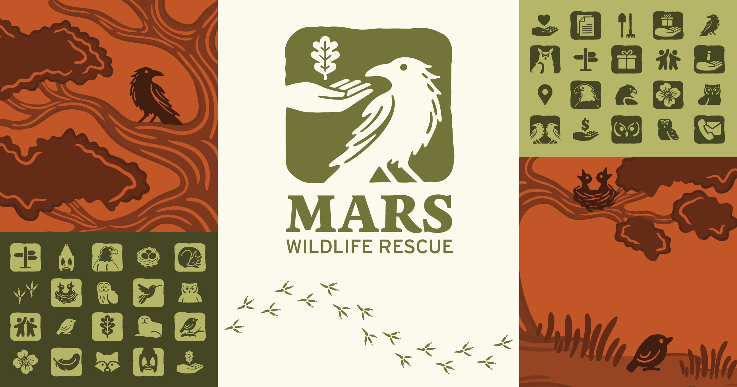
While MARS’s original logo featured a hawk, I chose to depict a crow instead, paying tribute to two of their ambassador birds, albino crows named Nimpkish and Kokish. The final logo shows a hand reaching towards a crow, gently cradling an oak leaf—an important native species on Vancouver Island. Each element is symbolic: the hand stands for human care, the oak leaf represents nature, and the crow bridges both worlds. Together, they communicate MARS’s mission of harmony between people, wildlife, and the environment.
Early logo concepts explored various arrangements of the crow, hand, and leaf to find the best visual storytelling balance. From these iterations, I developed a full logo suite with flexibility in mind. It includes a primary logo, a horizontal version, and a text-only version—each adaptable for use with or without the extended tagline.
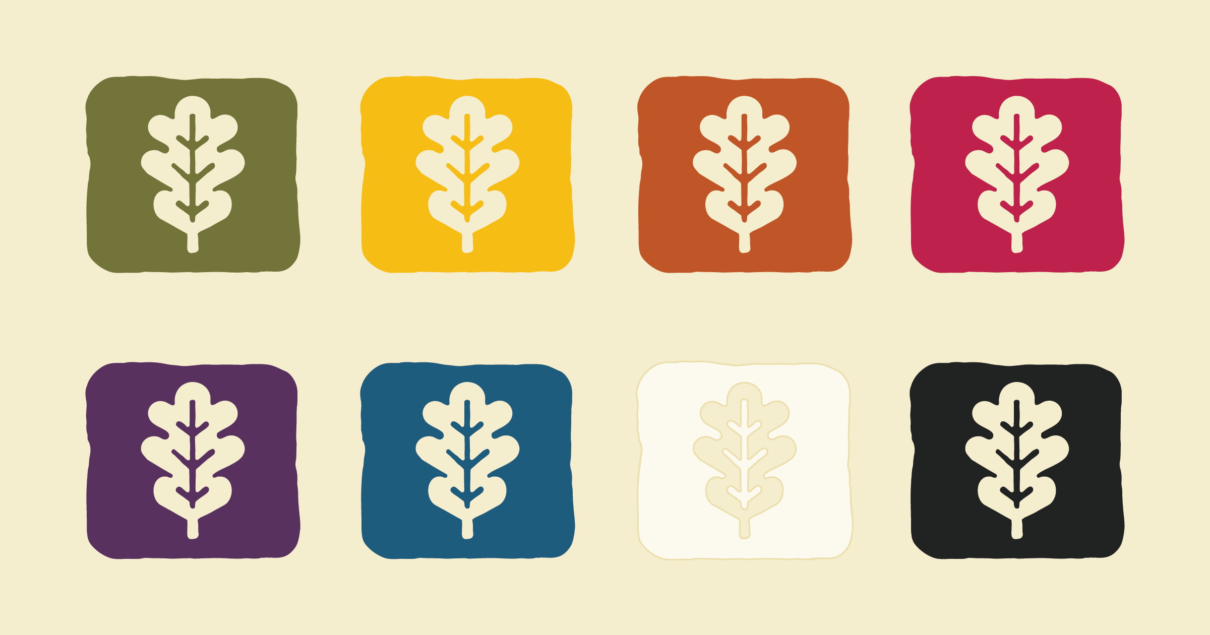
The logos are shown here in MARS’s primary green but can also be used in the other approved brand colours. To allow even more versatility, individual icons were created—such as the crow alone, the hand and leaf together, or just the oak leaf—making it easy to apply brand visuals across a wide variety of materials.
Brand Colours & Typography
I aimed for a colour palette that felt vibrant, fun, and grounded. Drawing inspiration from jewel tones, I chose bright, earthy hues that are complemented by soft neutrals like cream, off-black, and a warm green-toned greyscale. Each primary colour has two supporting secondary shades—one darker and one lighter—for visual cohesion.
While vivid, these colours present some limitations in accessibility combinations. To address this, I tested all necessary elements to ensure they met the WebAIM readability standards.
For typography, Zenon Black is used for the logo text and headings. Interstate Regular, widely used in road signage, brings a clean, legible, and adventurous feel. For the body text, I chose Atkinson Hyperlegible—one of the most accessible typefaces available.
Website & Section Icons
Icons play an important role in enhancing usability and supporting navigation. I created general-use icons for key areas such as the contact page, volunteer info, gift shop, and lendable tool library. I also designed icons for more specific needs, specifically the Emergency Information page, which offers guidance on what to do if you find an injured or displaced animal. These icons were later developed into layered illustrations, vectorized for website animation.
Ambassador Bird Icons
Each ambassador bird was given a custom icon based on its species. I designed two versions of each: a square cutout (echoing the logo style) and a standalone silhouette. I also created extended full-body versions for use in educational materials and signage, if needed. View all the icons, logos, and more in part one of the MARS Brand guide on ISSUU.
Digital Illustrations
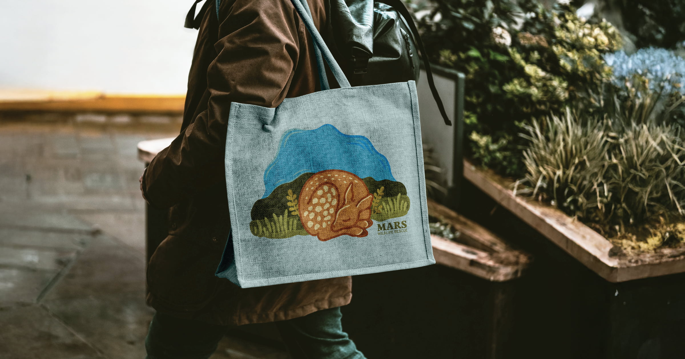
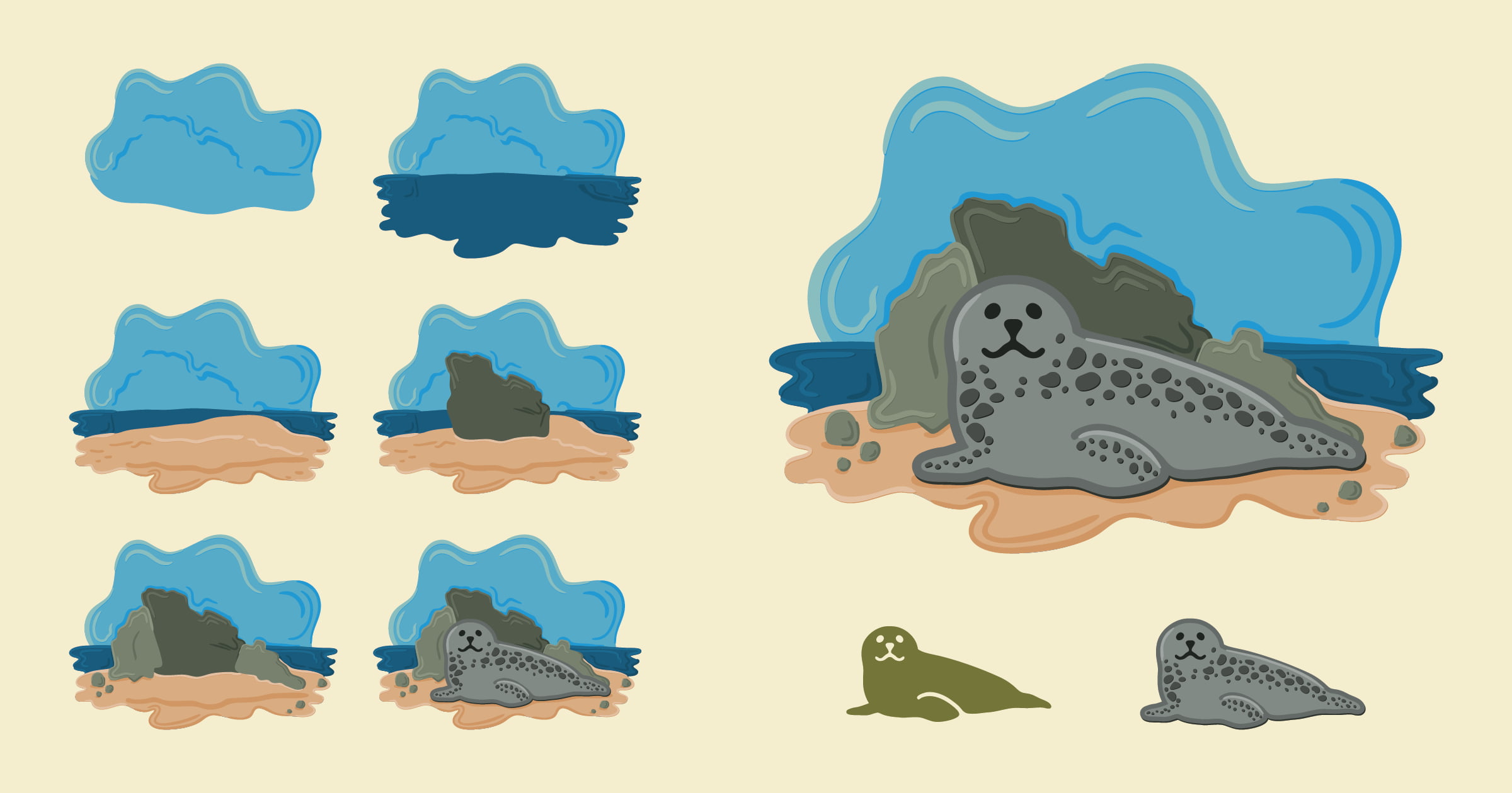
Another key part of the rebrand involved creating digital illustrations. Expanding on the Emergency Info icons, I hand-drew more detailed animals and backgrounds in Procreate, separated them into layers, vectorized the artwork, and exported them for web animation. These illustrations bring key web content to life and can be repurposed for merchandise, brochures, and ads to boost engagement and fundraising.
Additional Assets
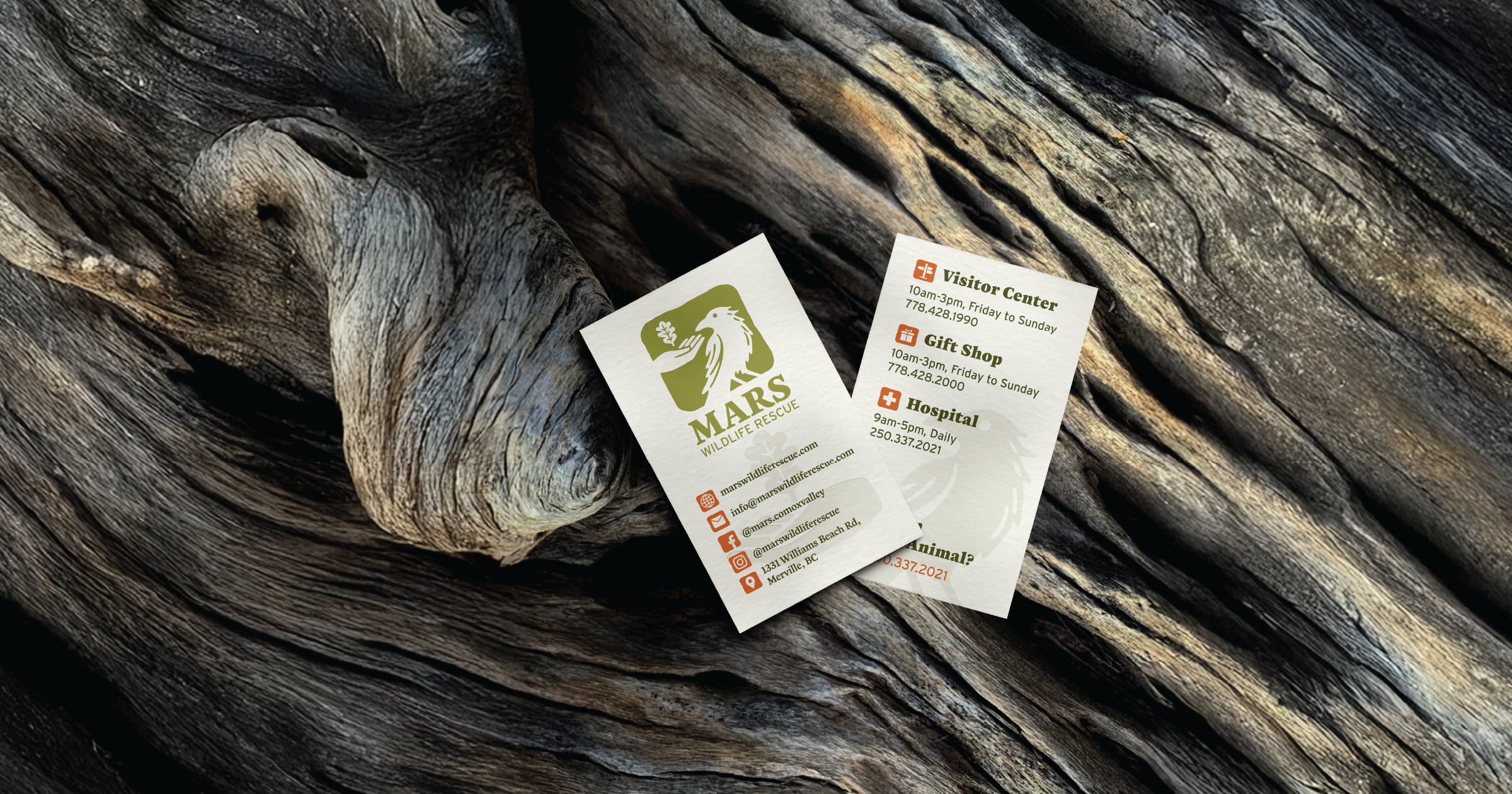

Other practical assets were thoughtfully designed with everyday use in mind. Business cards, a staple of any rebrand, were carefully created to accommodate the extensive contact information for the Visitor Centre, Gift Shop, and Hospital, each of which has its own phone number and operating hours. Employee ID cards were also developed for staff to wear on-site, colour-coded to make it easy to identify which sector of the rescue centre they work in. Additional mockups, including store signage, extra ID badges, and merchandise, are featured in part 2 of the Branding & Style Guide, which you can find on ISSUU.