TF Design System
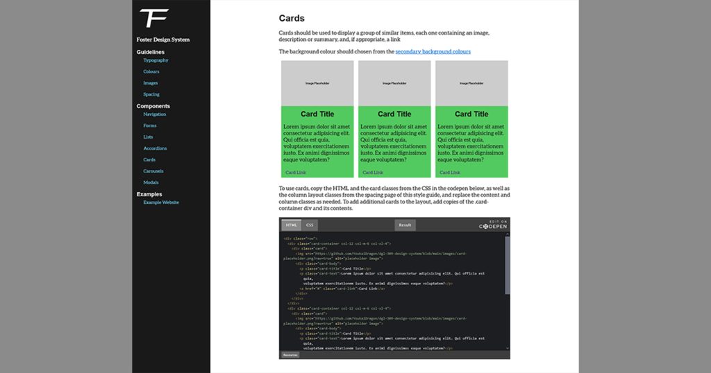
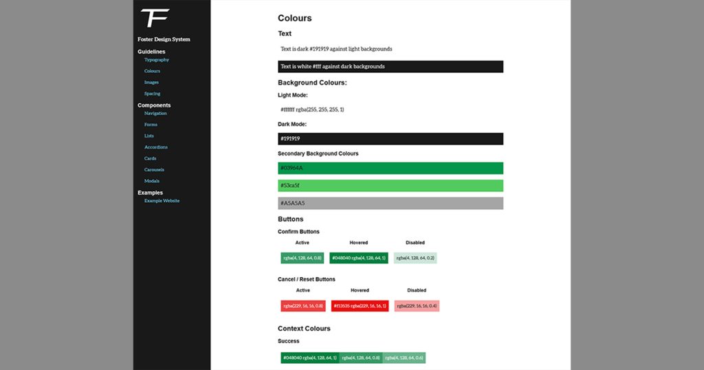
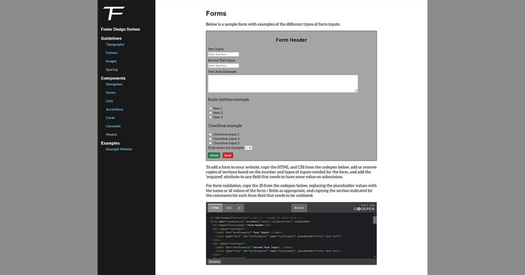
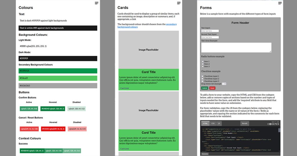
My capstone project is a design system meant to aid in developing websites while informing design decisions to create a personal brand consistent across any websites created while using it. The design system lists style guidelines and component examples with code blocks that can be copied and pasted to quickly and easily implement them in a website. An example website in the form of a small portfolio site is also included to demonstrate these styles and components being used together.
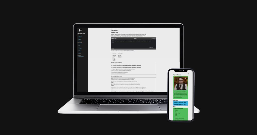
Check out the website or look through the code on GitHub.
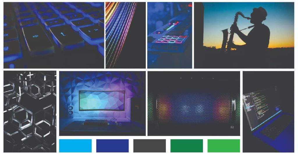
The project began with deciding what I wanted my example website to be, as that would be a major contributing factor in both the intended look and feel that the system would provide as well as what components I would want to focus on including. In the end, I decided to make the design system as a way to start developing a personal “brand”, and so the example site was chosen to be a simple example of a portfolio website, and the components were picked based on what would be useful for such a site. The moodboard was then developed with this concept in mind.
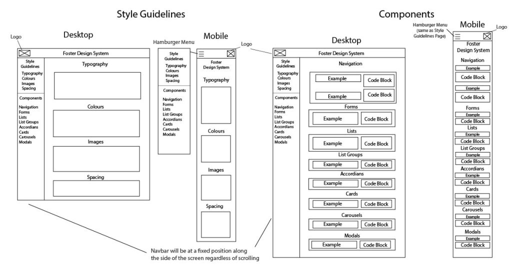
A set of wireframes was created to determine the layout of the design system. However, as development began it quickly became apparent that this initial design, which had the entire system spread across 2 pages (one for style guidelines, and one for component examples), would not make for a very effective layout, so the original plan was scrapped for a new design using one page per element, that would make it much quicker and easier for users of the design system to navigate and find what they’re looking for.
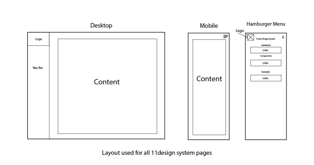
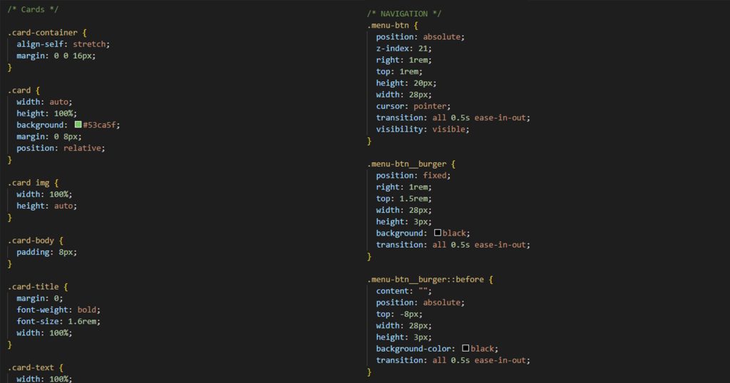
The codeblocks, meant to allow for easy copying of templates / examples, were done using CodePen, initially through simple links to each codepen, and later replaced by embeds directly into the design system pages after some feedback.
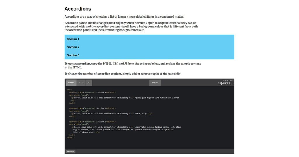
Codepens were chosen over simply displaying the code as plain text on the pages for two main reasons: to reduce the vertical size of each page (as some of examples can get lengthy), and to make copying / pasting the code easier, by cleanly separating the example HTML, CSS, and JS from each other and the rest of the text on the page. Plain CSS was used in development instead of SCSS for readability and ease of use of the example codeblocks, so that examples could be copied directly without needing external dependencies.
The logo was created using Illustrator. After a bit of experimentation, and based on the intended purpose of the design system, I constructed the logo based on my initials, using a sharp, angular font, to match the feeling of the moodboard and the kind of look I felt would fit well as a personal logo.

Once the initial version of the design system was made, work began on the example site.
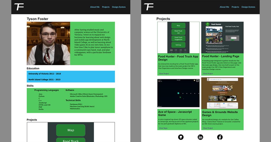
As development proceeded, both the design system and example site went through multiple rounds of revisions based on feedback. Further revisions / additions were also made to the design system in response to progress made on the example site, as utilizing the styles and components together made it easier to see some issues than considering each one separately in a vacuum.
