Same City Shopper
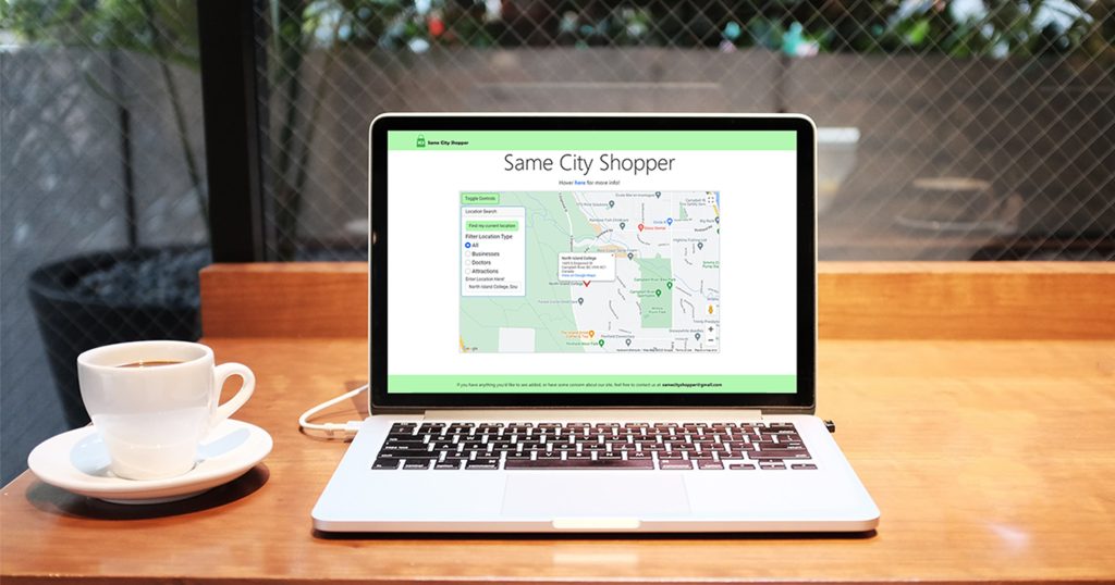
The goal behind creating Same City Shopper (SCS) was to produce a web app that users may open to find stores and services that are nearby. SCS was built to be used while on the go, meaning it had to be lightweight and mobile friendly. Part of the challenge in creating SCS was to keep the project simple. I used nothing other than vanilla JS, simple SCSS and Bootstrap, as well as learning how to interact with APIs such as Google’s.
Check out Same City Shopper.
Planning
Before I got started on any sort of coding or design, I did some research on similar products, as well as my target audience for SCS. The three competitors I found were Visa, Yelp, and BC Marketplace. They were all similar to what I ultimately wanted to achieve, they also all had downsides and functions that I was trying to avoid.
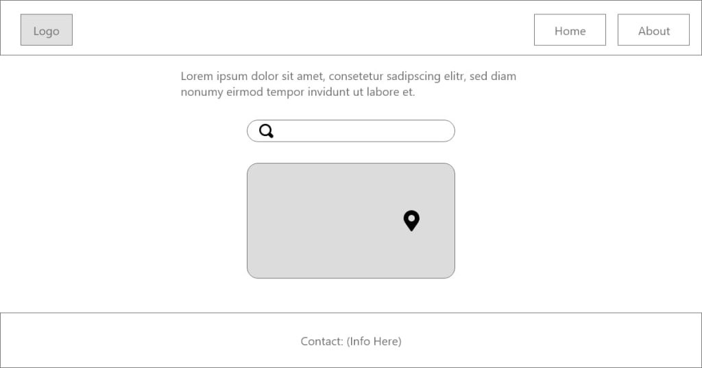
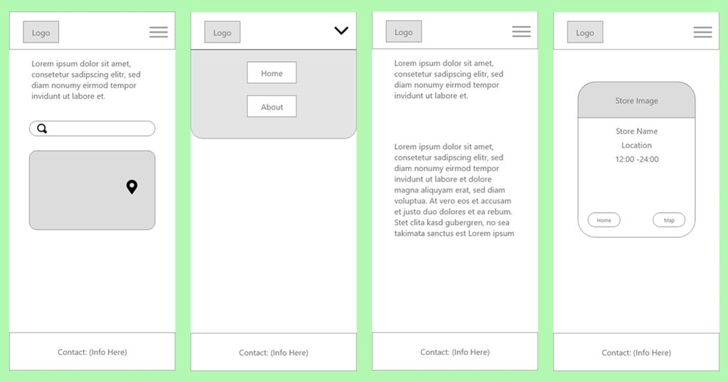
During this stage, I planned out what I wanted to achieve as a Minimum Viable Product (MVP), wrote user personas and created wireframes.
Basic Functionality
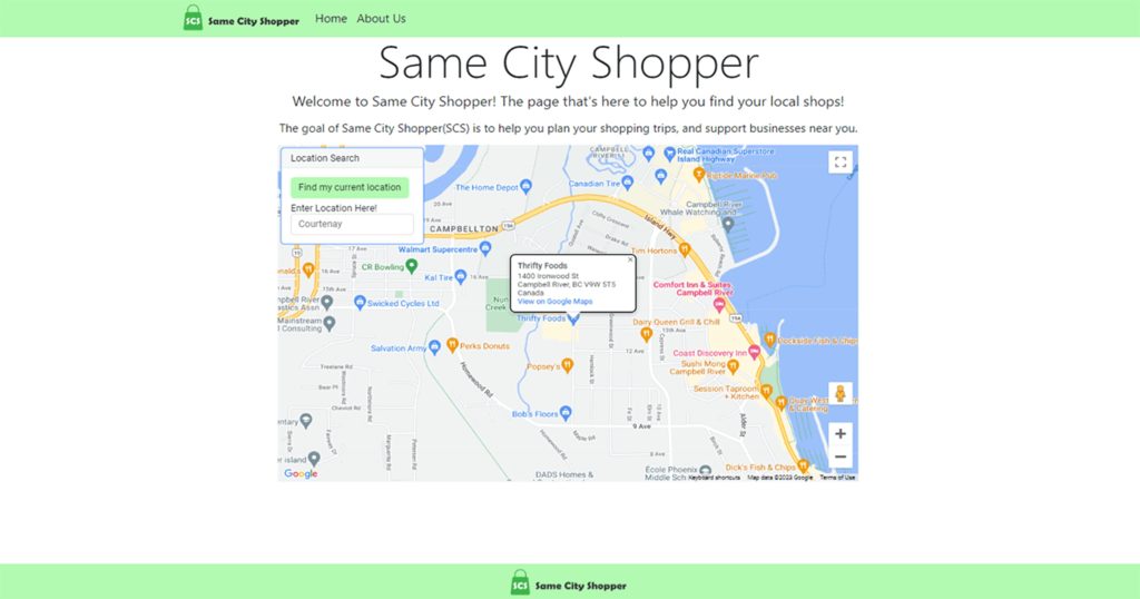
At this point, I created all of my basic functionality, to the point where I considered this my MVP. This involved creating the SCS Logo, deciding on branding and colours, as well as writing the required code. Here I created the HTML, SCSS and JavaScript files, imported Bootstrap, and wrote content for the included pages. Google Map functionality was also created here, the app connected to Google’s API, imported and displayed the map. Feature-wise, during this stage the map could display locations, allow the user to search with autocompleted results, and get the user’s current location.
Revisions + Improvements
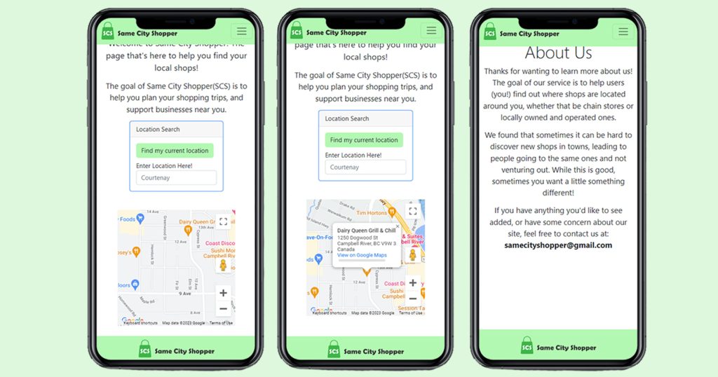
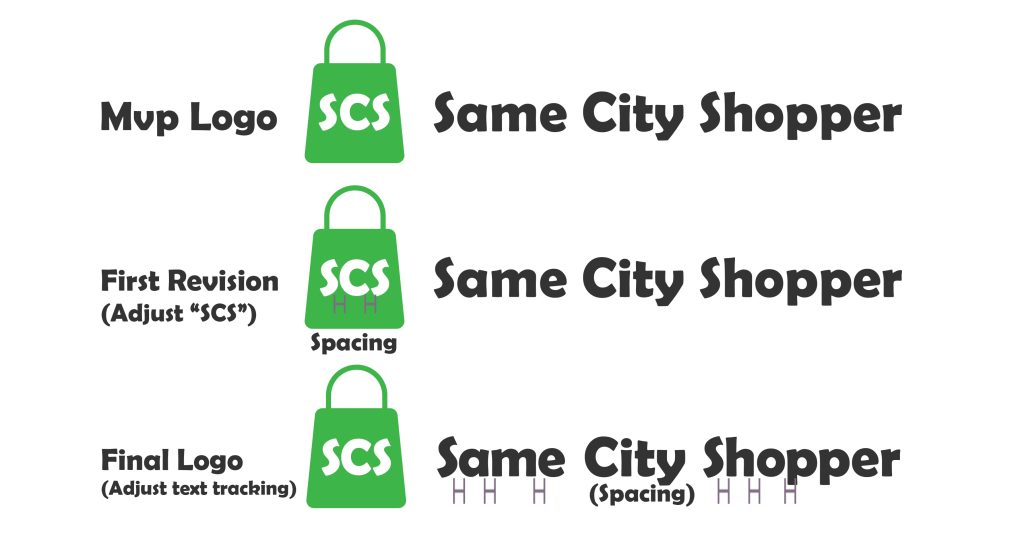
After creating the MVP, my focus was then shifted to implementing any improvements that were pointed out in our review process. This included text content changes, moving said text between pages (resulting in the removal of the About Us page). Branding changes were also made, particularly with the SCS Logo, adjusting the spacing on letters throughout the logo. Code was also changed to improve the user experience in the mobile view, this included moving the controls, increasing the map size, and hiding some introduction text unless the user clicks or hovers, increasing the screen space.
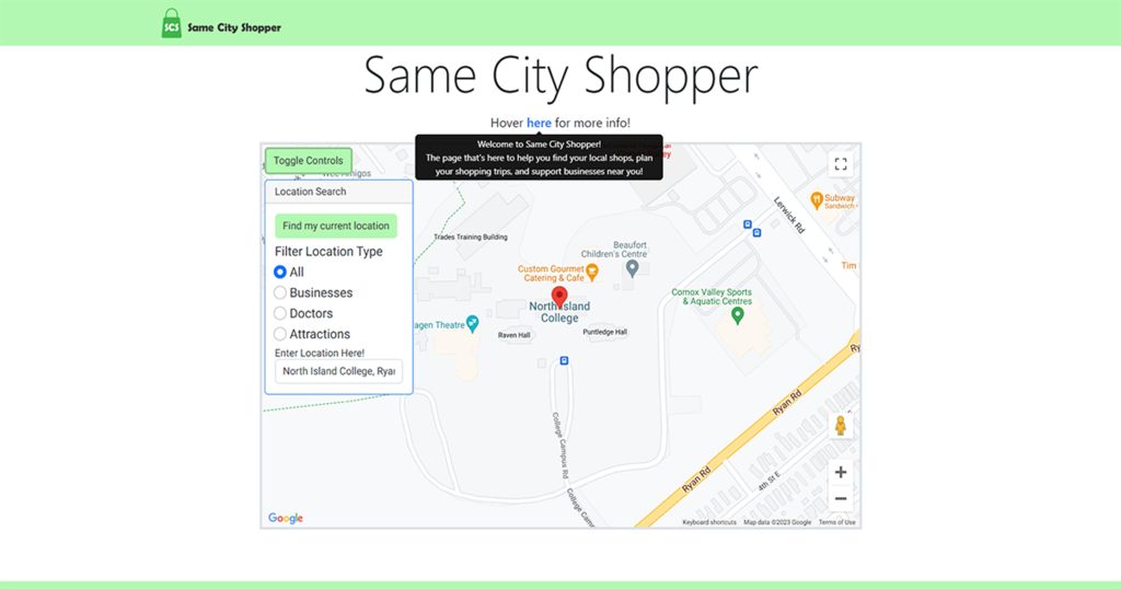
During this phase, I also implemented additional functionality that wasn’t in my MVP. I included filtering of the map so it would show results based on what the user selected (with the option of selecting all, stores, doctors or attractions). I also made the controls card a toggleable dropdown, hiding the controls when they weren’t needed.
Both the changes and additions were accomplished using the Adobe Suite, as well as coding languages such as JavaScript, HTML, SCSS as well as use of Bootstrap and Google APIs.
Deployment
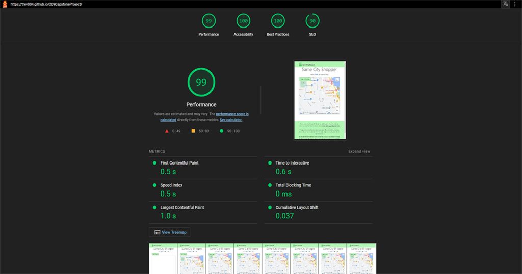
I had some checks and tests I needed to do before deployment. These tests were for quality assurance, where I made sure every function I added worked, and speed, where I ran it through Google’s Lighthouse test. After that, I performed an accessibility report based on the guidelines set by WCAG.
Hopefully you enjoyed reading through my process in creating Same City Shopper! I hope that it detailed my process through creating my site, and I appreciate you taking the time to read through it all!
Check out the GitHub repository.
