Paper & Pine Creative
Paper & Pine Creative is a woman-owned web design studio based in Campbell River on Vancouver Island, built to help small businesses show up online with clarity and intention. The challenge was to design and develop a real, launch-ready business website from the ground up — one that could serve as both a functional client-facing tool and a portfolio of my capabilities.
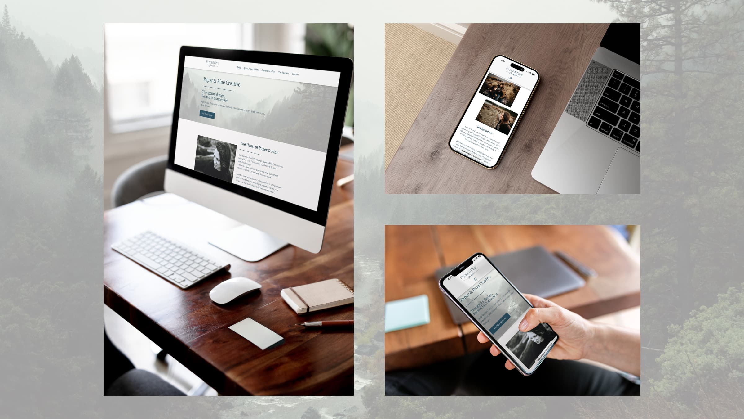
I built this site for my own design business, using it as an opportunity to put everything I’d learned into a real, launch-ready product. Built on WordPress using Elementor, the five-page structure covers the studio and myself as the owner, a breakdown of services offered, and a portfolio to show previous work. The visual direction draws from the Pacific Northwest landscape – muted tones, natural black and white photography, and a serif-script logo – creating a cohesive identity that feels calm, refined, and grounded. The result is a fully responsive, live website.
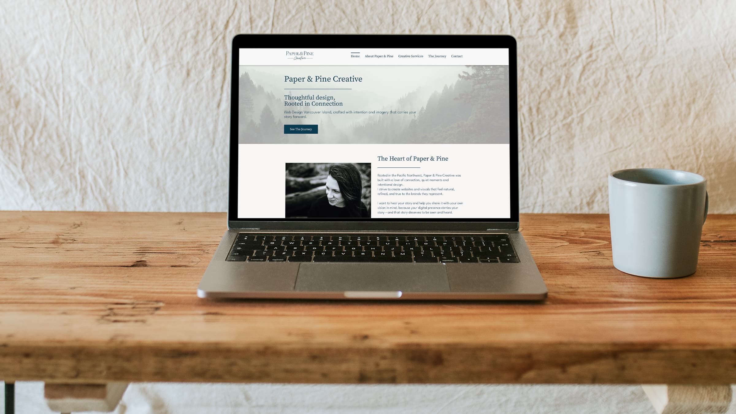
Check out the live website at paperandpinecreative.com.
Brand Foundation
Before anything touched a screen, I needed to know what Paper & Pine Creative, and myself for that matter, stood for and how best those pillars could serve those who work with me. This business grew out of my own experience of starting over and finding my voice again after years of putting everyone else first. I wanted to build something that helped other people do the same — to take the dream they’d been quietly carrying and finally share it with the world. Paper & Pine Creative was built around that belief — that every small business has a story worth telling, and my job is to help them tell it.
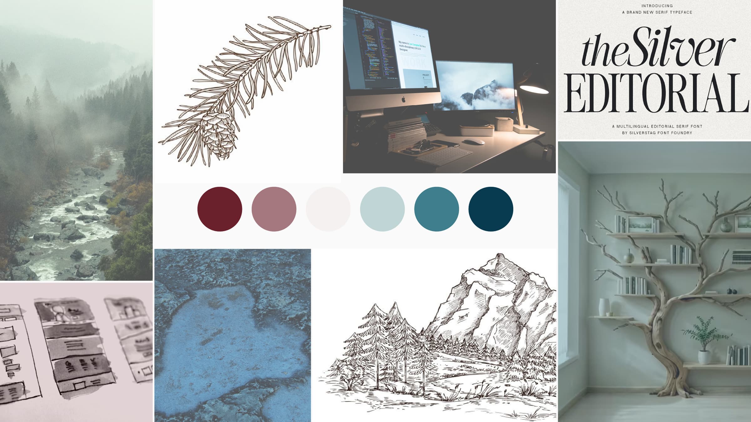
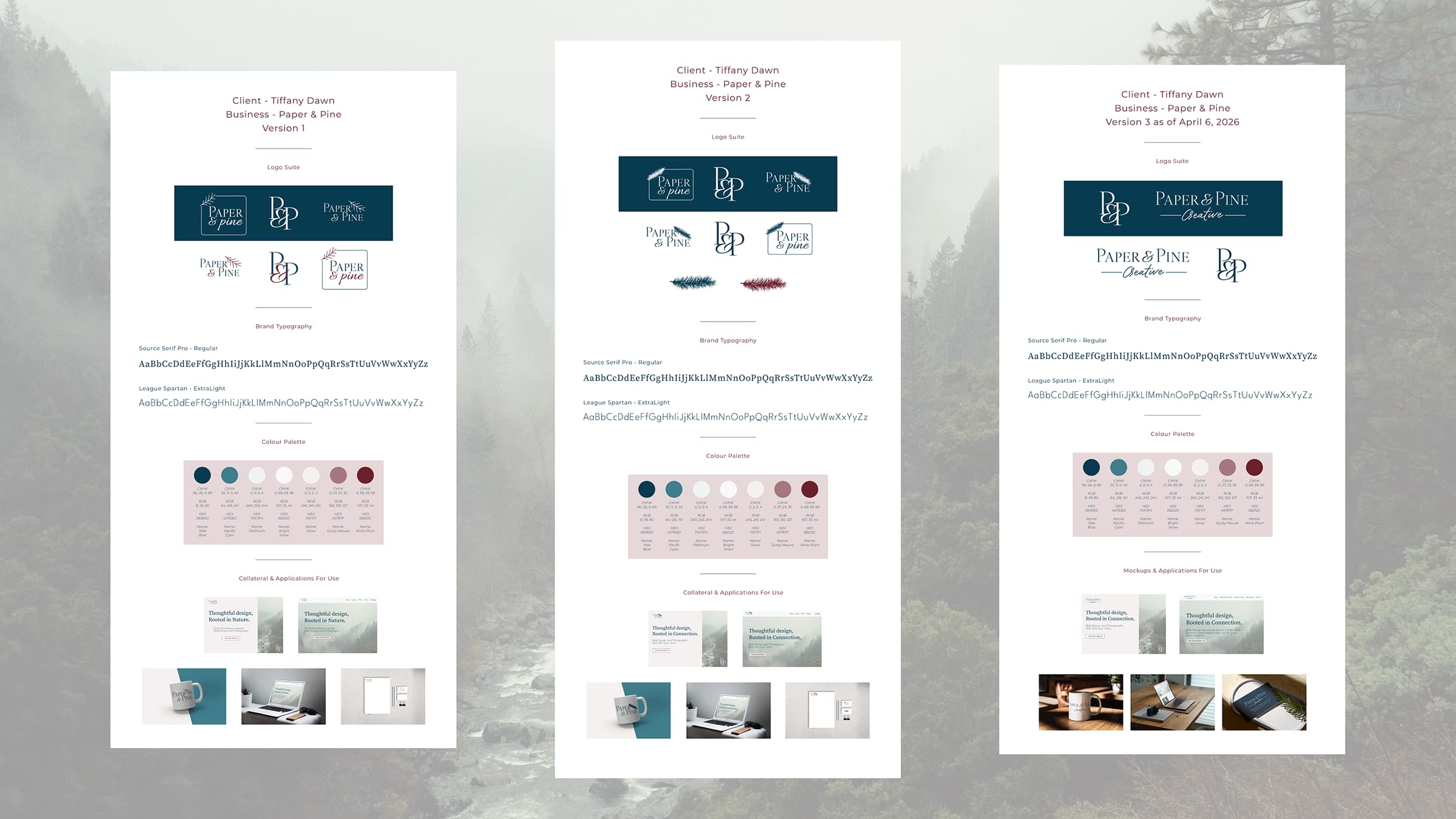
I started by developing a full style guide in Figma – to give the entire project a clear foundation to build from. Getting into Figma after time away from it was a bit of a re-learning curve, but once I got the hang of it, the pieces started falling into place quickly.
The mood board came together first, and that set the emotional tone for everything that followed: Pacific Northwest landscapes, muted earthy tones, natural light and photography, and a sense of quiet confidence. The colour palette locked in around a deep teal and warm off-white – colours that felt both professional and grounded.
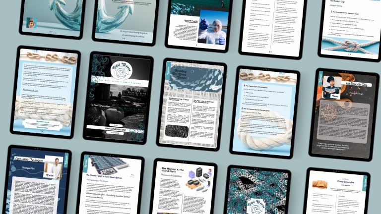
Check out the entire multi-page style guide
Logo & Messaging
The logo went through more rounds than I expected and ended up in a completely different place than where it started. My original design included a pine branch icon, which looked more like a feather and never felt quite right – feedback confirmed it was more of a placeholder than a true brand mark. After staring at it for far too many hours, I made the decision to drop the icon entirely and let the typography do the work. The final logo pairs the main serif font with a script “Creative” underneath, framed by simple horizontal rules – clean, refined, and much more aligned with the overall feel of the brand.
The word “Creative” wasn’t part of the original name either. It came out of a practical problem: finding a business name with an available domain and matching social handles. Troubleshooting that with my instructor led to “Paper & Pine Creative”, which ended up bringing the feeling of everything clicking into place – and it speaks more clearly to what the studio actually does.
The hero messaging needed a pivot, too. My original copy – “Thoughtful Design, Rooted in Nature” – was flagged as too niche, suggesting I only worked with nature-based businesses. I updated it to “Thoughtful Design, Rooted in Connection”, to better reflect what the studio stood for and opening up the audience while keeping the PNW spirit intact.
Wireframes & Planning
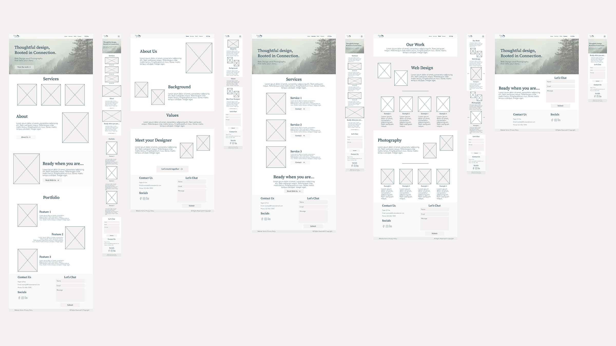
With the brand defined, I built out the sitemap and wireframes in Figma before touching WordPress. Wireframing is honestly where I have to push myself – I tend to over-refine and second-guess all parts of the layout details during this stage, which slows me down. But having those wireframes meant that when I opened Elementor, I had a clear blueprint to follow rather than making design decisions on the fly.
The Build
Building the front end in Elementor was my favourite part of the whole project. Watching everything I’d planned actually come to life on screen made all the earlier struggle worth it. The site came together across five pages – Home, About Paper & Pine, Creative Services, The Journey (portfolio), and Contact – each designed to feel consistent in layout, tone, and pacing.
The toughest stretch of the build had nothing to do with design. Setting up hosting and connecting the domain turned into two full days of troubleshooting – multiple support tickets, cache clears, a lot of patience and coffee. It was a good lesson in an area I knew was outside my comfort zone, and I came out of it knowing a lot more about how hosting environments actually work.
QA & Polish
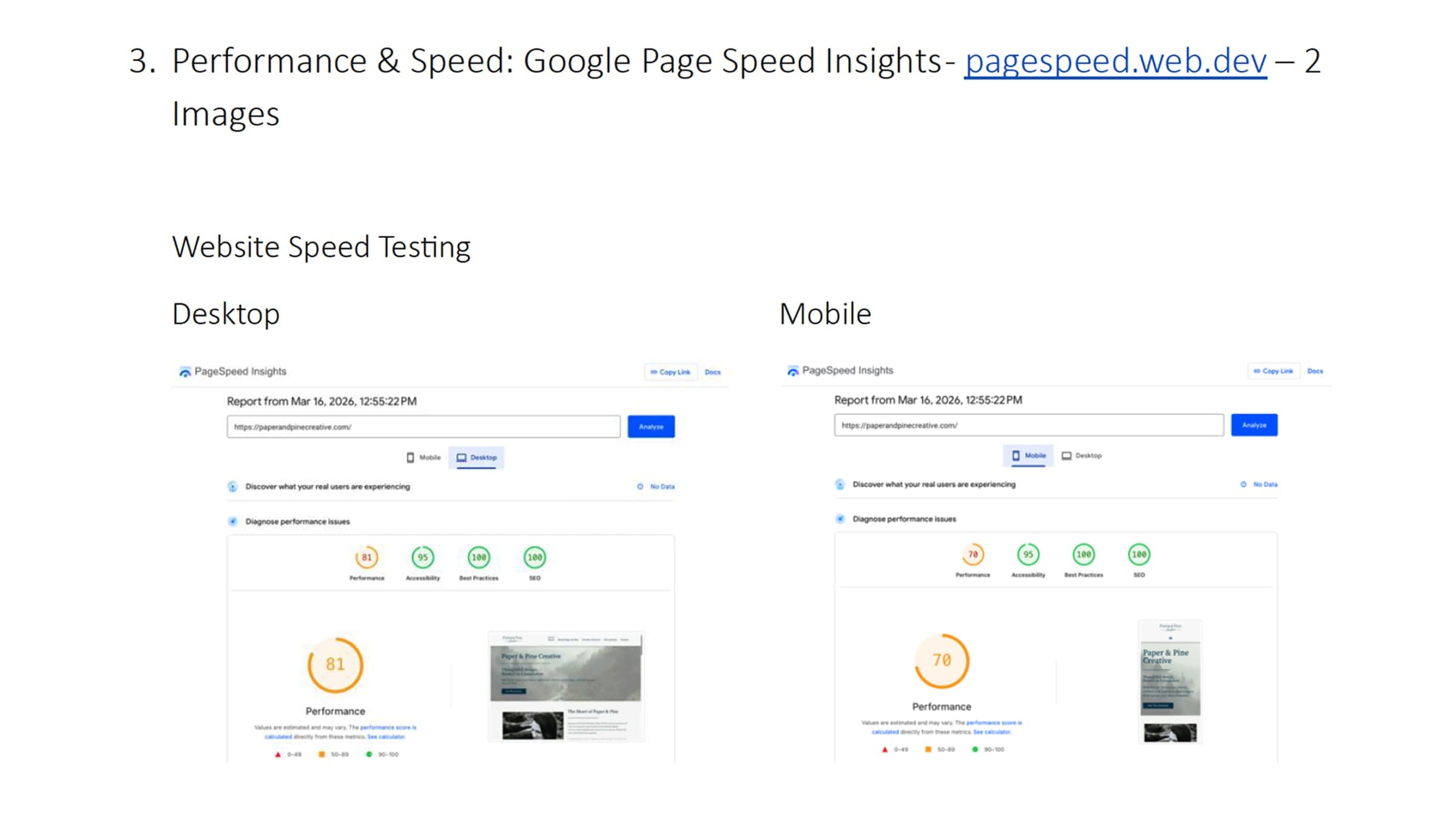
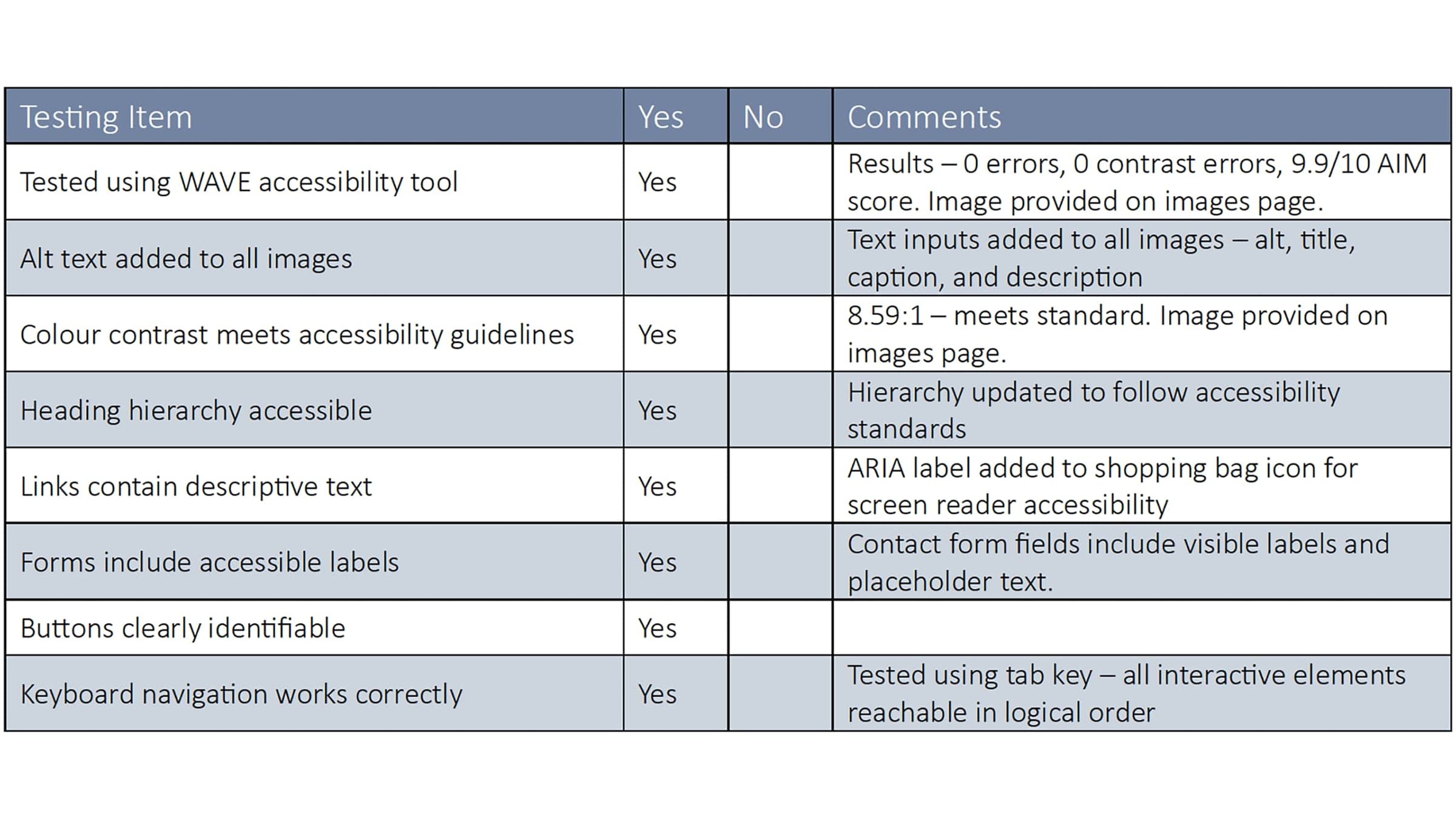
The final phase was a thorough QA review covering speed, accessibility, SEO, and responsiveness across desktop, tablet, and mobile. I had set some site-wide sizing settings incorrectly early on, which meant I’d overridden them manually in several sections – fixing that took time, but it meant the site is now properly configured for any future updates. I kept detailed notes throughout the feedback session, which made it much easier to track and action each revision systematically.