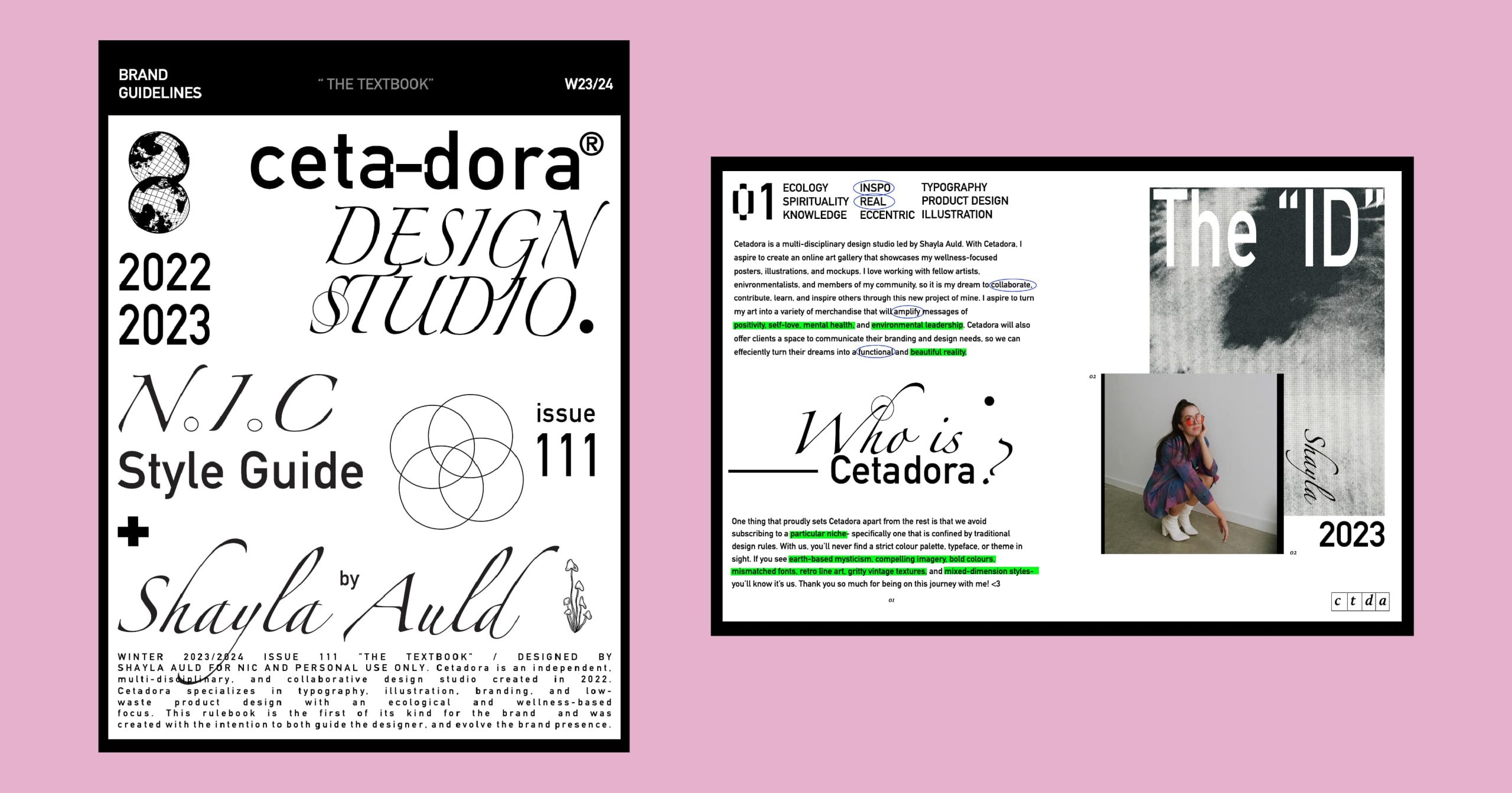
Cetadora Design Studio
Cetadora is a multi-disciplinary design studio created and led by myself, Shayla Auld. The studio is based in Victoria and operates completely online, primarily through my Instagram page and website. With this project, I aspired to create a brand and space that showcase my illustrations, educational infographics, and products. Cetadora specializes in creating low-waste merchandise that amplify messages of positivity, self-love, mental health, and environmental leadership. Cetadora is bold, creative, and in a constant flux state- as I am always shapeshifting, learning, and growing with new knowledge and inspiration.
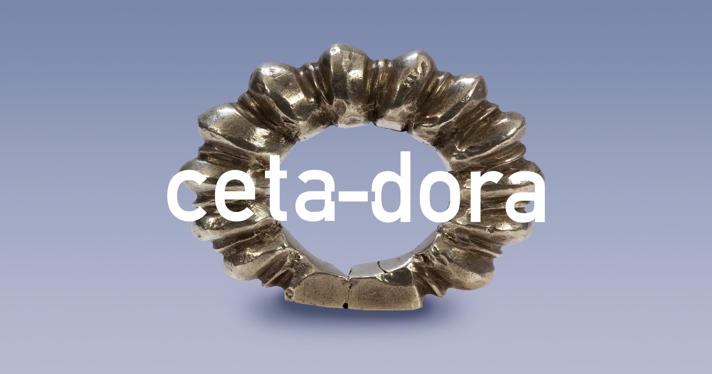
The Name
I had been percolating on my brand name for over a year, when ‘Cetadora’ finally hit me on my plane ride home from Ontario after thinking of ways to encapsulate a word that was unique, bold, feminine, and captivating— yet emulated my passion for the environment and ecology in some way.
I started thinking of Carl Linnaeus and his infamous binomial nomenclature processes for naming all plants and animals, and began looking at Latin root names, and ways to combine them. Ceta– is the Latin root name for whales (my favourite species), and –dora is the root name for gift. I thought this was very fitting, as I had always seen my art as my gift. Together, they combined to create the perfect name that authentically resembled me, and I feel incredibly proud of that.
Brand Voice
Cetadora’s tone of voice defines how we sound across all communications, including everything written and spoken- from inside the designs, to inside the DM’s. Our voice is an extension of my personality, coming from who I am at my core. This includes: enthusiastic, grounded, playful, knowledgeable, kind, inspiring, spiritual, welcoming, relatable, and authentic.
Mood Board + Inspiration
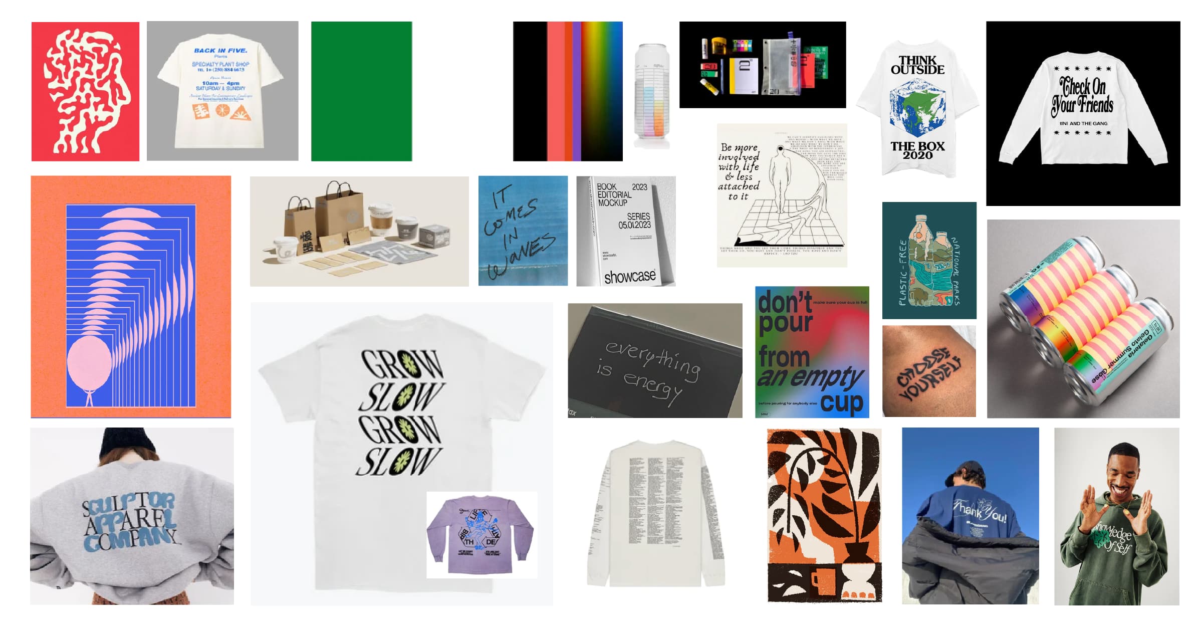
I have used this moodboard (and images like it) to guide my branding vision from the get-go. I always felt very drawn to bold colours, mostly those of the primary wheel. Solid greens, blues, reds, and of course, heavy on the whites, greys, and blacks. Funky typography with warped and stretched lettering, complex yet simple hierarchies, earthy mysticism, and bold yet fun illustrations really paved the way for me. I always loved the idea of combining spirituality with positive messages of mental health and environmental activism in my art and designs, so this inspired me to create merchandise mockups, specifically t-shirts, totes, and other low-waste items, with elements that correspond to that.
Logo Sketches + Variations
Ah, the logo process. I filled about four sketchbook pages full of logo sketches before I decided on the final 32 logos. Yes- 32! I wasn’t happy just drawing these logos ideas out, so I played and finished and designed all 32 in Adobe Illustrator. This didn’t make the process any easier for me, because I ended up genuinely loving 9 of them. To this day, I plan to use them in some form throughout my future designs and branding. Below, you’ll see some of the process and evolution of the logo, along with my second favourite choice on the right.
Final Logo + Brand ID
This is the final logo that I decided to go with. I really love this look as it’s extremely clean-cut, and simple. The reduction of the dash from the two words separates the two root words, while connecting them completely. This also resembles the dashes present before and after the root names of each (ceta-), (-dora).
For this logo I used the DIN Alternate Bold typeface, and Calluna Semibold Italic for the subtext. I decided to play with the use of ‘design studio and store’, ‘art studio’, and ‘design studio’ interchangeably. My main colours of choice are black and white, with a forest green, electric blue, and secondary colours of pink, orange, blue, grey, and brown. Highlight colours are used to highlight the brand’s strengths and draw attention to areas of focus.
Social Media Plan
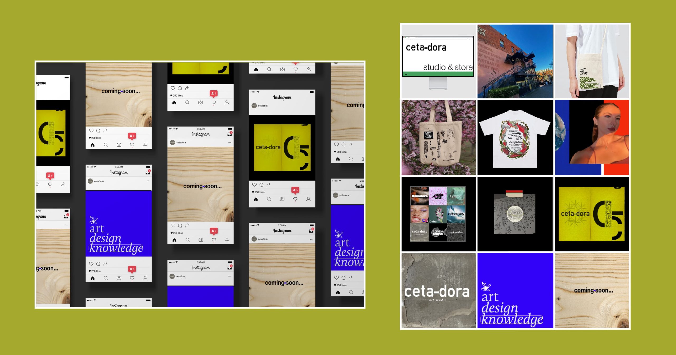
For my social media campaign, I plan to launch it over a one month period. I will first start with a teaser image, followed by a ‘post-teaser’ of what the account will be focused on (art, graphic design, mental health/ environmental educational knowledge). Then, I will officially launch the brand with Cetadora’s first and offical logo graphic.
Over time through the posts and captions, I will explain who I am, how I evolved and designed the brand name and logo, and introduce the designer, (me!). I will slowly launch my designs and mockups to gauge interest on my low-waste products, and launch my pre-made PSD mockups, before teasing the launch of my website where all of the above can be viewed more intimately.
Merchandise, Messages + Infographics
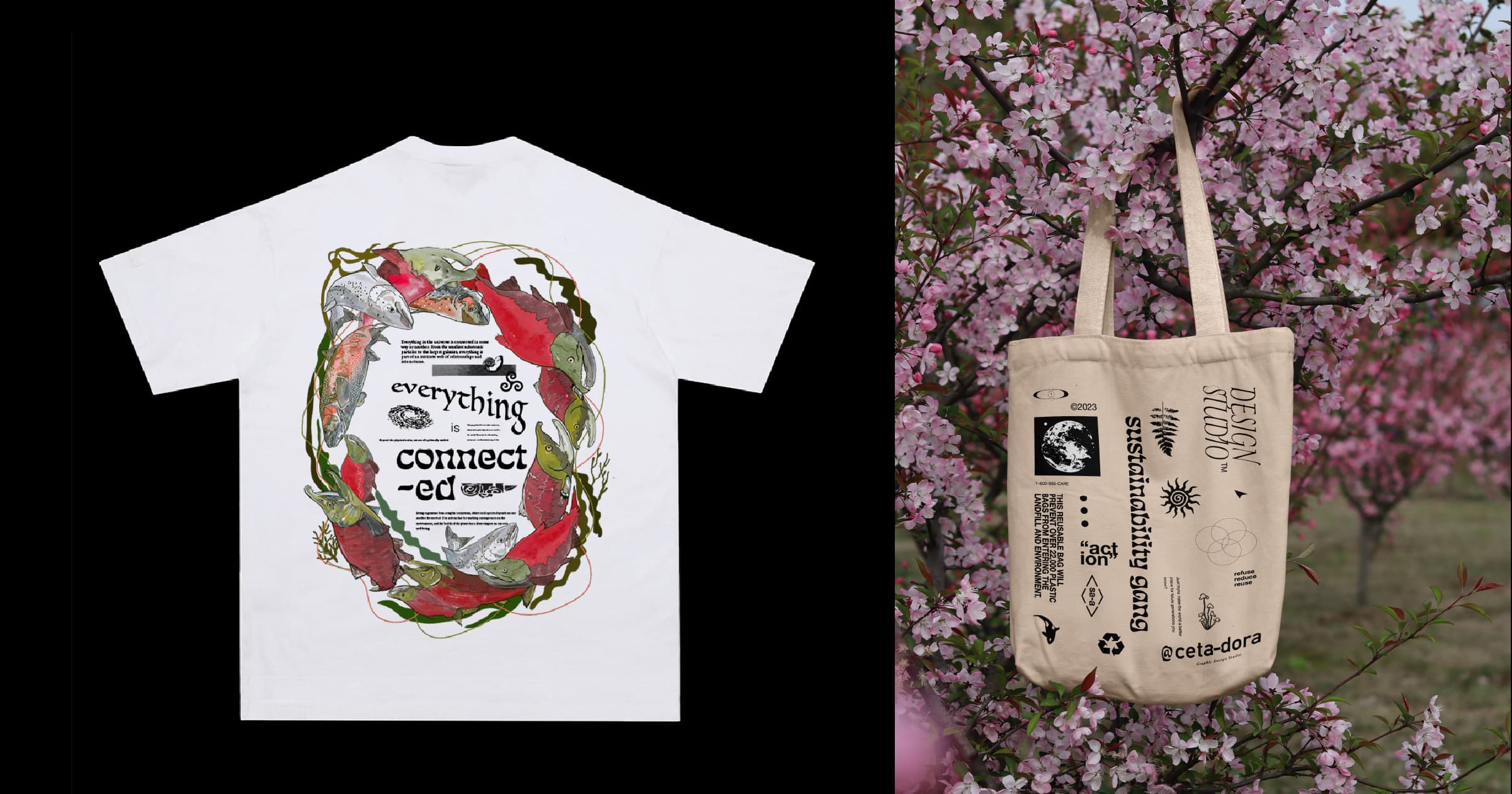
These products are the two I am most proud of. The ‘Everything is Connected’ Tee was drawn on Procreate, where I then took the design into Illustrator and created more illustrations before adding text elaborating on the message of connectivity. I chose Pacific salmon as they are a keystone species that play an major role in B.C.’s ecological health and function. The bag on the right is more personal to me, as it is a cotton tote bag that elaborates on the amount of plastic that would be saved from its use. Plastic pollution education is a major passion of mine, stemming from my previous undergraduate thesis studies at Lakehead University. I really love the patchy design work of the design as well, and I’m excited to put both of these into print.
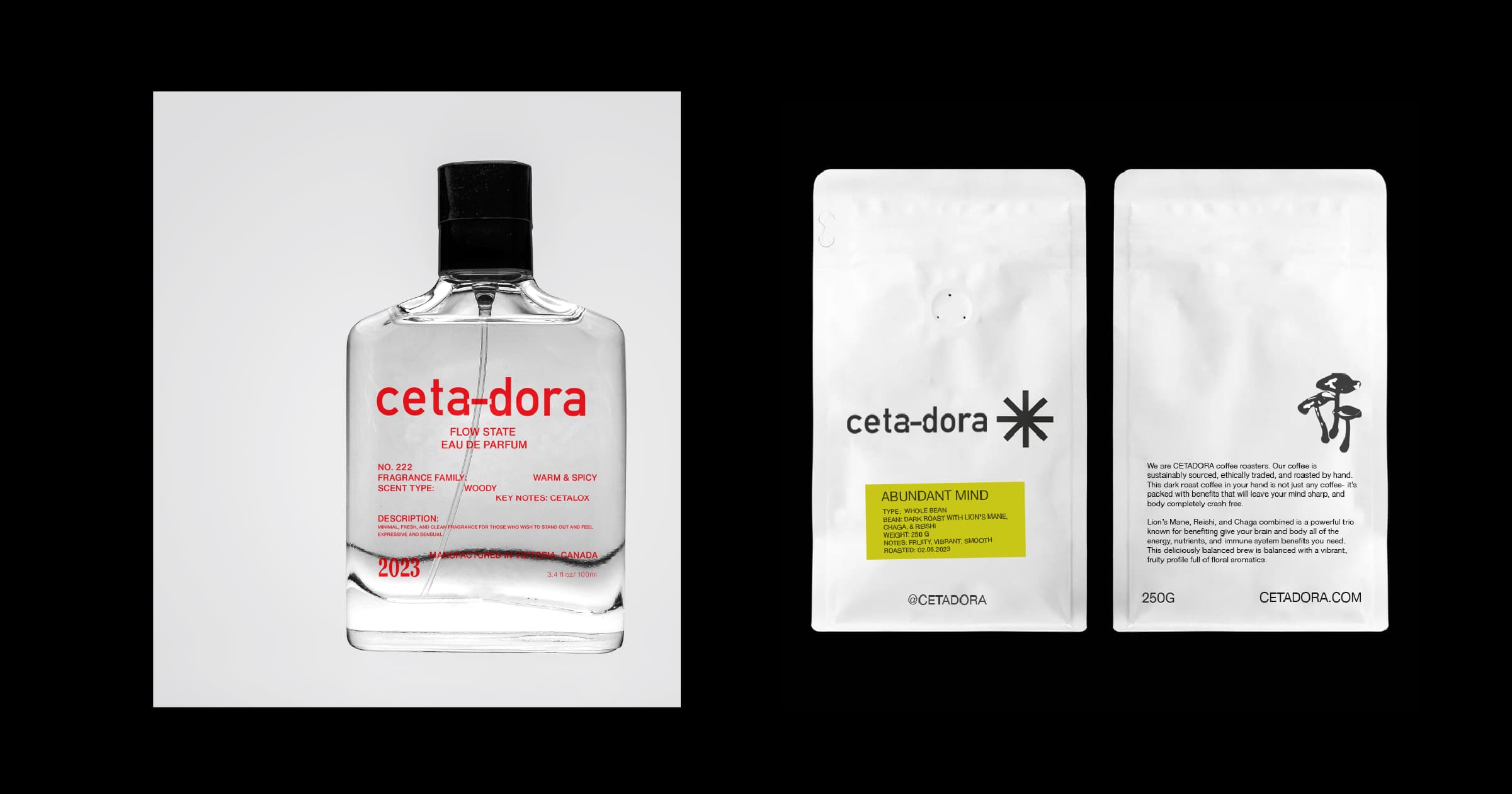
These two designs were examples of what I could create for future potential mockups and brands, but also potentials for Cetadora’s products in the future. The design on the left is a essential oil perfume, the packaging on the right is a mushroom coffee pack.
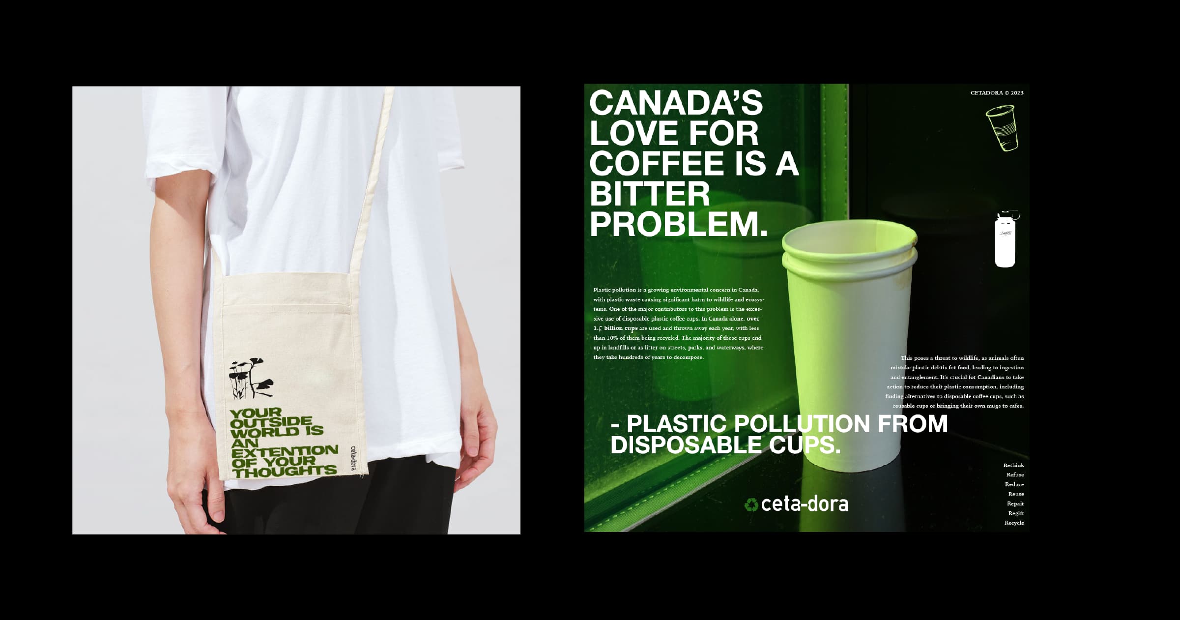
The above includes another tote design with a positive affirmation quote I created, along with an infographic about plastic pollution in Canada. When I’m not creating low-waste merchandise, I plan to create more intriguing and educational infographics, like this one here.
Style Guide
Check out the style guide on ISSUU.
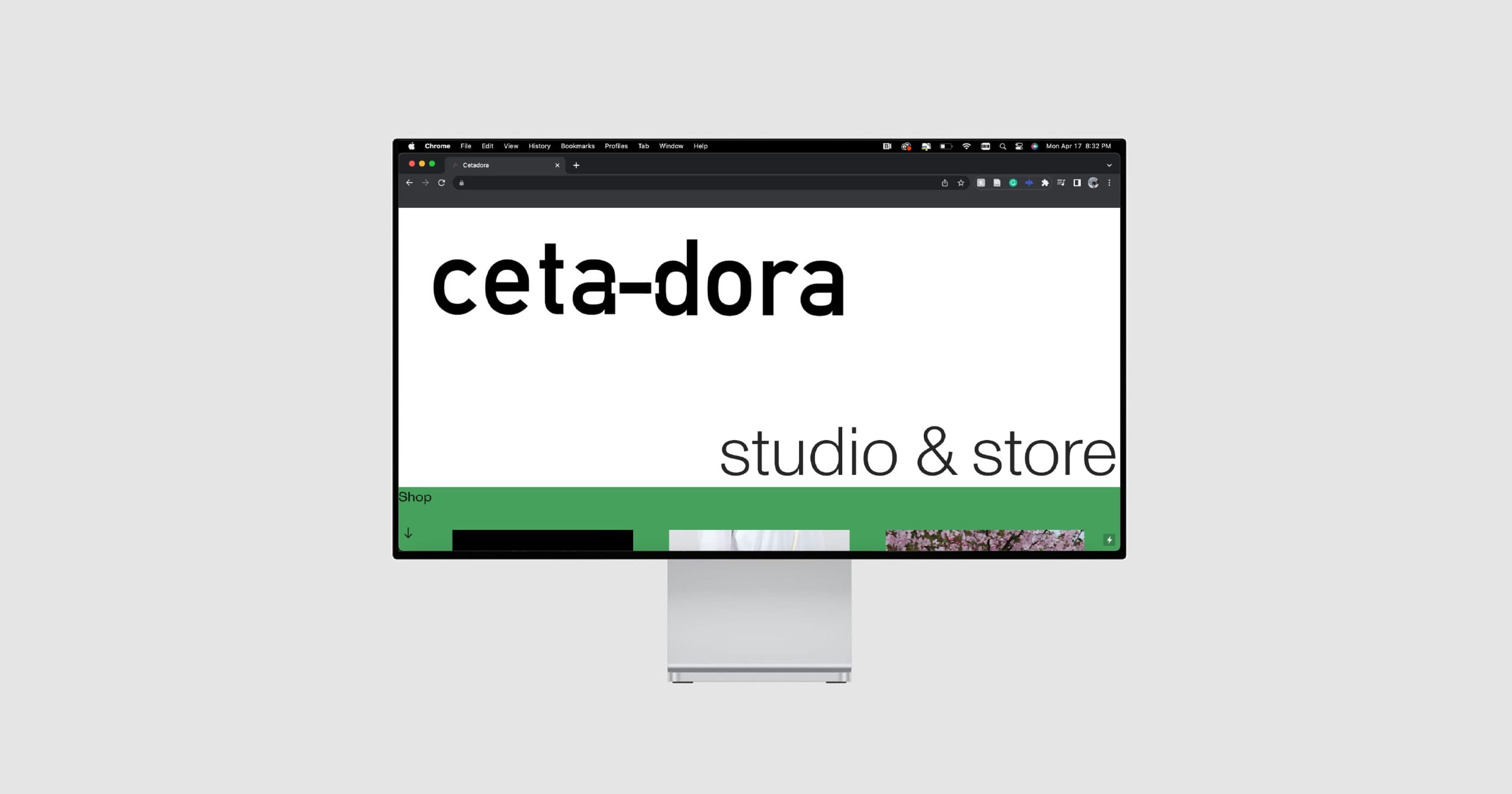
Website
As part of this design, I created a live website that showcases my designs, low-waste merchandise for sale, and downloadable PSD mockups of the downtown Victoria scene. Because this link will fluctuate throughout Cetadora’s growth, I will not be linking it here.
But- do stay up to date with our brand launch and evolution by following @cetadora on Instagram, and feel free to get in touch with me through my Linked-In profile attached above at any time.