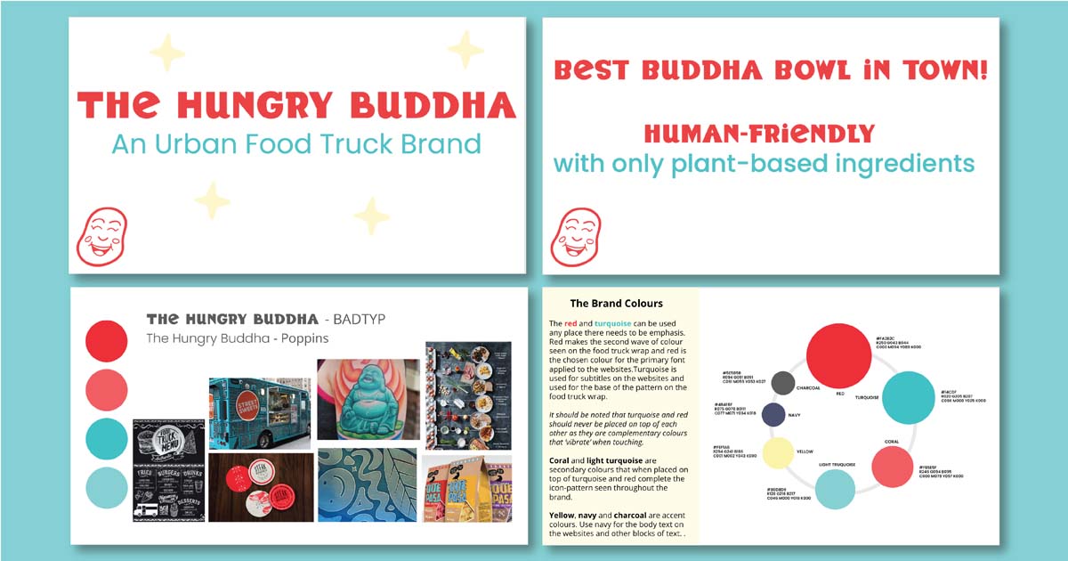
The Hungry Buddha is a concept food truck business selling a variety of vegan Buddha bowls. Instead of branding strictly to vegans, I tried to appeal to all diets by using the brand message: “human-friendly,” not just vegan-friendly. I used vivid colours and a quirky hand-drawn logomark that says the Hungry Buddha is a friendly place for all to grab lunch.

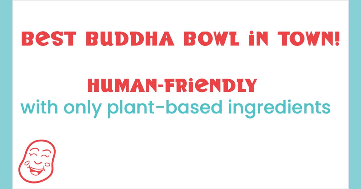
I wanted to set the tone that the Hungry Buddha is inviting and appealing to anybody craving a Buddha bowl, not just vegans/vegetarians, so I came up with two brand slogans: ‘Best Buddha Bowl Around’ and ‘Human Friendly, With Only Plant-Based Ingredients.’ ‘Human friendly’ was meant to invite people with all diets to the Hungry Buddha. ‘Best Buddha Bowl Around,’ is the phrase used on the sides of the food truck wrap.
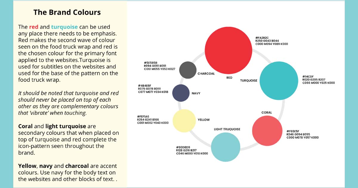
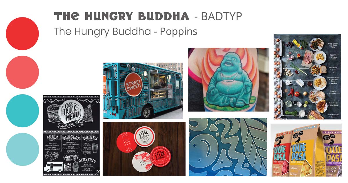
I created a moodboard to visualize the brand and provide brand inspiration. The moodboard displays the bright and limited colour-palette used to set the Hungry Buddha apart from the greens and pastels that are commonly seen in the vegan/vegetarian food market. It also shows a turquoise food truck with an all-over pattern as design inspiration. With a business name like The Hungry Buddha, I knew I needed to pay homage to Buddha in some way but felt like the actual depiction of Buddha was too zen for this brand. I decided to go with Buddai, ‘the laughing Buddha,’ that many westerners recognize as Buddha. He can be seen on the moodboard as a turquoise tattoo. Buddai is jovial and perfect for The Hungry Buddha brand with his smiling face, he is welcoming to all.
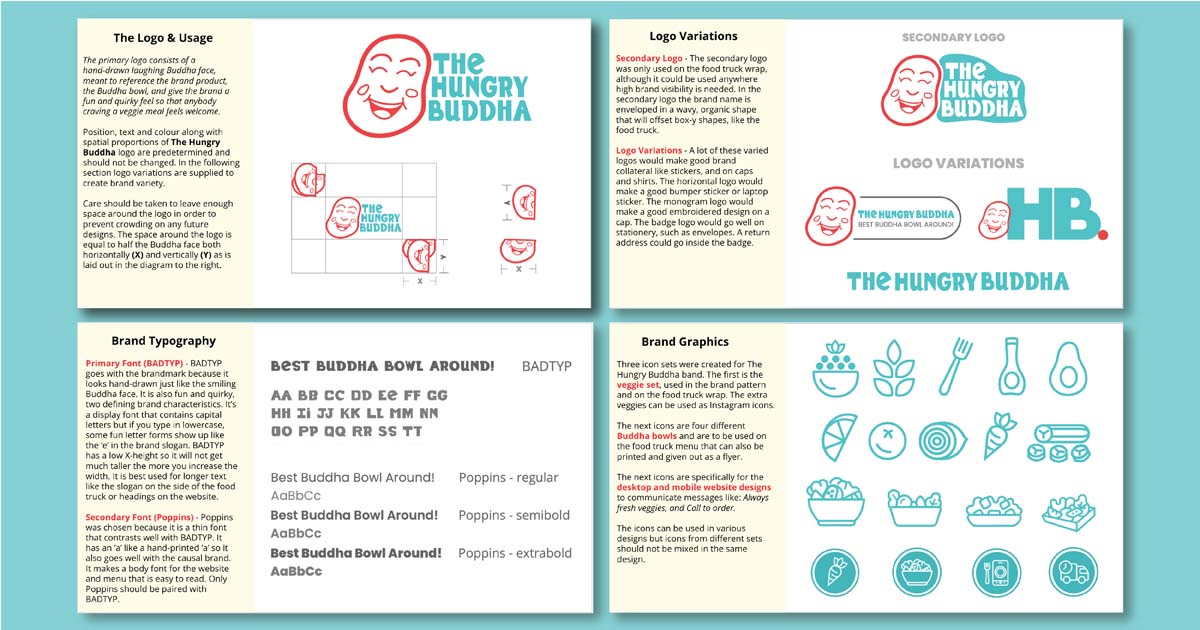
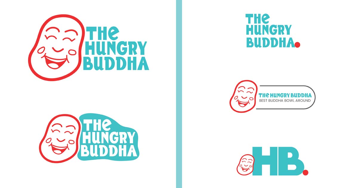
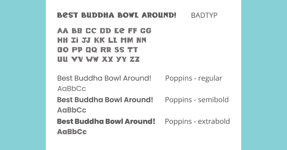
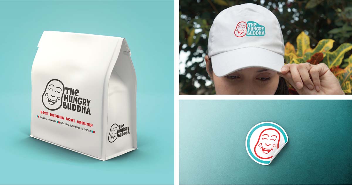
After sketching many versions of Buddai’s head and feeling that they weren’t graphic enough, I doodled a deconstructed Buddha head, leaving out the ears. It was the perfect way to represent the Hungry Buddha brand. It looked enough like Buddai to represent the ‘Buddha’ in the Hungry Buddha name but not close enough to the actual sacred Buddai to appropriate Buddhism. I paired the Buddha head with the business name written in a fun and quirky hand-drawn font, called BADTYP. In the secondary logo, the business name is enveloped in a wavy turquoise shape meant to make the logo stand out while on the sides of the food truck wrap. I also created three logo variations meant to be used for brand collateral; t-shirts, caps, stickers, etc.
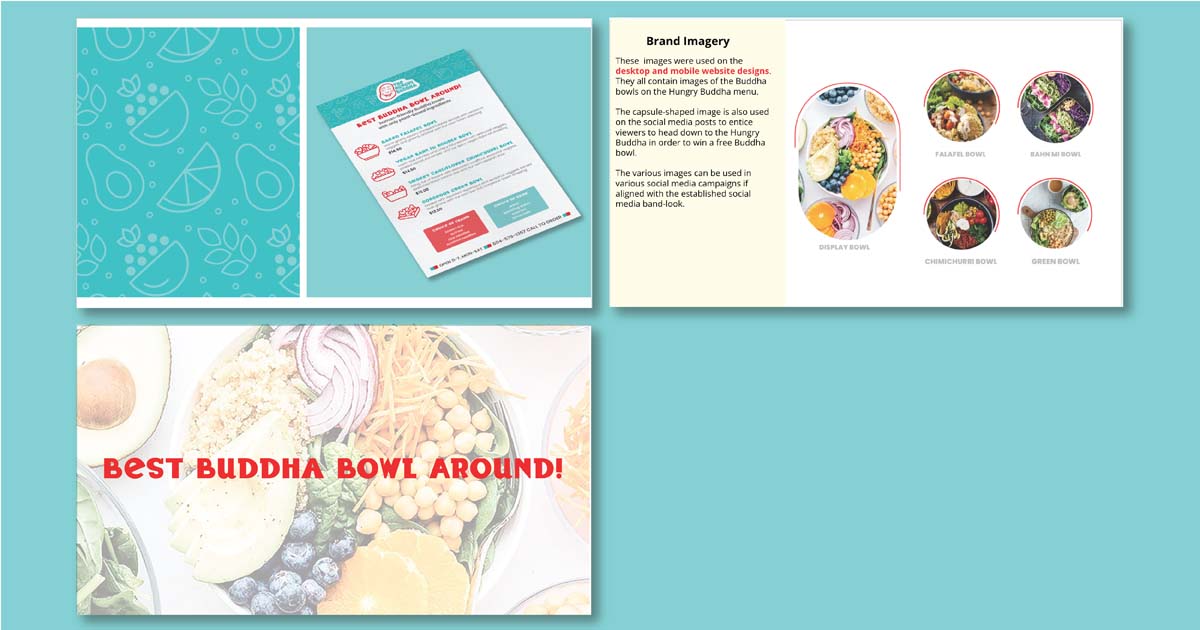
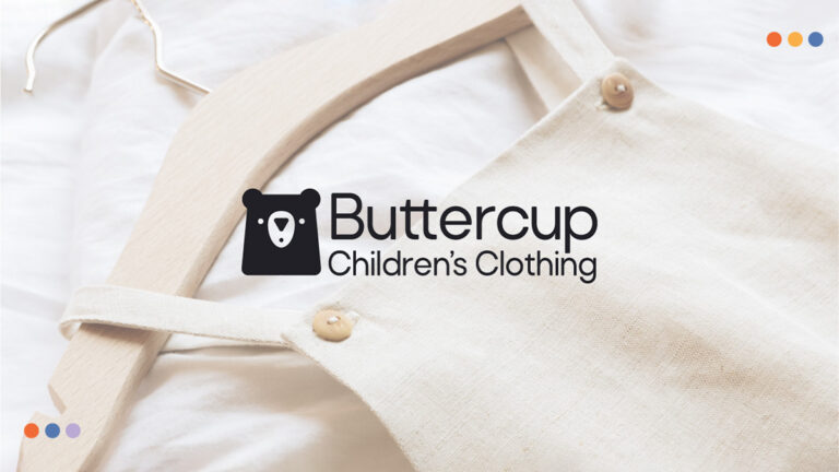
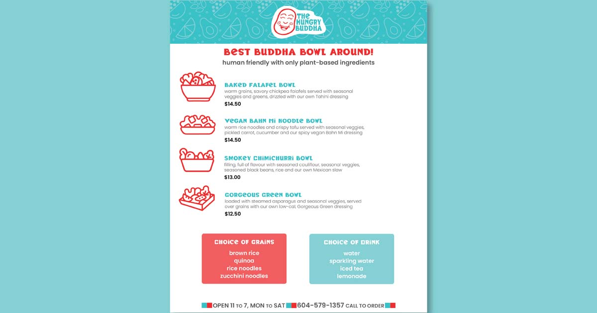
I wanted to create a brand pattern so I made veggie icons and I used four of them (leafy greens, avocado, orange slice and Buddha bowl) in a repeating, seamless tile-pattern. I used light on dark shades of turquoise so that the pattern would be subtle. I also made four distinct Buddha bowl icons to use with the four menu options on the food truck menu. The menu is also formatted to be printed and handed out to customers, flyer style. The final four icons are used on the website prototype to illustrate points about the Hungry Buddha service.
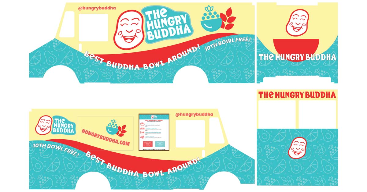
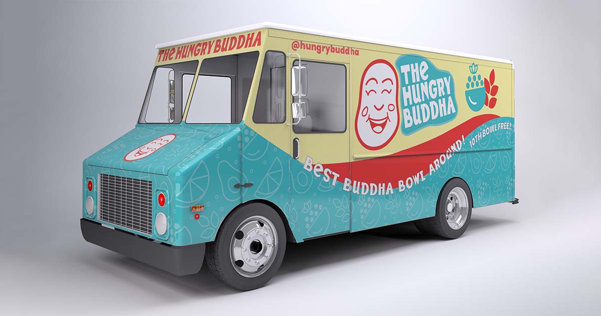
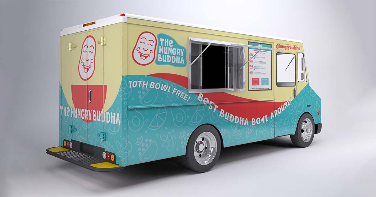
I designed all sides of the food truck wrap using a template in Adobe Illustrator. I featured the secondary logo quite prominently on the non-service side so that the business name and character would be highly visible in traffic. I used the brand pattern in a waveform on all sides of the wrap and added the brand slogan “Best Buddha Bowl Around!” curving with the wave on both sides of the truck. The rear of the truck is playful and gives drivers behind the truck something to laugh at as the Buddha is quite literally in the bowl (well almost!). The front of the truck design continues the turquoise pattern and displays the Buddha head by itself, to be recognized by loyal customers.

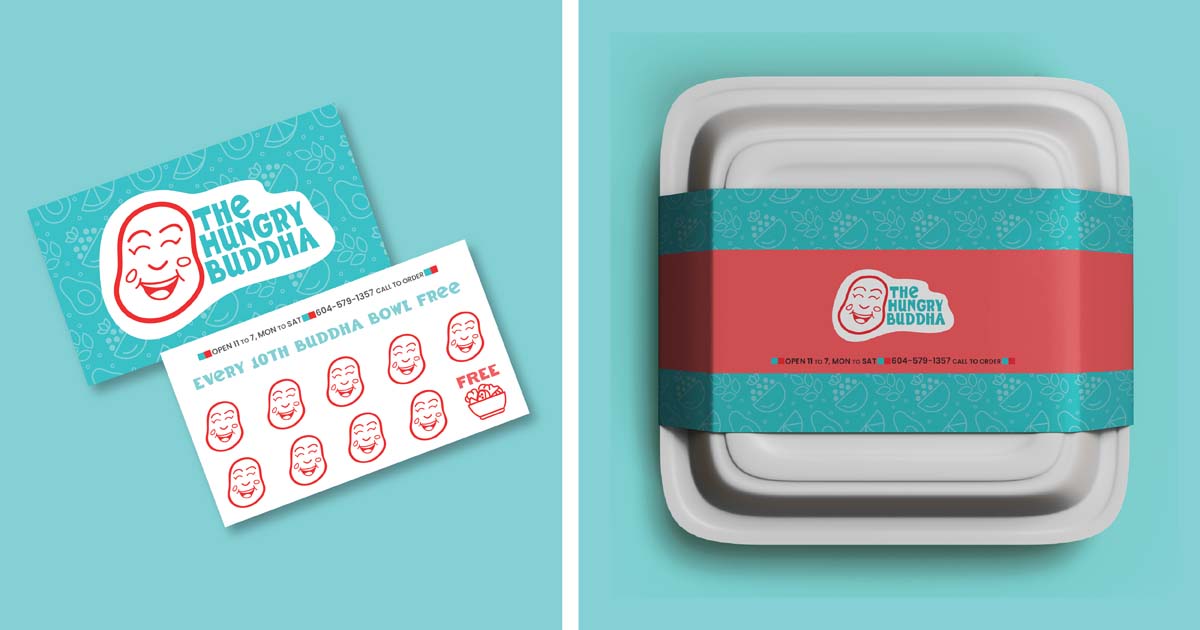
I designed a wallet-sized loyalty card with the brand pattern and the primary logo on a white, wavy background (so that it could be seen on the turquoise pattern.) The client will have to use this version of the logo for placement on top of anything turquoise or the text in the logo will be lost. When customers have collected nine Buddha head stamps (enhancing the brand’s playful tone) they get a 10th Buddha bowl free, represented on the card by one of the menu icons. I also designed a recyclable take-out box, complete with a paper belt with the same primary logo and pattern to keep the brand consistent.
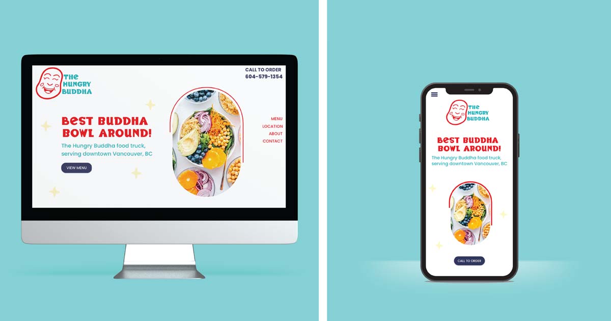
I designed a one-page Adobe XD prototype website that is responsive. Why one-page? Because the food truck business is a fast business. Customers move quickly out of downtown office buildings when they see The Hungry Buddha go by. Customers need two things: they need to know what’s on the menu and they need to know where the food truck is. To provide this service I didn’t need a multi-page website, I needed something designed with efficiency in mind.
I did that by placing the Hungry Buddha phone number right at the top, so customers can phone to order right away. ‘Call to Order’ became the prototype CTA. On the mobile prototype, the Call to Order button is prominent on the first screen.
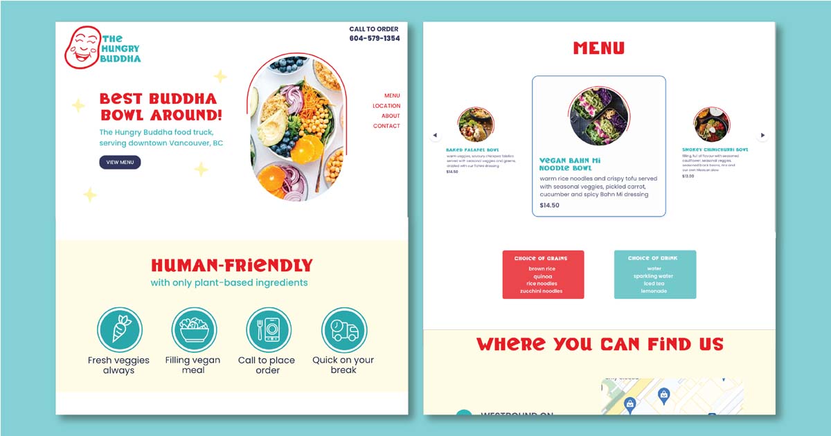
The website uses responsive carousels to display four menu items. I originally designed a menu where all four menu items were displayed in list fashion but I realized that my goal of providing quick knowledge to hungry customers would be better reached if I didn’t make customers scroll down a long list.
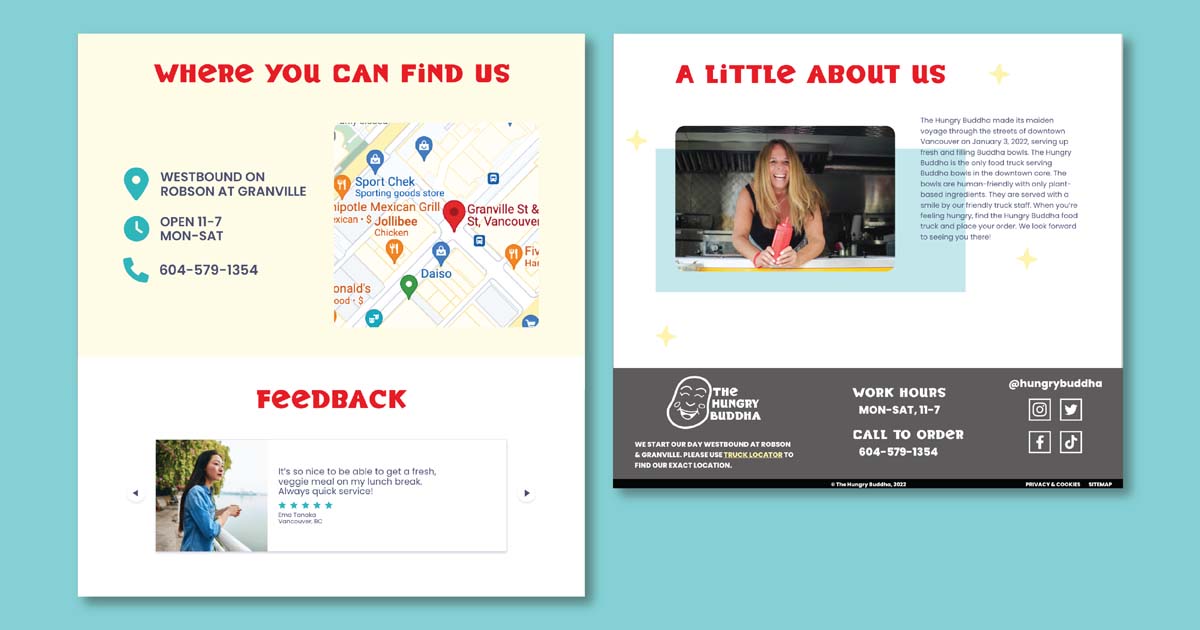
Just below the menu section of the webpage is the truck locator section. The truck’s GPS feeds into the map web app, letting the customers know where they can find The Hungry Buddha. I designed the map to be prominent, taking up a full screen on the mobile prototype, so that customers can find it easily with a quick, short scroll. Beside the map is the Hungry Buddha phone number/contact button, hours of operation and starting location.
For customers with a little more time, I included a section with four icons to illustrate pertinent info printed below such as: Always Fresh Veggies and Quick On Your Break. The about section of the prototype is just above the footer, which may seem unconventional, but with the need for the menu and truck locator to be placed high in the website hierarchy, it made sense to place less vital info further down.
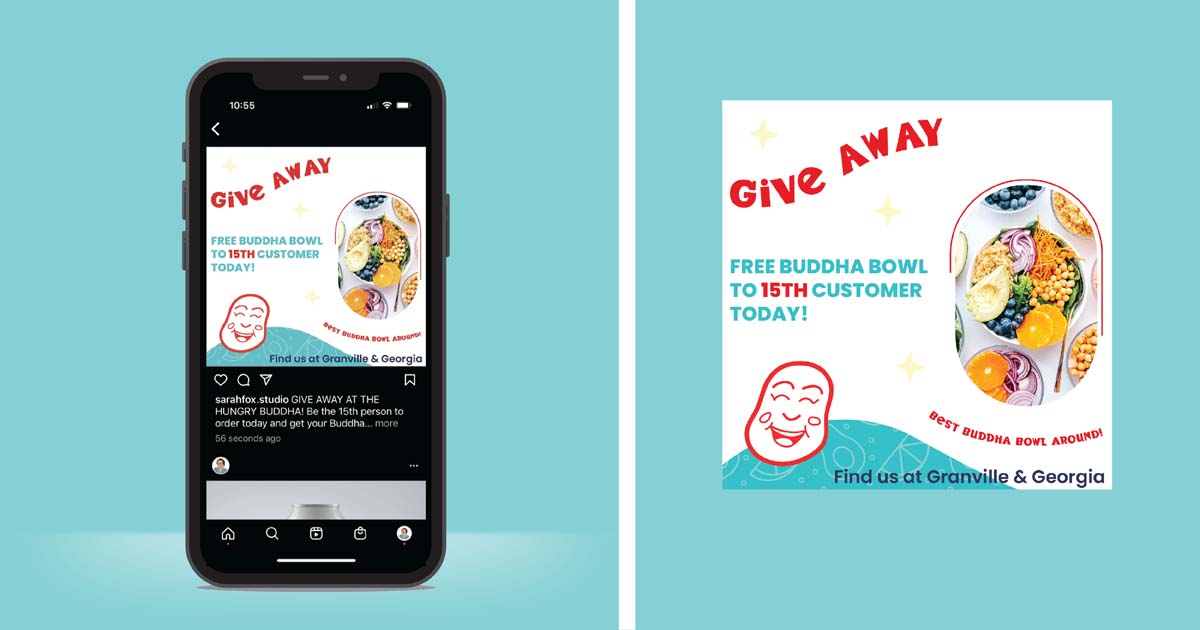
I designed a social media campaign to bring more customers to the Hungry Buddha food truck. The 15th customer to the truck that day, will receive their Buddha bowl free. I used brand colours and a wavy turquoise pattern that mimics the food truck so that the Instagram post would be instantly recognized as The Hungry Buddha. For those viewing the post organically, brand imagery of a Buddha bowl is used (and matches the desktop and mobile website prototypes.)
I designed the Hungry Buddha style guide in order to show the client how all the elements of the brand I designed the Hungry Buddha style guide in order to show the client how all the elements of the brand fit together. It starts with the brand slogans and mood board and touches on brand colours, logos and variations, typography, brand graphics and imagery. I used brand colours and fonts in the typography of the style guide so that it will appear familiar to the client. I explained the space requirements around the primary logo using half of the Buddha head, which adds a little humour and hopefully makes it memorable. Between each section of the guide I created section title-pages with the title in dark grey (another colour added to the Hungry Buddha palette) on top of a Buddha bowl image with lowered opacity. I handled the images in Photoshop and the typography in Illustrator. Where explanation was needed I created a sidebar on the left of the page and then used the secondary font, Poppins.