Plan & Plate
As someone who enjoys cooking and finding new recipes online, I wanted to create a website that helps others do the same. The idea was to build a simple, functional platform where users can discover recipes, contribute their own, and stay organized in the kitchen.
To bring this idea to life, I built a custom WordPress website using Elementor, enhanced with custom HTML, CSS, JavaScript, and PHP. The site includes core features like a searchable recipe directory, a user-friendly recipe submission form, grocery list generation based on ingredients, and a blog section for cooking tips and food-related content. The design is responsive, performance-optimized, and built with SEO in mind to ensure a smooth user experience across devices and improve search visibility. This project allowed me to combine my technical skills and personal interests into a real-world solution for home cooks and food lovers.
Moodboard
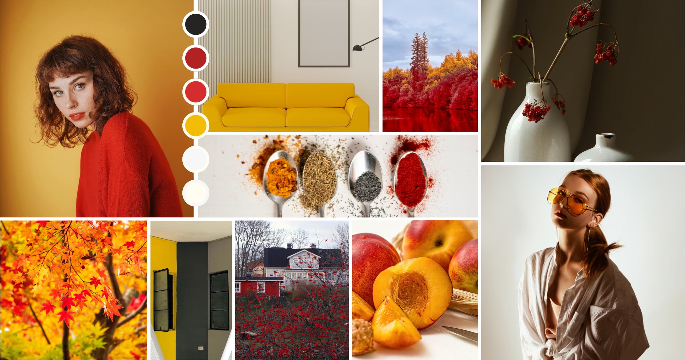
Before starting the project, I researched a range of recipe websites to better understand user needs. One thing that stood out was the demand for a clean, easy-to-navigate interface that combines recipes with practical kitchen tips. I began by sketching ideas and collecting visual inspiration to define the overall tone and functionality of the site. The mood board I created helped shape the visual direction—using warm, organic tones with accents of red and yellow to represent freshness, flavor, and creativity in the kitchen.
Logo Design
I started the design process by creating the logo for Plan and Plate, focusing on a clean and clear concept that would be easy to recognize. The main logo combines bold typography with a fork and spoon icon to visually connect with the site’s purpose—cooking. I also designed an alternate, simplified version for use in smaller or minimal spaces. Both versions are consistent and versatile, working well across digital and print materials. The warm red tones in the logo help it stand out while complementing the overall visual theme of the site.
Brand Colours
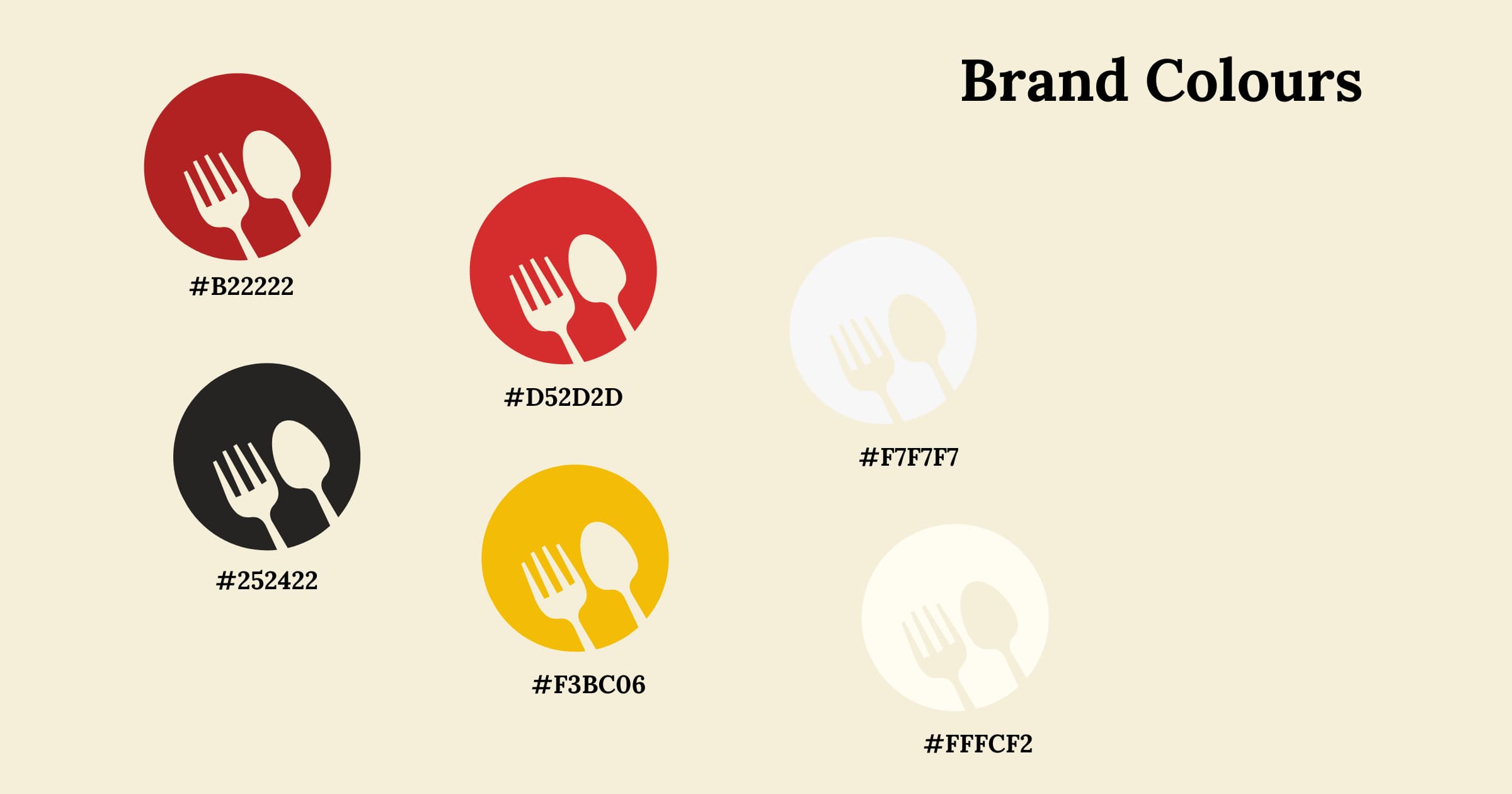
The color palette was inspired by natural ingredients like spices, fruits, and warm seasonal tones. I used rich reds, golden yellows, deep charcoal, and soft cream shades to create a welcoming, kitchen-inspired atmosphere. These colors not only enhance the visual appeal but also provide strong contrast and support accessibility for all users navigating the site.
Brand Typography
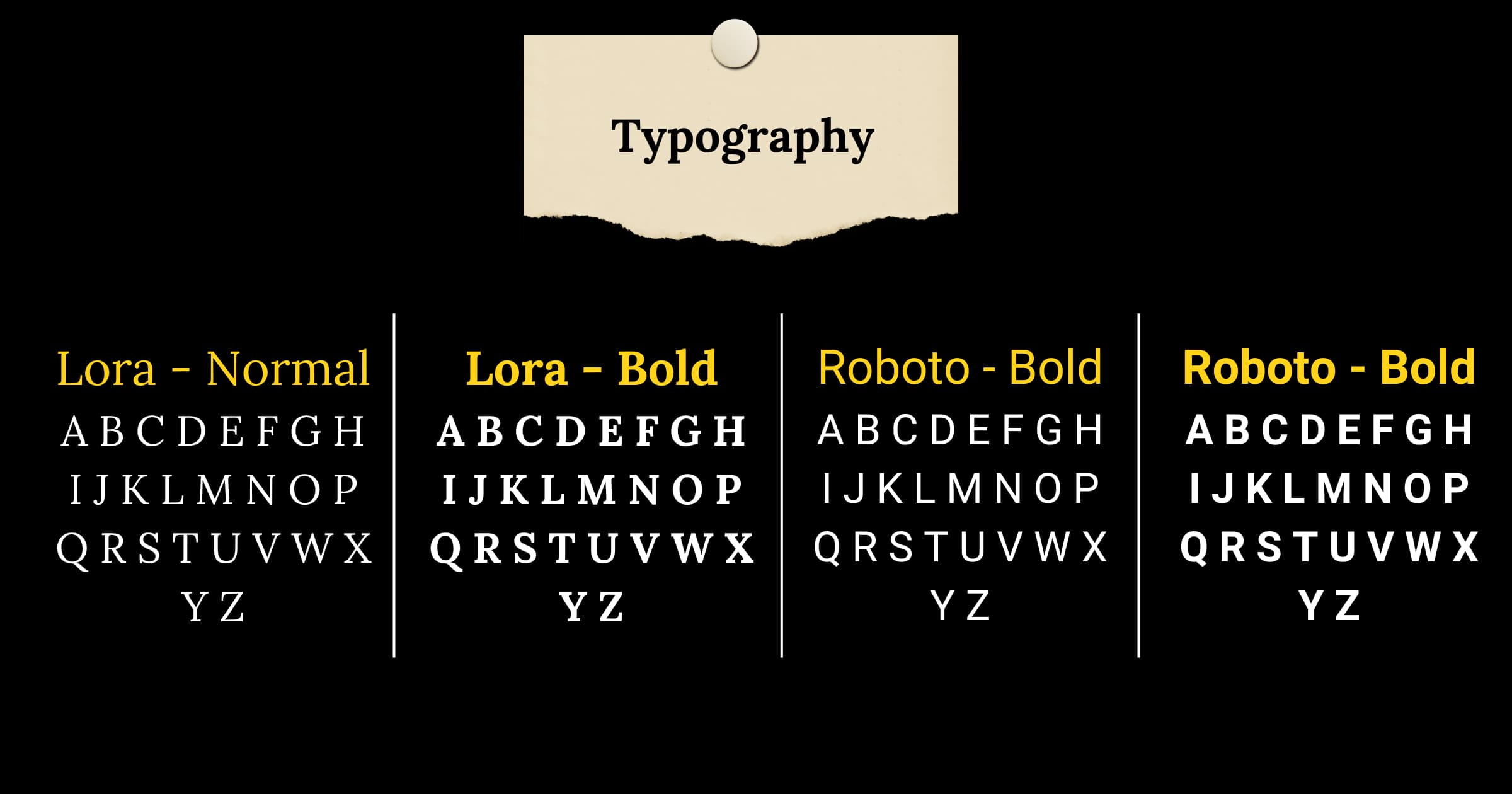
For the typography, I selected the Lora type family for its balance of readability and elegance. Its serif style brings a classic, approachable feel, while the bold weights provide strong contrast and clarity across headings, buttons, and body text. Using Lora consistently throughout the site helps maintain a cohesive and smooth reading experience on all screen sizes.
Design Collaterals
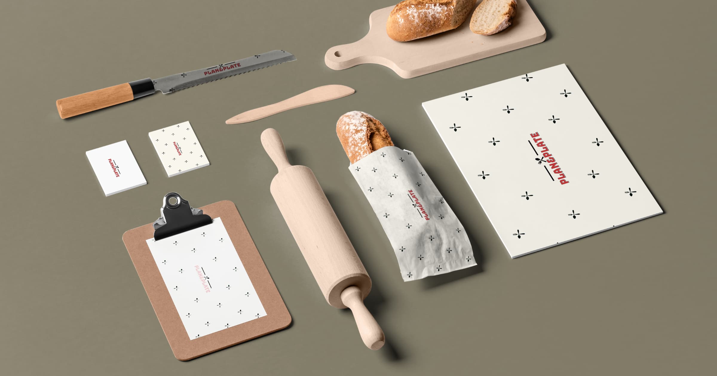
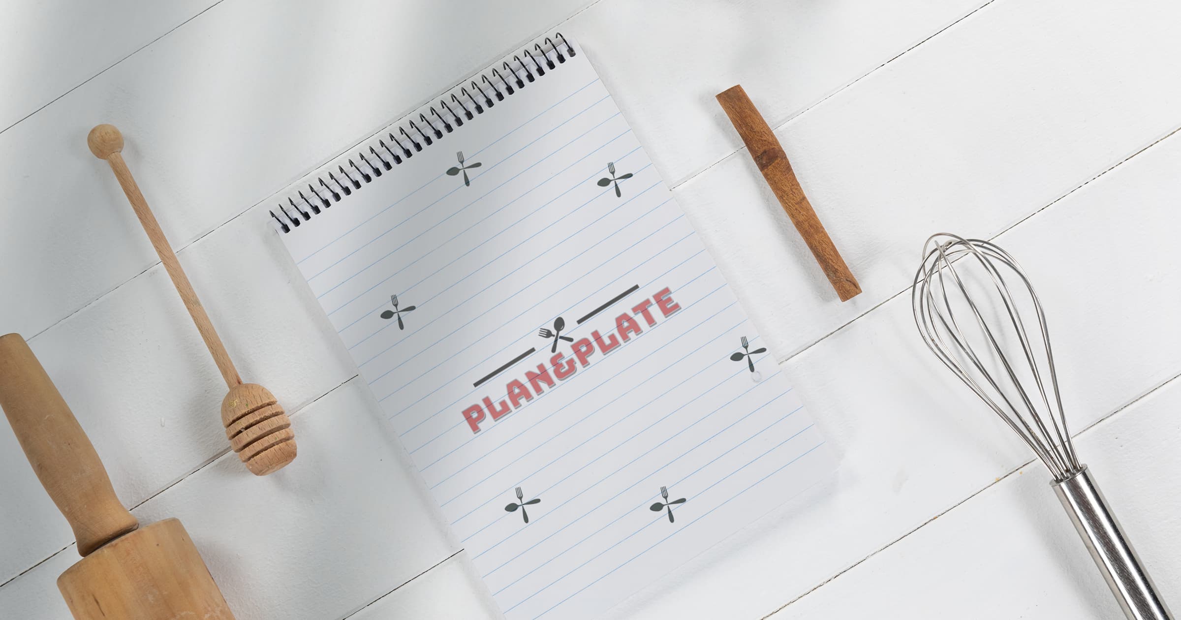
To explore how the brand would extend beyond the website, I created a set of product mockups that included packaging, kitchen tools, and digital devices. These mockups helped showcase how the logo, color palette, and typography work together across different touchpoints, creating a consistent brand experience. They also played a role in early user feedback sessions, where I tested how the branding translated across various formats. From recipe cards to tablet screens, every element was designed to feel cohesive, approachable, and practical.
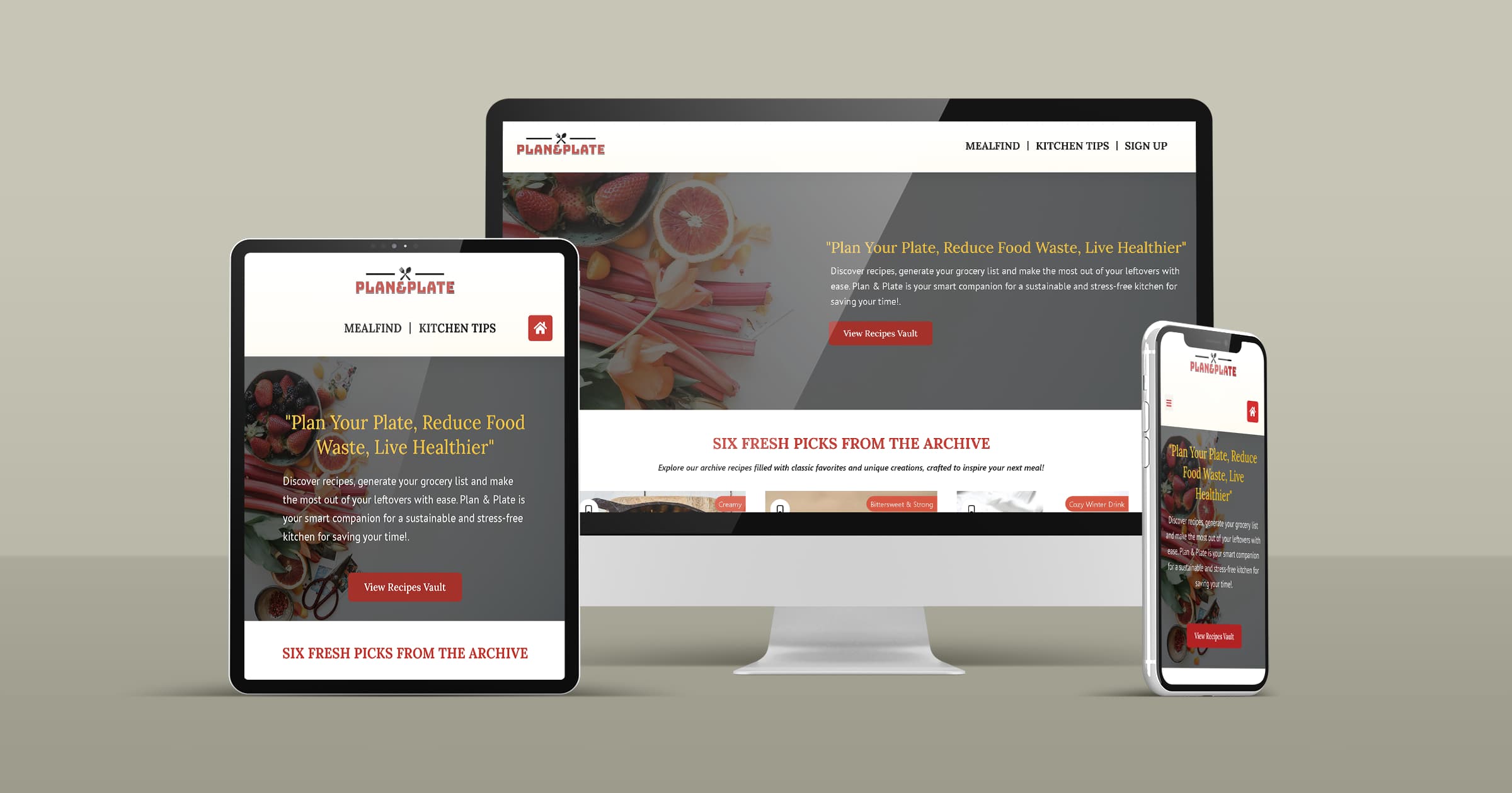
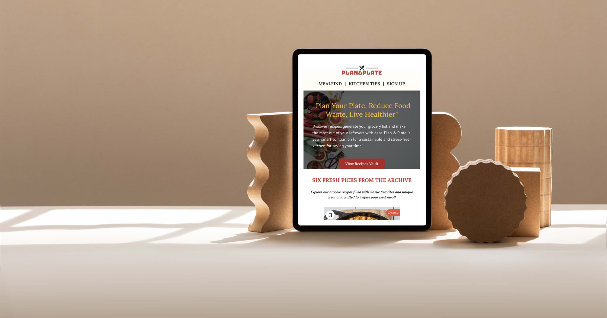
Website
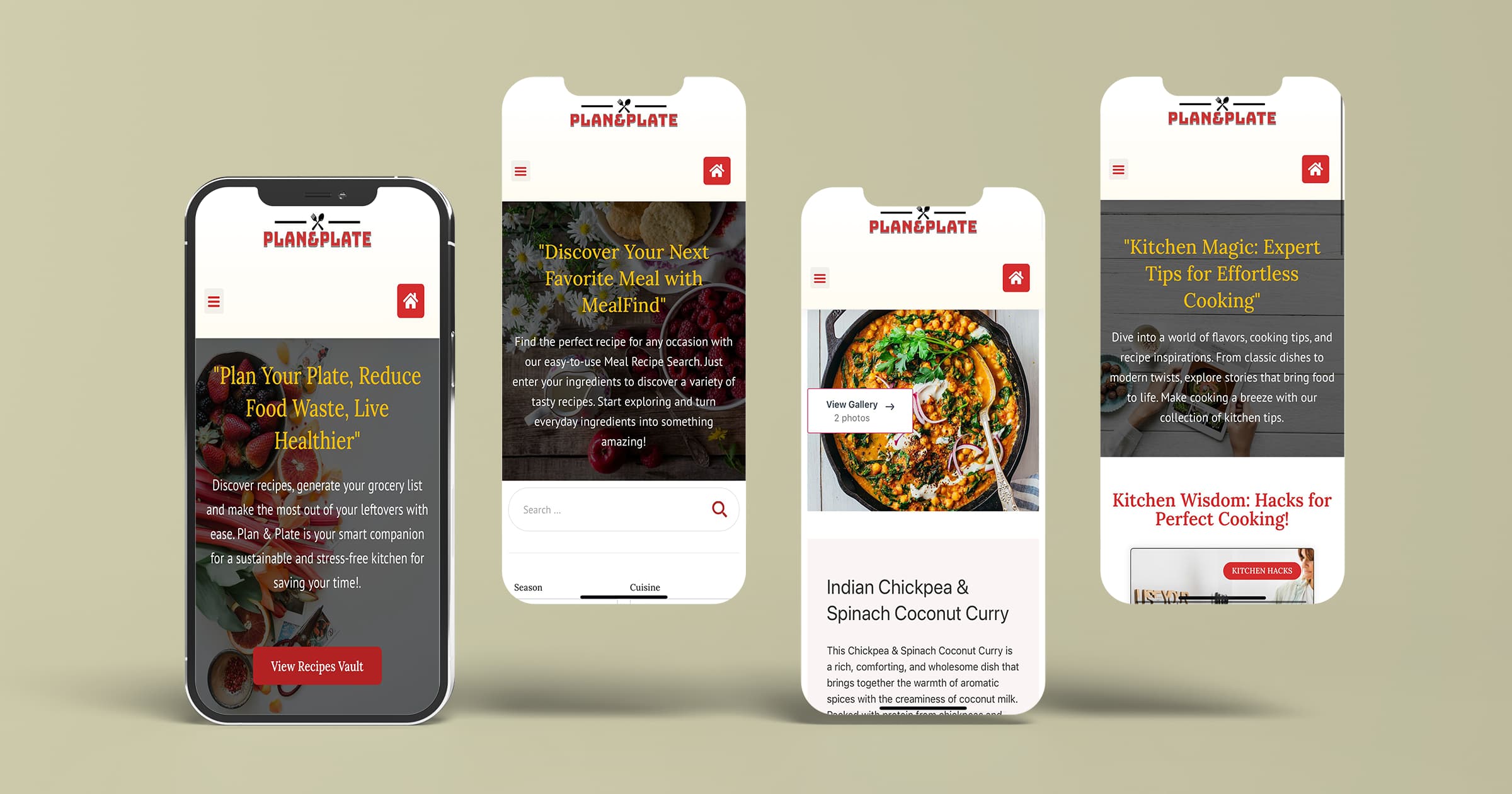
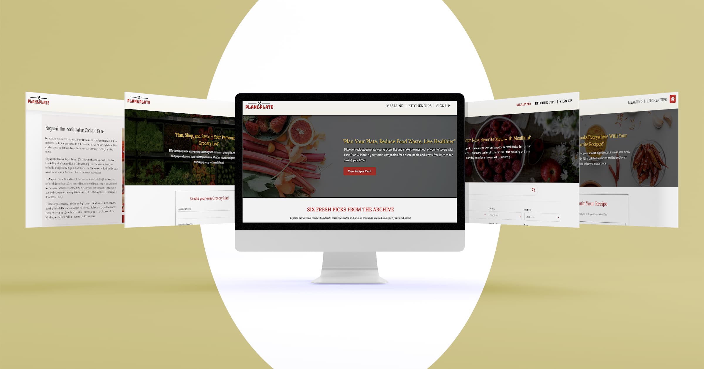
After finalizing the branding, layout, and core functionality, I developed the full website to bring all the design and development work into a complete, interactive experience. This stage was where everything came together—typography, color palette, UI elements, and layout—into a cohesive, fully responsive website that works seamlessly across devices. This resulted in not only a way to showcase the visual direction of the brand, but also an opportunity to refine the overall user experience.