Gorge Magazine
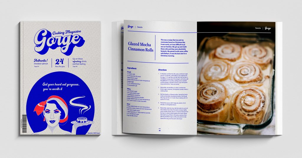
Get ready to cook up a storm and satisfy your inner chef with Gorge Magazine! With its stunning vintage aesthetic and tantalizing recipes, this publication is the ideal kitchen companion for adventurous foodies. Immerse yourself in a world of culinary delight, featuring beautifully crafted ads and illustrations that will transport you to a bygone era of gastronomic bliss. From delectable hors d’oeuvres to indulgent desserts, Gorge Magazine has 68 pages of everything you need to create nutritious and delicious meals. Whether you’re an experienced cook or just starting out, let Gorge Magazine whet your appetite on a journey of flavor and fun!
Check out the condensed digital version for yourself at ISSUU.
Inspiration
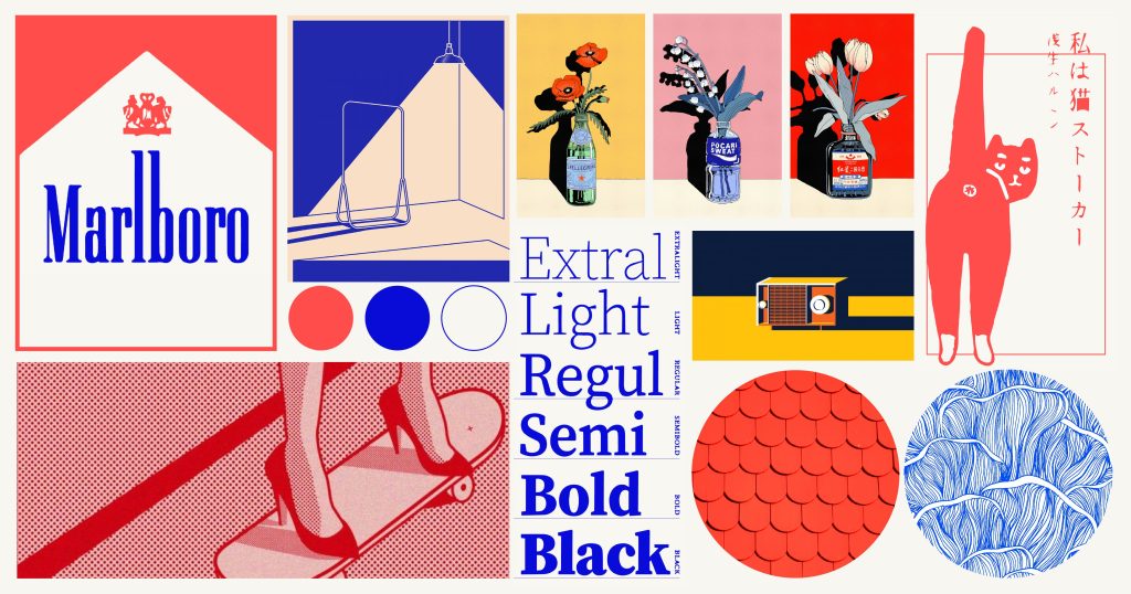
For some time now, I’ve had a desire to undertake a project like this, and this opportunity provided the perfect chance to bring it to life. Food is a significant factor in determining my mood, shaping my day, and influencing my emotions. To commence this project, I began by browsing through Pinterest in search of ideas and inspiration for the desired artistic style and aesthetic that I aim to incorporate into my magazine.
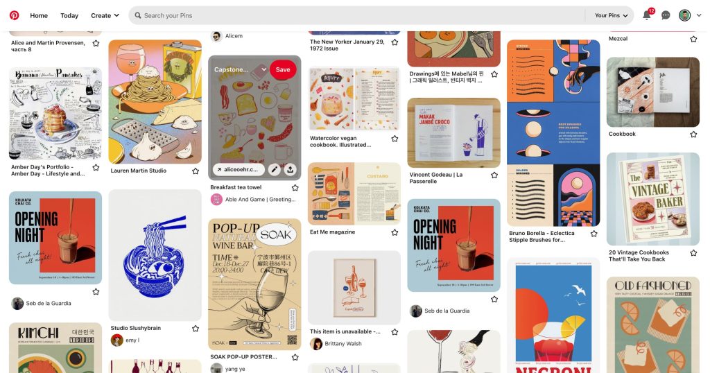
The flat illustration style caught my attention as it exudes a sense of playfulness and offers plenty of creative opportunities.
Mood Board
At present, I’m drawn to the modern-vintage style of graphic design, which has heavily influenced my vision for the magazine. To achieve this, I limited the color scheme to a navy blue, red, and cream white palette, and opted for a flat illustration style. This approach has challenged my skills, but it has been rewarding to integrate it into such a large-scale project.
Style Guide
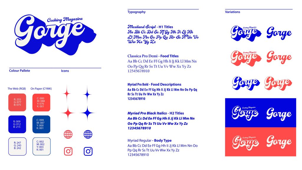
I utilized the three chosen colors and applied a variety of text bubble thicknesses to differentiate the titles, such as “Gorge,” as well as the dividers. In addition, I incorporated three distinct typefaces with varying weights to establish a hierarchy and evoke different emotions throughout the magazine. These elements were incorporated into the style guide for reference and consistency.
Cover
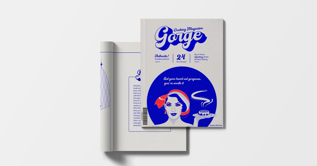
I decided to illustrate the magazine cover last to ensure it captured the publication’s essence in one image. The illustration features a glamorous woman wearing a headscarf and makeup, posing with a tempting cinnamon bun. My approach to combining appetizing visuals with a playful yet glamorous style resulted in a cover that accurately represents the publication’s theme.
Editor’s Note + Table of Contents
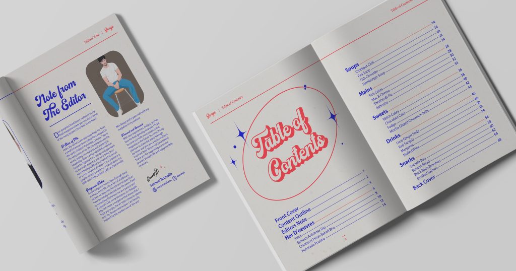
In my magazine, the editor’s note and table of contents both showcase my unique aesthetic. The editor’s note is simple yet visually appealing, detailing my personal journey and aspirations for the future. Meanwhile, the vintage-inspired table of contents serves as a helpful guide for readers. These elements come together to create a cohesive and visually pleasing navigation.
Magazine Dividers
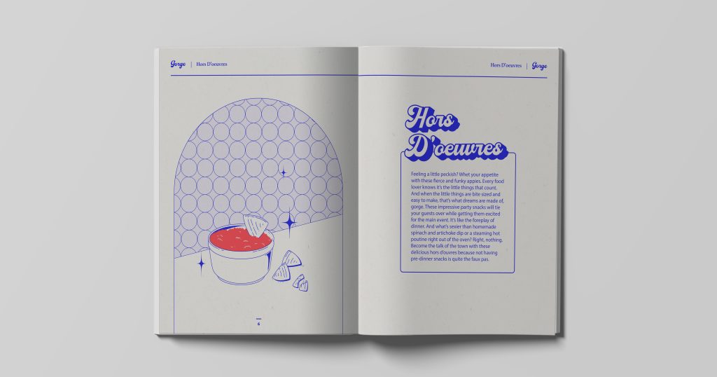
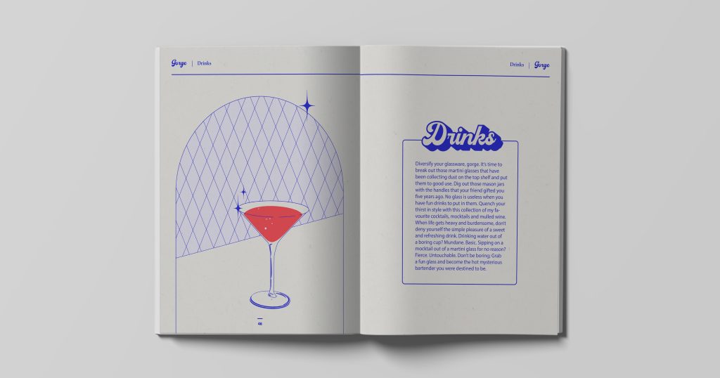
Illustrating the dividers was a joy, incorporating star icons and dish illustrations for each of the 6 sections: hors d’oeuvres, soups, mains, drinks, sweets, and snacks. I maintained a consistent arch while using unique geometric shapes to distinguish each divider.
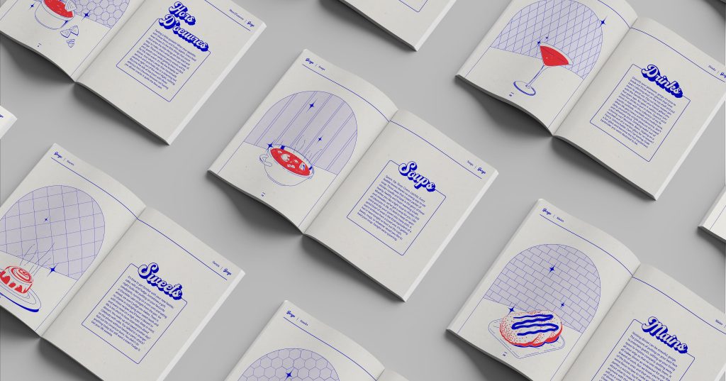
I included an upbeat, and campy description to go with each description so you could have something to laugh at before you start cooking.
Recipe Layouts
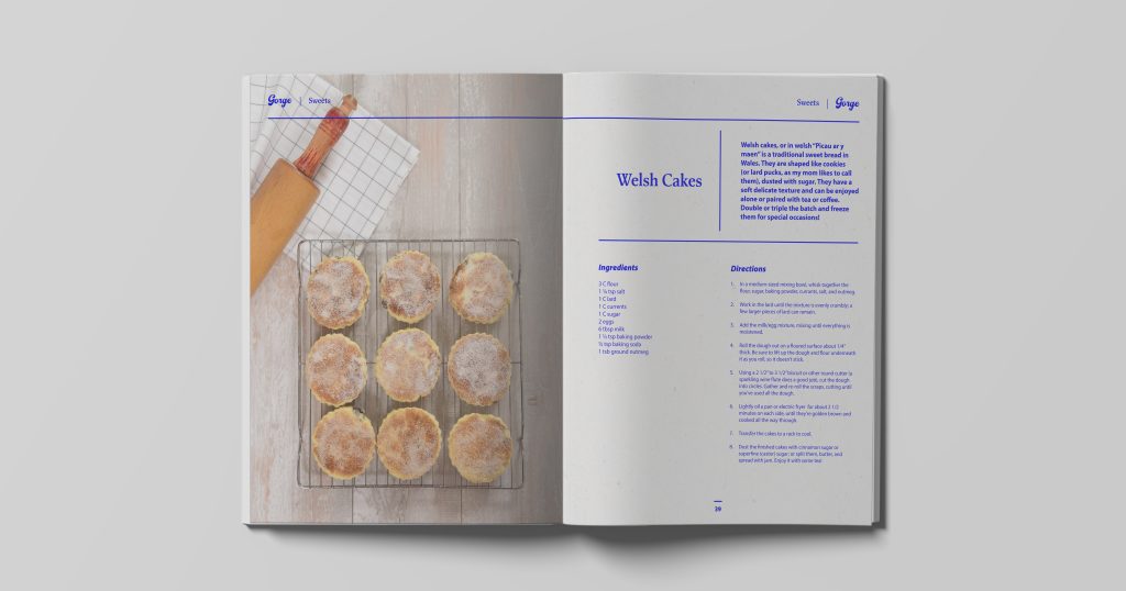
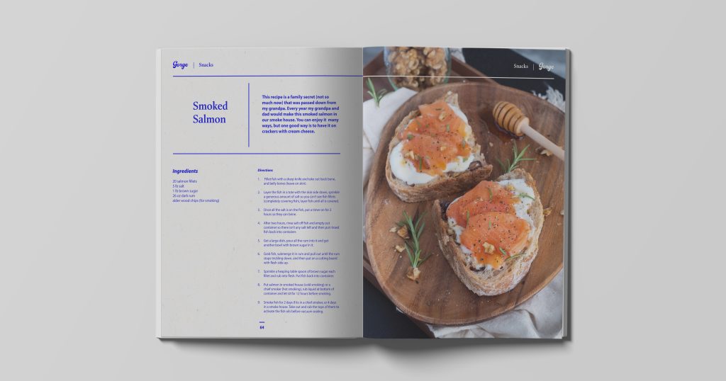
Enjoy these delectable recipes! They’re a collection of family, friends, and personal favorites I’ve gathered over the years. Each recipe features a photo so you can visualize what you’ll be cooking up.
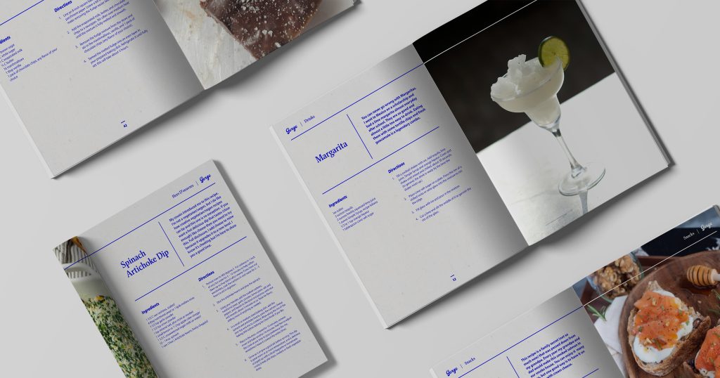
I have provided a recipe along with a carefully curated picture of the dish to showcase the delightful flavors you’ll soon be enjoying. To add an extra layer of interest, I have also included a brief but informative explanation about the origin or meaning behind the dish.
Advertisements
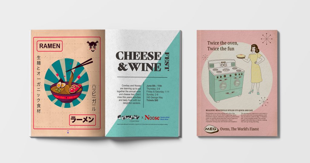
As a new illustrator, I challenged myself to create three distinct ads. The first promotes a fictional Japanese ramen company, the second advertises a wine and cheese festival, and the third showcases a vintage oven. All three have a food theme, but each design is unique. It was an opportunity for me to test my skills and create something new and exciting.
