Black Ridge Roasters
Black Ridge Roasters is a fictional specialty coffee brand that focuses on ethical sourcing and small-batch roasting. The project aimed to create a brand identity and website that communicates transparency, craftsmanship, and education in a way that does not overwhelm the user with a lot of information. Many coffee brands focus on aesthetics that support sustainability but lack clear information about sourcing and roasting. This project bridges that gap by building a brand centered around clarity and authenticity.
I approached this project by developing a visual identity and a color palette close to coffee aesthetics. The website is designed to be responsive and includes CTAs for soucing, roasting methods and coffee offerings. The final outcome is website that is visually beautiful, consistent and tells the brand story and help users learn about coffee lifestyle.
View the live website at dgl209.sdhaliwal8.imgd.ca/Blackridge/
Moodboard
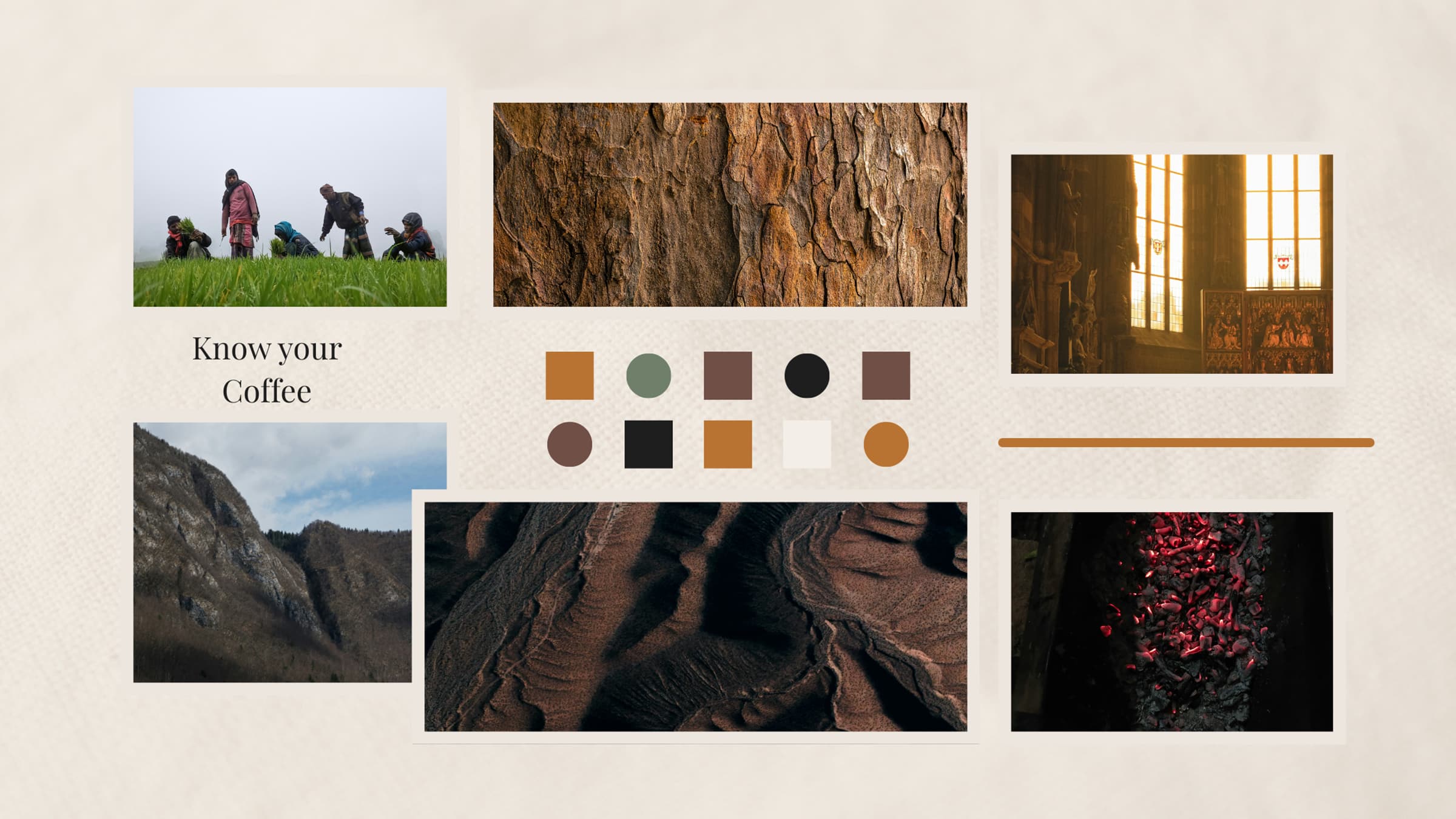
The moodboard for Black Ridge is based on earthly texture and coffee color aesthetics. The goal was to let people know about the message and our story while feeling warm.
Branding
The logo is based on shape of coffee beans which instantly brings clarity about brand and furthermore using color palette similar to coffee tunes keep the brand consistent and more visually appealing.
Wireframes
I developed wireframes to establish layout and content hierarchy. The wireframes helped define structure before moving into visual design.
Key pages included:
- Home
- Our Impact
- Roasting Process
- Coffee
- Cafe Menu
- Visit Us
The wireframes focused on clarity and simple navigation.
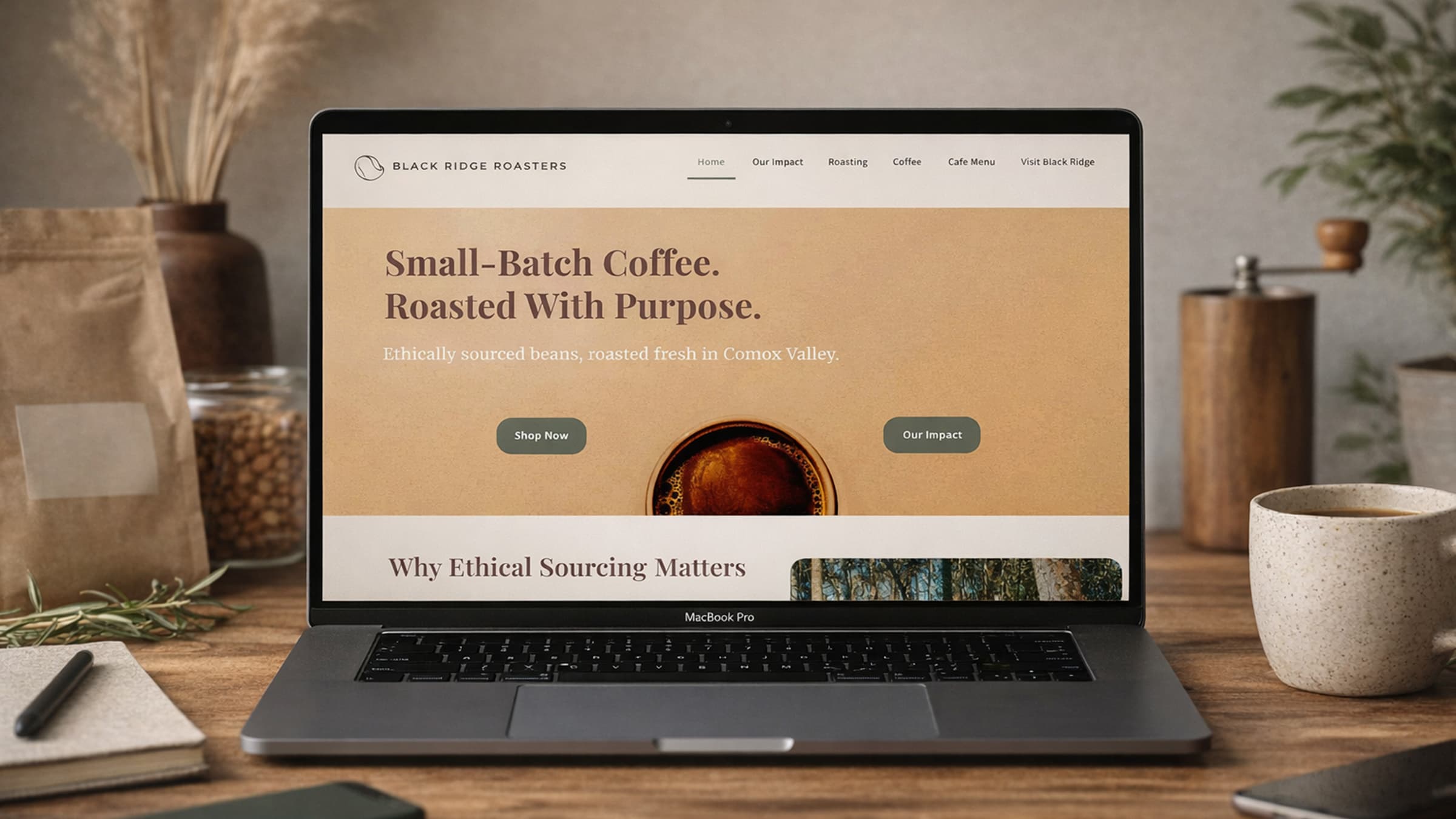
Website Design
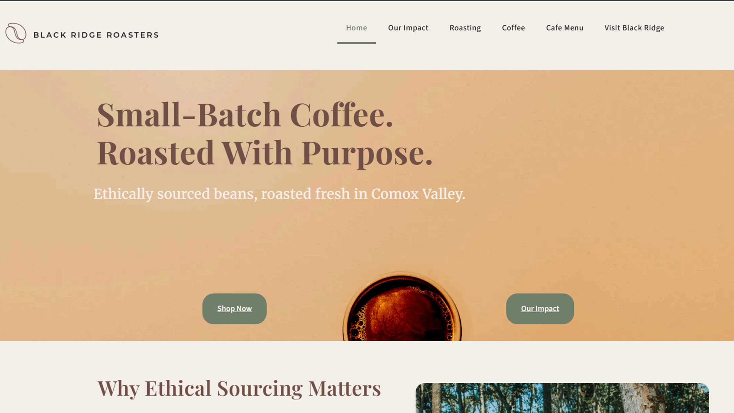
The website design emphasizes readability and storytelling. The homepage introduces the brand and highlights ethical sourcing and roasting methods.
Sections include:
- Hero section
- Ethical sourcing
- Roasting process
- Featured coffee
- Visit section
The layout uses whitespace and consistent spacing.
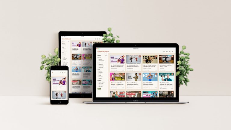
Mockups
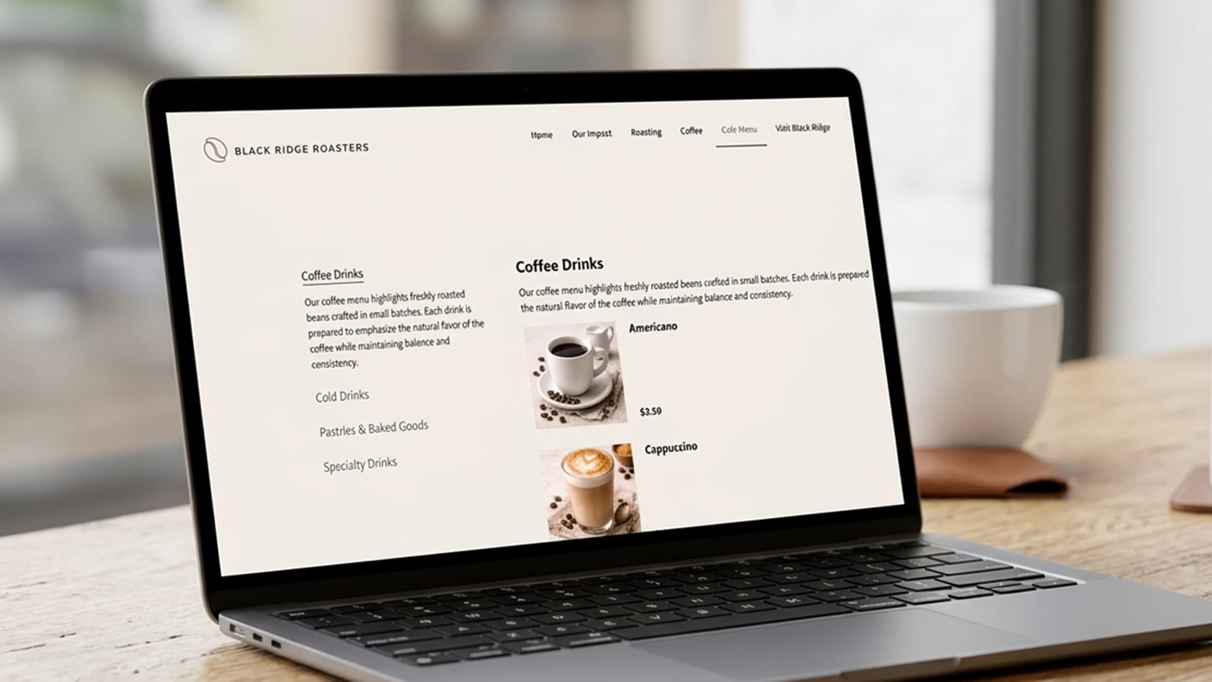
To show website being used in different devices I created some mockups and also some for showing the products that how black ridge will look in real life.
Challenges
Some challenges included:
- Balancing information and too much text
- Creating consistent visual hierarchy
- Presenting sustainability ideas
Final Outcome
The final result is a calm and modern brand identity that reflects craftsmanship and transparency. The website communicates the brand clearly and provides an engaging user experience.