Coffee Luv Bug
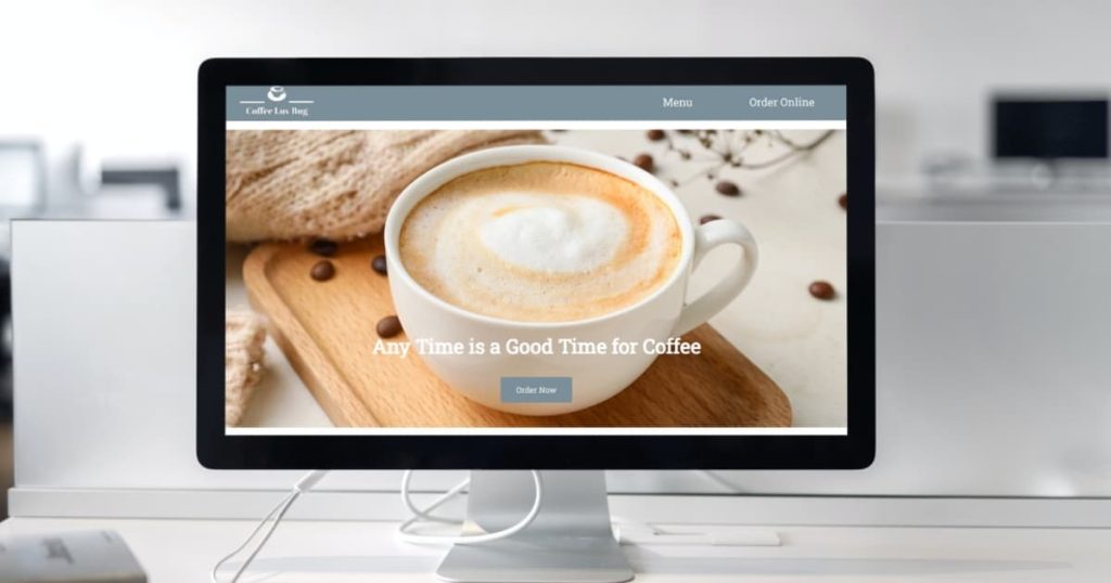
Coffee Luv Bug is a coffee shop in the heart of Courtenay that offers a unique and cozy ambiance that invites everyone to take a break from the hustle and bustle of daily life. Their expert baristas are trained to craft every cup of coffee with precision and care, ensuring that each sip is a delightful experience. After many years of success with a physical shop, they are now interested in expanding their business by creating a website for their coffee cafe brand, which will allow them to reach a wider audience and cater to customers who prefer to order online.
For this project, I have created a design system for building a high-quality website for their business. The design system includes a collection of components, guidelines for typography, color palettes, and principles to ensure consistency and coherence in the design and development of the Coffee Luv Bug website and other digital assets. I have also created a demo website using this design system, which helped me to create a consistent and cohesive website that reflects the client’s identity while saving time and effort in the design and development process.
Check out the design system and the demo website.
Planning + Design
I started researching and analyzing the competitors of the Coffee Luv Bug business to gain insights into the market and understand what is already out there. By doing so, I was able to identify the design trends, features, and functionality that are effective in attracting and engaging visitors. Based on this analysis, I determined the components needed to include in the design system.
Then I made a decision on which programming language would be best for my project after deciding the elements I would include in the design system. Since it was a simple-website, a combination of HTML, CSS, and JavaScript seemed sufficient for the development process. I chose HTML as the primary markup language to create web pages, CSS as the styling language to define the appearance of a web page, and JavaScript as the scripting language to add interactivity and functionality to web pages.
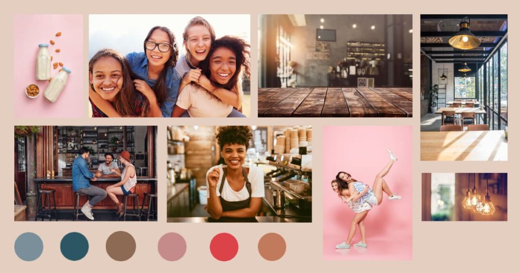
Then I created a mood board to establish the visual style and aesthetic of my project before beginning the design work. I wanted the design system and demo website to have unique color shades since many coffee websites tend to feature dark and earthy tones associated with coffee, such as brown, beige, and cream. So, I chose color shades with the aim of creating a warm, welcoming, and comfortable atmosphere that appeals to coffee lovers and encourages them to explore the brand’s products and services.
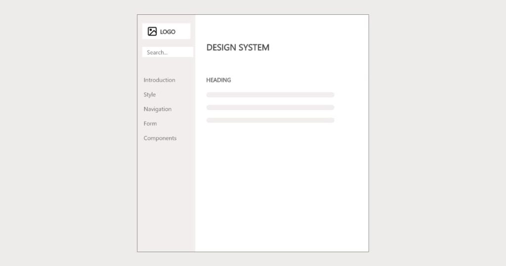
The next step was creating wireframes to establish the hierarchy of information and the placement of design elements, including navigation menus, content areas, and images. I planned to ensure that my websites meet contemporary standards by being completely responsive and accessible on multiple devices. As a part of this effort, I developed wireframes demonstrating how the pages could be adapted to fit all types of screen sizes, including desktop, tablet, and mobile.
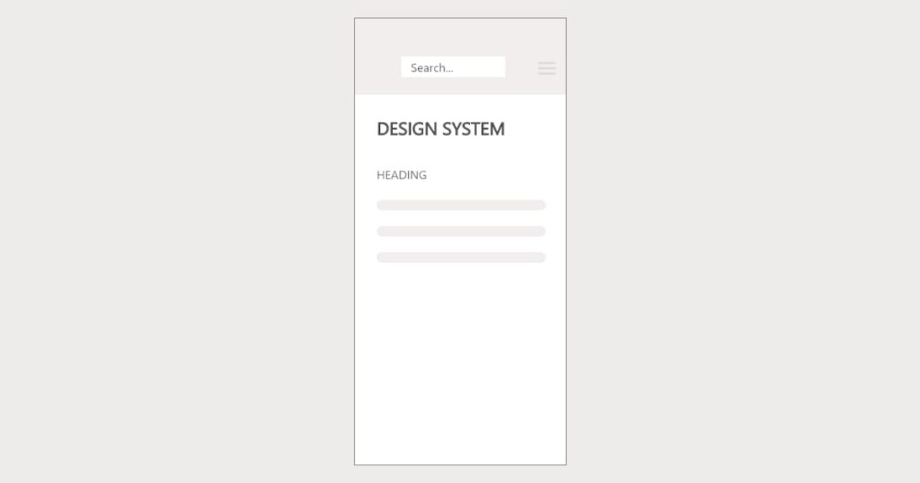
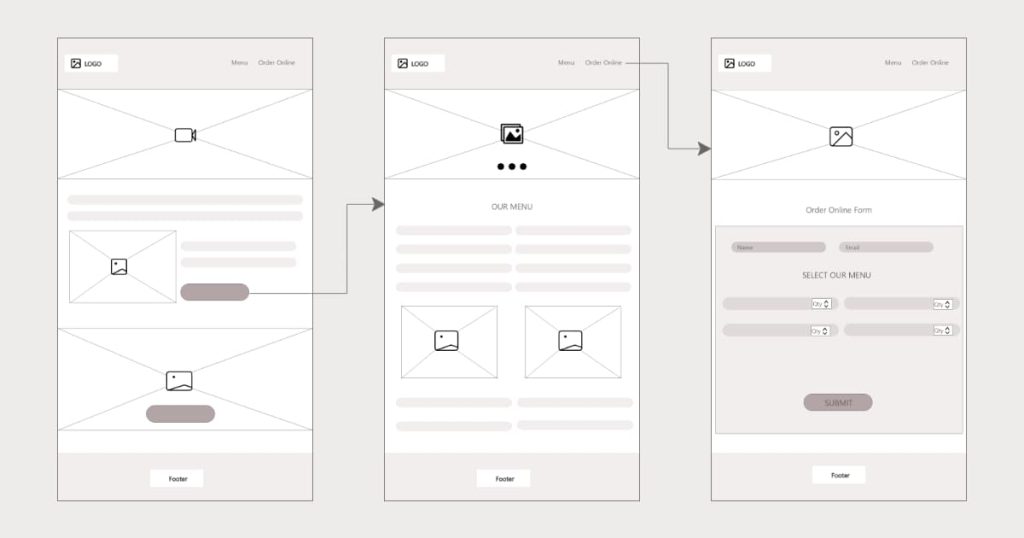
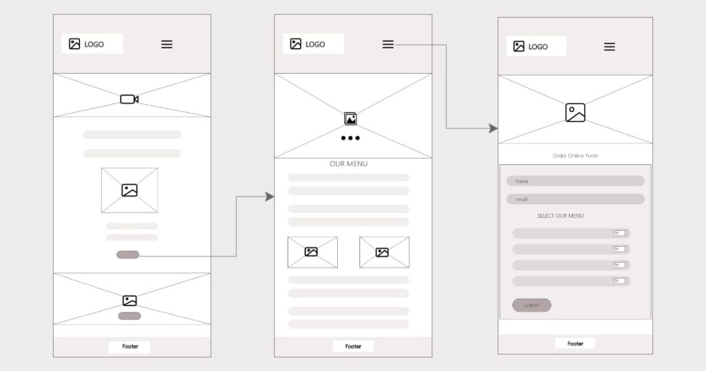
Next, I created a few different logos and chose the best among them. Designing a logo is important for establishing brand recognition and creating a visual identity for the brand. When customers see the logo on a website, they will immediately associate it with the brand and the products or services it offers.
Development
After dedicating weeks to researching, planning, and designing, it was finally time to start developing. I established my GitHub repository, organized my project structure, and began coding.
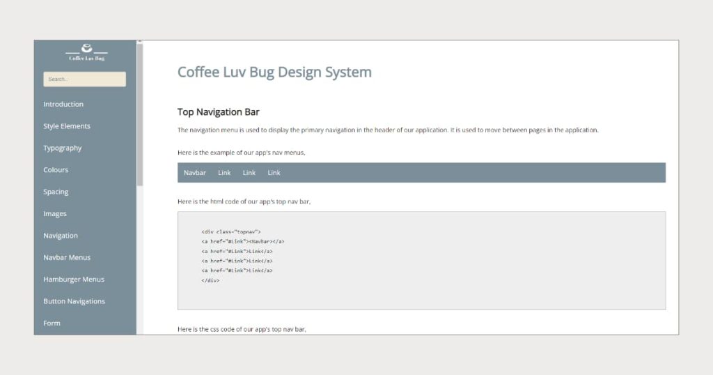
My first step was building the Coffee Luv Bug design system. I started coding the layout of all pages based on the wireframe I had drawn before. I added the header and included the logo, navigation menus, and a search bar. For the design system, I chose a side navigation bar instead of top navigation, and made it fixed to the left-hand side of the page, which remains in place as the page is scrolled. I used CSS to define the position and behavior of the sidebar by setting its position to “fixed” and then specifying the top, left, bottom, and right values to determine its position on the page.
I added a search bar in the header for the navigation menu that made it possible to search for specific navigation menus within the website’s side navigation.
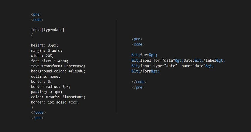
Then on each page of the design system, I have included the guidelines for using each element, its example, and HTML, CSS, and JS code snippets. I used the HTML <code> element and the <pre> element to include the code snippets.
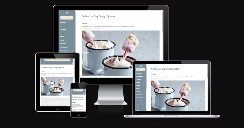
I used the CSS Grid technique to make the design system responsive. I divide the web page into a grid of rows and columns and then place content into the grid cells. The size and position of each cell is controlled using CSS properties such as grid-template-rows, grid-template-columns, grid-row, and grid-column. By adjusting these properties based on the screen, I created a responsive layout that adapts to different devices and screen sizes.
After developing the design system, I made a demo website for Coffee Luv Bug using the design system guidelines and components, such as color palettes, typography, logo, layout guidelines, and user interface (UI) components. I used the components video, carousel, hero image, and form fields to make the demo website. Because of the design system guidelines, it took only minimal time and effort for me to create the demo website.
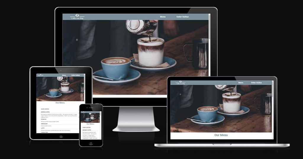
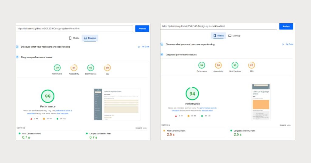
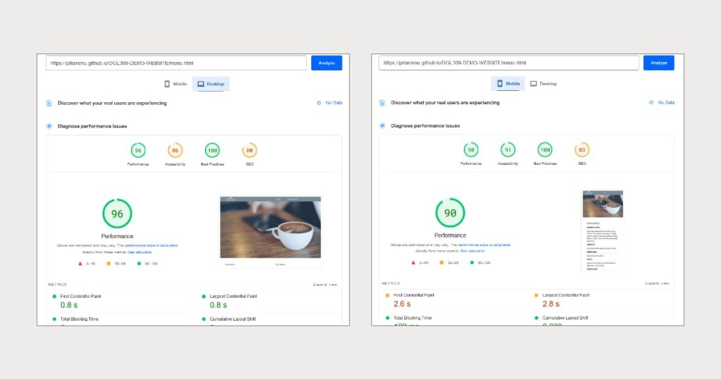
After completion of the development, I deployed the design system and demo website on GitHub Pages. After deploying, I used the PageSpeed Insights tools to test the performance and speed of the websites. I fixed the issue on a few pages that had performance below 80%, and I made the changes to those pages based on the diagnostics, and the performance of those pages improved to above 80%. Then, using the W3C Validation tools, I checked the HTML and CSS code of the website for compliance with web standards. Finally, my websites loaded in a reasonable time and were free of any validation errors.
