Black Moon
Black Moon is a fictional magazine dedicated to exploring legends, paranormal stories, science fiction, and popular myths of Canada. Its goal is to promote Canada’s rich culture and provide new immigrants with the opportunity to learn about the traditions and stories that are part of the country’s identity, many of which are unknown to those who have just arrived. The magazine will feature stories based on local culture and in the public domain, allowing their use without the need for copyright permissions.
Additionally, it will include a special section where the best stories submitted by “readers” from diverse cultures and backgrounds, both temporary residents and citizens, will be published, promoting integration and celebrating Canada’s cultural diversity. Through illustrations and photographs, the stories will be complemented, creating an atmosphere of tension, suspense, and mystery that will captivate readers and enrich their experience as they immerse themselves in these fascinating tales.
Check out the project: https://issuu.com/adrirbk/docs/black_moon_magazine_final_e93e2bfed6b27b
Process
Moadboard
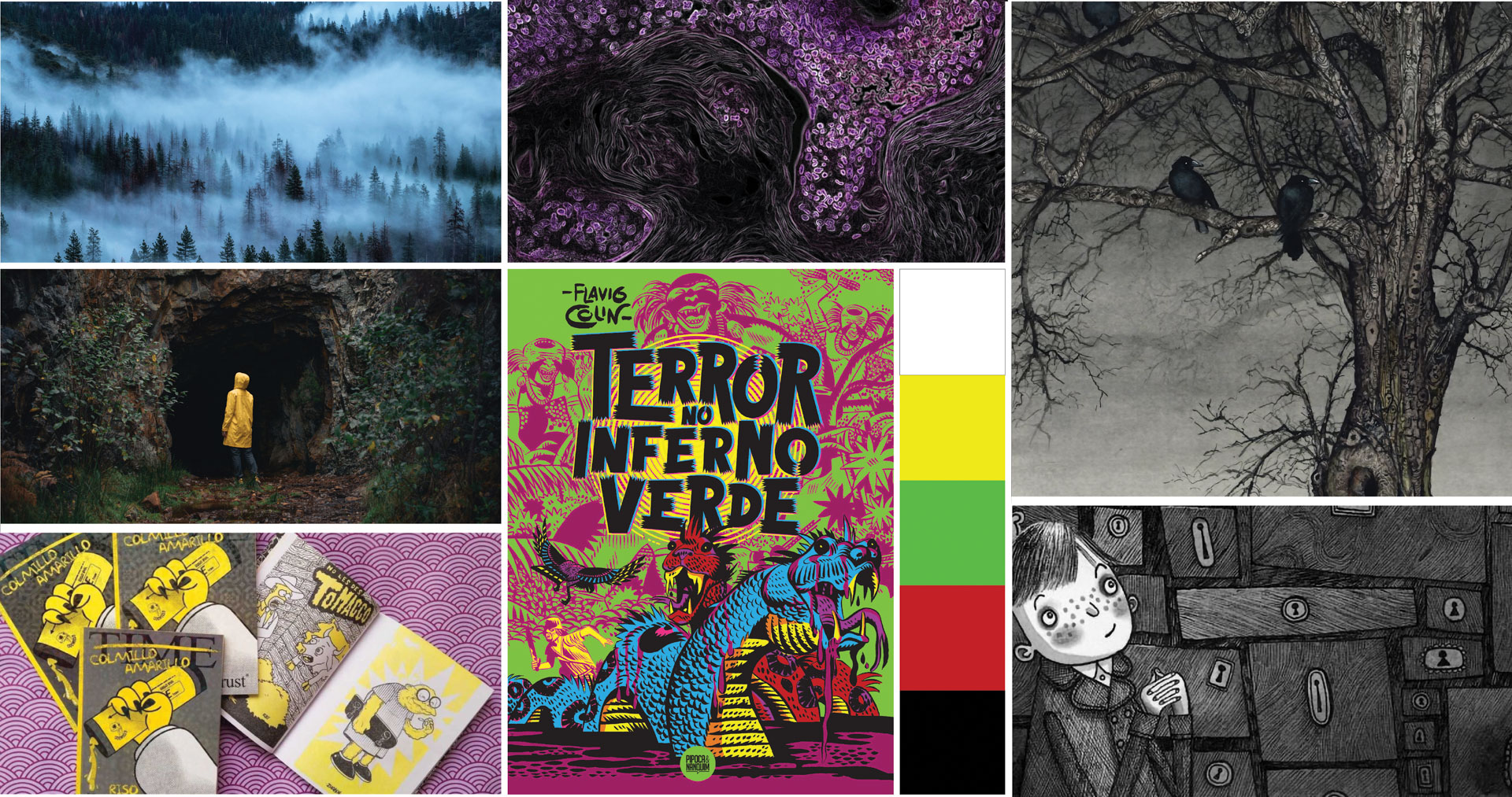
Black Moon magazine tells paranormal stories, so the concept behind the moodboard aims to evoke the textures and atmosphere of the forest through photographs and illustrations. The color palette includes neutral tones such as black and white, in contrast with solid and vibrant colors like red and green. This combination is intended to capture the reader’s attention and keep the reading experience vivid and engaging.
Branding
The Black Moon logo aims to convey the mystery and horror that define the magazine’s genre. To achieve this, I designed the logo with irregular outlines and sharp edges. These edges, especially at the ends, feature a dripping effect that evokes flowing blood. This visual element is inspired by the gothic genre and helps create a dark, unsettling atmosphere for the brand, clearly suggesting that the magazine’s content revolves around paranormal and mysterious stories.
Additionally, both words have a deliberate curvature, intended to allow the placement of text beneath the logo without disrupting visual harmony. The name Black Moon reinforces the sense of darkness and the unknown, inviting horror fans to explore the magazine, whether in print or digital format.
Check out the style guide: https://issuu.com/rbkg86/docs/rebeca_garcia_brand_guide
Logo Variations
In cases where the illustrations are particularly dark, the text will be rendered in white or red to create a contrast that ensures readability against the background.
Additionally, in certain cases and when the background allows, light reflections may be added to the logo to enhance the atmosphere and improve its visibility.
Colors and Typography
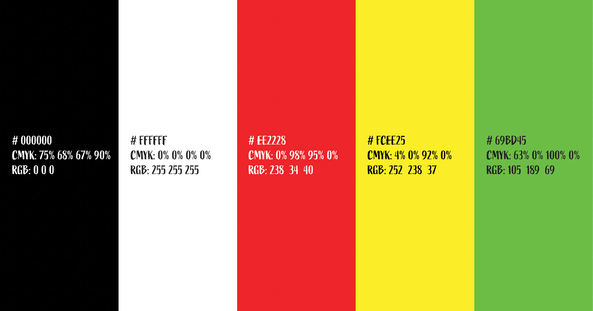
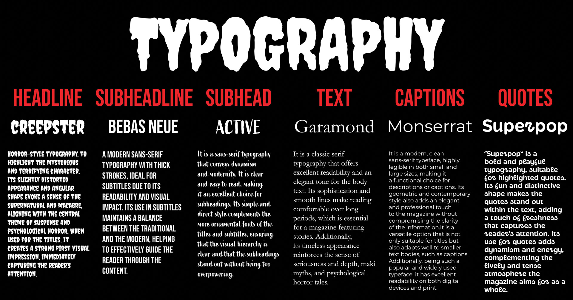
The colors selected for the magazine’s color palette are bright and contrasting tones that stand out against gloomy and dark environments. Since this is a magazine with horror content, the atmosphere and illustrations will mostly consist of dark and neutral tones, such as black and white. Therefore, vibrant colors will be used to highlight key elements like titles and other graphic resources, in order to create contrast and establish a clear visual hierarchy in each story.
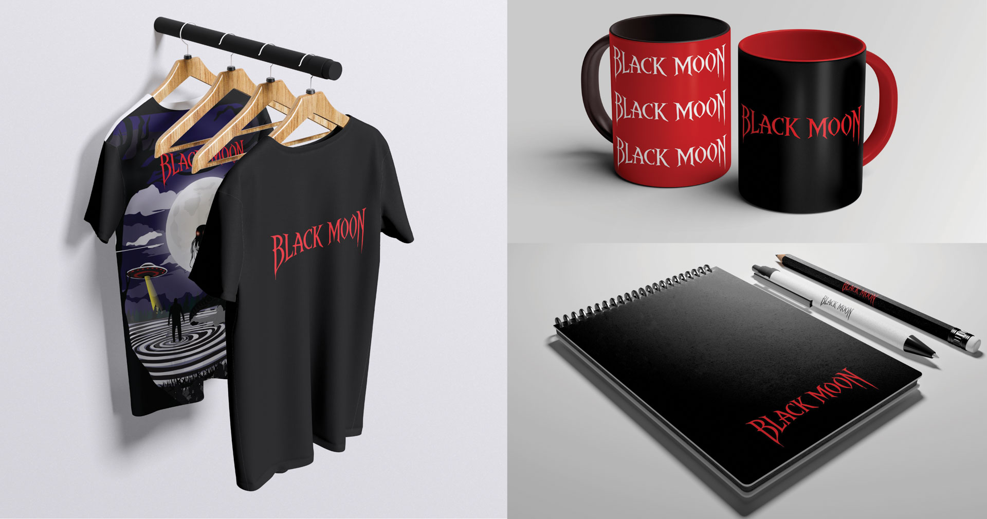
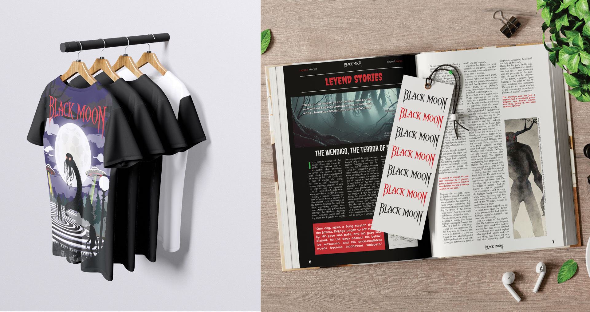
Brand Collateral
The Black Moon brand will be promoted through various channels, such as printed T-shirts, bookmarks, notebooks, pencils, mugs, and other popular items. The goal is for the magazine’s followers to connect with the brand and help spread it, while also generating revenue through the sale of products like clothing and accessories.
Ilustrations
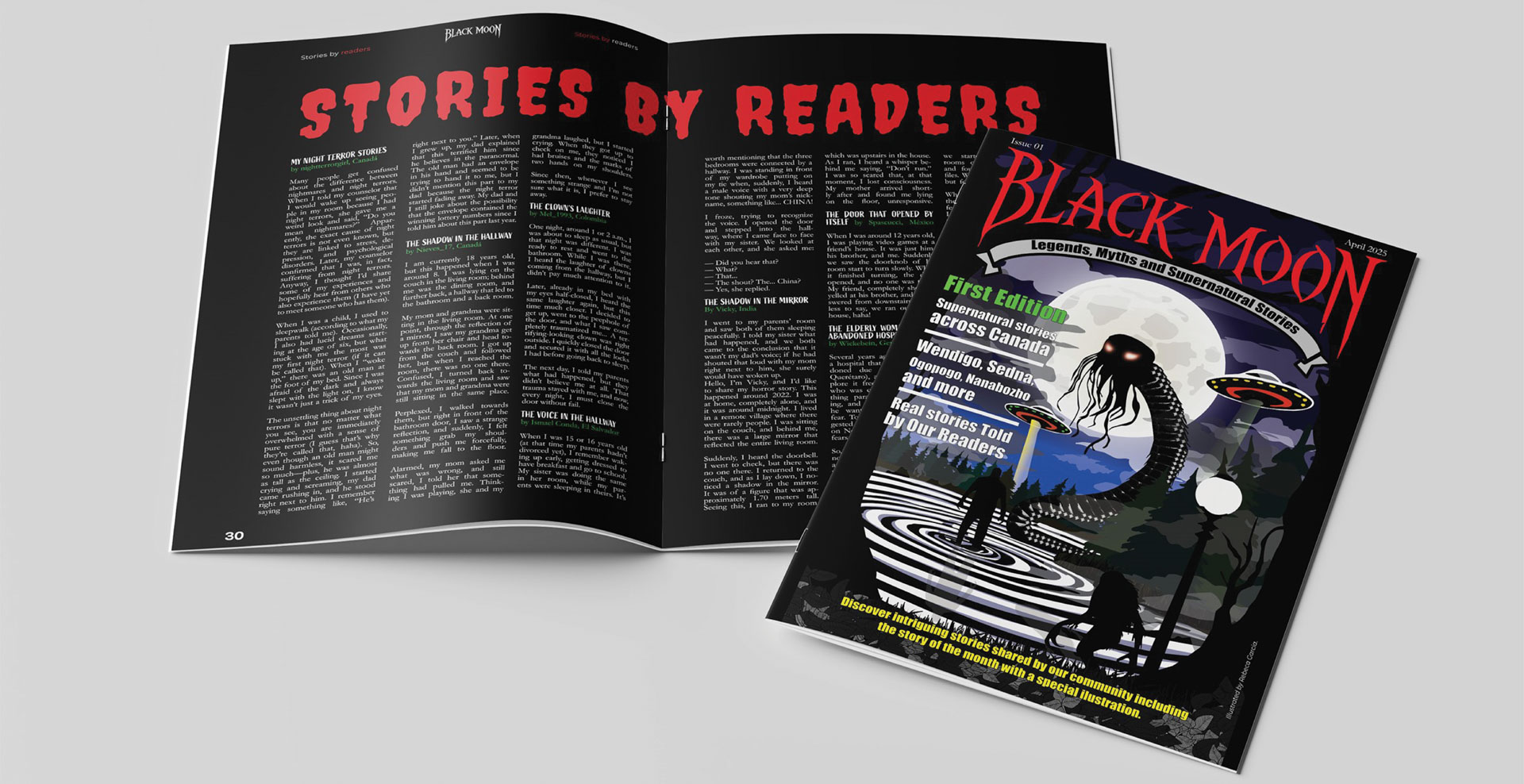
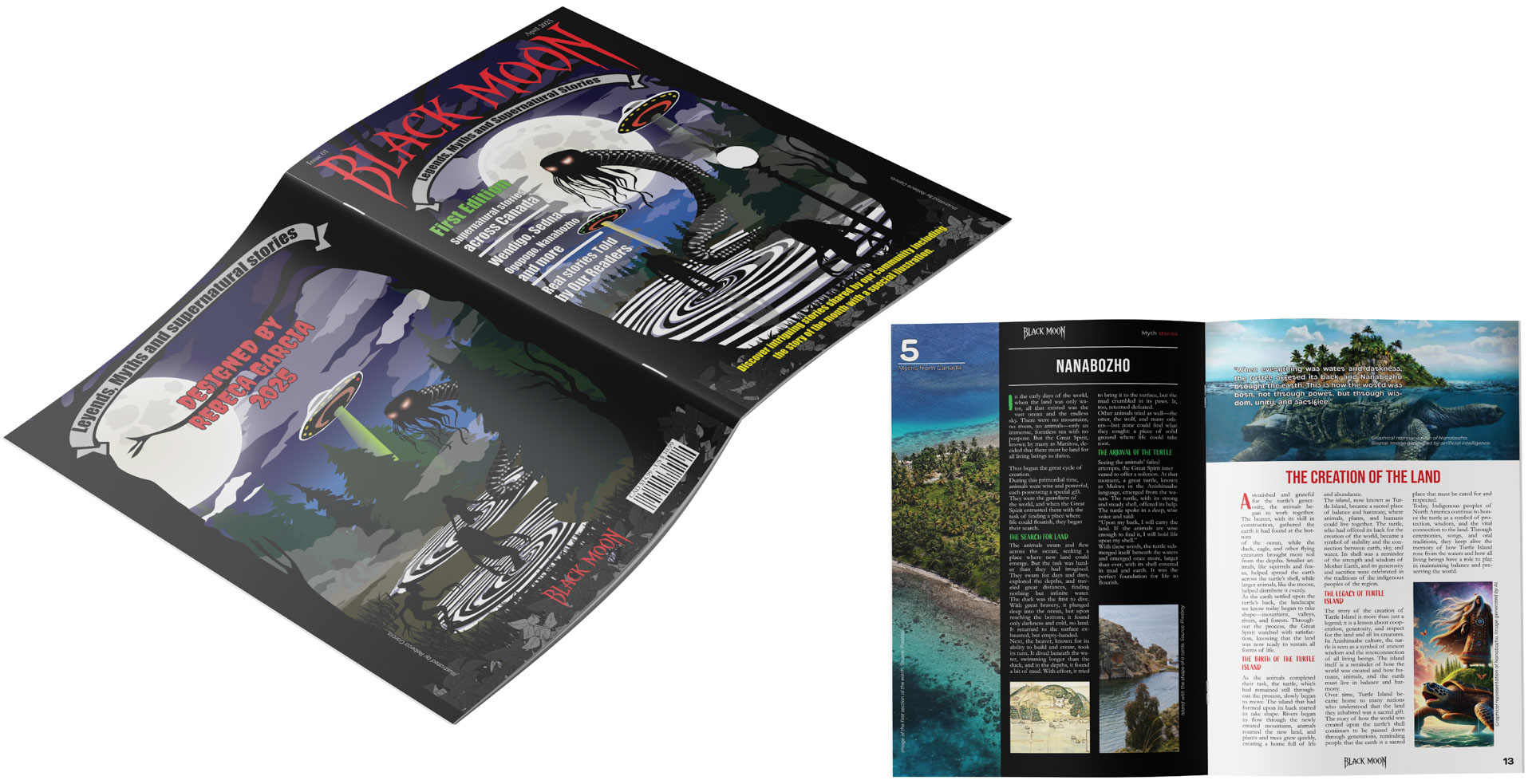
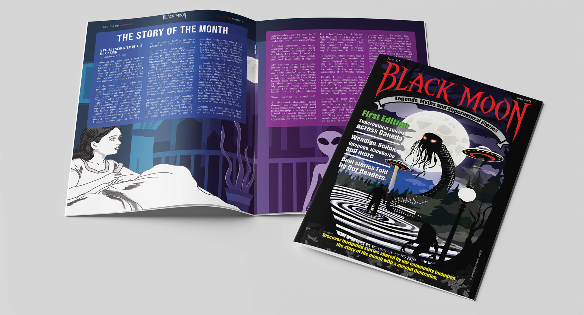
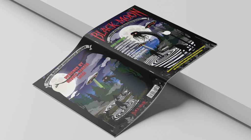
The front and back covers of the magazine were illustrated using characters featured in the Black Moon stories. Iconic and widely recognized creatures from paranormal culture were depicted, such as Ogopogo, the Wendigo, and aliens. Additionally, a full moon was included as a central element to reference the first edition of Black Moon and reinforce the magazine’s visual identity.
The most impactful story of the month was also illustrated as part of the magazine’s promotional strategy. This initiative invites readers to share their own stories, with the promise that the most outstanding one will be selected and illustrated. The goal is to encourage the audience to actively engage with the content and to foster a sense of community and belonging around Black Moon.
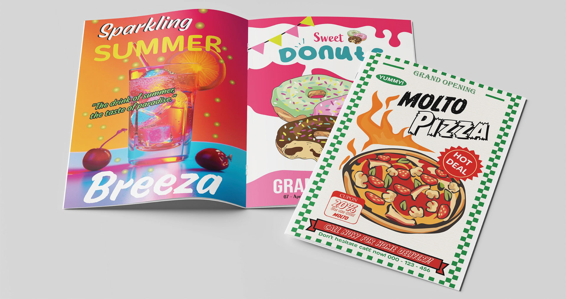
Advertisments
Regarding the advertising, it was also illustrated and includes content related to food, as well as discount coupons for the opening of new restaurants and cafes. The goal of this strategy is to promote the magazine’s sponsors and provide additional value to the readers.