Zia Makeup

Zia Makeup is an online store made with WordPress, Elementor Pro, and WooCommerce to create a simple way for people to find and buy makeup. It is easy to use and is made to help shoppers have a great experience as they look through different beauty items for sale.
This website offers a wide variety of makeup products, from well-known brands to special items that suit different tastes and needs. Using WooCommerce, the site is fully functional and ensures that purchasing products is easy and smooth. Elementor Pro helps make the website look good and work well on any device, making sure everyone who visits has a good time shopping without any trouble.
Check out the style guide on ISSUU.
Moodboard
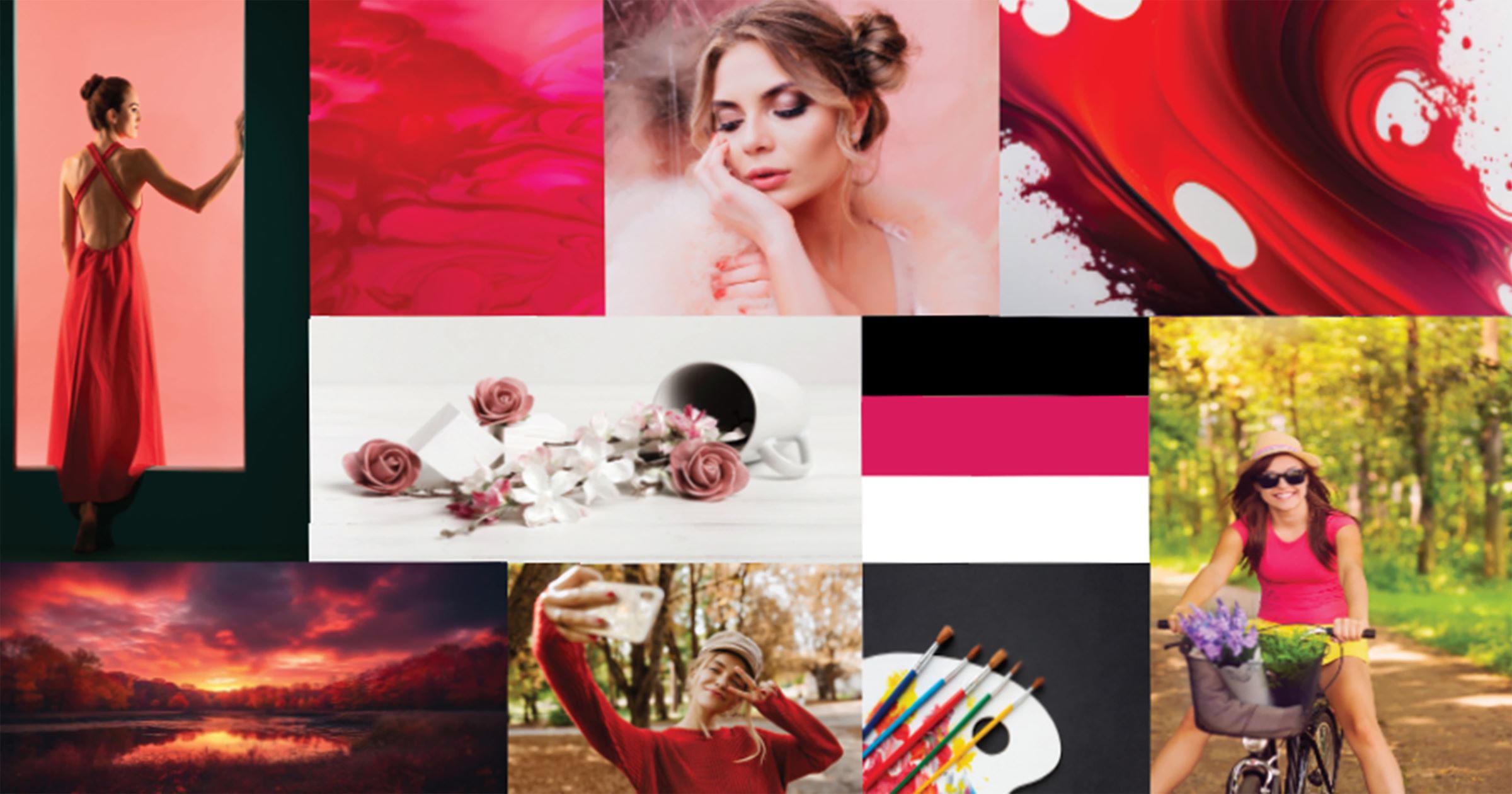
My journey for this project started with creating a moodboard for Zia, my makeup brand. It’s a canvas showing the mood I want to bring to life. Zia is about simplicity. It’s makeup is easy to apply and wear. It’s everyday makeup for everyone. The warm sunset and the casual bike ride is the spirit of our makeup. It’s about those moments when you feel happy and free. Zia is there for your bright smiles and golden glows. Just like the best parts of your day, Zia is about feeling good, naturally.
Logo
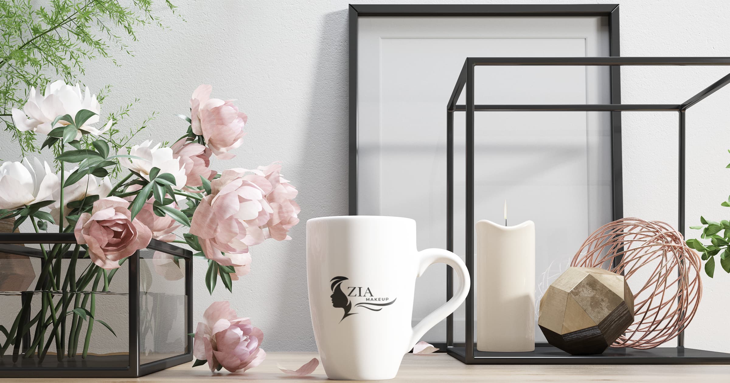
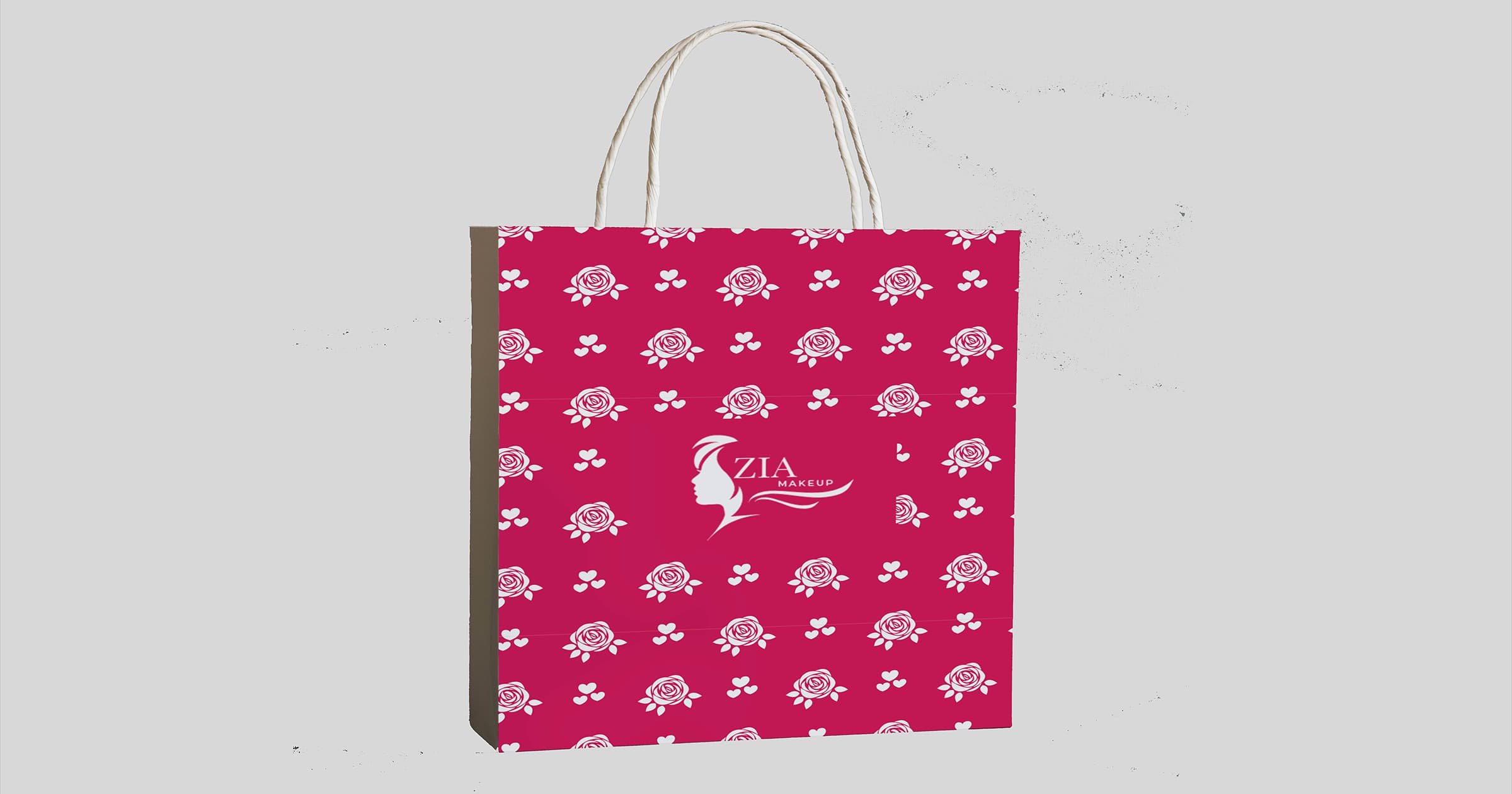
I worked on making the logo for Zia Makeup. It was a big deal because it’s like the face of the brand. I chose to draw a simple girl’s profile and added the name in a neat font. The logo had to show what Zia is all about and also look cool to the people we want to buy our makeup. After the logo was done, I put together a style guide. This is just a set of rules for how to use our logo, what colours to pick, and what kind of lettering we should use so that everything looks the same, no matter where you see our brand.
Colours and Typography
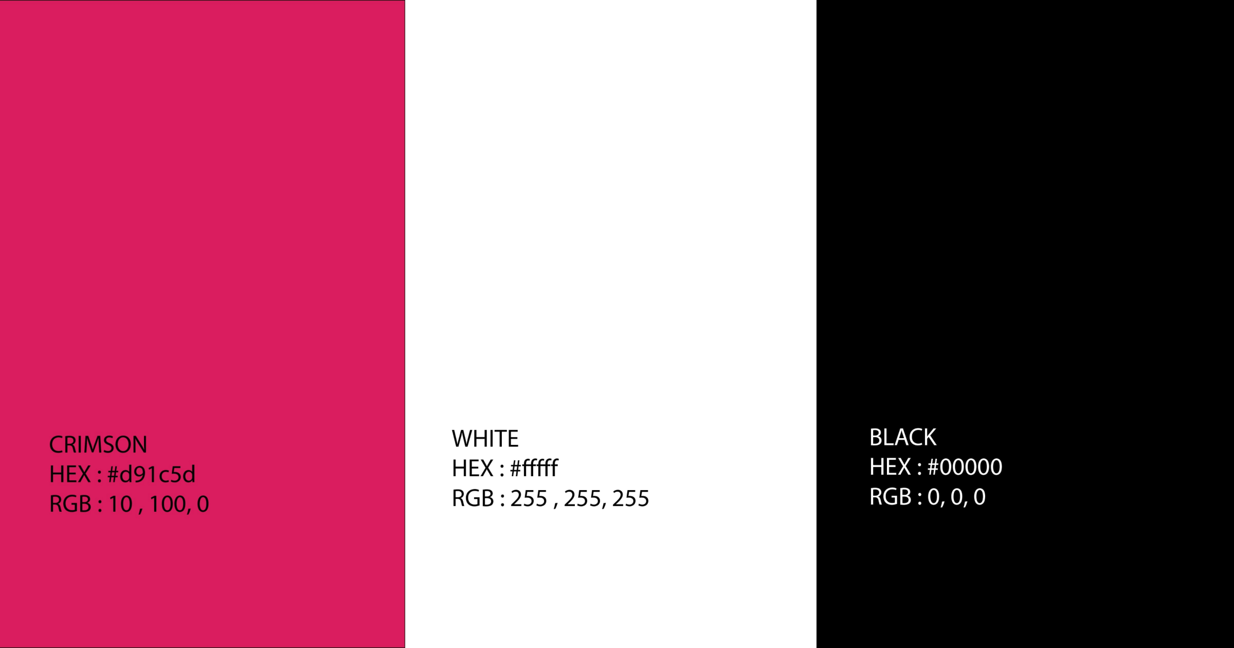
The colour theme for Zia is made up of three colours: a bright crimson, pure white, and deep black. The crimson is a strong, bold colour that really stands out. It’s the kind of colour that catches your eye and feels a bit fancy. White is clean and simple, and it helps the other colours pop. Black is solid and serious; it makes everything else look sharp.
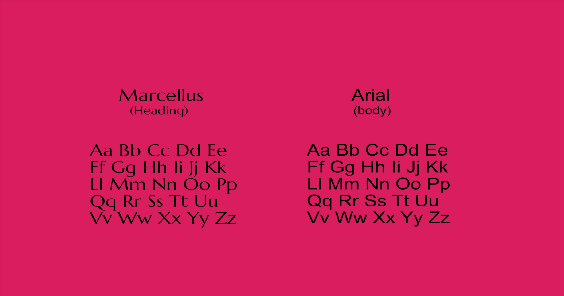
For the fonts, I am using Marcellus for the headings. It’s a little fancy, but it’s easy to read and looks good. For all the other texts, I am using Arial. It’s a really simple font that most people find super easy to read. Together, they make everything look neat and professional.
Brand Collateral
Before the official launch, I created detailed mockups of the site. These mockups served as a final check, ensuring that every element was perfectly in place and the site was ready to welcome its first visitors. The creation of mockups was not just about finalising the design but also about visualising the customer journey, making sure it was seamless from start to finish.