Leadmont Valley University
Leadmont Valley University, also known as LVU, is a fictional university located on Vancouver Island. They prioritize sustainability, leadership, and research, but their most prominent and differentiating value is their focus on wellness as a foundation rather than just as a service. At the start of this initiative, LVU’s pain points were low student enrolment and a lack of brand differentiation.
I used a blend of tools, including InDesign, Photoshop, Figma, Canva, and Illustrator, to develop marketing assets and social media campaign content for LVU. Social media graphics and the marketing strategy were formatted using scientific and theoretical bases to create a persuasive campaign that would generate leads, increase enrolment, and support brand differentiation.
The outcome of the social media campaign and brand development was a highly customized, evidence-based campaign that markets LVU, targets the client’s pain points, and helps to achieve their business goals.
The Challenge
LVU has several goals, including increasing brand awareness, establishing itself as a credible university on the global stage, and boosting student enrolment. Their pain points include low international and provincial awareness, limited brand recognition, and strong competition from universities like the University of British Columbia and the University of Victoria. This marketing project targets LVU’s two core pain points, being low student enrolment and a lack of brand differentiation.
The Solution: Part I
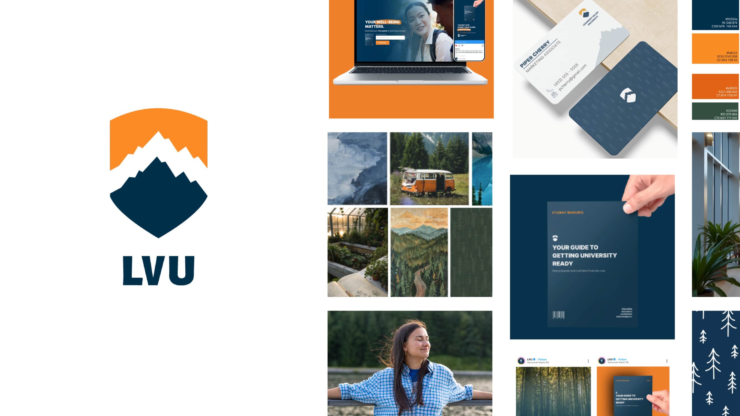
The solution to Leadmont Valley University’s issues is three-fold. Firstly, to address the issue of limited brand recognition and differentiation, I created a cohesive brand style guide including a moodboard, various logos, colours, typography, images, icons, patterns, mockups, and improper use cases. This branding guideline helped to lay the foundation for the rest of the solution.


Check out the entire multi-page style guide
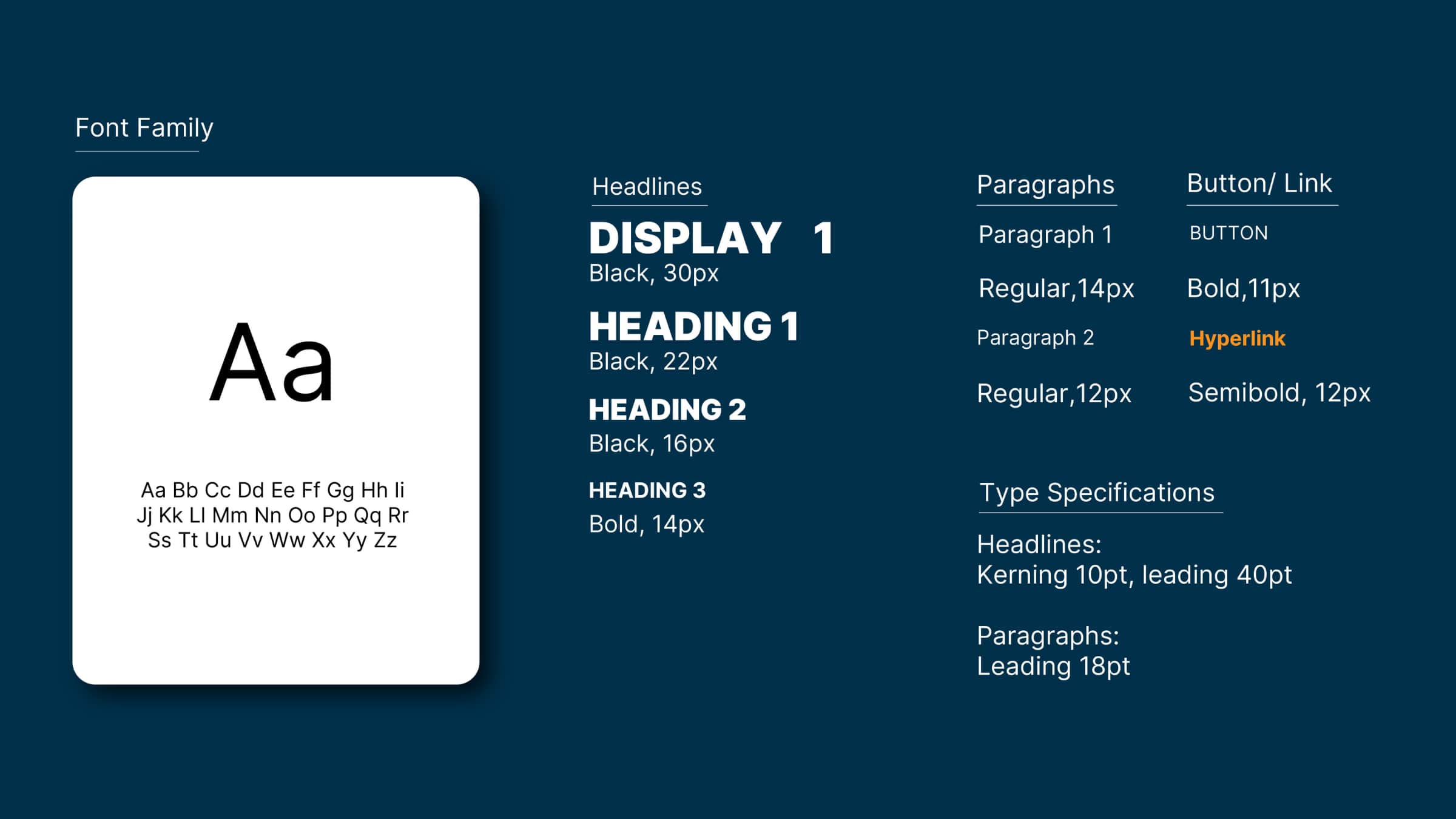
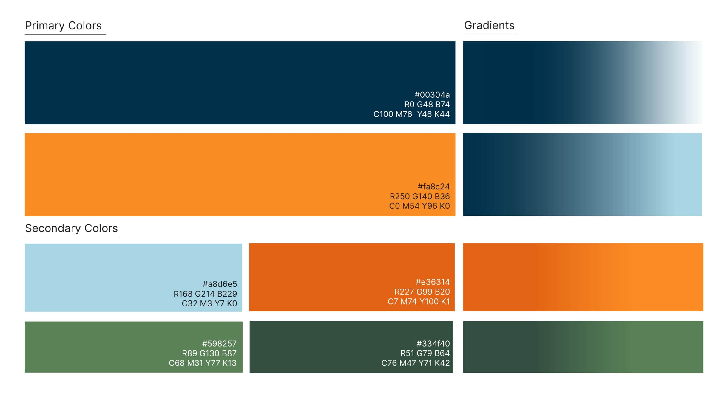
Within this style guide, I chose a colour palette that would target specific emotions and represent the personality of the brand. Navy blue establishes professionalism and trust. Orange adds a sense of joy, energy, and freshness. The green tones connect the brand to its values of nature and organic growth.
A well-refined logo is vital to brand recognition. Therefore, I developed a custom logo for LVU that drew upon the chosen colours and values of the brand. I drew inspiration from organic shapes like trees, lakes, and mountain silhouettes. I chose a badge format to align with traditional university branding (to instill a sense of longevity), though the challenge lay in simplifying the imagery so it remained distinct and legible at smaller scales. Integrating the silhouette across the entire badge and managing transparency through the mountain peaks required several iterations to perfect.
To ensure brand consistency, I designed custom lettering for the “LVU” type rather than using a generic typeface. This elevates the typography from simple text to a cohesive piece of artwork where every line has a specific purpose.
After developing the logo and variations, I applied it to a variety of marketing collateral to provide the client with a good idea of what their brand would look like in action. Having a strong style guide that represented the values and personality of LVU was the first solution to addressing the problem of limited brand recognition and differentiation.
The Solution: Part II
The second part of the solution to LVU’s pain points was to develop a strong marketing strategy and social media campaign.
In order to generate leads and enrolment for LVU, I created a social media marketing plan that would run and evolve over three months from November to January. This timeline matches up with when students would need to start applying to post-secondary. The main campaign message I created ties into current relevant social issues as well as the main values of the client. The camping message is “Your wellbeing matters, study at a university that cares”. The message of validation and mental wellness recognition directly ties into the client’s values and addresses current mental wellness issues that are important to the target audience.
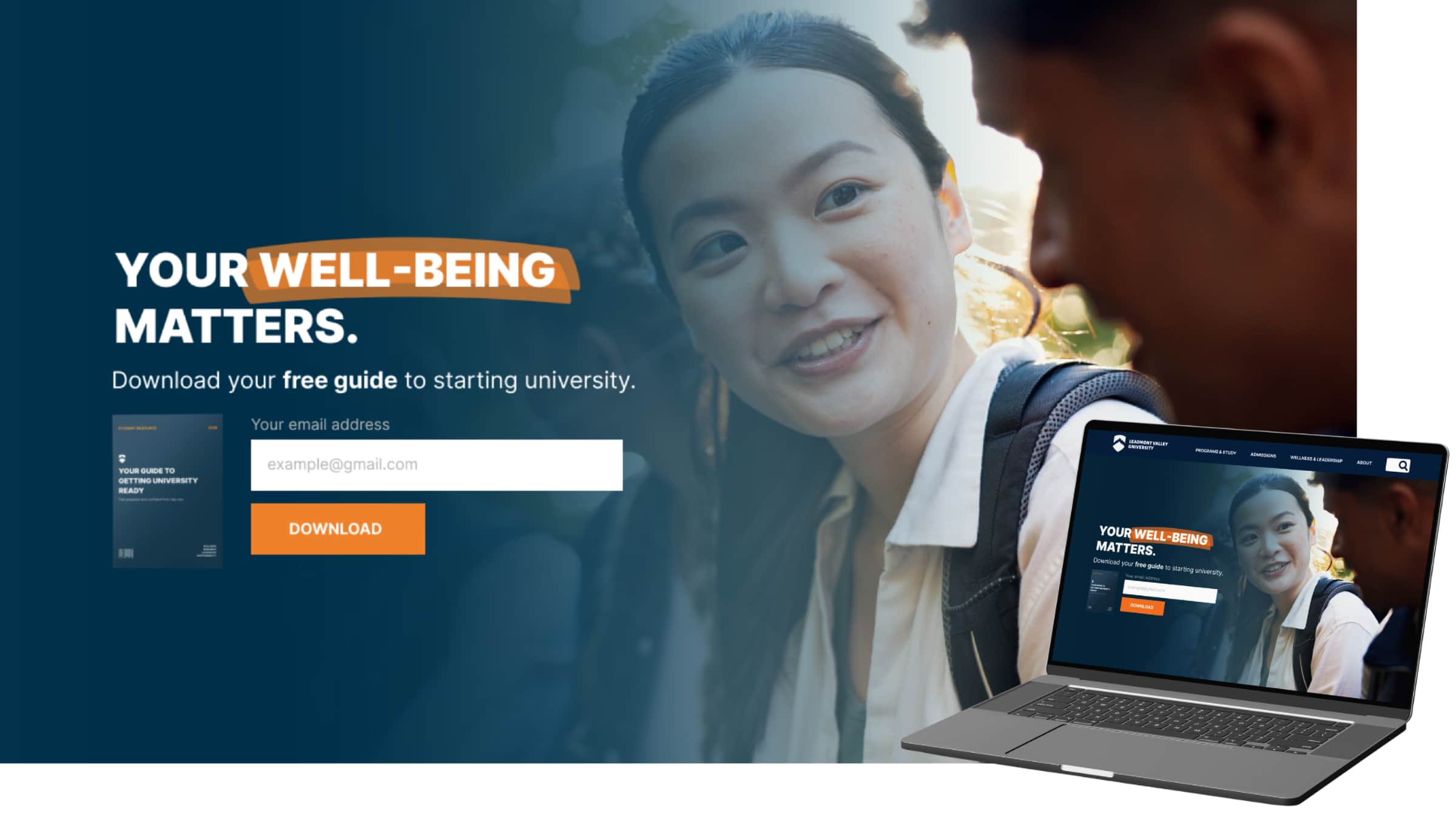
The goal of this campaign is lead generation. Users would be guided through a series of campaign posts to a landing page where they would be prompted to enter their information and download a guide on preparing them for university.
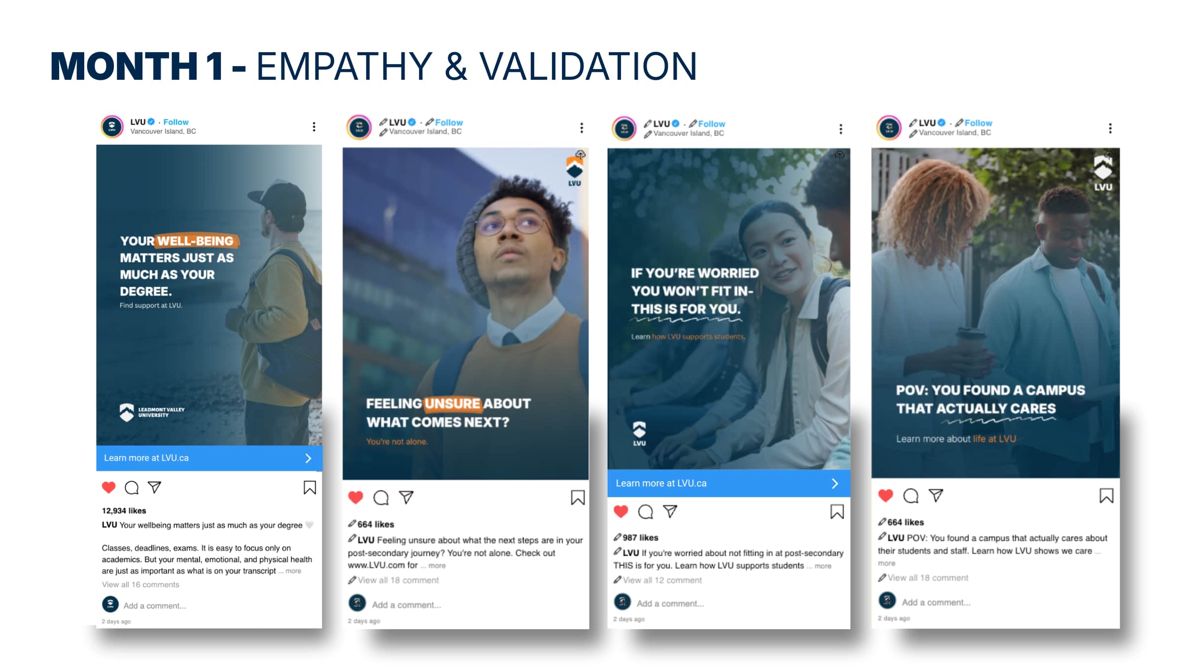
The main purpose of the campaign in month one is to bring awareness to LVU. Month one introduces the theme of mental health awareness and focuses on empathy and validation. The goal here is to spark interest but not focus very heavily on the conversion.
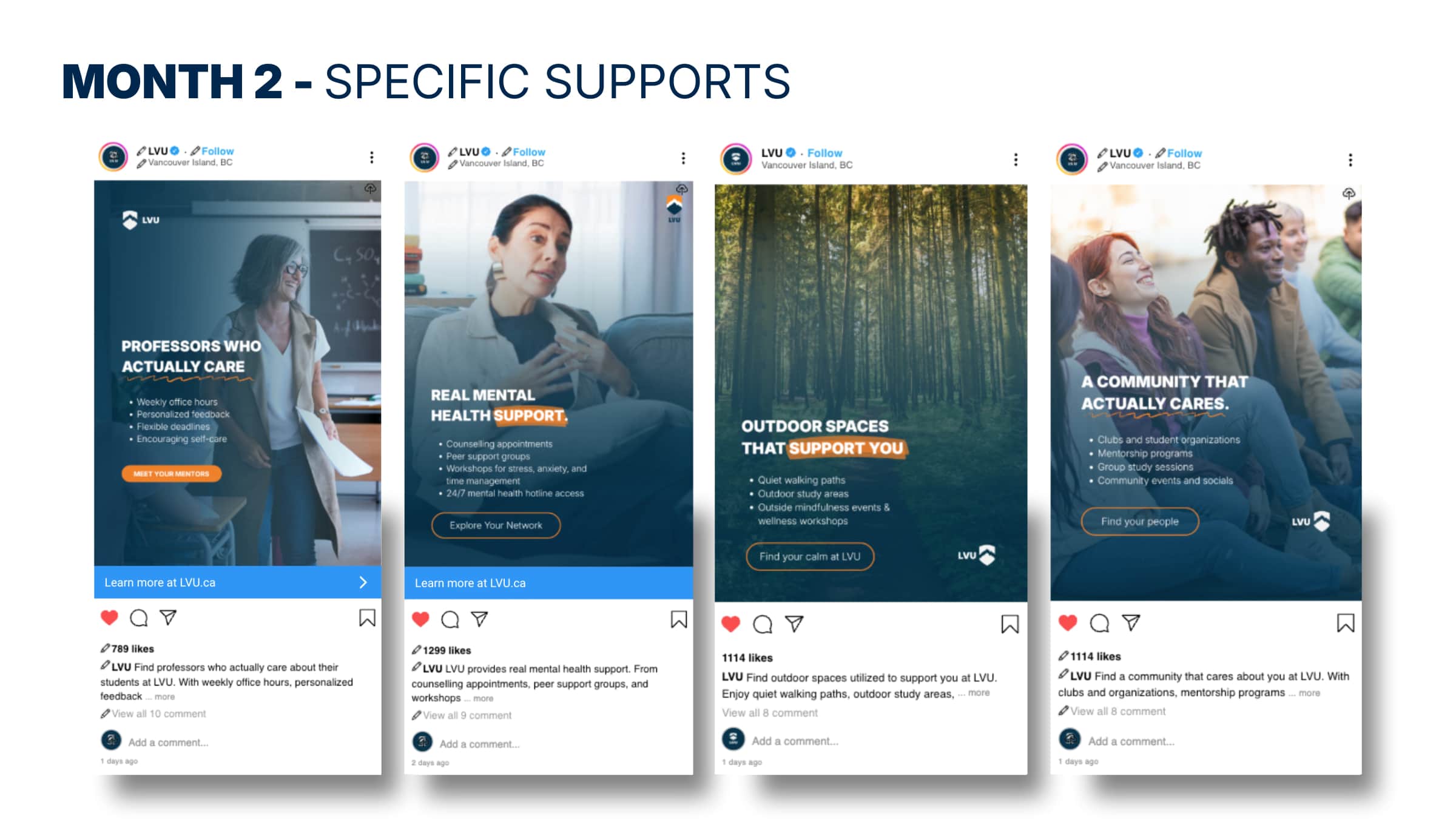
Coming into month two, students have moved past awareness and curiosity and are now evaluating options. This is the consideration stage of the campaign. Messaging during this phase focuses on the specific supports that LVU offers and provides the proof to back up the content seen in month one.
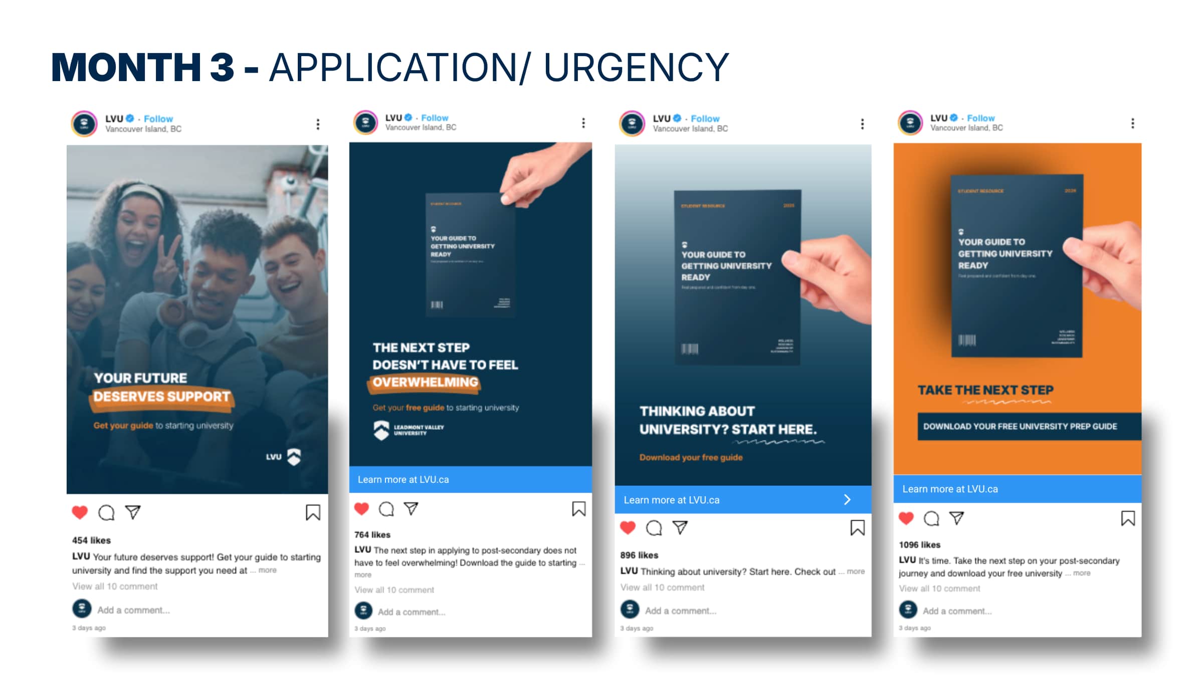
The campaign comes to a head during month three. At this point, users have moved through awareness and consideration and are now becoming ready to take action. Therefore, this month focuses heavily on application and urgency. The call to action during this month becomes stronger and more direct, pointing users towards taking the next step.
One of the issues I encountered during this campaign was developing a call to action that would be strong enough to prompt a user to give their information. Trust with a brand needs to be built before a user even considers giving their personal information. Therefore, the call to action had to be meaningful, relate to the campaign, and provide value for the user.
The Solution: Part III
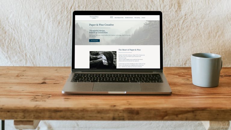
The final part of the solution to generate leads and boost student enrolment is to develop a landing page. It is here that the lead is captured. This makes analyzing the success of the campaign possible, as well as providing information for future tailored marketing initiatives using the information gathered.
Justification
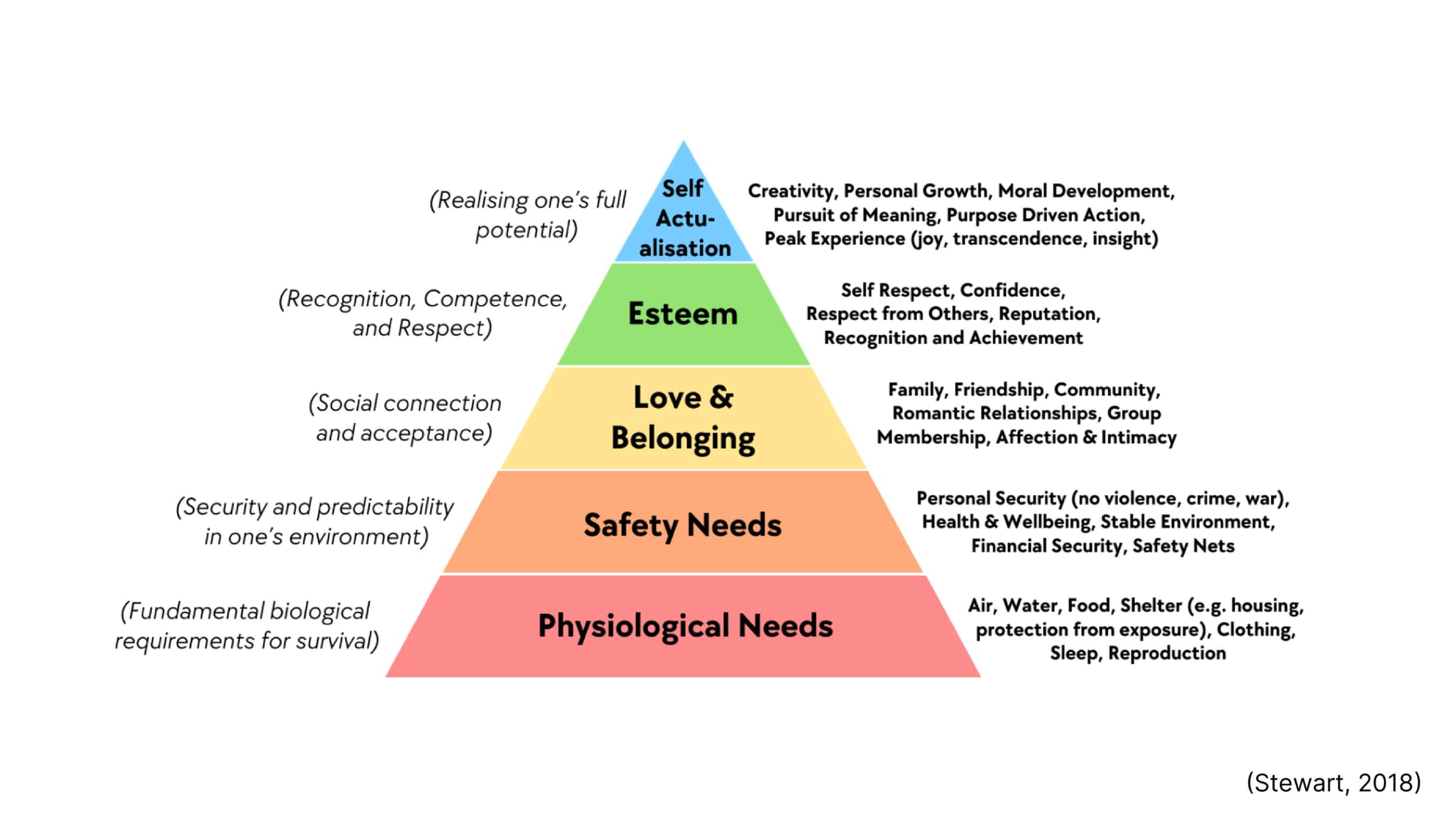
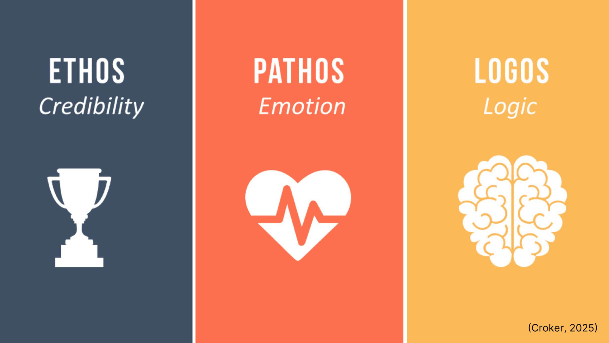
I developed the social media campaign using Maslow’s Hierarchy of Needs and Aristotle’s Rhetorical Strategies to engage the audience on a deeper psychological level. By focusing on safety and belonging (Maslow) alongside ethos and pathos (Aristotle), I crafted persuasive content designed to build trust and emotional connection, ensuring a higher return on engagement. I also used the Storybrand 7-Part Framework to make the user the hero and position LVU as the guide, helping to engage the audience.
The landing page was developed following industry best practices, and the layout features distinct content blocks, reinforcement statements, and multiple CTA buttons. To maximize conversions, I placed the lead form “above the fold” in the hero section, creating an immediate, action-oriented entry point for the user. The landing page is built using a 12-column grid, making it best for responsive sizing and structured spacing.
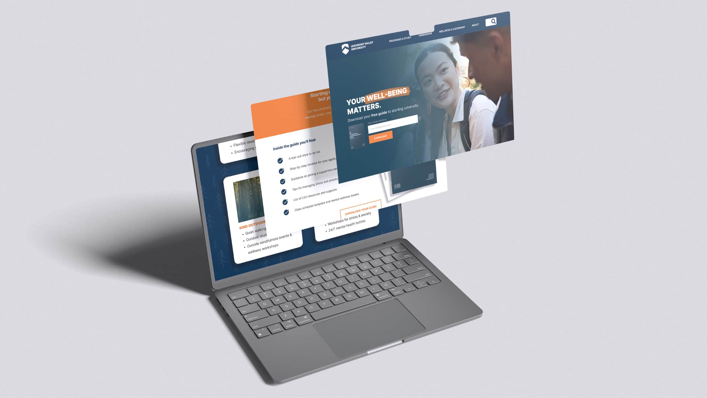
Check out the whole landing page online
Using a brand style guide and other marketing assets, I have developed a comprehensive brand style and marketing campaign to address LVU’s main problems: low student enrolment and a lack of differentiation. These marketing assets and campaigns have been developed using scientific and theoretical strategies to elicit the desired emotional response, build trust, and generate leads.