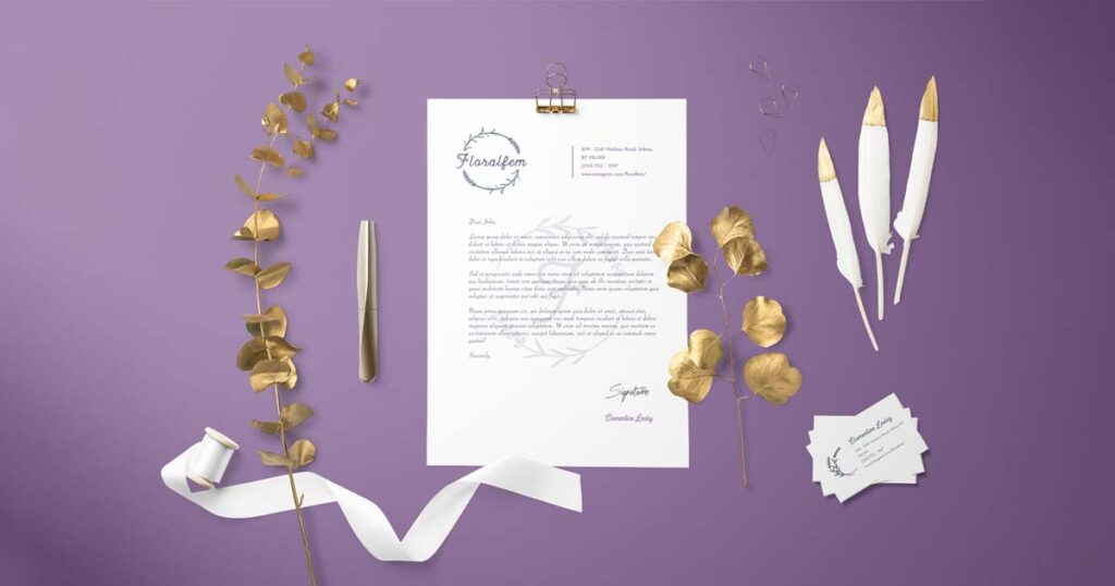
Floralfem
This project will focus on re-branding for a business called Floralfem with a handmade jewelry business, owned and handcrafted by a friend of mine – Clementine Lesley. She once asked me to help her design a logo. I have some ideas for her business, and I want to take this opportunity to implement it.
As a person who loves playing with color and shapes and enjoys creating useful products that help with people’s businesses, I found starting with branding was a challenge but really an exciting choice for me. Branding is one of the strengths that I am confident in, and it is the core for creating value for a business.
Process
Floralfem is owned and run by Clementine Lesley. The designs are based on natural elements such as flowers, trees, and animals. Since its establishment, the business has not achieved the desired number of customers and lacked the essential elements to be a brand. The goal of this project is to help Floralfem build an impressive brand image and increase brand awareness to potential customers.
Since this is an actual business, before doing any design, I started by analyzing the style of the brand. The owner of the business has some special requirements for the brand identity. One of those requirements was for the brand to have her personality. Fortunately, we are close friends, so I know exactly what is needed to create a brand identity that matches the owner’s style.
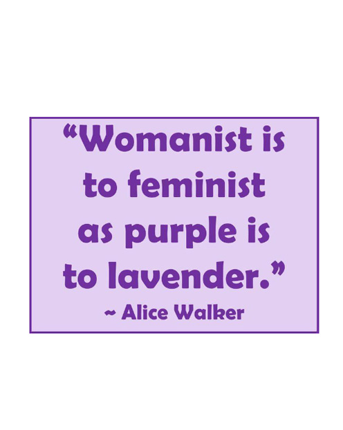
To begin, I did some research and analysis of the brand name. The name Floralfem may sound a little bit awkward. However, when I was doing research about this, I found quite a few products from different businesses named Floralfem. What they have in common is that they all express femininity, the beauty of the female body, feminism, and strength. I also found an article about gender representation and botanicals. In addition, the brand owner identifies and describes herself as a modern woman who “believes in women and fights for women”. For that reason, the flower that the brand owner chose as a symbol to represent herself and her design style, is lavender, which also represents femininity and feminism. And that’s what she intends for her business.
Moodboard
The next step was to build a moodboard. I have created a total of three moodboards, including Logos – Patterns – Color Theory. The moodboard evokes the feeling of femininity, with the main color being lavender.
I chose Heritage as the primary typeface for the brand, and Futura PT as the secondary typeface. Initially I wanted a soft typeface, something that can bring the feeling of softness and femininity. I have selected some script typefaces. But Clementine – the brand owner, was expecting something soft with either a vintage or a boho look, but that also comes with strength and consistency. Script typefaces have softness but do not evoke feelings of strength and consistency. Then I found Heritage and this typeface has all the elements I was looking for.
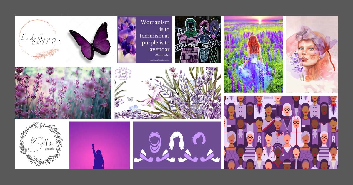
The primary colors are the palette of lavender flowers: blue purple and bright green. However, I did a little tweak and changed them to pinkish purple tone and teal-green tone. In addition, this color palette really creates a vintage vibe, which suits the requirement of the brand owner and is what I was aiming for.
Sketches
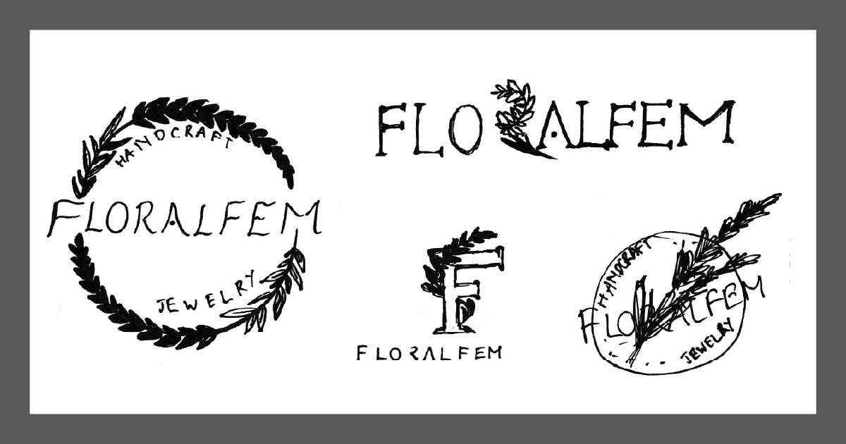
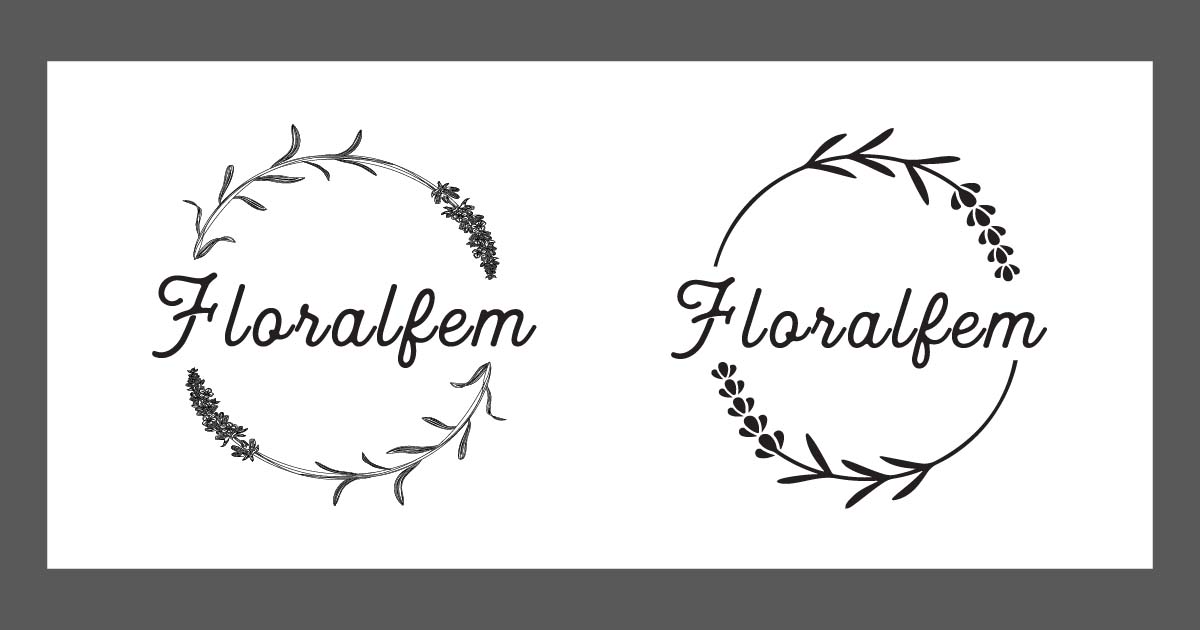
I created 2 forms of logo sketches: badge logos and letter logos. All drawings included a primary element – the lavender branches. I sent all the sketches to the client, and she chose a badge logo (number 6th).
Primary Logo
I did 2 primary logos: a hand-drawn style one and a graphic one. Both are in black and white forms. Initially I created only the graphic logo. But then I wanted to have different versions to use for different situations. The graphic logo was simple and elegant but at the same time I wanted something softer, something that would evoke a “handmade” feeling and I decided to do the hand-drawn style logo. The graphic logo could be used in almost all situations but the hand-drawn one could only be used on large printing such as signages, storefronts, or letterheads.
Secondary Logo and Variations
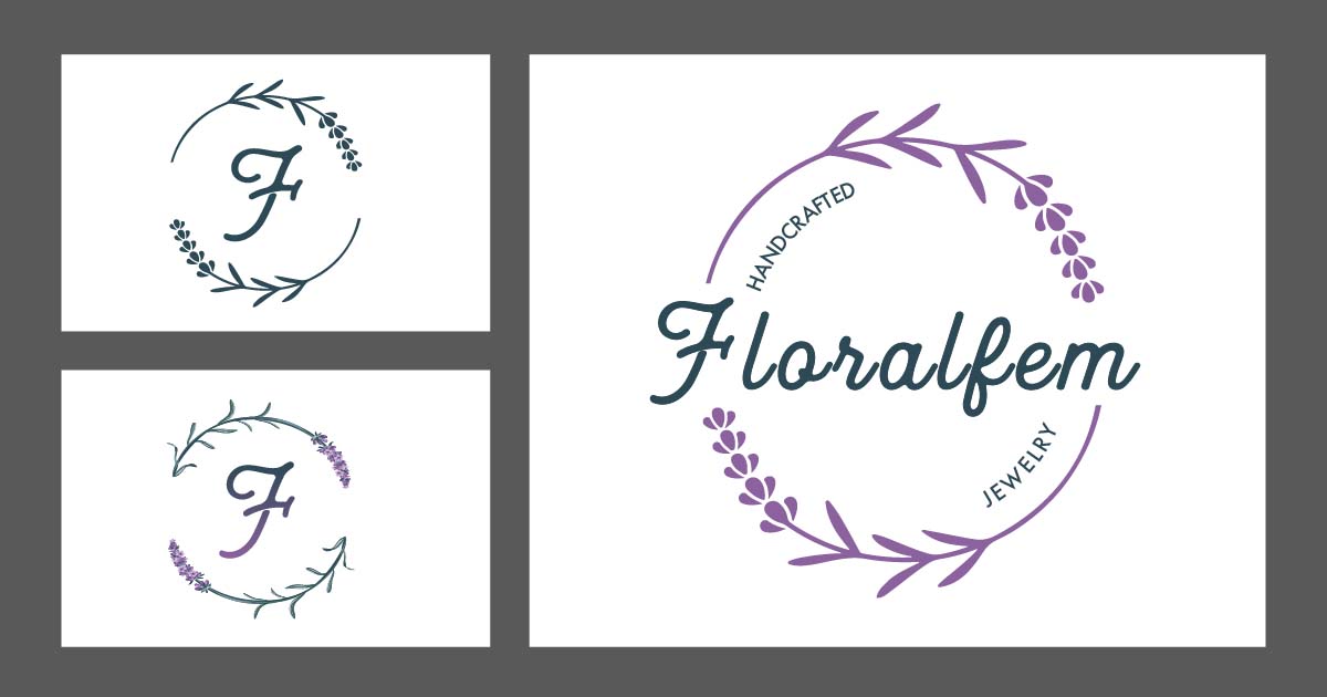
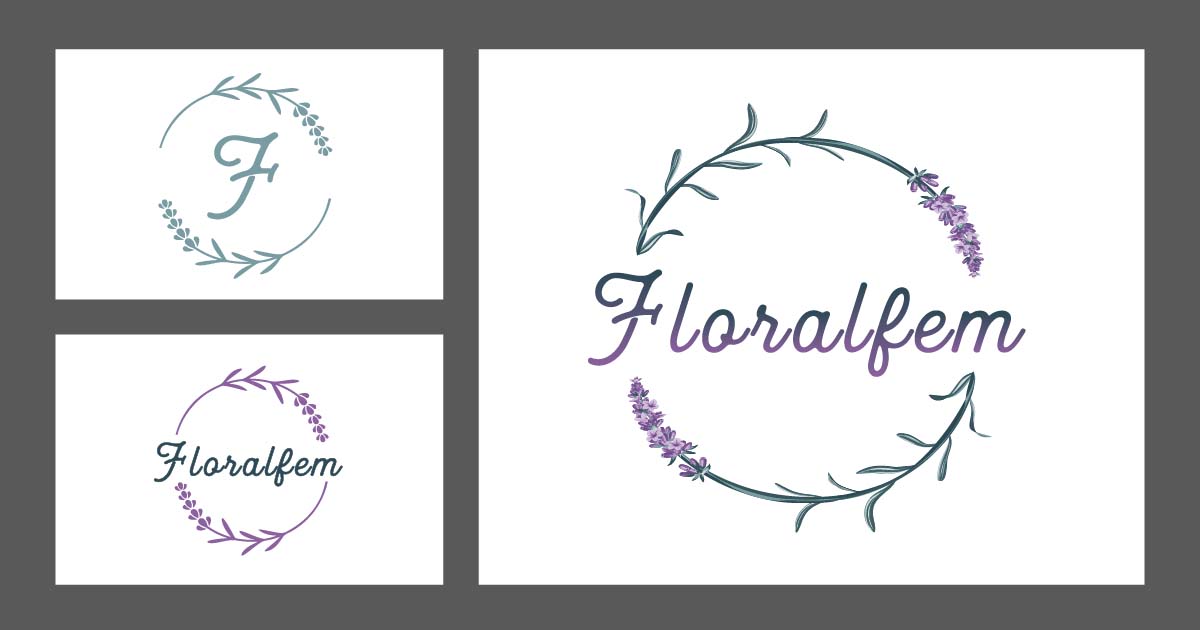
For the graphic logo, I used purple lavender branches and dark green text for the graphic logo, and mixed colors for the branches and gradient text for the hand-drawn style logo as below.
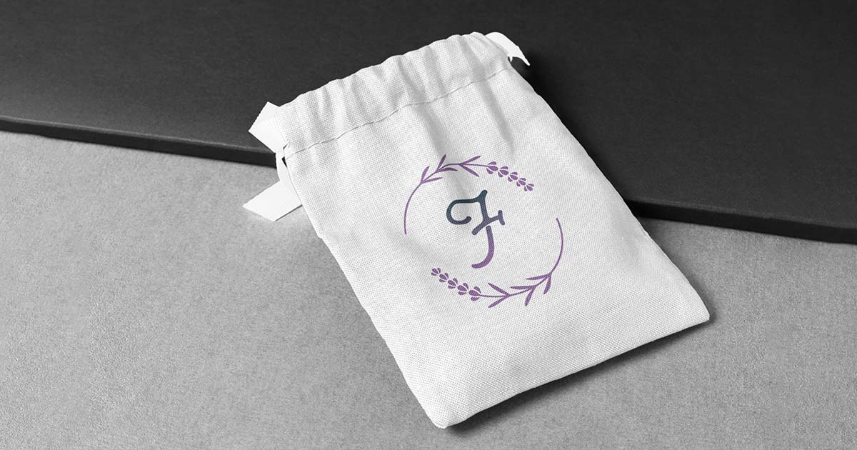
For a simple icon logo, I kept the lavender branches and simplified “Floralfem” to be a large “F” and centered it.
Badges & Icons
For the badge logo, I simply changed the logo colors to be all white and put them on a circle-colored background. Since the intended use of icons is mostly for social media and smallest prints, I just kept the “F” letter on top of a simple circle colored background.
Collateral
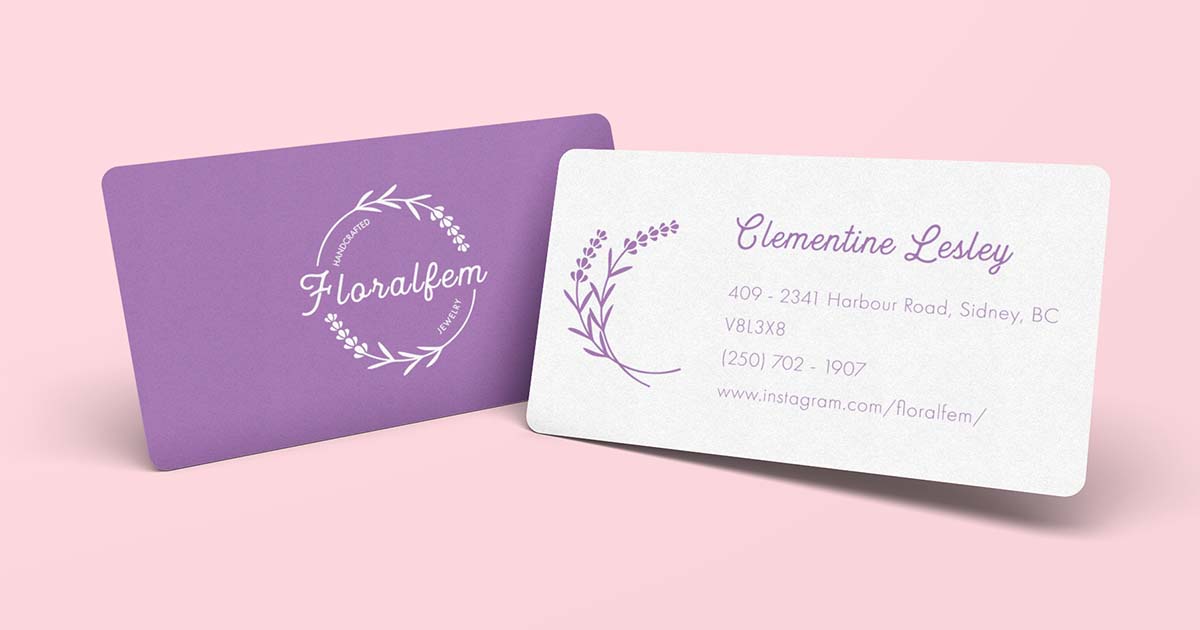
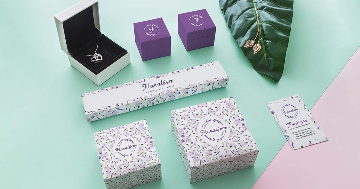
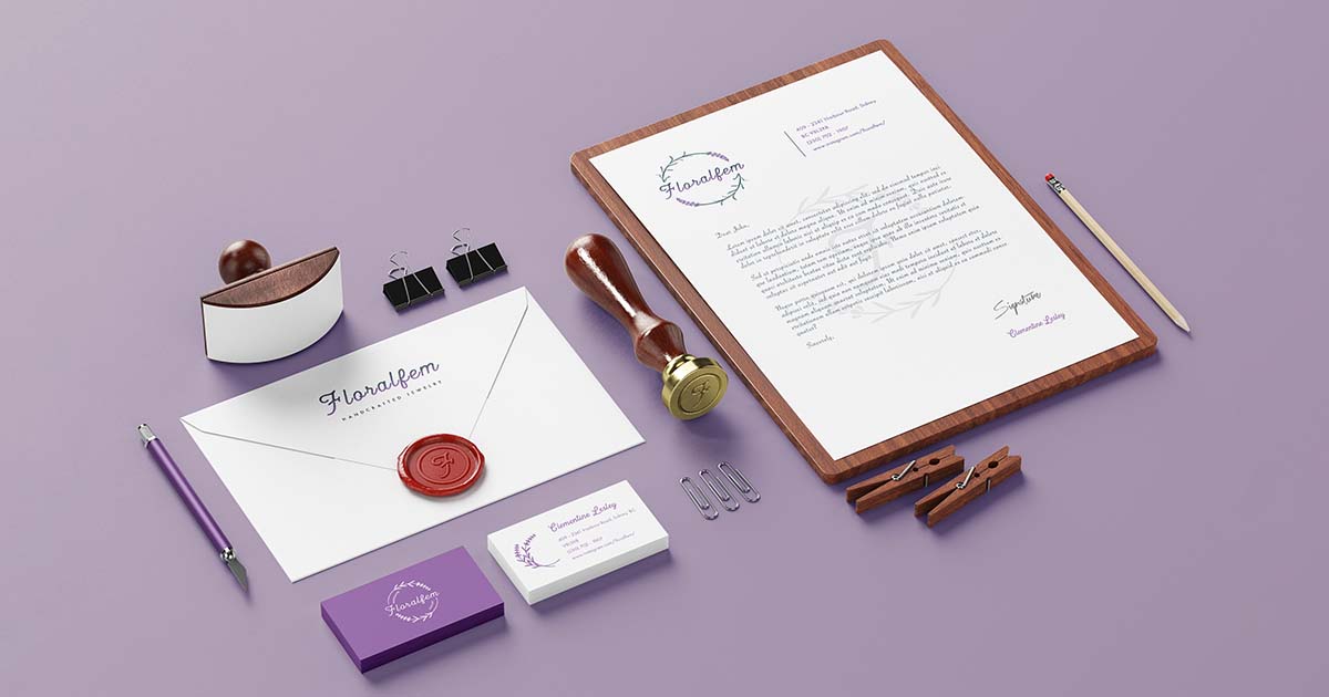
For the brand collateral, I’ve completed: Business Card, Letterhead, Envelope, Thank You Card, Postcards, Wax Seal Stamp.
Thank You Card was designed to put inside packaging when customers purchased products. Postcards can be used as gift cards or coupons/ vouchers. Wax Seal Stamp is a perfect match for a simple envelope that evokes the vintage mood.
Social Media Strategy
1. Our social media goals are
- Increase page engagement
- Increase search traffic
- Increase click-through rates
- Increase brand awareness
- Advertising
- Engage potential customers
2. Our target audiences
| Who are they? | Women (15-40), students, BC residents, ON residents (highest search traffic by region) |
| What are they interested in that you can provide? | Handcrafted jewelries, affordable prices, Vancouver Island based, low-cost or free shipping |
| Where do they usually hang out online? | Facebook, Instagram, TikTok |
| When do they look for the type of content you can provide? | Search traffic is highest in summer (July-August), after Christmas (Boxing Day), and April (end of spring) |
| Why do they consume the content? | To get deals and discounts on special days (Boxing Day; after-holiday sales) To pre-order products for holiday (Christmas, New Year), or for summer outdoor time. |
| How do they consume the content? | Watching TikTok videos, checking Instagram and Facebook newsfeed |
3. Platforms
Here are the themes of our content for each of our social media profiles:
| Advertisements, deals, events for Christmas | |
| Photo’s album of finished products, events, deals for Christmas | |
| Tik Tok | Videos of the making processes, finished products, events, and deals for Christmas |
4. Sharing schedule
From our research, we found that our target audiences:
- Tend to search and order more in the end of spring (April), late summer (August) and early holiday season (Christmas, New Year). We’ll set up posts for the deals and coupons around these times.
- Mostly active on TikTok and Instagram. Sharing posts will be prioritized on these platforms.
- Mostly active at late night (after 10pm). Sharing posts will take place at around 10-11pm.
- First 2 posts will be set up ready to share in October (pre-order for Christmas) and November (specific deals for Christmas).
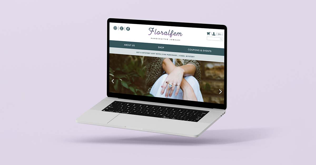
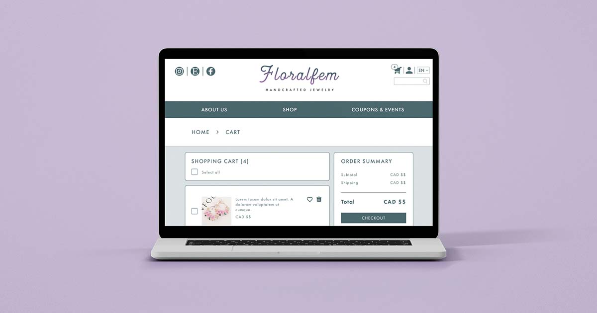
UX – UI
The Body section of the Home page includes 3 main sections of products shopping and Testimonials above the Footer. Icons on Header and Footer are linked to social media accounts and contact information. There is a drop-down menu for those 3 shopping sections under the “Shop” button on Nav Bar. The shopping pages are presented as a carousel with each sub-section. On the product pages, customers can add their favorite products to the cart. The cart icon on top right of the page can lead them to the shopping cart for checkout.