VIET Magazine
Viet Magazine is my Capstone project focused on publication design, created as a travel magazine for people who enjoy exploring new cultures or learning about different countries. The magazine introduces Vietnam through a mix of culture, food, and travel destinations, giving readers a closer look at everyday life and unique experiences. This project is very meaningful to me because it allows me to share my home country in a personal and visual way. At the same time, it helps me practice and strengthen my skills in typography, layout, and overall magazine design, especially in creating a cohesive and engaging publication.
The travel industry is continuing to grow, especially with more people looking for cultural and authentic experiences instead of just visiting popular tourist spots. In the first quarter of 2026, Vietnam welcomed over 6.7 million international visitors, showing a strong increase in global interest. This creates a great opportunity for a publication like Viet Magazine, which focuses specifically on Vietnamese culture, food, and local experiences. It can work as a helpful and visually engaging guide, especially for first-time visitors who want to explore the country in a more meaningful way.
Check out the condensed digital version for yourself at FLIPHTML5.
Moodboard
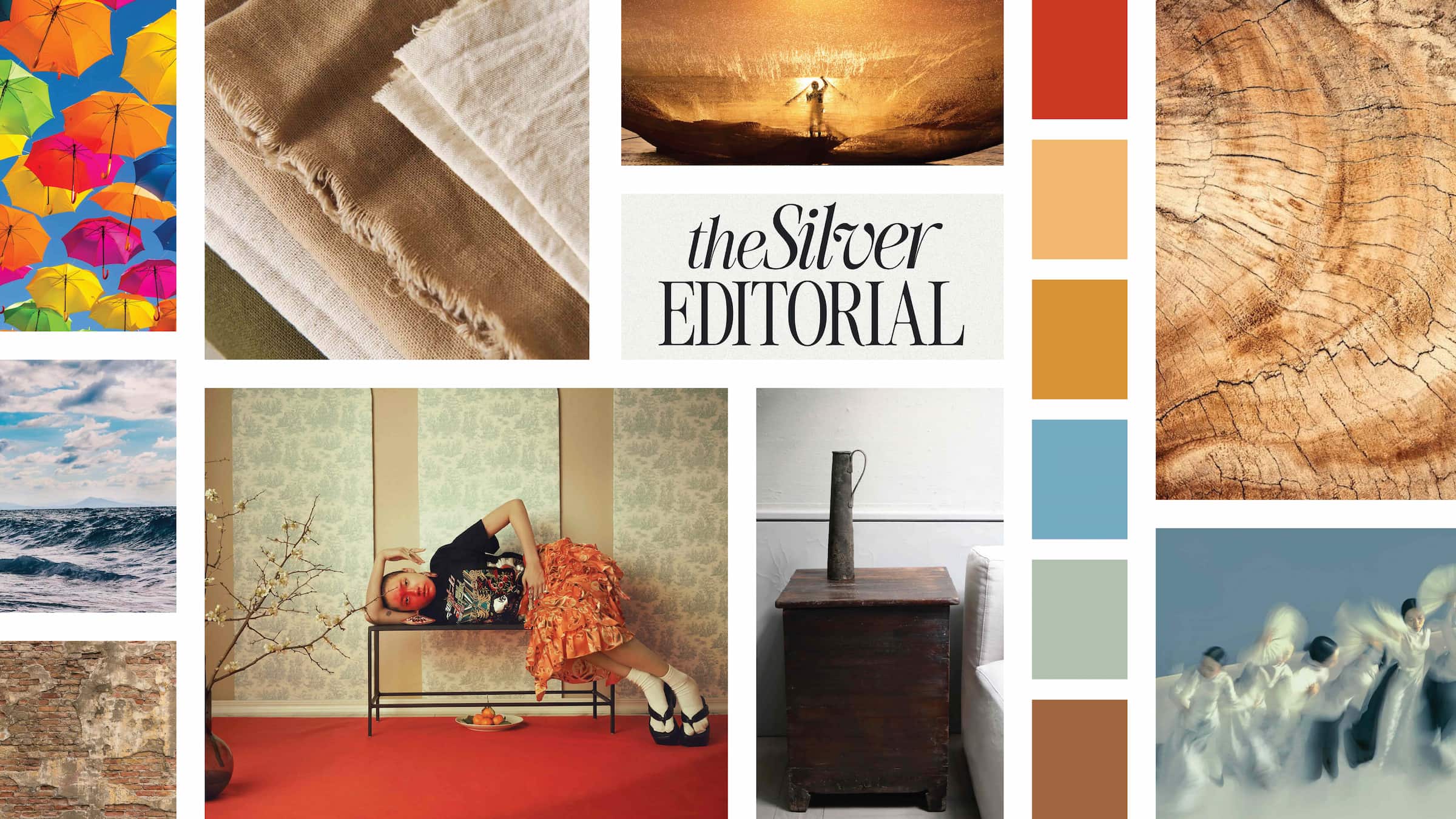
For the moodboard, I focused on a color palette that feels vibrant but still natural and balanced. I chose colors like red, yellow, dark orange, blue, green, and brown, which are often seen in nature and in Vietnamese culture. To avoid the colors feeling too overwhelming, I slightly muted the tones so they work better together across the magazine. The overall mood I wanted to create is rustic, vintage, and warm, with a strong connection to nature and tradition. This direction helps set the tone for the entire magazine and guides my design decisions in a consistent way.
Style Guide
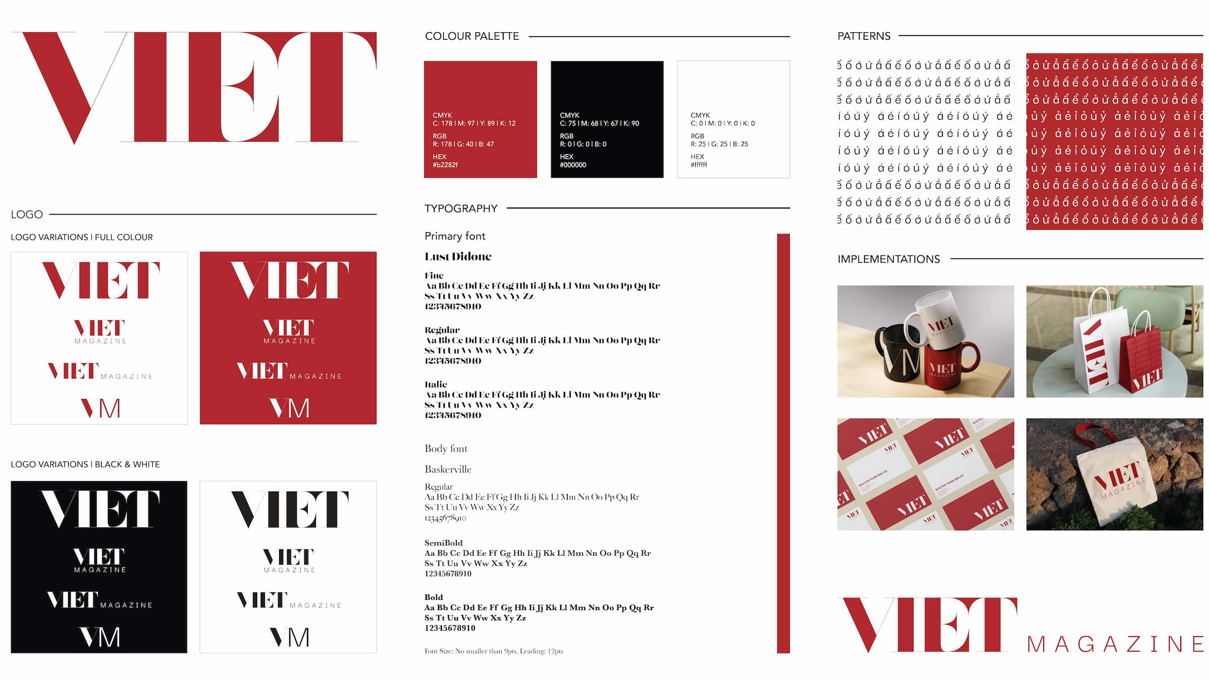
The style guide is built around a simple but strong visual identity. The main logo, “Viet,” uses red as the primary color because it is bold, eye-catching, and closely connected to the Vietnamese flag. I combined this with black and white to keep the design clean and easy to apply across different layouts. I also explored creating patterns inspired by Vietnamese language and letterforms, which add a subtle cultural detail to the magazine. These patterns work well as background elements and help reinforce the overall theme while keeping the design visually interesting.
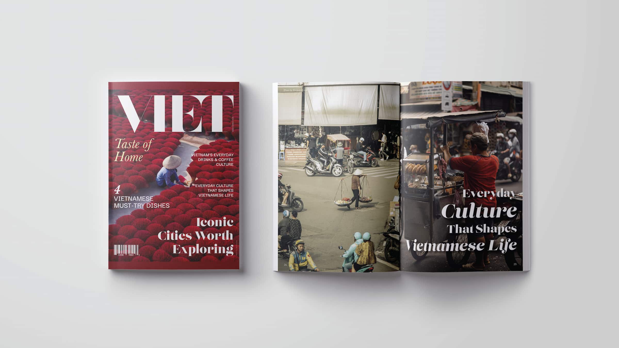
Front and Back Cover
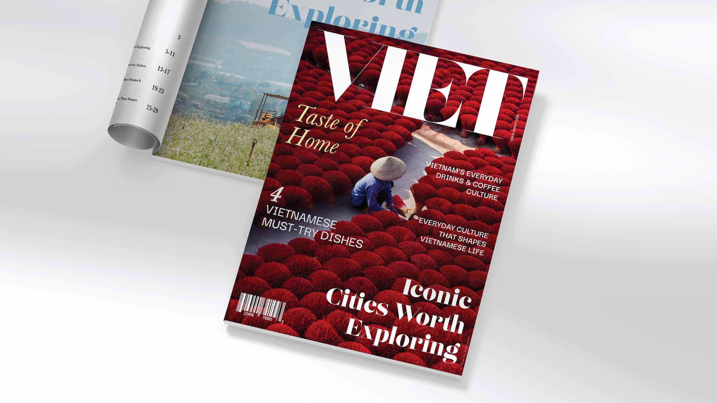
For the front cover, I wanted to create a strong first impression that immediately catches attention. I used bright and vibrant photography, especially with red tones, to connect with the brand identity and create visual impact. The “Viet” logo is placed clearly at the top, followed by the subtitle “Taste of Home,” which introduces the theme of the magazine. I arranged the feature titles in a clean and organized way so they are easy to read while still looking dynamic.
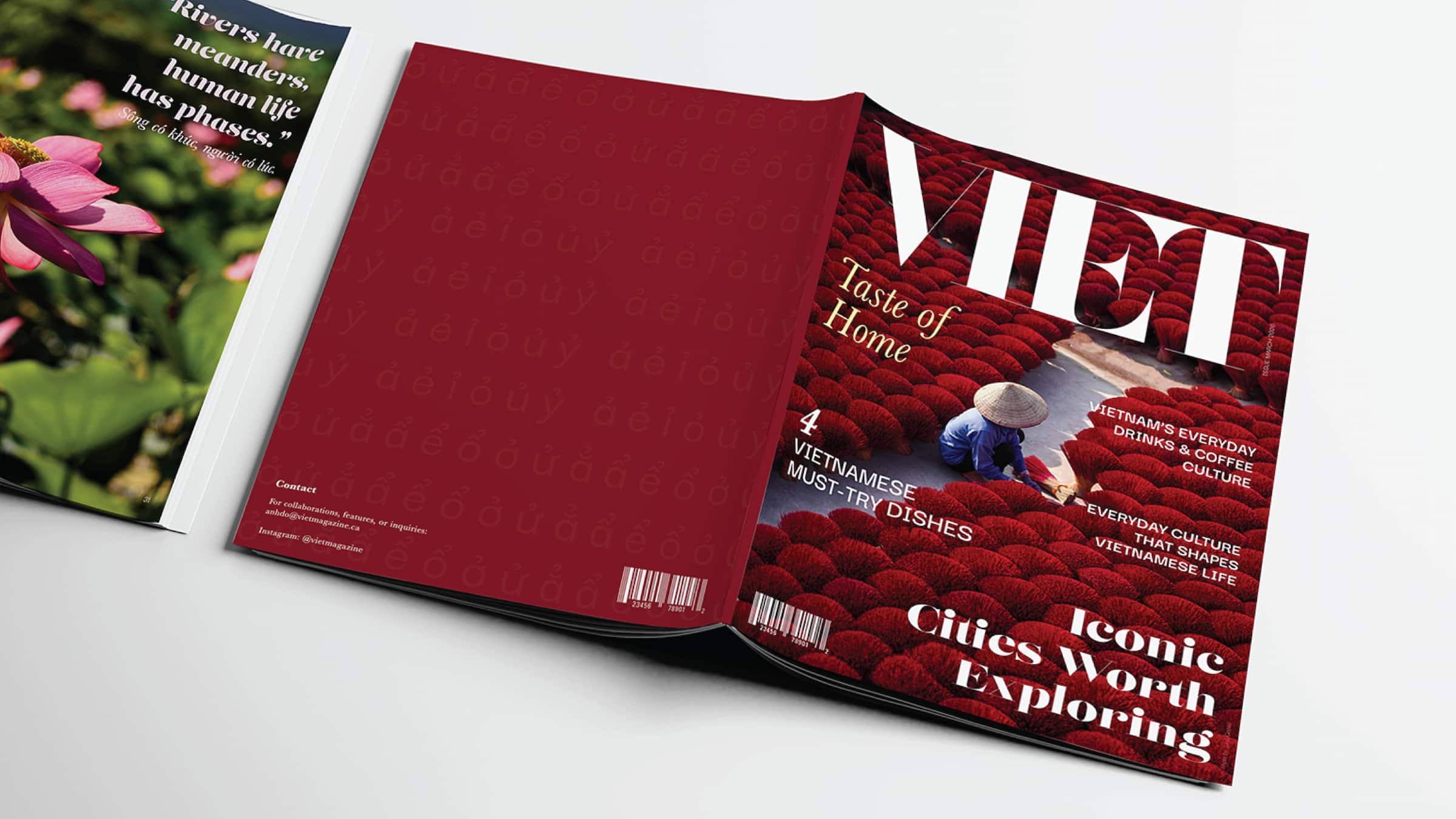
The back cover is designed to be simple and clean, with contact information and a barcode. I used the same color palette and pattern elements to keep the front and back visually connected.
Advertisement + Editor’s Message
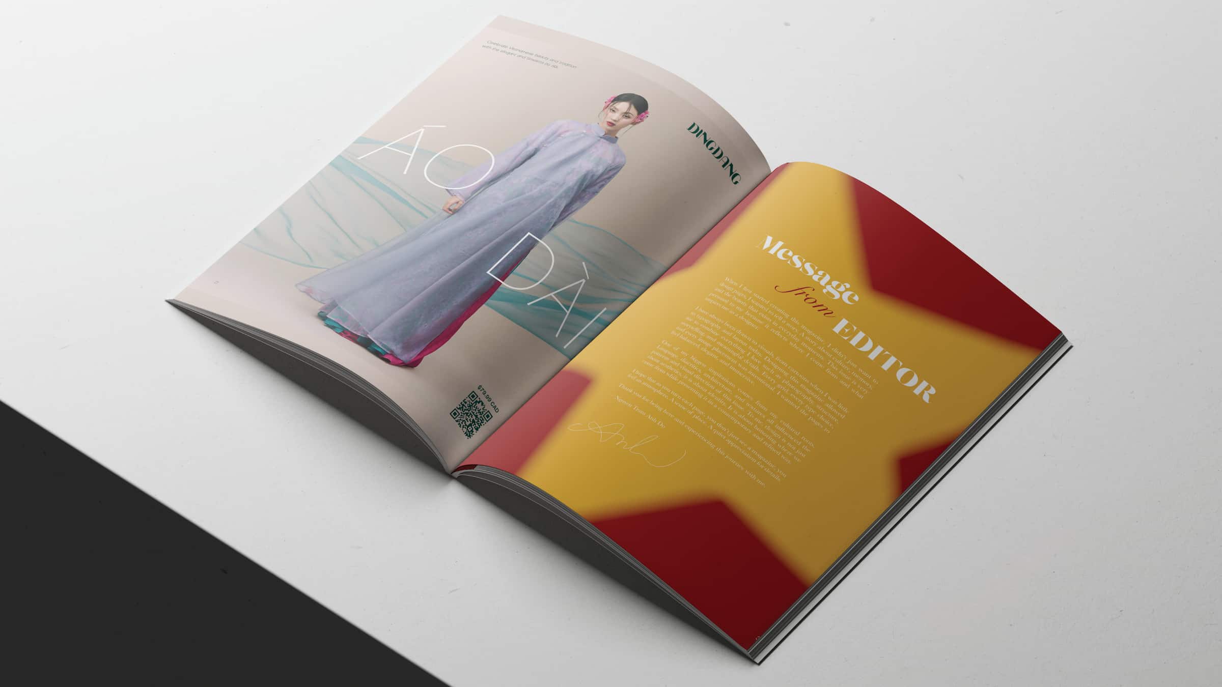
For the advertisement page, I chose to promote a Vietnamese clothing brand featuring the traditional Ao Dai. The design focuses on strong, high-quality photography, combined with simple typography to keep the layout clean and elegant. I also included a QR code so readers can easily access the brand online, making the design more interactive. For the editor’s message, I used a background inspired by the Vietnamese flag, with a red base and a yellow star. This creates a bold and meaningful visual that connects directly to the theme of the magazine while introducing the content in a personal way.
Magazine Layout
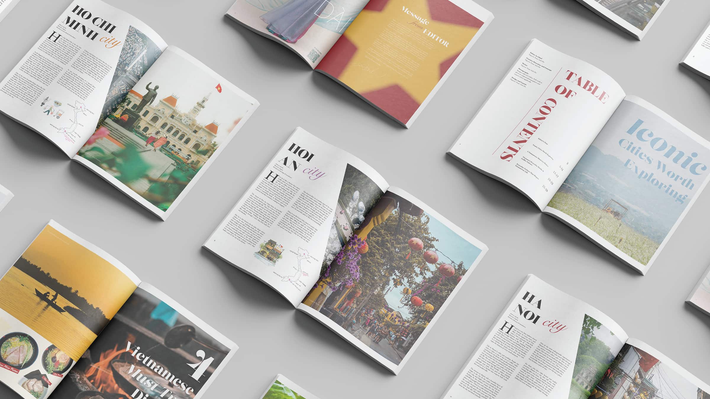
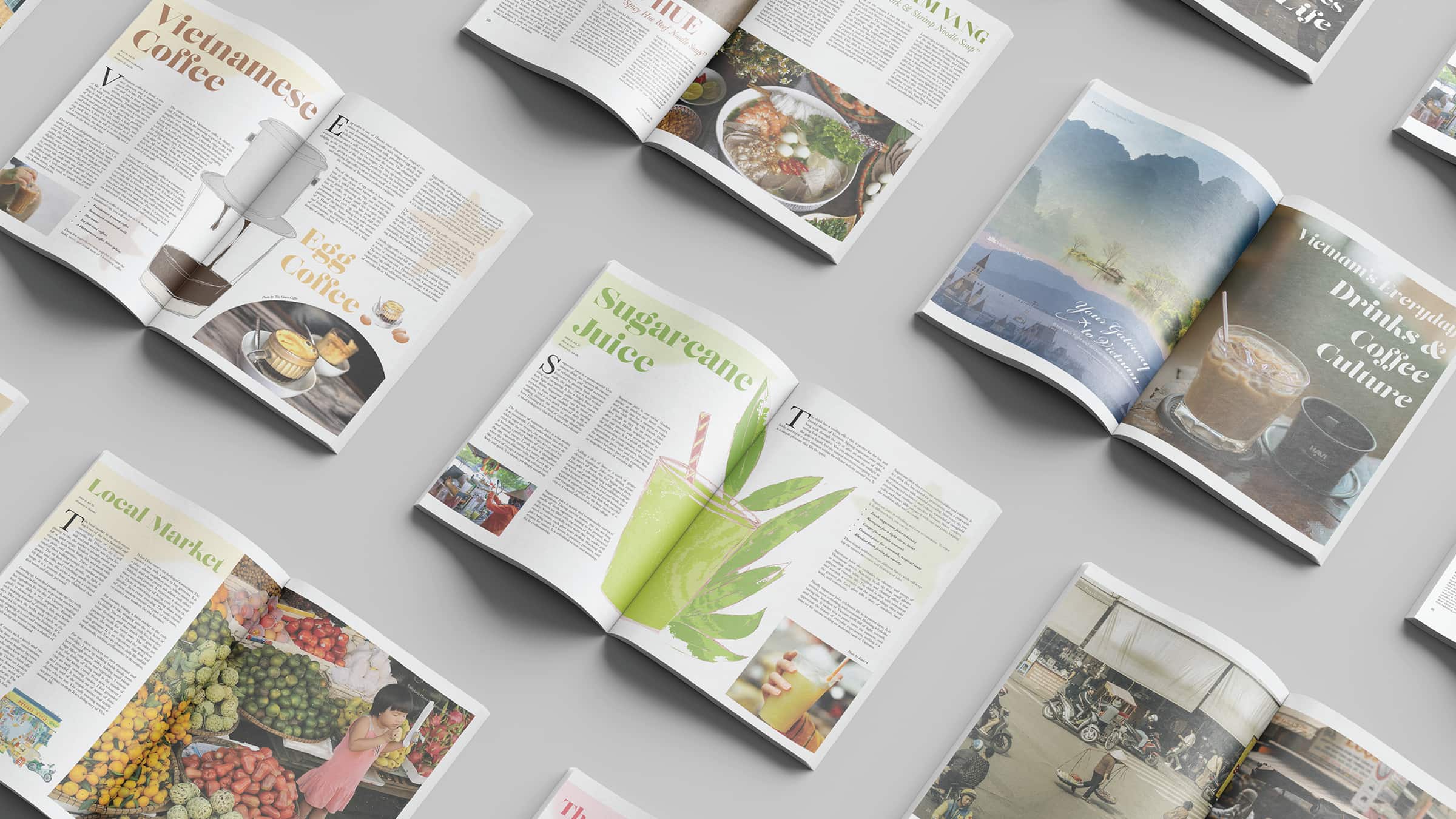
The magazine is organized into four main topics, and each section follows a consistent layout system to keep everything structured and easy to follow. I focused heavily on using photography because I didn’t want the pages to feel too text-heavy. High-quality images help capture attention and bring the content to life, making the magazine feel more engaging and immersive. At the same time, I explored different layout compositions and typography styles to keep each spread unique while still maintaining overall consistency. This approach helps the magazine feel more dynamic and similar to real travel publications.
Advertisements
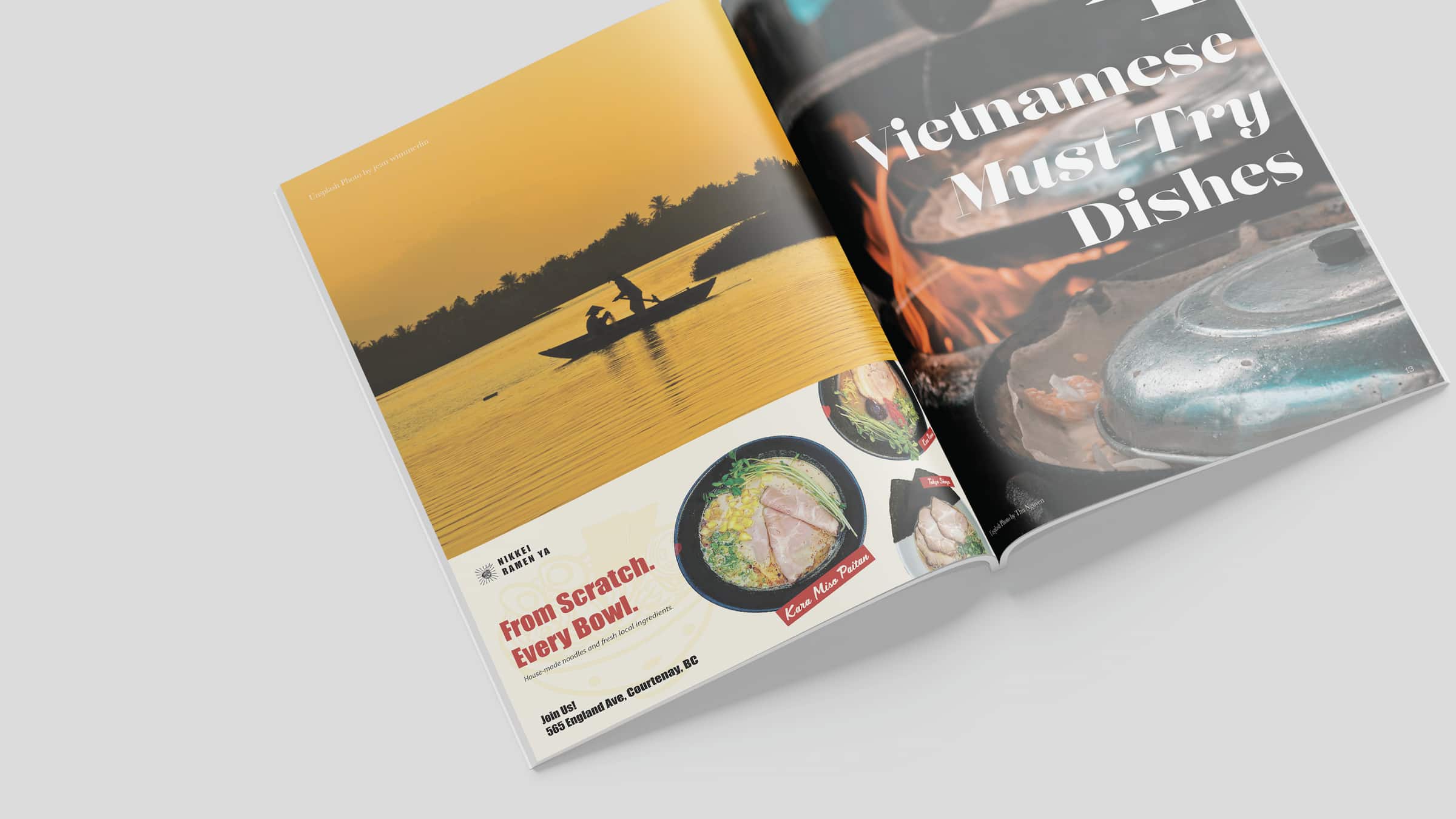
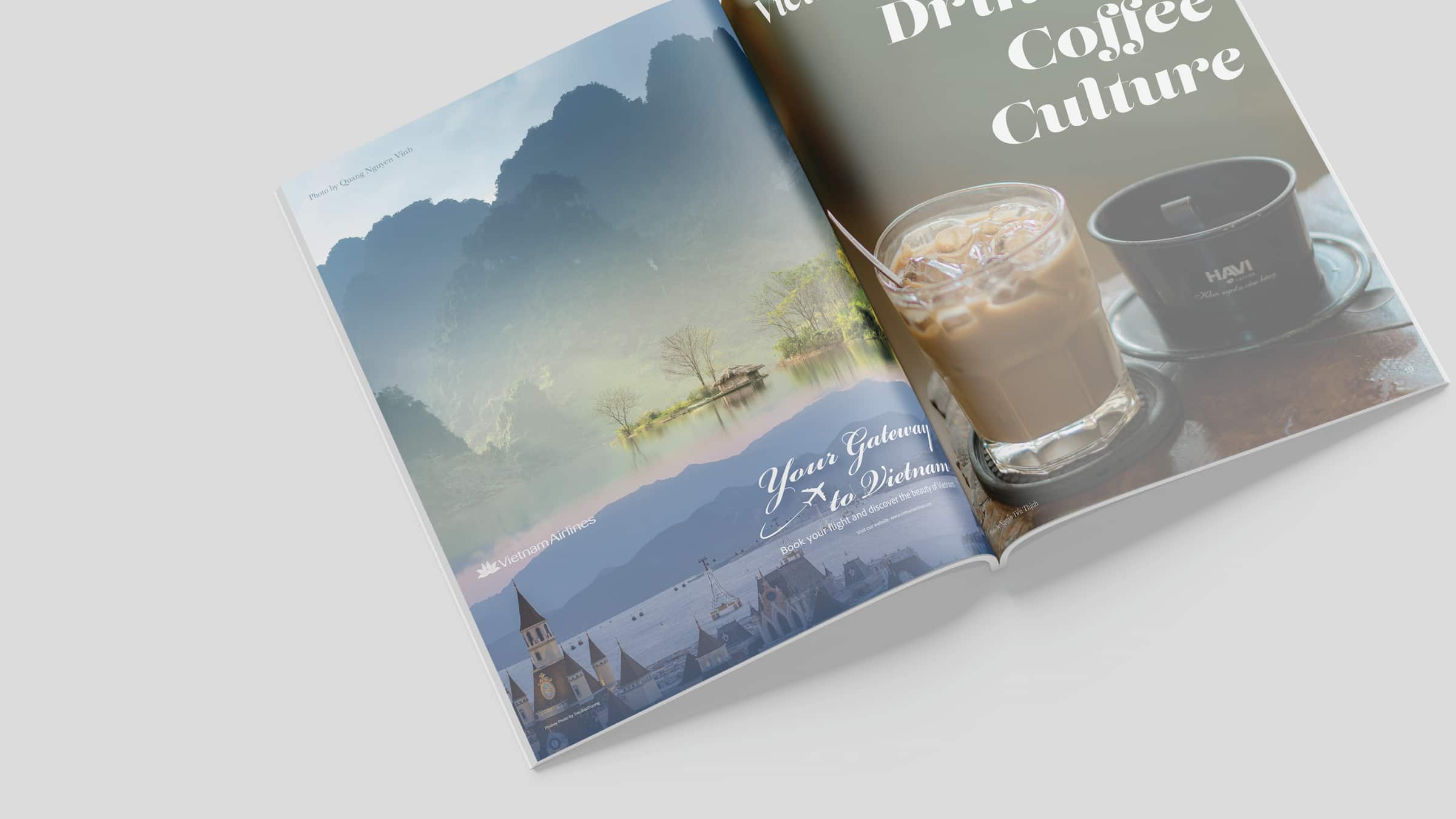
I included two advertisement spreads that fit naturally within the magazine theme. The first advertisement promotes a ramen restaurant, using a simple poster-style layout with strong visuals to highlight the product. The second advertisement focuses on a Vietnamese airline, which makes sense within a travel magazine context. For both designs, I made sure they blend well with the overall style of the magazine by matching colors, layout structure, and visual tone. This way, the advertisements feel like part of the reading experience instead of separate or disconnected pages.
Illustrations
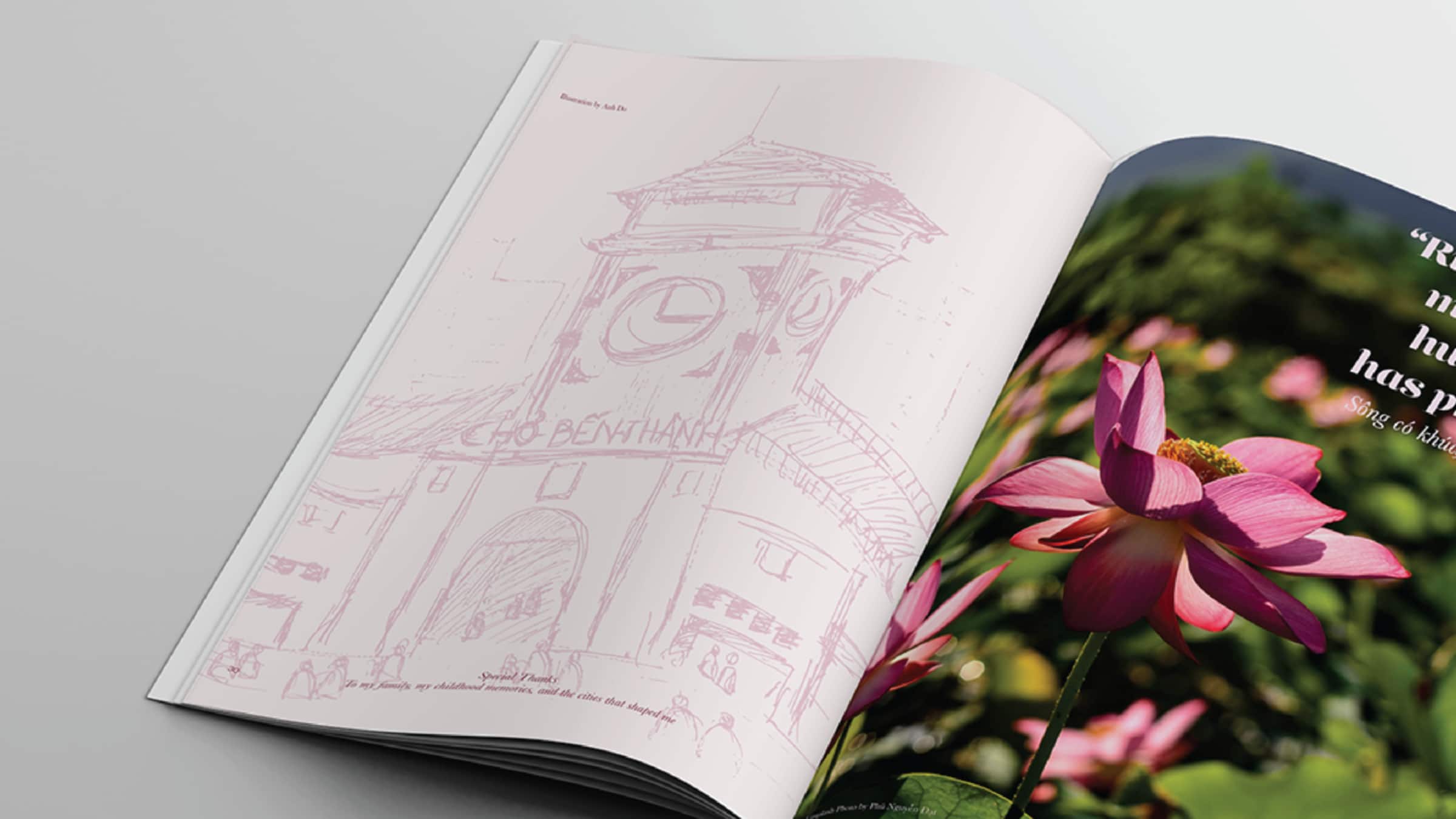
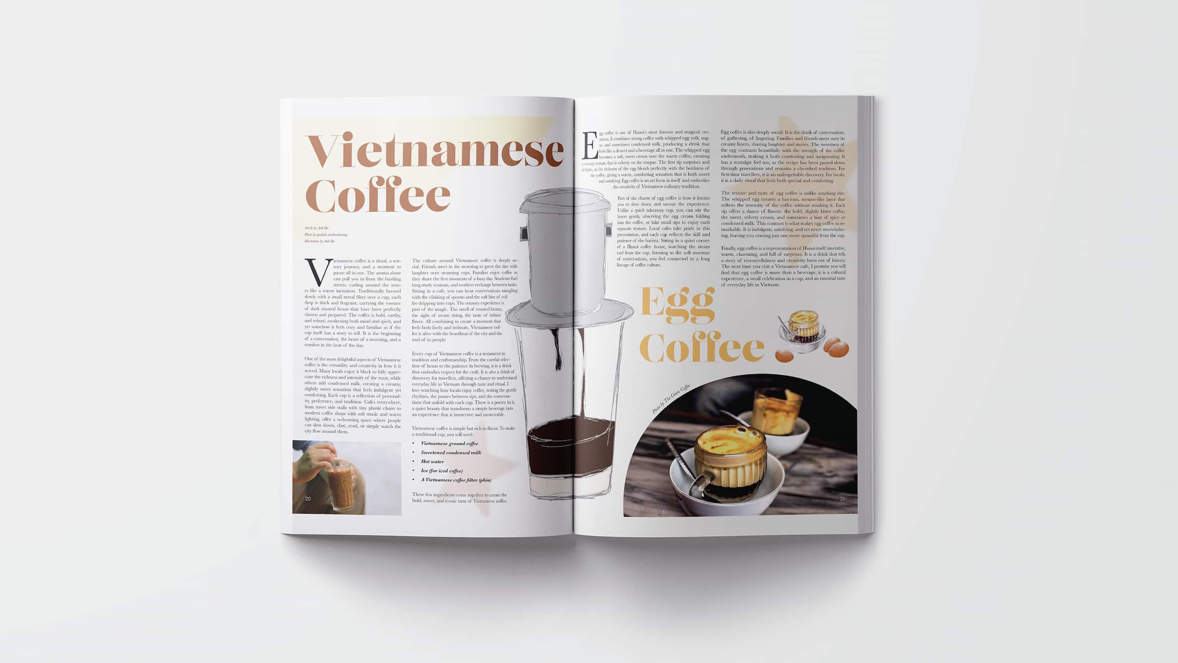
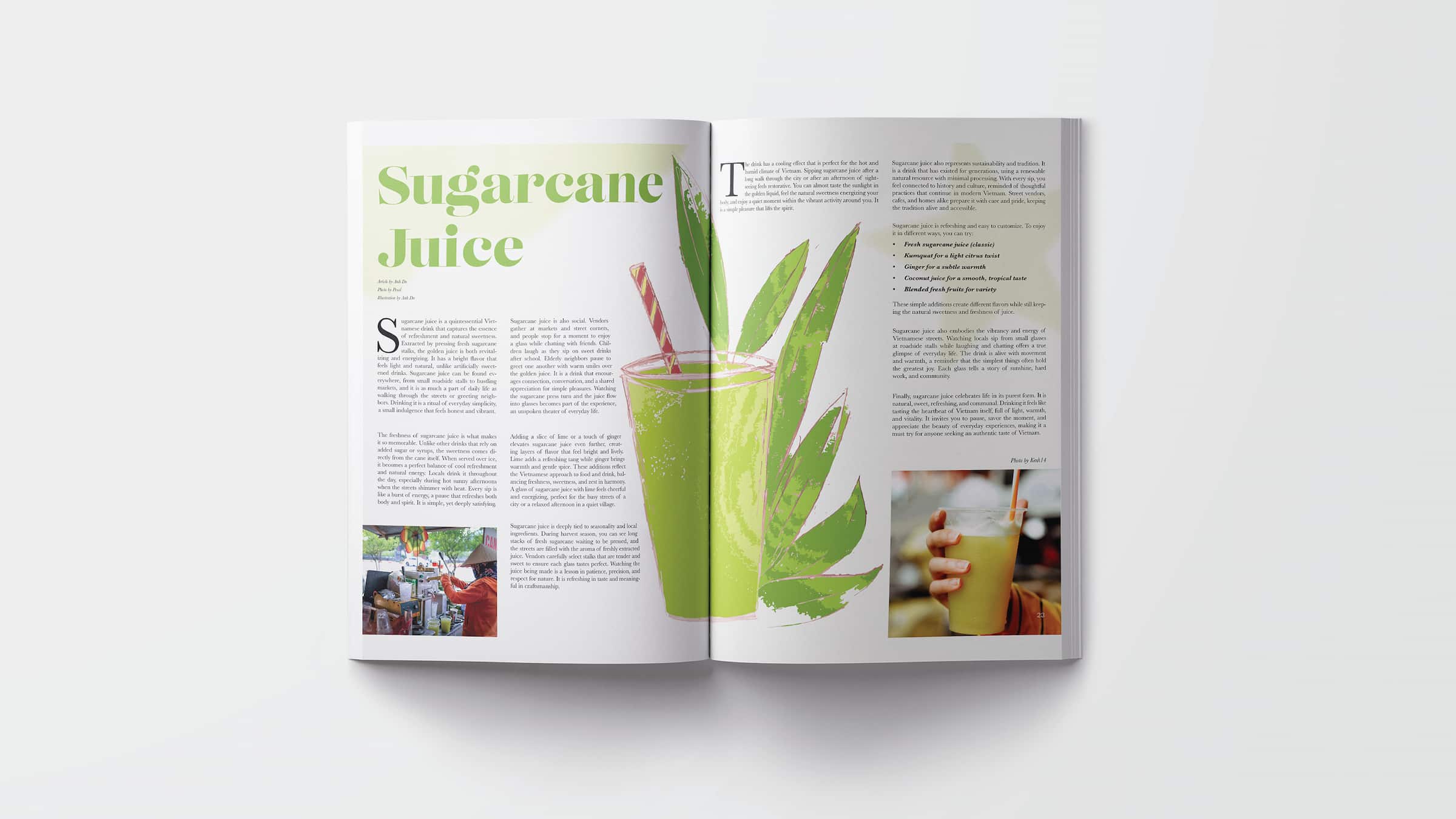
For the illustrations, I created three pieces that add a more personal and handmade feel to the magazine. The first illustration features Ben Thanh Market in Ho Chi Minh City, using a loose and sketchy style that gives it a lively and rustic character. The other two illustrations focus on Vietnamese coffee and sugarcane juice, which are very popular everyday drinks in Vietnam. I intentionally kept the drawings slightly messy and imperfect to match the vintage and organic style I was aiming for. These illustrations help balance the photography and add a unique visual layer to the overall design.
To wrap up, Viet Magazine is more than just a travel magazine, it is a way for me to share my culture through design and storytelling. This project allowed me to combine photography, layout, and illustration to create a cohesive and engaging publication. It also reflects my growth as a designer, especially in creating work that is both visually strong and meaningful.