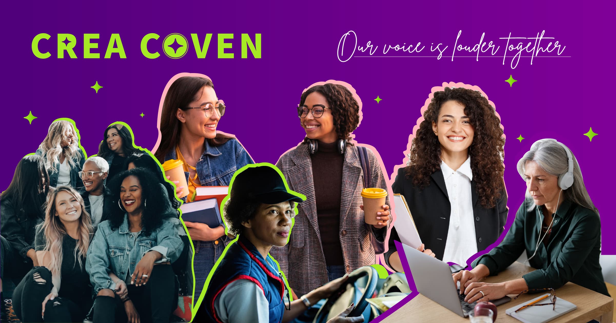
CreaCoven
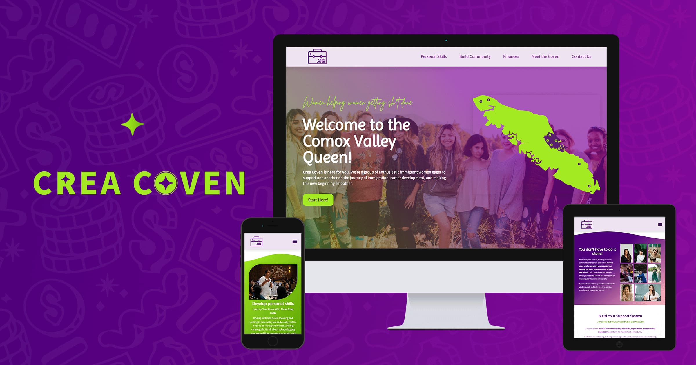
CreaCoven is an immigrant women’s collective providing useful tools to women settling in the Comox Valley. The focus of the collective is to share holistic tools with career-focused immigrant women, making their settling process smoother and supported by others who have experienced it firsthand. By extending this information to the public, the original coven also invites women to gather and build their support systems.
The project includes the development of a logo and logo variations, colour palette that emphasizes feminist values, brand identity guide and a website containing relevant information for the target audience organized into three main groups: personal skills development, community building, and money management
Check out the project online.
Planning and Conceptualization
I began by researching support options for immigrants in the Comox Valley and identified several groups and communities of women supporting each other in business. Recognizing a gap in combining these concepts, I decided to create a fictitious collective of career-driven immigrant women supporting each other to achieve their goals more effectively.
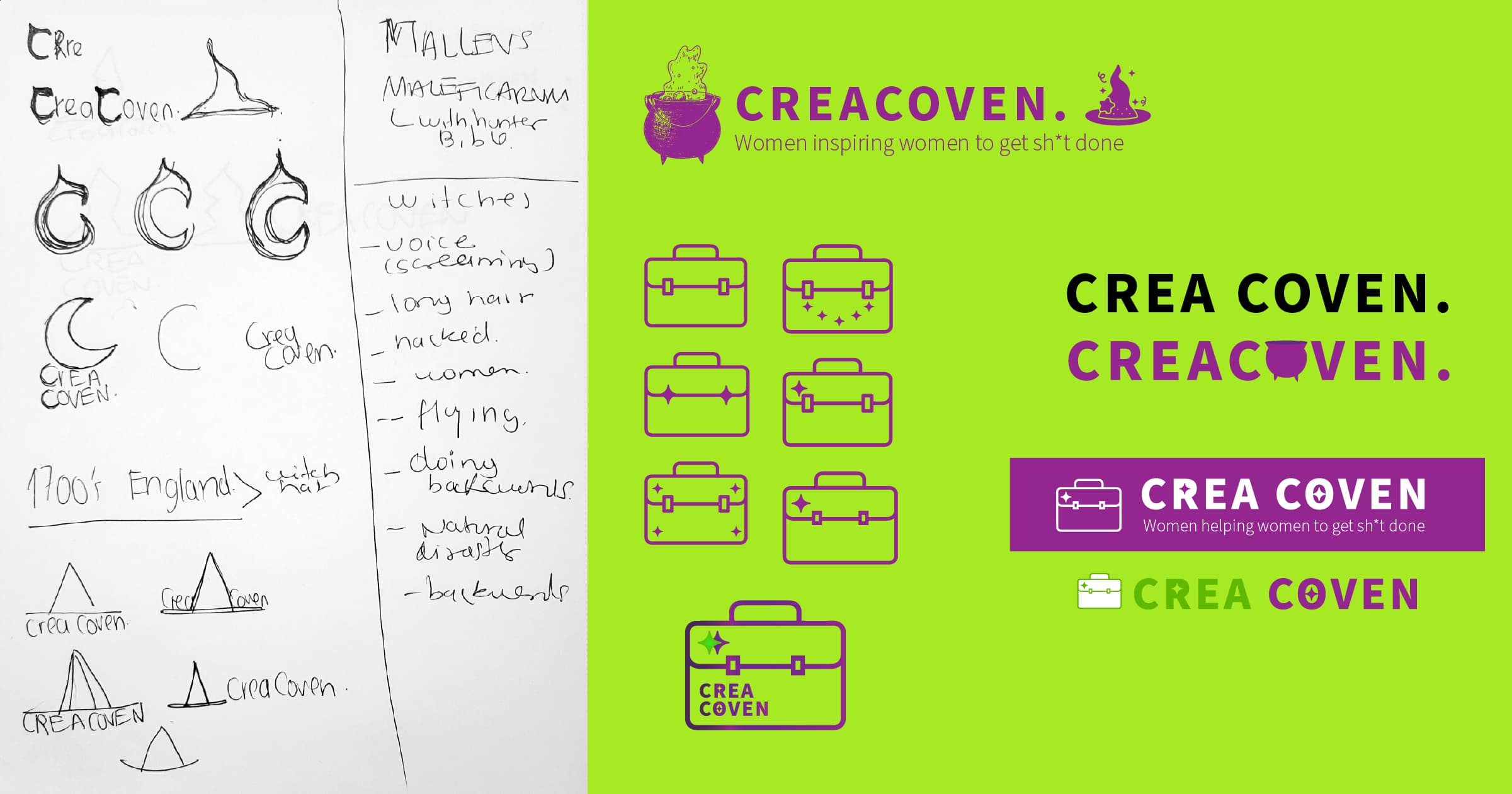
I started by researching the history and meaning of covens and witches, and gaining more historical knowledge about the stigma behind groups of women helping eachother in a context of power, magic, collectivity and independence. I wanted to re write this part of the history with a more professional and contemporary look and feel. I then brainstormed ideas and shapes that would combine these two concepts and set aside time to explore colors and shapes that could inspire the brand.
This research also led to the conclusion that the decision to seek help and build a new community often depends largely on personality and energy levels. I aimed to provide a starting point for all women arriving in the Comox Valley, whether they had considered approaching their immigration process holistically or not. This involved considering physical well-being, intellectual skill development, and adopting new social and financial behaviors.
Moodboard
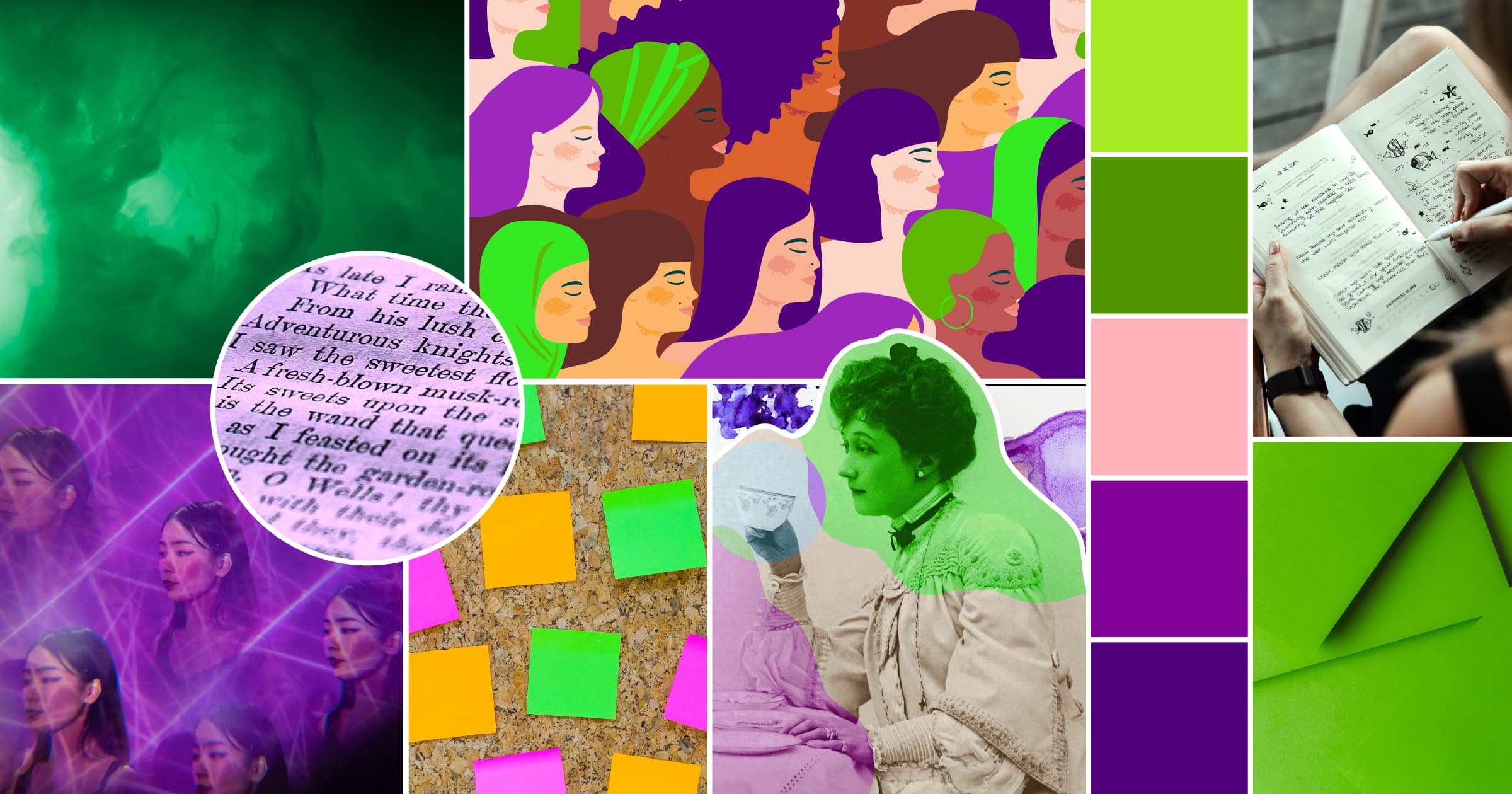
I gathered images that would represent the overall look and feel of the brand and website, taking into account the goals of the brand: to encourage action, women’s community, and feminism. Creating a mood board was key to defining the brand identity and the brand’s tone of voice: powerful, casual, and friendly.
Colour Palette
I chose traditional feminist colors because their meanings allow the brand to keep growing and expanding. Purple, historically associated with feminism, dates back to 1900 England and is a mix of blue and pink, traditional gender colors. Green represents the freedom to choose over our bodies and decisions, while pink serves as a contemporary addition to feminist colors, symbolizing the inclusion of all people who identify as women.

Logo Suite
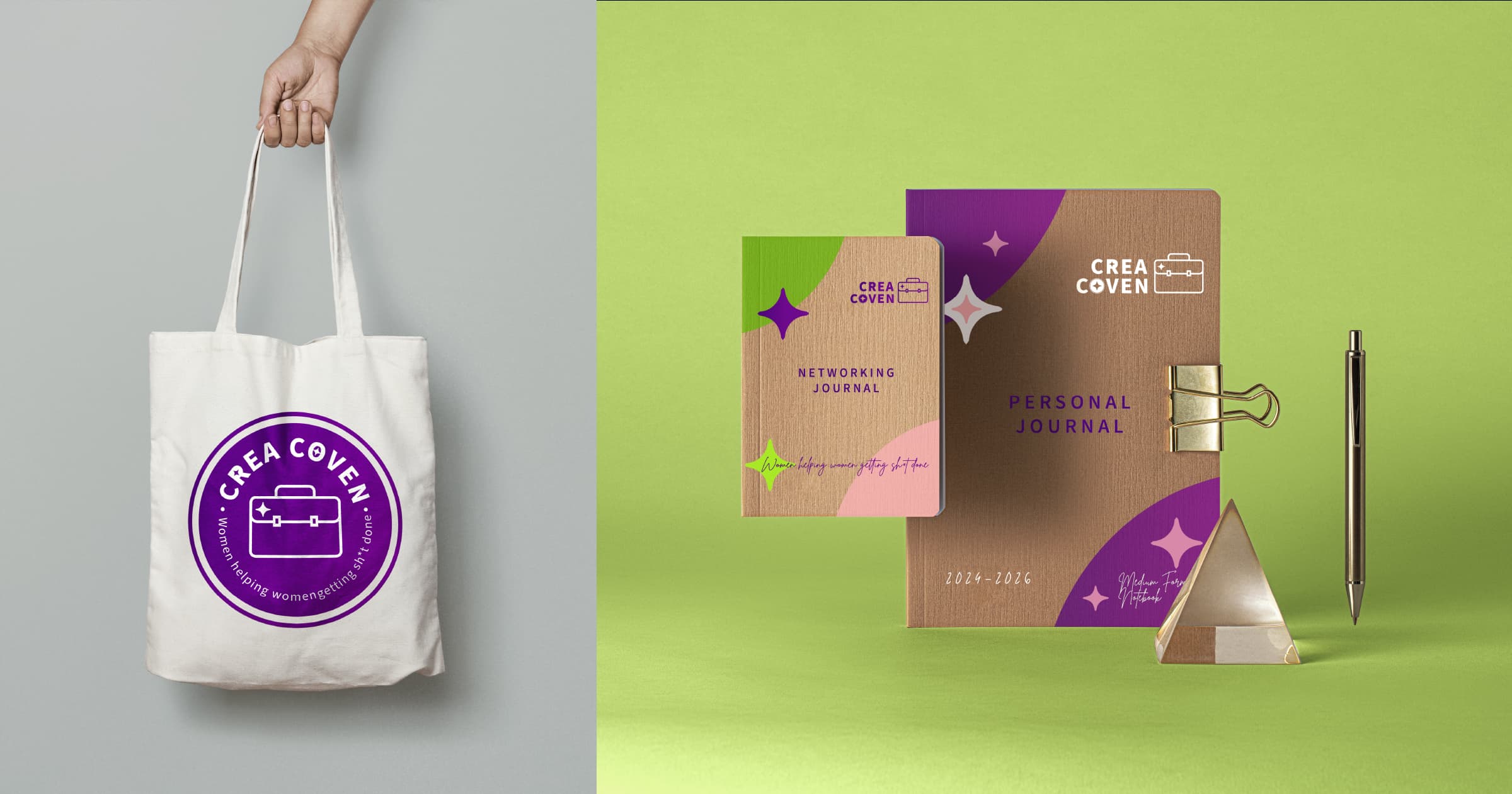
I created a collection of logos considering different applications for web and print. I started with the primary logo depicting a traditional business suitcase with the magic brand twist.
I also developed badges, icons, and logo variations to be used across the brand in digital applications and brand swag.
Building the Website
Based on the customer journey of three user personas (career-driven immigrant women), I began by creating a site map with the main categories and breaking them into three relevant sub-categories per topic. I utilized WordPress and Elementor Pro to manage both the back and front end of the website. It was my first time working with the 2024 version of Elementor Pro, so it took me longer to become accustomed to the new interface and locate features like columns and rows, which are now flexbox containers.


The bulk of the work for this website involved finding resources in different categories and organizing them in a visually appealing presentation. Despite the client being fictitious, I aimed to create a live website that served its purpose, so I decided to purchase hosting to integrate this project with my effort to contribute to community building.
Testing and Refining
After finishing the MVP, I conducted a usability with a group of five to refine the user experience. Giving me guidelines to improve button alignment, picture styling and task flow.