Plant Parents
This Design System is a collection of web elements and components to be used for the future development and launch of Plant Parents.
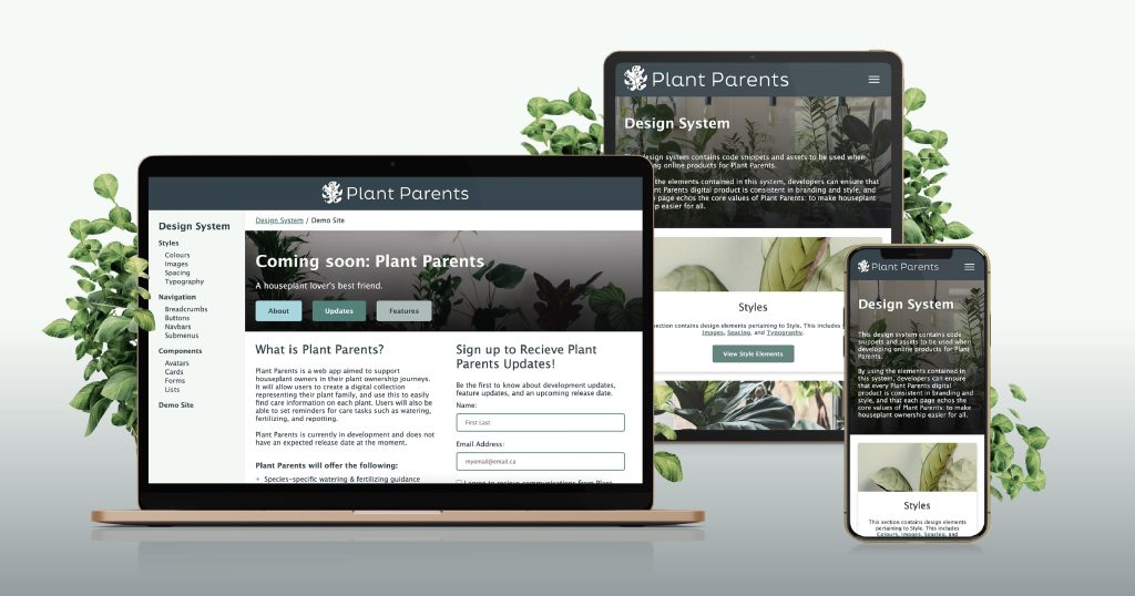
Plant Parents is a houseplant enthusiast’s online resource for being the best plant owner they can be. As a web app and a mobile app, Plant Parents helps users learn about their houseplants’ specific needs and allows them to create a digital catalog of their plant family, complete with customizable care reminders.
This design system will ensure that Plant Parents is accessible, mobile-friendly, consistent, and supports the big-picture mission of making people’s lives easier.
View the Plant Parents Design System live.
Ideation
My goal for this project was to focus on something I was personally interested in and could positively impact others. As a self-proclaimed “plant mom”, the idea of a product that could make life a bit simpler for houseplant owners felt like the perfect fit.
I chose to develop a design system to be used for the future development of the product. As I had never built a design system before, I was eager for new challenges and learning opportunities.
An inspiration for this project’s mission was Helen Greiner, Chairwoman and Co-Founder of iRobot. In 1990 Helen sought to reduce housework and give individuals more time to spend on the things that matter. In doing so, she invented the Roomba.
After identifying pain points and need statements, I conducted a competitive analysis. While other websites offered a wealth of information about houseplants, Plant Parents would provide unique value by prioritizing simplicity and a personalized experience.
Branding & Design
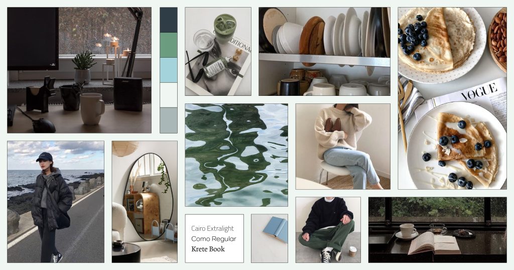
When developing the branding of Plant Parents, my priority was to create a system with a clean, cohesive, and positive user experience. My mood board was inspired by the colours of the Pacific Northwest, and I wanted to evoke feelings of simplicity and comfort.
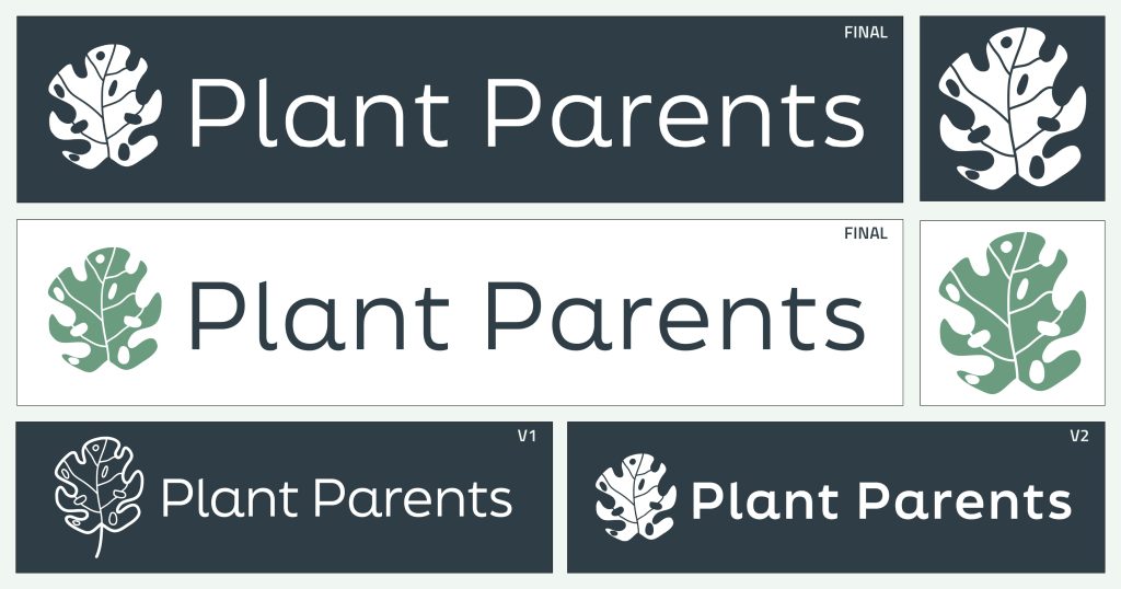
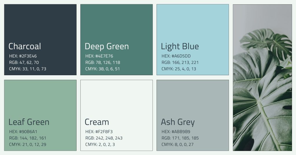
Next, I put together the brand colours and logo. Throughout the project, the logo and brand colours changed in response to user feedback, and to allow for improved colour contrast.
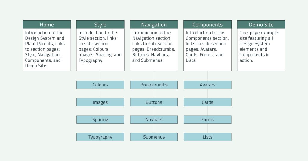
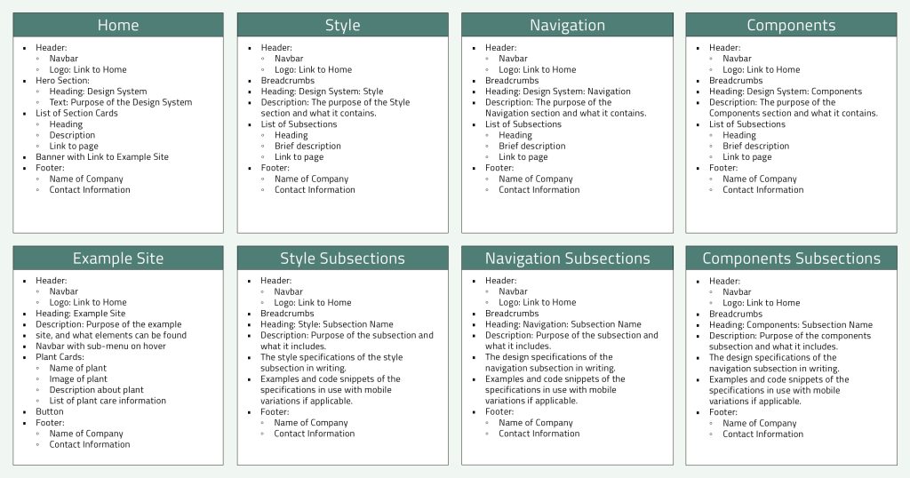
Once the branding and vision for the system were complete, I put together an overview sitemap and a detailed sitemap. The overview sitemap outlined the navigation structure and purpose for each page, while the detailed sitemap listed the specific content that would be found on each page.
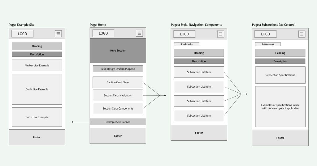
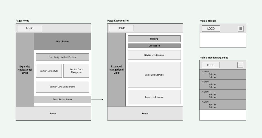
I then created low-fidelity wireframes to plan the layout of the design system on both desktop and mobile devices.
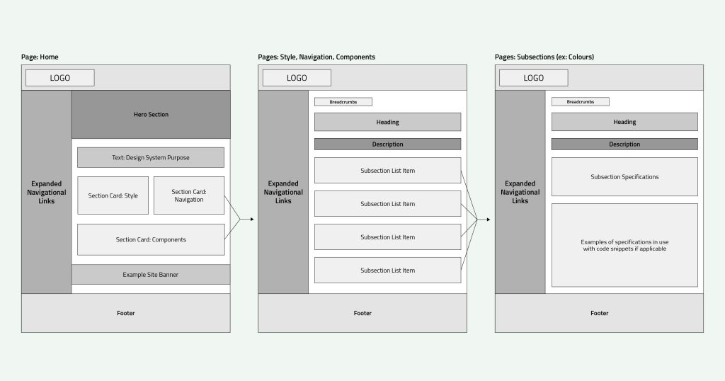
Development
I built the design system using HTML, CSS, and JavaScript. I started by building the HTML structure of the entire site, then used CSS and JavaScript to add style and functionality, including mobile responsiveness.
Next, I started working on the elements of the design system. I created a Codepen Library to house the elements, then populated a page for each element, which included a link to the corresponding Codepen, a short description, and an in-page example of the element in context. I later added quick summary sections to the top of each element page so that developers in a hurry could quickly and easily pull the information they were looking for.
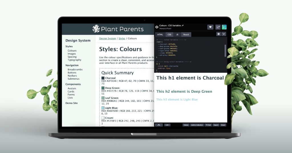
After completing the design system, I built a one-page Demo site to display the elements in action.
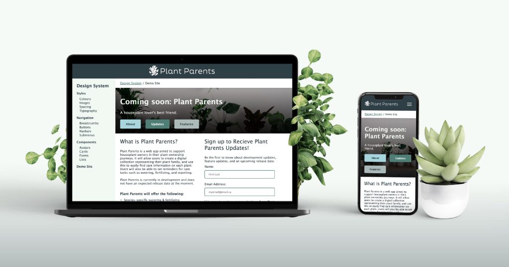
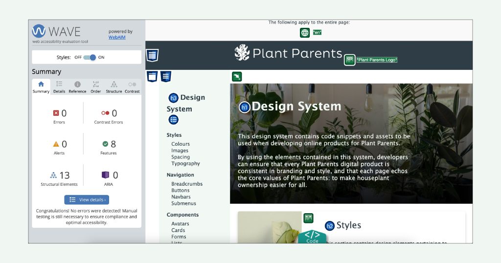
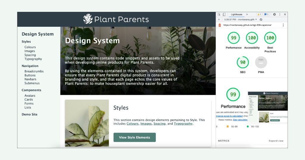
In the final stages of the project, I conducted accessibility and quality assurance testing, making adjustments as needed. I modified my code to pass validation tests, modified alt text for images, and improved colour contrast. I also optimized the site performance by reducing image sizes to improve page speed.
