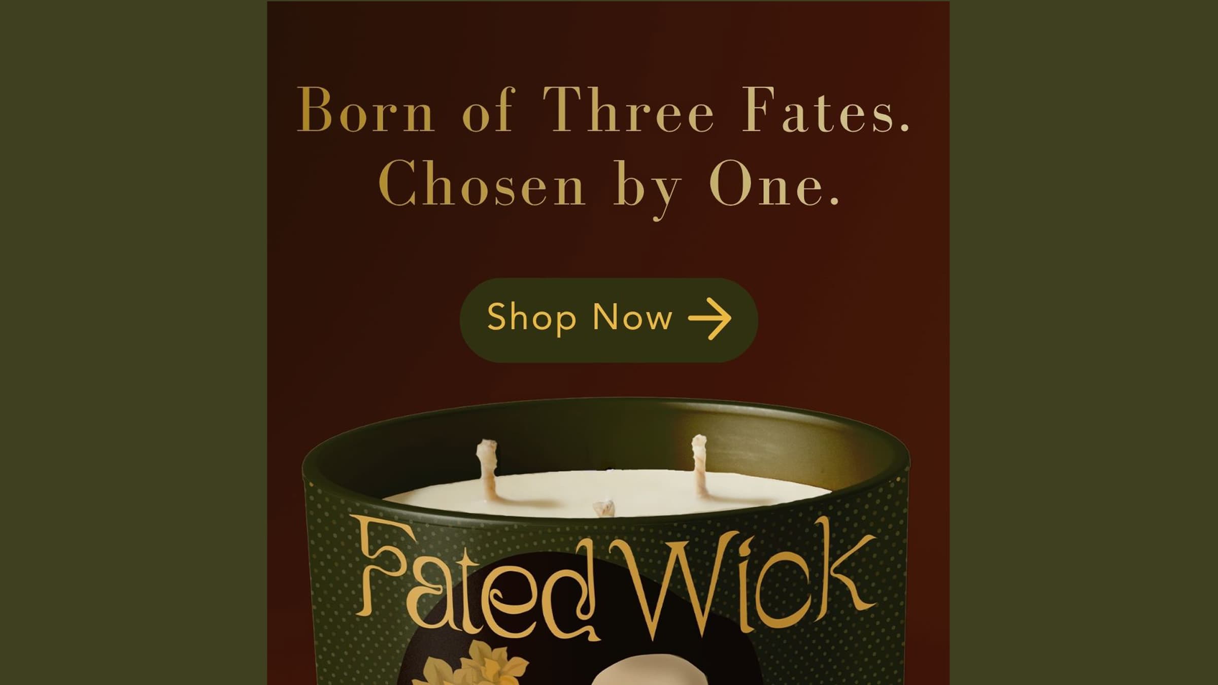
Fated Wick
Fated Wick is a boutique candle brand inspired by Greek mythology, designed to turn a simple purchase into a more immersive and story-driven experience. Instead of choosing a specific candle, customers receive one selected by fate, introducing a sense of mystery and anticipation.
For this project, I focused on building a cohesive brand identity that feels elevated and intentional. This included developing the visual system, packaging, and a responsive landing page, along with a supporting digital marketing strategy.
The final result is a collectible product that blends storytelling with design, encouraging curiosity, emotional connection, and repeat engagement through the idea that each outcome is part of a larger narrative.
Proposed Solution
My solution was to create a mystery-based candle brand that uses mythology and storytelling to stand out in a saturated market. Rather than letting users pick a specific product, the experience is built around the idea that fate determines what they receive.
To support this, I designed a full brand system including the logo, typography, packaging, and a narrative-driven landing page. I also incorporated a quiz to guide users through the experience, encourage engagement, and collect emails.
Justification
The candle market is heavily driven by aesthetics, and a lot of brands start to feel very similar. I wanted Fated Wick to feel different by focusing on experience rather than just appearance.
The mystery element adds a layer of excitement and makes the product feel more personal and collectible. It also naturally encourages repeat purchases, since customers don’t know what they’ll receive.
Using mythology gave me a strong foundation for storytelling and made it easier to build a brand that feels cohesive and intentional. It also works well across marketing, packaging, and product design, helping everything feel connected.
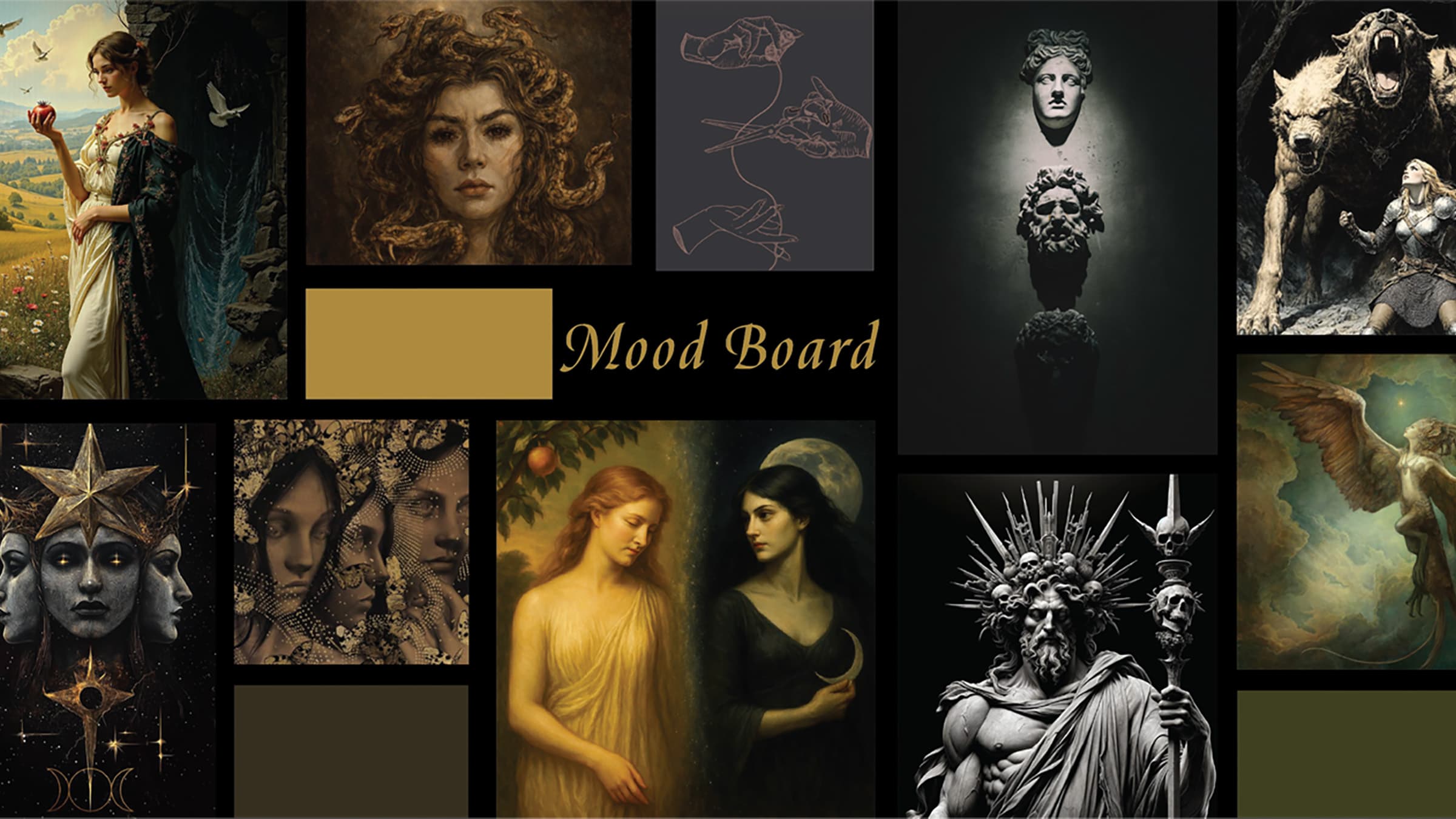
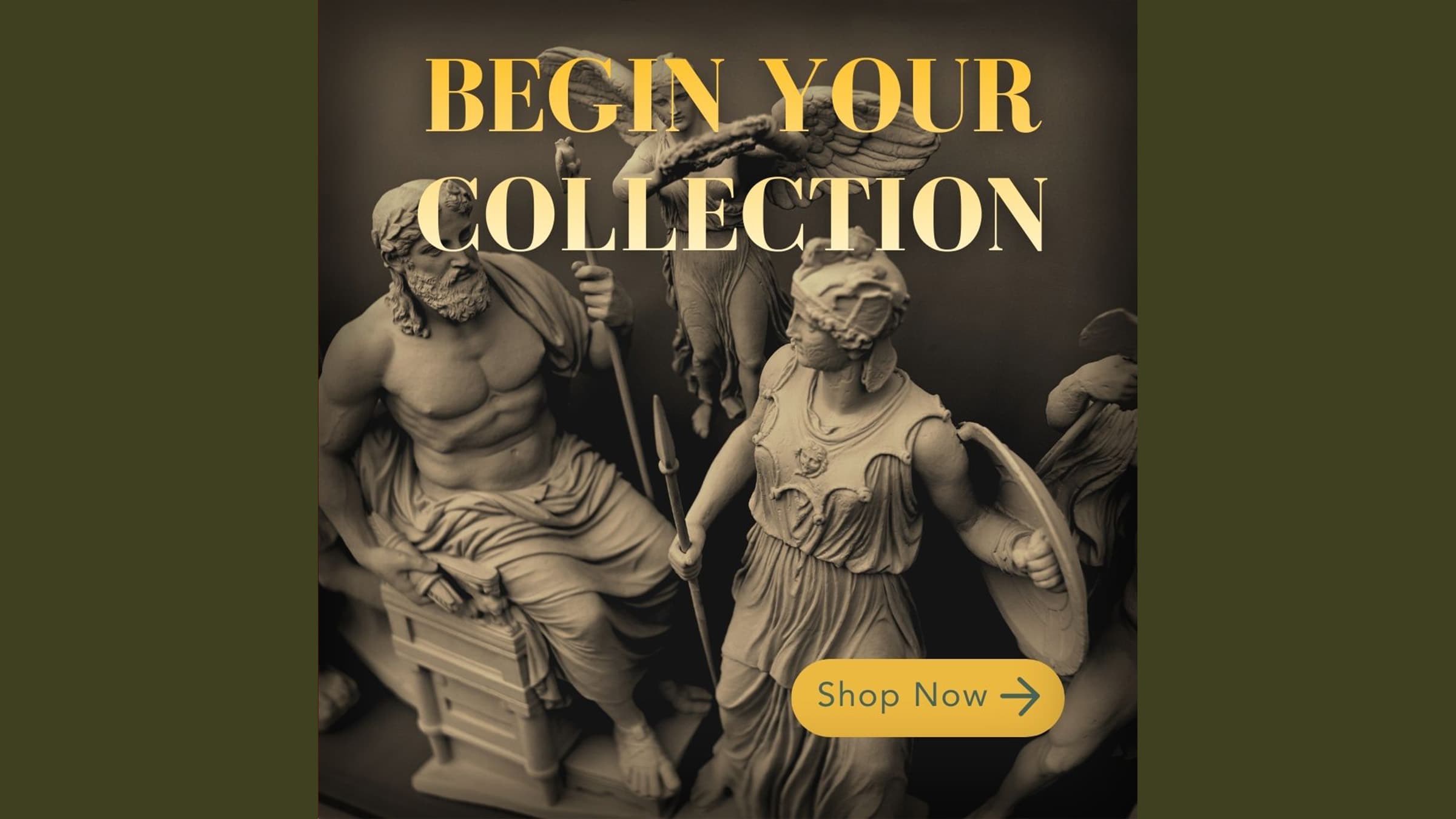
Brand Development
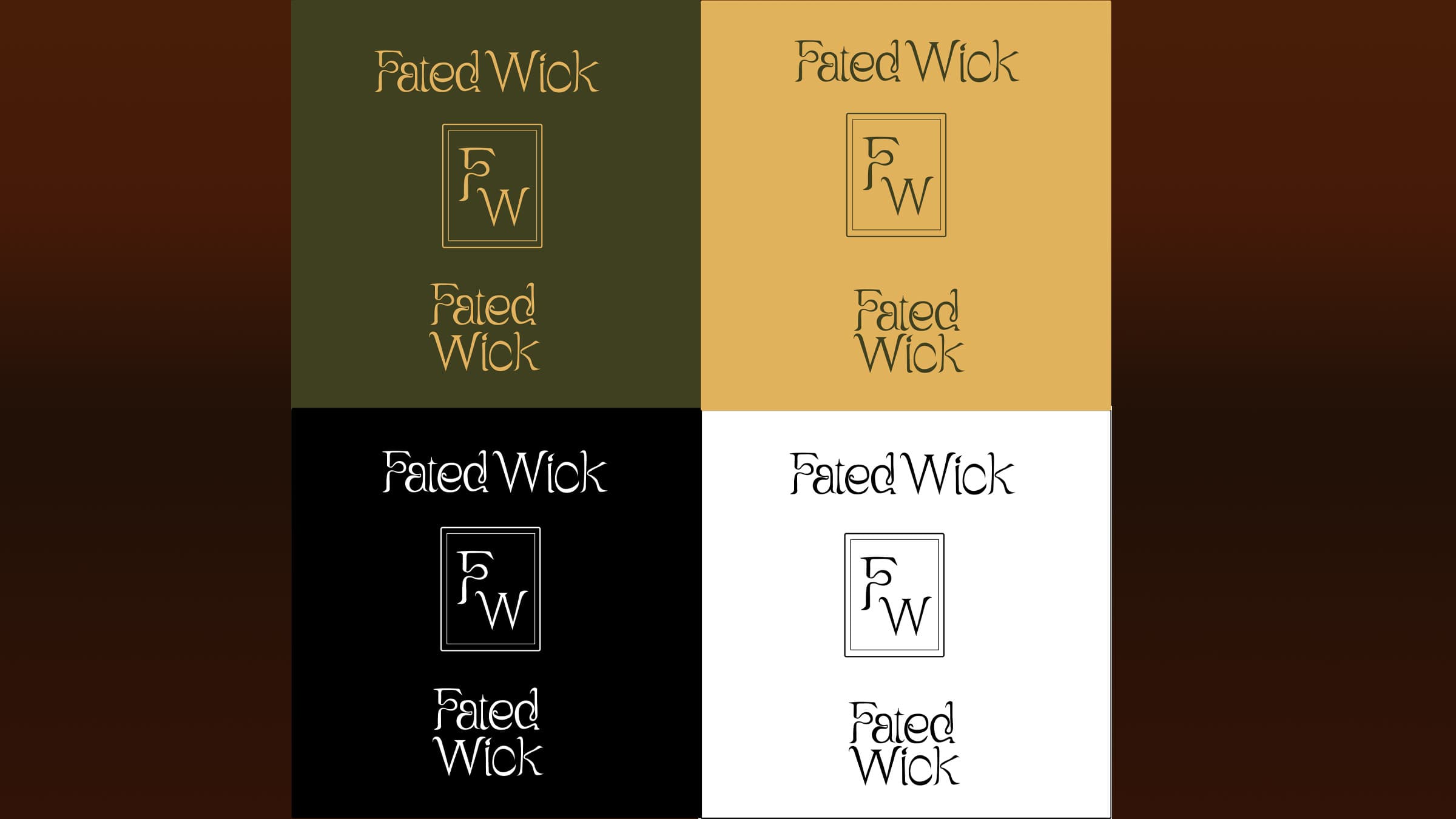
I started by defining the overall concept, tone, and visual direction of the brand. The idea of fate and mythology guided most of my decisions, especially when it came to mood, colour, and typography.
I developed a custom logo and chose a colour palette that feels rich and slightly moody to reflect the theme. The goal was to create something that feels premium but still intriguing.
Check out the entire style guide.
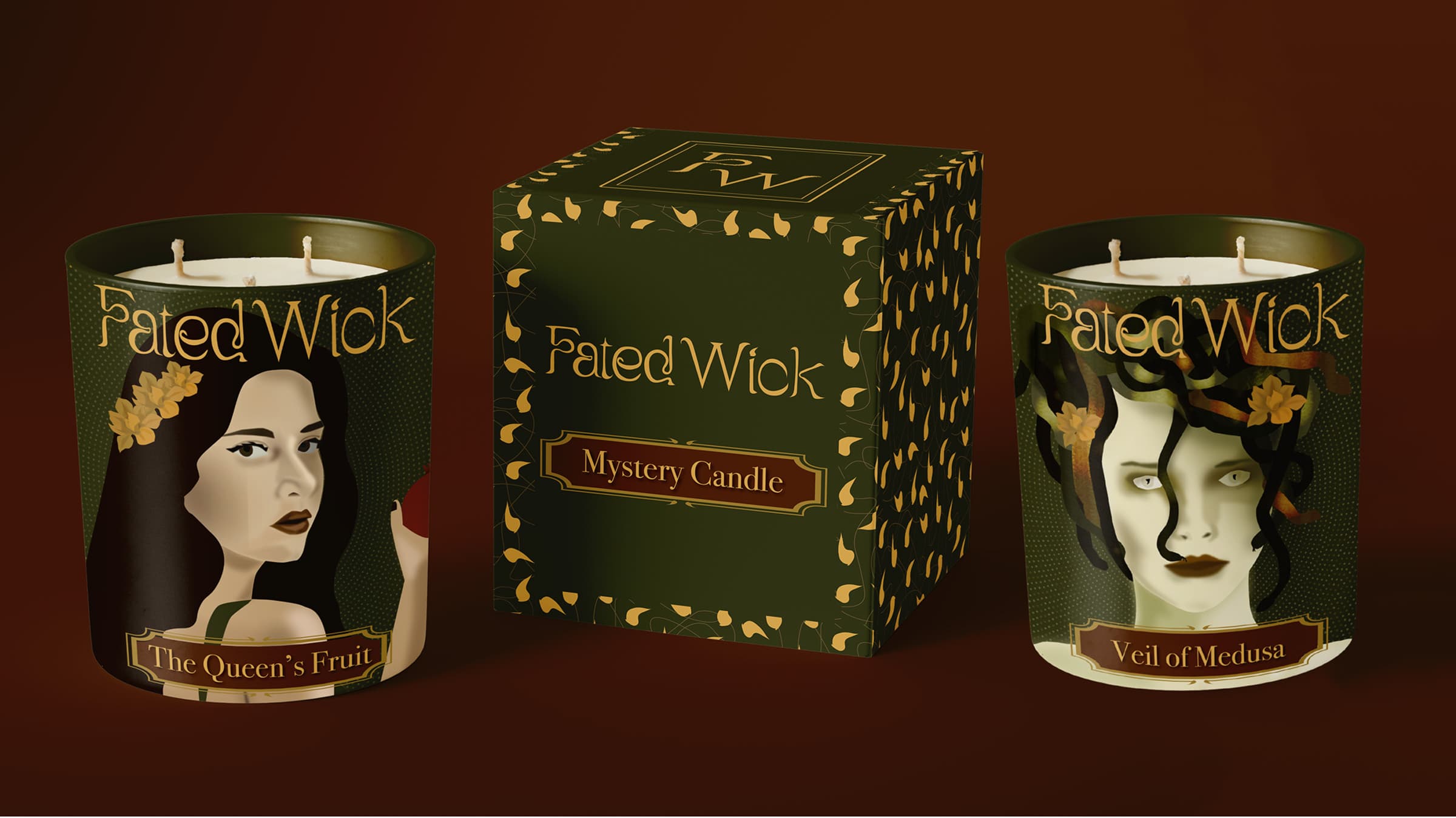
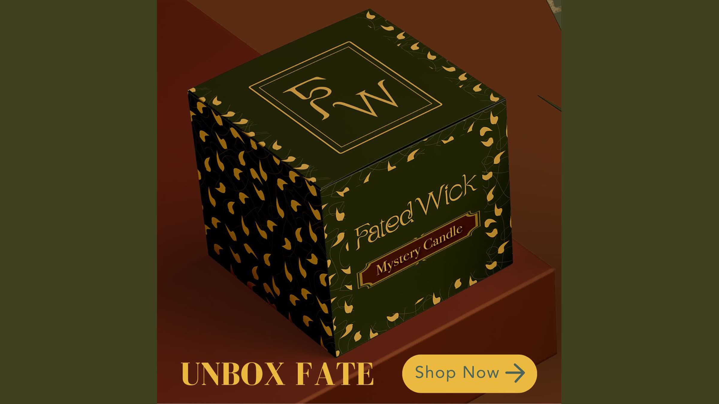
Packaging Design
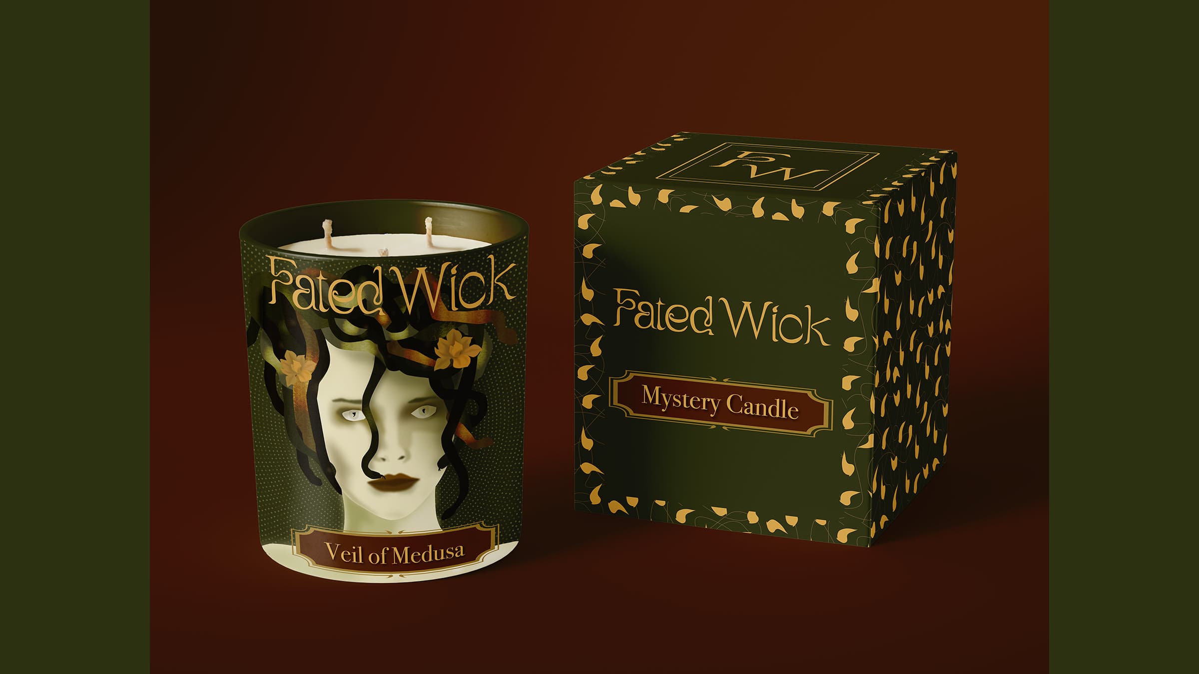
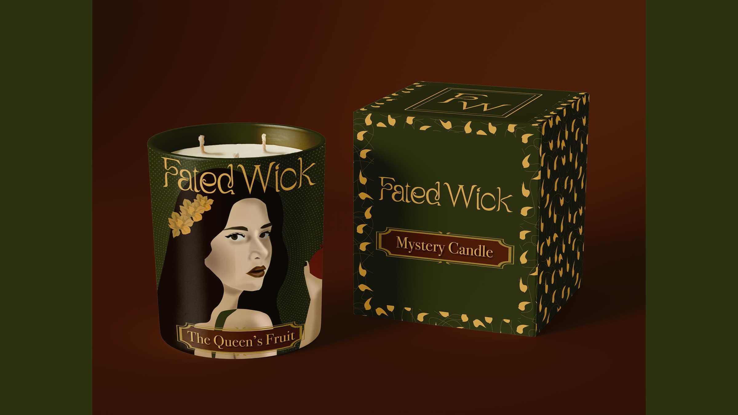
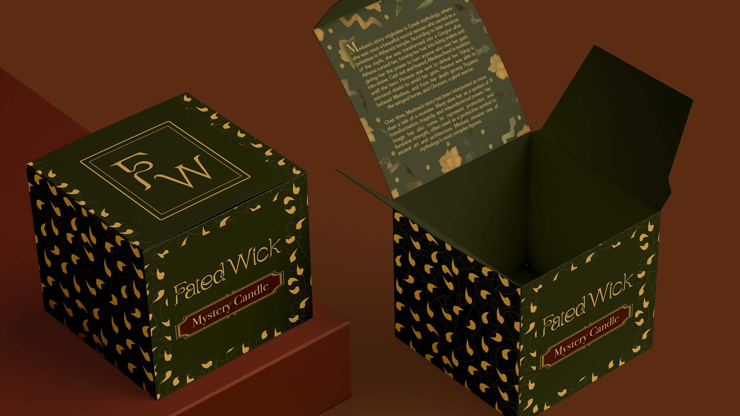
Packaging played a big role in this project because it’s a key part of the overall experience. I wanted the unboxing to feel intentional and slightly unexpected, reinforcing the idea that each candle is chosen by fate.
The exterior packaging stays consistent through the use of the brand pattern, while the interior changes depending on the character that you receive. This contrast helps create a sense of discovery and makes each candle feel more personal and collectible.
A big part of this was developing custom illustrations for each candle. I wanted each design to reflect the character it represents while still feeling cohesive within the brand. I started by exploring visual motifs tied to each figure. For example, Medusa incorporates snakes and organic forms, while Persephone uses pomegranates and floral elements to reference her connection to growth and the underworld.
I then developed the illustrations digitally in InDesign, focusing on compositions that would translate well onto the candle labels. I paid close attention to balance and contrast to make sure the designs stayed readable while still feeling detailed and immersive.
One challenge was making sure each illustration felt distinct without breaking the overall visual system. I addressed this by keeping elements like colour palette and overall composition style consistent across all designs.
These illustrations became a key part of the product, helping each candle feel unique while strengthening the storytelling and collectability of the brand.
Digital Marketing Strategy
To support the launch of Fated Wick, I developed a three-month digital marketing campaign focused on building brand awareness and driving early sales. The goal was to create intrigue around the idea of fate while encouraging users to engage with the brand before purchasing.
I focused primarily on TikTok, since short-form video works well for unboxing and storytelling. The content was structured in phases to build momentum over time. The first month introduced the brand through cinematic packaging and mood-focused videos with messaging like “Your fate awaits.” The second month shifted to unboxing and reveal content to highlight the different outcomes and make the experience feel more tangible. By the third month, the focus moved toward conversion, using messaging that emphasized collectability and gifting.
Alongside this, I developed Google Ads to capture more direct purchase intent. These ads used clear messaging and strong visuals to balance intrigue with clarity.
To measure success, I defined key performance indicators, including a click-through rate of 1.5 to 2.5 percent, a conversion rate of 2 to 4 percent, and a target of 75 to 150 purchases within the first three months.
Overall, the campaign was designed to guide users from curiosity to engagement to purchase while staying consistent with the brand’s tone and storytelling approach.
Landing Page Design
I designed a responsive landing page in Figma that walks users through the brand and the experience. Instead of a typical “how it works” section, I framed it as a journey to keep it on theme.
One challenge here was making sure the messaging was clear. Since the product is mystery-based, I needed to explain that the quiz is for engagement and doesn’t determine the candle, without breaking the tone of the brand.
Figma embed link:Check out the landing page online.
Risks & Mitigation
One of the biggest challenges was making sure the mystery aspect didn’t feel confusing or misleading. I addressed this by refining the copy throughout the site to clearly explain the experience while still keeping it on theme. I also made it clear that the quiz is meant to guide engagement, but does not determine the candle, as fate ultimately decides the outcome.
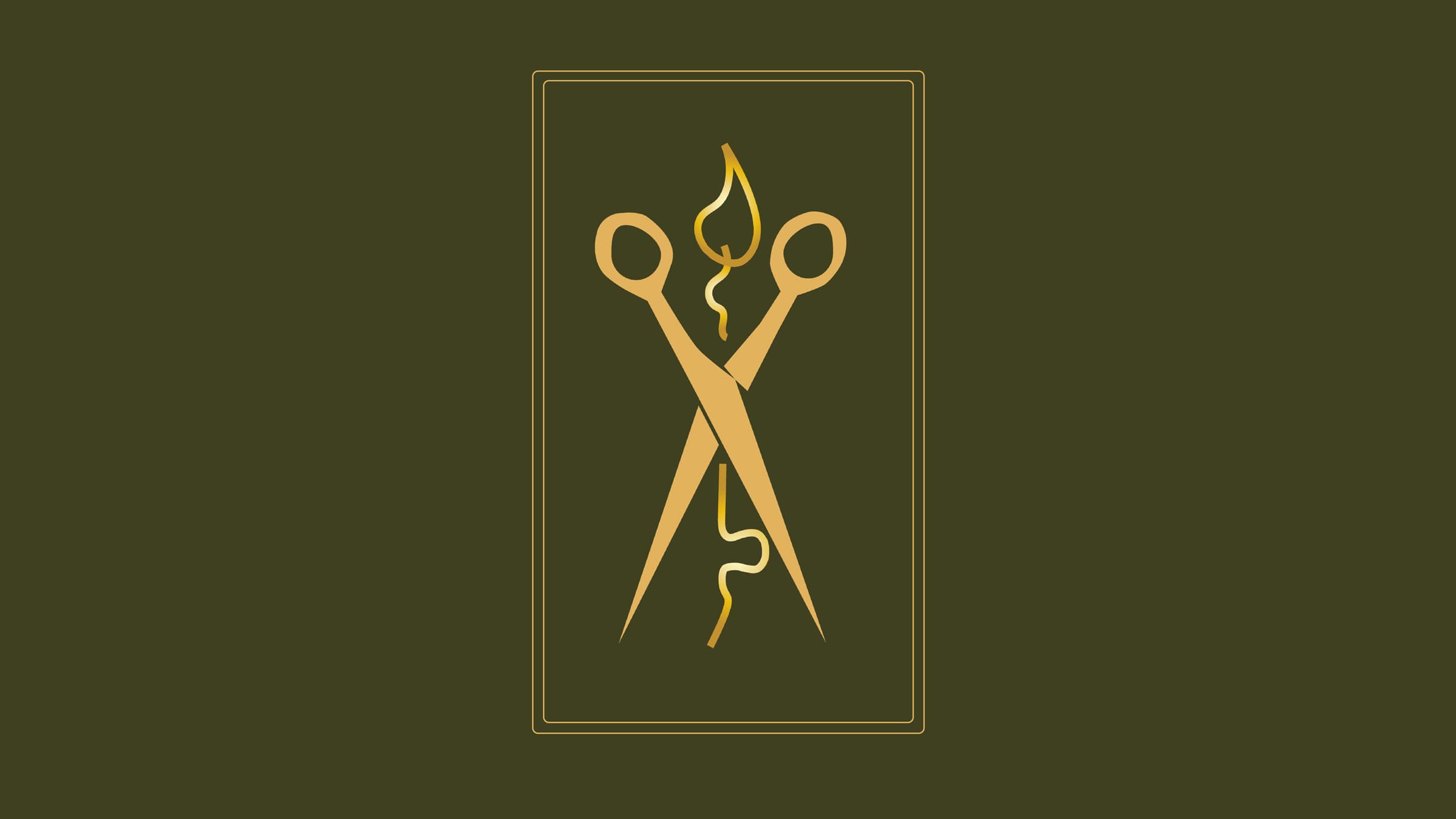
Another challenge came up with the logo design. My initial concept focused heavily on the Greek Fates and included scissors cutting a lit wick. While this is tied closely to the mythology, I realized it could be confusing for users who are not familiar with that reference. I decided to simplify the logo and refine the Fated Wick pattern to create something more accessible while still maintaining the overall concept.
Final Outcome
Fated Wick shows how storytelling can elevate a product into something more than just a purchase. By combining mythology, mystery, and thoughtful design, the brand creates a more engaging and memorable experience.
The final result is a cohesive system that works across product, packaging, and marketing, and can easily expand with new characters and collections over time.