Alpine Supply Co.
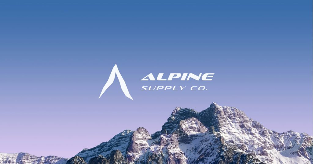
Alpine Supply Co. is a new, albeit fictional, mountain supply and apparel company based in Whistler, British Columbia. The company specializes in mountaineering and casual apparel such as t-shirts, winter jackets, and toques made from recycled materials.
For the company’s inaugural launch event, this project aims to develop the brand identity of the company as well as to create the first of the collateral assets for the brand. In addition, the project will provide the company with a new social media campaign for its launch event and a landing page.
Moodboard
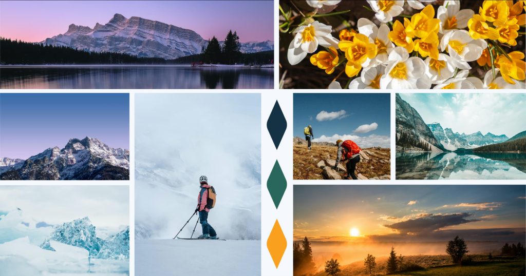
Before starting on the branding for the company, the first step was to define the overall feel of the brand. The mood board displays the brand’s colours and how they tie in with the natural surroundings of Whistler, the overall feel of the brand, and how its clients perceive it. As the company is deeply rooted in its natural surroundings, many of the shapes found in nature include sharp and flowing edges which help influence many of the brand’s design styles.
Brand Logos
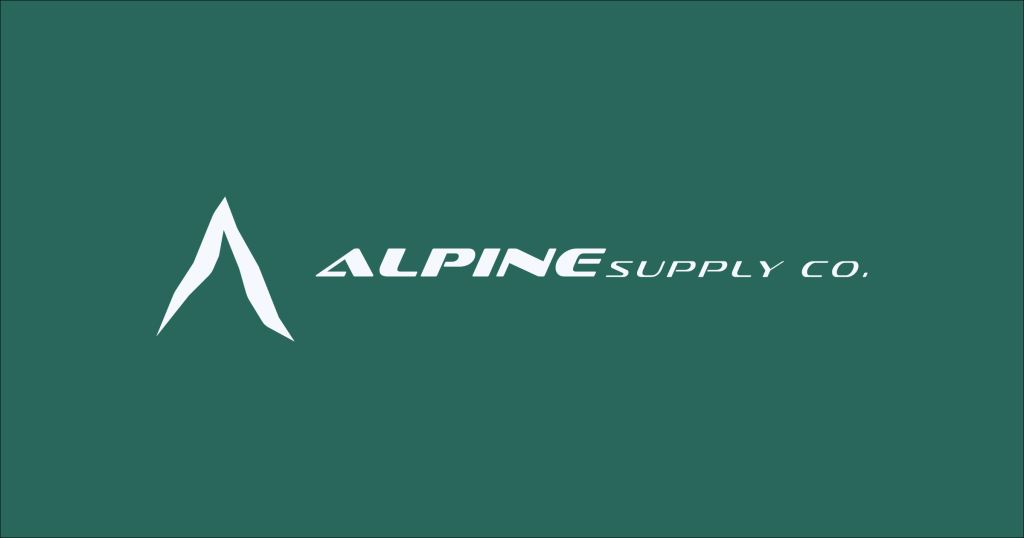
Taking inspiration from the mountains of the Whistler area, the logo incorporates the sharp, jagged lines from a mountaintop shape into an “A” shape to represent the name “Alpine”. The logotype is designed to represent the flowy and smooth curves of a river. These combined make a simple contrast between sharp and curvy lines in the logo.
Logo Variations
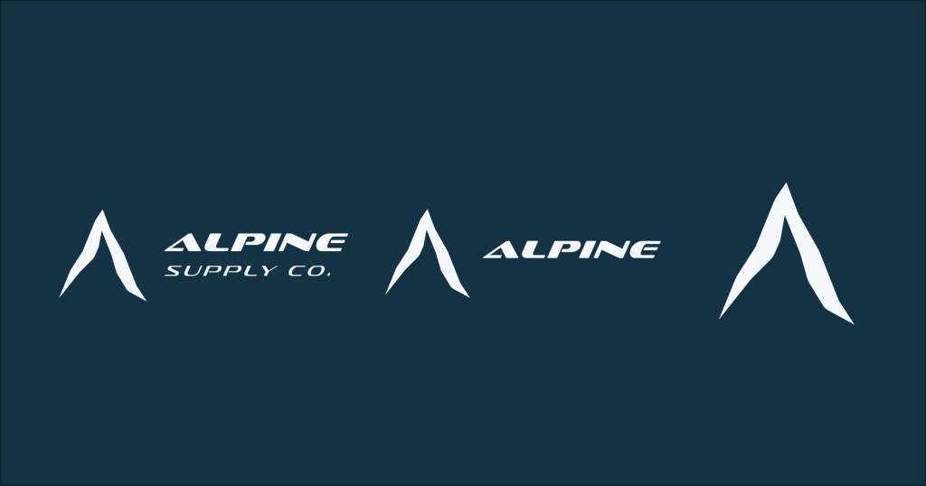
To make the brand’s logo applicable to their various needs, three logo variations were designed to fit their needs.
Colours and Typography
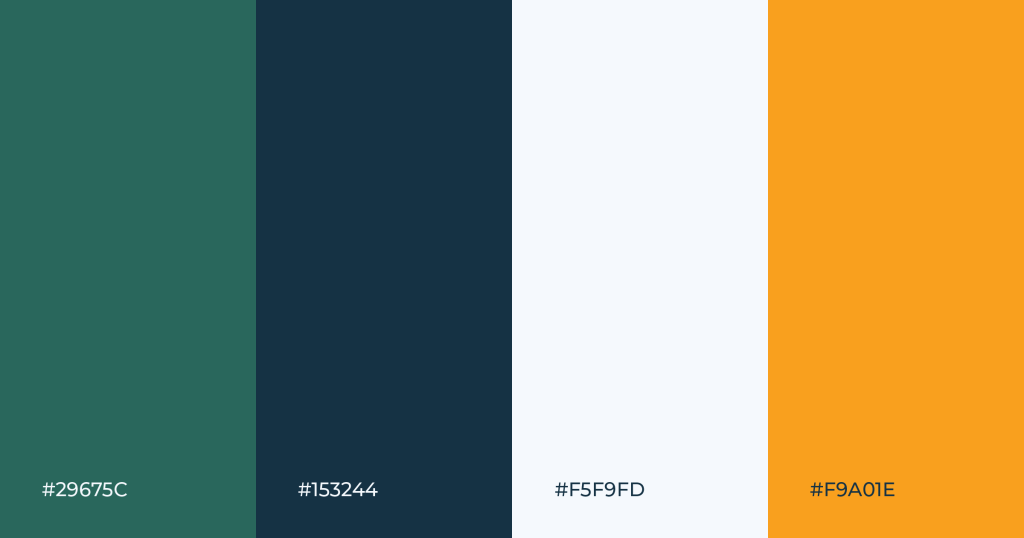
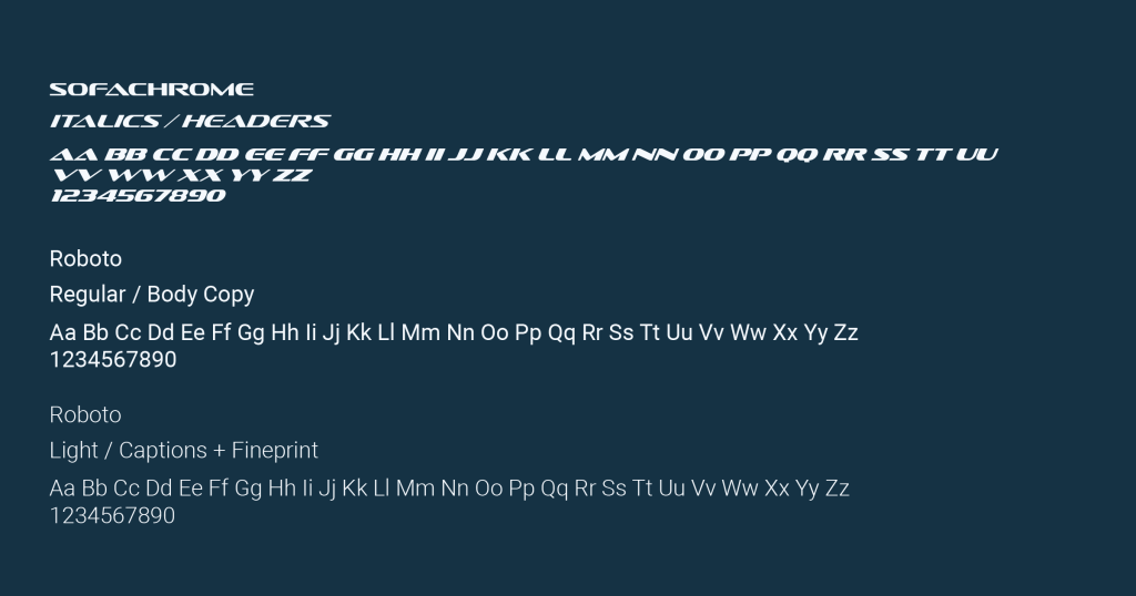
The colours selected for the brand are made to represent the natural colour palette of the company’s natural surroundings. The dark blue and amber yellow represent the shadows of the mountains and the light from the alpine glow, while the teal represents the waters of Rainbow and Lost Lake. Finally, the light white blue represents the blanket of snow covering the mountains in the area.
The primary typography used for the brand headers, titles, and sub-headers is “Sofachrome”, which is a modern, industrial font used to replicate the flowing shape of rivers, as well as to provide a modern and simple touch to the company’s brand identity. For the secondary typography, “Roboto” is used for the main copy and captions for the brand, the sans serif font gives a minimalistic yet modern feel for the brand. Both typography work together to create a cohesive design feeling of modern, simple, and natural.
Style Guide
The use of the style guide is to provide the client with a collection of a brand’s design elements and rules for print and web, consisting of graphic elements, colours, typography, and guidelines for different assets.
Check out the style guide on ISSUU.
Collateral
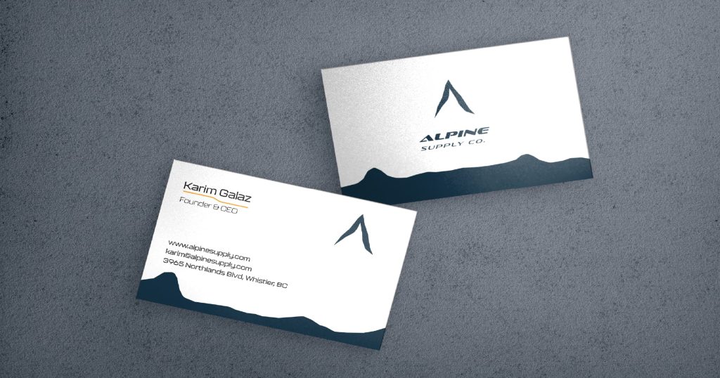
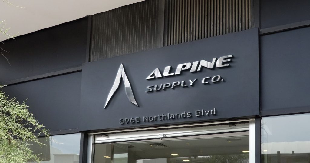
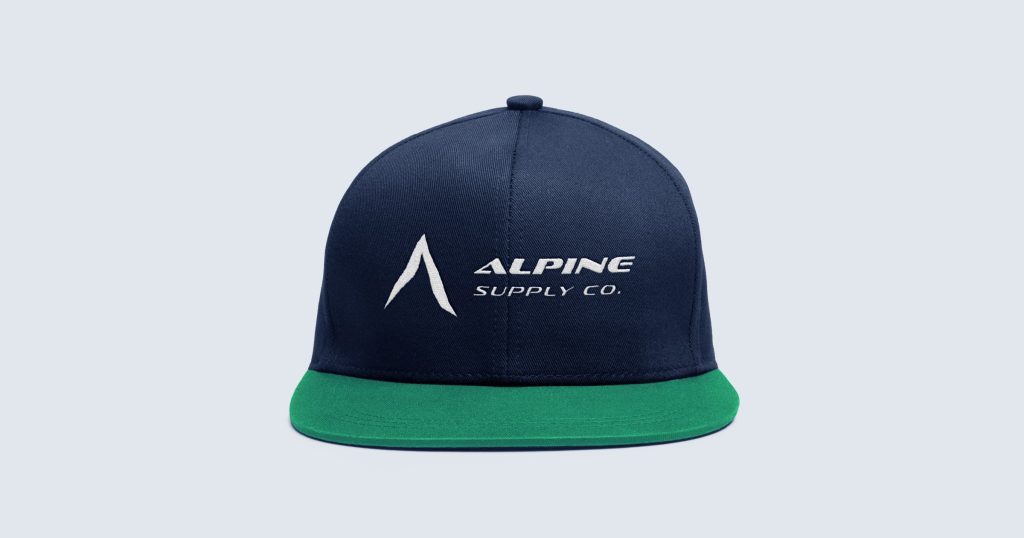
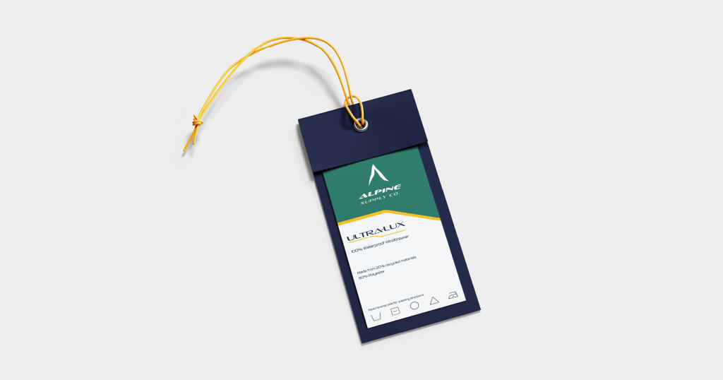
For the brand’s collateral assets, five different items have been created, ranging from corporate signage, business cards, apparel items, a product tag, and an aluminum bottle. These assets demonstrate the various uses of the brand’s different logo variations as well as the colours the brand utilizes. In addition, the collateral assets showcase the different design styles the company uses in their products.
Social Media Campaign
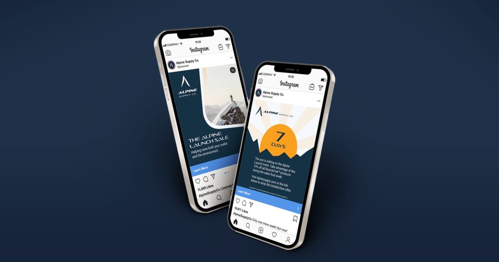
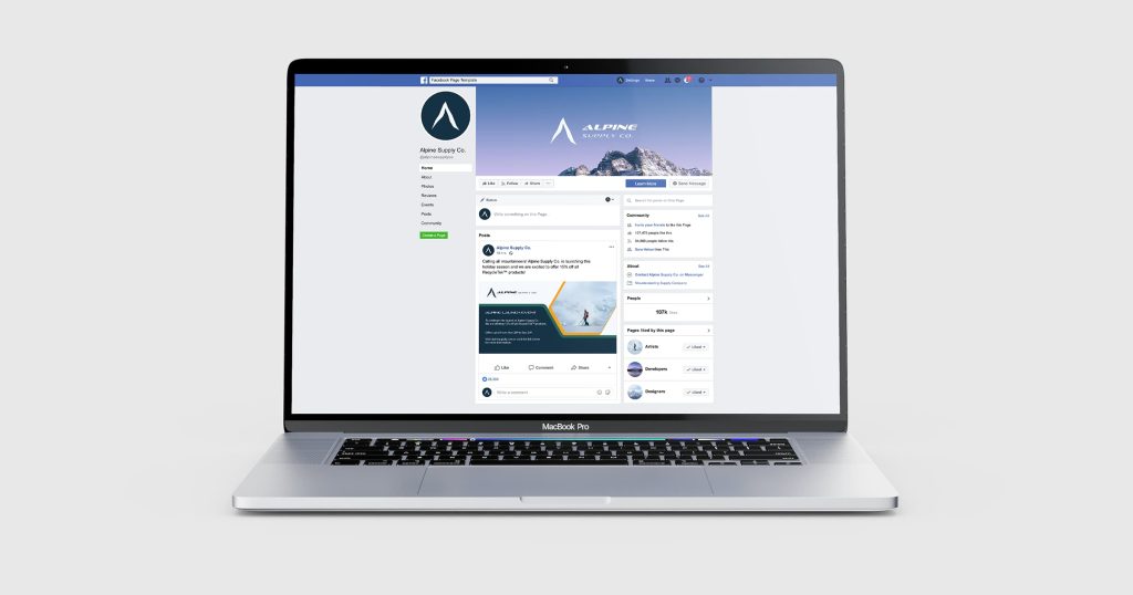
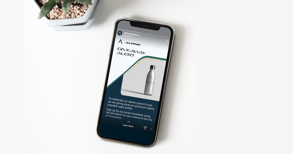
The brand’s social media campaign involves utilizing several social media platforms to promote a 15% discount for their inaugural launch event. This campaign involves creating ads such as carousels, stories, reels, and posts to use on their Instagram and Facebook pages.
Landing Page
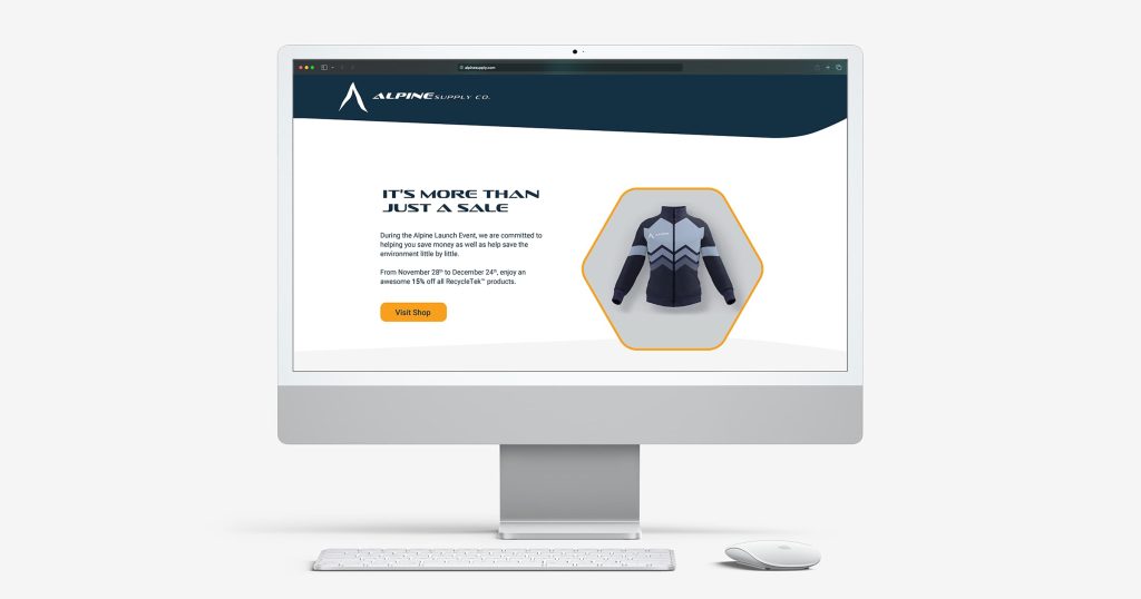
The landing page serves as the final step to convert customers from browsers to buyers. To keep the landing page similar to the brand’s social media posts, it incorporates similar design elements such as overlapping lines to create a fluid section divider and curvy lines rather than straight lines. The landing page functions to remind the customer of the sale and uses bright colours to draw their attention toward the shop button and make a purchase. In addition, the landing page is designed to remain simple and modern just like the company’s brand identity.
