Kaamos Streetwear Brand
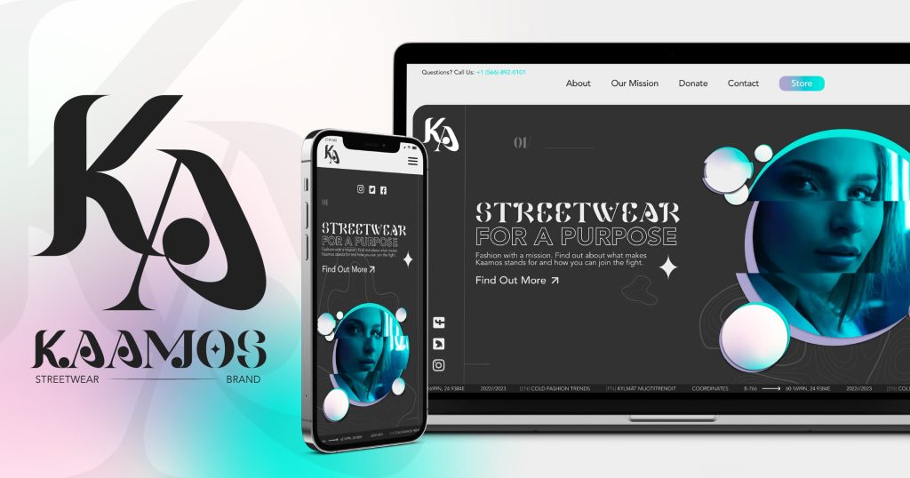
Kaamos is a Finnish-Canadian streetwear brand based in British Columbia, Canada. This brand aims to tell the story of post-soviet tensions between Finland and its neighbouring countries through design. Kaamos streetwear brand is stylistically inspired by the culture, industrialization, and militarization of Eastern Europe.
This project aims to exhibit thoughtful design decisions and the visual styles of current industry trends. This involves establishing a unique brand identity, creating a dynamic logo suite, a modern colour palette, an intricate typographic design system, and a functional landing page prototype. This process also involves conducting a thorough audit of the current marketplace competition and developing an effective digital marketing campaign.
Check out the project on ISSUU.
Defining The Problem
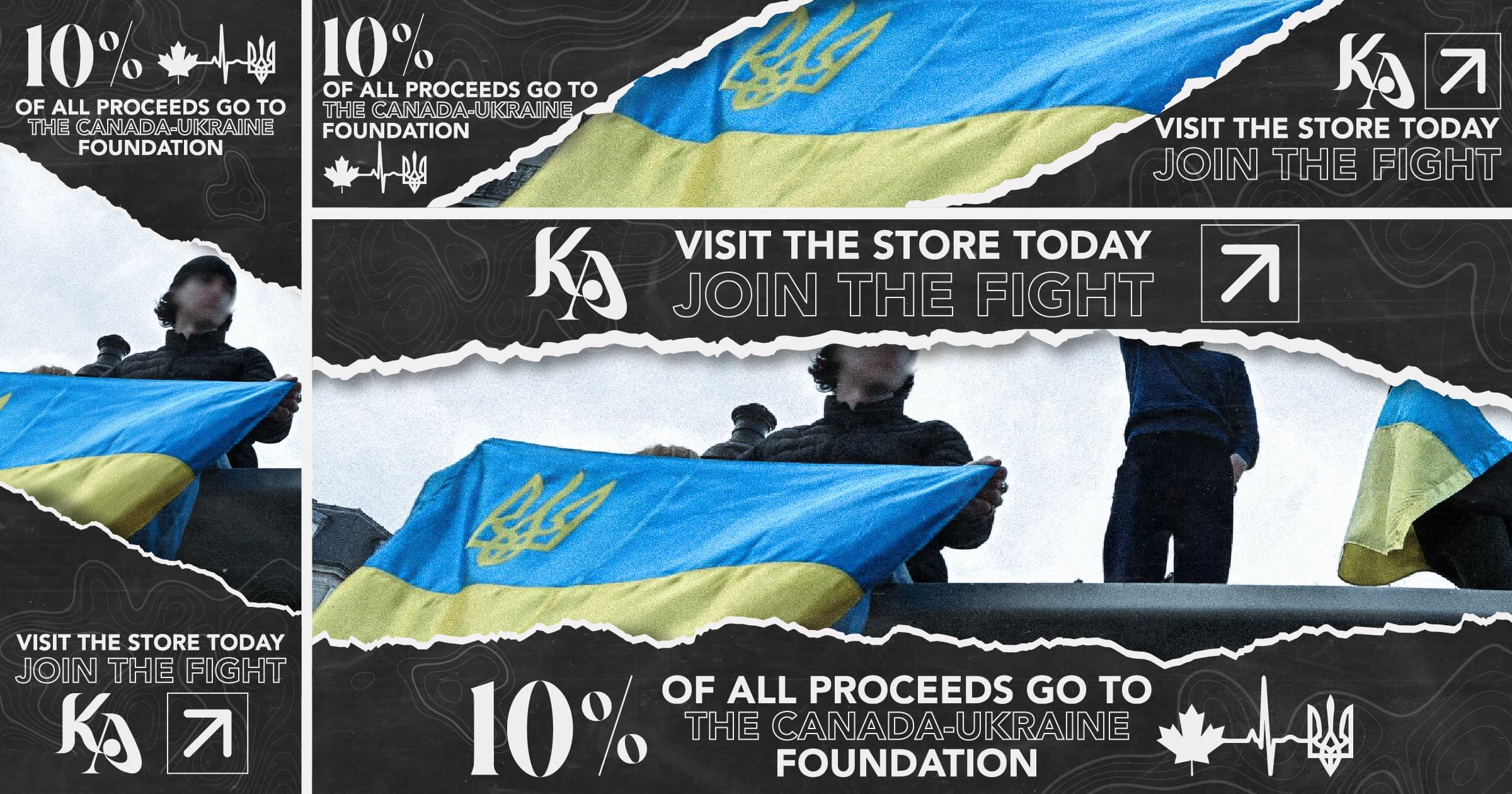
I started with the idea to create a clothing brand that would donate a portion of the proceeds to the Ukraine-Russia conflict. I sought to empathize with the needs, goals, and perspectives of the consumer and discovered a larger demographic of consumers seeking brands that contributed to social and political conversations.
From there, I started to define how to put human context behind a brand that stood for a social-good initiative while competing within a sector of the streetwear market.
Ideation
Before starting any project, I like to ideate a list of descriptors that I can use as a reference point for establishing the tone and feel of the project.
- Cold
- Edgy
- Eccentric
- Urban
- Monochrome
- Avant-garde
Once I had a list of words that described the overall tone, I moved on and created a moodboard that would visually encapsulate the chosen list of descriptors and establish a jump-off point for my branding.

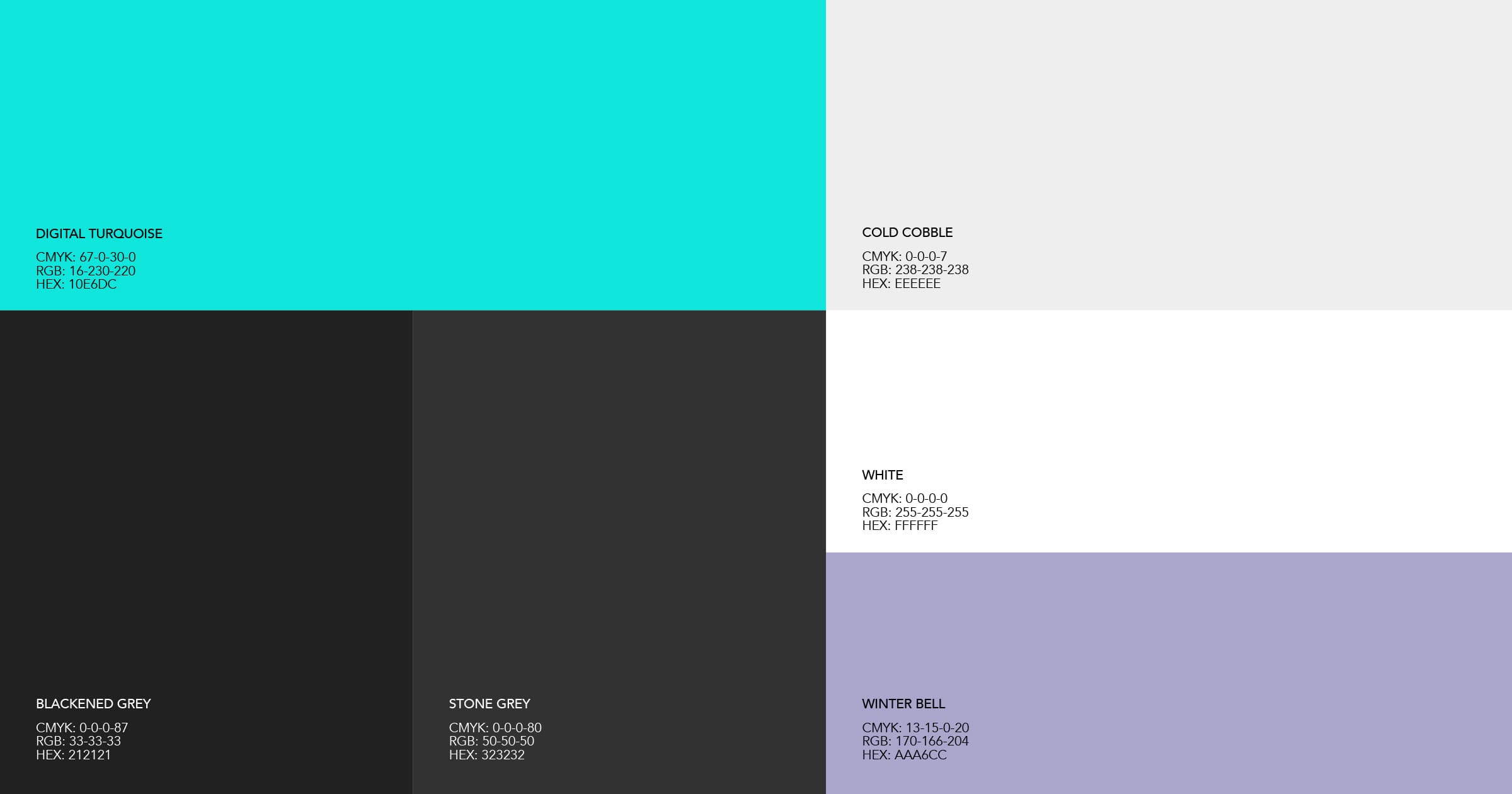
Colour Palette
I chose colours that evoked the mood of the written words and went for a monochromatic primary palette, with a bright accent colour followed by a muted pastel tertiary colour.
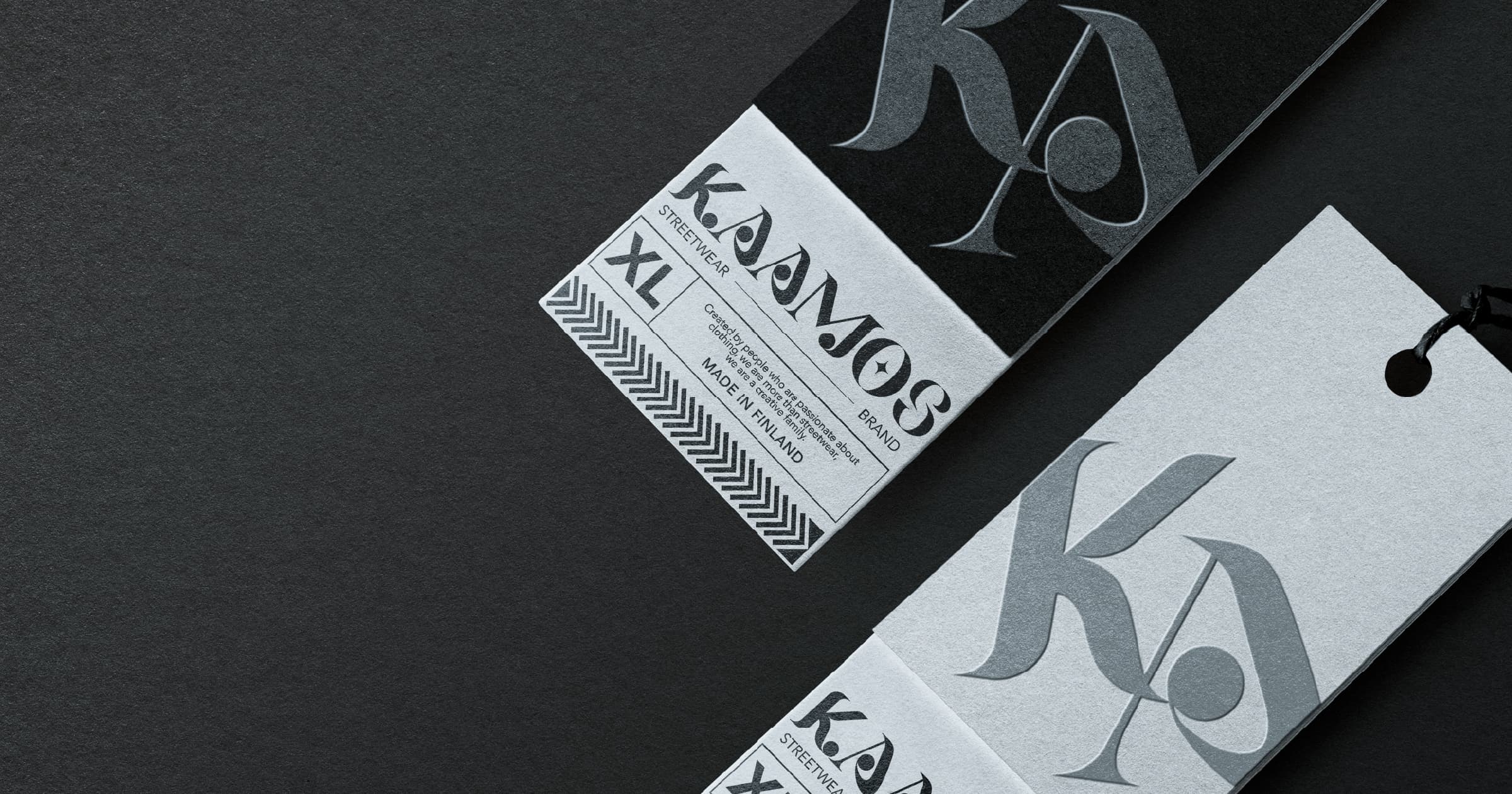
Logo Suite
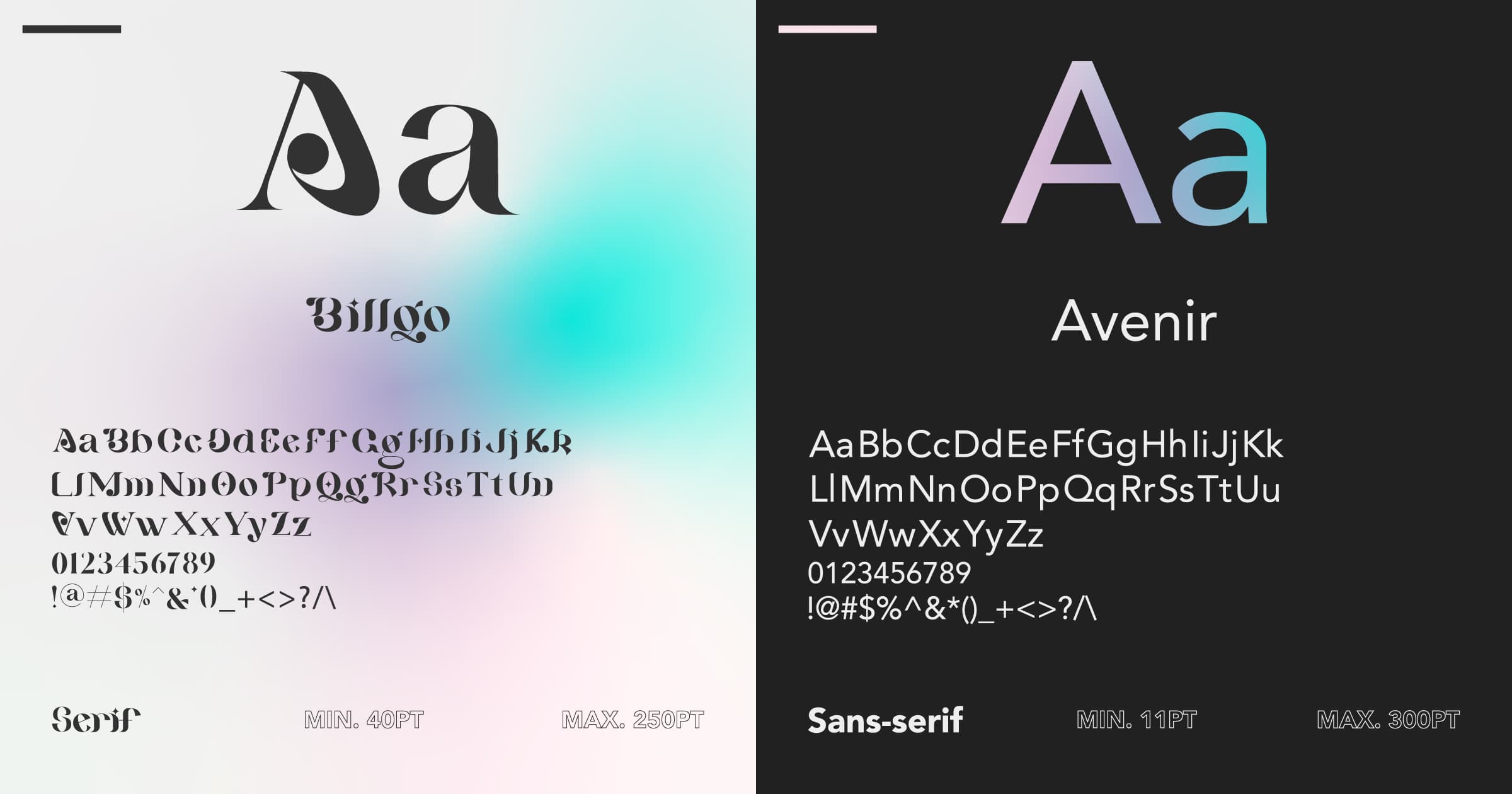
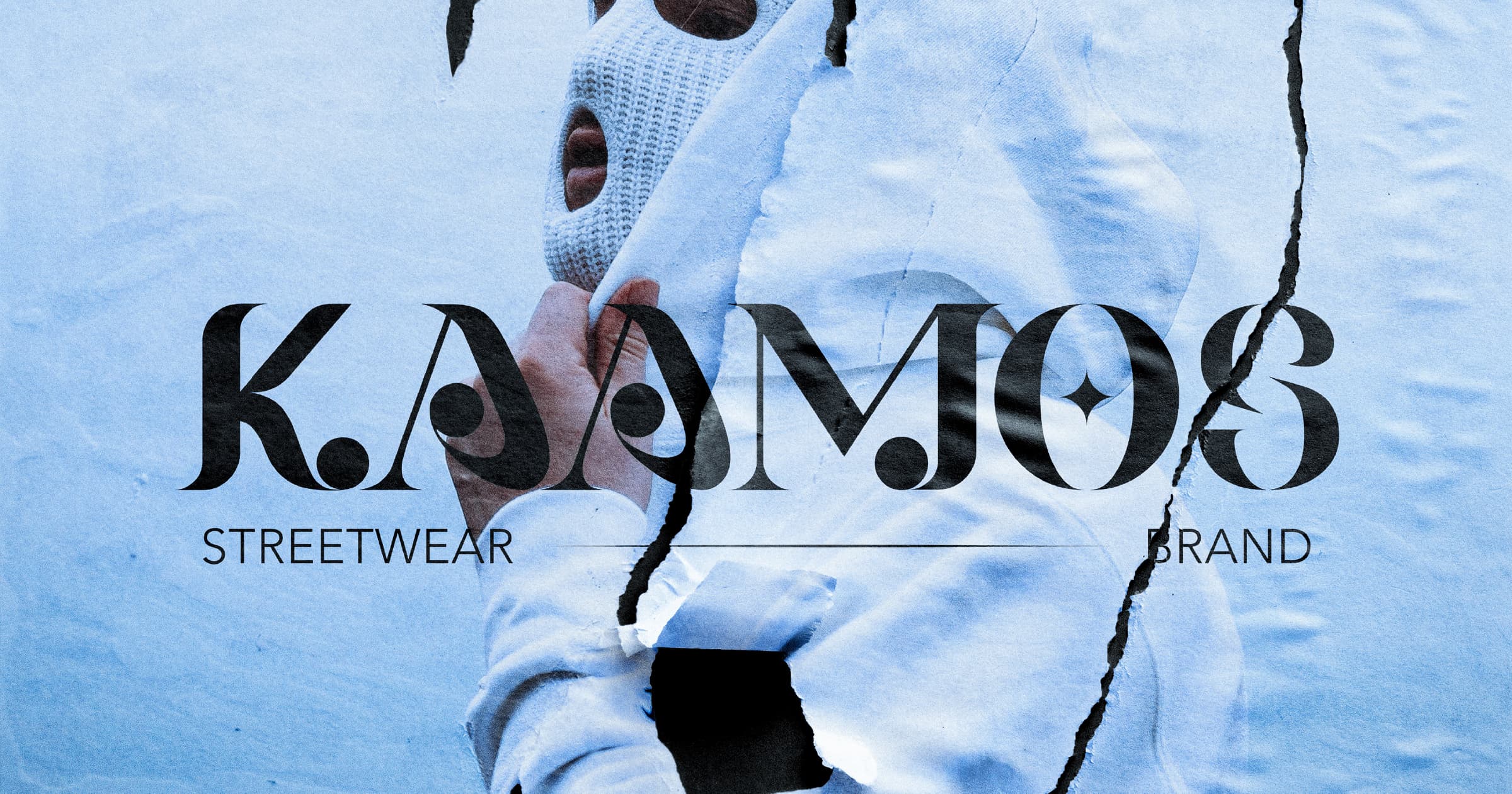
I had the brand name – Kaamos – already decided before going into the project. A Finnish word for “polar nights’”, Kaamos is a common phrase in Finland used to describe the sunless days during the winter. I created a Wordmark for the brand using Billqo, a modern-looking serif font that reads bold and confident.

From there, I created a Monogram that would complement the primary Wordmark and allow for a dynamic application in various mediums, sizes, and formats.
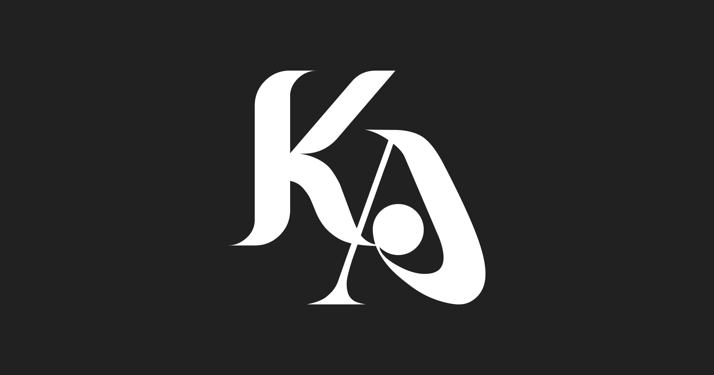

To show intention within the logos, I created a series of grids to demonstrate whitespace and manual kerning. Consideration was taken to exhibit repeating shapes and space between typographic elements.
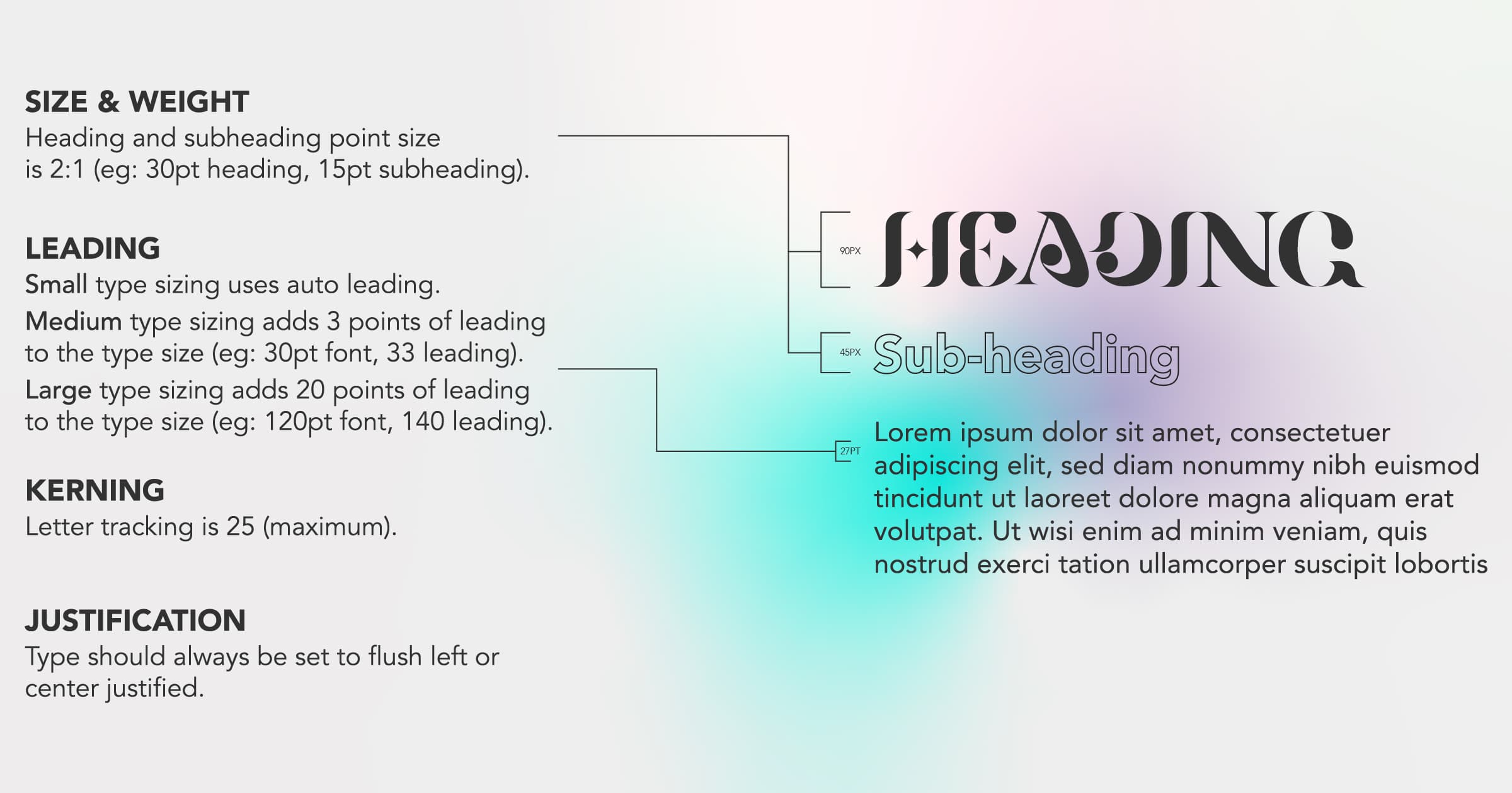
Typography
It was important to retain accessibility control when creating written content. Readability and legibility were critical, especially when using a decorative serif font like Billqo. Due to the nature of the thin stems, abstract crossbars, and counters, it was imperative to only use this font as title text with specified weight and tracking. Avenir Black and Avenir Light were then used for subheadings and paragraph text.

Social Media + Ads
Streetwear brands have a heavy social media presence. I wanted to develop specific guidelines and create comprehensive social and web template ads.

Mockups + POS

My favorite part of any project is point of sale items and PSD mockups. Mockups were essential for the brand; they provided a visual representation of how branding would appear to the public. They displayed how different elements, such as colour, typography, and imagery, fit together cohesively. This helped ensure that brand identity was clear and consistent across all mediums.


Landing Page
The landing page is where it all came together. I took all of the specifications from the style guide and applied them to the landing page to create a fresh and unique experience for the end user. In conclusion, the project and style guide accomplished the goal of creating a cohesive and modern brand identity. The logo design, colour palette, typography, and imagery guidelines reflect the brand’s innovative and dynamic nature. From web design to marketing collateral, the project has provided a strong foundation for consistency across various platforms.

Check out the landing page XD prototype.