Too Good Magazine
Too Good is an art and culture magazine that celebrates diversity in art, providing a platform for artists from different backgrounds to showcase their work. The magazine is published independently, which means it is not affiliated with any major publishing house, allowing it to maintain its unique identity and voice.
The magazine covers a range of art forms in each issue, including illustration, photography, and digital art. The content is carefully curated to showcase emerging and established artists, providing a fresh perspective on the art world.
This project explores the publication design process, covering every aspect, including initial research and planning, layout design, advertising, and cover design.
Target Audience
Too Good’s primary target audience is artists and those interested in art and culture. The magazine caters to a range of readers, from casual readers curious about art and culture and wanting to stay updated on the latest trends to emerging and established artists looking for inspiration and engaging stories about other artists and their work. In addition to offering a wide range of content, Too Good provides a platform for artists to showcase their work and share their ideas with a larger audience.
Mood Board
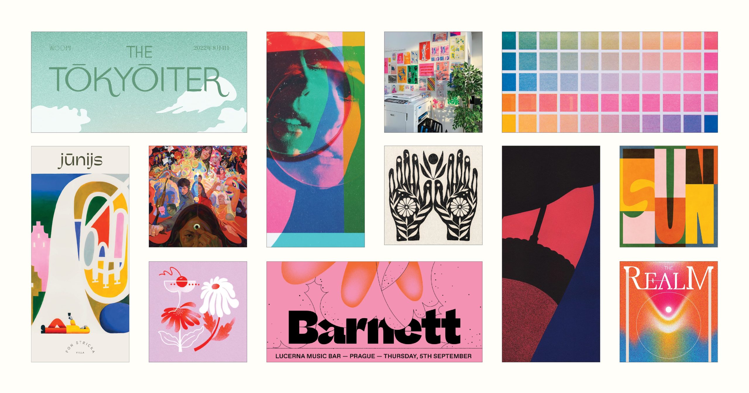
I started this project by creating a moodboard that included inspiration for logos, typography, colours, and imagery. The moodboard allowed me to develop the general idea and vibe I wanted for the magazine, to have a youthful and fun feel while providing an example of the content it would feature. I included some risograph colour swatches and an image of a risograph printing studio to convey the vibe of an independently printed magazine.
Style Guide
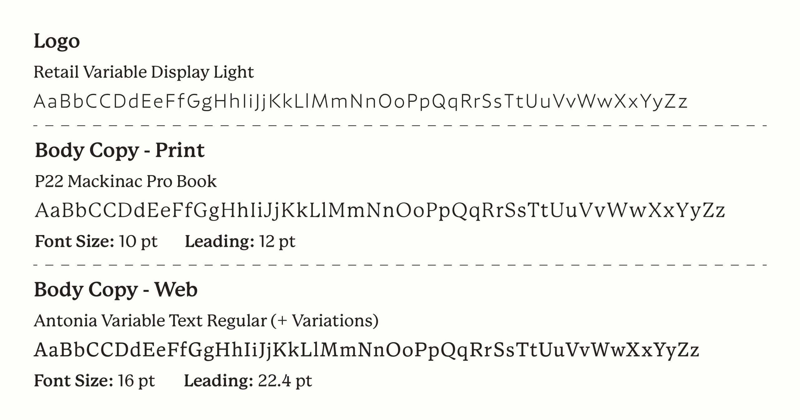
I began my style guide by designing the primary logo for Too Good Magazine. I wanted the logo to be plain and contemporary yet still have charm and character – allowing the logo to be recognizable but not overshadow the featured image on the cover. After pondering fonts, I chose the Retail Variable Display font from OH no Type Co, one of my favourite type foundries. I experimented with various weights and settled on the light version to make the logo feel contemporary and current.
I modified the font by matching the “G” to the shape of the “O”s, slicing a diagonal off the arm of the “T,” and adjusting the kerning. I placed the triangle cut from the T on the last letter of “Good” to represent a page corner, conveying that this magazine is “Too Good” and the reader can’t resist flipping through the pages.
To create the logo variations, I simplified the primary logo by removing the tagline. I also designed a more compact, vertical secondary logo for tighter spaces. In addition, I created a monogram and a standalone page corner icon for use in tiny areas where the primary or secondary logos would be unreadable.
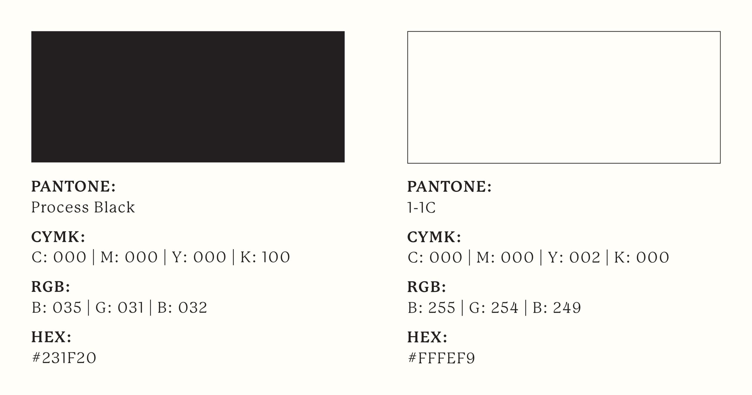
I chose to keep the colour palette simple to allow the logo to complement any cover image without being distracting. For the black-on-white version, I used Pantone Process Black. For the white-on-black version, I used Pantone 1-1C. I love the softness of Process Black, and I selected an off-white because I do not like pure cool whites.
For the print body copy of the magazine, I chose P22 Mackinac Pro in the Book weight. It’s a general-purpose, utilitarian serif font with good readability that compliments the retail font. After researching optimal font sizes for magazines, I decided the body copy font size would be a minimum of 10 pt, with 12 pt leading.
As for the web font, I thought Antonia Variable Text would be an excellent choice since it is similar to P22 Mackinac and is variable, allowing for smooth CSS transitions between text states. After researching the optimal font size for web reading, I decided the body copy font size would be a minimum of 16 pt, with a line height of 22.4 pt.
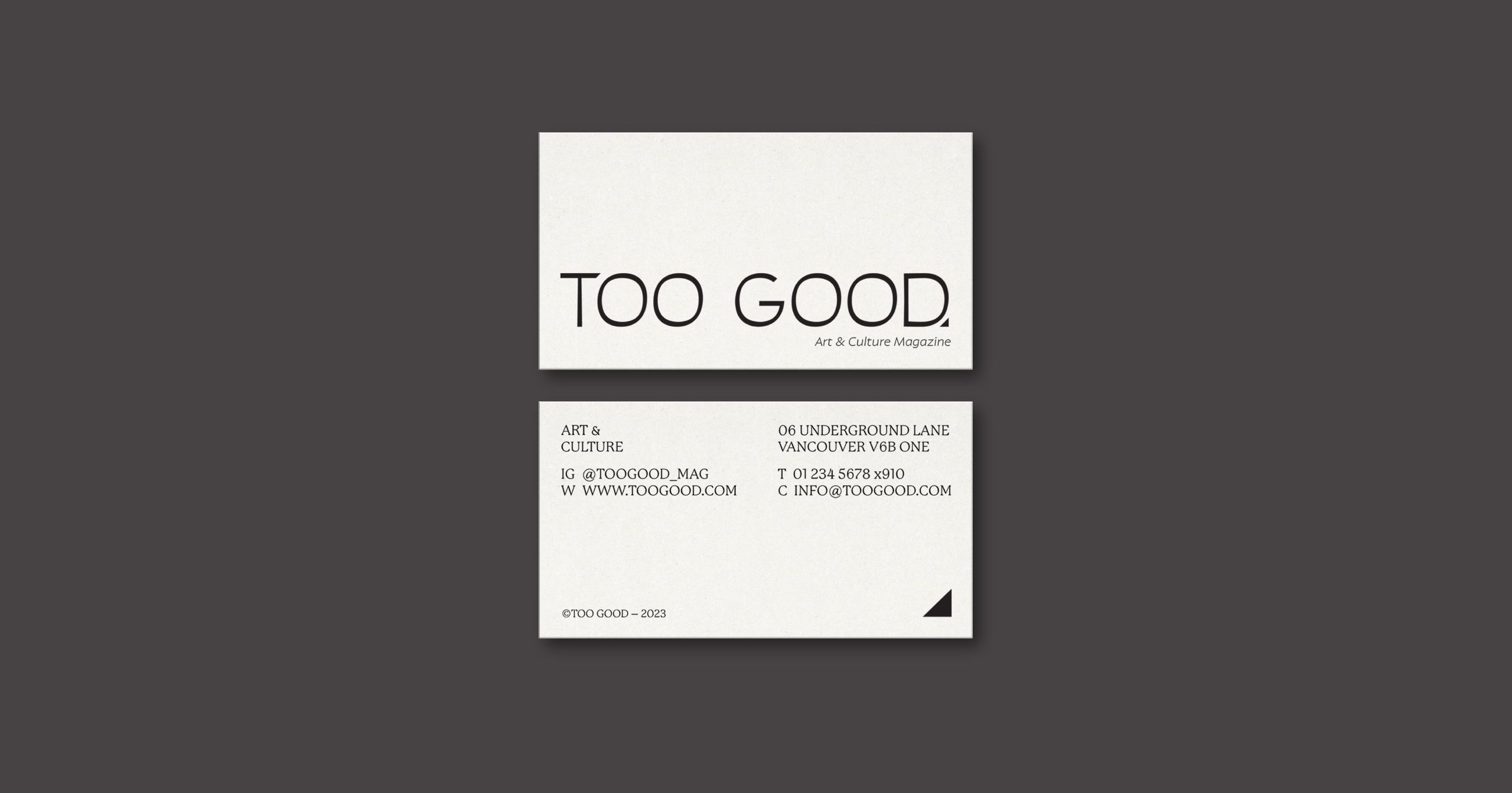
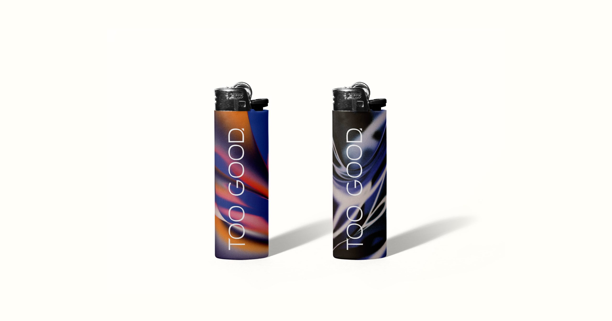
As part of the brand collateral, I created examples of logo usage. I designed a business card which utilizes the primary logo and page corner icon and envisioned contemporary merchandise such as funky lighters.
Content Outline
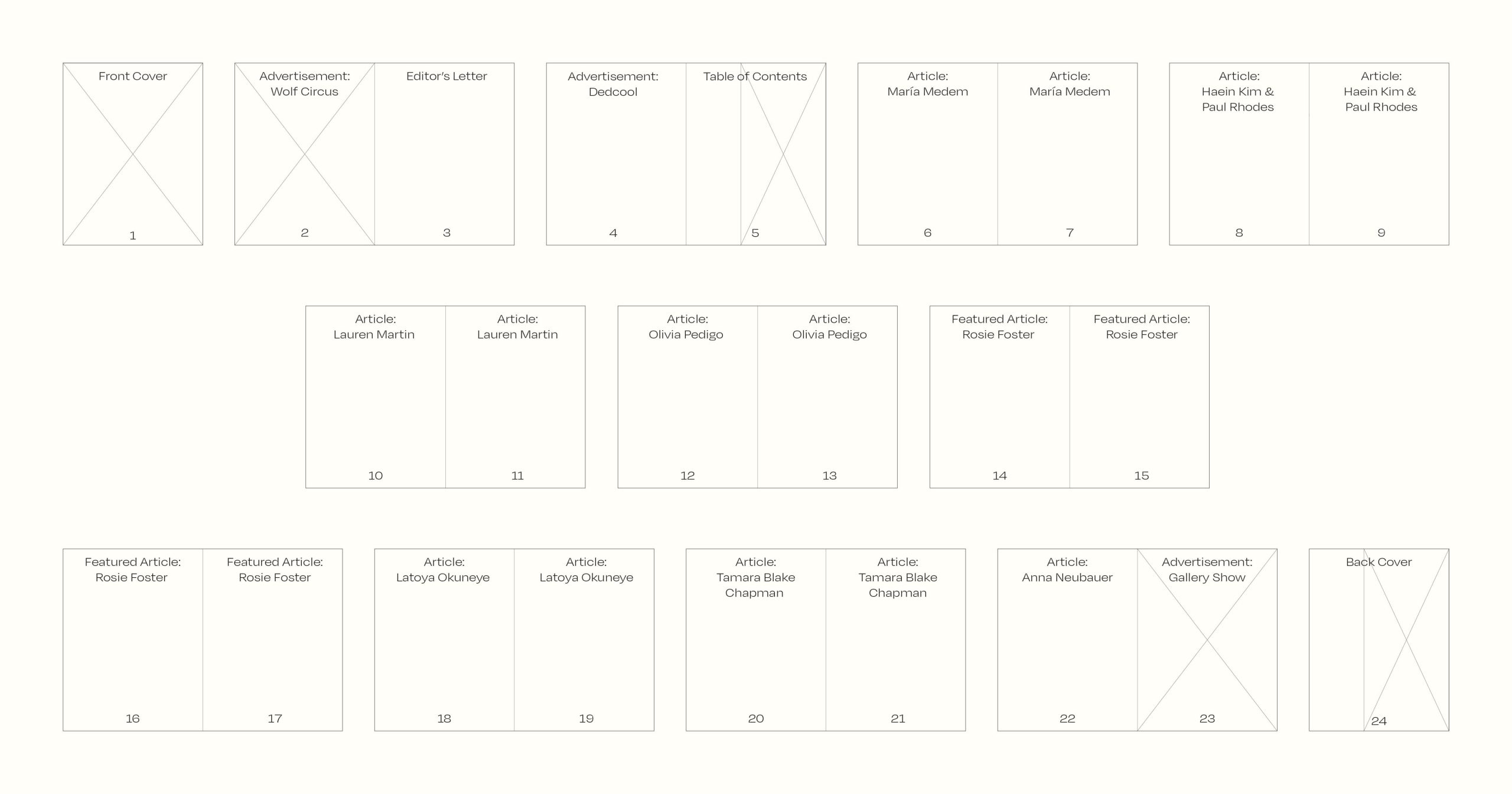
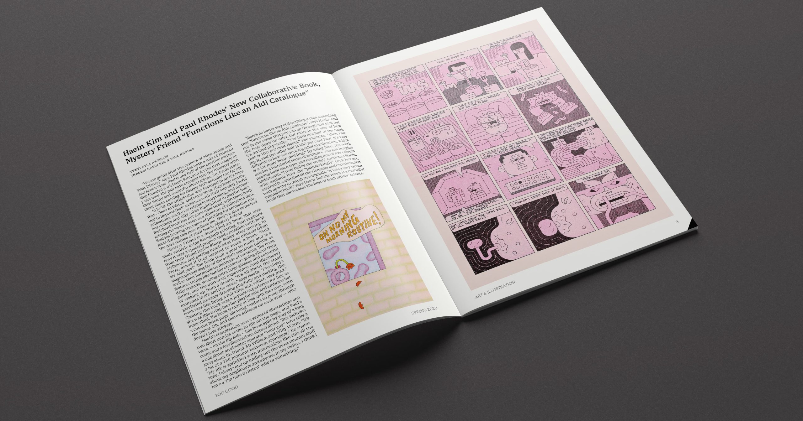
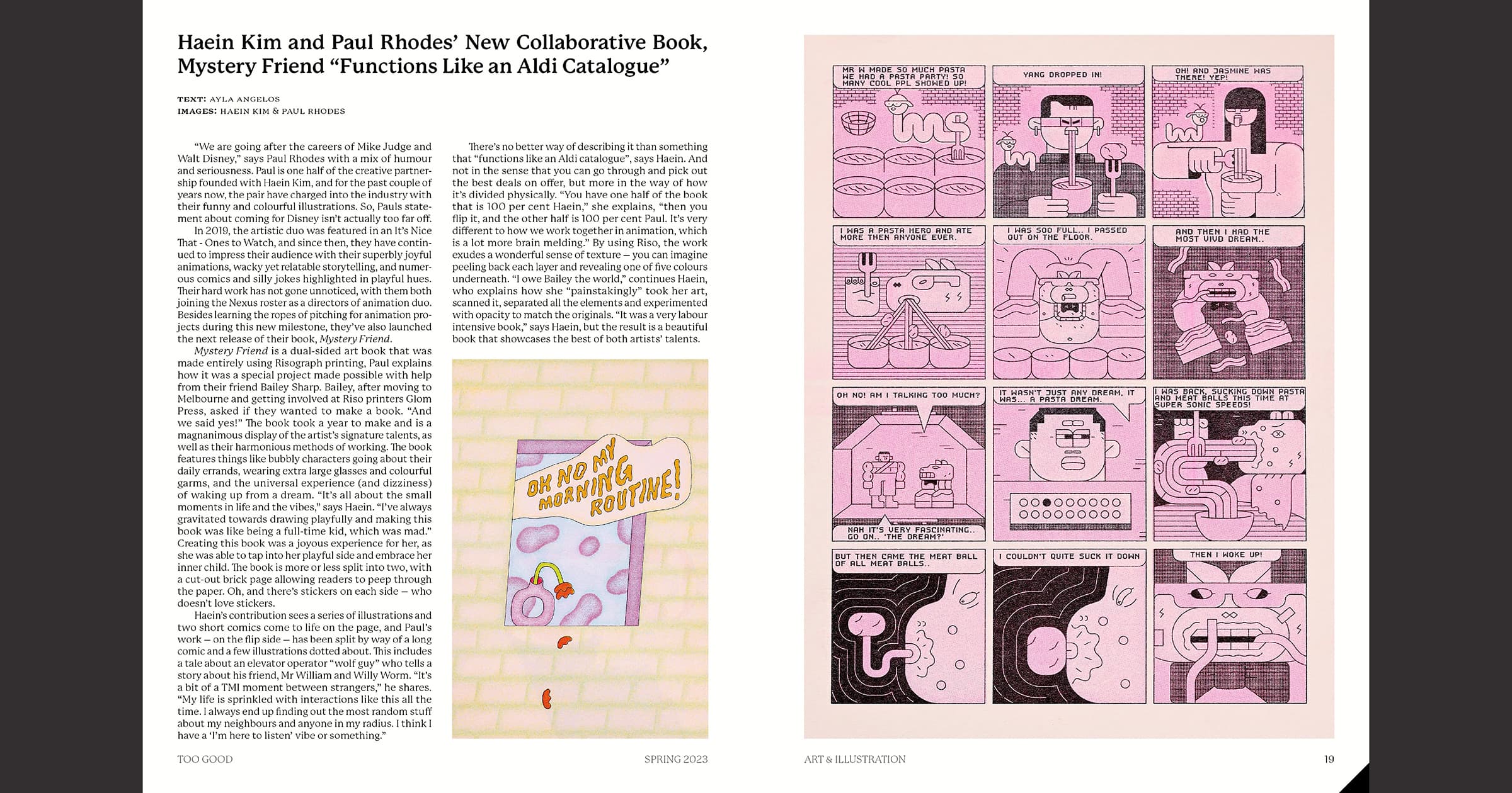
To organize the content for my magazine, I created outlines for both visual and written content. The articles used in this magazine were sourced from It’s Nice That Magazine. The written content outline helped me to structure the pages, with a link to the original article on the It’s Nice That website. The visual content outline served as a guide for planning the order of the articles and content on each page.
Layout
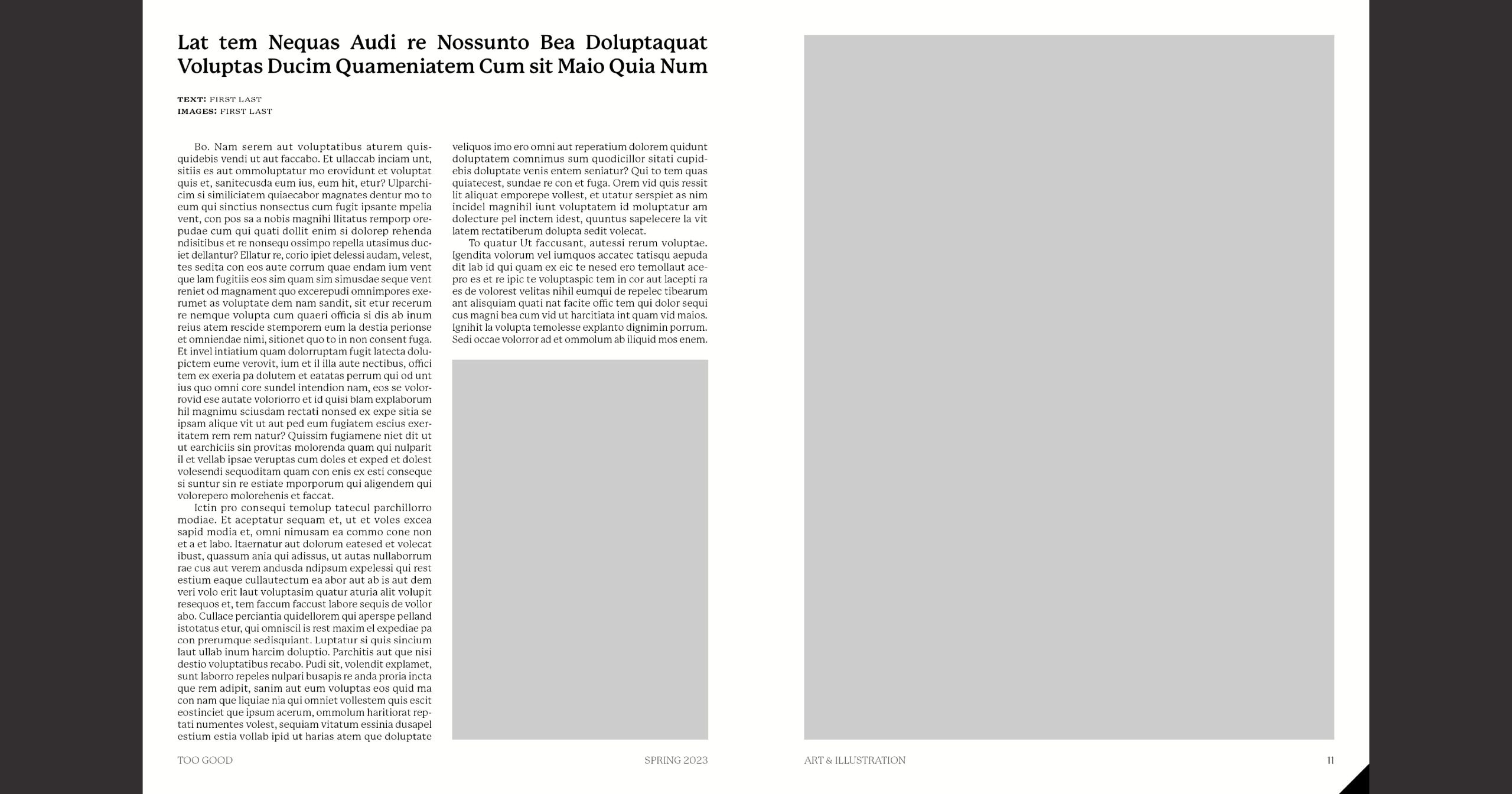
I created a master page for each page in my publication. To start, I set up a 12 pt grid with a wide gutter to prevent the text from looking too cramped. I used a combination of a baseline grid and an f-height grid to keep the text consistent from page to page and to allow for easy alignment of headers and images with the body copy. After setting up the guides, I arranged the content on each page. That way, all I needed to do was to replace the placeholder text and images with the final copy.
I created three full-page ads for this magazine. It was important to me that they were gender-neutral and could appeal to any reader. The first advertisement is for Wolf Circus, a Vancouver-based jewelry brand. The ad showcases an image from their new unisex gemstone collection. I took inspiration from their current ads, which focus on editorial photography and keep things simple. I added some fine print at the bottom describing the jewelry the model is wearing from the collection, with the corresponding prices. The second advertisement promotes the unisex fragrance Taunt by Dedcool. The final ad is for an imaginary gallery show hosted at the Polygon Gallery in Vancouver.
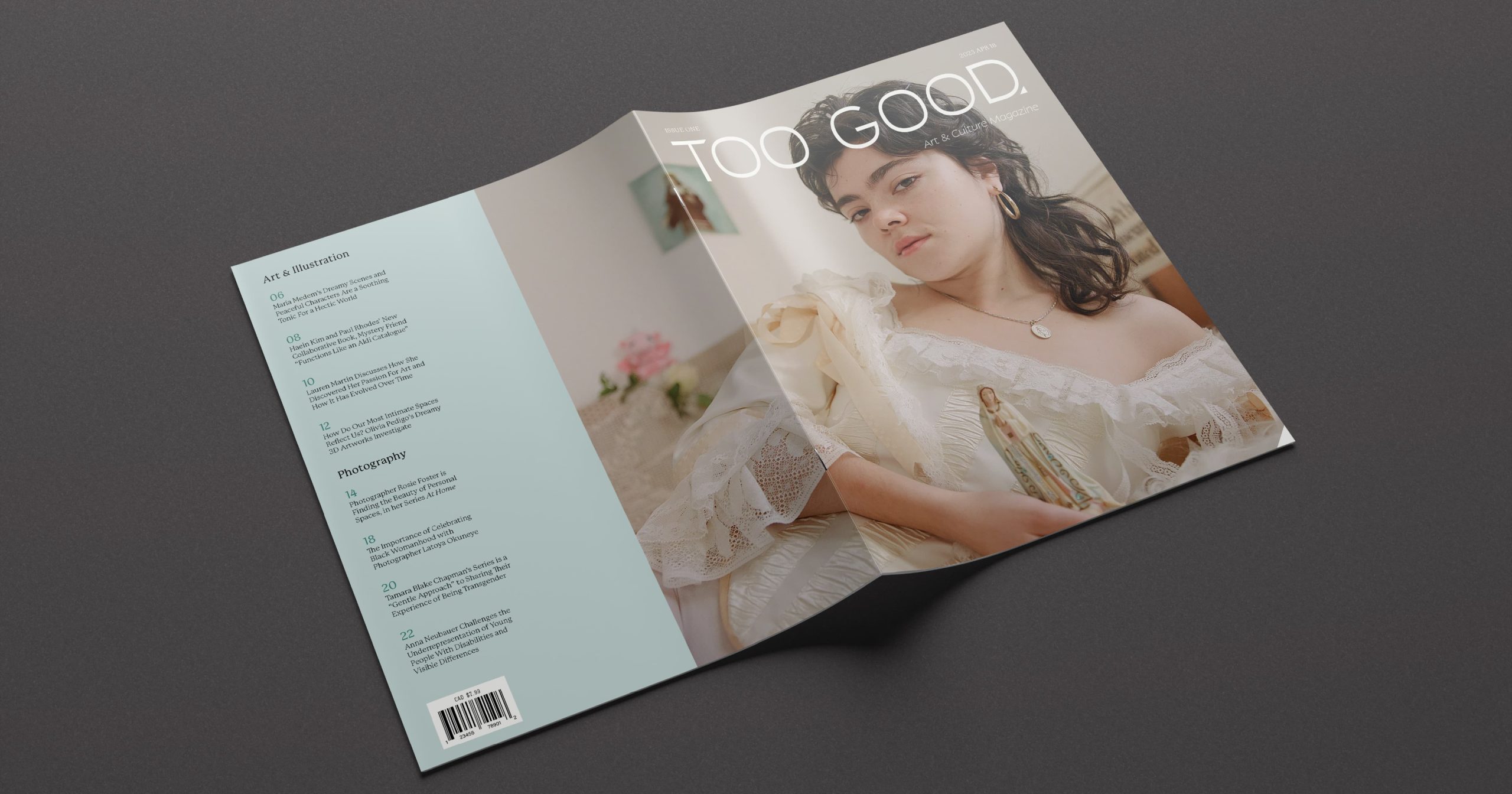
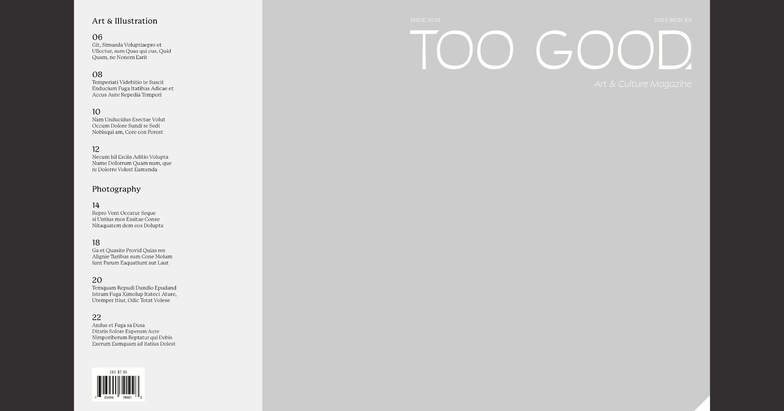
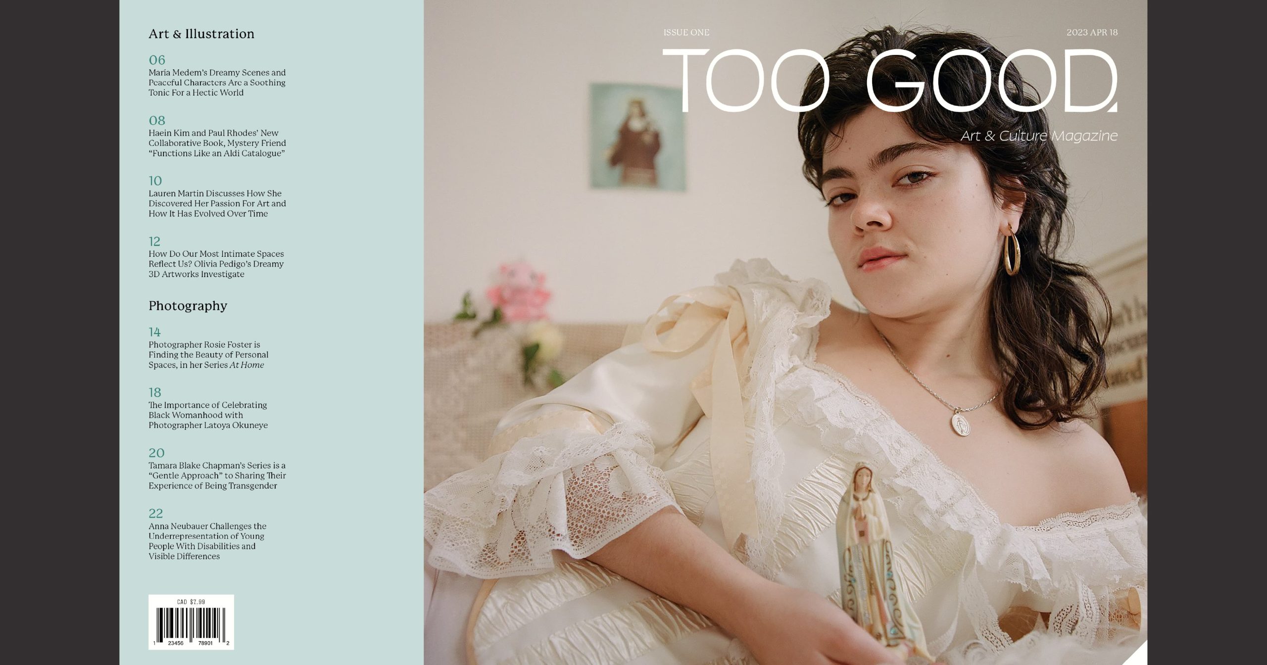
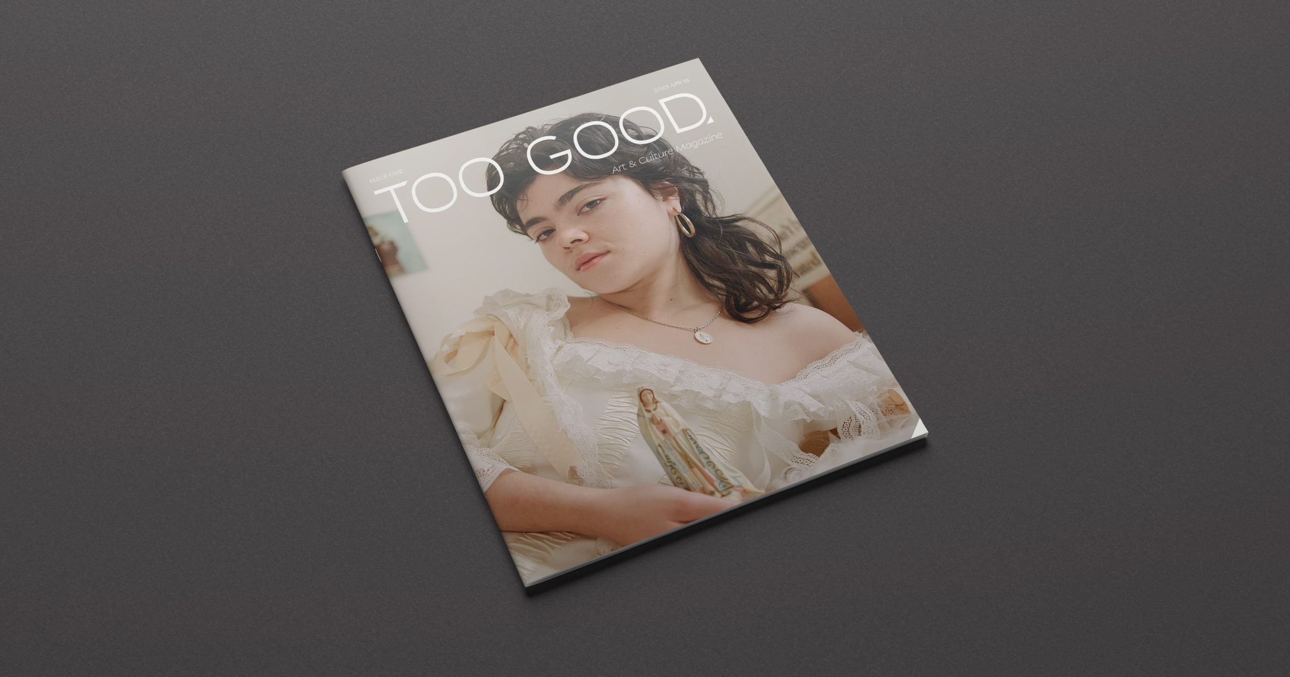
I saved the design of the magazine cover for last. I created a spread for the front and back covers, with the featured image wrapping partway to the back cover to add visual interest. The cover image is by London-based photographer Rosie Foster, who is the center of the featured article in this issue. To allow the featured image to shine, I kept the front cover simple, adding only the logo, issue number, and date. I decided not to use cover lines on the front of the magazine, as I included a copy of the table of contents on the back cover.
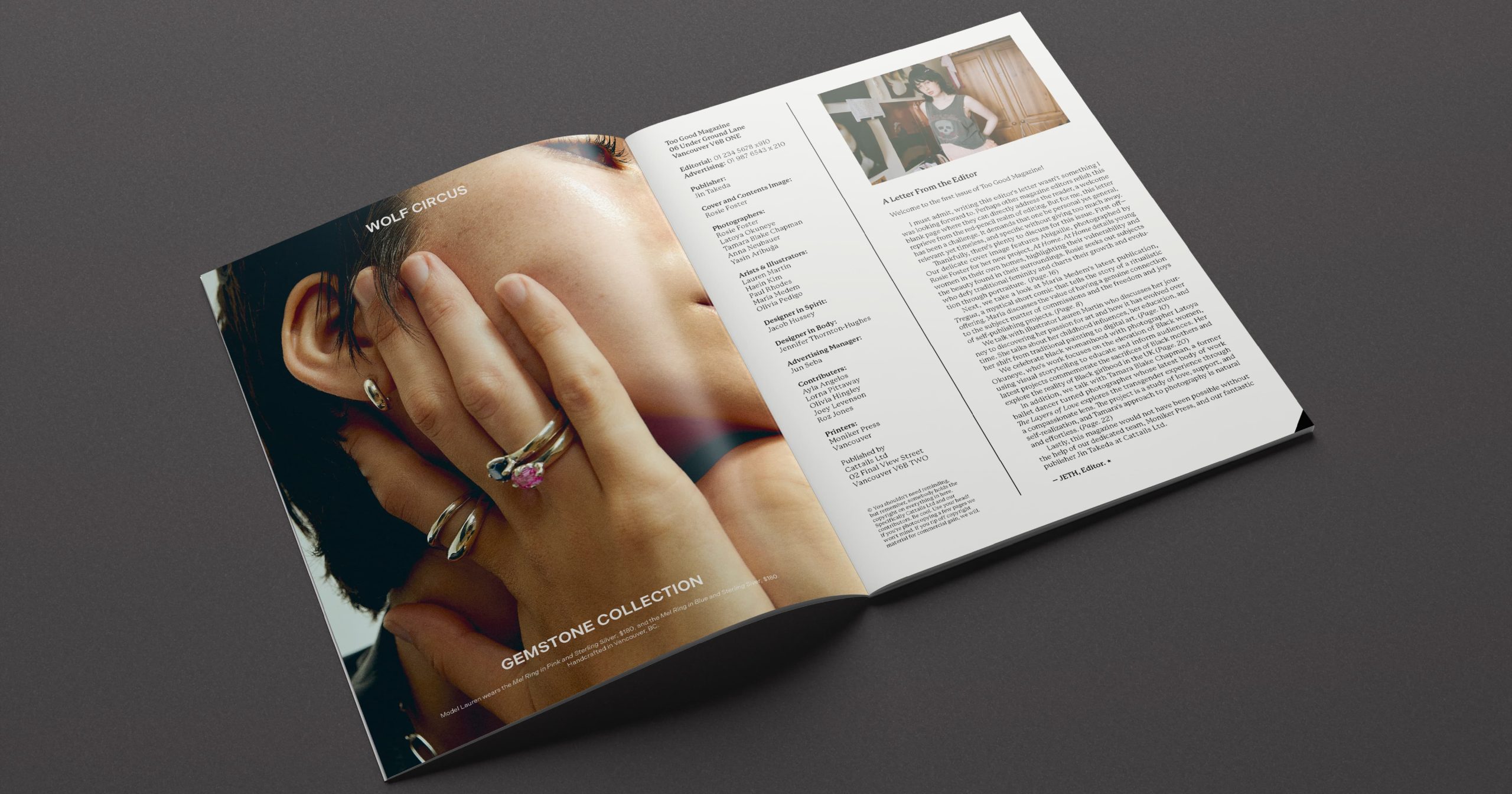
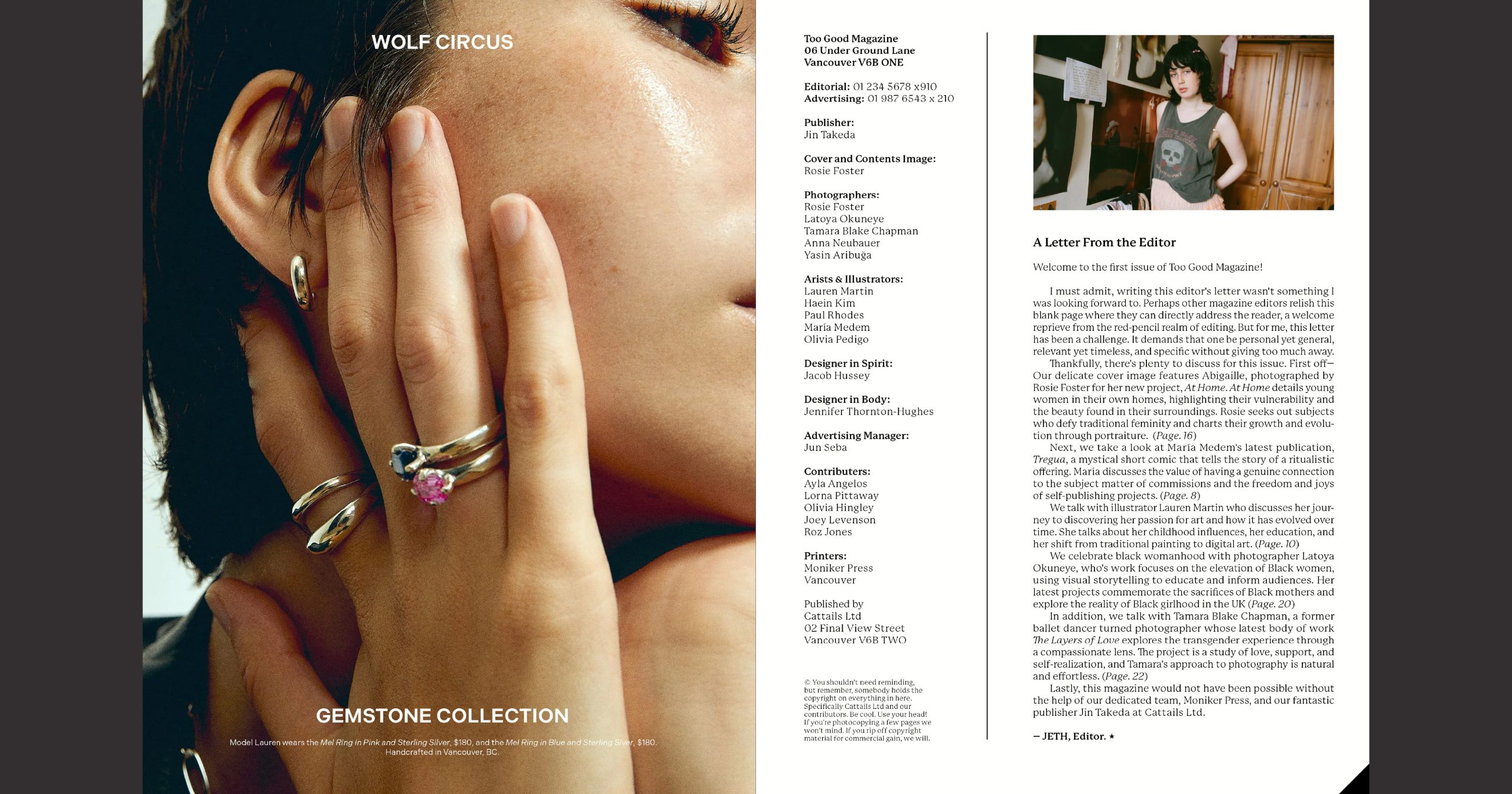
The editor’s letter provides an overview of the magazine’s contents, highlighting some main articles. Above the letter, there is a photo by Rosie Foster. The inspiration for the staff list was Read and Destroy, a British skateboarding magazine published from the late 1970s to the mid-90s. I filled the list with an imaginary publisher and advertising manager, the contributors who wrote the articles for It’s Nice That Magazine, and the artists and photographers who own the rights to the images I used. The printer listed is a risograph print and publishing studio in Vancouver that collaborates with artists to produce small editions of books, zines, and print ephemera. Ideally, this studio would print the magazine if it were real.
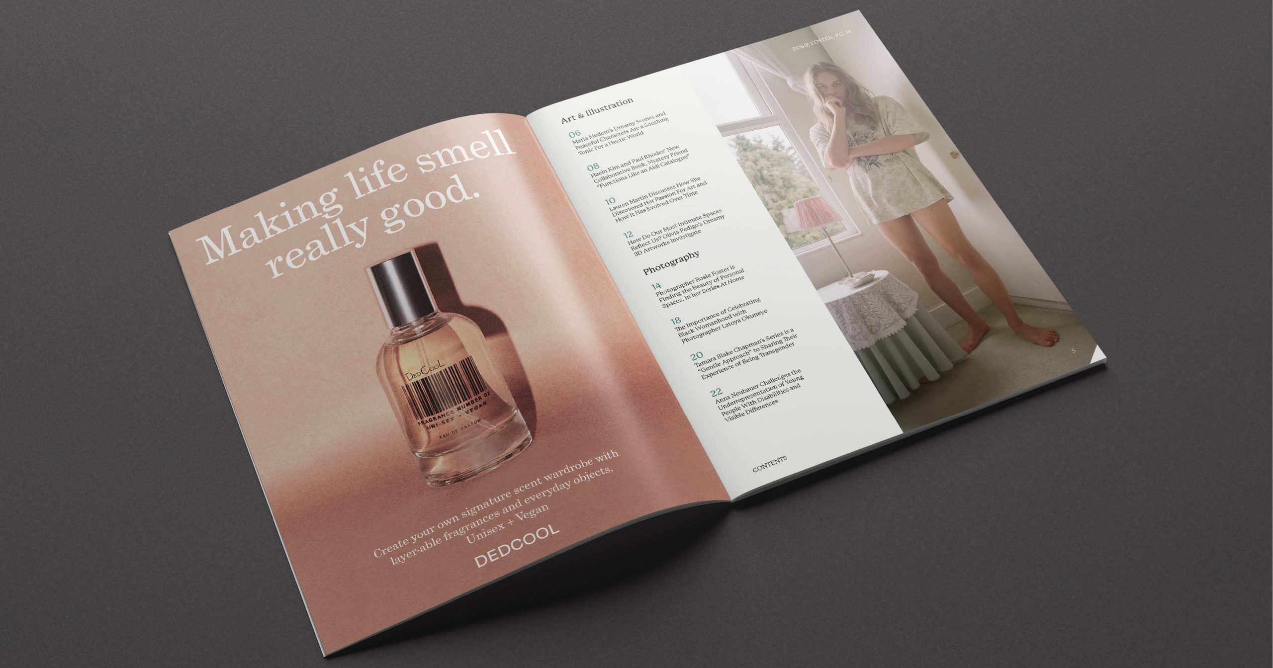
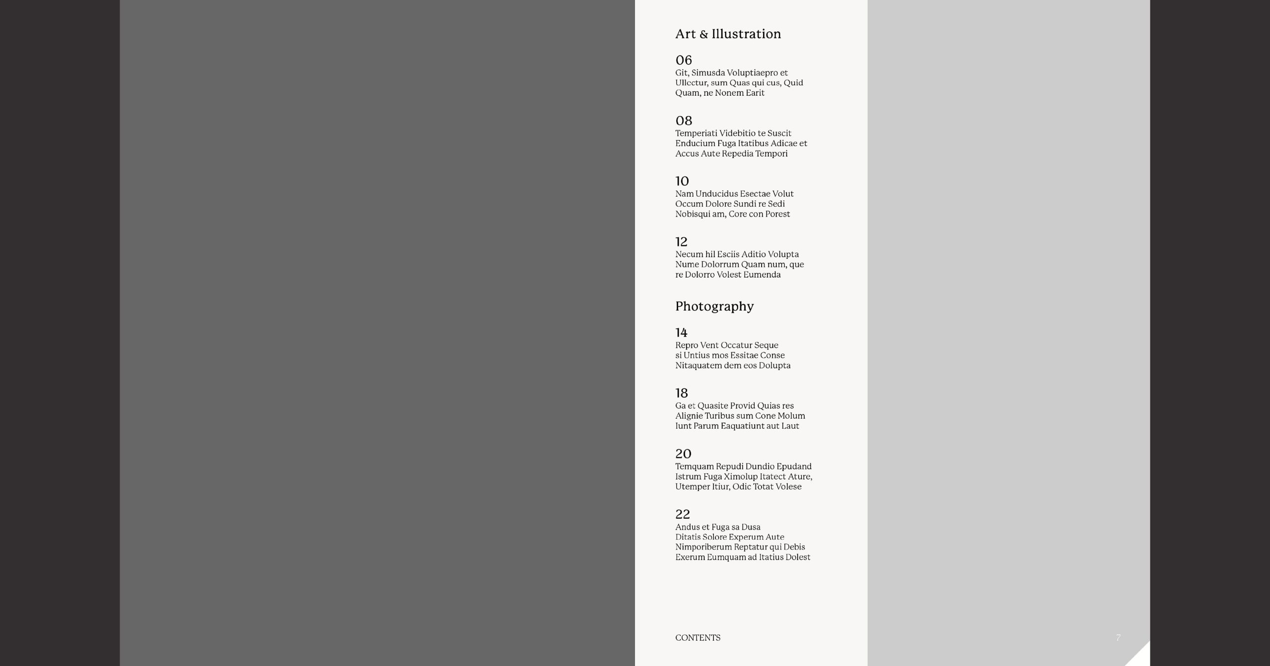
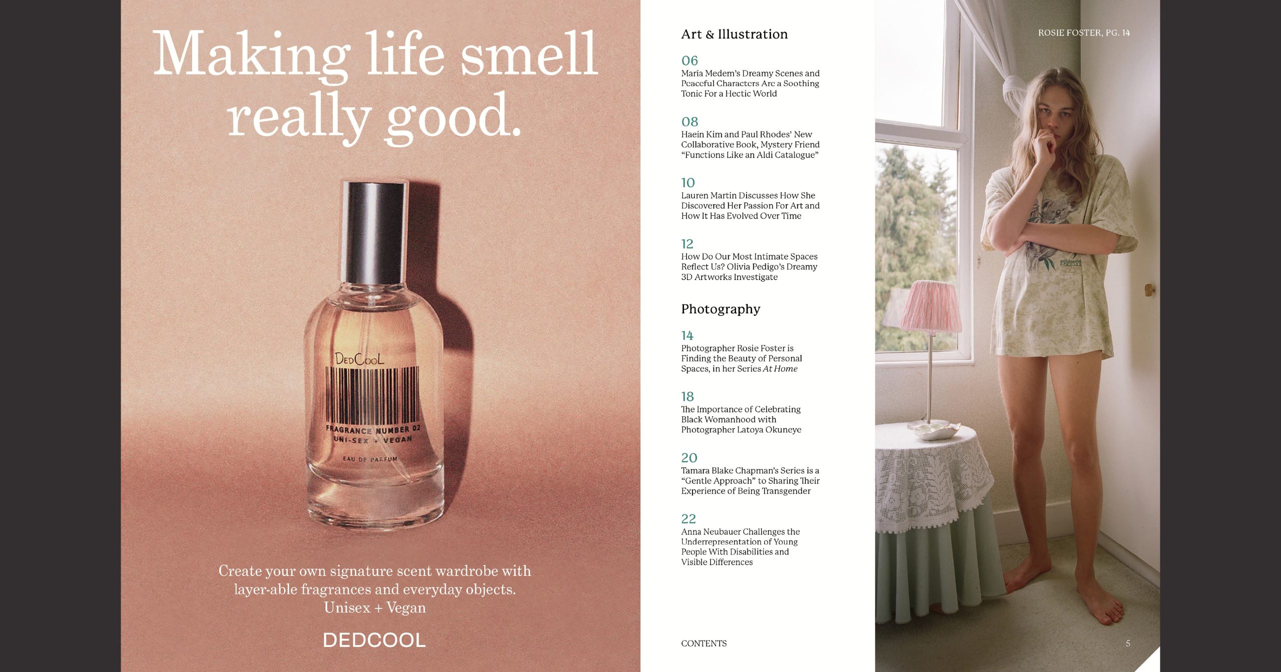
The table of contents within the magazine is identical to the one printed on the back cover. I paired the table of contents with a photo from the featured photographer and a caption detailing her name and the page number of the corresponding article. Instead of adding a heading to this page, I used the same running head seen in the rest of the magazine. To improve readability, I made the page numbers a darker shade of the blue/green colour used on the back cover, adding contrast and breaking up the text.
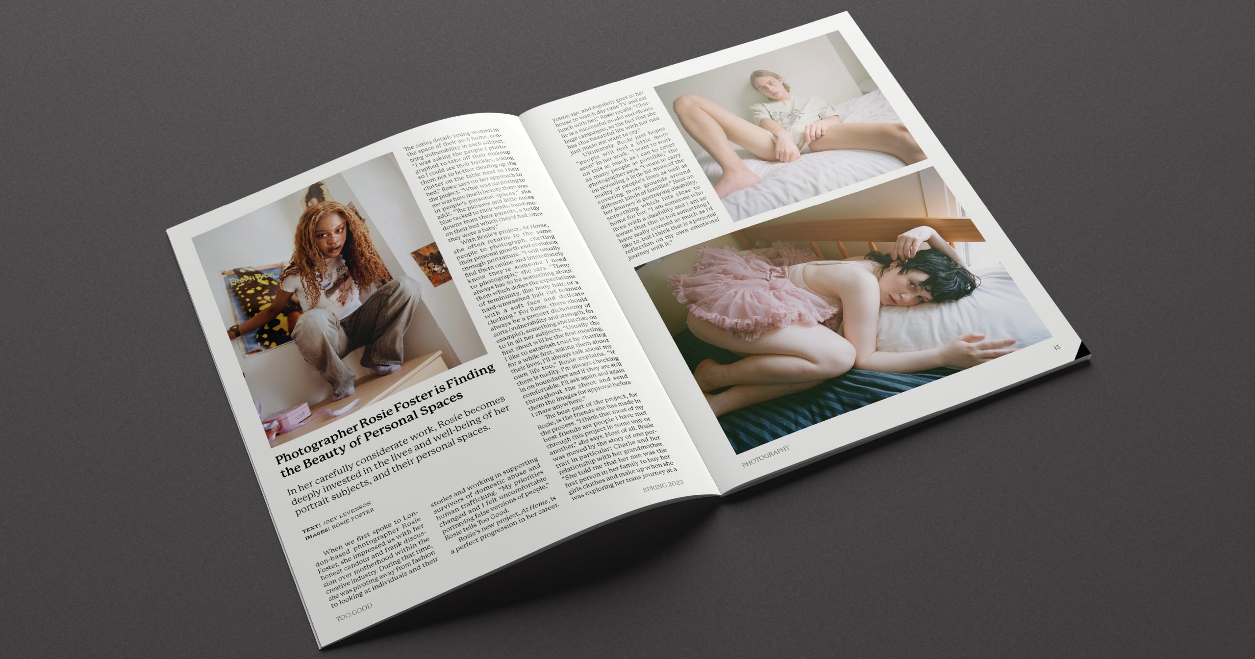
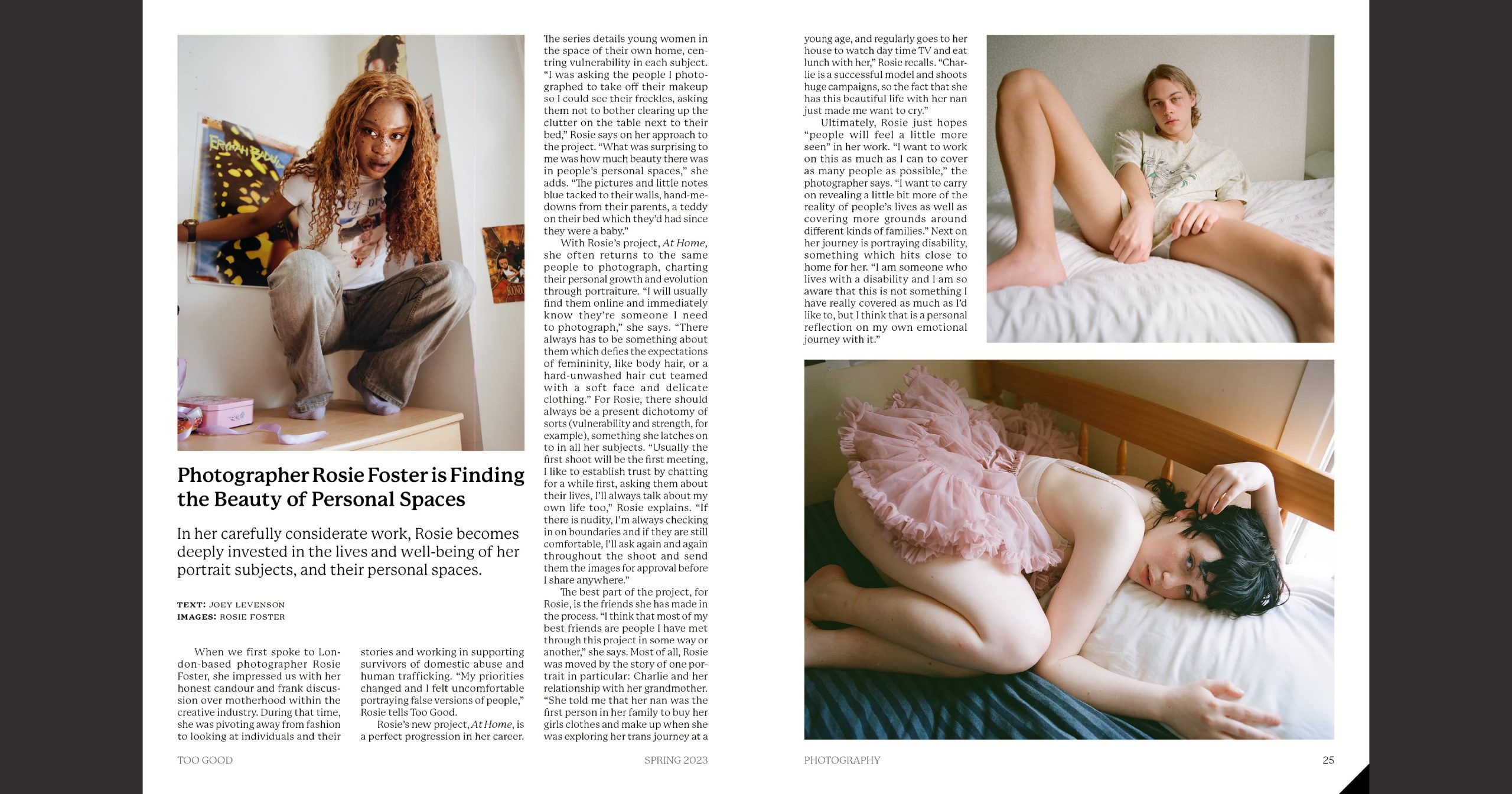
The magazine articles fall into two sections: art & illustration and photography. Each one has several 3-column and 2-column layouts depending on the length of the article copy. The featured article spans four pages, with the text on the first spread and two full-page images on the second. To keep the reading experience interesting, I alternated between using 3-column and 2-column pages. I included the page corner icon in the bottom right-hand corner of every spread.
Deployment
Check out the magazine on ISSUU.