Tidal Waves Magazine
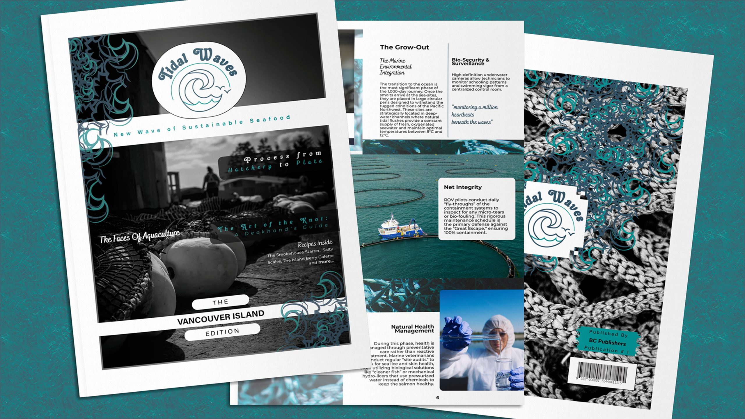
Growing up on the Island, I have constantly been surrounded by the realities of coastal industries. This inspired me to create Tidal Waves, a multi-page magazine exploring the evolving aquaculture industry on Vancouver Island. The primary challenge of this project was to take dense, technical information and transform it into highly engaging, accessible lifestyle content that balances technological innovation, environmental stewardship, and local culinary traditions.
I approached this by developing distinct personas—from ROV pilots to artisanal chefs—to craft a narrative that humanized the “blue economy.” Visually, I established a rigorous hierarchy and a consistent coastal aesthetic. I built structured recipe cards and immersive feature spreads, balancing typography, proportional image scaling, and a unified color palette to ensure cohesion.
Ultimately, Tidal Waves demonstrates my ability to merge complex subject matter with polished, print-ready editorial design.
Process
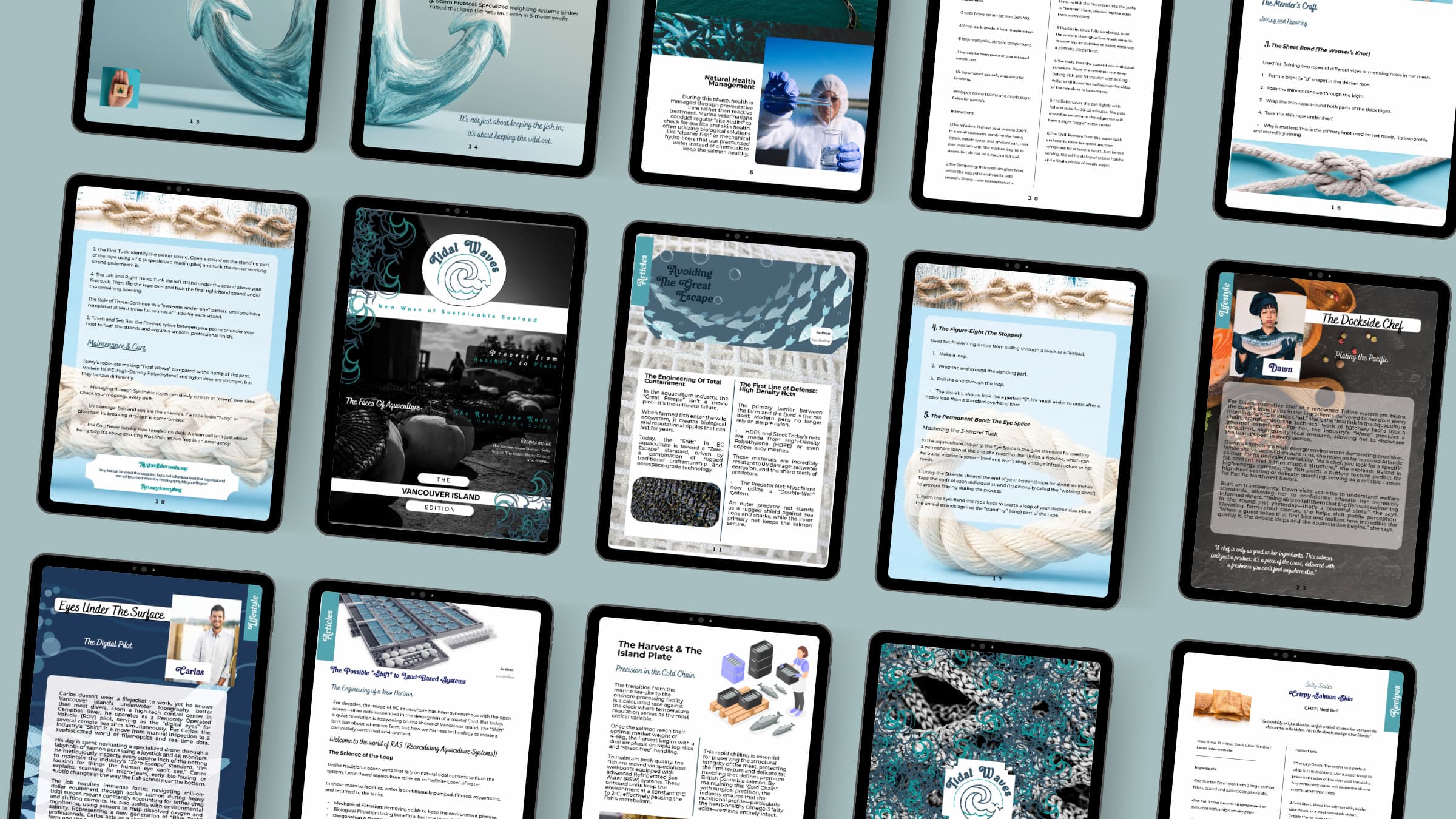
Adobe InDesign is utilized as the primary tool for this editorial capstone project. The project begins with developing a structural grid, establishing typographic hierarchies, and writing a comprehensive case study to define the parameters of Tidal Waves, an editorial magazine exploring the evolving aquaculture industry on Vancouver Island. Three distinct content pillars are crafted: scientific processes, lifestyle technician profiles, and coastal culinary recipes, focusing on vibrant storytelling and engaging layouts.
The multi-page magazine spreads are created to enhance visual representation and readability. Through meticulous planning and execution, the project demonstrates a seamless integration of complex technical information and community-focused design solutions. This approach ensures the magazine makes the “blue economy” accessible and visually compelling.
Flick through the online publication on FlipHTML5.
Concept & Mood board
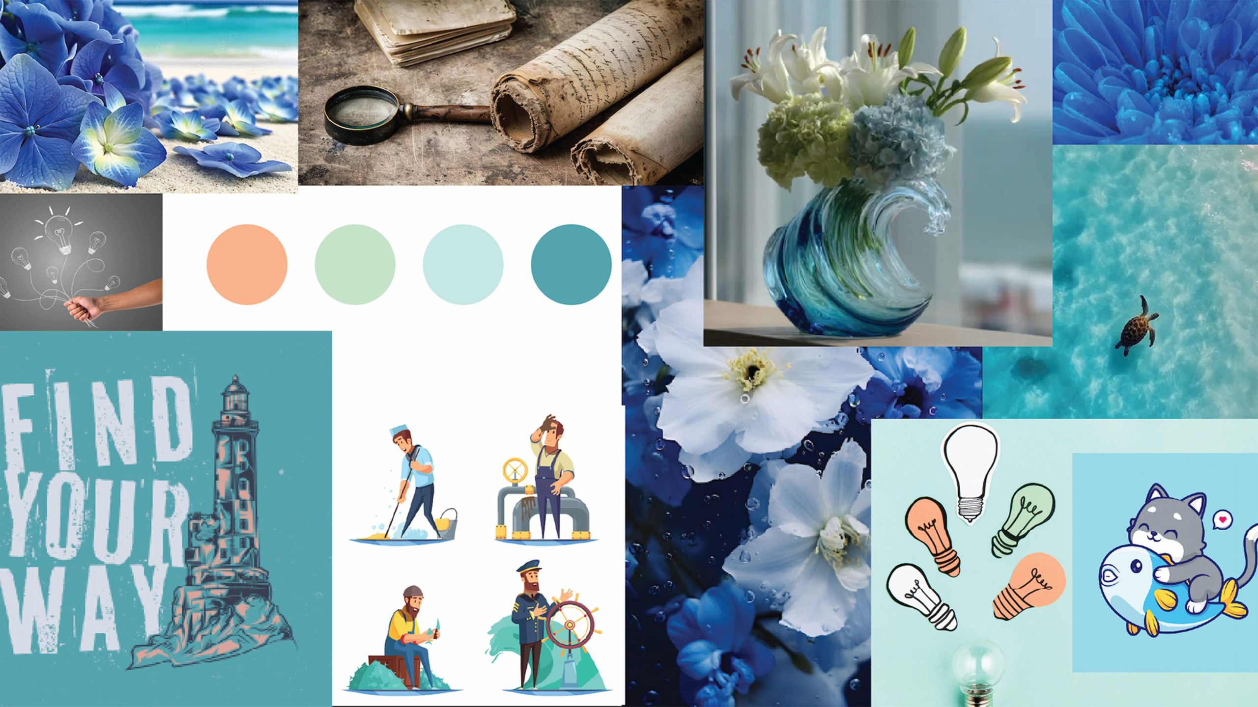
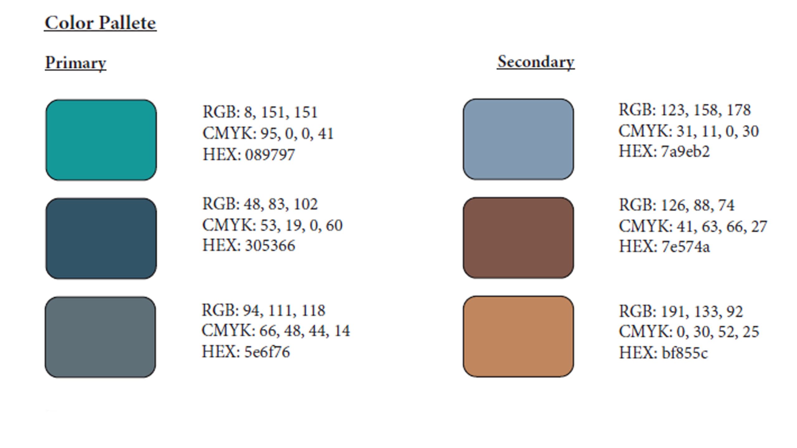
For the Tidal Waves project, I wanted to create an authentic, coastal-inspired vibe through the mood board. Deep ocean teals, slate greys, and crisp whites were chosen to infuse the publication with a professional yet rugged aesthetic, reflecting the realities of the Pacific Northwest and the aquaculture industry.
With each layout, I aimed to balance nature-inspired elements, high-contrast industrial photography, and structured typographic grids, setting the tone for the project. This was the guiding inspiration for the subsequent stages of the design process, ensuring that every aspect of the Tidal Waves magazine remained true to its educational and community-focused goals.
Branding & Typography
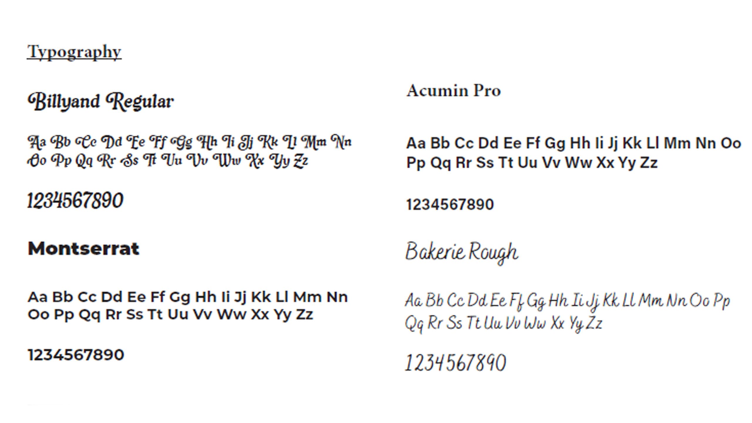
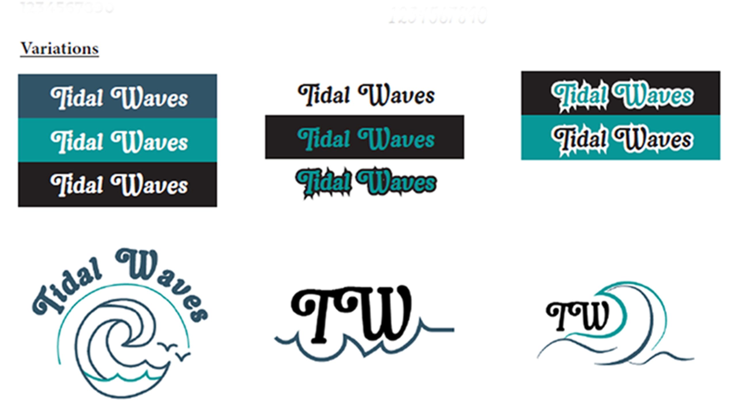
In developing the visual identity for Tidal Waves, I sought to create an editorial style that would reflect the brand’s balance of technical innovation and local heritage. Central to this endeavor was establishing a rigorous typographic hierarchy that would serve as the cornerstone of the magazine’s readability.
Drawing inspiration from traditional print media, I envisioned pairing elegant, authoritative serif headers with highly legible sans-serif body copy. After experimenting with various column structures in InDesign, I settled on a layout design where consistent margins and uniform gutters allow the dense information to breathe. This structured approach pays homage to classic magazine design while prioritizing modern scan ability.
In addition to the typography, I simplified the color palette for Tidal Waves to complement the vibrant and diverse photography featured in the spreads. By opting for a more restrained, coastal color scheme, I ensured the branding design would provide a cohesive backdrop for the culinary features and technical articles showcased within the pages.
Once these were established, the logo creation variations were created using Adobe Illustrator.
Editorial Writing & Personas
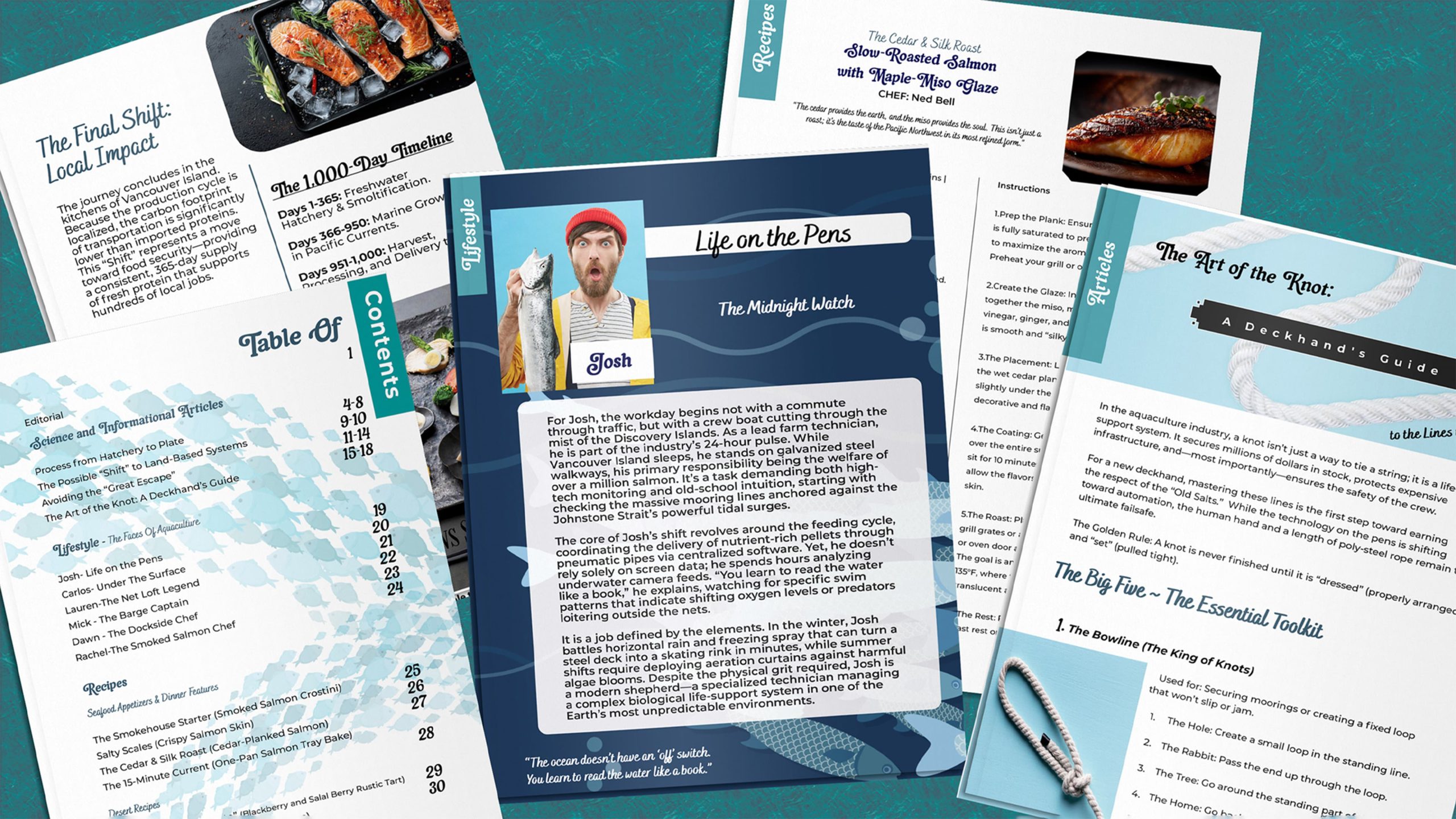
I combined technical research with narrative storytelling techniques for the articles featured in Tidal Waves. I drafted the foundational elements of the features focusing on specific personas—such as Josh the farm technician and Rachel the smokehouse artisan—capturing the essence of the real people who drive the local blue economy. From detailed accounts of ROV net inspections to the high-energy environment of a dockside kitchen, each story was infused with authentic coastal charm.
Once the drafts were complete, I transitioned to editing and condensing the text to fit seamlessly into the magazine’s grid. I crafted each paragraph, paying close attention to word counts and pacing. This process allowed me to achieve crisp, scannable content that retained all necessary scientific accuracy, ensuring that the final articles would translate beautifully into the multi-column print layouts.
Custom Illustrations & Ads
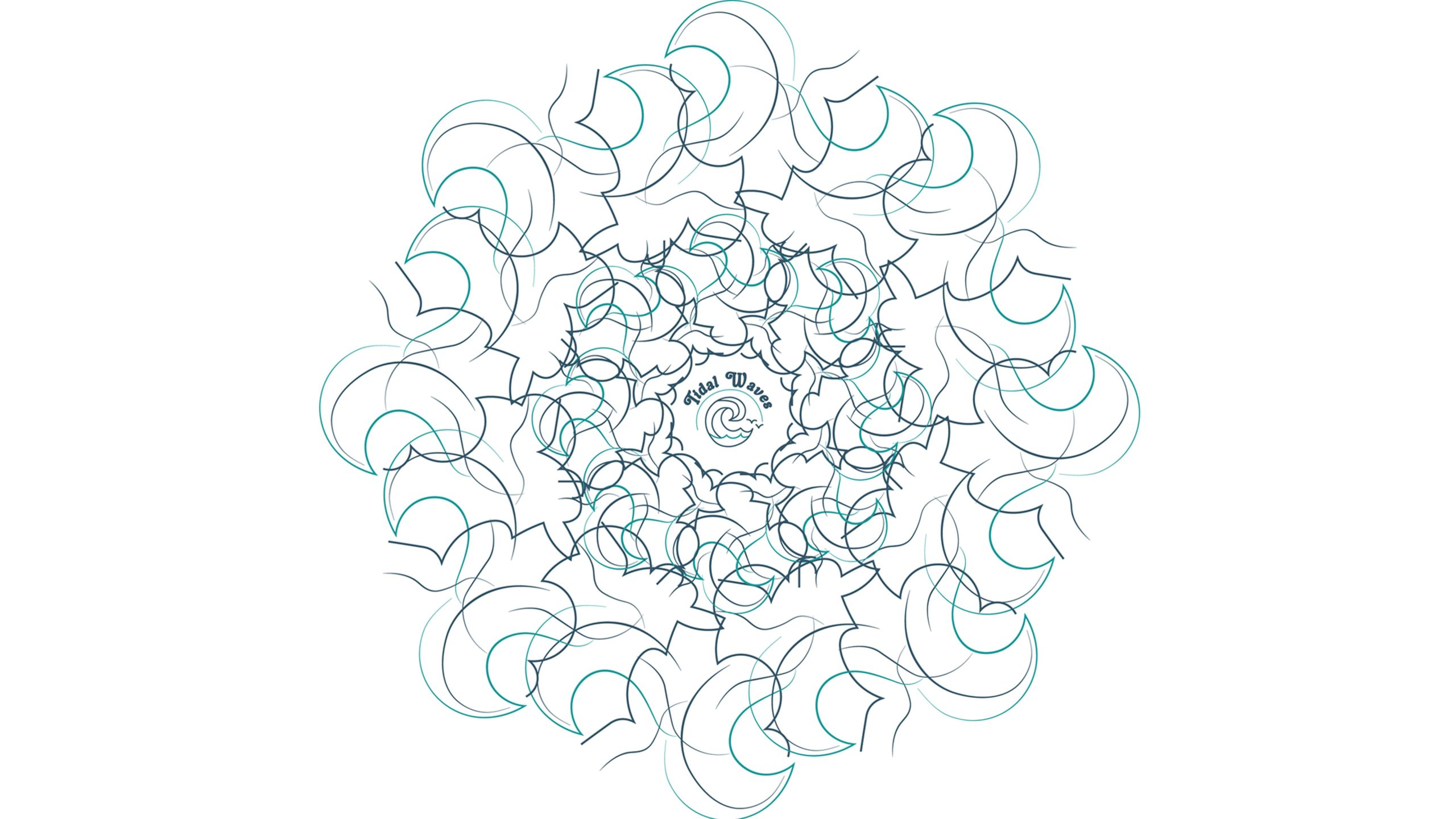
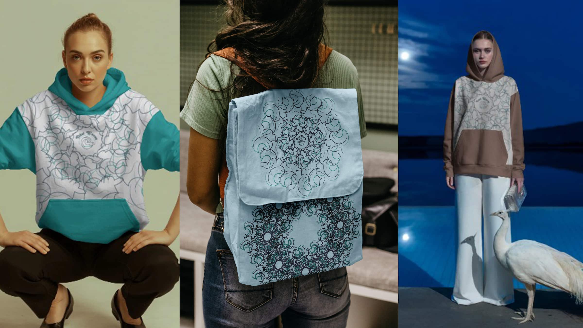
To add unique visual texture to Tidal Waves and provide realistic sponsorship breaks, I designed custom logos, patterns editorial illustrated banners, full-page advertisements and mock ups from templates using Adobe Illustrator. A primary design challenge was creating digital vectors that didn’t feel overly sterile or corporate, as the magazine required an authentic, rugged coastal aesthetic. To mitigate this, I moved away from flat vector shapes and utilized custom brush strokes and layered opacity masks in Illustrator to mimic the organic, textured feel of hand-drawn ink and watercolor illustrations.

For the advertisement designs, such as the Hardy Buoys Smoked Fish spread, I encountered a challenge with visual hierarchy; my initial nautical vector motifs (like a heavy rope border) were overpowering the product photography. I resolved this by refining my clipping masks to perfectly contain the imagery and establishing a clear typographic hierarchy—pairing a bold serif headline with a clean sans-serif subhead. This ensured the local product remained the focal point while still seamlessly blending into the magazine’s overall premium, coastal identity.
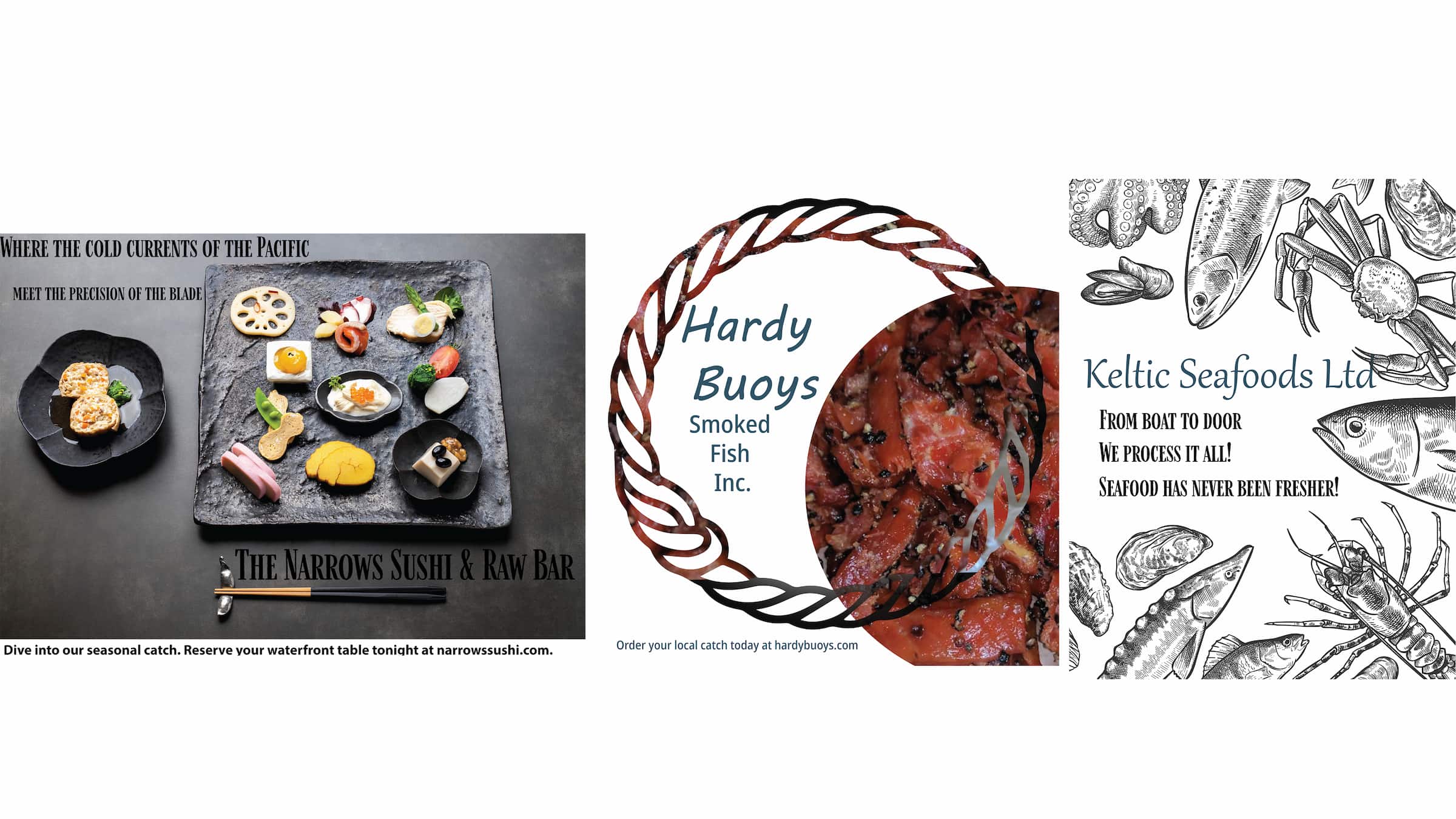
Image Selection, Preparation & Formatting
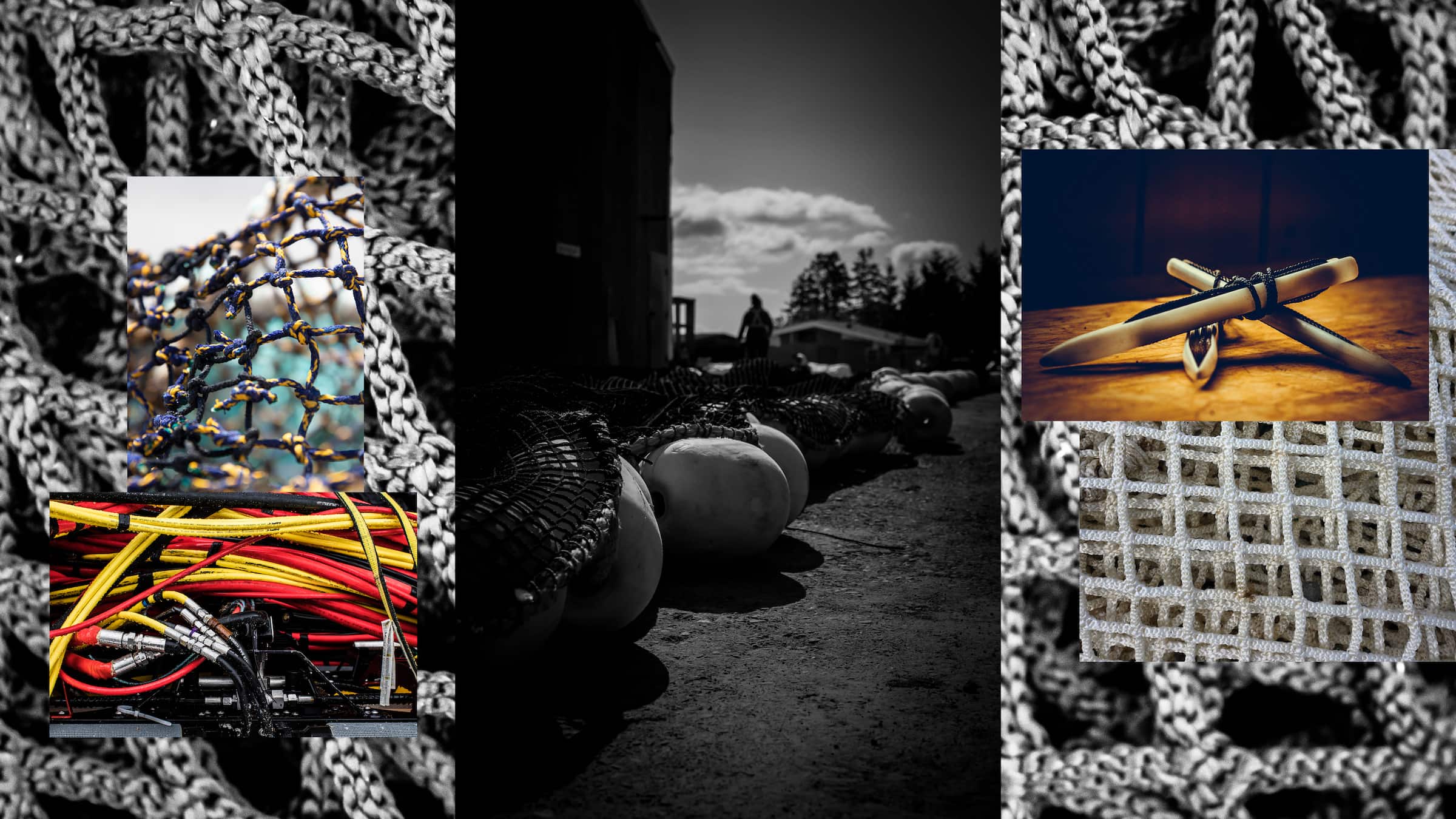
To bring the Tidal Waves articles to life, I utilized a combination of my own original photography and carefully curated high-resolution imagery from Freepik. One challenge I faced was ensuring that my photographs of the coastal environment matched the professional lighting and tone of the stock assets. To mitigate this, I used Adobe Photoshop to apply a unified color-grading adjustment layer across all images, cooling the temperatures to match the deep teals and greys of my mood board. I then seamlessly integrated them into vector frames using InDesign, showcasing everything from the icy waters of the Johnstone Strait to beautifully plated culinary dishes. By presenting the images with proportional scaling and strict baseline alignments, I aimed to highlight their aesthetic qualities and demonstrate the scale of the “shift” happening in BC waters. This approach adds depth and dimension to the editorial presentation, allowing readers to visually connect with the technical subjects being discussed while maintaining a unified, premium visual identity.
Final Layout & Assembly
During the assembly of the Tidal Waves magazine, I encountered a significant layout challenge: my initial text drafts proved overly lengthy for the 3-column visual grid I had established, resulting in crowded pages with no breathing room. To mitigate this risk of reader fatigue, I had to act as a strict editor, condensing word heavy articles down to punchy, shorter features while ensuring I didn’t lose the scientific accuracy of the aquaculture processes. Using Adobe InDesign as my primary blueprint, I refined the Master Pages and utilized Paragraph Styles to ensure formatting consistency across the entire document. I integrated strategic visual breaks, utilizing ink-and-watercolor nature illustrations to guide user engagement and provide rest for the eyes between heavy informational sections.
To optimize the reading experience, I implemented strict tracking and kerning adjustments to clear any text overrides. This meticulous formatting approach minimizes awkward hyphenations, eliminates widows and orphans at the end of paragraphs, and enhances overall visual responsiveness.
To prepare the project for my portfolio, I exported the final spreads as high-quality, web-optimized PDFs and images. Rigorous proofreading and alignment checks ensured the magazine’s compatibility across digital viewing platforms, maintaining professional standards and delivering a seamless reading experience for all visitors.