Family Care Dental Clinic
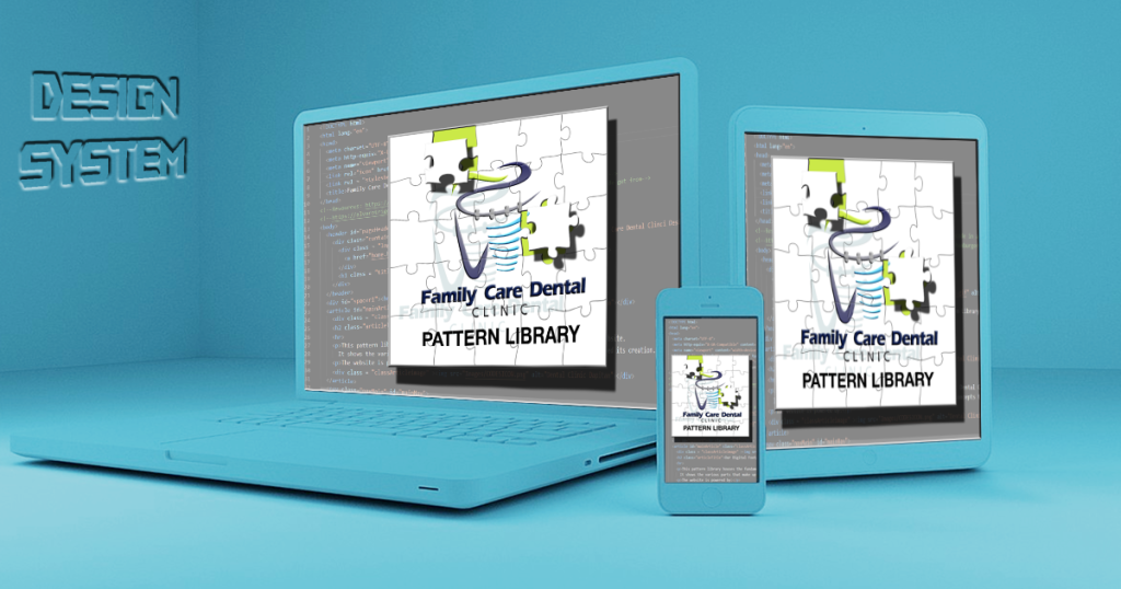
Family Care Dental Clinic Pattern Library is a design system for the website of Dr. Glenn Mohametano’s dental clinic located in the Philippines. This pattern library houses the fundamental elements of the Family Care Dental Clinic website. It is a set of guidelines for designing the user interface. The patterns and colors were developed specifically for the Filipino potential client since the clinic operates locally and the target clients are within a 50km radius of the clinic.
Included in this pattern library are reusable elements like color, typography, icons, layouts which are persistent across the site and also all digital assets that could be used. It also includes user interface components like buttons, links, forms, navigation, tables and other patterns.
Check out the website or look over the code on GitHub.
The site logo was derived from the existing logo on the clinic and was enhanced through Adobe Illustrator and Photoshop. An enhanced photoshop image was created with shadows on it and an animated gif image.

Since the design system is for a dental clinic, the moodboard used conveys calmness and freshness to invite clients that the clinic is a clean and safe place to be and these are the actual colors used on the design system and the sample site.


The main purpose of the website that this design system was made for was to attract potential clients and make them have an appointment. To make the call to action button more inviting to click, an animated icon made from Adobe Illustrator and Photoshop was created and placed beside the call to action button. The icon was made of a series of images and woven into a gif image.
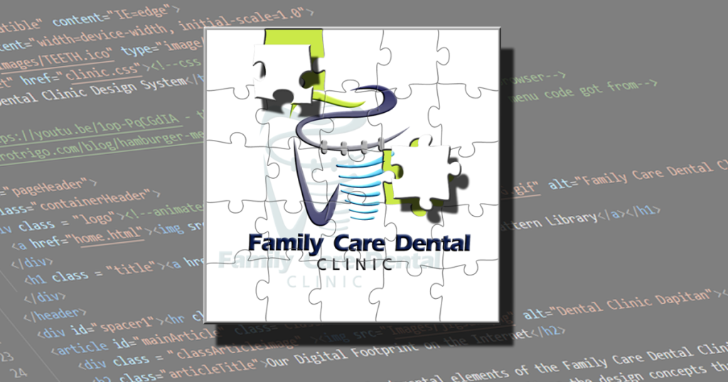
The hero image was derived from the site logo, it was transformed into a jigsaw puzzle image with the actual html coding as background. The logo was edited to look like some pieces were extracted and floating. The image signifies that both dentistry and jigsaw puzzles require a high level of attention to detail and precision. In dentistry, even the smallest error or misalignment can have a significant impact on a patient’s oral health, while in jigsaw puzzles, a single misplaced piece can disrupt the entire picture. Both fields require practitioners to have excellent manual dexterity, spatial awareness, and an eye for detail. The jigsaw image and the pattern library have something also in common, both are composed of little pieces and when everything is grouped together it creates this whole picture or for the pattern library, a reference for the dental clinic website.
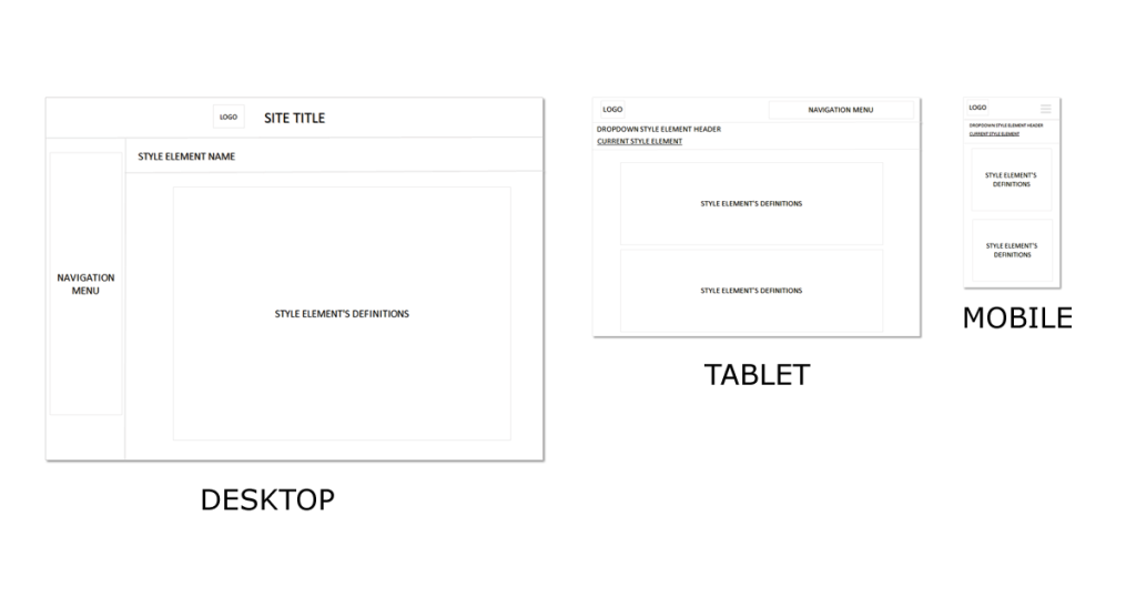
The navigation menu on the side has its own icons present and are formatted vertically and has a radial-gradient background on it. This navigation menu was designed to be responsive and at 990 pixels the side navigation menu will be hidden and the navigation menu will transfer to the top with the style element name selected present under it with a drop-down menu. At 700px, the navigation menu will be changed to a hamburger menu.
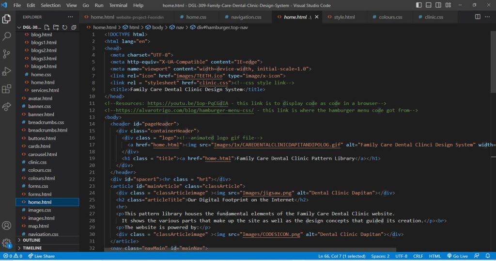
This pattern library was purely coded by HTML and CSS only and it was a bit of a challenge doing it due to some limited functions on it. Adobe Photoshop and Illustrator were also used for image editing.
For the responsiveness of the site, most elements would line up into a column format to adapt to the device’s display and the images would be resized accordingly.

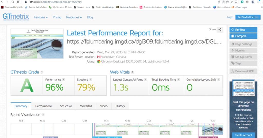
Both sites were tested for speed on the web and both sites were light and rated very good.

