Wave DS
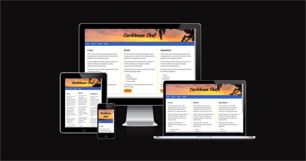
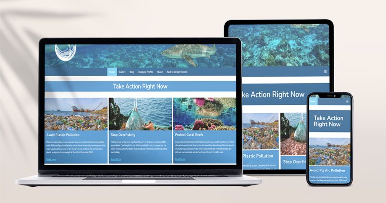
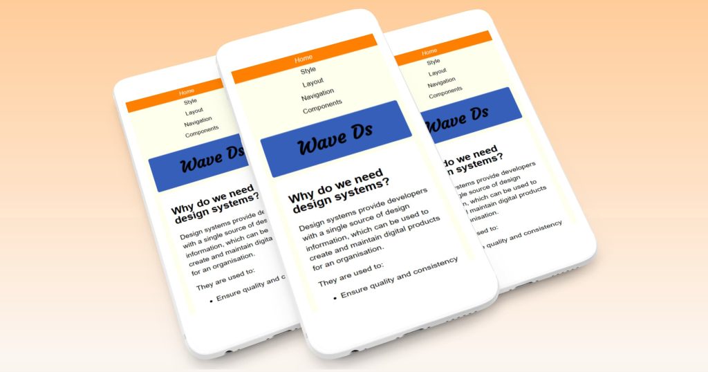
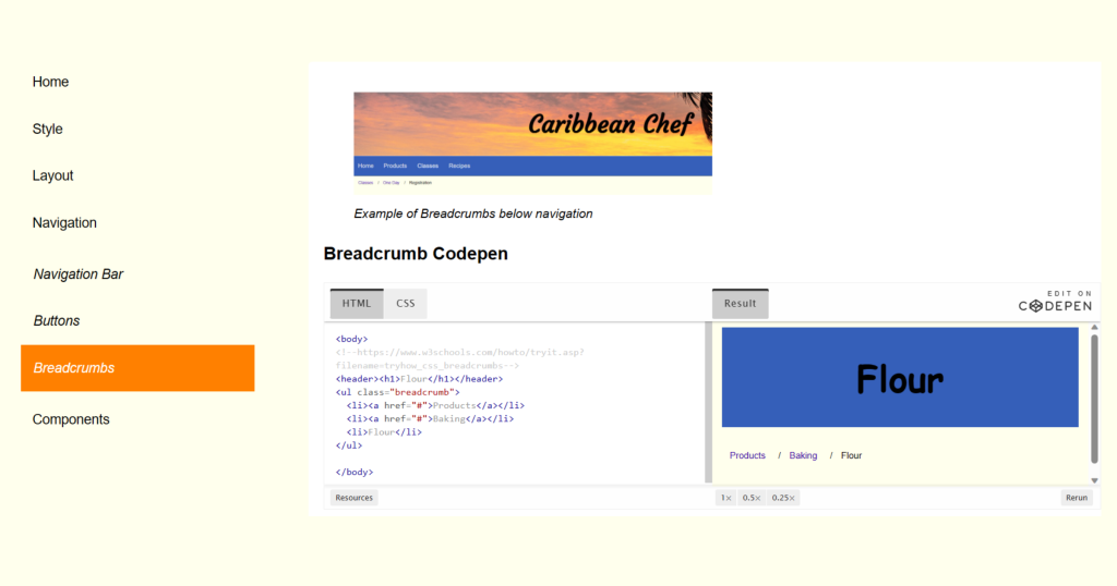
Wave DS is a design system which was developed for a fictitious company, Caribbean Chef. Wave DS was built with the purpose of providing a comprehensive set of guidelines and elements for development of all Caribbean Chef’s digital products. Wave DS caters to designers and developers of all levels, providing clear and concise explanations, images of what each element should look like, code via CodePen links as well as access to a demo website.
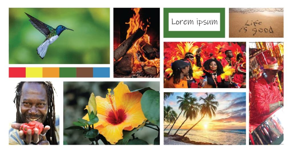
One of the first steps in the design of Wave DS was to create a moodboard that conveyed the Caribbean Chef ‘feeling’. This was an important step since it would indirectly speak to style elements such as color and typography.
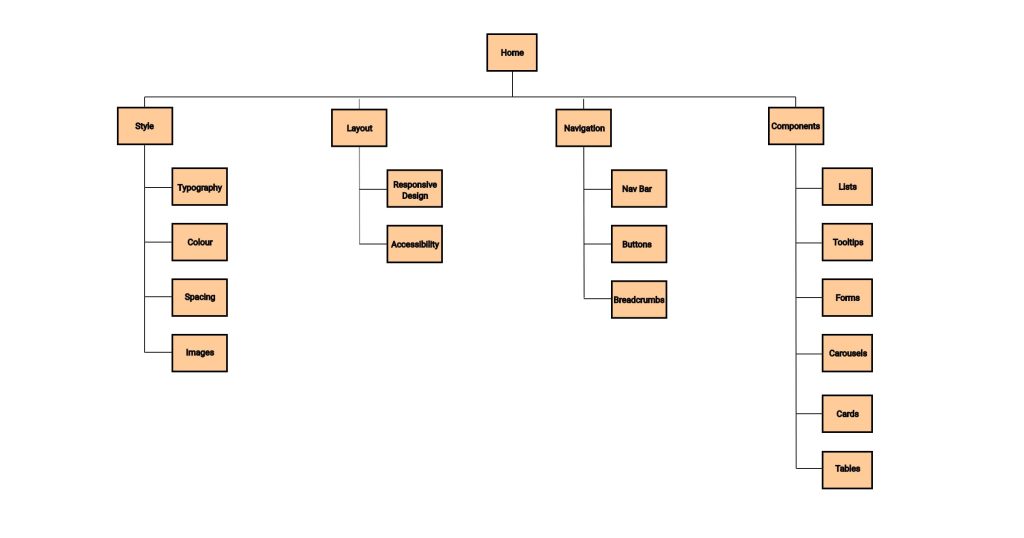
Elements most commonly used in digital products were selected for the design system and categorised.These categories and the elements within them became pages and sub-pages of the design system. Grouping elements was a way of helping developers find elements easily and reduce the number of onscreen navigation items. For example, buttons, breadcrumbs and navigation bar were all grouped under Navigation.
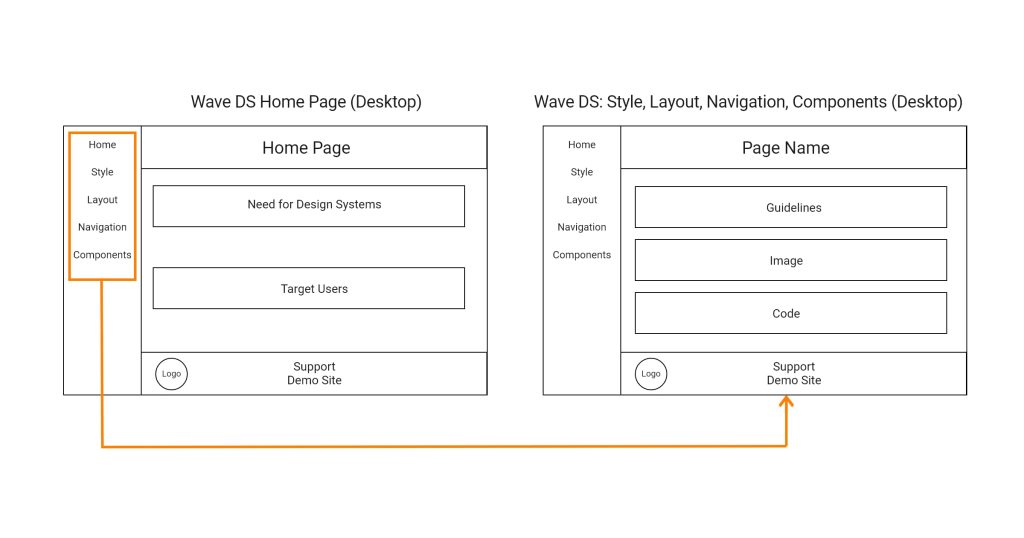
Wireframes, for both Wave DS and Caribbean Chef, were created using Adobe Illustrator. HTML, CSS and vanilla JavaScript were used to build the design system. The basic structure of the design system was created, then components were coded in individual CodePens which were embedded into Wave DS.


Throughout the development of the design system small, incremental changes were applied, committed then pushed to a GitHub repository to provide rollback points that could be used to easily restore the project with minimal loss of time and work.
The decision to use CodePens allows easy modification of element code by Wave DS developer/s and simultaneous update of code on the design system without impacting code structure of the design system.
The accessibility and performance of Wave DS and Caribbean Chef were both important considerations in the development process. Features were added to improve accessibility, such as form validation features, alternative text and captions for images and skip focus buttons (demo site). To improve page performance: images were converted to webp format.

I enjoyed planning both the design system and website and thought more detail could have been added in specific areas such as guidelines for spacing and typography. But, given deadlines and a budget, every developer has to learn to produce a solid functional product. The things that helped me to do this were reading and re-reading requirements, managing my time and taking notes everytime someone spoke. I appreciated working within a team and I think I learnt how to provide and receive constructive criticism and hearing others critique my work was where I had most learning and growth.
