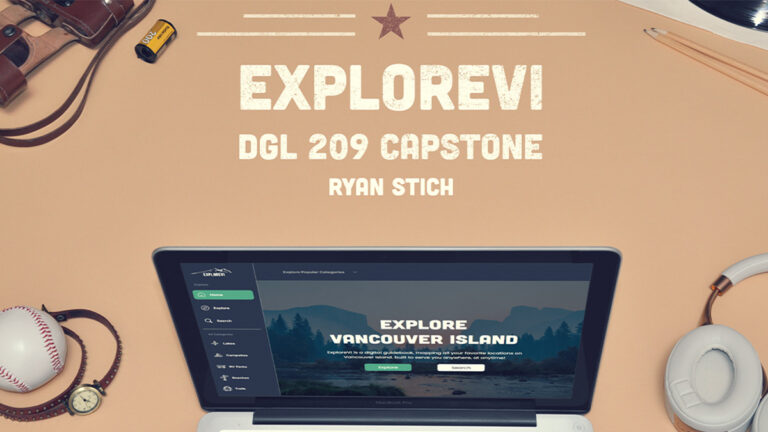
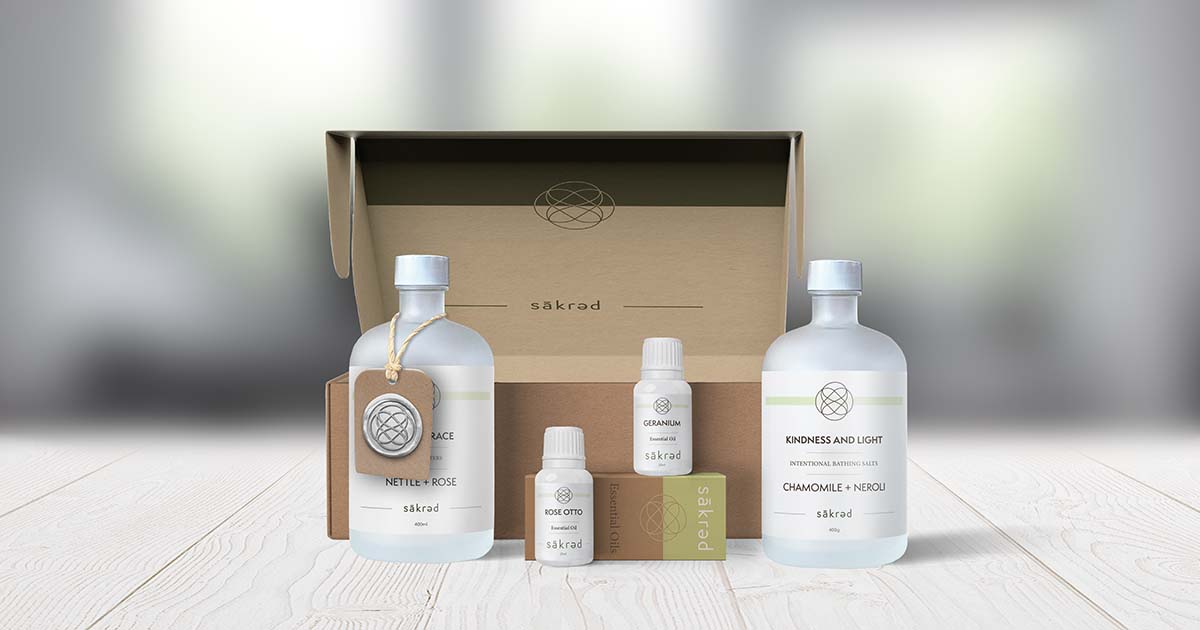
Sakred
“sakred” is a line of wellness and self care products that are hand-crafted in Miracle Beach by a local apothecary using organic and wild-grown ingredients. The essence of the company embodies light, clean living and environmental responsibility.
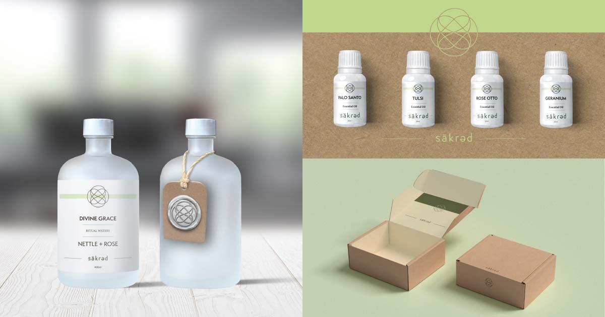
For this project I created the branding, packaging design and a landing page for sakred. The list of products for this line include essential oils, l bathing salts, body oil and a gift box.
Discovery
The first step of the Discovery process was to conduct an interview with the client where I could gain an understanding of her vision of the brand and the scope of the project. The client had very broad but cohesive plans for the new line of products. From this we prioritised the most important products and came up with a set of features for the product.
To get a better understanding of the sakred brand identity I sent the client an intake questionnaire, and conducted research on like minded brands and potential competitors.
Planning
Planning was carried out by creating a detailed, granular task list where items were allotted an estimated time value. Once I had an idea of how much time was needed for the project it became very clear that the deliverables on the list needed to be reprioritized, trimmed and adjusted. For example, a three page website prototype became a WordPress landing page, allowing more time for me to put towards a large volume of package sourcing and design.
Production
The creation of the logo was one of the biggest challenges for me. I put in many hours and changed course a number of times during the process.
Moodboard
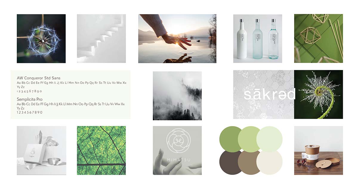
With the majority of planning out of the way, I created a moodboard to get a better sense and feel of the brand. The images that I included depicted a clean sensibility but also a balance between geometric shapes and nature.
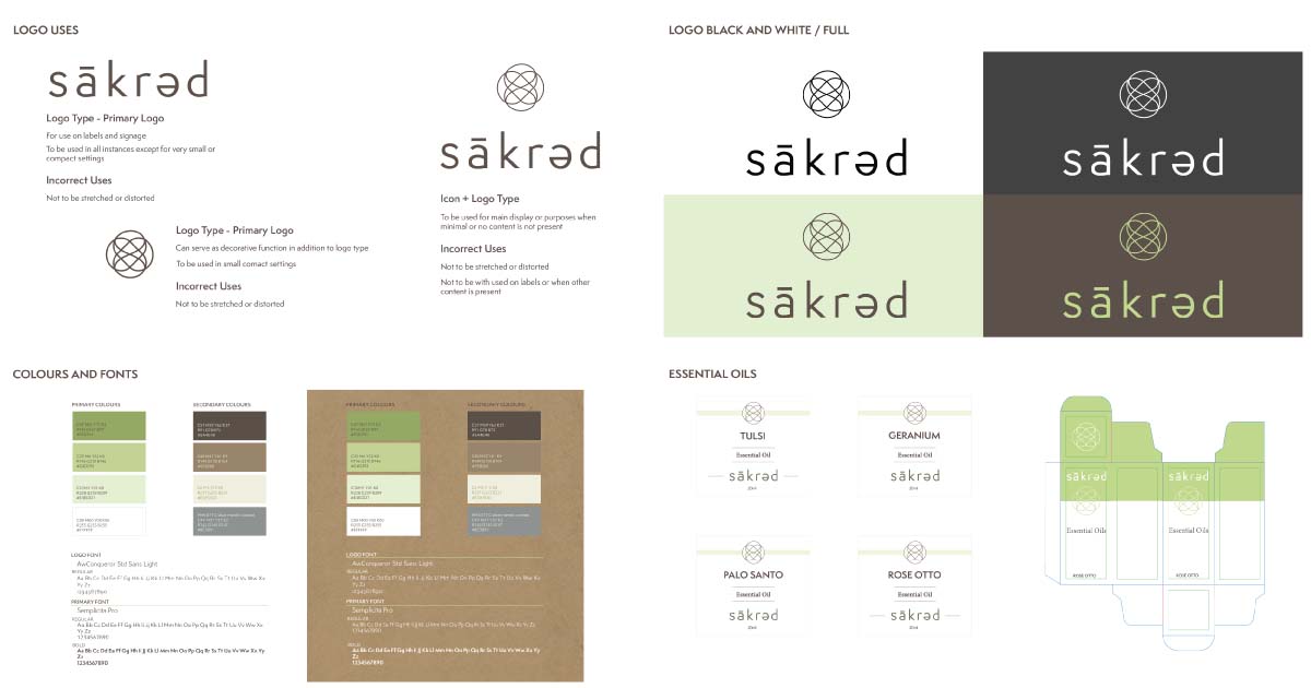
The mood board illustrated the fonts and the colour palette that would be used for the project. For all text other than the logo I chose the font, Semplicita Pro. It is a sans serif font that is both easy to read, warm and has a presence on the page. For Brand colours the client wanted white, browns and greens. Knowing that the boxes would be unfinished recycled cardboard I chose whites, greens and browns that would compliment the natural colours of the box materials.
Logo
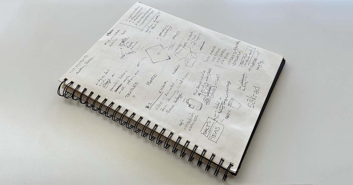
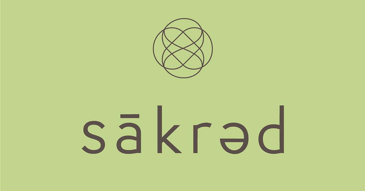
The logo proved to be one of the tougher challenges that I faced with this project. I originally sat down with the intention of including some form of symmetrical, geometrical shapes and possibly including a logotype that used the phonetic spelling for brand name. The client had provided some sacred geometry examples that she wanted to mimic. I began brainstorming with pencil and paper trying to get every bad idea out of the way. Mostly I was trying to come up with ideas worth carrying forward. This was fairly unsuccessful so I moved to the computer to try to do the same. The challenges that I was facing was how to tastefully pull from sacred geometry and also how to keep the logo simple enough so that it could be legible in all sizes.
After a number of false starts and dead ends I scrapped my original intention and went instead with a simple logotype. The goal was for the logotype to be clean and memorable without being too audacious. After hours of thumbing through fonts I settled on AWConqueror light as a jumping off point. It is a lightly decorative sans serif font. Some of the stylistic considerations present in the font (mainly the merging of the bowl and the stem in the letter “d”) I chose to embellish slightly and apply to other letters (the “a” and the “r”).
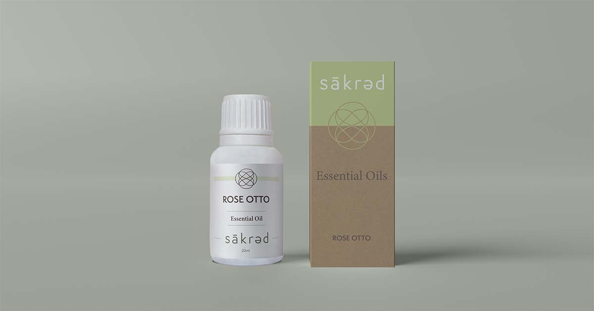
Label Design
Through an ongoing client interaction it had been decided that the labels and box design was to be clean and minimal with an abundance of whitespace. With this in mind I brainstormed a large number of ideas and sent the strongest of these to the client. The client made suggestions and I, in turn, made adjustments. This back and forth process went on much longer than I had anticipated which forced me to make a final decision on my own due to time constraints.
Addition Of An Icon
While designing the product labels it became clear to me that the logo was going to need the addition of an icon to accompany the logo. I refined my research on symbols and shapes and eventually created a number of my own. Having a logotype already designed made clear what style of symbol would be needed.
Mock Ups
Creating the mockups was a tedious process but in the end rewarding. The bottles for each product had been specifically chosen by the client. I photographed each bottle and then had to figure out how to insert the images into each mock up template. All the labels had to be resized and colour values adjusted, to make them look convincing.
Style Guide
The style guide outlines all that was created for the brand such as brand colours and fonts, the labels and mockups. It also provides instructions on how to use certain assets such as the logo and Icon.
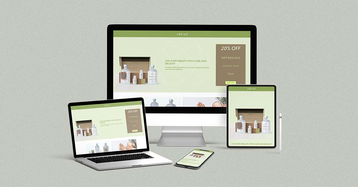
Social Media and Landing page
For this part of the project I created three sets of social media launch posts. Each of the three included a facebook post and an Instagram ad. From there I built a simple landing page that was based on one of these ads.
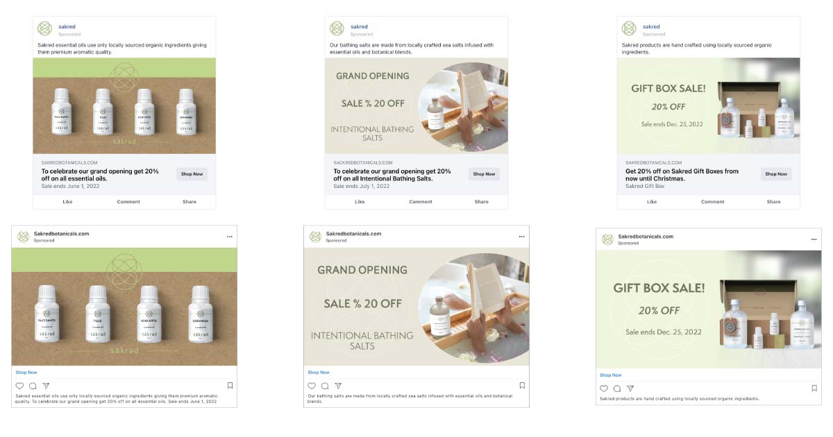
If a user were to click on the social media ad the landing page would be the user’s destination. The Landing page provides a value proposition, the product benefits, social proof and a clear link to purchase the product.