Capybara Coffee
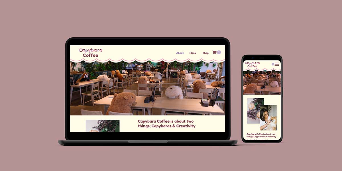
Capybara Coffee is an up-and-coming coffee shop located in the heart of Vancouver with an unconventional twist; it’s completely made up. This project covers every step of creating a brand from defining a mission statement to making a mockup for their website. Other highlights include creating business cards, cups, coffee beans, a menu, and of course, a style guide.
Why Capybara Coffee?
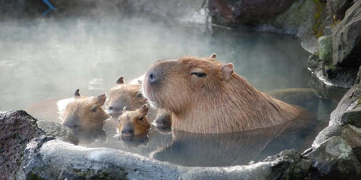
Capybaras are the world’s largest rodents, known worldwide for being friendly and relaxed. It’s a reputation that would carry over well to a coffee shop; so I thought I’d make one.
Mission statement, target audience, and value proposition
When approaching any branding project I always have to take into consideration the people behind the company; the people behind Capybara Coffee, of course, aren’t real so I had to come up with Capybara Coffee’s goals and aspirations myself. Going off the name I knew right away that one of Capybara Coffee’s goals would have to be creating a relaxed environment. With that in mind I created the following mission statement:
“Capybara Coffee wants to create an atmosphere where you can relax from the stresses of the world; like a capybara in almost any situation.”
With a mission statement like that and a name like Capybara Coffee, I felt like targeting young adults was inevitable. Not to mention that a place to relax would appeal to people in that age range because they’re stressed from work, might need a neutral place to meet people (out of fear or because of roommates), and need coffee (yes, NEED). To define that further, I decided Capybara Coffee would target anyone from the ages of 20-30 (millennials and gen z).
Vancouver has a huge coffee shop scene that is highly competitive so I needed something to set Capybara Coffee apart. After researching competitors, I realized there were a lot of coffee shops with a focus on roasting their own beans and creating delicious black coffee; but not a lot, if any, focused on out-of-the-box combinations. So that became Capybara coffee’s value proposition: “Capybara Coffee is committed to serving excellent coffee in interesting ways, by continually experimenting with different spices/flavor profiles in order to create something truly delicious”. With the value proposition & mission statement done I felt completely confident to jump into creating the logo.
Moodboard
An important step, in my workflow at least, to logo design, is making a mood board. If I go into illustrator without any ideas for colors and fonts I’ll be in there for HOURS. I find it also helps communicate to my peers (in this case) what I was going for so they can give me more informed feedback. It’s hard to critique any design project without knowing what vibe they were going for in the first place. Picasso’s work is beautiful but if he was going for realism I have a few notes for him.
Originally I was tempted to go down the traditional delicate handwriting path seen in many other coffee shop logos, but that isn’t a good representation of what Capybara Coffee is all about. Capybara Coffee is a café brimming with two things: coffee and creativity and their logo should be no different. So after making the mood board I knew I wanted to include:
• A sans-serif font to make the logo feel welcoming,
modern, and poppy
• Asymmetrical typesetting to represent the creativity of the Capybara Coffee
• A circular logo/coffee-based graphic again would help to bring in that
welcoming feeling
• Finally, if possible, a swirly colorful graphic would allude to Capybara Coffee’s flavor experimentation add a little flair to the logo.
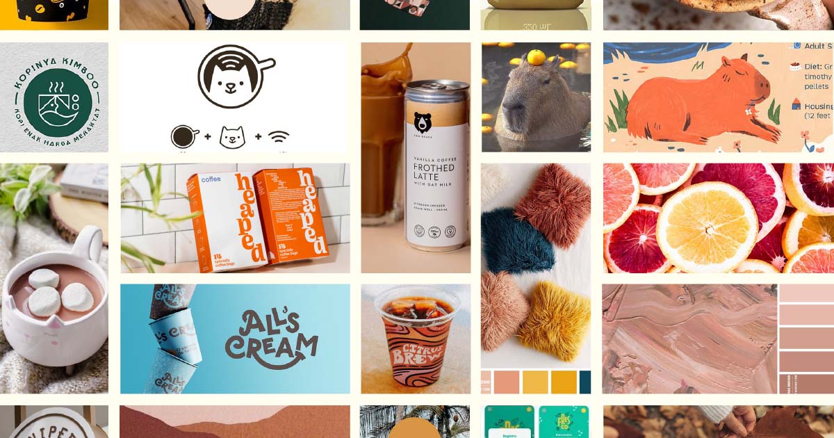
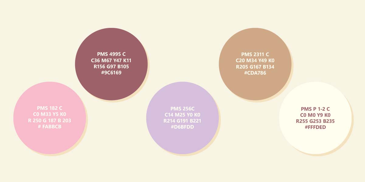
In terms of color, the only thing I was sure of was a neutral brown had to be involved, you can’t have capybaras or coffee without one. My first instinct was again to go to the more traditional colors, browns, greens, etc.; but once again that doesn’t feel quite right for the brand. There just needed to be some pops of fun colors to express Capybara Coffee’s creativity and welcoming atmosphere. I was thinking of something warmer and more saturated but I wanted to leave the colors up to some experimentation like Capybara Coffee’s coffee.
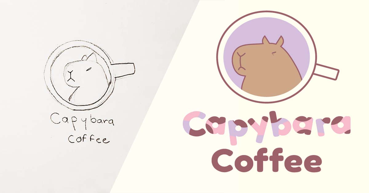
Logo sketches
I started sketching out a couple of ideas before jumping into illustrator. It took a while until I decided on my final design for the capybara; originally I was going to make him look more relaxed but when I made him look grumpy, I fell in love. Once I finished the graphic I went to work finalizing the colors, I used Printkick’s ‘Image color match tool’ to find the closest Pantone possible to my RGB value and it worked well with a little tweaking.
Presenting to the group and doing reversions
This project is set with three different benchmarks at the end of which we present what we’ve done during said benchmark to get feedback. The creation of the brand identity, logo & style guide was the end of benchmark one; so the last step was to present. I got the following feedback on my original logo:
- The black and white text was hard to read
- The handle of the mug should be rounded off a little more because it looked too stiff
Using that feedback I made a couple of improvements as seen below.

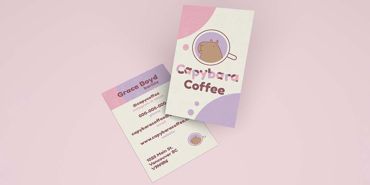
Business cards
Capybara Coffee’s logo was finally done, now I could move on to the fun part: brand collateral. I started with their business card, once the logo is done it’s pretty straightforward. I knew from the beginning it was time for a vertical business card; they’re stylish, modern and a little unconventional just like the brand. I also wanted it to use the brand palette and for it to have a decent amount of white space so it didn’t look cramped. It seemed a little bland without any texture so I overlaid a patterned spot varnish; it added so much more character to an otherwise simple card.
Tote Bag & Aprons
With the tote bag, I wanted to make something simple that felt a little more unique than slapping a logo on a bag. My first thought was just to use the capybara icon art but I wanted to use the tote bag as a marketing opportunity. With just a capybara icon no passerby would assume it belonged to a coffee shop. So instead I used the wordmark and a pattern of overlapping circles (exactly like the ones in the wordmark) to make the design for this adorable little tote. For the outdoor sign, I just wanted it to be legible and recognizable and there’s no better way to ensure that than using the original logo.
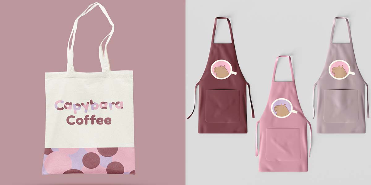
I went back and forth on the apron design. I wanted something simple that the employees wouldn’t despise wearing; as someone who has worn more than one uniform in her time, certain colors do not work for certain people. I thought offering more than one color would be ideal, so regardless of skin tone there would be an apron an employee can feel confident in. Originally I was just going to use the wordmark but I felt like the storefront needed more capybara, so I ended up using the capybara icon in its original and alternative colors.
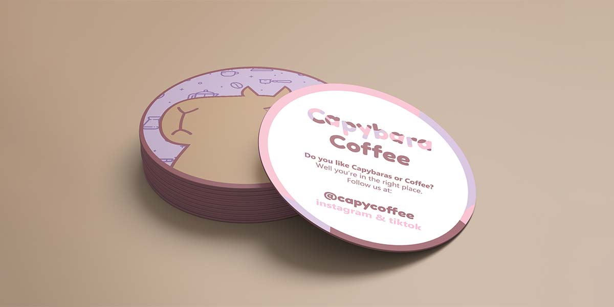
Coasters
A lot of coaster designs aren’t double-sided; isn’t that weird? It’s a great marketing opportunity. The design of the coaster came instantly with Capy on one side, and social media on the other with the overlapping circle pattern as a border.
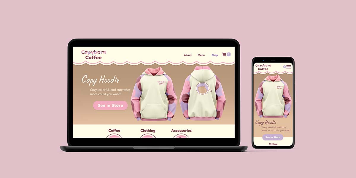
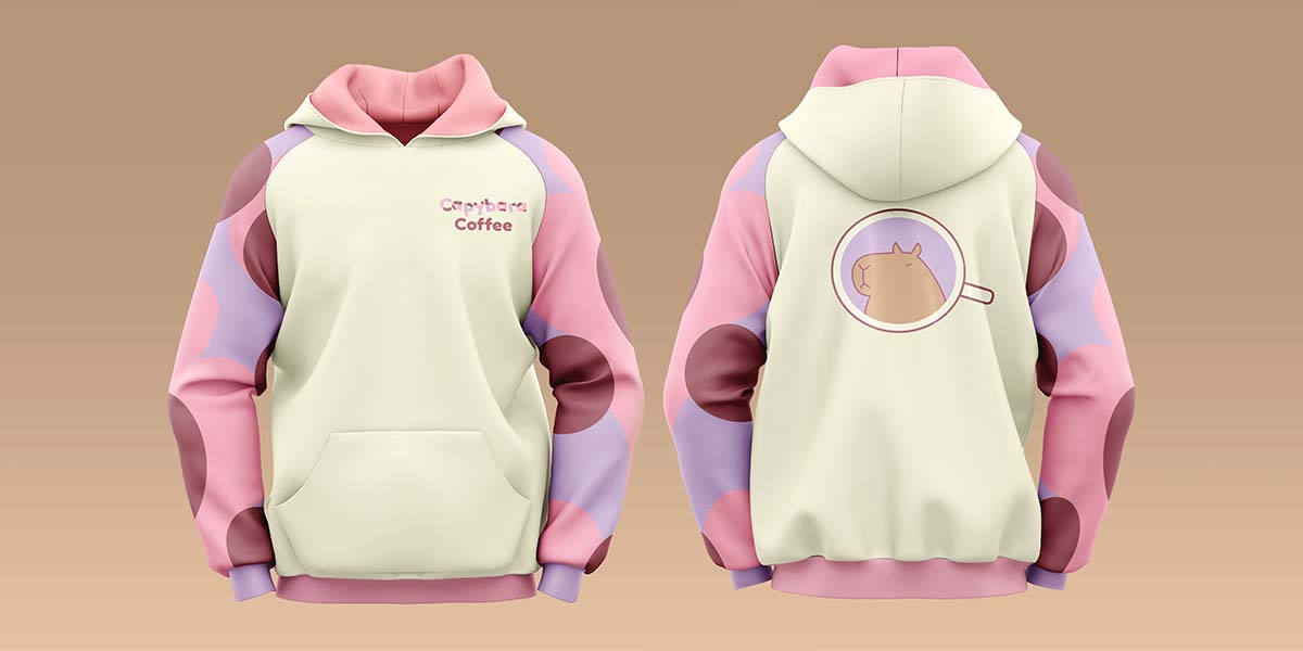
Hoodie
I felt like the colors and patterns of Capybara Coffee leant themselves nicely to a hoodie. Of course, a real coffee shop wouldn’t stock something so elaborate lest it gets splattered with coffee but it turned out beautifully.
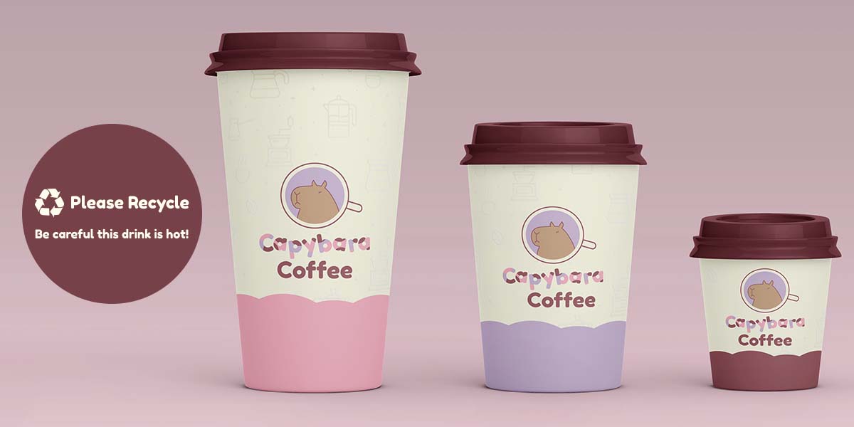
Coffee Cups
One of my favorite things to design was the coffee cups. I had to do some research into the standard dimensions of each size (6oz, 120z, 16oz) and the printable area of each. I also had to look into what a paper cup requires legally in B.C – which is apparently nothing; you don’t need to have a ‘caution hot’ warning in Canada, but it felt a little obtuse not to add one. I also added a recycle logo and a message that said please recycle. Going into the actual design I wanted to make a simple design with lots of white space & use the brand colors consistently. I used different colors for each size to add a little variety and make it easier for employees to tell which is which if they could only see the bottom.
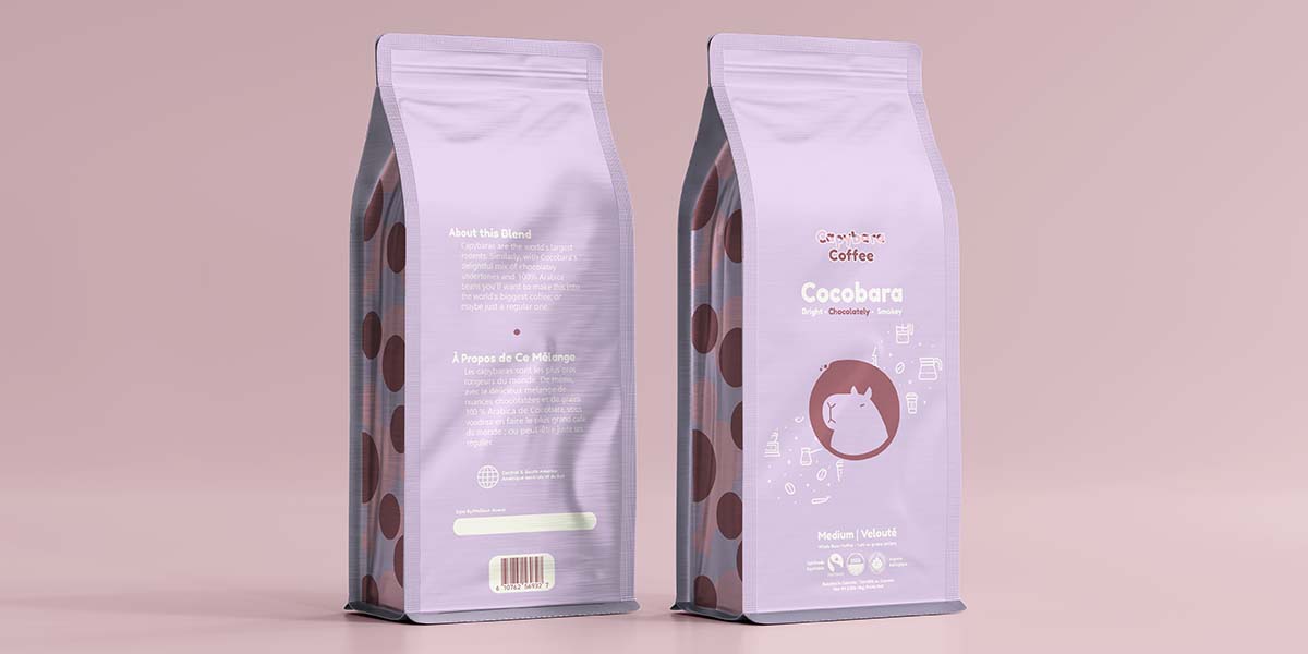
Coffee Beans
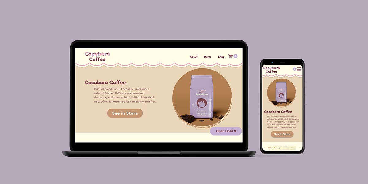
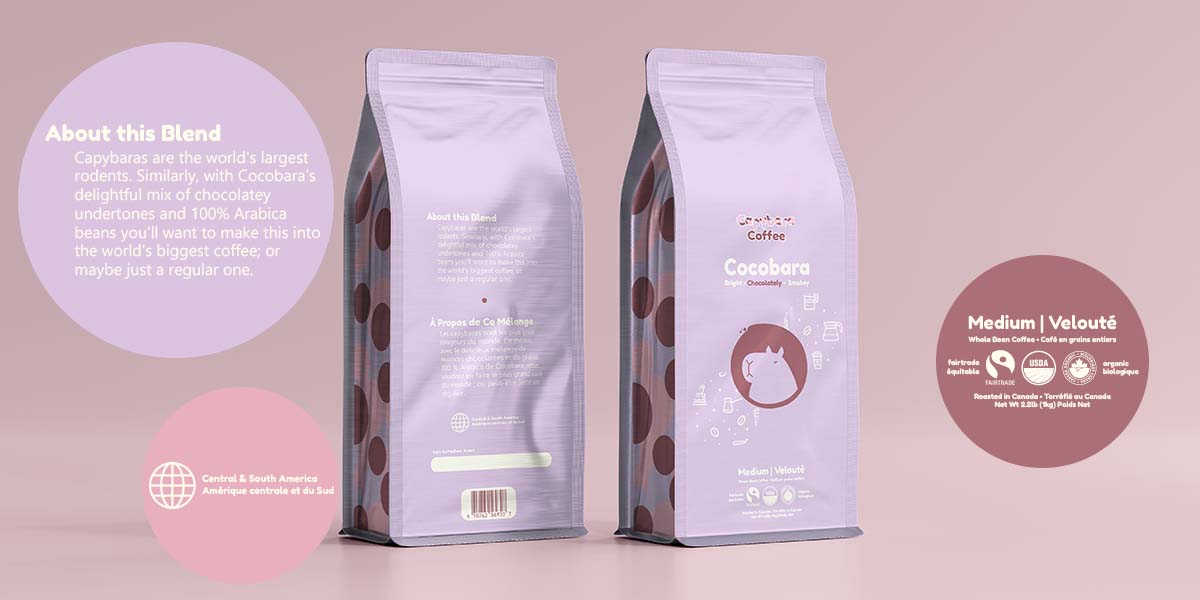
I found the dimensions for a roll-up coffee bag, measured the distance of a similar bag I had at home to estimate where the slant would sit, and kept all the text well within the ‘safe zone’ for printing. When it came to the text itself I also had to research a fair amount, the design would have to include, the net weight, the roast (medium) where the beans were roasted, whether it was grounds or beans, a space for a best before date and a barcode. I also decided to have the text be in French and English, and the net weight is in pounds and kilograms.
As capybara coffee as a brand is targeting gen z and millennials I thought it would be important for the coffee to be ethically sourced, as this is more of a priority for the younger generations. Because of that Cocobara is fairtrade USDA organic & Canada organic. I also included a section on the back that clearly states that the brands are sourced from north & south America so it’s easier to skim. In the same vein, I included flavor notes under the title.
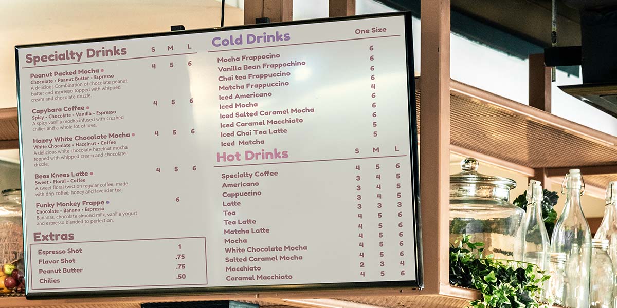
Menu
After much debate, I decided to go with an electronic menu board, so it could be changed more easily. I wanted the menu to be simple and modular, so it could be easily transitioned into different formats later if need be. This design can be easily transitioned to a three-column design or a one-column design for print or web. For the specialty drink, I included flavor notes so it’s easily skimmable and colored dots to denote whether the drink is cold or hot.
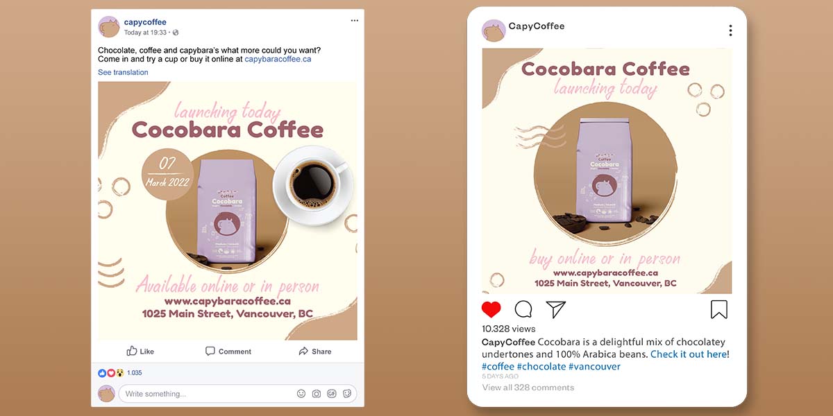
Social Media
The social media posts for Cocobara’s launch felt like a victory lap. I took the vibe of the style guide with its consistent use of brown and added in some nicely textured shapes to make these launch posts. Facebook’s aspect ratio is a little bigger so I tried to take advantage of that by adding in the date and coffee cup. On Instagram, I tried to make it a little more minimalist and clean.
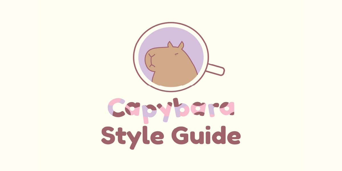
Style Guide
With all the brand collateral done I could finally make a style guide. The style guide covers Brand colors with RGB values, hex codes & Pantone names; Logo usage and spacing requirements; logo variations with instructions on how to use them; and examples of brand usage. Overall I’m really happy with how the style guide turned out; it’s an excellent example of the brand I set out to create.
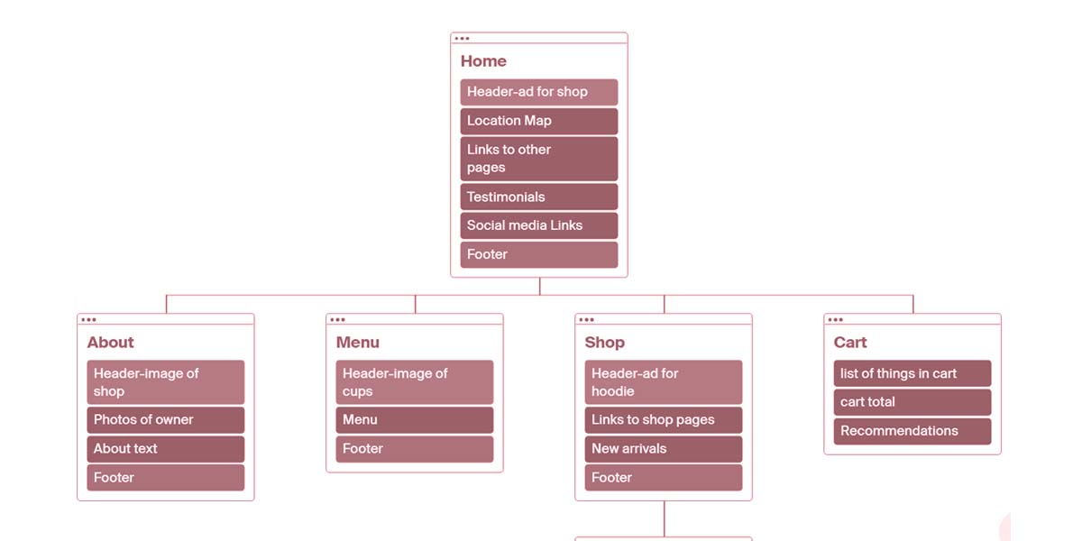
Sitemap
A sitemap, if you don’t know, is usually a flowchart with a list of all the pages on a site. It’s used as a planning tool. For my purposes, I decided to also include every chunk of information I wanted to include in the final prototype. I find it saves a lot of time to know exactly what needs to be on the page BEFORE you start working on it.
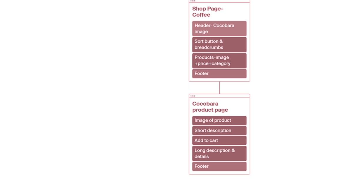
Wireframes
Similar to sitemaps, Wireframes are all about chunking your content out before you finalize the colors, images and design. It’s kind of like a sketch of the final website and once again it saves me a bunch of time to do this step. If you’re interested you can check them out here; although you’ll have to navigate with the arrows at the bottom of the screen.
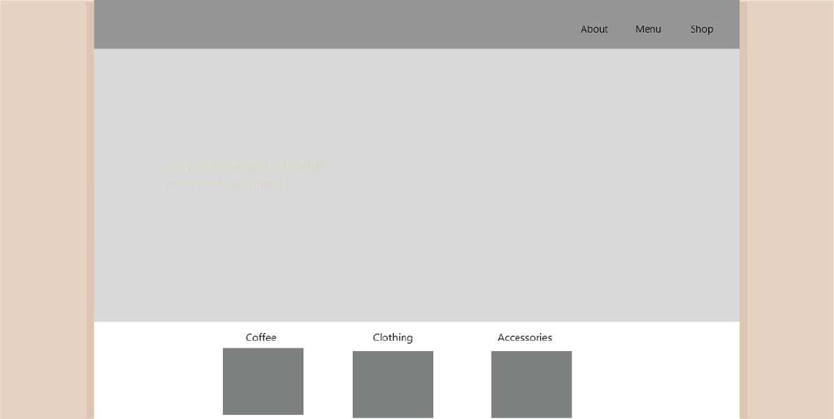
XD Prototype
After planning out the content and a general layout I finally got to add in some color and some fun final touches. I think it’s really important to ground your user by making the majority of the website neutral colors so I used the off-white and light brown as a base and threw in fun pops of color as much as I could. I tried to balance how often I used the brand purple and pink colors. The logo had roughly an equal amount of both so I wanted the site to reflect that as well. For example, the navbar is rimmed with pink while the cart indicator is purple. You’ll find that same balance with the hover colors as well.
Other than that I tried to keep the design consistent with everything else I had designed up until this point. One of my favorite details is on certain pages you can find the shadow of Capy as a background texture. There’s a desktop version of the website available through adobe XD. I think it turned out really well, I’d love for you to check it out.