Eco Surf Resort
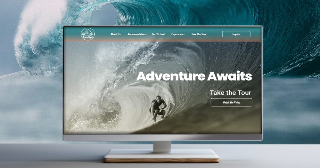
My project involves creating a brand identity and a website for a fictitious off-grid Eco Surf Resort, located on the Emerald Coast of Nicaragua. The resort is committed to sustainable tourism and community development while offering low-key off grid luxury glamping. Along with a surf school, the client offers trips, tours, and activities along with educational, citizen science, and community volunteering opportunities. The project goals include creating a brand identity, brand assets, and WordPress website that grabs the viewer with compelling visuals, reflects the brand’s values, and attracts their target audience.
Discovery
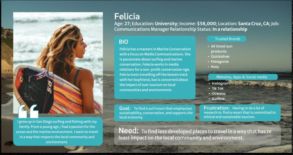
During the discovery phase, I researched competitors, user demographics, and decided on specific business goals. Business goals included increasing brand awareness, increasing leads, attracting new customers, and encouraging repeat business. The goals also included: promoting environmentally and socially sustainable travel, as well as providing economic opportunity to the local community. The target audience are primarily educated, environmentally and socially conscious surfers (or people interested in surfing), and adventure seekers looking for unique and educational experiences.
Planning
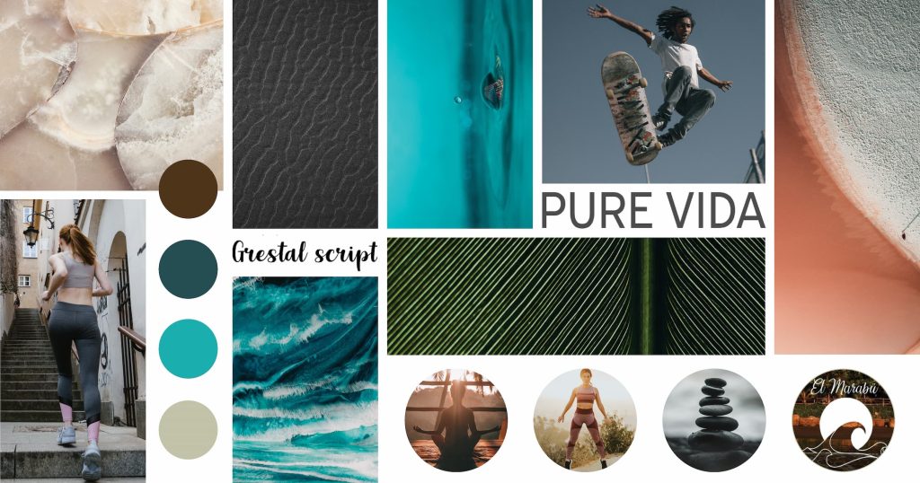
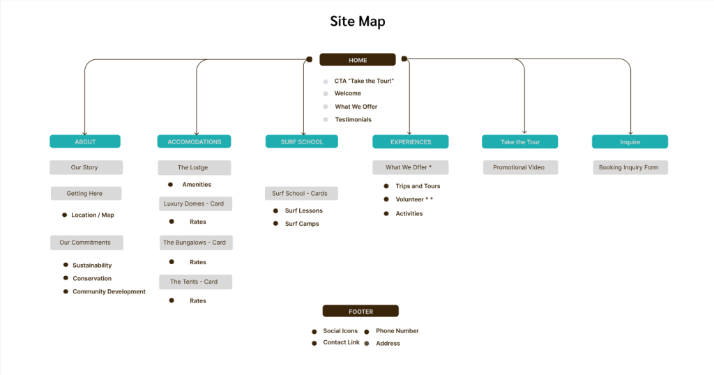
The planning phase involved creating a mood board, sitemap, and low-fidelity wireframes. I also conducted competitor logo research and began sketching thumbnails. I decided on a simple round one color logo and a wordmark, each to be used together or separately. To represent the area, I chose to incorporate a volcano and an ocean wave. The brand colors are reminiscent of the sea, sand, and earth. The typography is a mixture of Sans-Serif fonts and the surf inspired Grestal Script as an accent font. I wanted the viewer to be drawn in by dramatic visuals and feel a sense of adventure, relaxation, and fun.
Production Prep
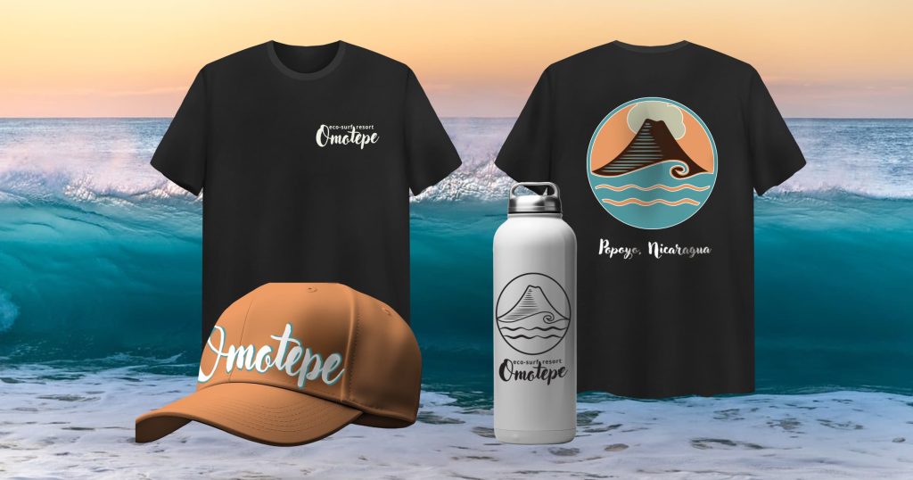
At this stage, I finalized the logo and prepared for production by creating a multi-page style guide. I further expanded on the logo design by creating more detailed color versions that can be used for T-Shirts and stickers.) The style guide includes a section for all the main elements, including colors, typography, logo and logo variations, photography, and collaterals. Each section begins with a brief introduction of the chosen element, includes visual examples, and instructions for how each element is meant to be used.
Production Layout
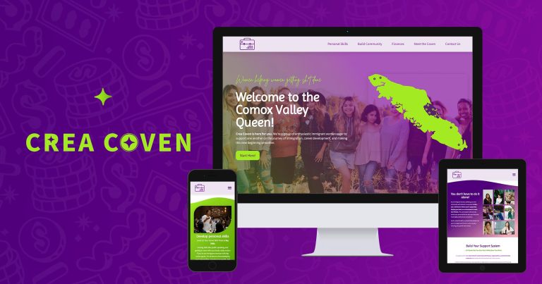
My goal for the website was to create a minimum viable product that could be expanded upon later. I created cards based on posts which can be made into full published posts, and eventually, each post type can have its own archive page. To create the website, I used WordPress, Elementor Pro, and a smattering of custom CSS. I also created a promotional video in Adobe Premiere Pro. I referred to my wireframes and sitemap to ensure that my site would be cohesive and easily navigable. Additionally, I employed the use of various plugins to give the site extra functionality or visual appeal.
Production Final
With the bulk of the website complete, I conducted a Quality Assurance that evaluated or listed several metrics, including functionality, layout and design issues, SEO, and performance testing. For the functionality and design portion, I enlisted the help of two testers, who gave me invaluable feedback. For the SEO, accessibility, and performance testing, I utilized Yoast SEO, Semrush and Google PageSpeed Insights.
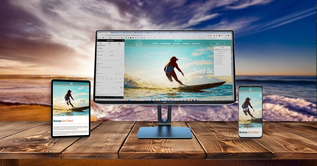

While building my website I overcame multiple difficulties, including bugs and technical issues with Elementor Pro. I also needed to implement a range of custom breakpoints to optimize responsive layouts across device sizes. This took a lot of trial and error and continual adjustment to fine tune the layout for odd device sizes. Despite these issues, I worked hard to create a worthwhile project that meets the project goals.
