Unisport
Unisport is a fictitious sportswear brand that provides high-quality sports gear and clothing. The company serves both male and female clients, seeking to supply them with attractive and effective sportswear.
Unisport attempts to satisfy the demands of athletes and fitness enthusiasts by providing a diverse selection of items such as running shoes, exercise clothing, and sports equipment. Unisport is the go-to brand for anybody seeking premium sports apparel and equipment, with a dedication to quality and customer satisfaction.
Check out the style guide on ISSUU.
Mood Board
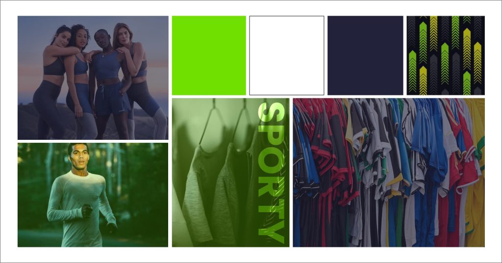
To establish a solid foundation for the project, I started by building a moodboard with a range of colors, and imagery to serve as a source of inspiration. The moodboard serves as an indirect reflection of the soul of the brand as a whole. This stage is critical since it determines the direction for the rest of the project while also offering a preview of the final product’s look. My goal in this project was to combine sustainability with liveliness and dynamism, which I accomplished by combining vibrant and cool tones that were complementary to the brand’s identity.
Logo
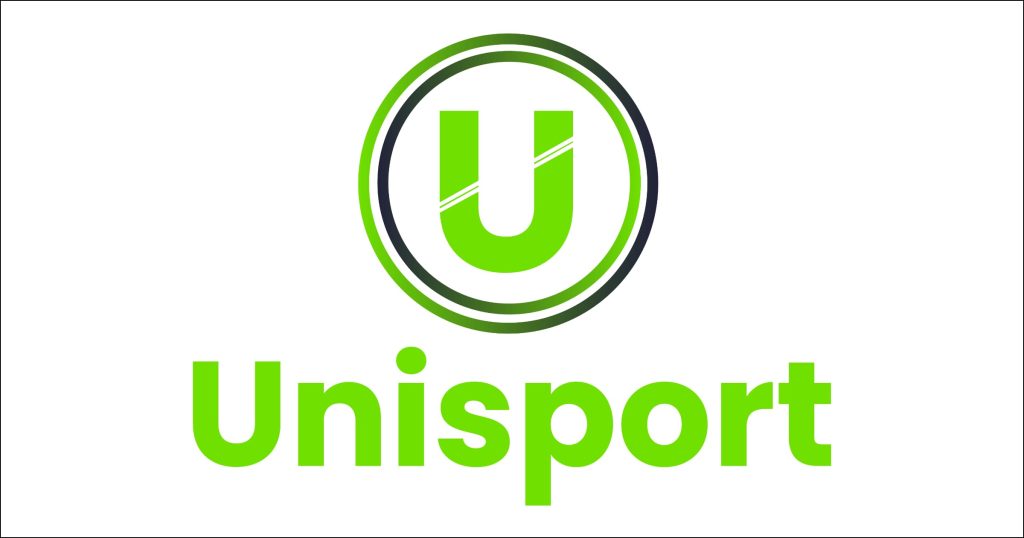
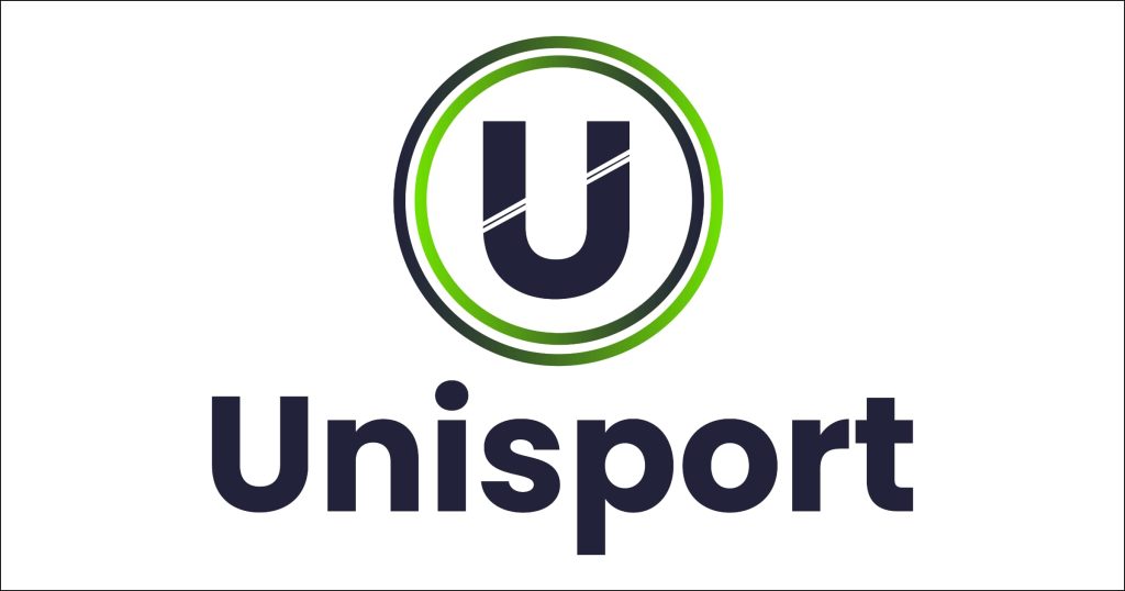
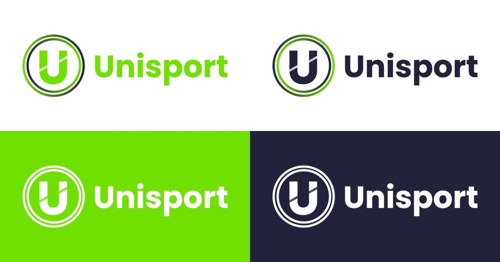
The logo of Unisport is designed to be simple yet effective in communicating the brand’s identity and values to today’s audience. The logo consists of the brand name “Unisport” in bold case letters, with the letter “U” featuring a sliced diagonally creating the effect of stripes around two spheres.
The bold, uppercase font and bright green colour used for the brand name gives the logo a strong and confident visual, while the use of the blue color conveys a sense of trust, reliability, and professionalism. Overall, Unisport’s primary logo effectively communicates the brand’s identity as a trusted and reputable provider of sports equipment.
Logo Variations
It is essential to have many variations of a company’s logo to ensure that it suits diverse situations and designs. To appeal to multiple uses, I created a simplified monochromatic logo, a horizontal logo, and an icon logo
Colours + Typography
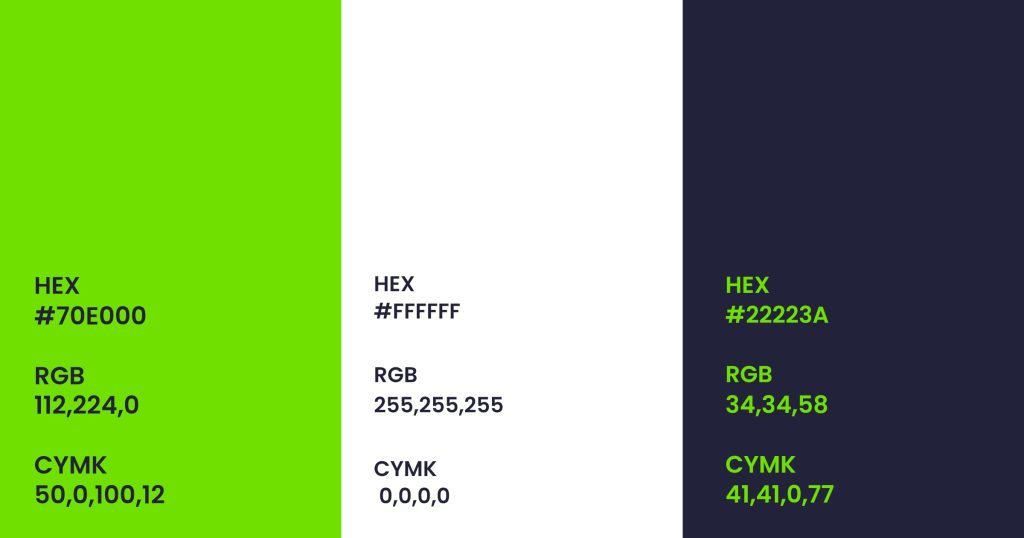
The colors selected for the project are a blend of vivid, cool, dark, and bright shades that complement each other well, providing good contrast while also being accessible. The energetic vibe of the brand is represented by the bright green color, while the navy blue shade signifies safety and trust, and the white color evokes peace. Altogether, these colors effectively reflect the brand’s mission..
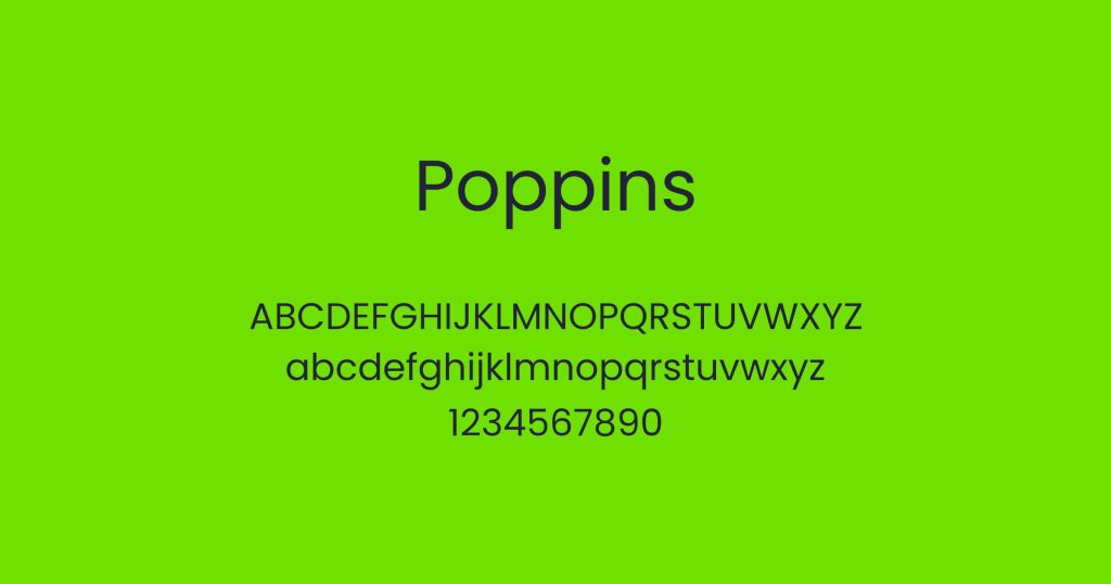
For numerous reasons, I chose the Poppins font family as the typeface for the “Unisport” brand. First and foremost, I found Poppins to be a modern, clean, and adaptable typeface that functioned well in a variety of mediums, including print and web.
In addition, I thought Poppins had a modern vibe that fit with the brand’s concept of being trendy and modern. The font’s simplicity and clarity expressed professionalism and credibility, all of which were important traits for a brand. Ultimately, I selected Poppins because I thought it was a good fit for the Unisport brand due to its adaptability, readability, and contemporary style.
Brand Collateral
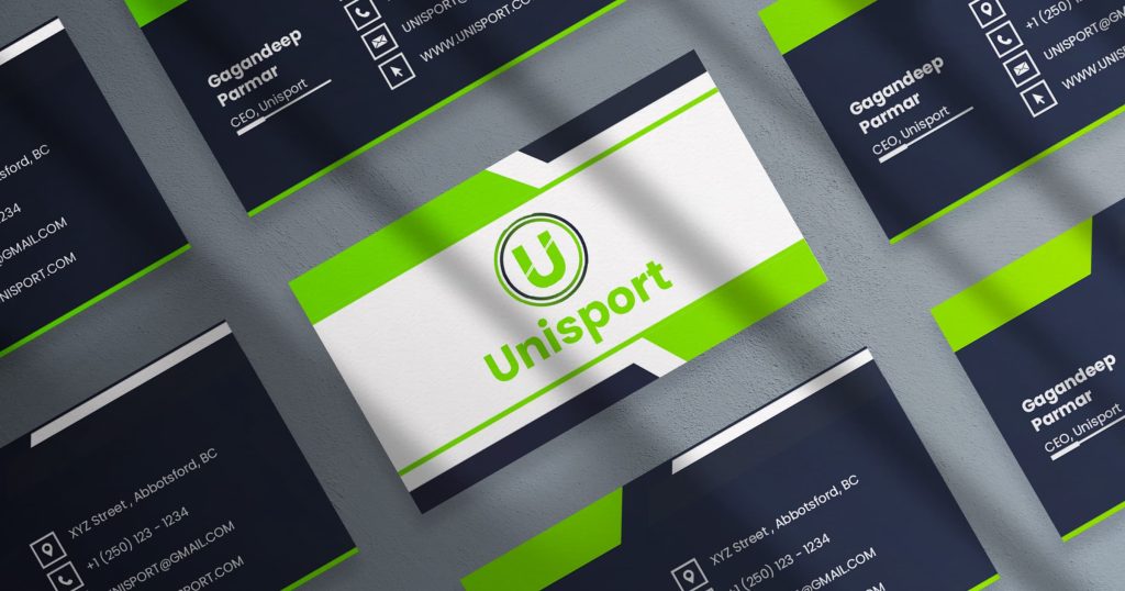
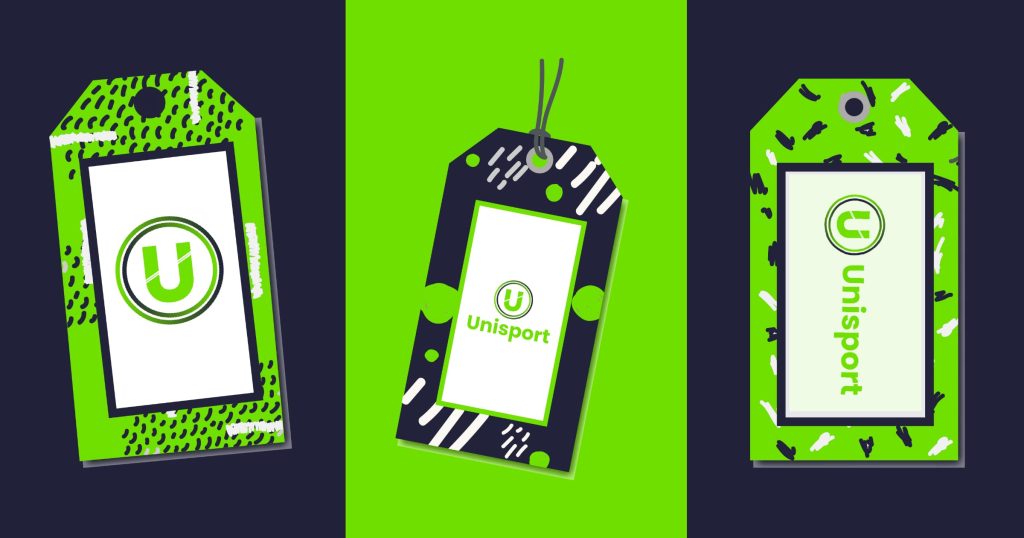
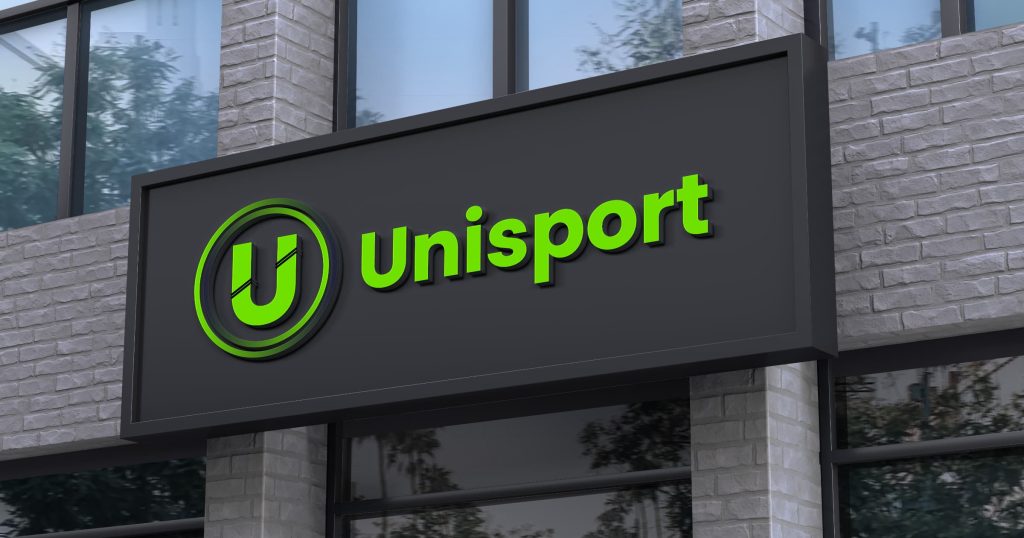
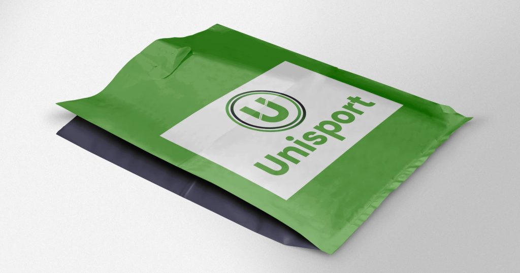
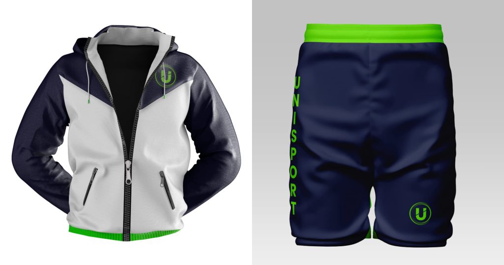
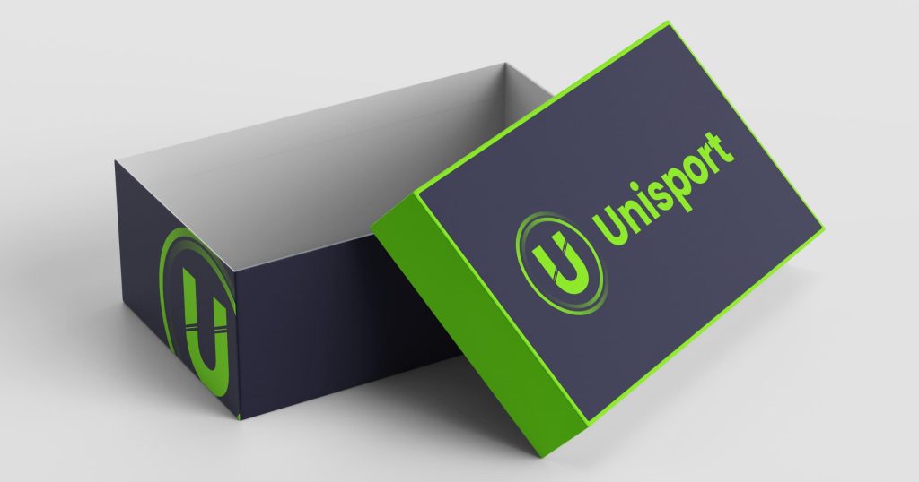
I created various mockups to highlight the logos I designed and to present the brand with design phase materials. Their designs featured business cards, garment tags, retail signage, shopping bags, branded clothes, packaging and other products.
Digital Ads / Social Media
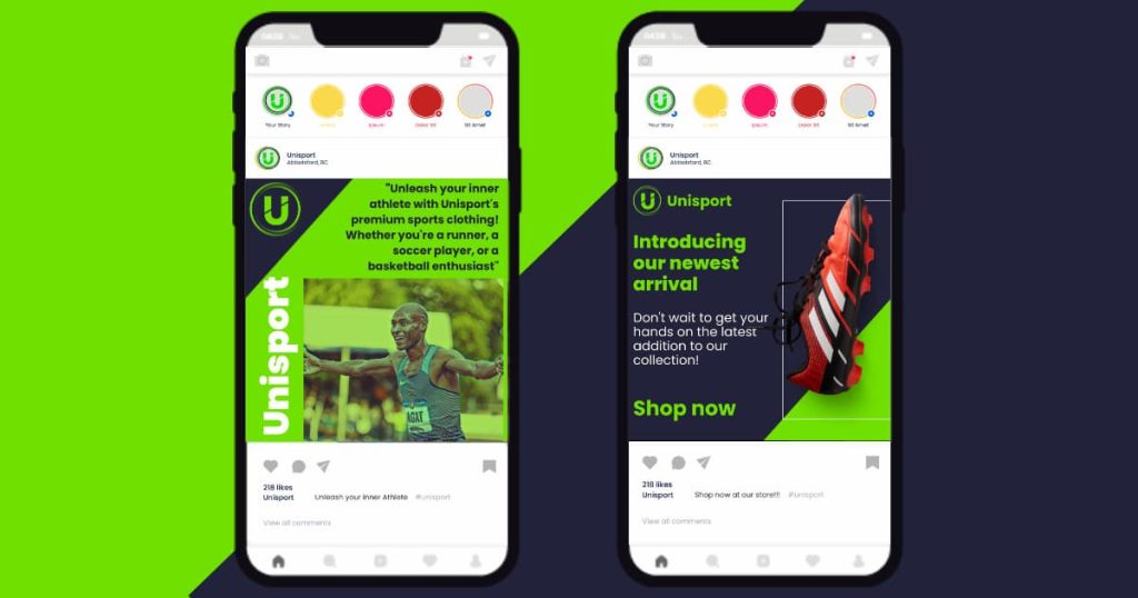
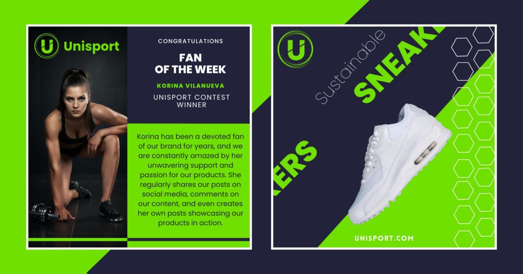
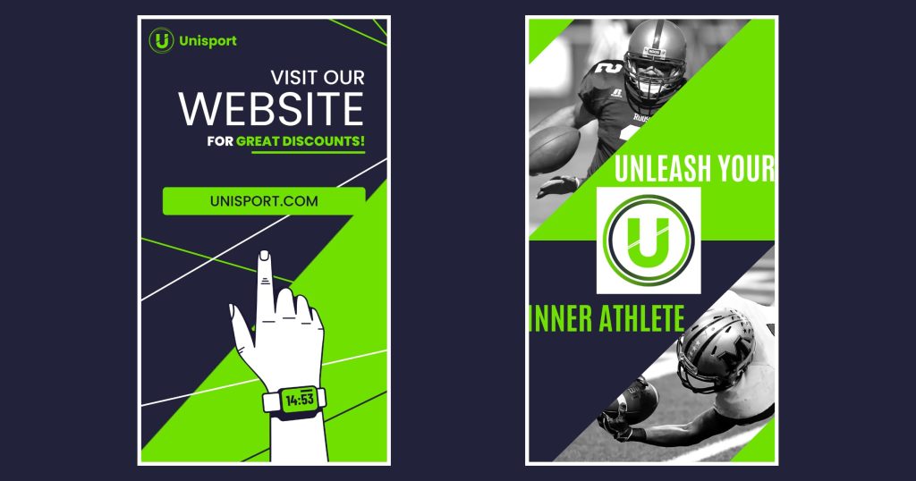
For the project, I created a social media strategy that includes a campaign called “Sport your Style with Unisport.” This strategy includes developing social media postings and stories for distribution on sites such as Instagram and Facebook.
Landing Page
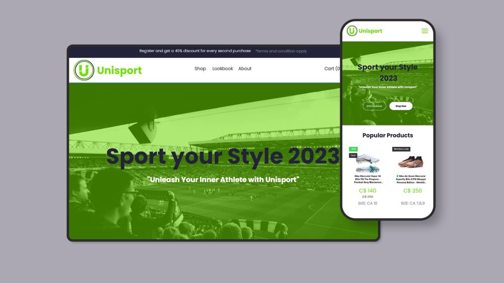
My goal was to create a landing page prototype that corresponded with their brand campaign. Users who click on social media advertising will be routed to this page, which will feature the most current bargains and discounts.
