Pacific Safaris Travel Magazine
My Capstone Project is a magazine titled Pacific Safaris Travel, about adventures from Alaska to Chile. Articles feature unique accommodations and experiences from freelance authors and photographers. The magazine is available in hardcopy and via online access with subscription membership. This product is slightly different in that ‘unique, charming, exotic or untouched’ are key characteristics for our travel destinations and beautiful imagery in the layouts are very important.
The typical reader has a zest for adventure with a moderate to affluent income. Articles and accommodations will appeal to all ages, alternating in appeal and range of interest and experience levels. Subscription users want advice from experience; and our freelancers bring these colourful stories to life through copy, imagery, and design.
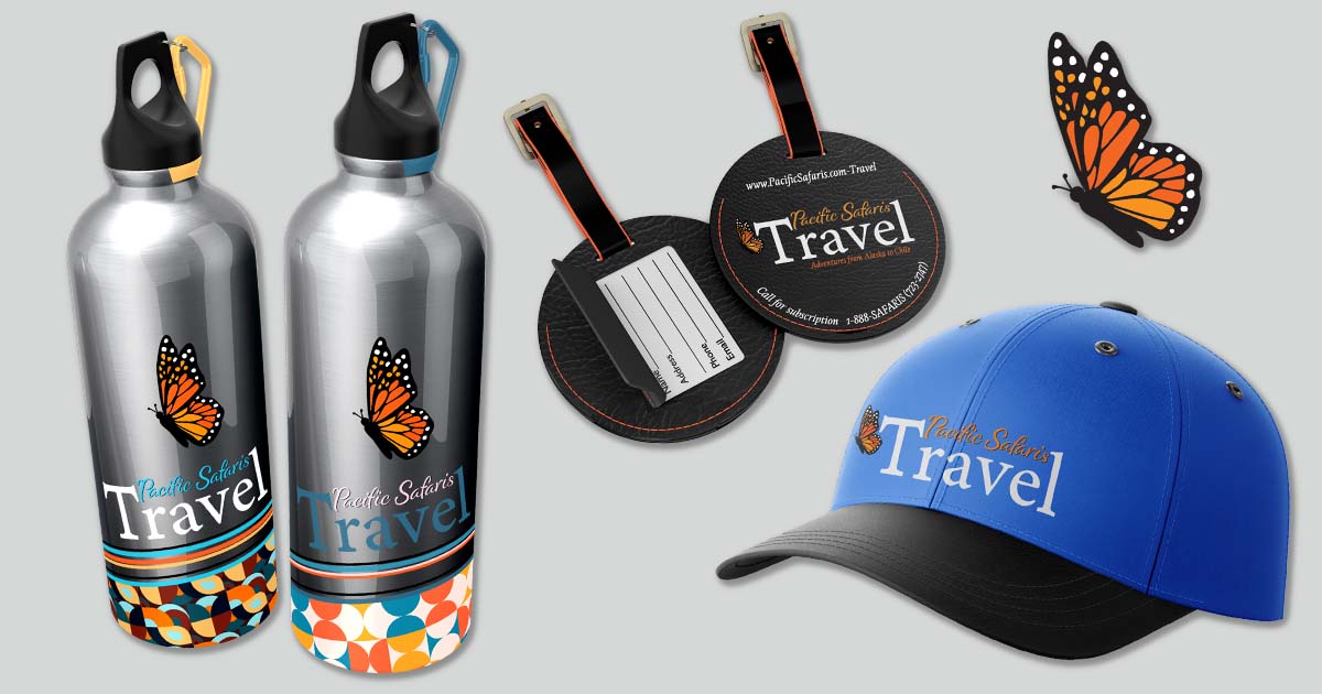
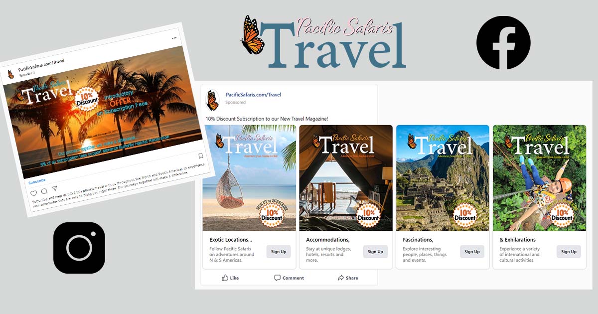
The magazine layout is a 2-facing pages spread, totaling 24 pages in print and available online with the free version of ISSUU. Social media posts and video teasers are included to bring awareness to the magazine brand. These posts are designed to offer a first-year discount magazine subscription on Instagram and Facebook platforms. Branding also includes promotional travel merchandise.
Process
My mood board captures different travel locations with colourful images. I found orange to be the most noticeable colour, while teal stood out, yet reflected a calmness like tropical Pacific water.
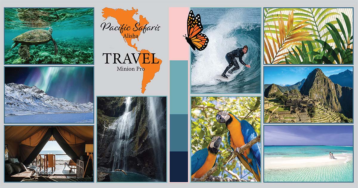
Palm fronds, monarch butterflies, and a map of North and South America is included to represent our distribution area.
A logo was designed to reflect the travel industry magazine standards, where Travel is the most noticeable part of the title and most often displayed in white. New fonts and design modifications to a few letters created the word mark.
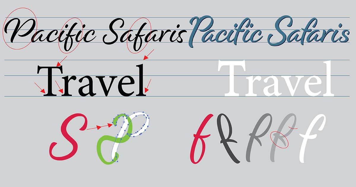
Travel is done in the common font Minion Regular by Adobe (T,r,l modified) and Pacific Safaris is Alisha font by Laura Worthington from Adobe (P,f, S modified).
The well-traveled Monarch butterfly was chosen as the identifying icon Colour usage for the name mark and icon are flexible, excluding the monarch when used within the logo. It is to remain black with light & dark orange and spotted white details.
The magazine is formatted primarily with InDesign and enhanced with Photoshop, and Adobe Illustrator. Production started with setting master pages which include: magazine name on left bottom, and issue with section on right bottom of page. Page numbers are set in the lower corners respectfully. Margin, bleed, columns and gutter measurements were also set in master pages. Each page was then titled in the top slug space for my reference, and I find guides very helpful and use them often, both horizontally and vertically.
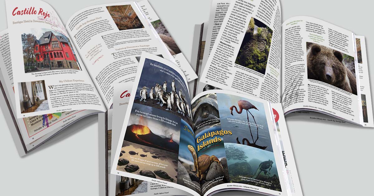
Article ideas were thoughtfully considered, and 3 locations chosen from across our distribution range; one from BC, Canada: one in Central America and another in Chile. While doing image searches for these articles I was also inspired to do a 2-page spread of images from the Galápagos Islands, Ecuador.
My first content design layout was the cover page which includes a vibrant image, magazine nameplate, tagline, content blurbs, discount offer, feature article highlight. Redesign of the UR page furniture (flip corner) was done to allow for more margin space. The barcode price, placed on the back cover, was designed in PS. Issues are noted by the three months in a season, then includes the year. The season is not mentioned as it changes between N & S Americas.
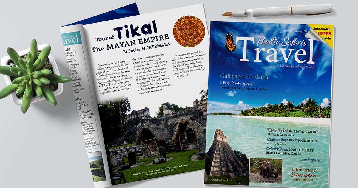
Table of Contents, Impressum and Editor’s Journal were designed next and styled within their sections. The first ad is a full-page advertisement for an international airline agency. The ad was created in Photoshop, saved as one image, and placed into InDesign. Three more advertisements were created in Photoshop of varying fractional page sizes within the content margin space.
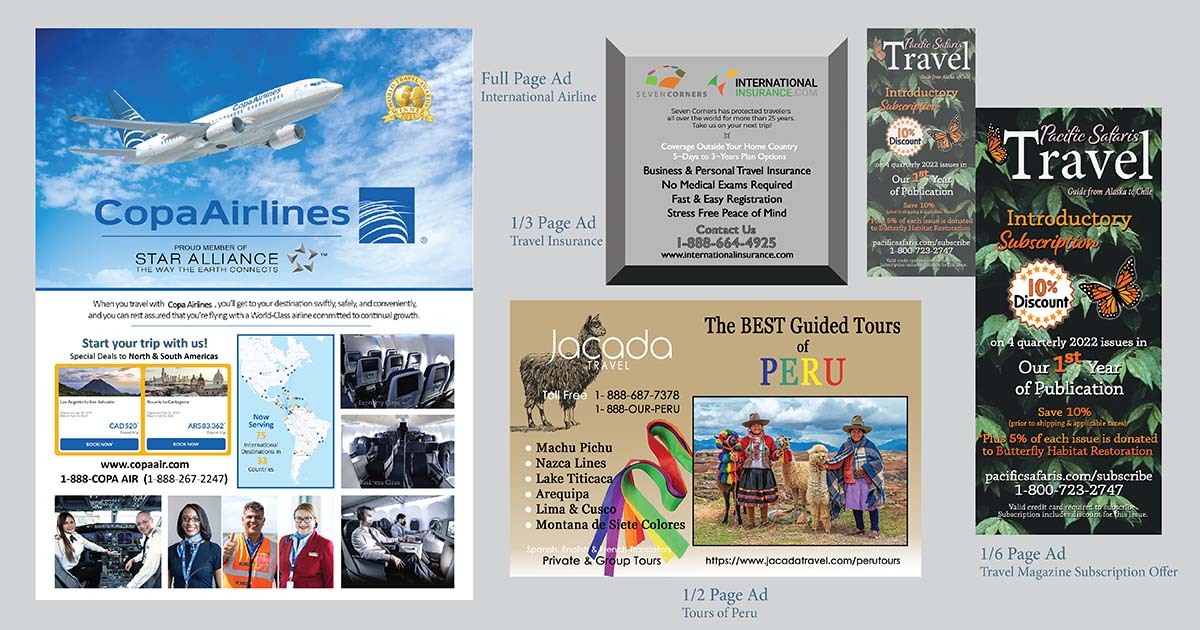
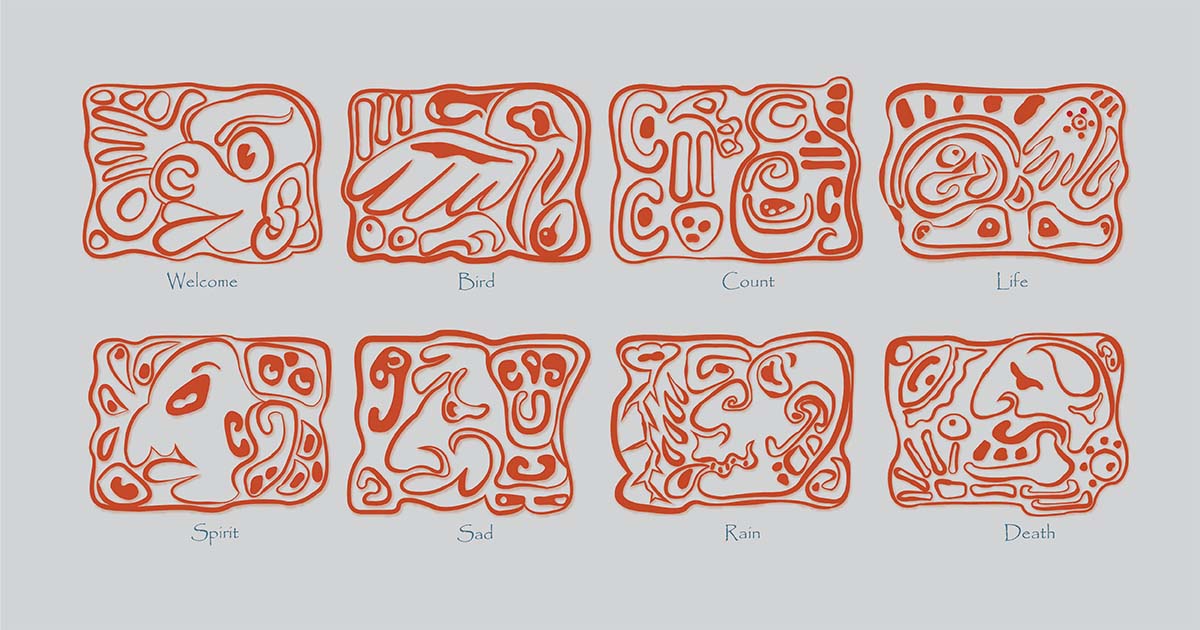
The first and feature article on page 5 is about Tikal, Guatemala, from my own experience and photos. I set up character styles and paragraph styles for textual content, and image captions for this article. I used Papyrus font for my main text which gives it an exotic sense. The title is done in a rustic 210 Yeonpilsketch font, an ancient feel. The images were mask edited to enhance exposure in areas, as well as other image enhancements to colour and tone. Due to the natural grey and green tones, I added some sourced illustrations and MYOWN hieroglyphs (like MAYAN hieroglyphs) on pages 8-9. They were researched online for conceptual ideas, sketched on paper, and rendered in Adobe Illustration with the pen and width tools, enhancing the line shapes. These are of my imagination with fictional meanings and rendered in burnt red cinder. The Jacana Travel – Tours to Peru ad is within this article.
The article on the Galápagos photo spread was interesting in that I signed up to National Geographic to source the images used for this school project. I used Agency FB Bold font for my main text which is clearly read. The title is done in a windswept Capellina Script and dramatic Britannic Bold Regular font. This spread aligns to the middle fold of the magazine.
The next article is 3 pages about a boutique hotel in Santiago, Chile. It is also fictional. All images and stories are collected from assorted web sources and edited for use. This layout has more white space and features card layouts designs of local cuisine at nearby restaurants. I set up with different fonts and paragraph styling to enhance this article based on an online blog. Garamond Regular font is used for the main text, a serif which is clearly read. The title is done in deep red Cortado Regular font and dramatic Imprint MT Regular font for subtitles and drop caps. Pacific Safaris Travel Magazine Subscription Offer ad is placed within this article.
The last article is about Grizzly Bears in BC, Canada. Again, unique storyline text and paragraph styles were set up and content entered is from an online source. This article includes text formatting around images where Arial Regular font is used for the main copy. The title has a Shakespearean styled Colonna MT Regular font and Modesto Initials Inline with its outline and boldness as a subtitle. This 6-page article contains the Seven Corners Travel Insurance ad. The final page is the inside back cover and displays the articles included to date with a sneak peak of the articles in the next issue of the current year.
My Capstone Project concludes with 2 social media posts mockups and 2 social media video teasers. The Facebook social media ad is a 4-page carousel of images. The second ad is for Instagram and focuses on the younger demographic to subscribe and help the planet. Social Media posts differ in size and format but have the same Call to Action of signing up for our magazine subscription. Click titles here to view Teaser #1 and Teaser #2.
Please view my Capstone Project, the imaginary Pacific Safaris Travel magazine online, with my free membership at ISSUU. A paid membership to ISSUU removes ads; allows embedding on a website; and hyperlinks within the magazine to function. Merchandising products include travel water bottles, luggage id tags, and a baseball cap sporting the Pacific Safaris Travel logo.