Koastal Kombucha
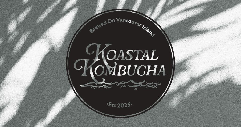
Koastal Kombucha is a new start-up company set to open in the Comox Valley. The business ethos is centred around a profound connection and respect for nature, coupled with a dedication to physical and mental well-being. Founded by a mother-daughter team, their mission is to produce a product using solely local ingredients, brewing each small batch of kombucha with love and care.
To effectively convey their story, Koastal Kombucha needs a complete brand guide, accompanied by the design of a social media campaign to announce their launch. This campaign is designed to drive traffic to a landing page, building excitement for their debut at the Comox Farmers Market.
Check out the style guide on ISSUU.
Moodboard

I began the design process by curating a collection of images to inspire my project. What deeply resonated with me was the concept of fostering a community that cherishes the natural beauty of the Comox Valley. Drawing from our surroundings, I selected images and colour that visually convey the emotions I aimed to evoke. I was particularly inspired by the deep, earthy atmosphere of our expansive forests. I envisioned the soft light filtering through the trees, imparting warmth and joy to contrast the forest’s lush, damp ambiance. I continuously came back to my moodboard when I felt stuck, and it served as a guiding light throughout my design process.
Primary Logo
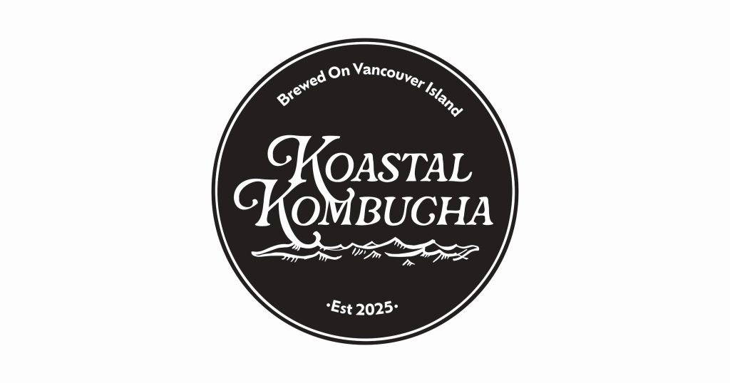
When it came to the brand’s logo, my goal was to create an organic and natural aesthetic, while ensuring clarity and usability. To achieve this, I customised the Rafaella font to emphasize sweeping lines reminiscent of ocean waves. After blending the letters together I incorporated a hand-drawn wave sketch at the bottom of the logo. This detail injects personality into the design, enhancing the brand’s identity and introducing thematic elements that can be carried through to other design components. To maintain a balanced visual, I enclosed the logo with a circular border that can be adapted to either white or black, depending on the medium.
Logo Variations
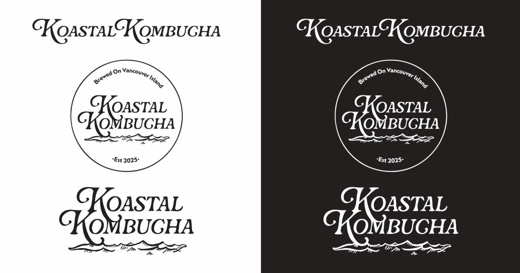
To maximize value and usability for the client, I developed multiple logo variations for diverse brand applications. I created a horizontal version suitable for narrow spaces as well as a version with the circle border removed for seamless integration with backgrounds. When it came to logo colours, I maintained a black and white palette to ensure adaptability across different contexts.
Colour and Typography

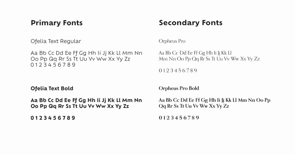
The brand’s colour palette is rooted in nature, featuring a deep green reminiscent of forest leaves paired with a warm, muted gold that adds a touch of warmth to the cool tones. For typography, the primary font selected is Ofelia, available in Regular or Bold weights. Ofelia is a modern and clean typeface with an approachable feel, ideal for important headings and titles. The body text is set in Orpheus Pro, a more formal font suitable for longer blocks of text such as ingredient lists or body content.
Brand Collateral

When I began thinking about brand collateral, I decided I needed to design elements that brought the personality of the logo to other elements. I drew up some sketches of some of the featured ingredients, such as herbs, lemon and ginger. These images could then be used in packaging, as well on the landing page and social media.
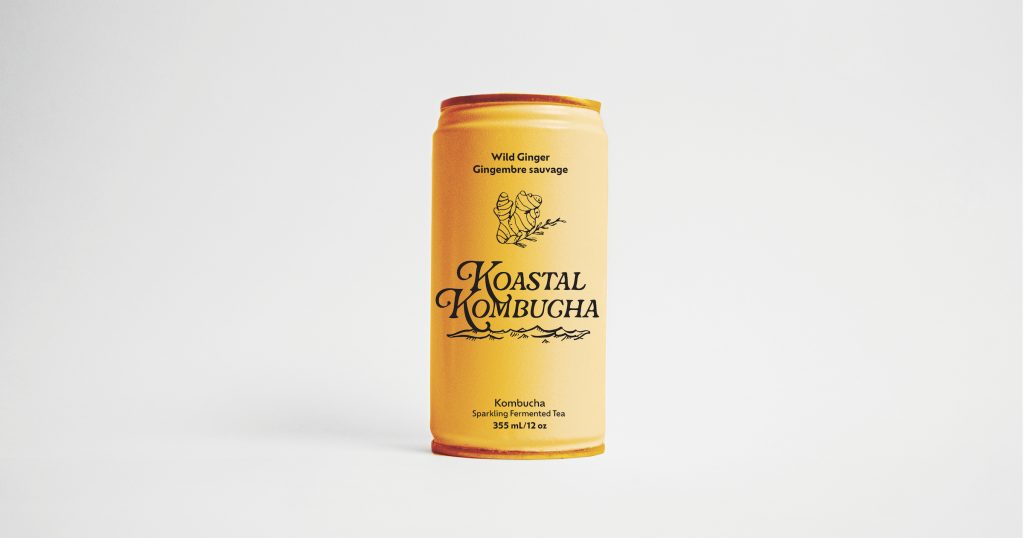
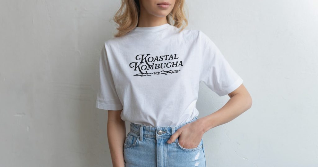
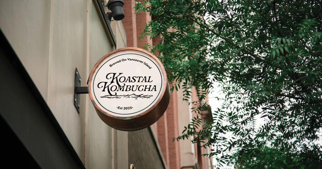
I developed a variety of options to present my design in different contexts. I began with a simple white t-shirt, as apparel is an effective tool for building brand recognition and customer loyalty. I also designed an exterior sign to assist the client in envisioning their logo displayed within a physical brewery setting. Finally, I designed a can mockup to demonstrate how the logo will appear on the final product.These images allow the client to visualize their brand in real-world applications.
Social Media Campaign
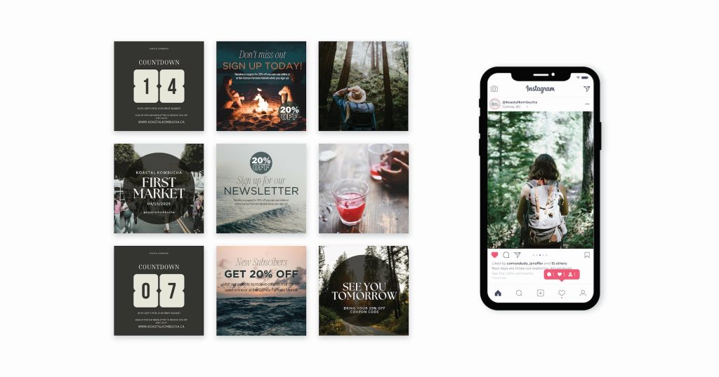
I developed a strategic social media campaign aimed at generating excitement and engagement in anticipation of the company’s debut at the Comox Farmers Market. The primary objective of this campaign was to build an email subscriber base, enabling direct communication with potential customers regarding market dates and new product launches.
To achieve this goal, followers were directed to the company’s landing page, where they could sign up for the newsletter and receive a 20% discount coupon as an incentive. I also introduced a branded hashtag #lovetokoast, which will be tagged on every social media post to encourage followers to use the tag when they are out exploring. This approach effectively leveraged social media to drive traffic and convert followers into engaged subscribers, laying a strong foundation for future marketing efforts.
Landing Page
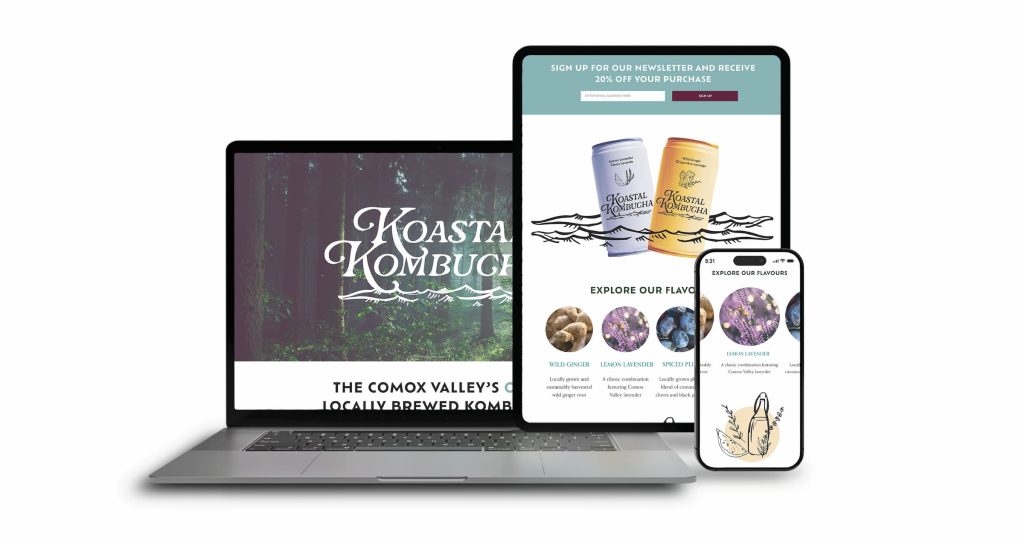
The purpose of the landing page was to showcase the products offered by Koastal Kombucha and convert visitors into customers. This objective was achieved through strategically placed newsletter sign-up forms integrated at multiple points on the page. Upon signing up, visitors will receive an email containing a 20% discount code, enticing them to experience the products firsthand and let the quality speak for itself. This approach is aimed at driving conversions by offering value to the customer and encouraging engagement with the brand.


