Black Clothes Album Launch
Black Clothes is an experimental black metal project, based out of the Comox Valley, BC. Their upcoming album, The Things We Leave Behind, is a conceptual exploration of the band’s movement beyond negative aspects of their life to achieve inner growth.
Focusing on the themes of the album’s conceptual themes, this project designs and develops a brand identity to accompany the album launch, including an updated logo, a brand colour palette, and typography; an album cover, CD booklet, and packaging design for the new album; a tour poster for the (fictional) headlining album launch tour; and a suite of social media assets to promote both.
Check out the digital album booklet on ISSUU.
Process
Moodboard
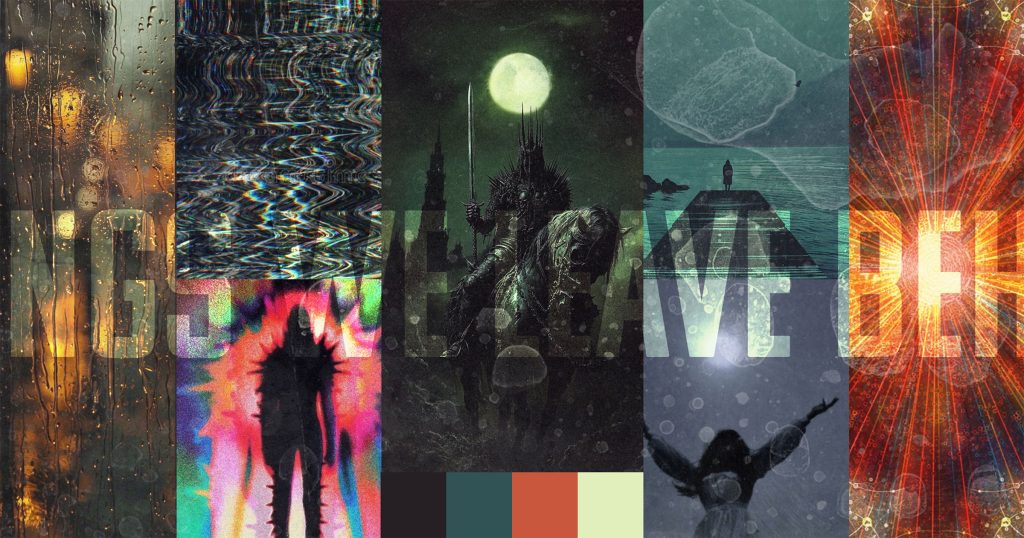
The atmosphere I wanted to create for The Things We Leave Behind was a transformation from darkness into light. With the images I selected, I wanted to capture that transition of a gloomy or stagnant mindset to one of self-actualization.
Logo & Monogram
I created an updated, cleaner logo for Black Clothes. The overall inspiration of the final logo draws from the fantasy elements of the album’s concept and design, as well as my client’s personality.
Branding: colours and typography
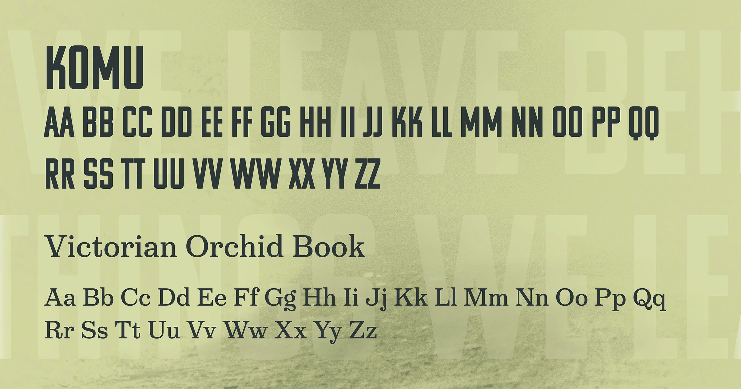
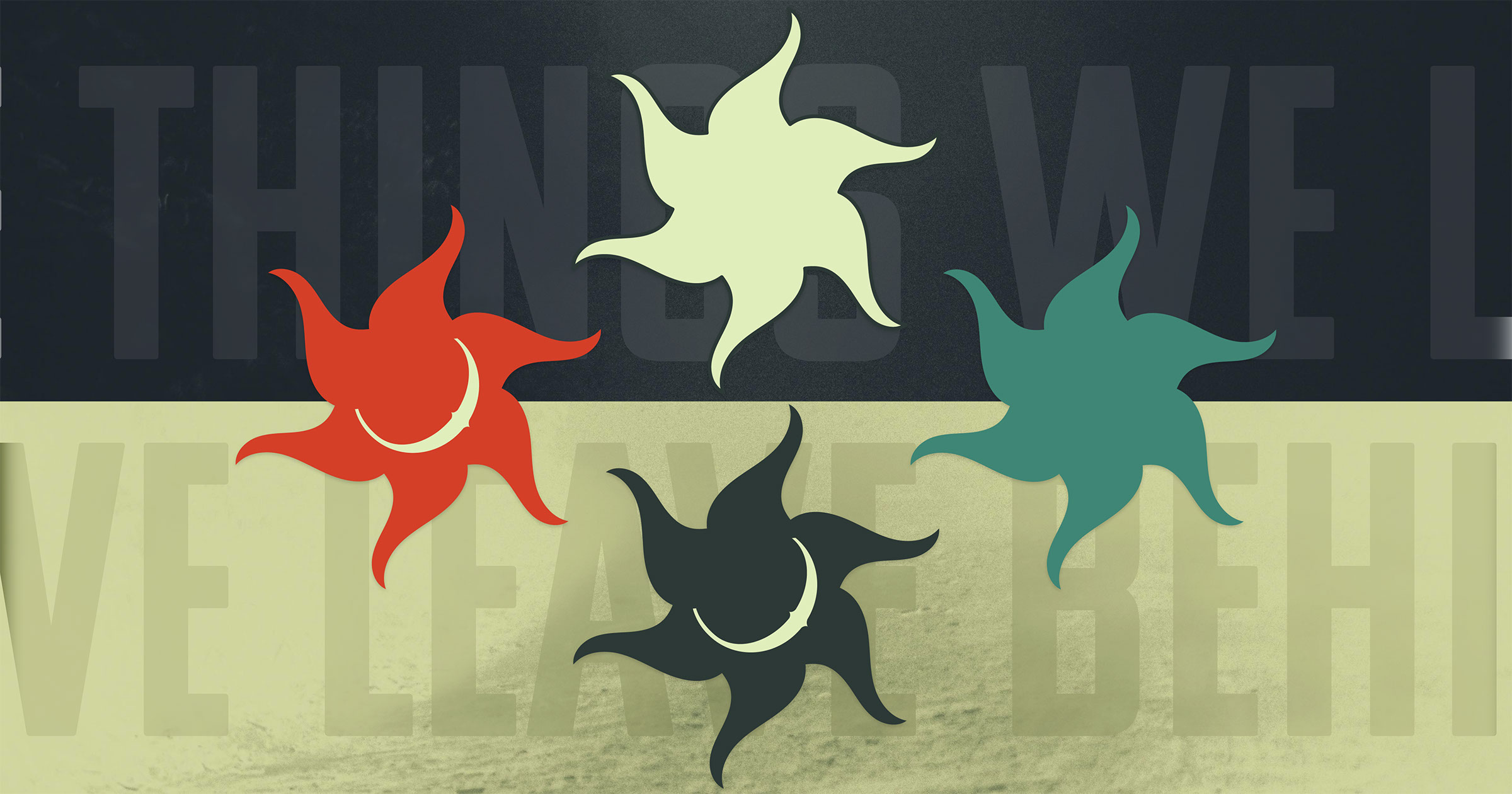
My branding decisions for The Things We Leave Behind touch on the familiar, while throwing in an edge of disruption. For the colour palette, I wanted to encompass a feeling of nature and growth with different shades of green. For my accent colour, I picked a brilliant red/orange that stands out like the sun.
For typography, I wanted the headings to be bold and make a statement. I picked Komu, which is styled after socialist billboard typefaces, to make an immediate and strong impact. For the copy I chose Victorian Orchid. This type evokes a more vintage feeling, more in line with what is expected in black metal and creating a visual contrast with the bold, modern lines of the Komu type.
Recurring symbols used throughout the branding were incorporated to reinforce the conceptual theme of the album, including a moon (taken from the shape of the capital “C” in the logo), and a sun symbol. Both can be used together or separately to reinforce the conceptual transition of dark to light.
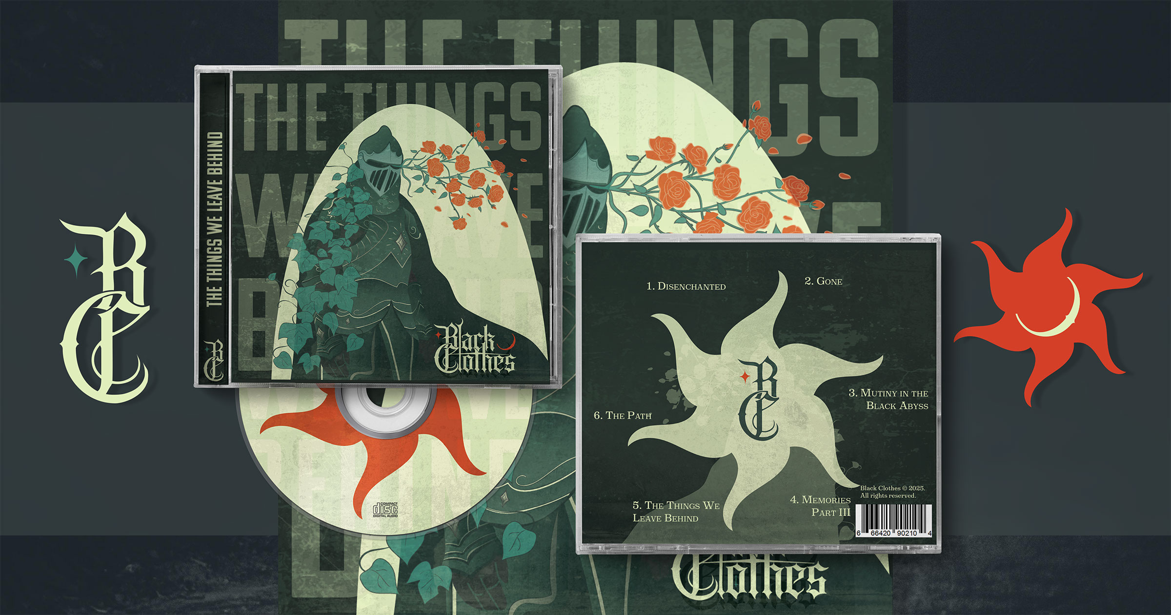
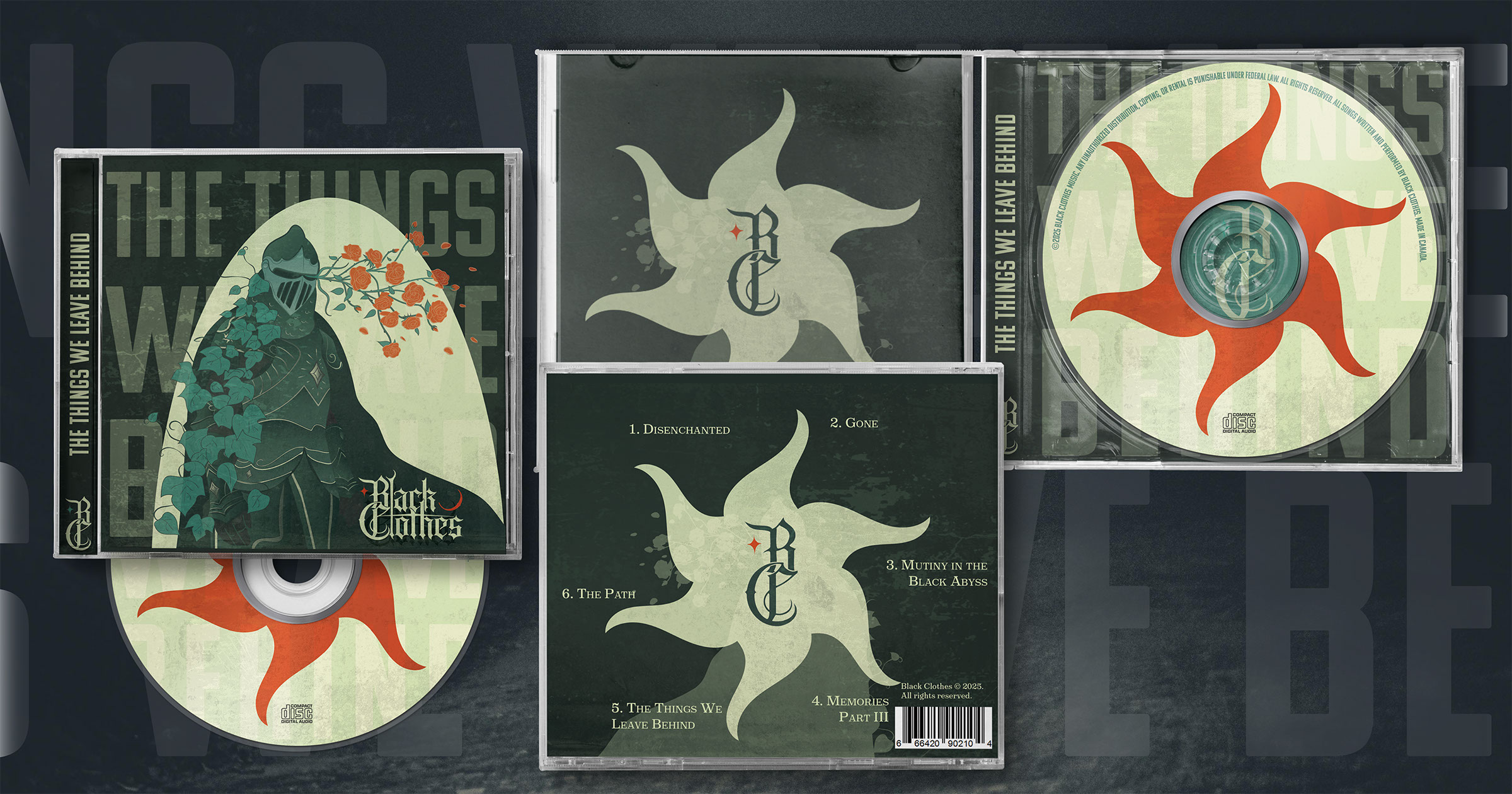
Album Cover
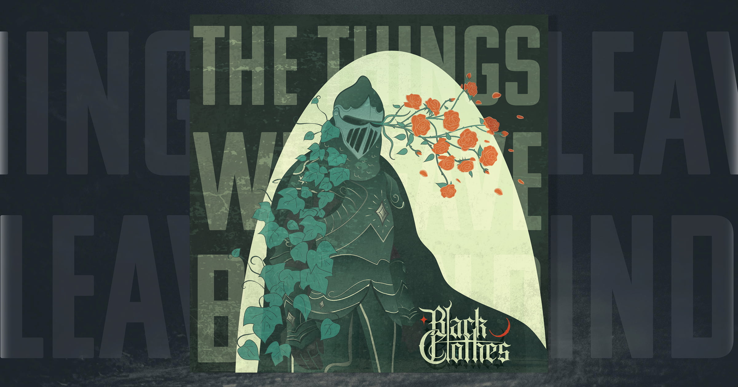
The visual concept for this album is inspired by growth from within. To convey this message, I combined elements associated with violence and destruction (knights) with something beautiful and organic (flowers).
I started by illustrating my most promising brainstorming concept in Procreate. When I was happy with the overall composition, I took the image into Adobe Illustrator to create a vector image of the artwork that I could size up or down, as necessary.
I chose a knight with flowers emerging from its helmet to symbolize growth from within. The flowers are growing despite the cold and unpleasant environment. Knights and fantasy are also a common thematic choice within black metal, so the design felt similar enough to appeal to that audience, while still visually differentiating itself stylistically.
Album Booklet and CD Case
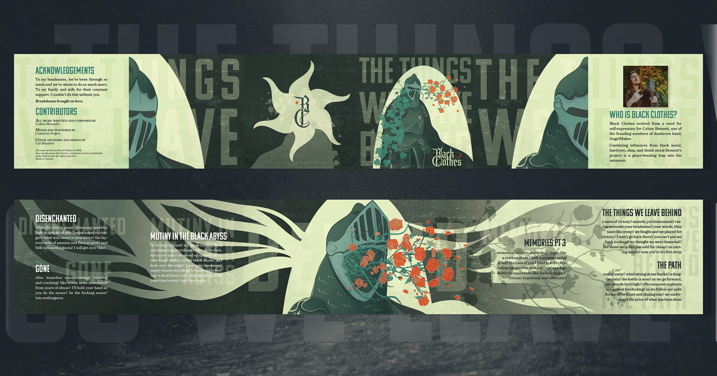
I wanted the entire album booklet to complement the album’s themes. I conceptualized the booklet as a gatefold layout, which allows the story of the album to be told incrementally as it is unfolded.
Closest to the core of the booklet is where the viewer will finally encounter the song lyrics, which I wanted to represent as “closest to the heart”. As you progress into the booklet there is more organic movement, with the flowers bursting from inside. The illustrations were developed in Adobe Illustrator and arranged in Adobe InDesign.
Tour and Merch
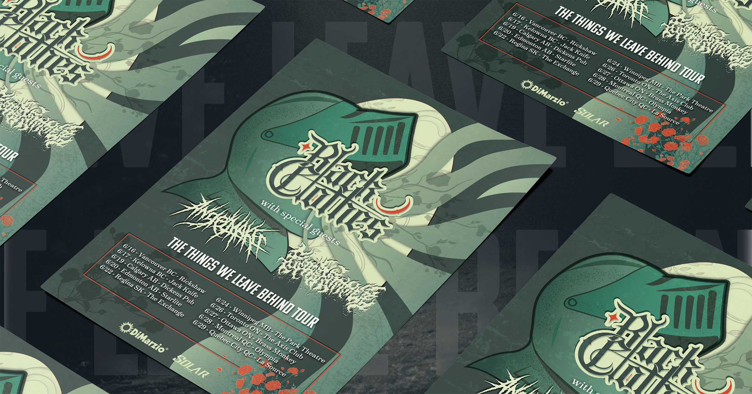
To promote the release of the album, I envisioned a fictional tour for Black Clothes to headline. I designed a poster in Adobe Illustrator to complement the album artwork, without duplicating it. The use of the same colour palette and conceptual theme helps the viewer make an instant connection between the album’s existing branding and this tour.
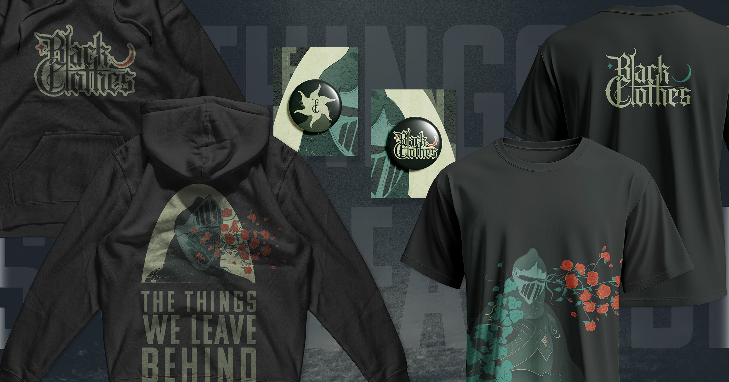
Likewise, merch designs were created to promote album sales.
Social Media Assets
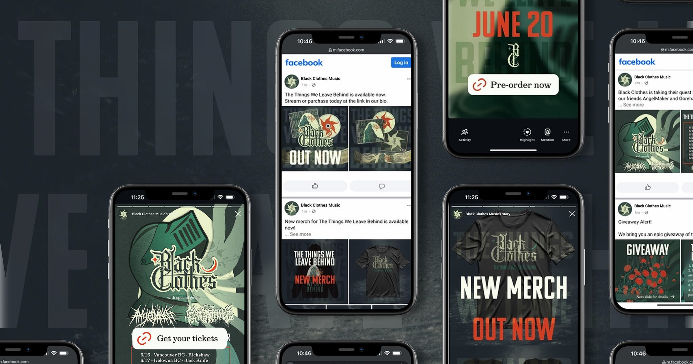
To support and promote the album launch cycle, I created a social media campaign and a series of sample posts. I used these posts to stylistically reinforce the album’s concept, and the visual identity associated with The Things We Leave Behind.