Forechek Equipment
Forechek Equipment is a fictitious hockey equipment company located in Victoria BC. Forechek’s goal in the industry is to ensure that quality and affordable hockey equipment can be provided to anyone at any time. They want anyone to be able to enjoy the sport of hockey, so they offer a range of sizes and colors for each individual to find something that suits them.
For this project I started with creating a recognizable and legible logo. Followed by a complete marketing campaign, landing page, a full logo suite, and mockups such as hockey equipment, social media posts, and more!
Mood Board
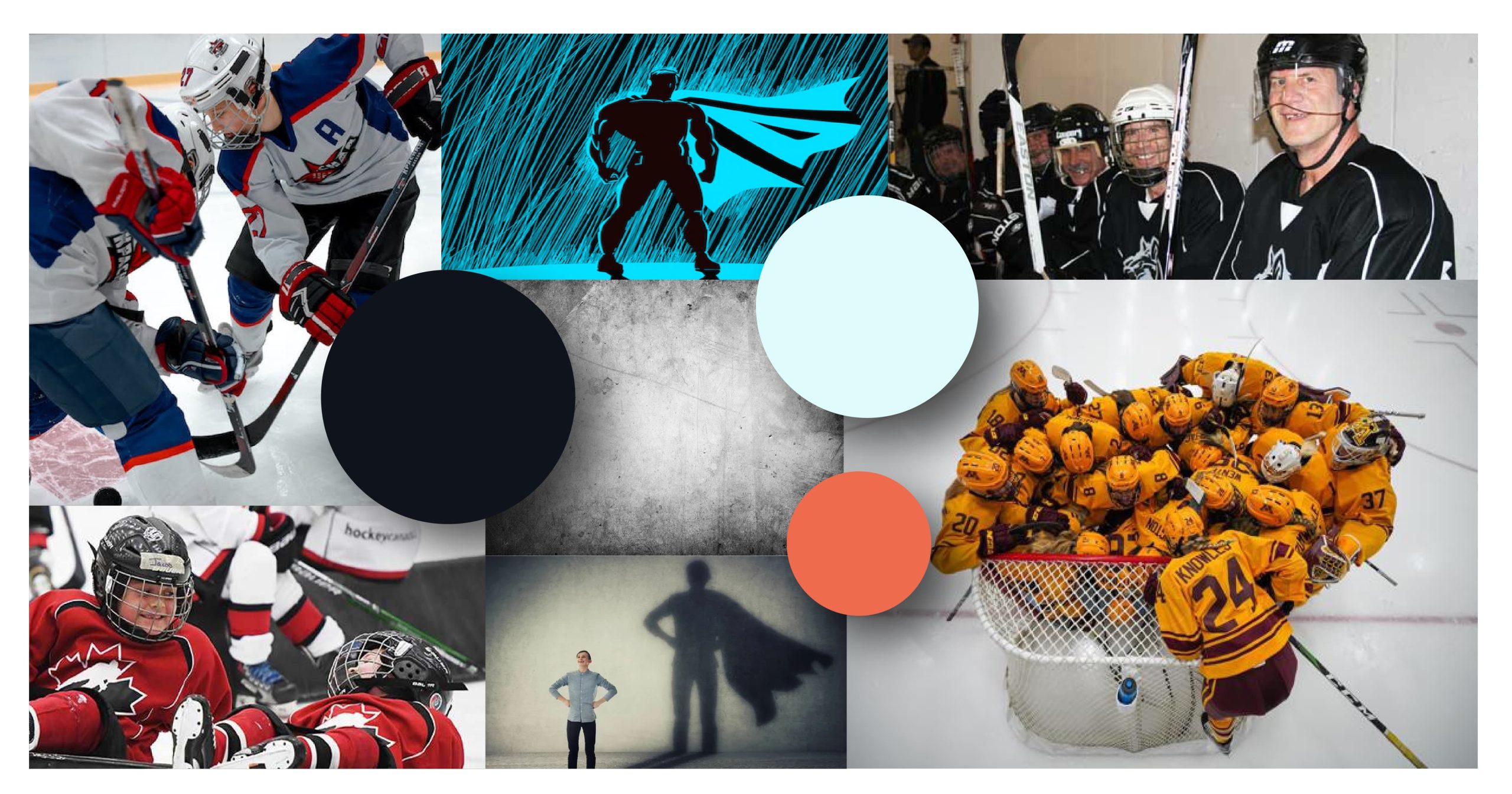
The purpose of this mood board was to capture exactly what this brand is, and what it offers! The mood board showcases the colors that the brand is going to use, an example of texture that will be used throughout the company’s branding, digital ads, and website, as well as photos that showcase exactly what Forechek believes in. The main goal is to showcase that anyone, at any age, can enjoy the sport of hockey.
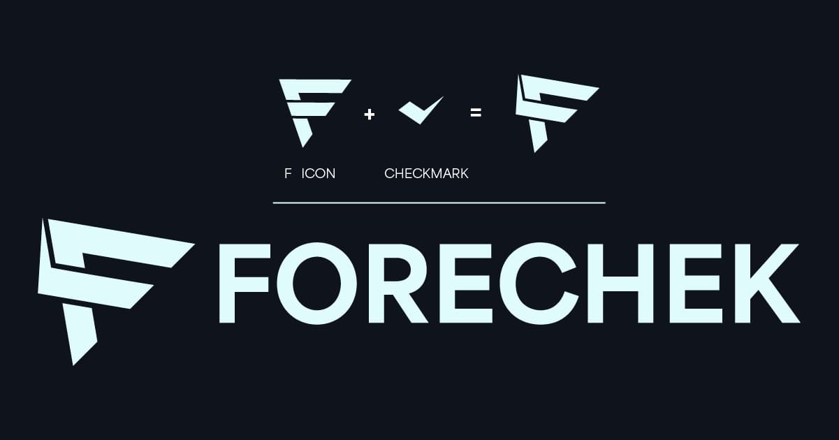
Primary Logo
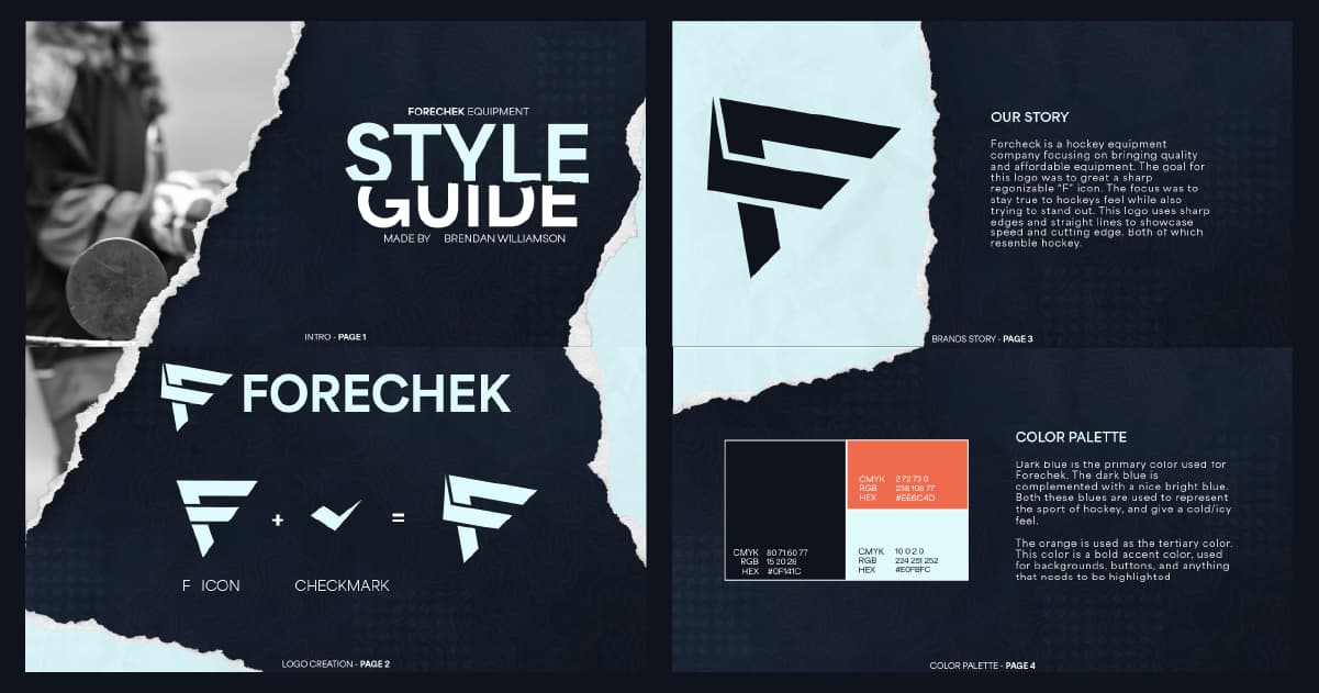
It was very important for me to create a unique, yet recognizable logo so that Forechek can stand out in this industry. In designing the logo, I knew I wanted it to resemble and relate to hockey. Which is why the icon has very strong and sharp edges. I wanted to include a “checkmark” to refer to the name of the company (ForeCHEK). When the icon is paired with the strong typeface chosen, you get Forechek’s primary logo.
Logo Variations
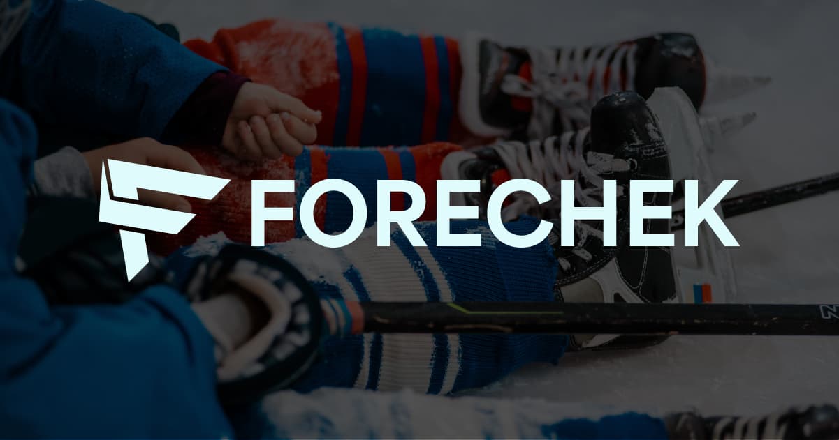
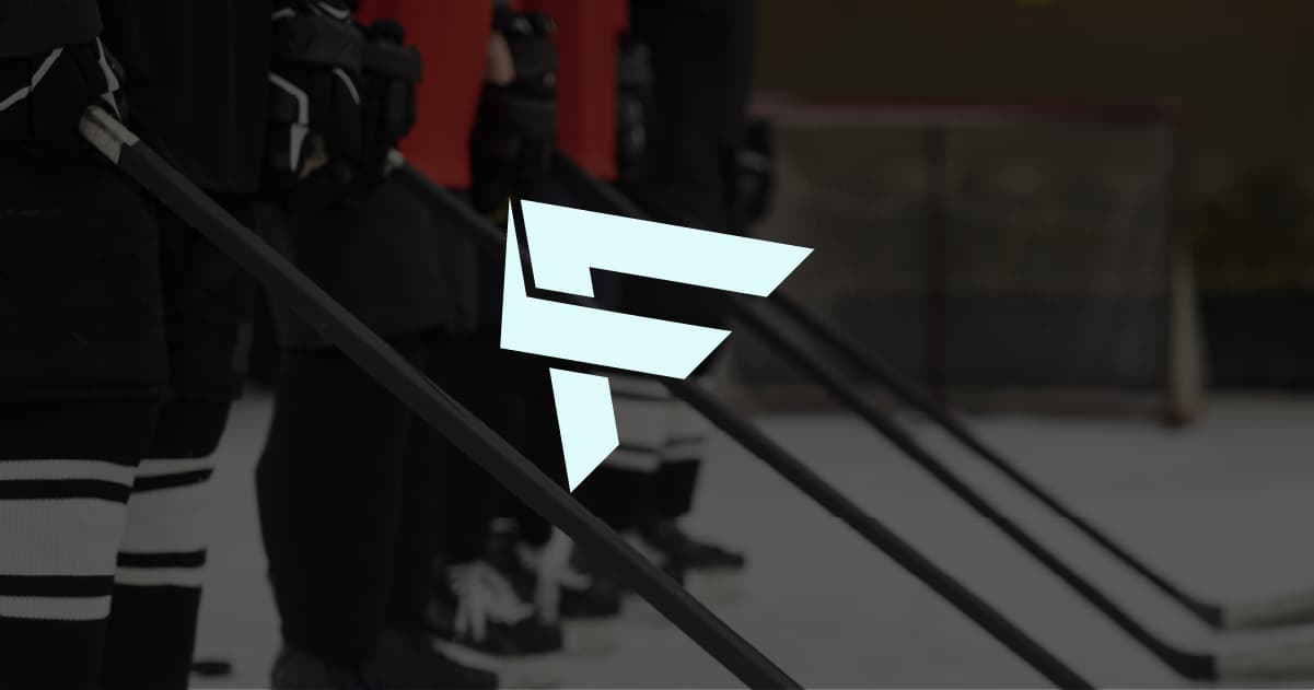
After the logo was created, I designed variations that could be used to display the logo on different applications. This allows for more versatility. With this in mind I created 3 different logo variations, the icon on its own, which can be used in situations that require a smaller logo such as hockey equipment, and the website’s favicon. A vertical logo that is used in situations that require less width space, and more vertical space. Lastly a horizontal stacked logo, this logo features the icon next to the word mark “Forechek” that is then cut in half and stacked, this logo variation creates a horizontal logo that doesn’t use as much horizontal space as the primary logo, therefore It can be used in smaller, skinnier applications.
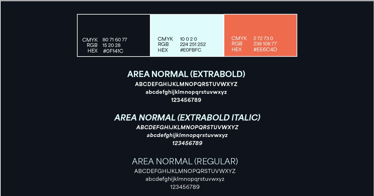
Colour Palette + Typography
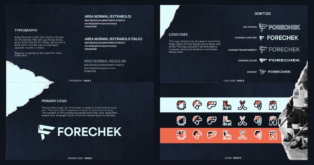
The primary goal for the color palette was to stay “on brand” and relate to the game of hockey. With that in mind I decided to go with two different shades of blue. The dark blue is the primary color, which is then complimented by a very light blue. The light blue color was chosen because It resembles the color of ice. The tertiary color chosen is a unique shade of orange to be used as a “highlight” color, and a color that stands out from the blue that can be used for backgrounds, and or headings. As for the typography, I chose to use only one typeface, this typeface is to be used in three different styles, which allows for more versatility.
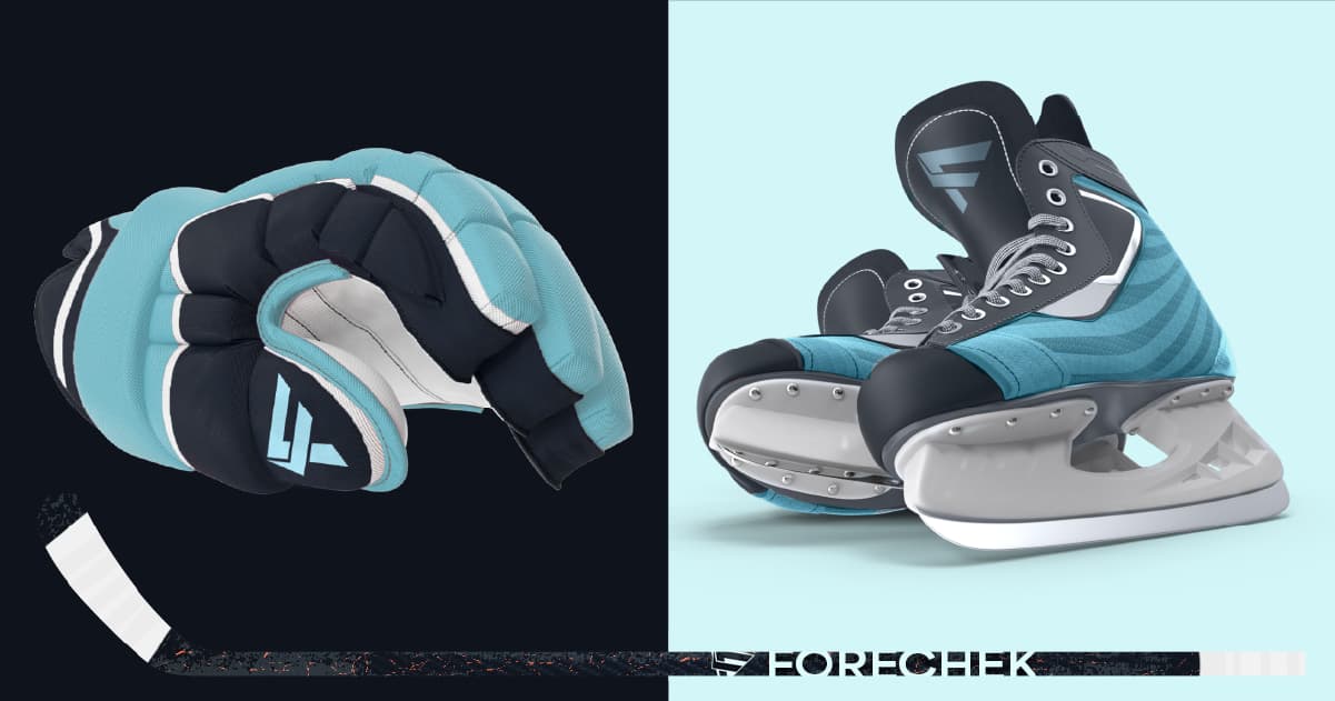
Assets
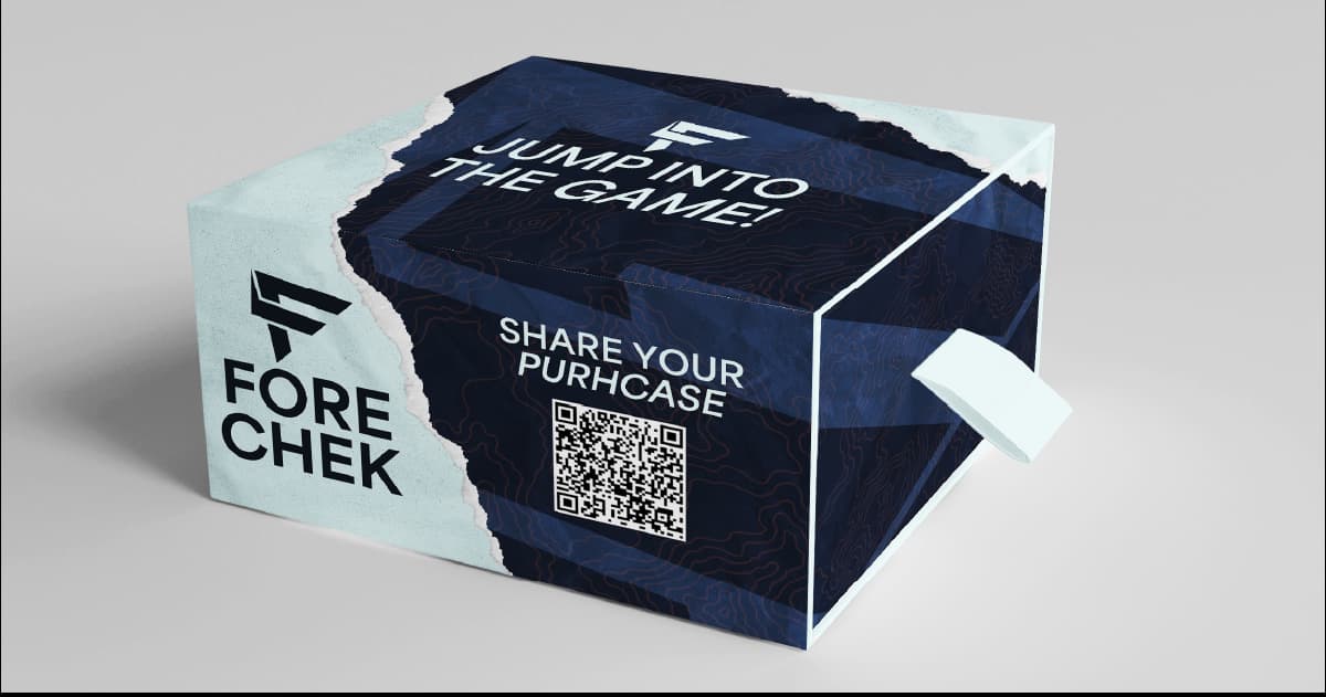
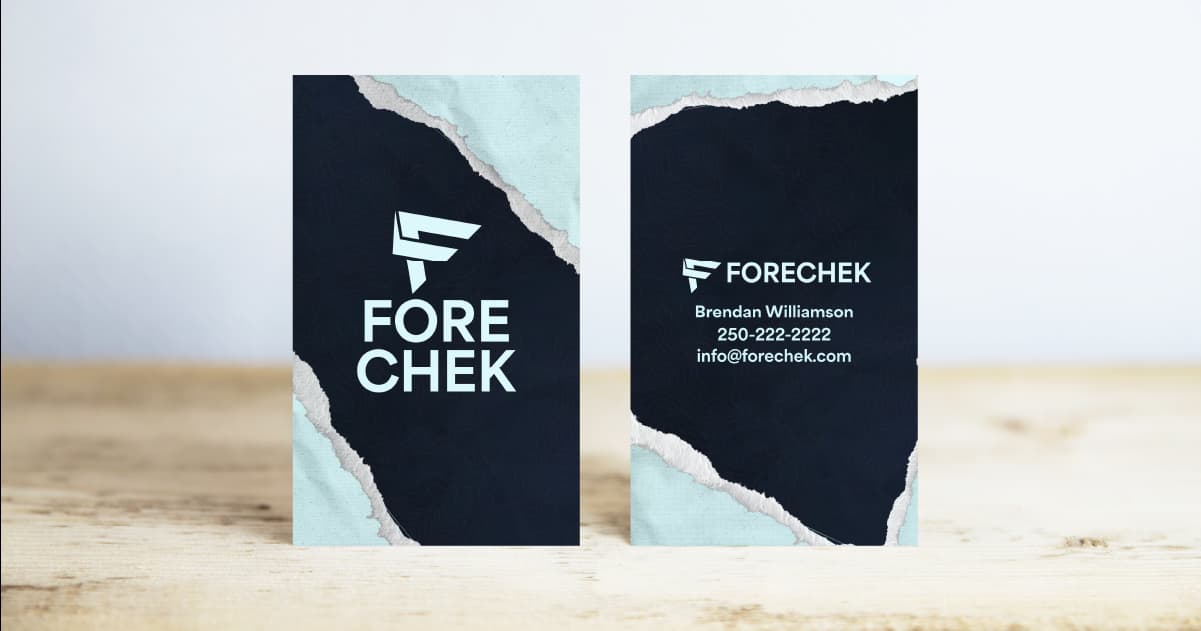
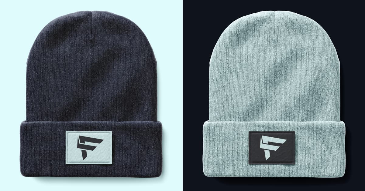
The best way to view and get an image of the logo is through mockups, I created various mockups that showcase the logo being used for different purposes. I designed a company business card, a box design, toques, and hockey equipment. The goal for these mockups was to stay true to the brand by using the brand’s colors and logo variations, but also having designs that stand out and are unique from the rest.
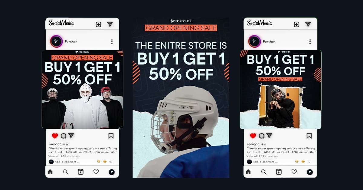
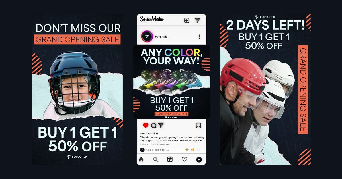
Branding
I created a digital marketing campaign for Forechek. This campaign consists of a week-long grand landing page. The digital campaign consists of 10 posts throughout the week, 6 digital ads, 3 story ads, and 1 video advertisement. All of these designs have the same feel and vibe, this allows for instant recognition of the brand and allows viewers to instantly know what brand they are looking at.opening sale to promote the company’s grand opening and drive customers to Forchek’s.
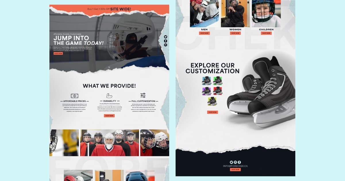
Landing Page
My goal for Forechek’s landing page was to make an easy to use page that gets the customers right where they needed to be without any hassle or searching. I wanted it to be as easy as possible to find the section and / or product they are looking for. At the bottom of the page I made sure to highlight the customization that Forechek continuous to advertisement and promote. By allowing customers to quickly and easily cycle through the different colors, and find one that suits them.
Check out the XD prototype.
Style Guide
The goal and purpose for this style guide is to ensure and solidify the look and boundaries of the company. The style guide showcases the do’s and don’ts of how to use the logos, colors, and branding. This allows the brand to remain consistent in the future.
Check out the style guide on ISSUU.