Nixie Watermakers
For this project, I chose to work with a client, Nixie Watermakers, to create both a fully functional e-commerce website, and a complete branding kit. I felt confident in my skills and wanted to challenge myself by working with a real company. Nixie Watermakers Inc specializes in desalination systems for both personal and commercial marine vessels. They are a young company, currently in their infancy stage, which was one of the reasons that I was excited to work with them. With my help, they plan to launch in summer 2022. This project encapsulates and showcases some of the skills I have learned so far, such as project management, branding, digital design, layout design, web design and web development. Working with a client, has provided an extra component of client communication, and the ability to meet and exceed their needs, goals and expectations – all valuable experiences for working in this industry.
The Planning Phase
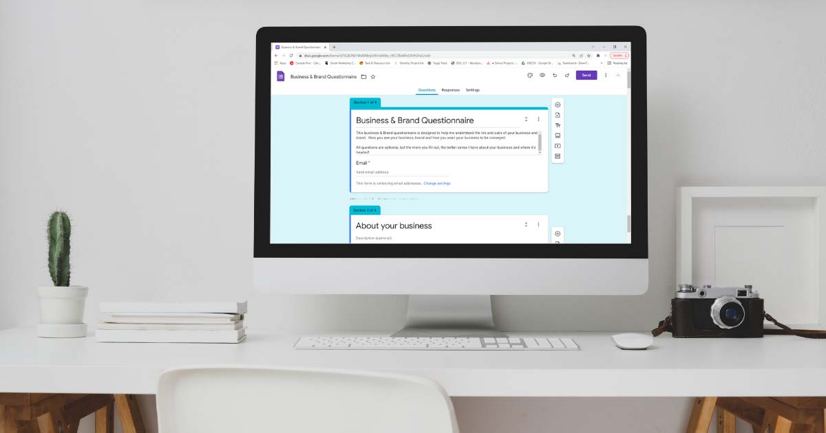
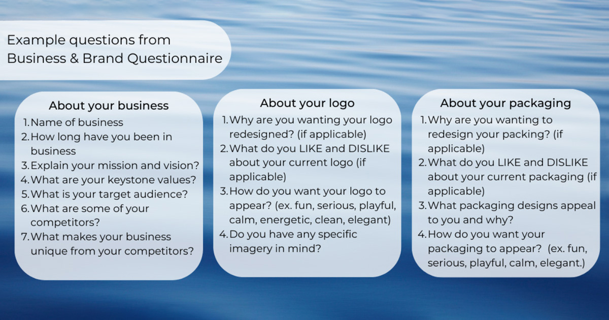
Using Asana, Toggl and creating a Gannt chart were key to the success in keeping on track and managing tasks, hours and budgets throughout the project. Working with a client was an additional factor in this project, so I developed an online Business & Brand questionnaire form that includes in depth questions regarding their business, brand, goals, needs and wants for their business and project(s) and had multiple meetings with them throughout the project. I took a lot of time to conduct research among various companies within the industry and ideate.
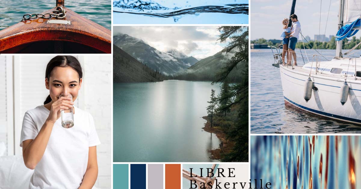
Throughout the ideation period, I created a mood board to encapsulate the overall brand of Nixie Watermakers. This mood board contained oceanic imagery, images of sailboats, couples enjoying themselves on their boat, clean, clear water, glasses of clean water, along with brand colours consisting of shades of blue, turquoise and complimentary colours of a rust orange. Through this mood board I wanted to convey the sense of ‘clean’, ‘clear’, ‘simplicity’.
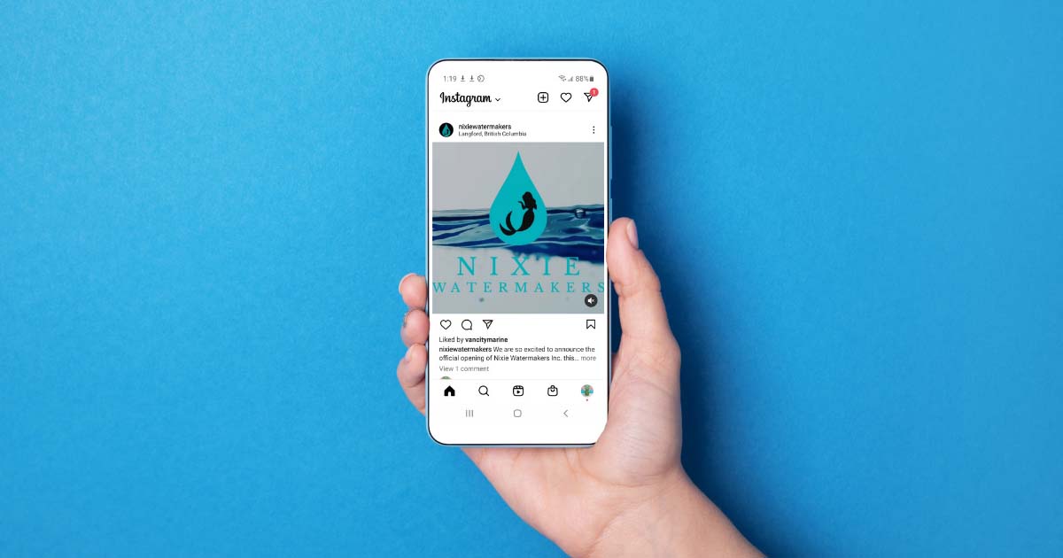
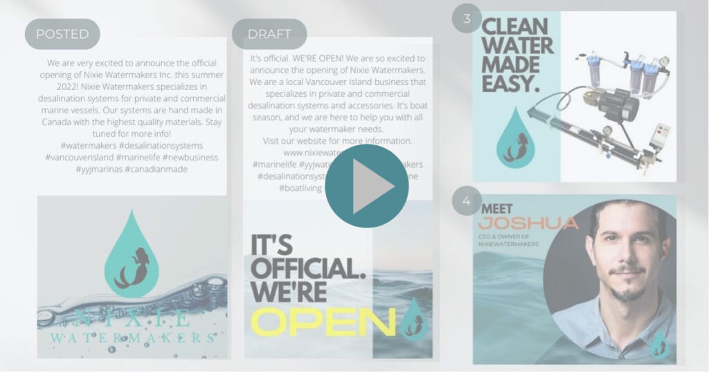
I then created a social media strategy that included information regarding the potential demographics, target audience, goals for current social media channels and future channels, and implementation of those goals. I created a list of possible posts to help build brand recognition and awareness for the company. This acted as a guide for the posts that I created for them, as well as a guide for the company to implement future posts. The first post I created for their Facebook and Instagram channels was a mp4 video clip of water with a subtle animation of the Nixie logo and “summer 2022” to help build buzz around the product. This post included copy content about the company, their mission and when they plan to launch. The following post is for when the company has officially launched. It has been set up as a draft in Facebook’s Meta Business Suite Planner. The post is meant to act as an e-launch for the company’s online store. The following 2 posts are introductory posts about the products and the owner.
The Development Stage
Logo
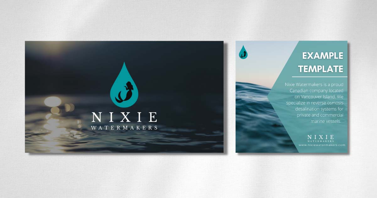
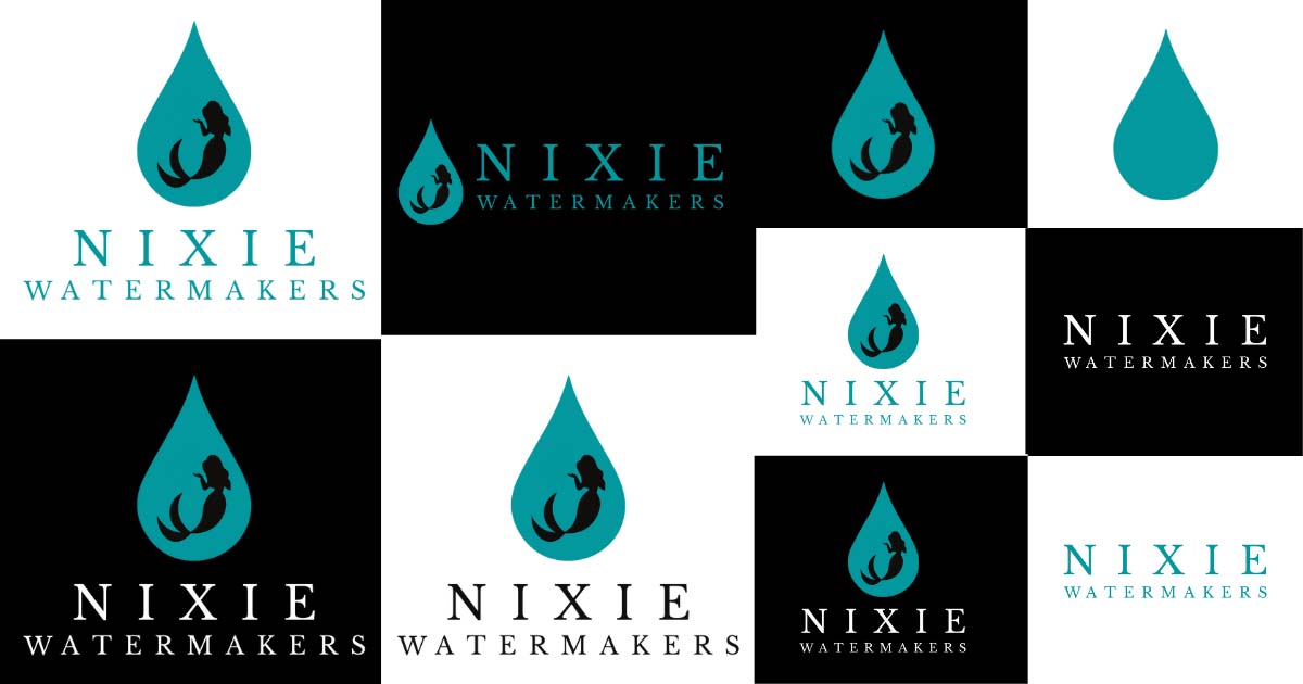
In designing the logo, I wanted to focus on the unique story associated with the name ‘Nixie’. In German folklore, the Nixe (Nixie in English) is a mermaid or sea fairy. Nixie was also the name of Fritz Angermeyer’s sailboat. Fritz Angermeyer was one of the first settlers in the Galápagos Islands and grandfather to Nixie Watermakers owner, Joshua Angermeyer. These roots were very important to convey in the naming of the company as well as in the logo.
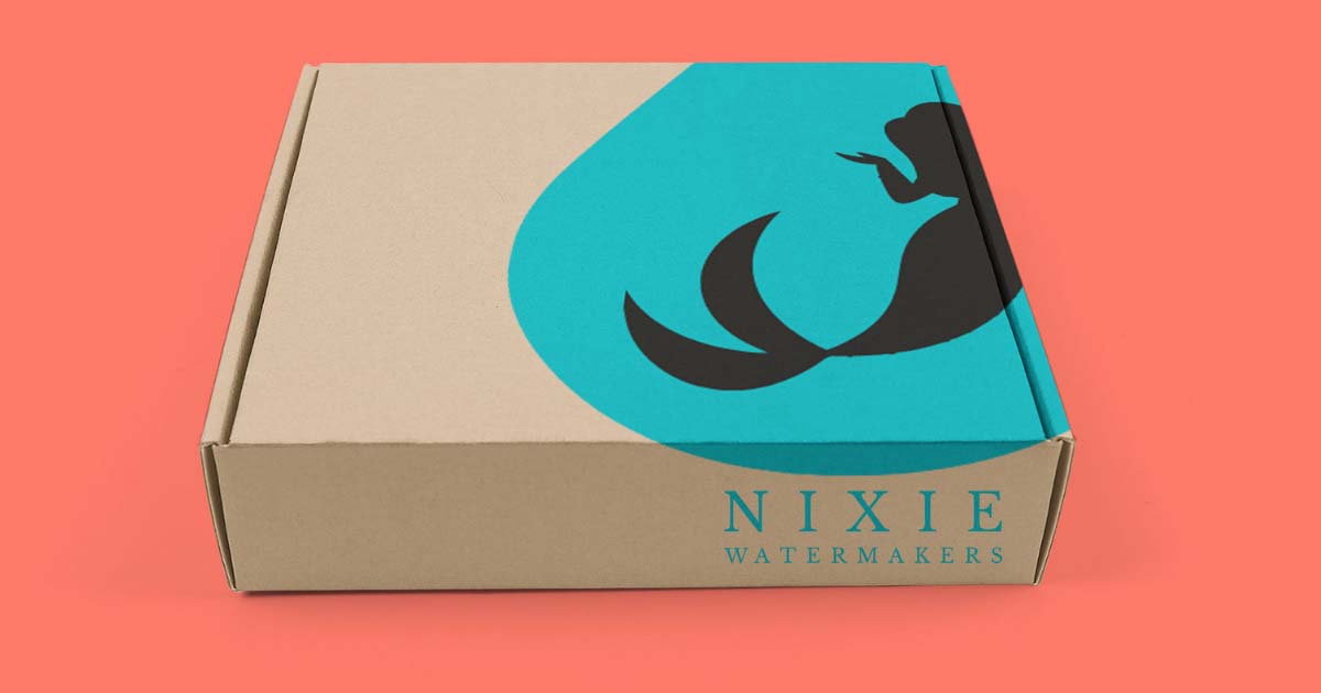
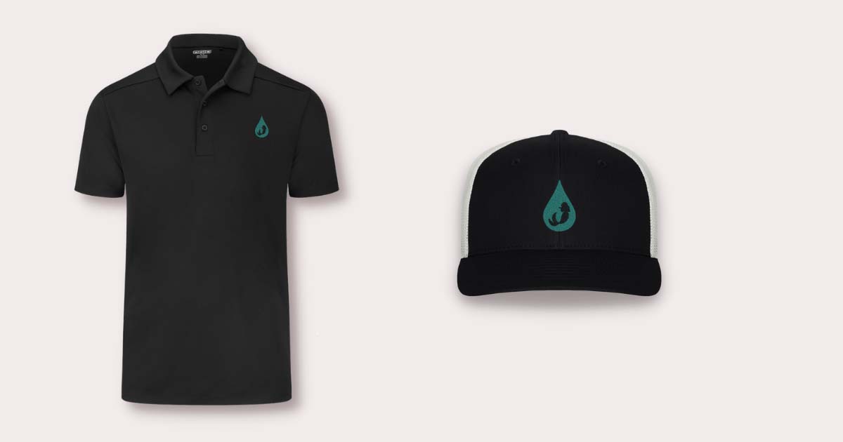
There were many renditions of the logo, however the most important feature to include was the mermaid, to reflect the name and family history. The second feature was the water drop. It made sense to amalgamate these two icons together to create a simple, yet memorable logo.
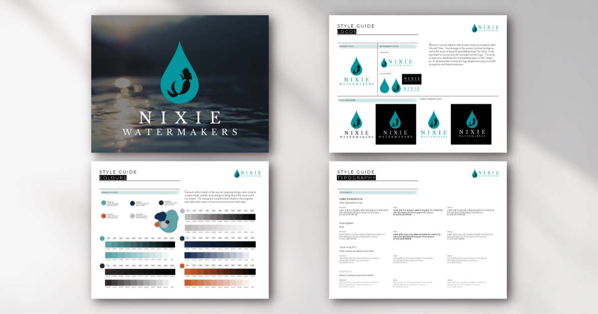
Style guide
The style guide outlined the final logos above, as well as a brief regarding the backstory of the logo. Primary fonts were also outlined in the style guide, header fonts being Libre Baskerville (used in logo), as well as complimentary body copy font Montserrat. Two other options were provided for possible use of brochures, that may require more readability, those fonts being Adobe Song STD (Headings/Titles), and Acumin Pro.
I then applied design and branding from the style guide to branding collateral.
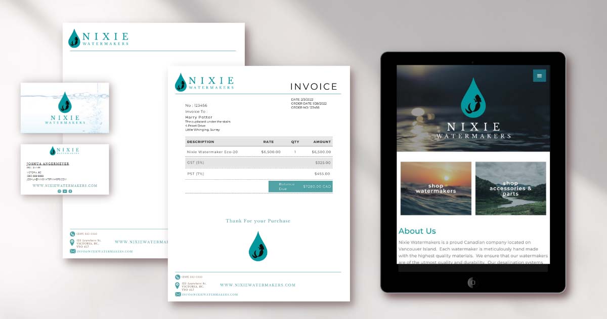
The website
I used HostGator to purchase and host nixiewatermakers.com. Once purchased, all custom company emails were set up in the cPanel. I used Word Press for the content management system (CMS), Elementor page builder, Astra theme, necessary plugins, and Woocommerce for the e-commerce functionality.
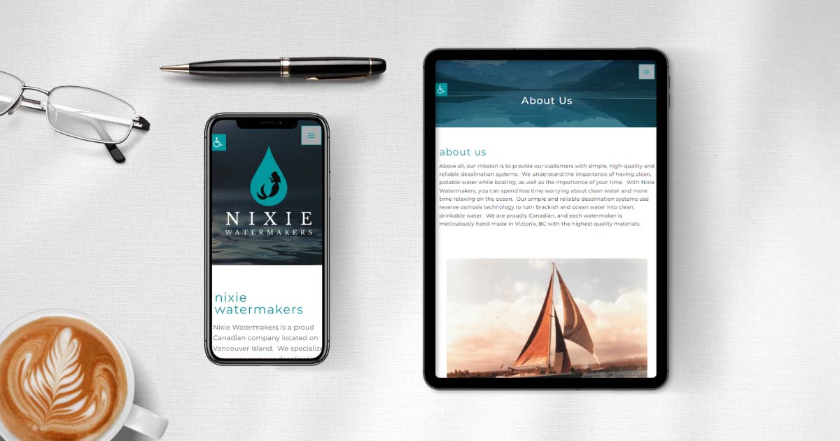
I applied the overall branding theme and goals of simple, cohesive and professional to the site with aid from the style guide and mood board. I used oceanic open source imagery for background images as well as the style guide colours to create a cohesive brand. Micro ‘fade-in’ animations for the page titles/h1 headers, ‘grow’ animations on buttons during hover state and a fixed background while scrolling helped to create an overall fluid and active feel to the site.
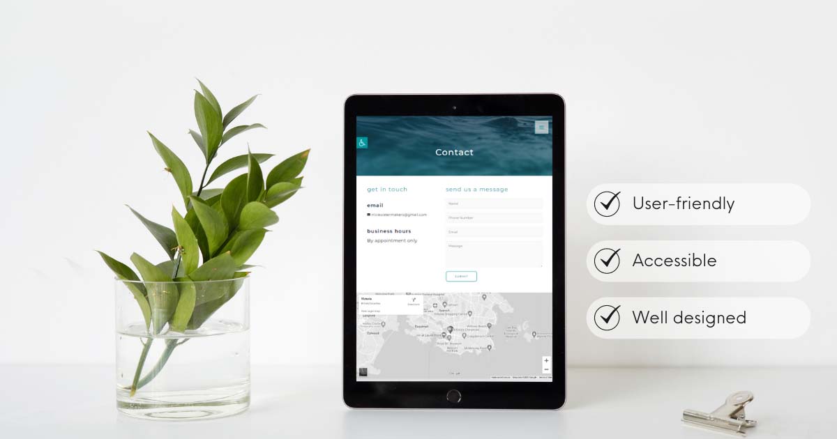
Accessibility
Accessibility was an imperative feature. I accomplished this by use of clear body copy (Montserrat font, 16px size), large, clear headers (Montserrat font h1 50px, h2 28px, h4 23px), shorter paragraphs with a left to right layout for more fluid scanability. Mostly left aligned text and descriptive Alt text and titles for images were also used to increase accessibility. Hover colours were updated to a more vivid colour, as well, a one click accessibility plugin was installed which provided a sticky button where users can increase text size, contrast, grey scale, highlight links and meet their accessibility needs.
SEO
Both longtail and short tail keywords were founds using Mongools KW Finder. These keywords were executed using the Yoast SEO plugin, as well as being included throughout body copy, headers and image titles. Through Yoast, I was also able to write meta data (meta description and meta title), create structured data through the schema markup tab, and provide images, title and description for the pages when shared on social media. I attempted to meet a target of 300 words per page, however certain pages it was not feasible (ex. Contact page).
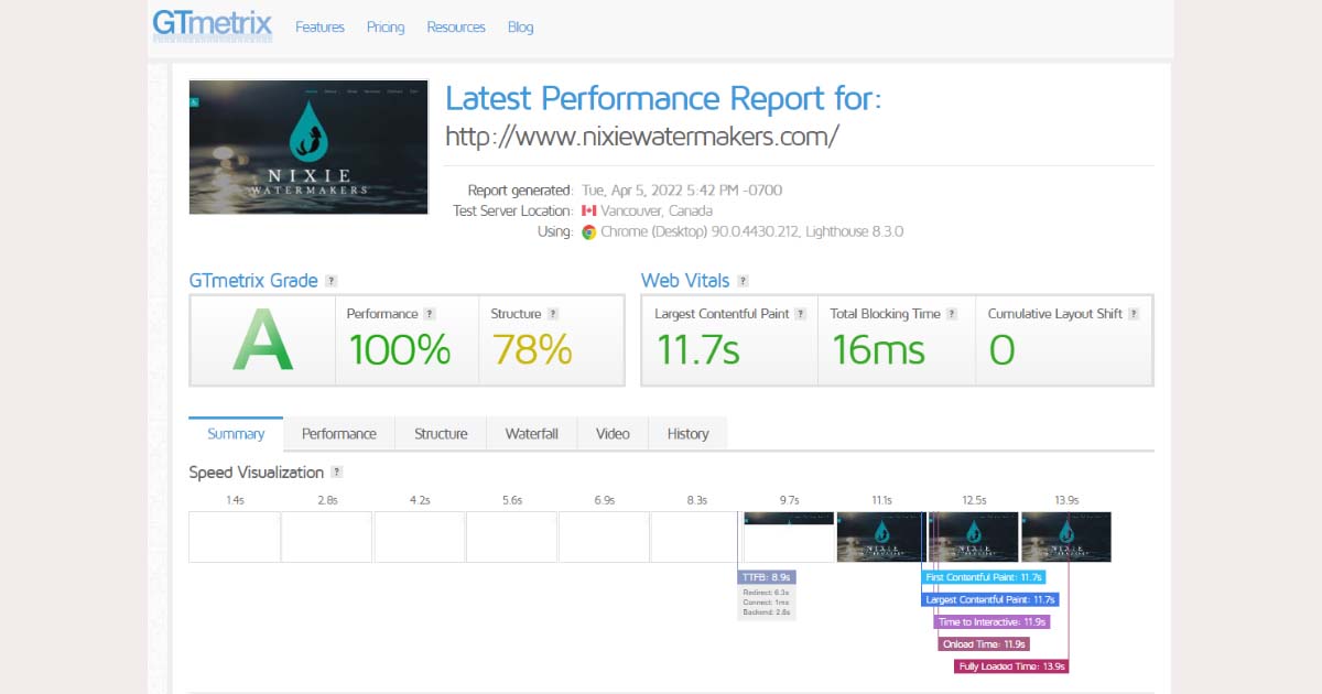
Another way to increase SEO and overall user experience was to increase the loading speed of the site. I was able to do this through optimization of images, using a png compressor to get the images down to a small size, as well as plugins such as ‘Smush’ and WP optimizer in decrease overall loading speed. Site speed tests were conducted using Chrome Lighthouse and I am pleased to say it’s latest test received an A (100% performance/ 77% structure).
Crawlability is another important aspect of SEO, so I created a Google Console account for Nixie and submitted an XML sitemap. Pages also had a sufficient amount of inbound and outbound links to help with this aspect. I also added an SSL plugin to create a security on the site.
Now that SEO had been implemented, I needed a way to track web traffic. I created a Google Analytics account and used GA Google Analytics to install the GA tracking ID.
Testing was a vital part of SEO and user experience. All links and buttons were tested as well as the overall appearance across mobile, tablet and desktop platforms and among different browsers. This was a crucial step, especially to test via mobile, as approximately 80% of users are visiting websites through their mobile phone.
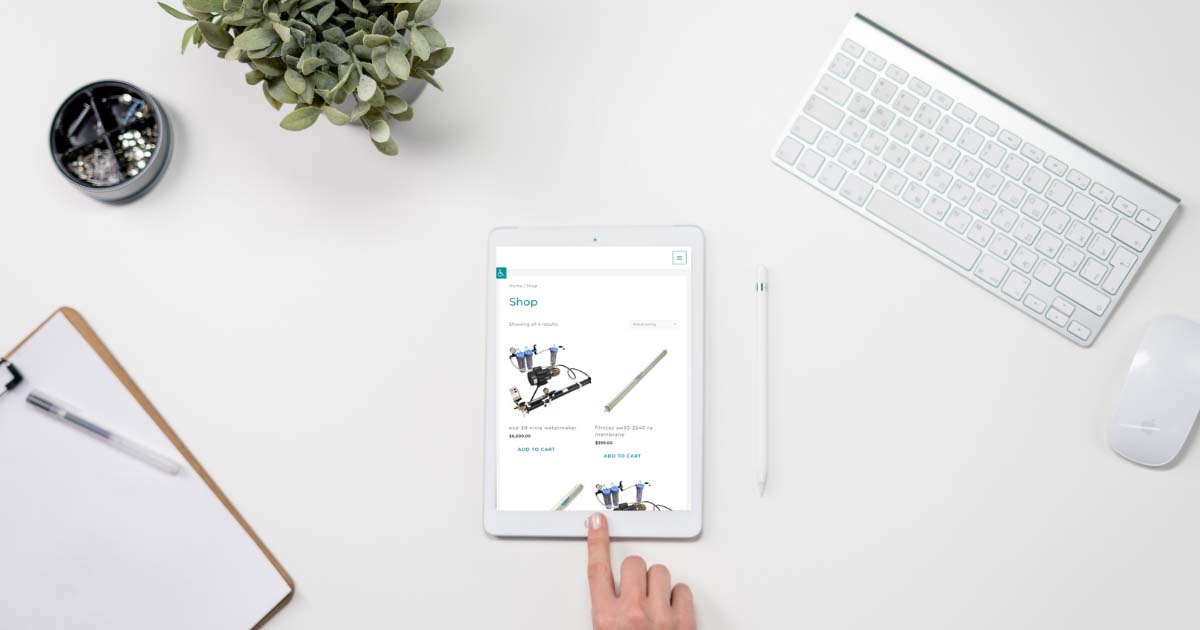
Ecommerce
I set up the entire shop using Woocommerce. This plugin allowed me to input appropriate taxes, and various shipping zones and weights. I input products with their descriptions, meeting SEO – Yoast standards, product tags, and images. All processing emails to customers and shop manager were set up accordingly. The shop is fully functional, however I plan to create a fully customized shop using the Woolementor plugin to make and install a custom shop template.
Handoff
I presented my work to the client and did a full walk-through with the website, as well as asked them to navigate it on their own. I provided the client with all necessary material, login’s and passwords as well as a basic tutorial on how to edit content and upload products and descriptions. All steps throughout this capstone project were documented so that I may refer back to them. The client was absolutely thrilled with the end products and very excited to have a strong foundation for the launch of their company.