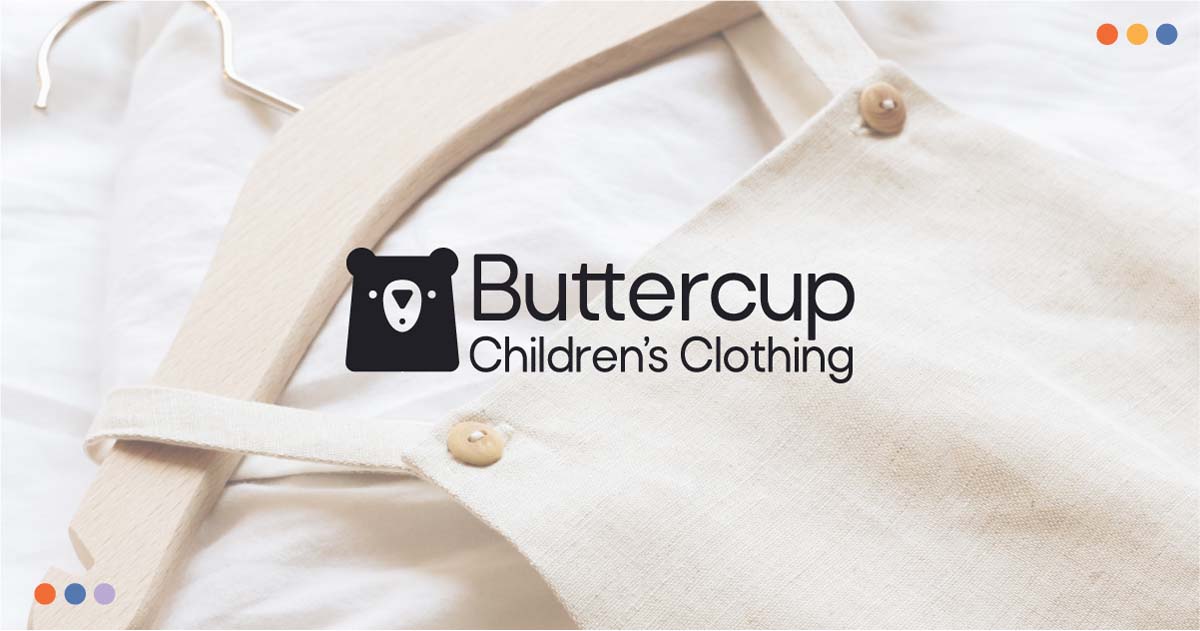
Buttercup
Buttercup is an imaginary children’s fashion brand based in Victoria, BC. After a couple years of success with a physical shop, they would like to branch into the eCommerce realm.
They aim to provide cheery alternatives to the fast-fashion industry by crafting styles that both parents and children will adore. Spreading joy through each and every interaction with the shop is what their mission is all about. For this project, I created a comprehensive brand design featuring a logo suite, brand collateral, and a prototype for their new website.
Moodboard
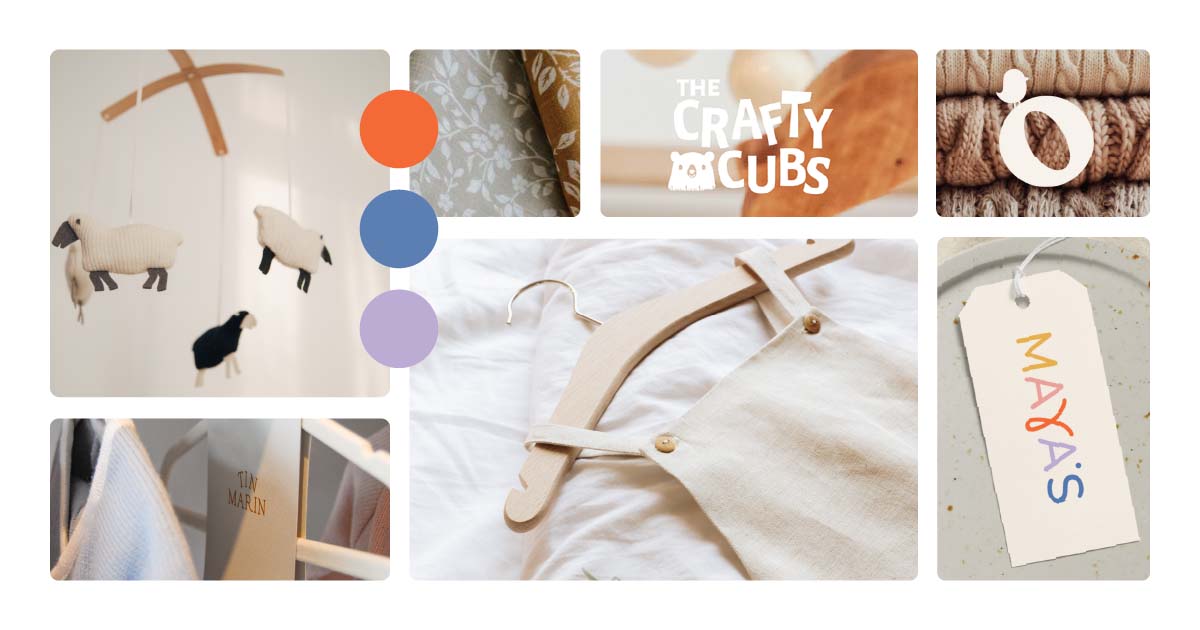
To lay the foundation for the rest of the project, I created a moodboard. Here, I collected inspiration for colours, typography, imagery, and logos. This step is important, because it sets the tone for the rest of the project, but it’s also fun to be able to get a visual representation of what the end product might look like. For this project, I wanted to blend sustainability with childlike fun and cheerfulness. I found that the best way to do this is to pair brighter colours with natural, textured imagery.
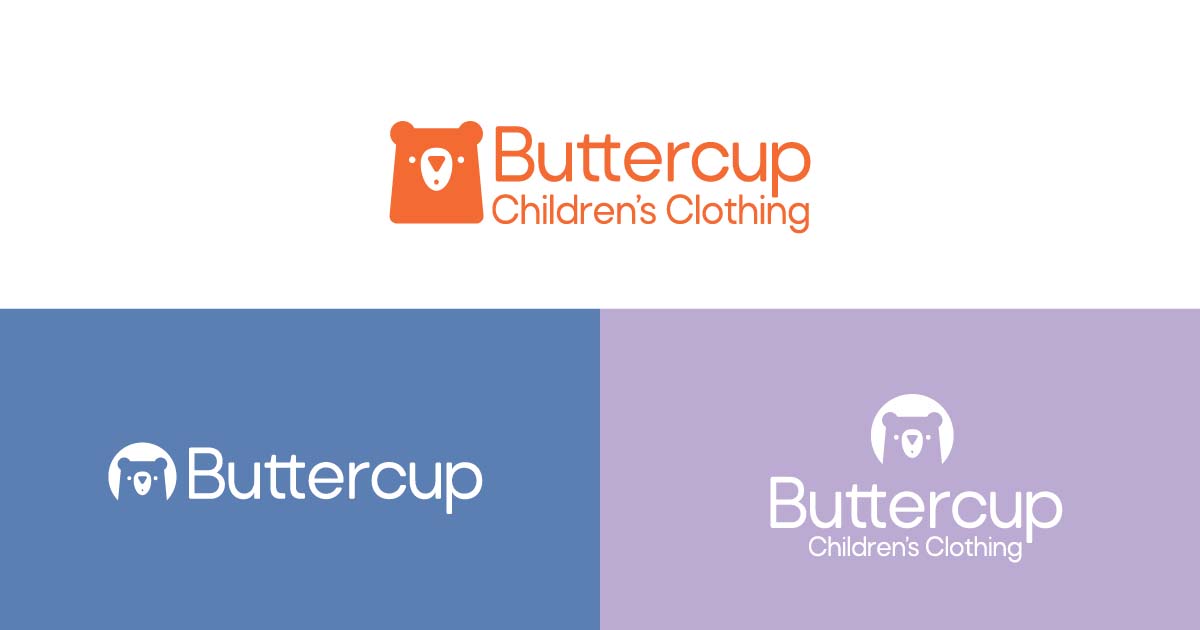
Primary Logo
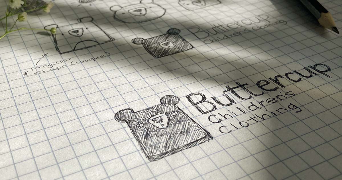
To work through my ideas, I started doing some rough sketches with pen and paper. I then turned those sketches into simple digital concepts, which I refined until I was happy with the final logo design. The goal for the logo was to create a symbol that would be memorable and easily recognizable for children. Pairing an easy-to-read font with a cute mascot helped to create a friendly logo for this brand.
Logo Variations
It’s important to have a few different versions of a company’s logo, so that they fit in different circumstances and designs. I created a simplified version, a centred version, two monograms, and a mascot icon.
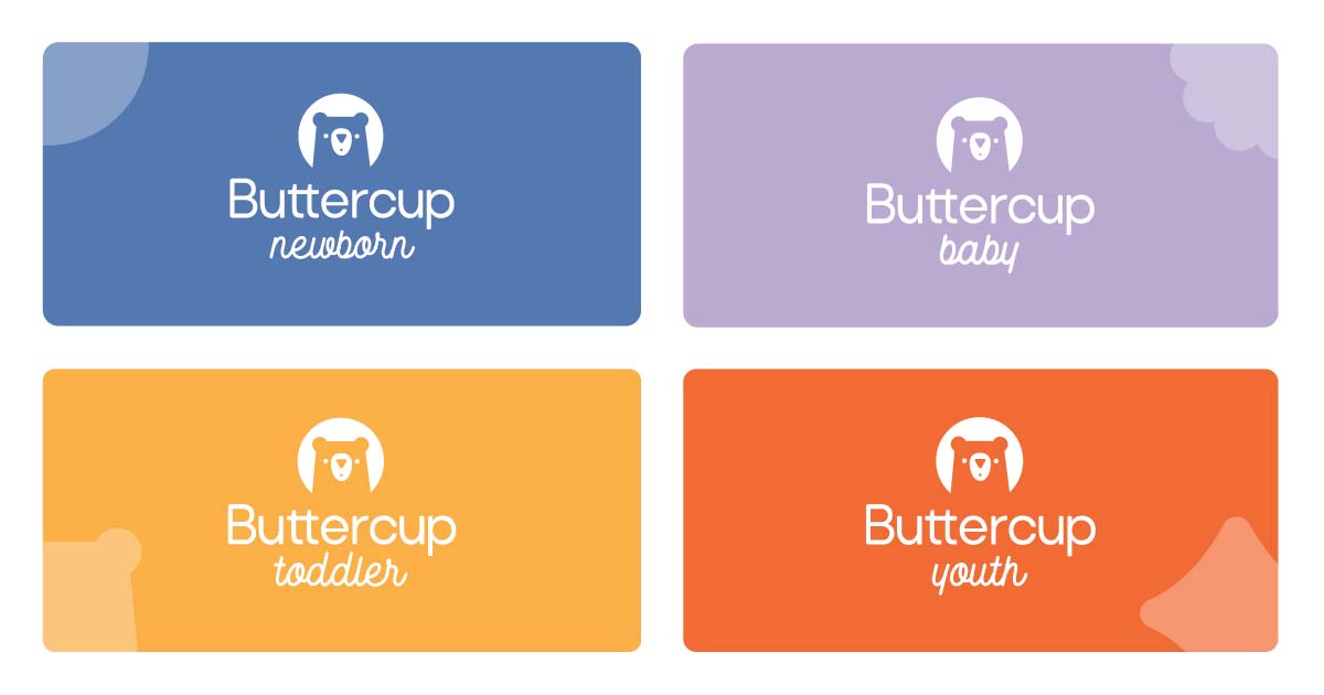
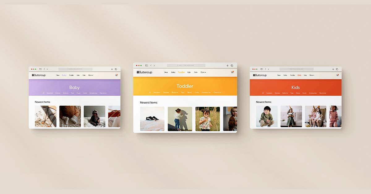
In addition, I created logos for each clothing line, or age category. These help to easily distinguish between clothing sizes.
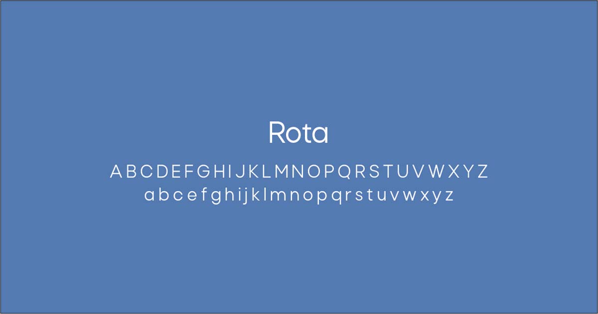
Choosing Colours & Typography
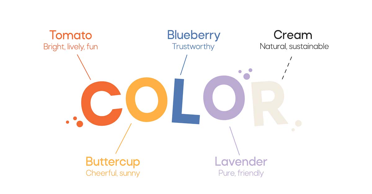
The colours I chose for this project are slightly muted versions of brighter colours. They work well together, but can be used on their own to break the larger brand up into smaller mini brands for each clothing line. The blue and purple colours signify safety and innocence, while the red and yellow bring life and sunshine to the brand. Together, I think they perfectly represent the brand’s mission statement.
Brand Collateral
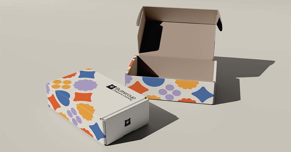
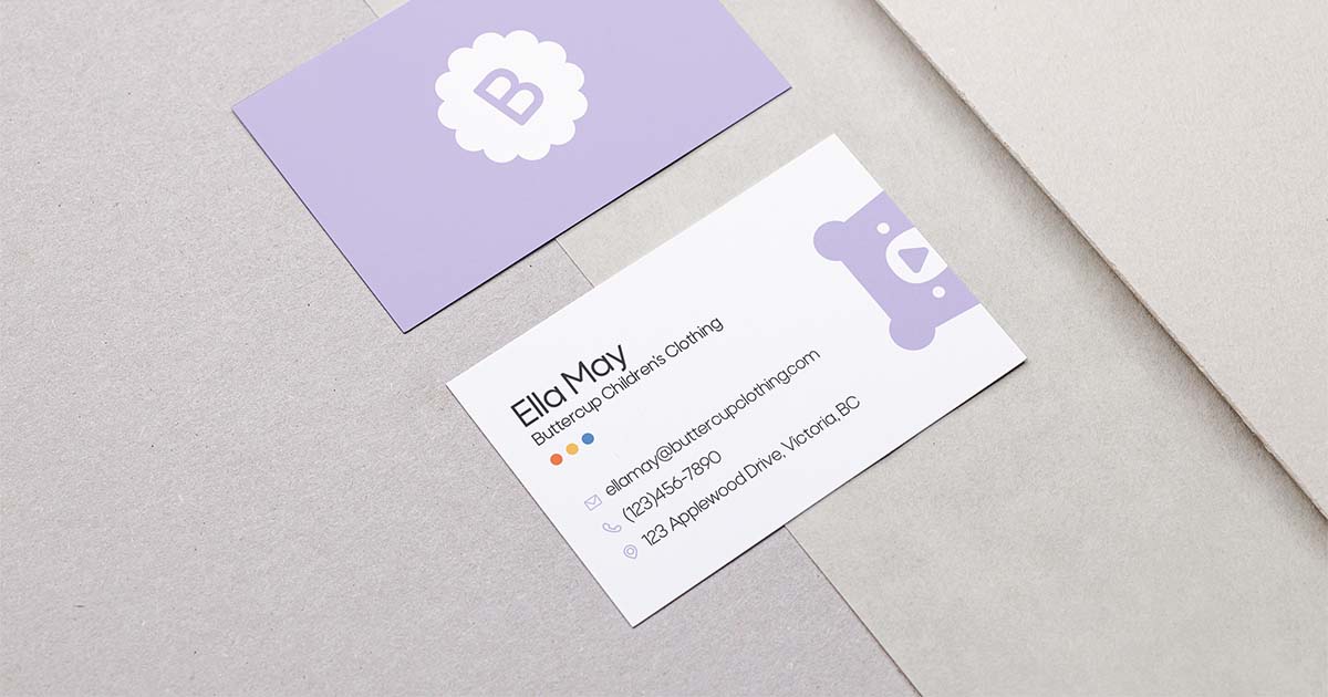
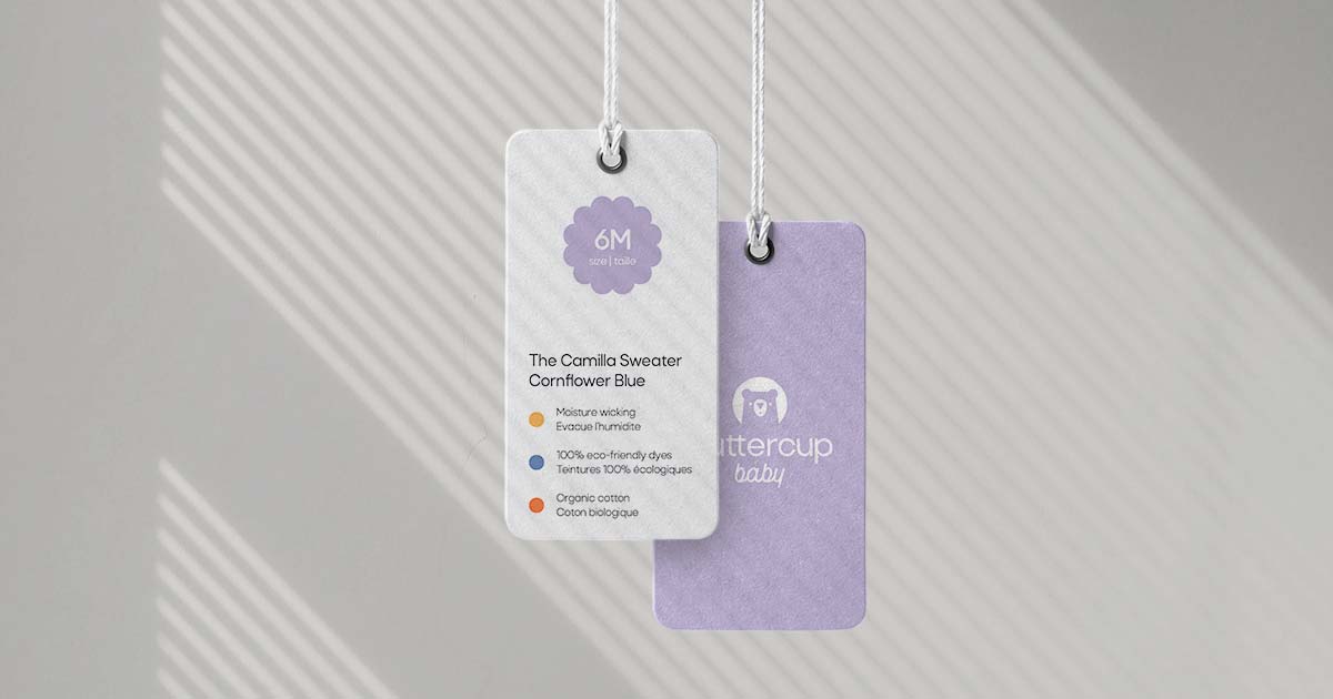
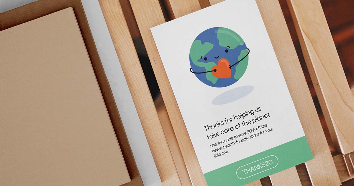
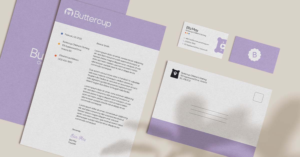
To showcase the logos I created, and to provide the company with some preliminary design assets, I designed some collateral. These included clothing tags, shipping boxes, stationery, branded clothing, and more. The goal was to include elements of fun, colour, and cheer, while also choosing sustainable materials and practices.
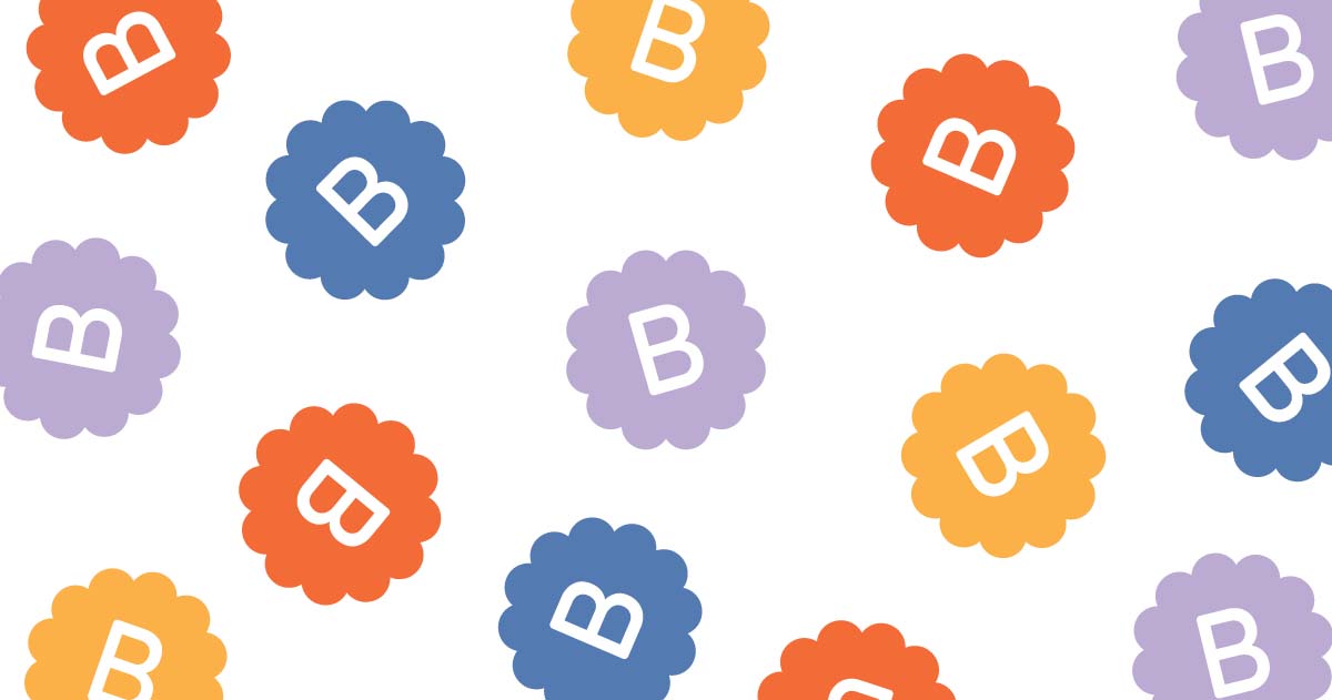
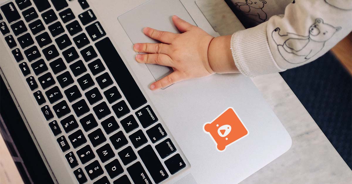
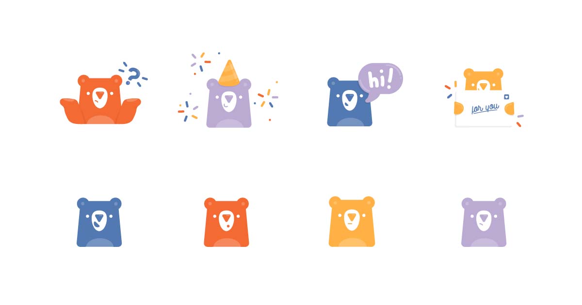
Icons
I designed a set of icons to be used on the website. The goal for these was to create round, bubbly icons that fit with the cheerful theme of the brand, and were easy to read and understand. Creating custom icons helps to create a well-rounded brand, and ensure that every part of the website’s design looks intentional and unified.
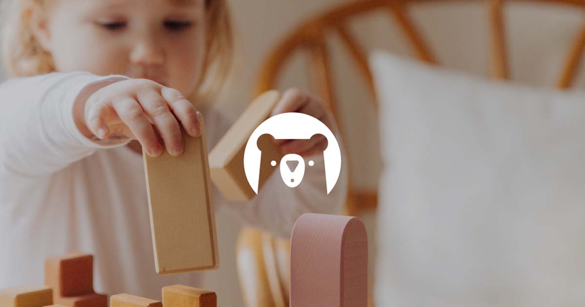
Illustrations
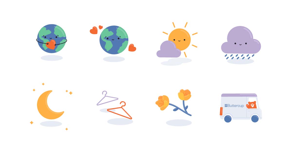
I also chose to design a limited illustration set for the brand. These illustrations feature the Buttercup Bear character, as well as other imagery that could be helpful for future design projects. These can be used as visual cues on a website or pops of colour and personality on a printed design. Either way, they’re an extra asset for the Buttercup brand to help engage parents and children alike.
Social Media Campaign
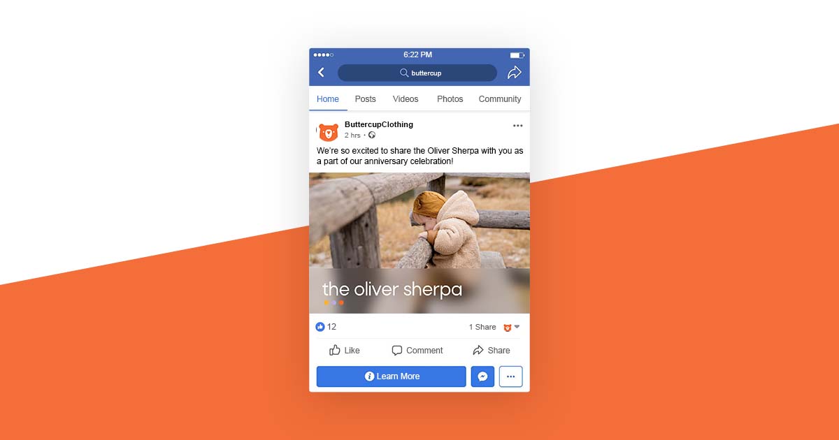
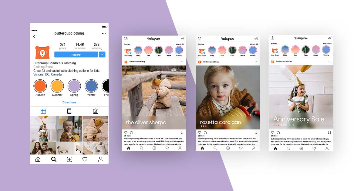
As part of the project’s social media strategy, I created a campaign announcing a 3-day sale in celebration of Buttercup’s anniversary. This campaign was to be launched on Facebook and Instagram, and featured 4 posts with product photos and captions.
Wireframes
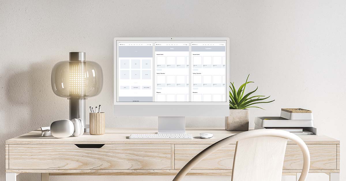
Before jumping into designing the prototype for Buttercup’s website, it was important to make sure that everything was planned out properly. I created a simple sitemap, which is basically just an outline of the pages I was going to create. Then, I sketched out some layouts by hand, and turned those into wireframes. These wireframes served as a blueprint for the rest of the website design.
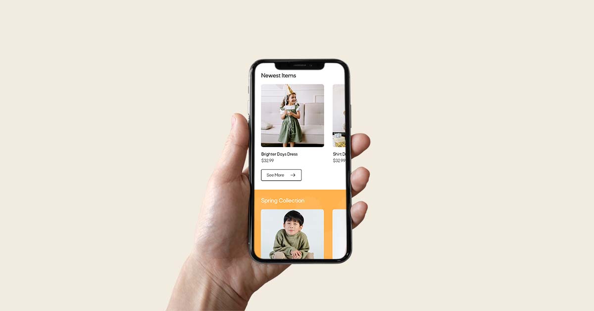
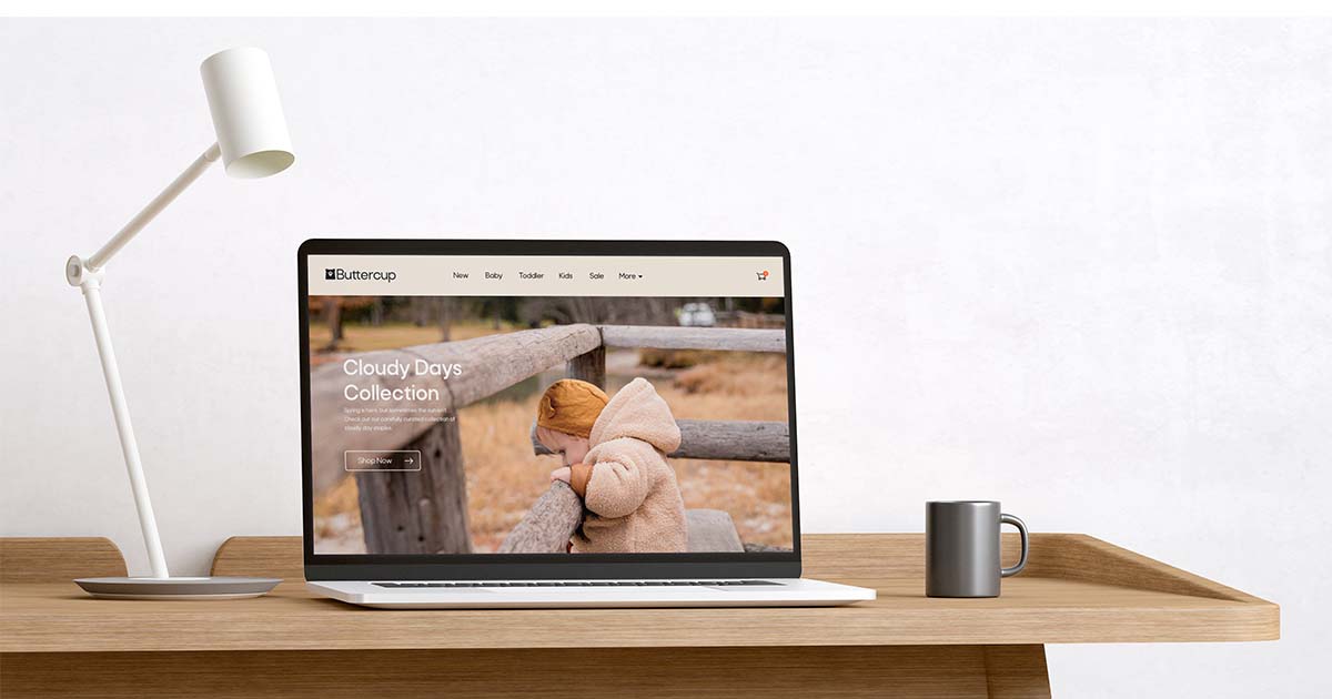
XD Prototype
https://xd.adobe.com/view/595d74f8-d80f-4856-925e-d3d6be4b77a8-0c0e/?fullscreen
The goal for Buttercup’s prototype was to create a website that was bright, fun, and easy to use. I created the main pages that one might expect to see on an e-commerce website – making sure to emphasise Buttercup’s mission and values.
Testing
Throughout the prototype design process, I did testing to ensure that everything was intuitive and easy to understand. I asked people to try finding a certain product on the site and give me feedback about their experience. This helped me to have a more objective idea of how well the prototype met my goals.
Style Guide
Issuu Style Guide Link: https://issuu.com/amanky/docs/buttercup_styleguide
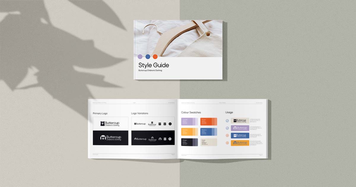
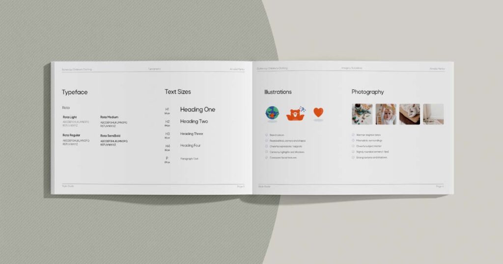
Creating a multi-page style guide for the Buttercup brand was a really important step of this project. It documents all the work I’ve done and how it should be used, so that even if someone else takes over the design work, they know how to use the brand assets appropriately. It ensures everyone is on the same page and makes it easier for everyone to maintain brand consistency.