Cumberland Community Forest Society Website
The purpose of my Capstone project was to redevelop the Cumberland Community Forest Society website using a new framework that I hadn’t used before. I chose React because I had an interest in it prior to my program starting and wanted to take the opportunity to learn it.
Process
The goal for this project is to redevelop the Cumberland Community Forest Society’s website while learning a new development framework.
I started in the planning stages by setting up my Gantt chart with the task list. I set up all of the Toggl projects so that I could start tracking my time as necessary. I created the budget estimate in the Gantt chart so that I could see where my time was going to be spent on a week to week basis. To finish the planning stages, I created the content deliverables, sitemap, and the self-directed study plan for learning React.js.
Benchmark one was all about doing the tutorials and reading the React.js documentation that I had outlined in my study plan. The main tutorial I concentrated on was from Freecodecamp that contained 47 different hands-on tutorials. Most of that content I then added into my study notes document so that I could reference when I needed it during build time. I also created the testing plan to test my site when I finished it.
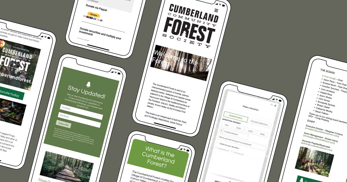
Benchmark two is where I got to start my website build. I started by installing React with npm and creating a react app. I imported FontAwesome icons and Google fonts. I created all the main component files that I was going to need for the website like the navigation header, the footer, and all the pages.
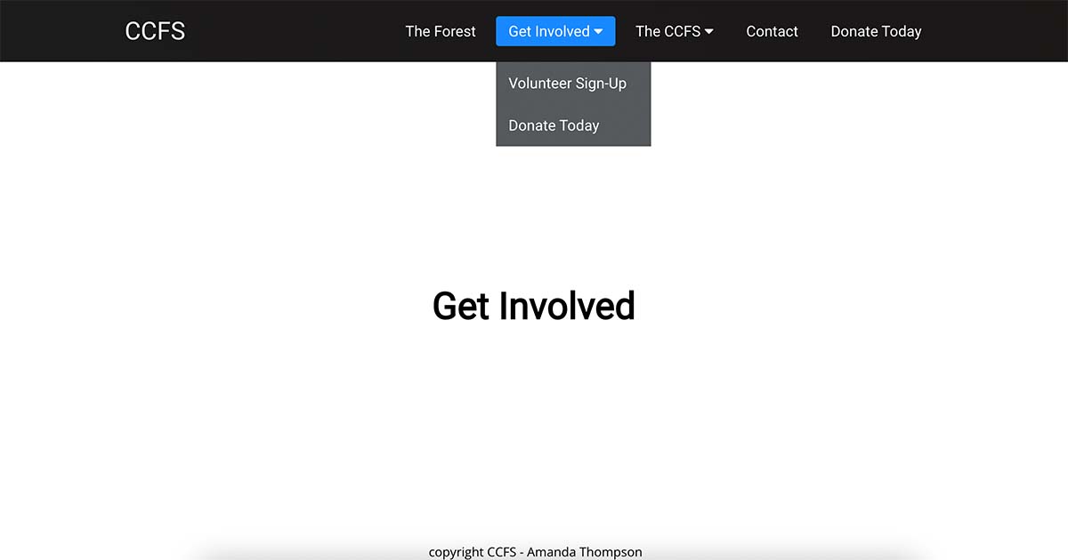
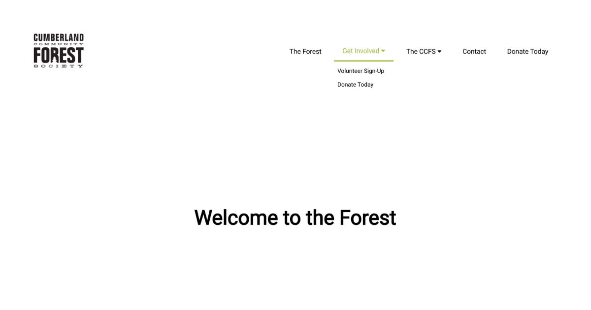
I worked on the header navigation and drop downs. I added the structure from a tutorial I completed in the first benchmark and customized it from there. I set up all the internal page links in navigation with Browser Router in the main App.js file then added a basic template for all pages so that I could see it was all working correctly.
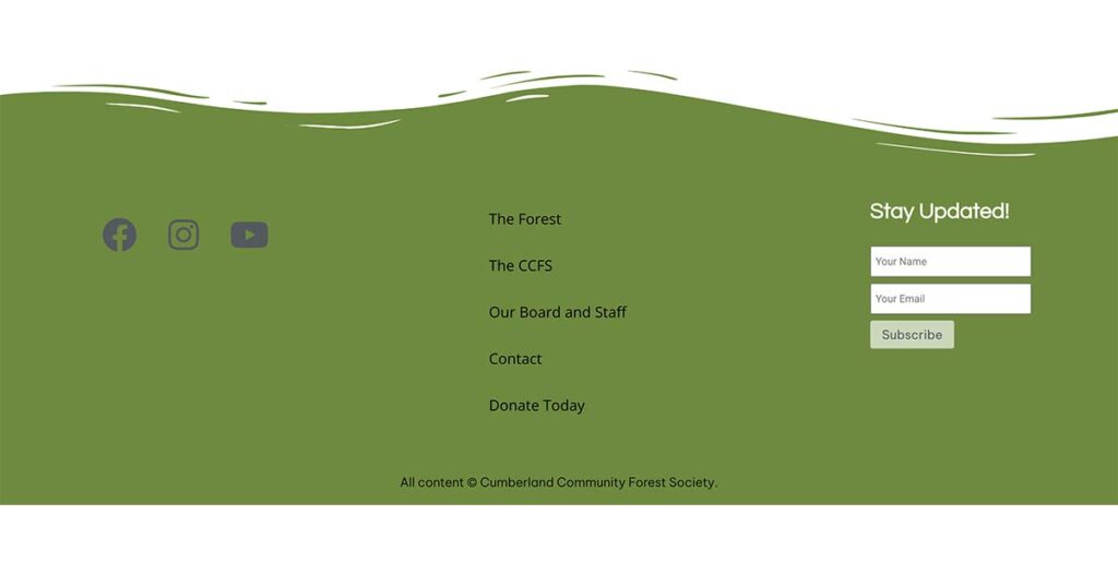
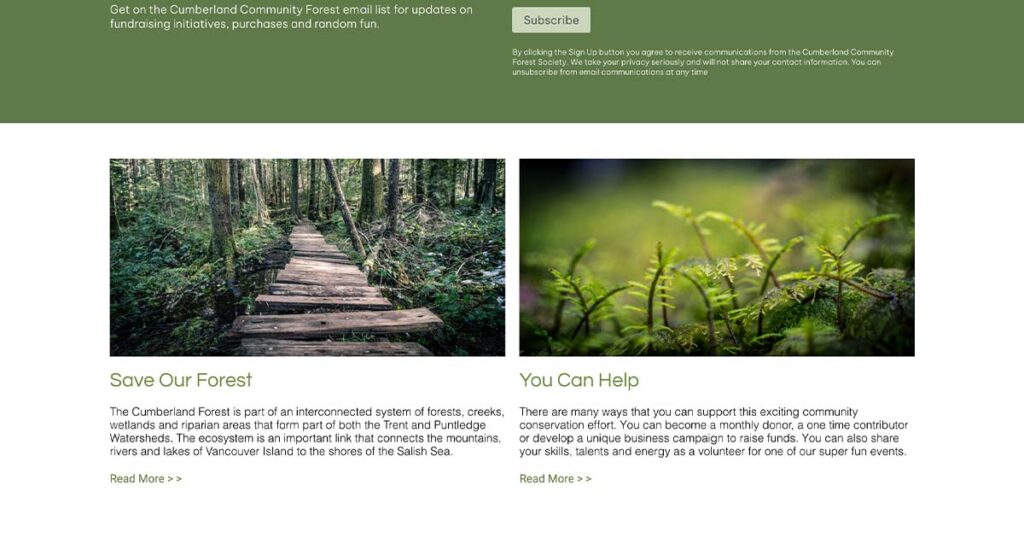
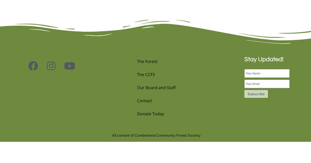
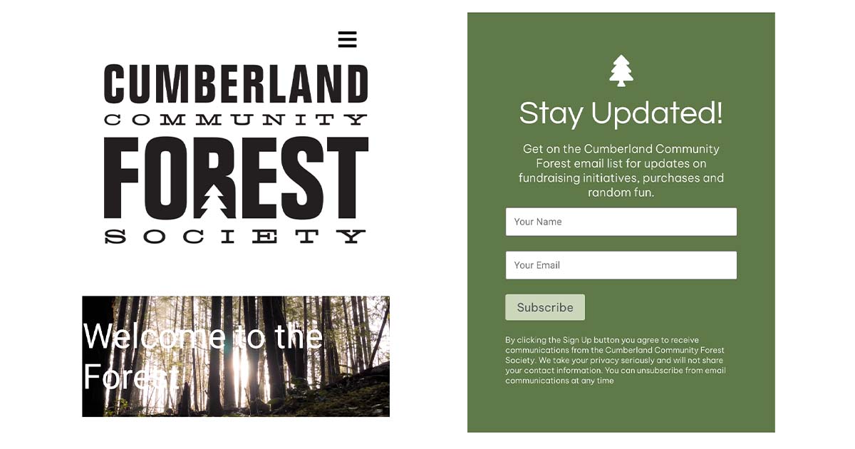
The footer was the next component that I worked on adding social icons, footer navigation, and a subscription form. I used a flex row to position the sections and added the svg graphic to the top of the footer border. The svg positioning took quite a bit of tweaking to have it sit right on top of the footer. I had to add a large screen media query to prevent the graphic from disappearing completely when the viewport was extended.
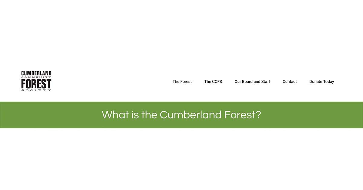
I gave all of the pages except for the home page a thick green banner with h1 headings of the page titles.
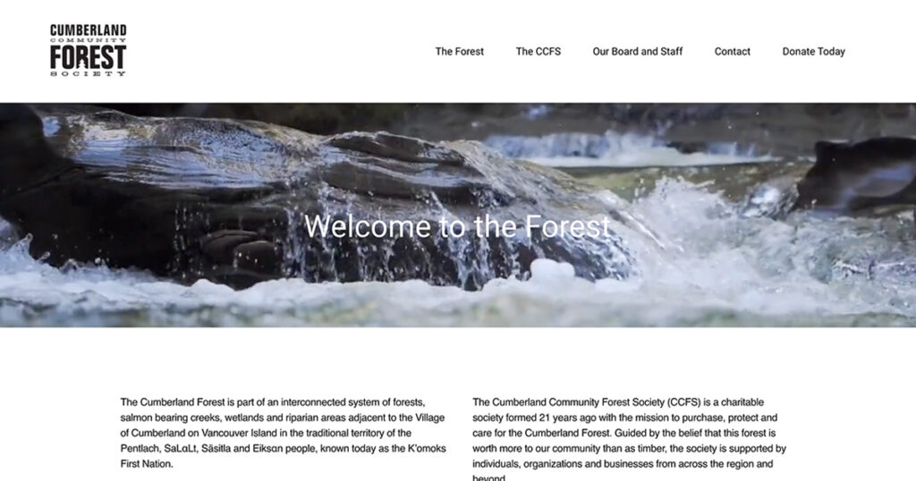
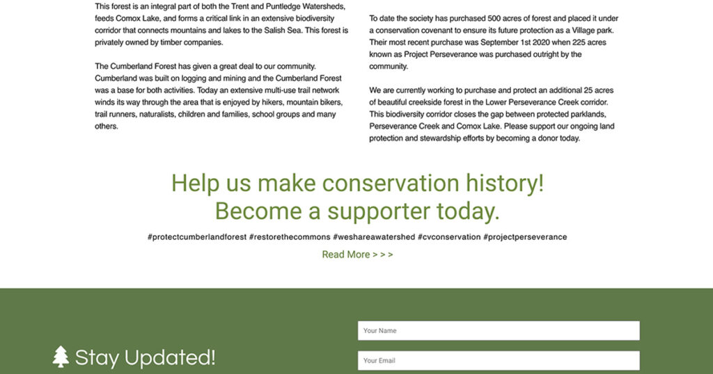
The first page I started on was the home page and added the video header. This wasn’t too difficult to accomplish but it came with performance problems because of using an mp4. I tried a bunch of different ways to use the external youtube video instead but I wasn’t able to get it to work in the time that I had. I came back to this in benchmark three to try it again and ended up trimming almost a minute off the video to try to gain faster performance with Lighthouse devtools. The rest of the page went in pretty easily. I used flex rows for all of the content so that I could use flex column media queries for smaller screens.
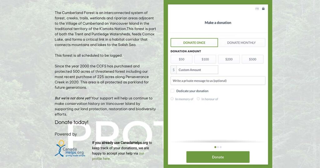
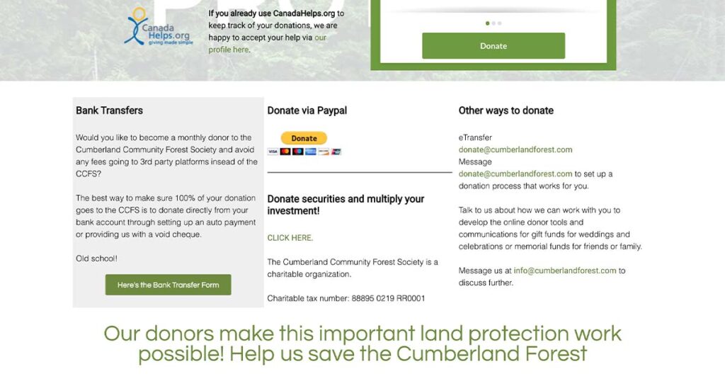
In benchmark three, I started on the donation page. I was able to add all of the live content from the CCFS website so users are able to make direct donations to the CCFS from my site through a live donation form, their paypal portal, and the CanadaHelps donation portal. I worked on adding the rest of the content again with flex rows and flex columns for smaller screens.
It was at this point in the project I had to rethink the amount of content I was going to include in the MVP because I was running out of time. I decided to remove a couple of the pages I was planning to do but weren’t totally necessary and remove the navigation drop downs in the header and footer to remove redundancies.
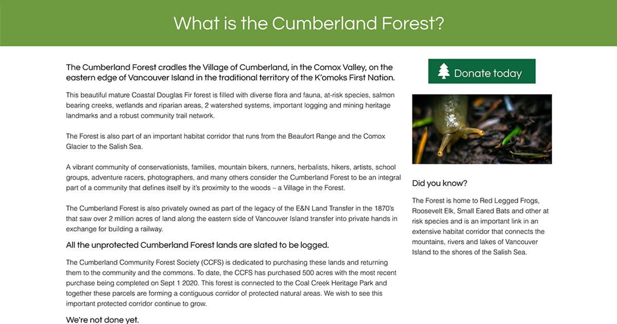
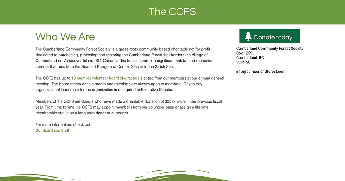
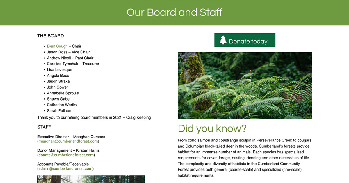
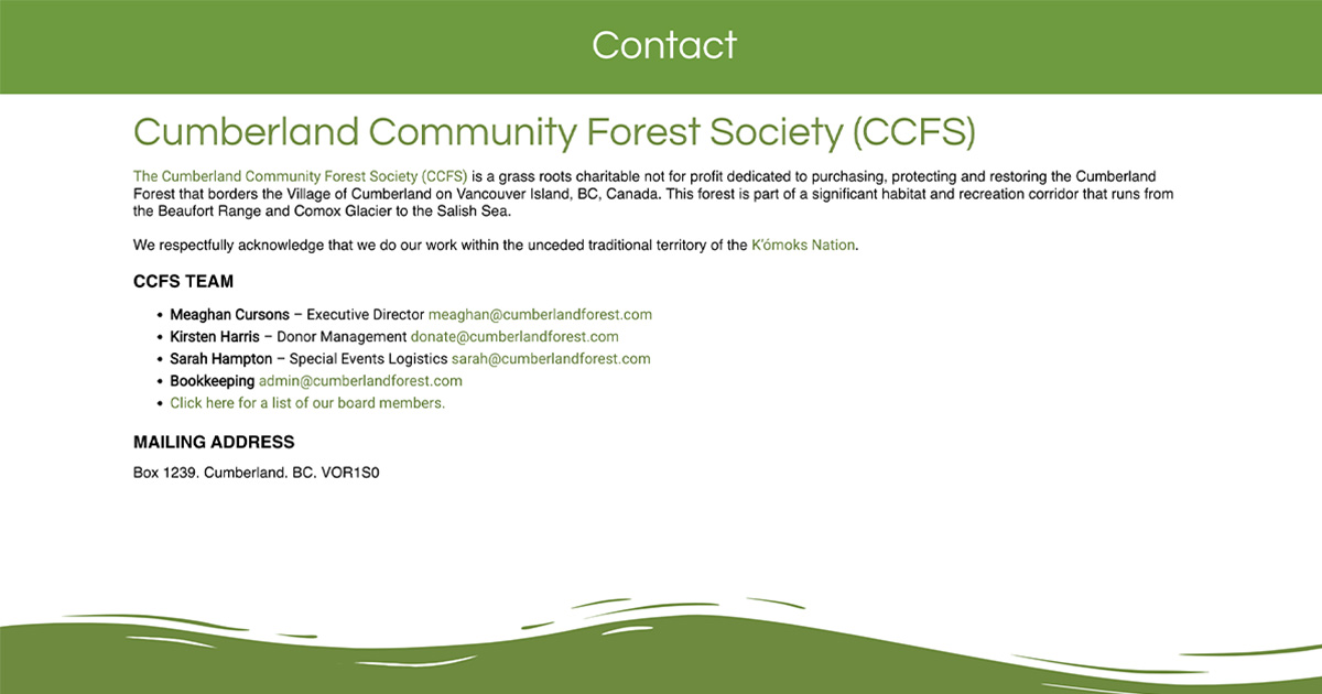
The rest of the pages were pretty simple content-wise so they were pretty quick to put together. The forest page and the CCFS page both had the same 70/30 content ratio with the donate aside section containing the donate now button. The next two pages were for the board members and the contact page. I used flex rows for all of these pages and flex columns for small screens.
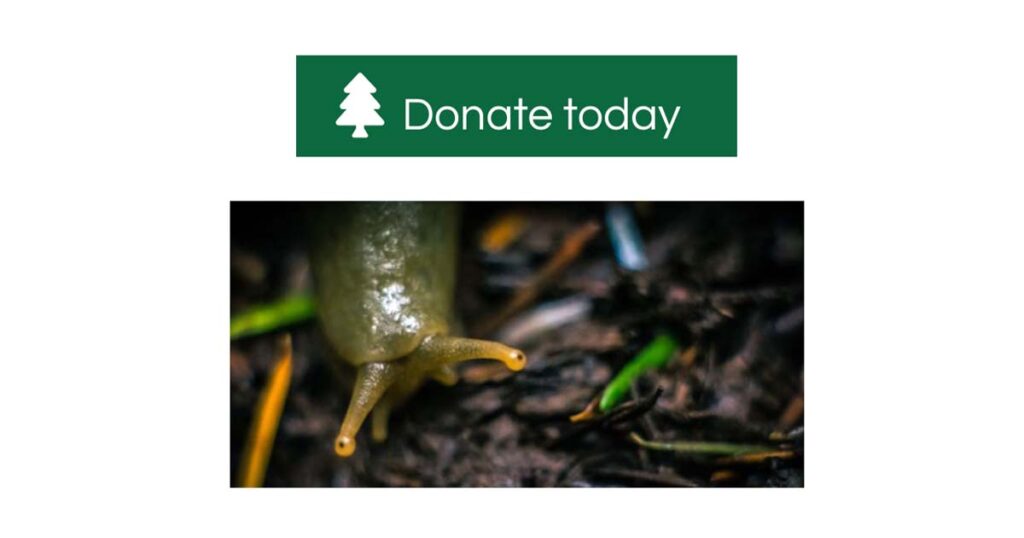
One component was the donate button that leads to the donate page. I added the tree icon to the left side of the button text and positioned it correctly. Applied a green background and centered the text. I then added a lighter green hover colour and set the minimum width of the button so that it wouldn’t squish up when resizing screens.
I worked on general clean up of the directory and removed extra videos not in use, removed unnecessary imports, and removed unused content pages along with their css files.
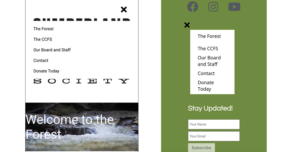
I started work on responsive styles and general fixes throughout the website. I fixed the header and footer navigation so they appeared in appropriate locations. Up to this point, the styles were conflicting with each other and I hadn’t had time to troubleshoot it. After I fixed it, I adjusted the width of the header mobile menu to be the full width of the viewport.
I added mobile responsive styles to the donation page, footer, subscription form banner on the home page and the card section on the home page. I decreased the height of the video header on the home page for small screens. Fixed the width of the donation form and page on mobile. I also had to adjust the margins on the bottom of the page content due to content disappearing behind the footer graphic on different screen sizes.
For accessibility, I ran the WAVE tool to see what was missing. I added missing alt text throughout all of the website, changed all the link colours to a darker green and added label forms and hid them visually.
Live deployment of Cumberland Community Forest Society on Heroku