Morbid Kuriosity
Morbid Kuriosity’s Strange and Unexplained Incidents is a meticulously researched nonfiction publication that explores real-life mysteries, dark histories, and eerie events from around the world. Created and designed by Abin Tom Sebastian, the project curates true accounts of disappearances, supernatural occurrences, and unsolved historical phenomena. Through compelling narratives and striking visuals, the book aims to engage readers who are fascinated by the unexplained.
The project builds upon the success of the Morbid Kuriosity community, expanding its reach beyond social media into the realm of published work. Combining Sebastian’s expertise in writing, design, and visual storytelling, the publication delivers a captivating experience that celebrates curiosity while maintaining a commitment to accuracy and respectful storytelling.
Process
Project Development
The journey of Morbid Kuriosity began with a solid foundation of research and concept discovery. From the earliest proposal stages, the vision was clear: this book had to feel like an artifact. Something you don’t just read, but experience. The central idea revolved around capturing the allure of historical mysteries, urban legends, and strange incidents, all brought together under one cohesive visual identity.
Through initial discovery phases, I explored visual inspirations that would later inform both the branding and narrative style of the book. My goal was to craft an atmosphere that feels timeless, as if the book itself could belong in an old curiosity shop, yet still command attention on modern shelves.
Moodboard & Visual Strategy
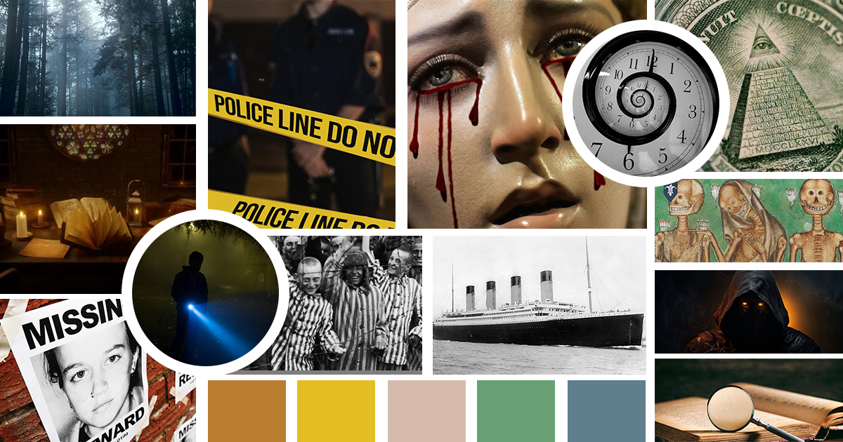
To set the visual direction, I created a dedicated moodboard that leaned heavily into vintage symbolism, esoteric illustrations, and bold yet elegant typography. This early visual framework allowed me to map out the aesthetic language of the project, one that would
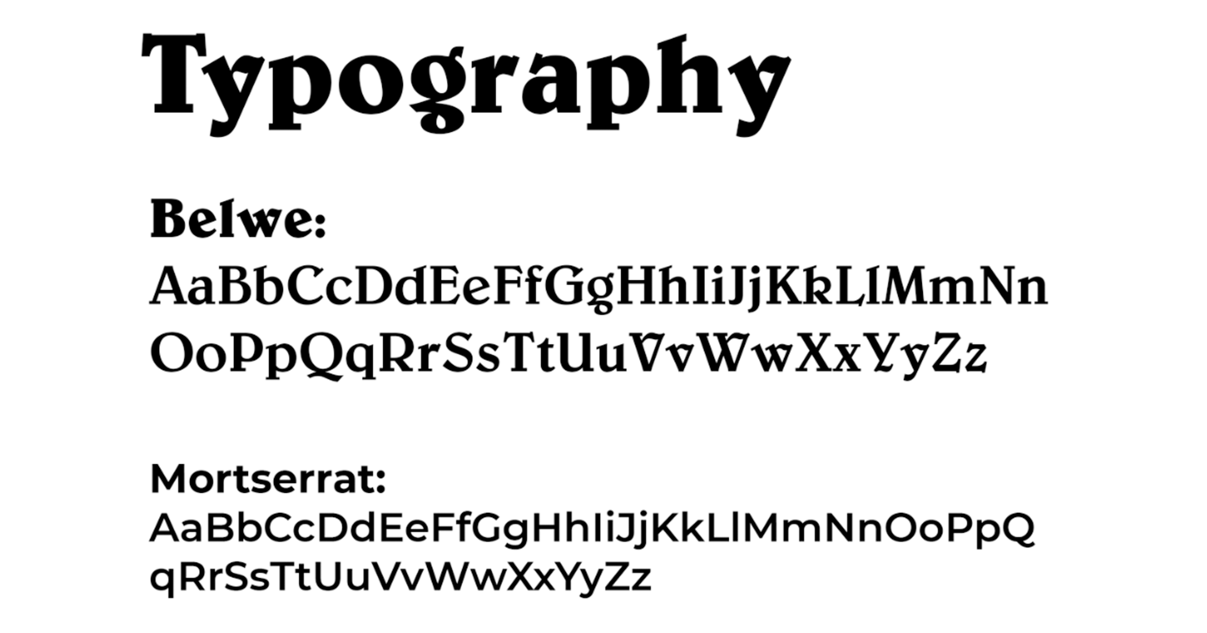
extend seamlessly from the book design to promotional materials and merchandise. The fonts used were Montserrat and Belwe, one clean, and one traditionally occult.
Book Cover Design
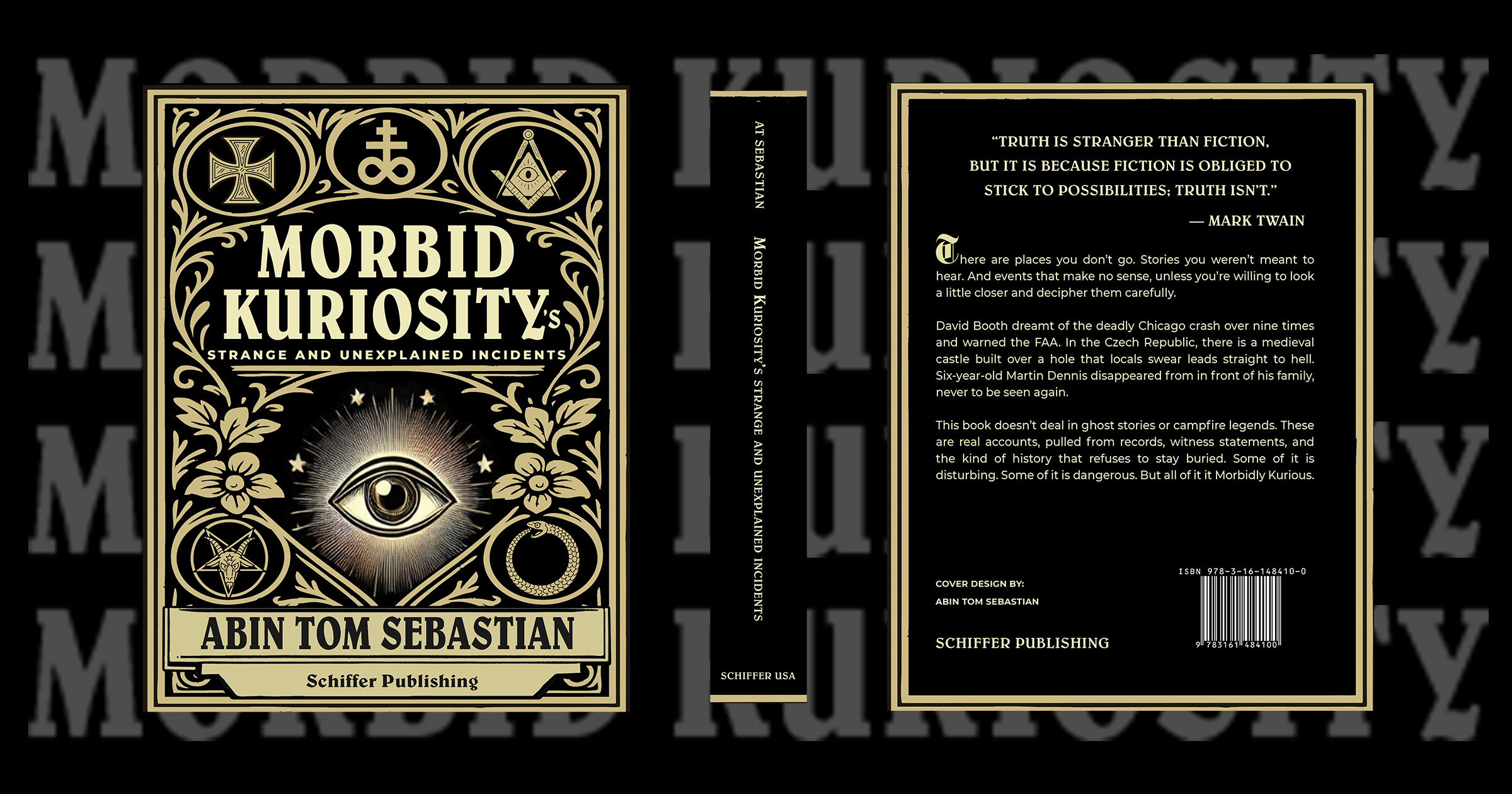
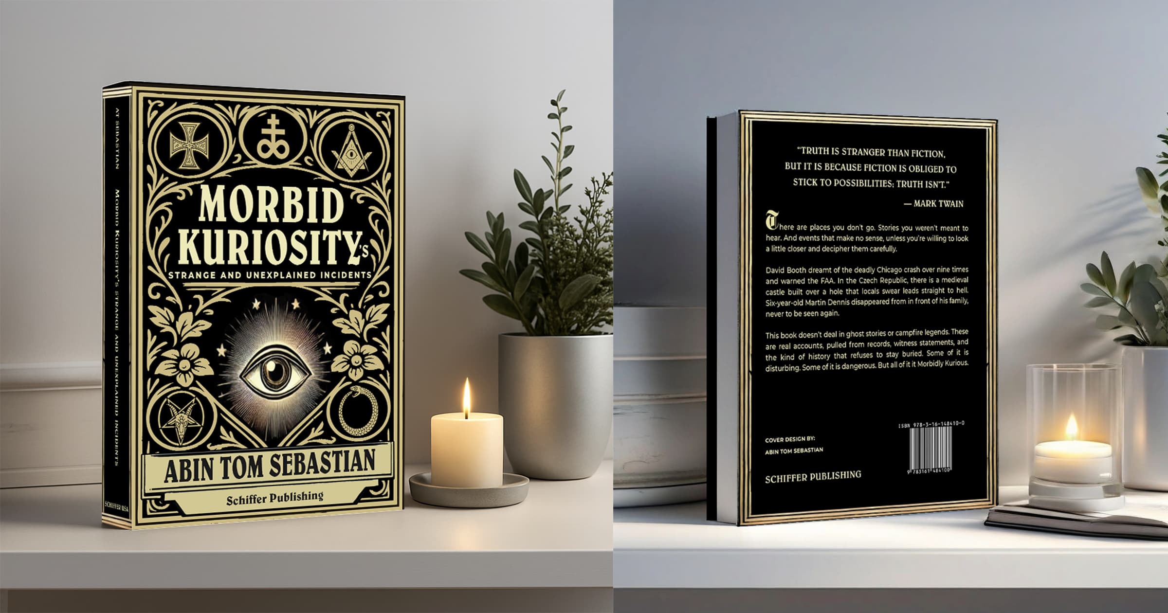
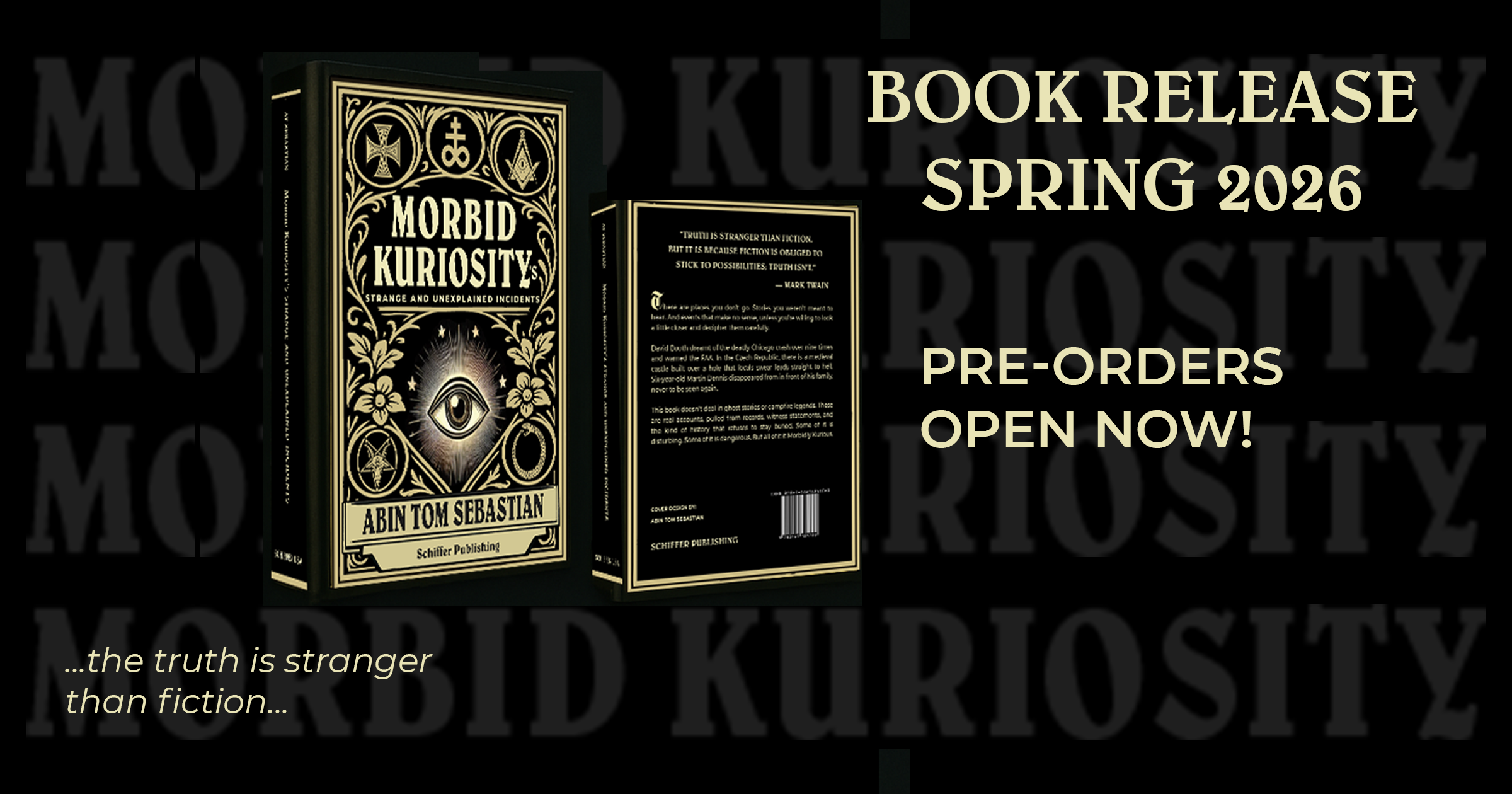
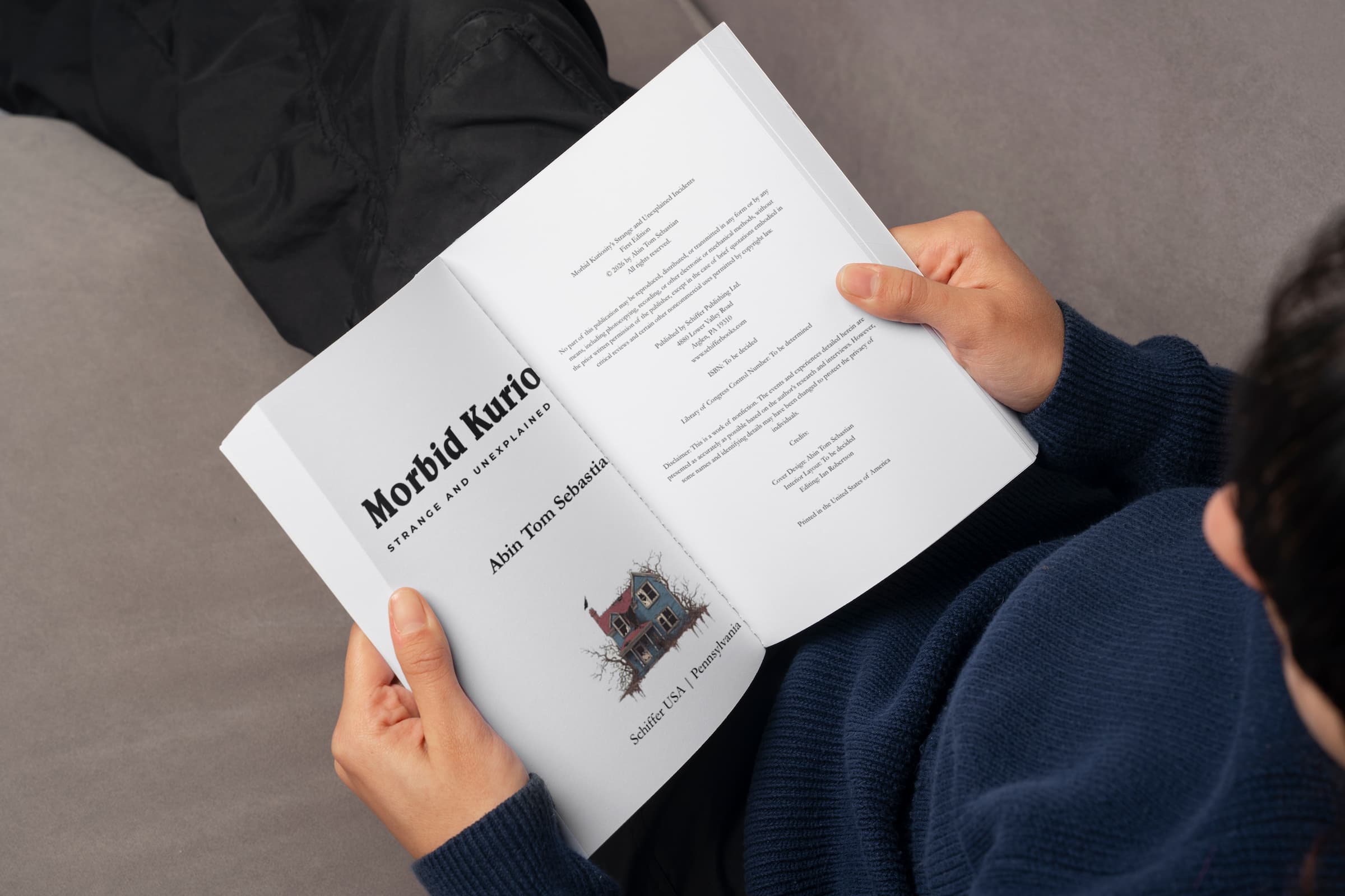
The book cover became the centerpiece of the entire visual system. I had, in three weeks, designed up to 5 different book covers, and finally decided to go with the one with the occult symbology. Designed in Illustrator and Photoshop, the layout features an intricate arrangement of occult symbols, natural motifs, and the iconic all-seeing eye, all set in a gold-on-black palette for maximum impact. The cover was as narrative as it was decorative. Every element was chosen to hint at the themes of hidden truths and the sinister beauty of history’s dark corners.
Throughout development, I refined multiple concept drafts before finalizing the design. The final cover is both arresting and thematically rich, functioning as the anchor point for all other collateral.
Promotional Posters & Storefront Displays
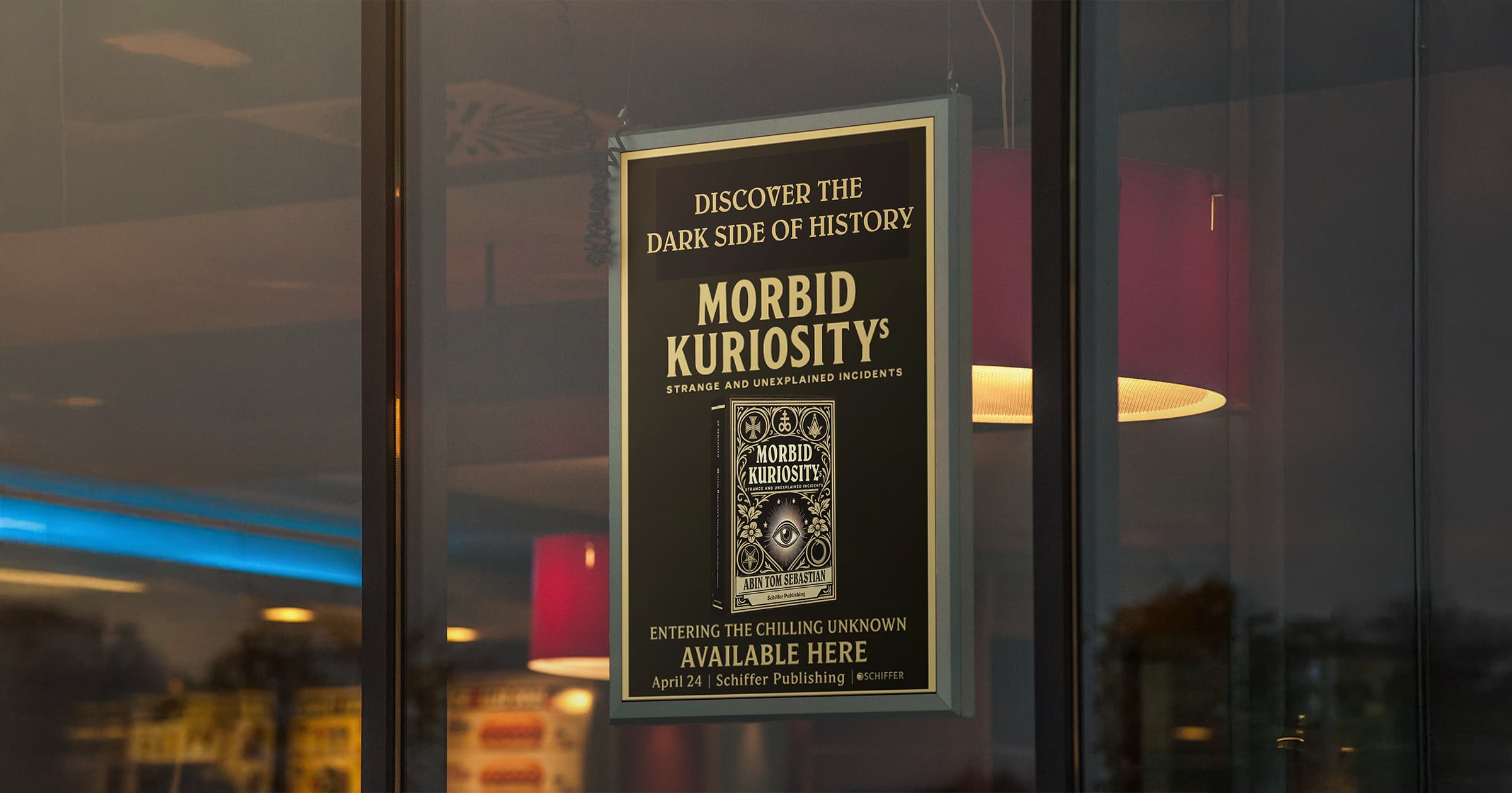
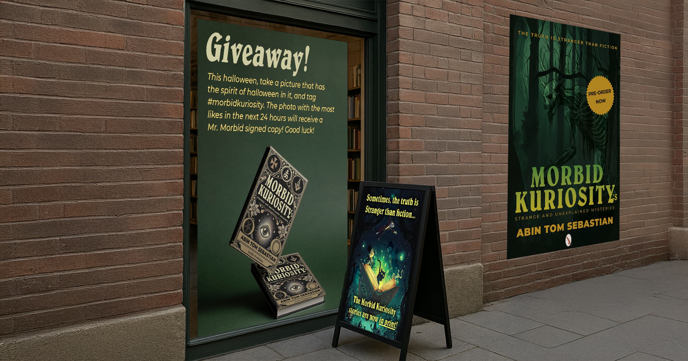
Beyond the book itself, I expanded the visual language into physical promotional materials. The posters and storefront displays were crafted to feel like they belonged in an old bookshop window or a dimly lit museum of oddities. Messages like “Discover the Dark Side of History” were paired with the book’s bold imagery to immediately draw attention.
I ensured these promotional materials weren’t simply ads, but extensions of the book’s world. They worked both as point-of-sale displays and as atmospheric pieces that built curiosity and anticipation.
Merchandise: Beer Coaster Design
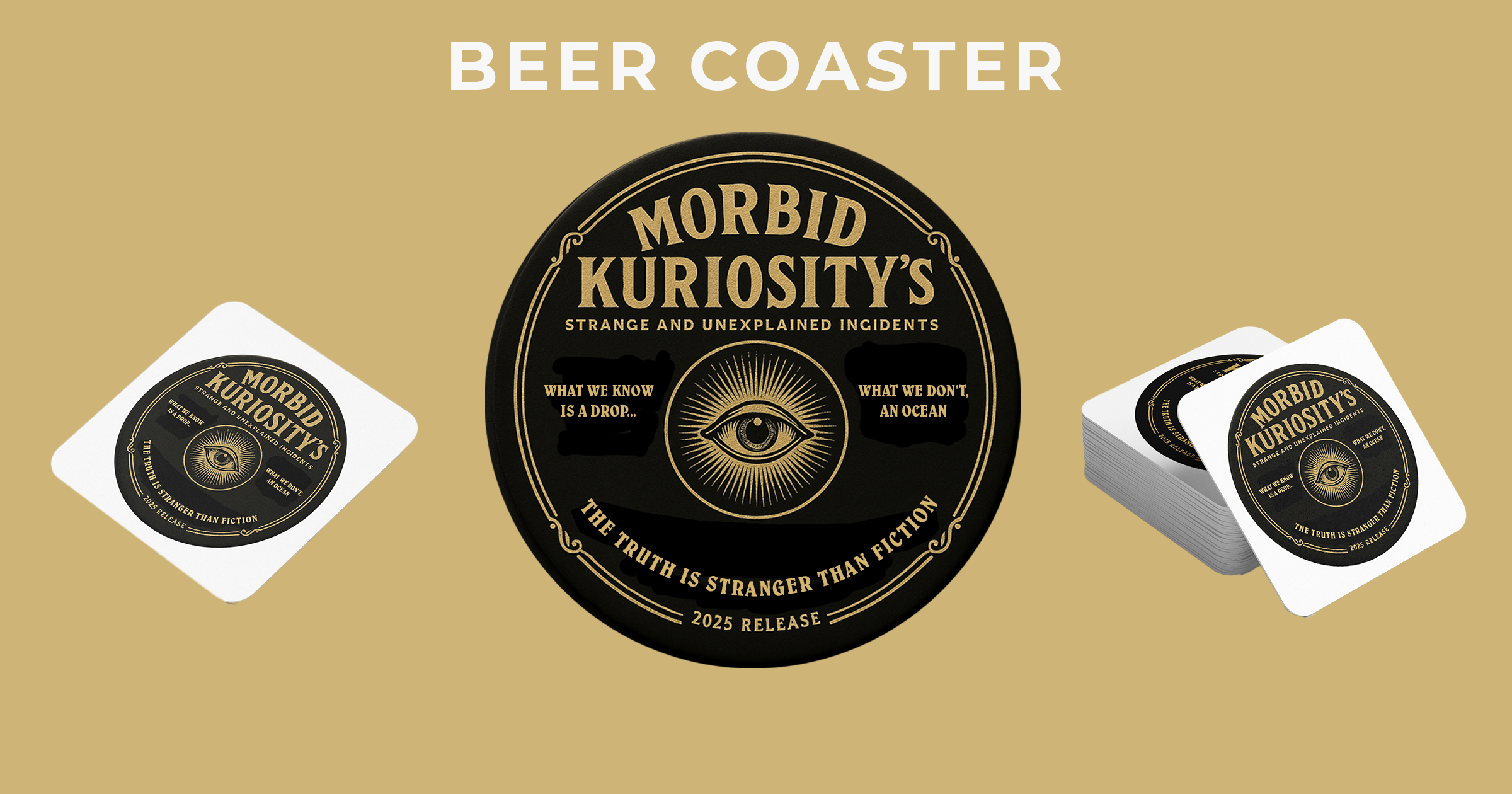
To push the branding further, I developed a unique piece of merchandise: the Morbid Kuriosity beer coaster. This design borrowed visual elements from the book cover but adapted them to feel like a collectible object, something you’d find in an old tavern or a speakeasy. The coaster carried the same dark charm, with phrases like “The truth is stranger than fiction” encircling the iconic eye graphic, tying the merch directly back to the book’s identity.
Social Media Campaign
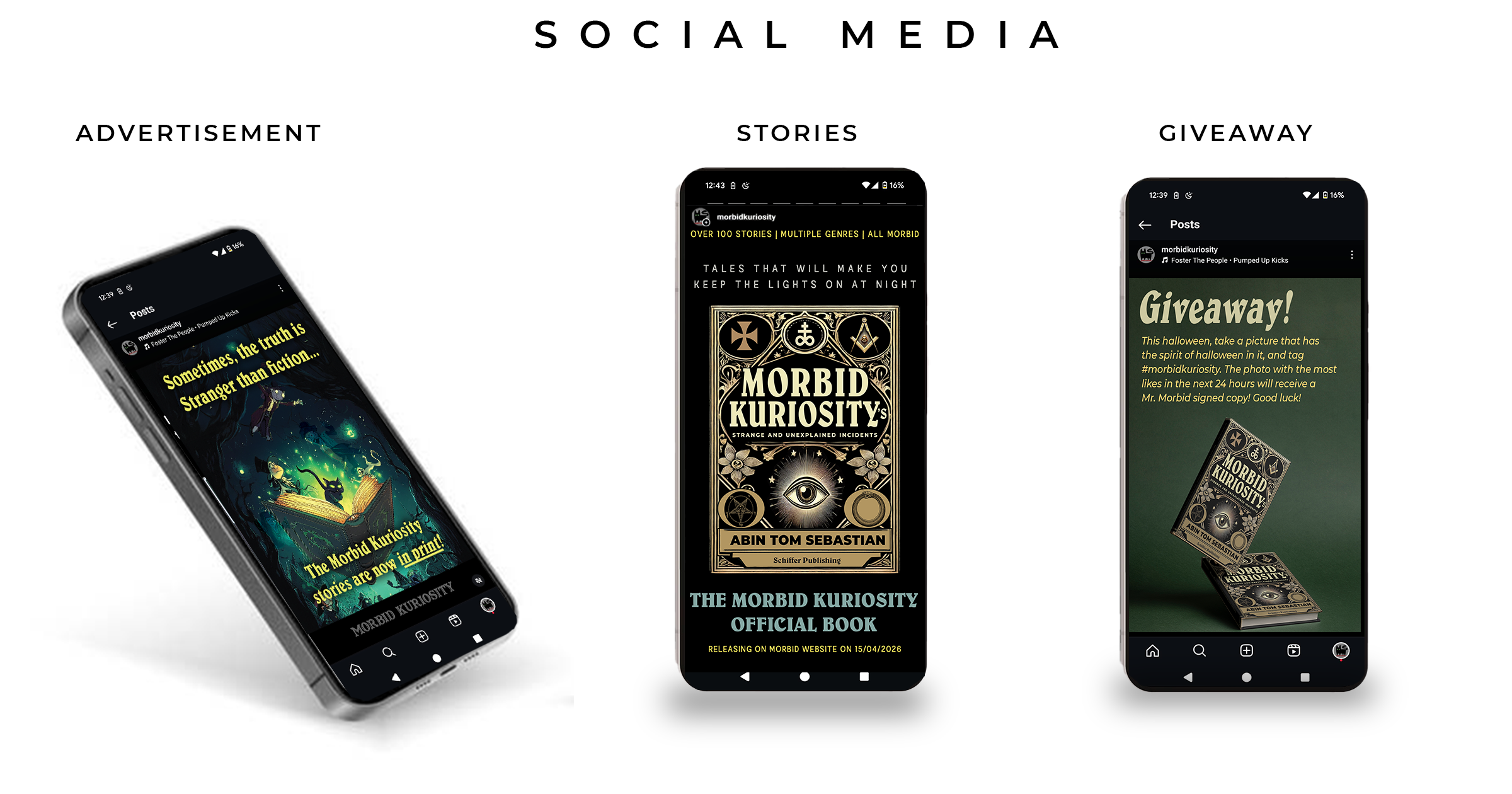
Understanding the importance of digital presence, I built a fully realized social media rollout. This included feed posts, story layouts, and promotional reels designed specifically to drive engagement and pre-orders. I used the knowledge that I gained from the Social Media class as reference to strategize and schedule the posts for maximum performance.
The visual tone of the posts mirrored the book’s aesthetic, keeping every touchpoint consistent. Teasers, giveaways, and behind-the-scenes glimpses formed part of the strategy, helping to build excitement before the official launch.
The current posting strategy has been stunning. Instagram Reels is playing a pivotal role, generating over 86 million views, with non-followers accounting for the vast majority of reach and proving that the content successfully expanded beyond existing audiences.
Website Integration
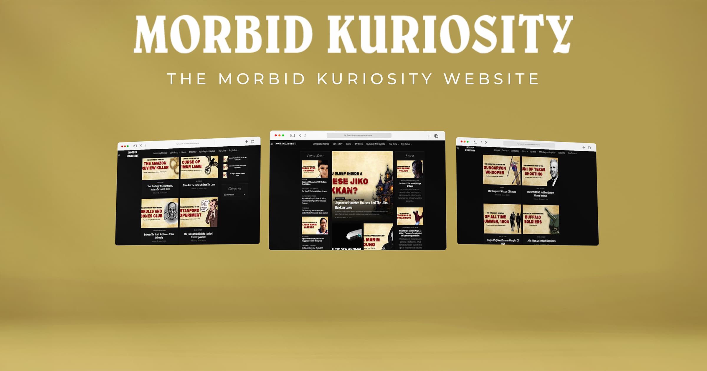
To house all content under one digital roof, I developed and updated the Morbid Kuriosity website. The site featured book previews, blog articles, and an integrated pre-order system. It served as the campaign’s command center, keeping followers and curious visitors alike engaged with fresh updates and easy access to purchasing options.
A Conclusion for Now
From initial concept to full-scale launch, Morbid Kuriosity evolved into a comprehensive branding ecosystem. From the beginning, I never treated this project as designing a book cover, but as a full scaled brand, with the book acting as a centerpiece, from physical merchandise to storefronts, social feeds, and beyond. Each element of the project was carefully designed to work in harmony, delivering not just a publication, but an immersive experience for the audience.