
The Blossoming Garden
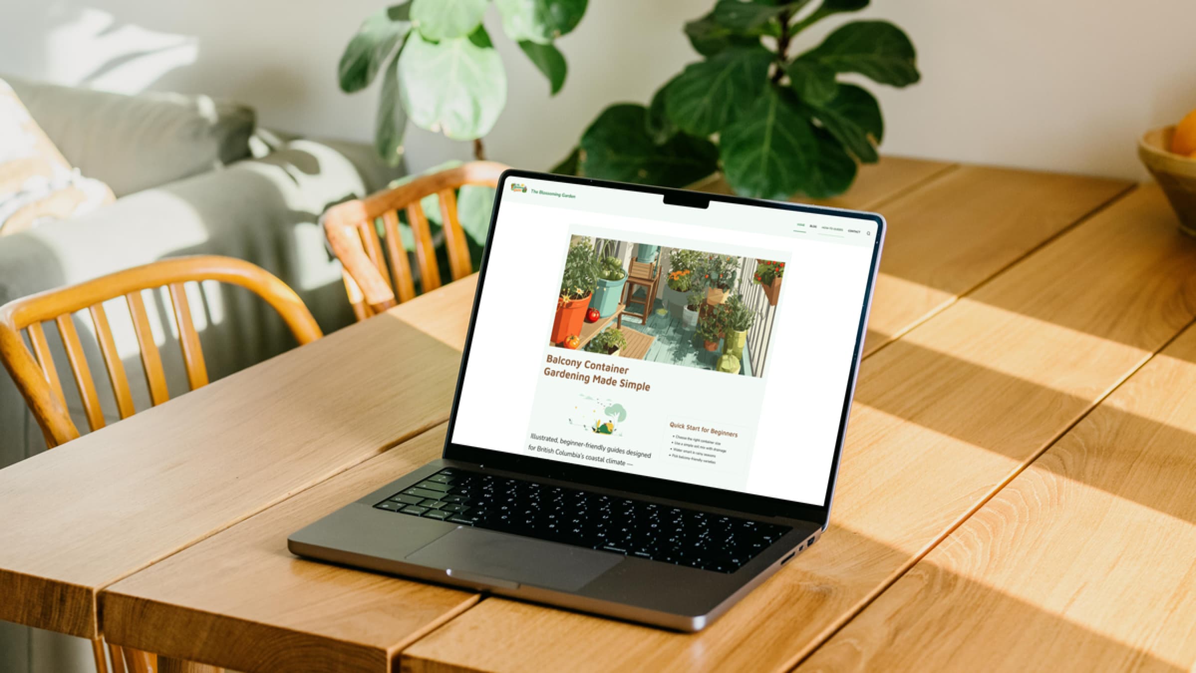
The Blossoming Garden is a container gardening website designed specifically for beginners who want to grow plants on balconies in British Columbia. Many gardening resources are too general or not suited for small urban spaces, so this project focuses on simplifying gardening through clear, structured, and climate-specific content.
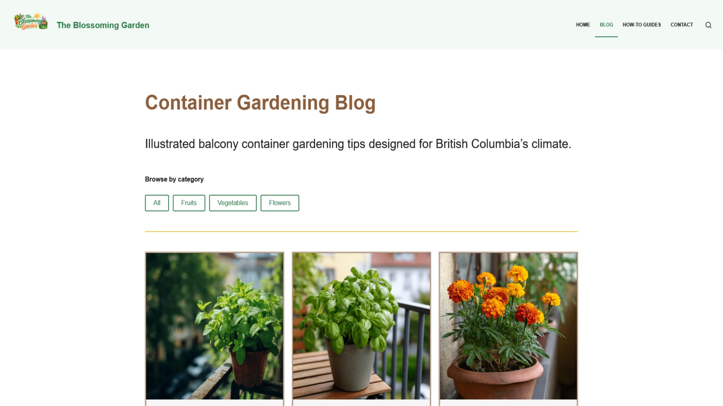
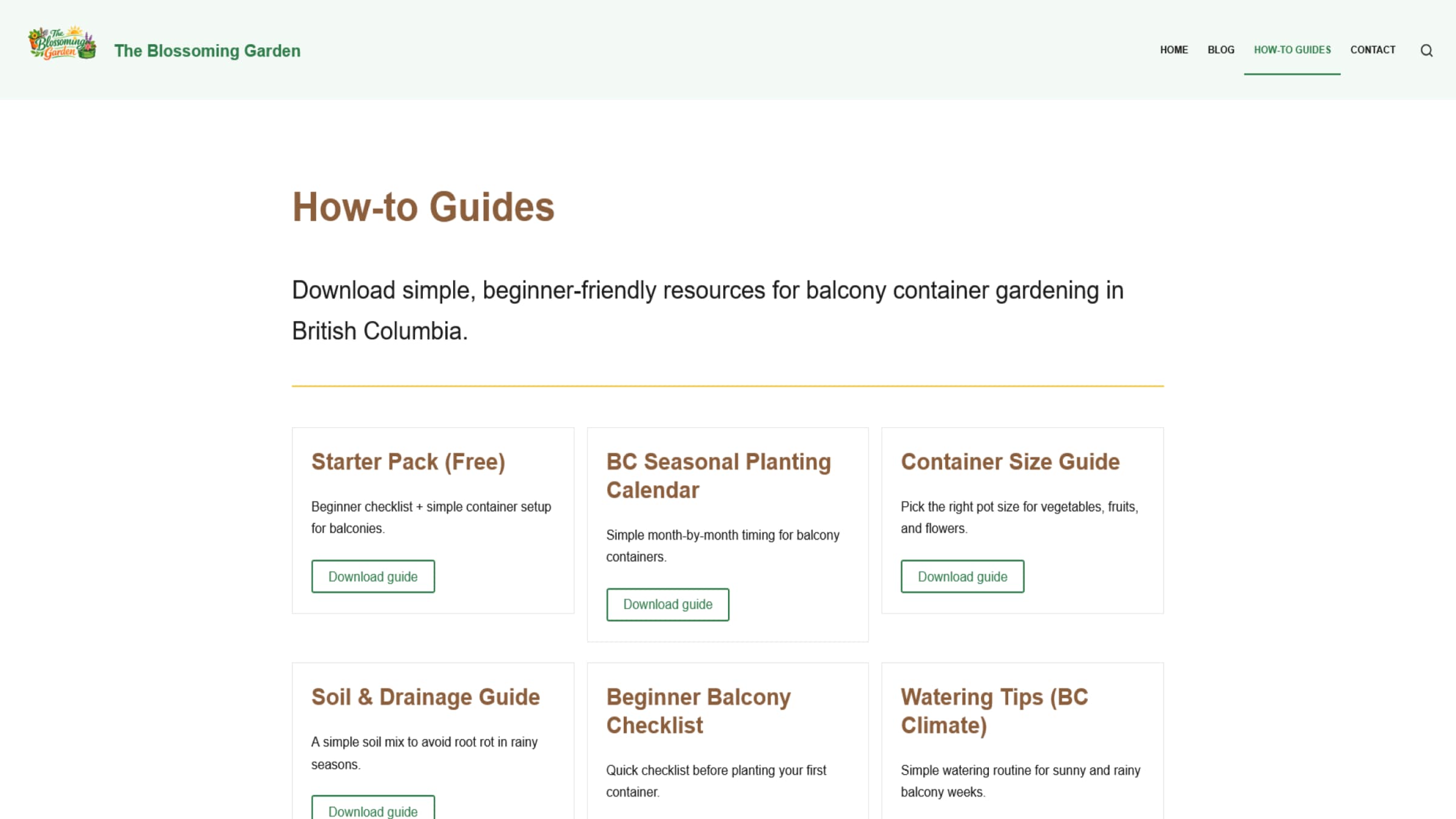
The website includes categorized blog posts, step-by-step guides, and downloadable resources such as a seasonal planting calendar, container size guide, soil and drainage guide, and a beginner starter pack. Built using WordPress with the Blocksy theme, Gutenberg, and Spectra, the project emphasizes accessibility, responsive design, and performance optimization. The final result is a clean, approachable platform that helps users confidently start and maintain balcony gardens.
Visit the live site at capstone.aawad.imgd.ca.
Proposed Solution
The goal of this project was to create a beginner-friendly gardening website specifically designed for balcony container gardening in British Columbia. I identified that many existing gardening websites were either too complex or not adapted to small living spaces. My solution was to design a clean, easy-to-navigate website that focuses on simple instructions, visual guidance, and practical resources tailored to local climate conditions.
Design & Branding Decisions
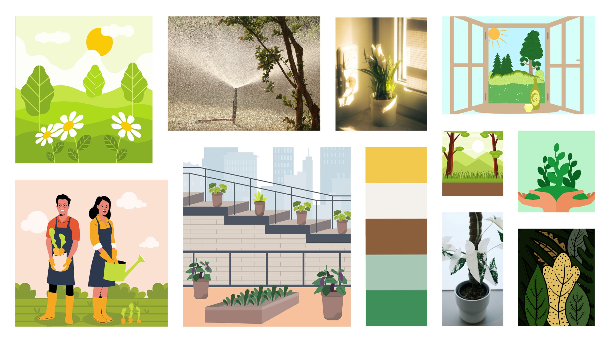
I began by creating a mood board to define the visual direction of the brand. I selected natural colours inspired by plants, soil, and sunlight to create a calm and approachable feel. The typography system uses Maven Pro for headings and Nunito for body text to balance readability and warmth.
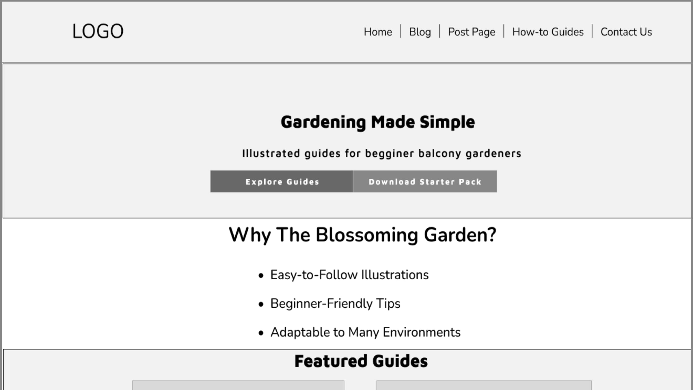
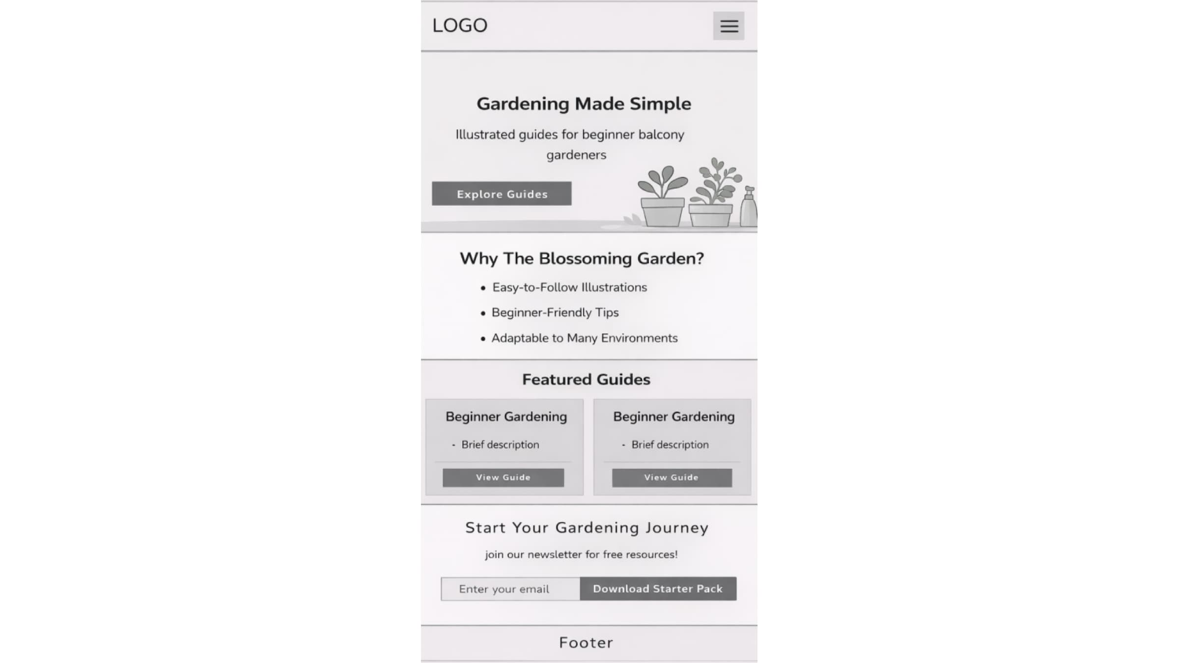
I then developed wireframes for both desktop and mobile layouts. These wireframes focused on content structure, hierarchy, and user flow. Based on feedback, I refined the homepage by improving the call-to-action buttons, simplifying the layout, and removing unnecessary navigation elements.
Development & Implementation
The website was built using WordPress as the content management system. I used the Blocksy theme along with Gutenberg blocks and Spectra to create a flexible and scalable layout. I implemented a blog system with categories for fruits, vegetables, and flowers, as well as a resources section with downloadable guides.
To improve user experience, I ensured that all article cards had consistent heights, optimized the hero section with a stronger visual and clear calls to action, and structured the navigation to highlight key content areas such as guides and blog posts.
Challenges & Improvements
One of the main challenges was balancing visual design with performance. Initially, some images were too large, which affected loading speed. I addressed this by compressing images and using optimization tools to reduce file sizes without losing quality.
Another challenge was ensuring consistency across all sections of the website. I refined spacing, alignment, and component structure to create a more cohesive design. I also improved the clarity of calls to action, changing them to more direct labels such as “Subscribe Now” and “Explore Guides.”
Testing & Optimization
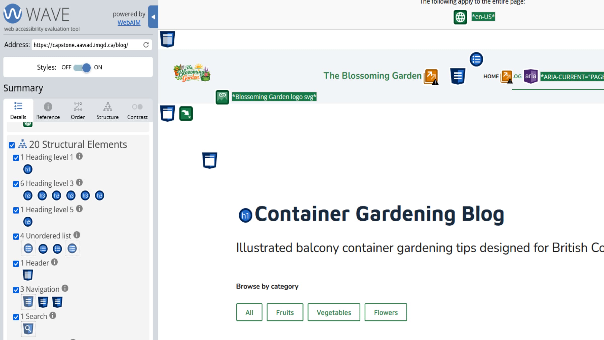
I tested the website using Google PageSpeed Insights and accessibility tools such as WAVE. The initial performance score was around 67, which indicated the need for optimization.
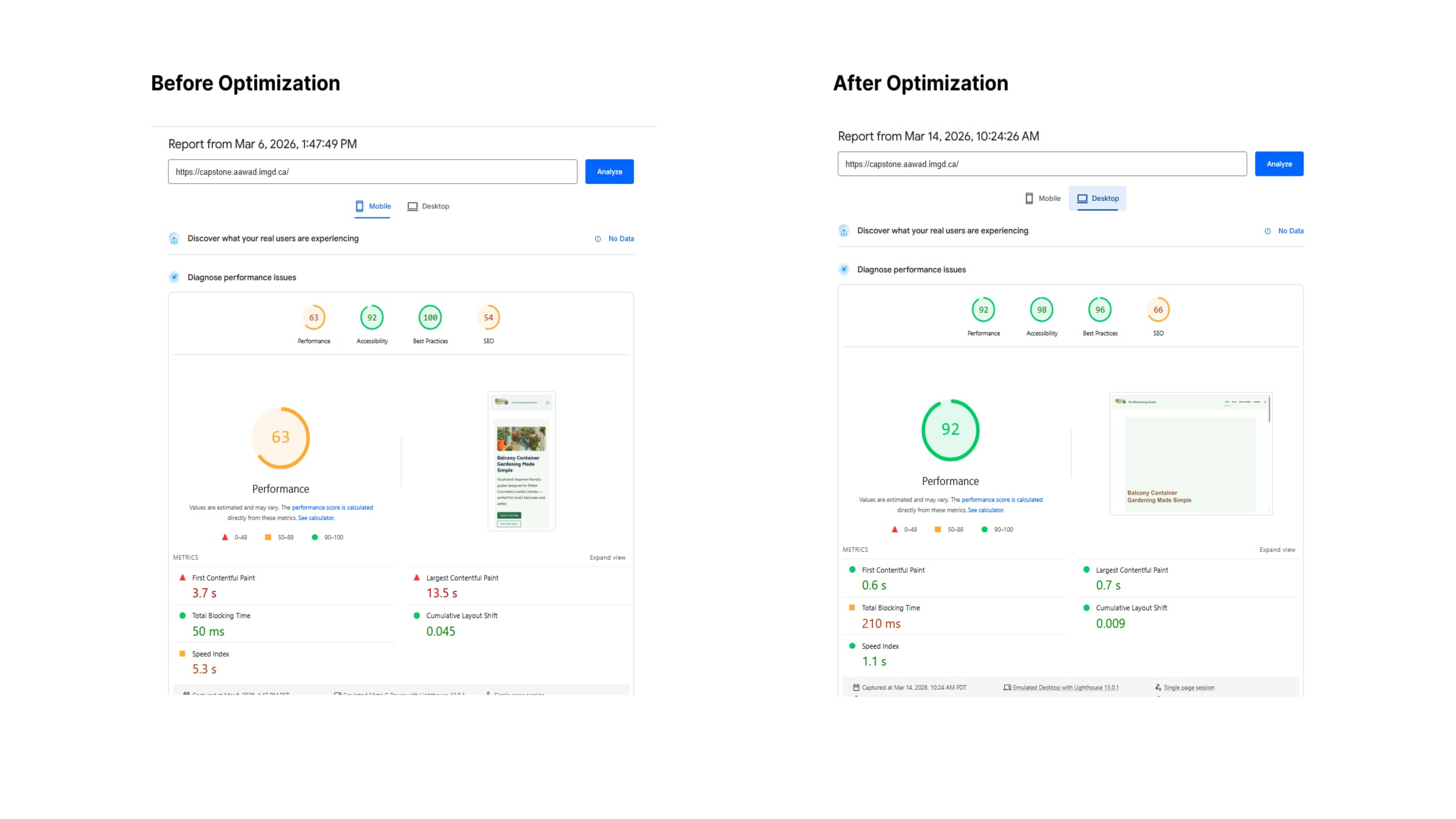
To improve performance, I implemented image compression using Smush and caching using LiteSpeed Cache. I also reviewed accessibility issues and adjusted content where needed to improve readability and structure. These improvements resulted in better loading performance and a more accessible user experience.