Tidal Touch Jewellery

Tidal Touch Jewellery, is a small business specialising in handmade sterling silver jewelry adorned with sea glass and beach stones. The goal of the project is to provide a cohesive visual direction and create a strong web presence. Branding efforts include crafting a versatile logo and comprehensive style guide for consistency across all collateral. Product photography is an integral aspect of this project’s ability to convey the brand’s coastal inspiration. Website production encompasses creating a WordPress site with established base styles and compelling copy. Quality assurance testing ensures navigation, functionality, and brand consistency, leading to a successful deployment.
Check out the full style guide on ISSUU and the at-a-glance style guide in PDF.
Discovery and Planning
I knew for this project visuals were going to be a key aspect, so I started by sourcing lots of images. Tidal Touch Jewelry, while not a e-commerce site, would need to showcase the jewelry pieces completed previously, so I made sure to source images to reference when shooting photos for the project.
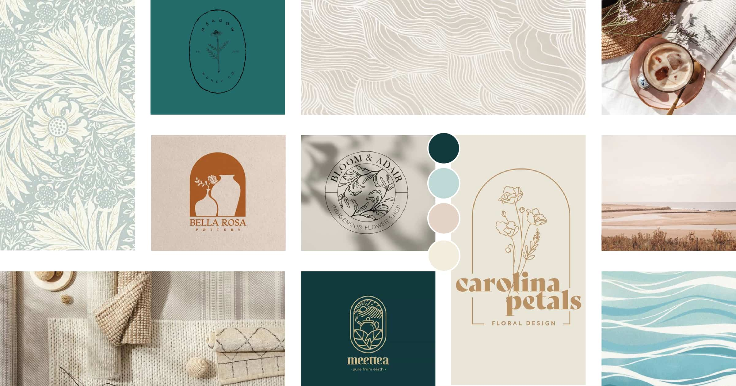
To get a strong sense of the project, I created a mood board, wireframes, and site map as a framework for building a website down the line. I selected images and textures which convey the relaxed, calming feeling of the water and the warmth of sunny beach days. I also gathered examples of product photography that I thought matched the style I would be aiming to achieve. The logo inspiration included hand-drawn and text solutions. I felt this mix of autographic and exacting lines would complement this client well.
Logo Design
By sketching out ideas I worked on finding the direction that suited the client and the aesthetic. After some trial and error, I settled on the shell shape for the logo mark and a round container in all use cases. For the full format and vertical variation, the logo mark is placed within the “o” in “touch” as a more subtle logo. For the round variation, I felt it best to let the logo mark shine and include the company name as a border.
Style Guide


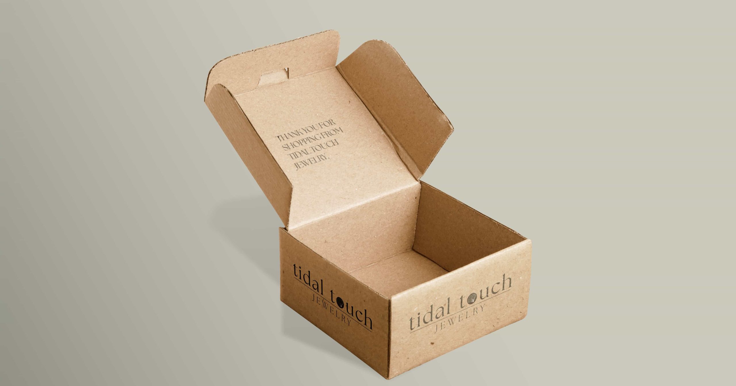
With the logo suite completed I created mockups of collateral. I compiled all of the logo information, mockups, photography, colour, and typography into a comprehensive style guide as well as an at-a-glance-guide.
Photography
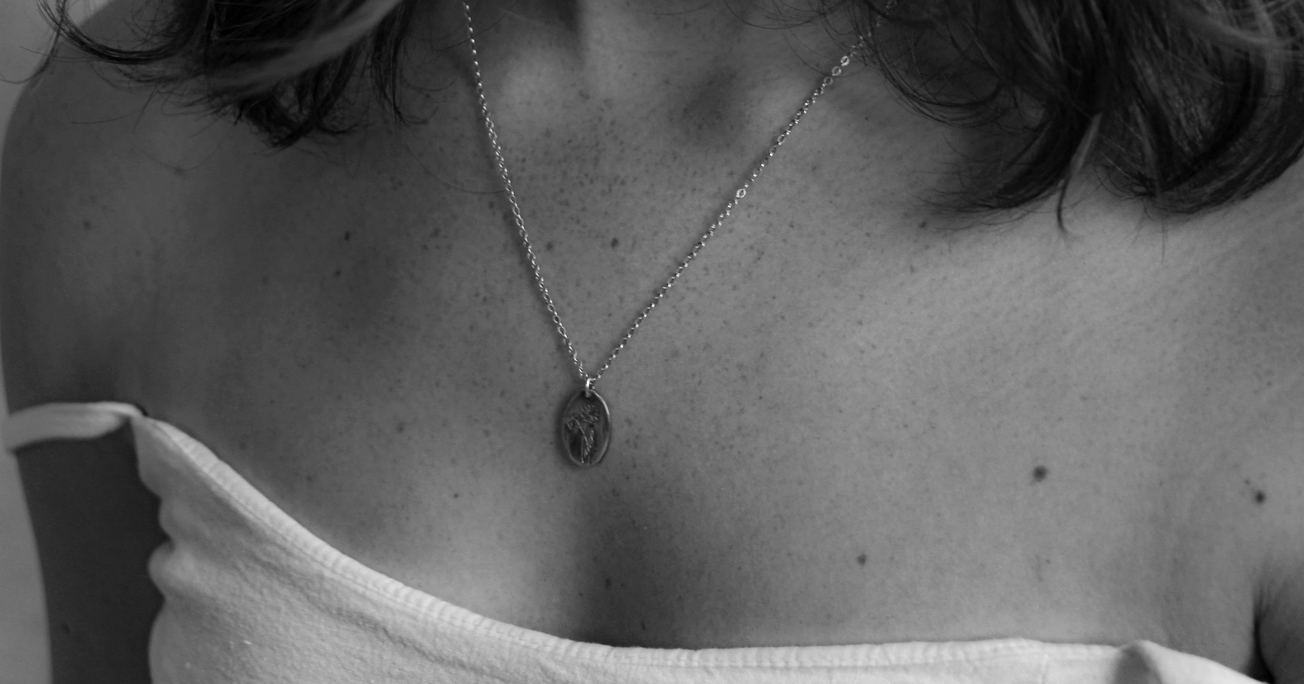


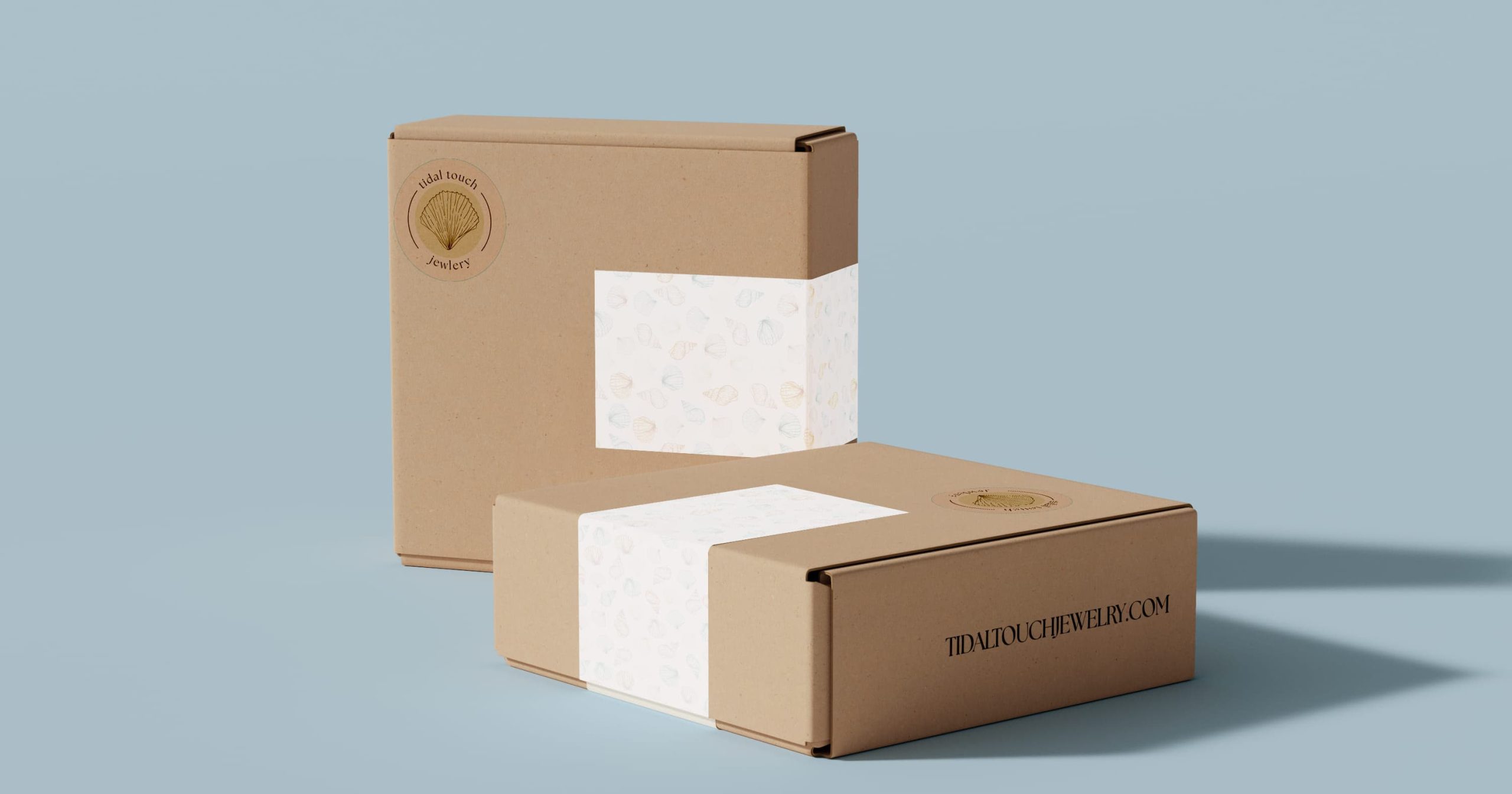

As this is a very visual focused industry I made sure the product photography I shot for this project matched the style rules I set out. I focused on incorporating both black and white images for sophistication and full-colour images for vibrancy. I considered conducting an outdoor photoshoot to capture the essence of the brand’s coastal inspiration, but ultimately time and weather did not allow for me to add this feature.
Website
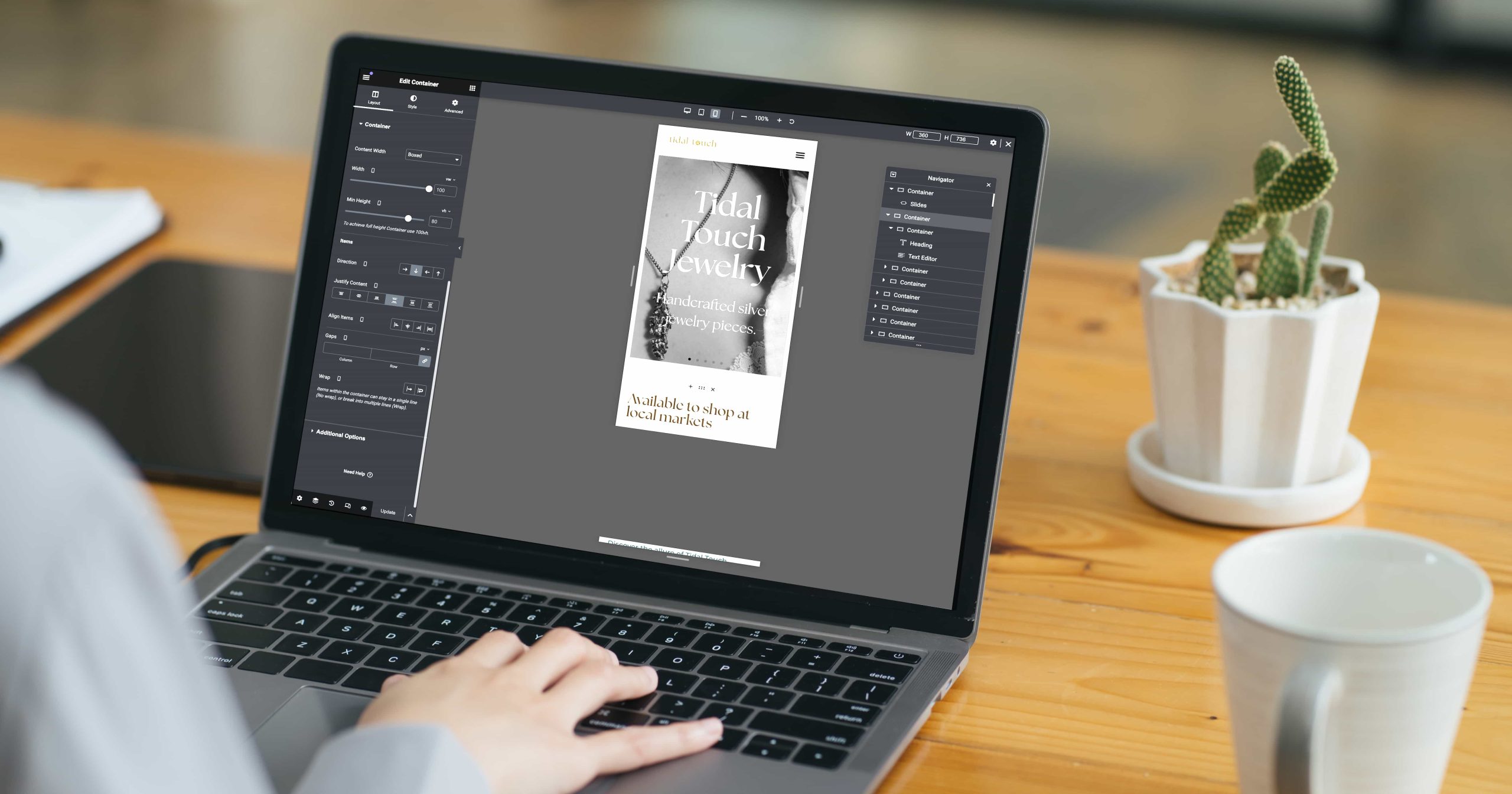
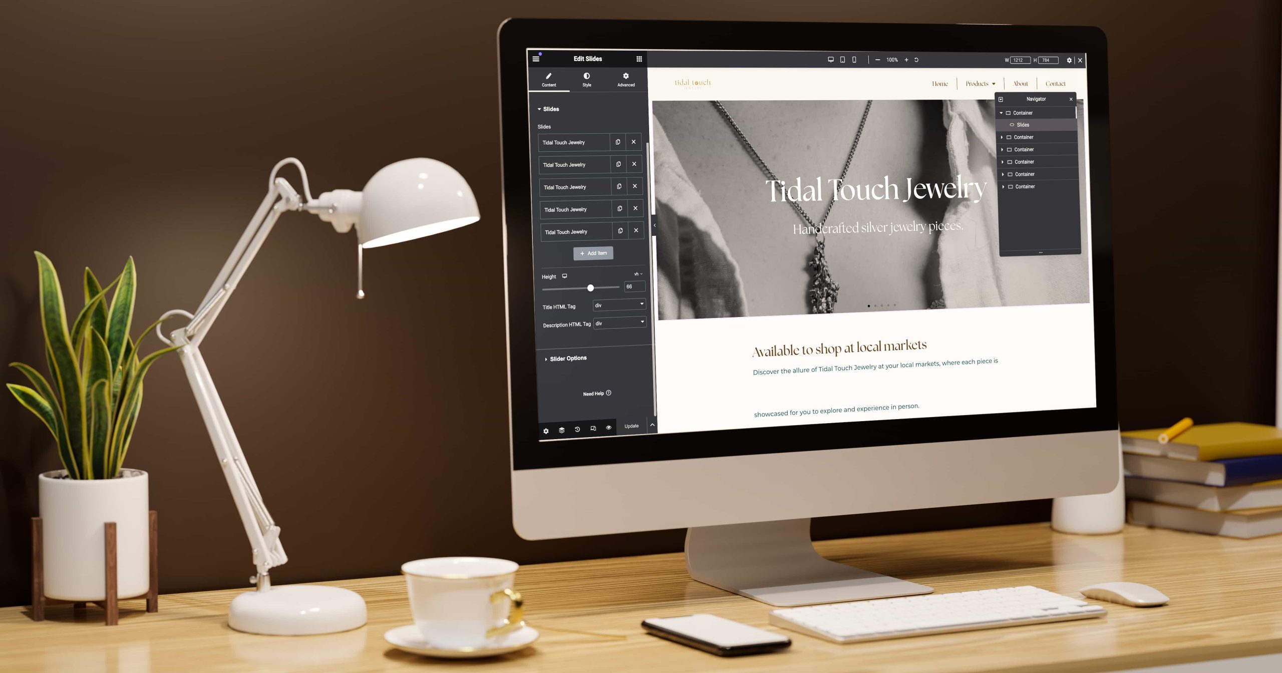
During the development of the Tidal Touch website, I embarked on several key steps to ensure a seamless and visually appealing online platform. First, I created a WordPress site and set up a corresponding database to manage content efficiently. I established base styles to maintain consistency across the site, focusing on elements such as the navigation bar, footer, and hover states. Crafting compelling copy for various sections, including the Home, About, Product Galleries, and Contact pages, while ensuring readability and coherence, was also part of my tasks.
Throughout the development phase, I made adjustments to improve the overall design and functionality. Feedback from my second experience working with Elementor in WordPress facilitated smoother navigation and increased intuitiveness. Suggestions for refinement included adjusting footer spacing, reviewing vertical and horizontal spacing, ensuring consistent button styles, and optimising the layout for readability and coherence.
Quality Assurance and Deployment
During quality assurance testing, I thoroughly assessed Tidal Touch’s website, checking navigation, functionality, content accuracy, and brand consistency. SEO, accessibility, and page load speed were also checked. Minor issues were found, but no major mistakes. After feedback and revisions, I addressed the issues and made sure to document all changes that were required.