VIVIDFORM
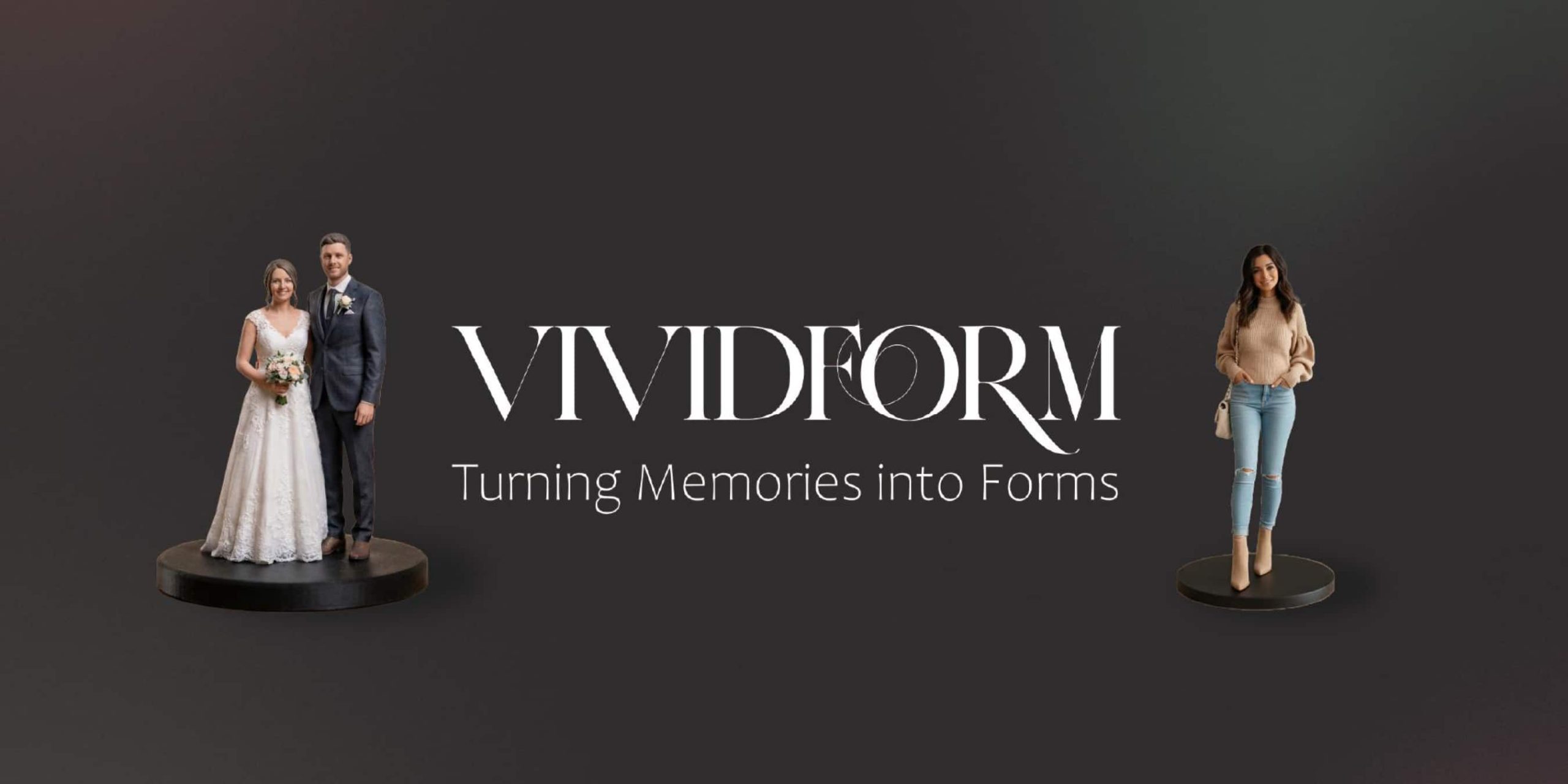
VIVIDFORM is a high-end brand focused on memory preservation, turning meaningful life moments into physical, crafted pieces. By mixing advanced technology with emotional storytelling, the brand helps people hold onto memories that might otherwise fade. My main challenge was balancing the highly technical side of custom 3D figurines with a brand personality built on care, authenticity, and permanence. From printed assets to digital UI design, VIVIDFORM shows how I create a cohesive experience that gives memories a lasting physical presence.
Process
I used Adobe Illustrator and Photoshop as my main tools for building the VIVIDFORM identity. I started by putting together a comprehensive style guide, setting up strict typographic rules, and figuring out the emotional core of a brand dedicated to saving memories. I focused on three main areas: a refined logo system, tactile print and packaging, and clean digital interfaces.
I designed these cross-channel pieces to make sure the brand looked consistent from the digital ordering phase right through to the physical unboxing. By planning everything carefully, I brought together a highly technical service, custom 3D printing, with a warm, human-centered design. This approach makes the idea of tangible memory preservation feel accessible, premium, and visually engaging.
Mood board
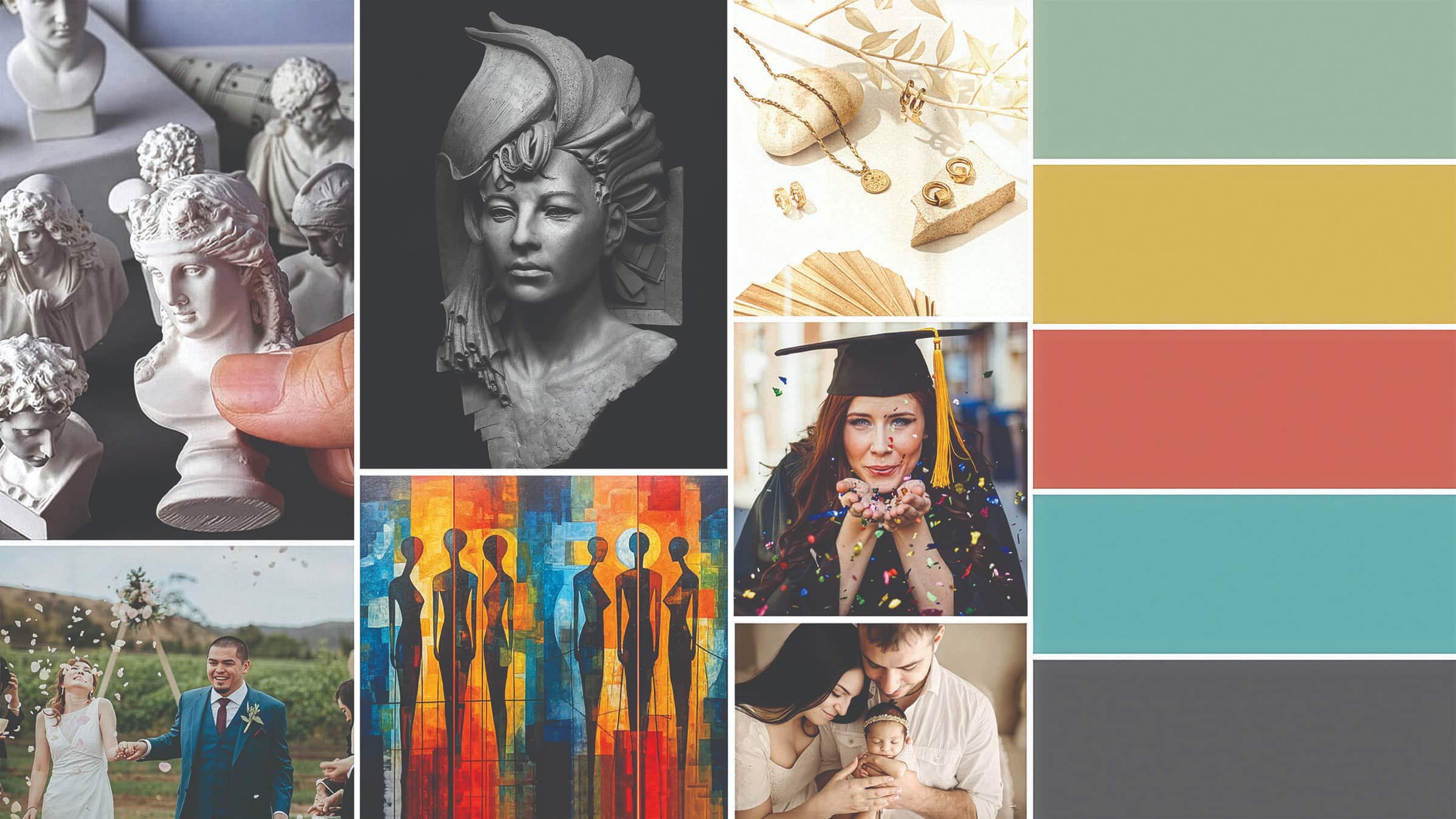
Visually, VIVIDFORM connects classical art with modern life. The moodboard pulls inspiration from traditional stone busts along with quiet, authentic photography focusing on hands, gestures, and touch. To tie it all together, I built a color palette that feels warm, emotional, and refined. It uses a grounding Charcoal Grey along with Soft Teal, Warm Clay, Muted Sage, and Soft Mustard. This mix keeps the brand feeling high-end but still deeply personal.
Branding & Typography
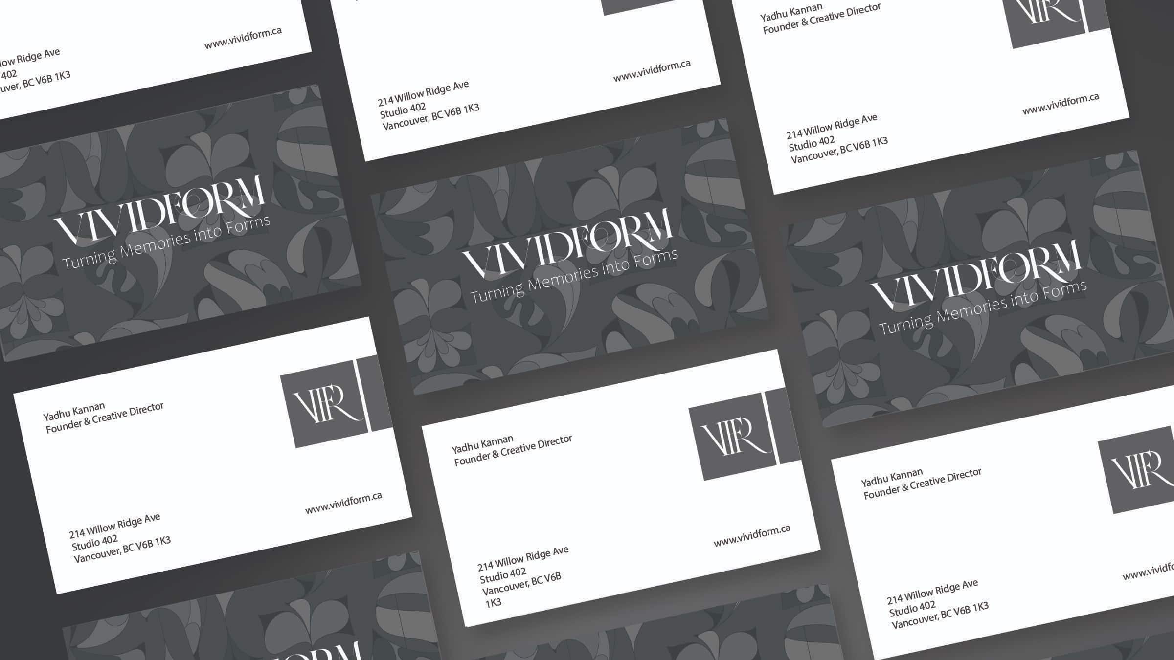
I needed the typography to feel trustworthy but approachable. The main logo pairs a refined serif font with subtle organic details, reflecting how memories transform into physical shapes. I chose CoFo Raffiné as the primary typeface for the logo and headings because it has an emotional, timeless feel. To balance that out and make sure things were easy to read on any screen, I set up a clear text hierarchy using Candara and Myriad Pro.
To back up the typography, I designed a core pattern system that uses subtle, organic shapes inspired by memory and craftsmanship. When taking these elements to physical media, the business card designs really show off my print production background. They use clean layouts and the custom pattern to give people a memorable, tactile introduction to the brand.
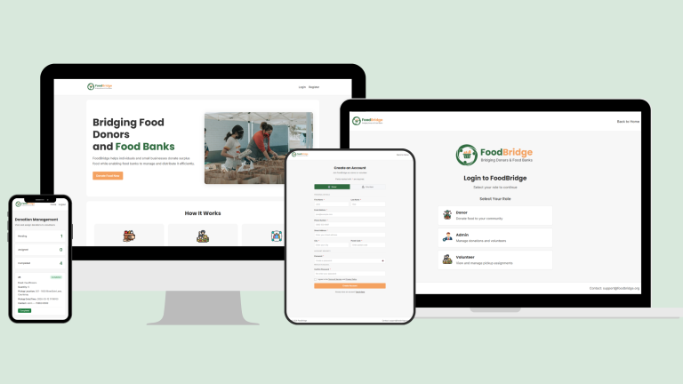
Marketing
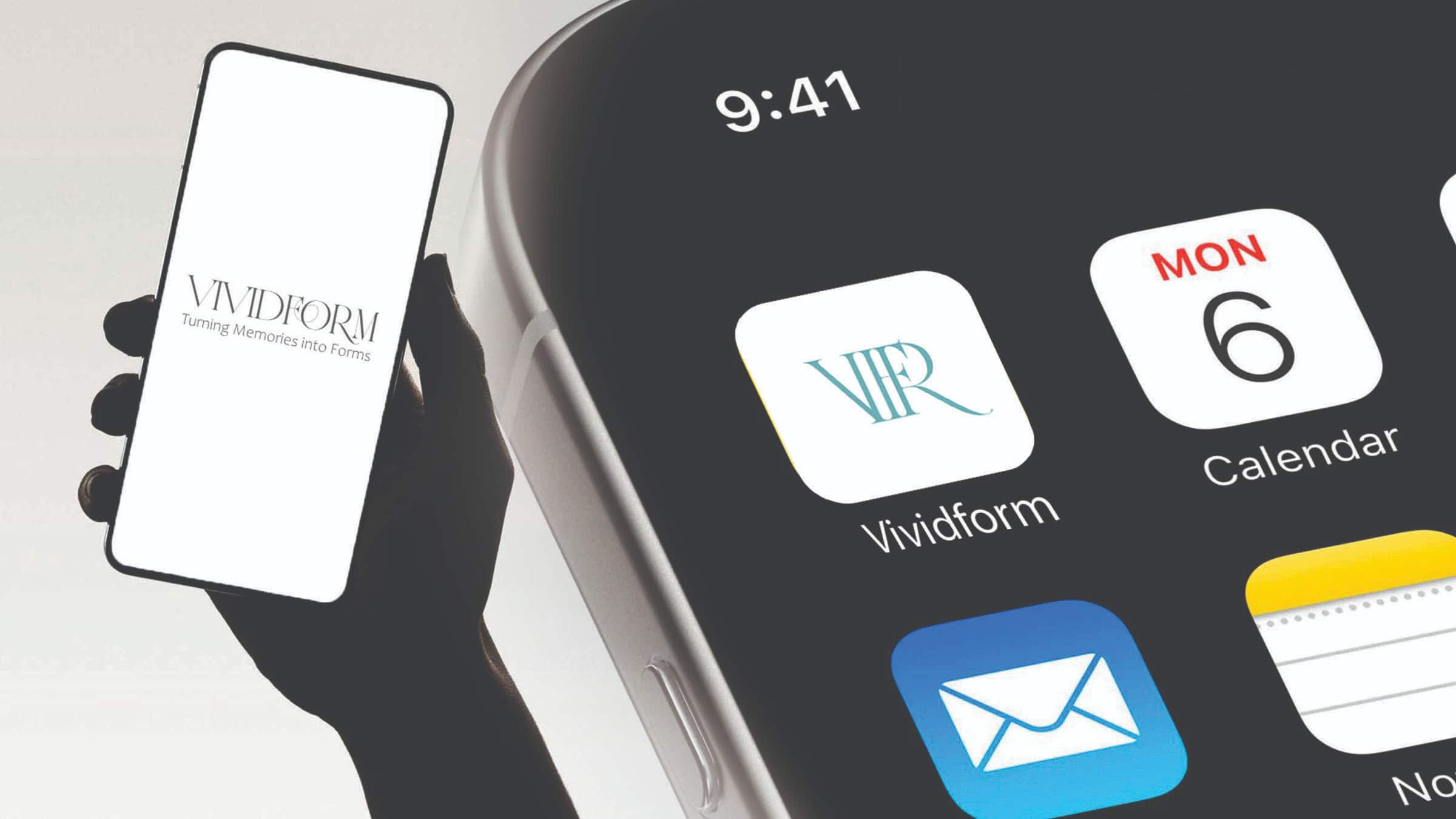
A modern brand has to work perfectly across every digital touchpoint. I designed a clean landing page and mobile app interface, making sure the main VIVIDFORM logo and the simplified V|F|R icon stayed consistent and clear everywhere.
However, introducing a new AI-to-3D technology requires more than just clean UI; it requires an educational customer journey. To address potential consumer skepticism around “new tech,” I developed a targeted 3-month digital marketing funnel:
- Month 1 (Technology Awareness): I designed social media strategies focusing on authentic, “lo-fi” behind-the-scenes vertical videos. This demystifies the printing process and builds initial brand trust.
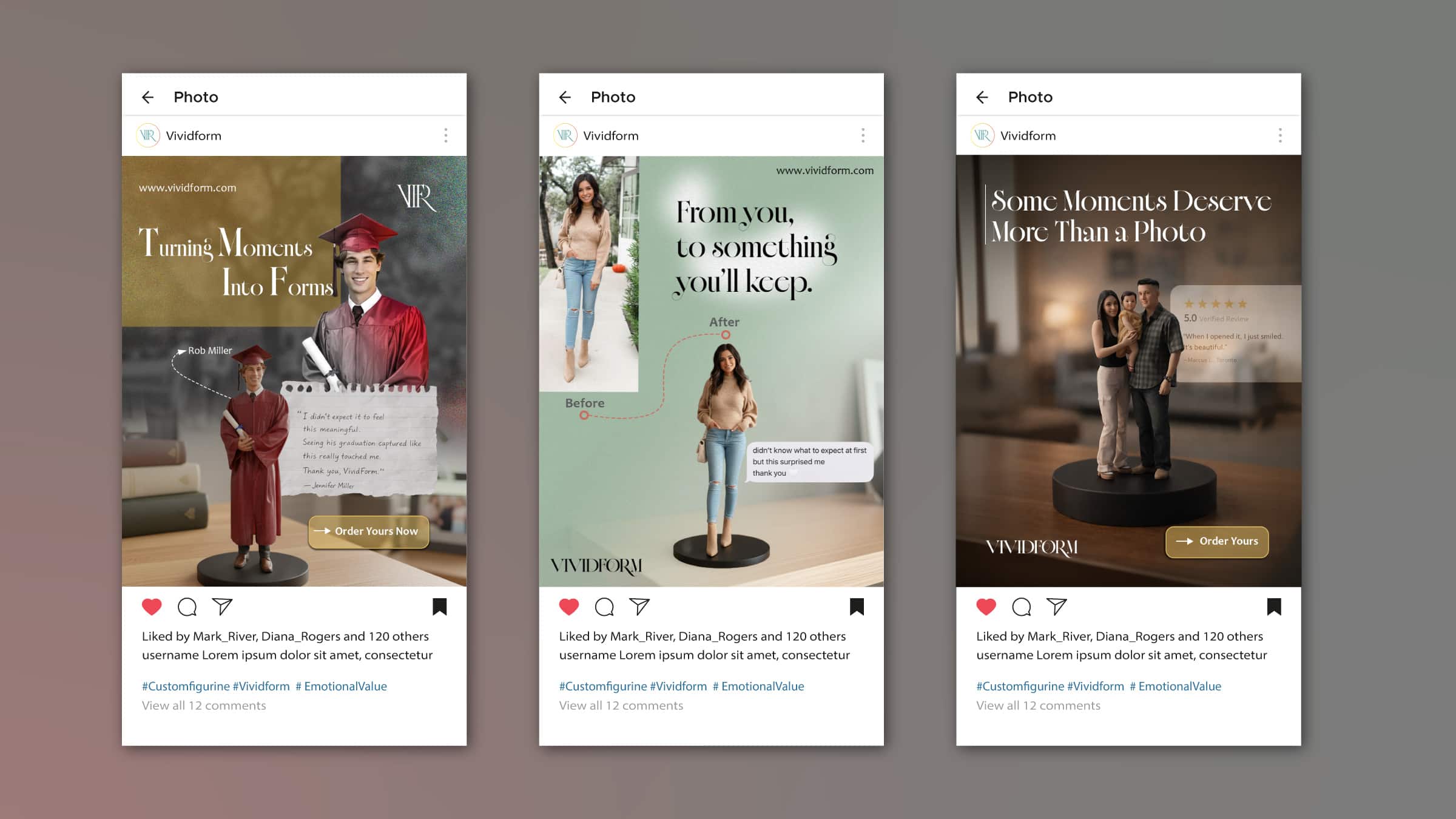
- Month 2 (Emotional Connection): The messaging shifts to highlight the emotional weight of the product. Using carefully structured Instagram carousels, the layout balances clean design with storytelling, utilizing customer “reveal” moments to build desire.
- Month 3 (The Conversion Push): The final phase leverages targeted ads directed at the 35–65 demographic, funnelling an educated audience directly to the brand’s landing page.
To drive immediate action and capture leads, I engineered the landing page UX to highlight a high-urgency, 50% early-bird discount for the first 100 customers. Across all these platforms and funnel stages, the brand’s voice stays thoughtful, calm, and emotionally grounded. The copywriting is meant to feel human and reflective, focusing on meaning and craftsmanship rather than sounding like a standard sales pitch.
Custom Pattern
To give VIVIDFORM some unique visual texture and add a tactile feel to the physical assets, I designed a custom repeating pattern in Illustrator to go with the core logos. A big challenge here was making a vector pattern that felt organic and emotional rather than stiff or corporate, especially since the brand is all about personal memories. To pull this off, I used sweeping, organic curves and interlocking shapes in the brand’s muted colors. This fluid geometry acts as a nice, soft contrast to the strict structure of the main serif font.
When applying this look to physical items like business cards and premium bags, I ran into a visual hierarchy issue. The detailed pattern could easily overpower the important brand info. I fixed this by using the pattern strategically, keeping it as a subtle background element or locking it into specific zones. I set up a clear text hierarchy so the V|F|R monogram and contact details were always the main focus. This balancing act made sure the physical items felt premium and put-together without being hard to read.
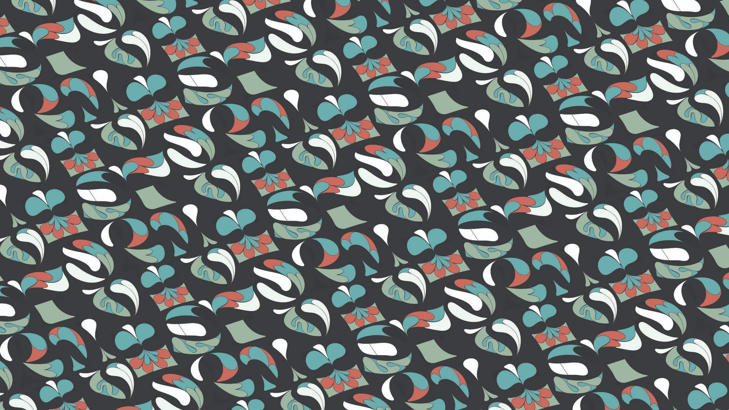
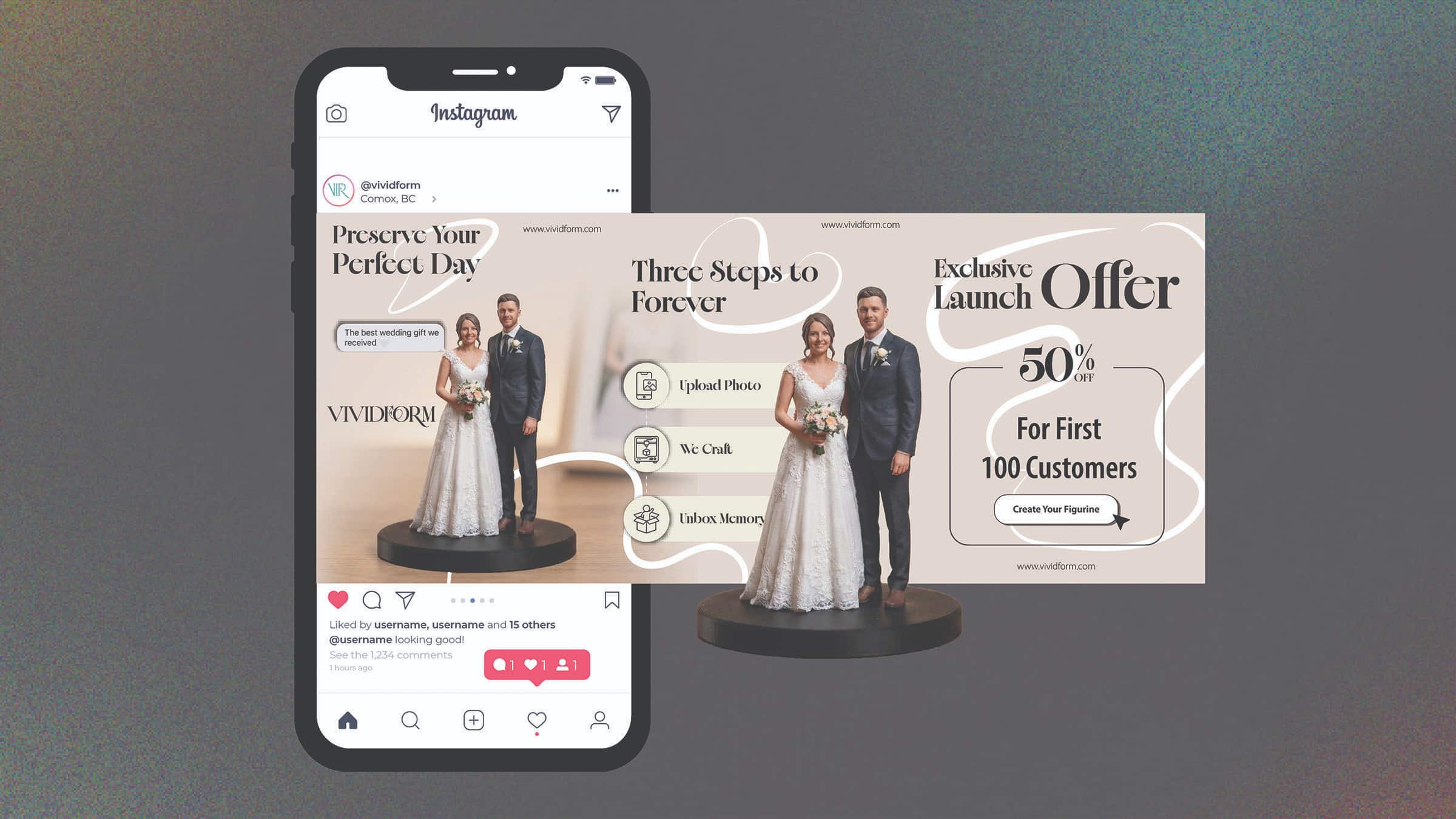
Image Selection & Art Direction
To nail down the emotional side of VIVIDFORM, I carefully curated and edited a collection of lifestyle photos. The tricky part was taking very different, highly personal milestones like weddings and graduations and bringing them together under one premium look. To achieve this, I set up strict art direction rules that focused on authenticity, natural lighting, and tactile moments, like close-ups of hands.
I used Photoshop to soften the contrast across all the photos and applied a color-grading strategy that subtly brought in the brand’s muted charcoal grey and warm clay tones. By focusing on quiet storytelling instead of staged, commercial shots, the final images add a lot of depth to the project. They help users emotionally connect with the brand’s mission of preserving timeless memories.