INNER HARBOUR chocolate co.
INNER HARBOUR chocolate co. is a fictional chocolate bar brand based in Victoria, BC. It focuses on small batch production and locally sourced ingredients. The brand offers chocolate bars as both gifts and personal treats.
The logo was designed to reflect the calm and elegance of Victoria’s Inner Harbour. A minimal line illustration of a sailboat is used as the brand icon. It reflects a sense of place and simplicity.
The website was built using WordPress and the Elementor theme. The design focuses on creating an intuitive and user-friendly experience to build brand trust. Six product variations are showcased, allowing users to explore the products in detail.
View the launched website at ygoto.imgd.ca/capstone/.
Mood Board & Style Guide
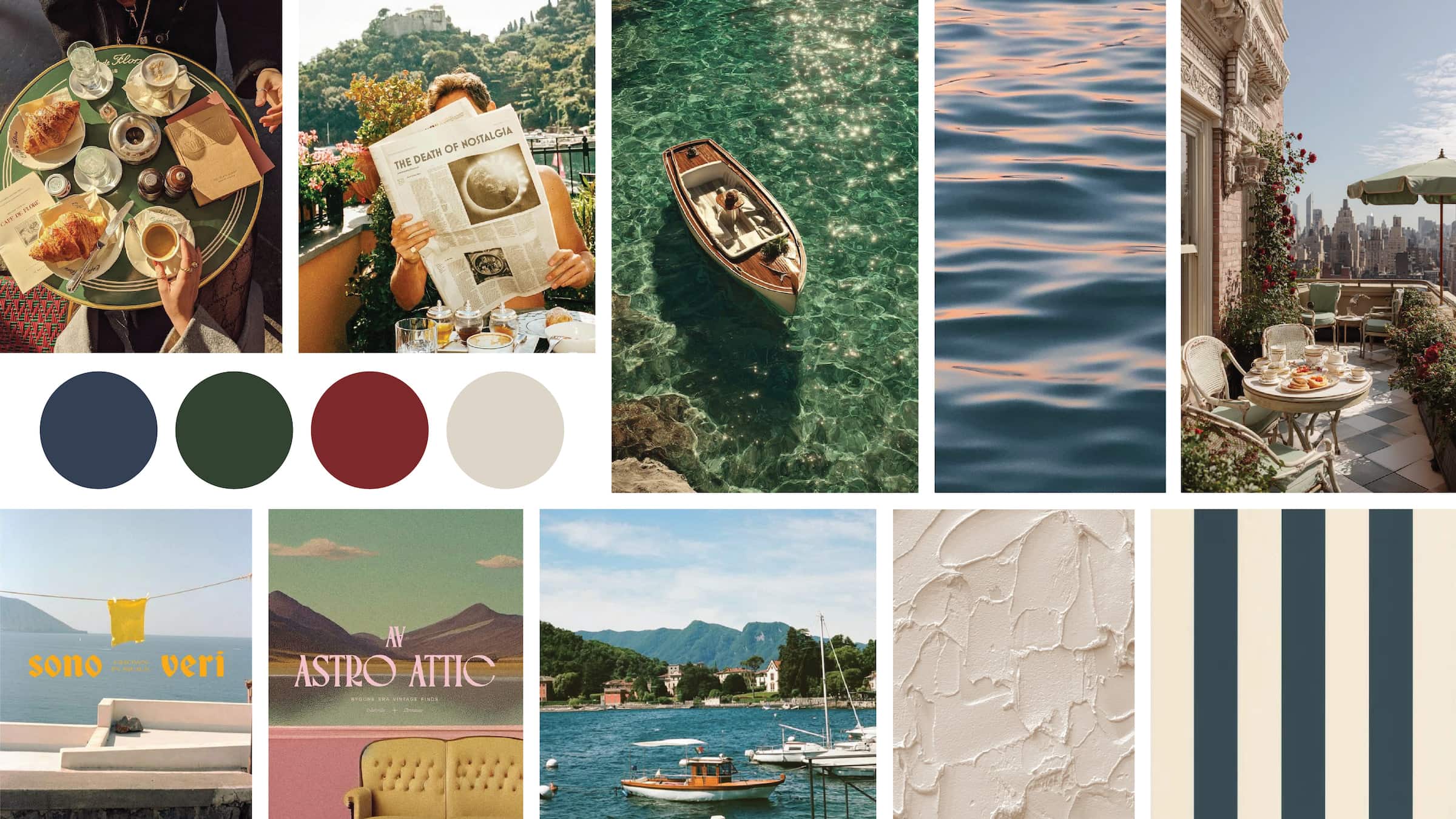
For this project, I aimed to create a calm and elegant atmosphere through the mood board. Cool, muted tones were chosen to establish this mood.
Since the brand name includes “harbour,” the imagery focuses on harbour and water related scenes. A subtle vintage treatment was applied to the images to evoke a sense of heritage and timelessness associated with Victoria.
The style guide was created to ensure consistency across all brand applications. It outlines key visual elements, including logo variations, colour palette, typography, and tone of voice. Guidelines for logo usage help maintain clarity and consistency in different contexts. The guide also establishes a clear visual direction that reflects the brand’s calm and elegant identity. It serves as a reference for applying the brand consistently across print and digital materials, supporting a cohesive and recognizable brand experience.
Flick through the online styleguide at FlipHTML5.
Branding
The brand is positioned as a small batch chocolate company based in Victoria, BC. Two Victoria-based competitors were selected for comparison to better understand the local market and identify opportunities for differentiation.
INNER HARBOUR chocolate co. is differentiated through its brand personality, pricing strategy, and ingredient sourcing. The brand is defined by a calm and elegant personality, creating a sense of premium quality while remaining approachable.
It targets both locals and tourists, appealing to customers looking for everyday treats as well as thoughtful gifts. A more accessible price point encourages regular local purchases, while the use of locally sourced ingredients supports regional producers and attracts consumers who value sustainability and community focused brands.
Logo
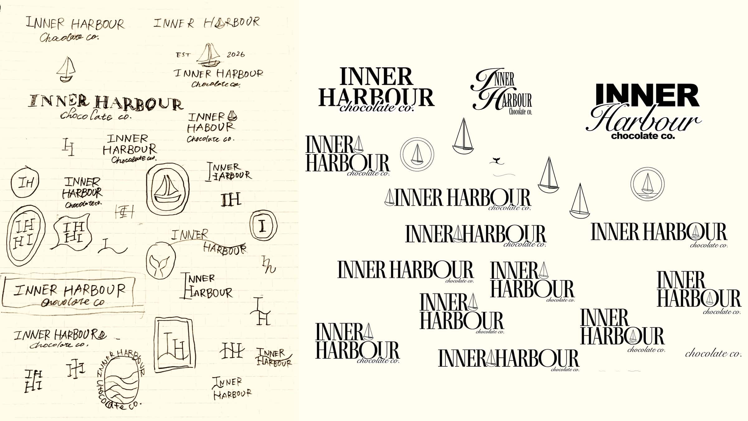
The brand logo was developed to communicate the atmosphere of Victoria’s Inner Harbour. The design process began with hand sketches and early explorations, where different typographic styles, compositions, and icon ideas were tested. Through refinement and iteration, the concept was simplified to better reflect the brand direction while maintaining clarity and visual impact.
The final logotype uses simple typography to reflect the calm and relaxed nature of the harbour, while ensuring strong readability across different applications. Subtly connected letterforms suggest a sense of community and connection, reinforcing the welcoming character of the brand.
The “chocolate co.” wordmark is set in a cursive typeface to introduce a sense of elegance and contrast against the primary logotype. A minimal sailboat icon is used as the brand symbol, representing the harbour and establishing a strong sense of place.
The logo system includes a primary logo, a horizontal version, and a badge mark to ensure flexibility across different applications. The primary logo serves as the main brand representation and is used in most contexts. The horizontal version is designed for wider or more constrained layouts, while the badge version features only the sailboat icon and is used as a simplified, recognisable mark.
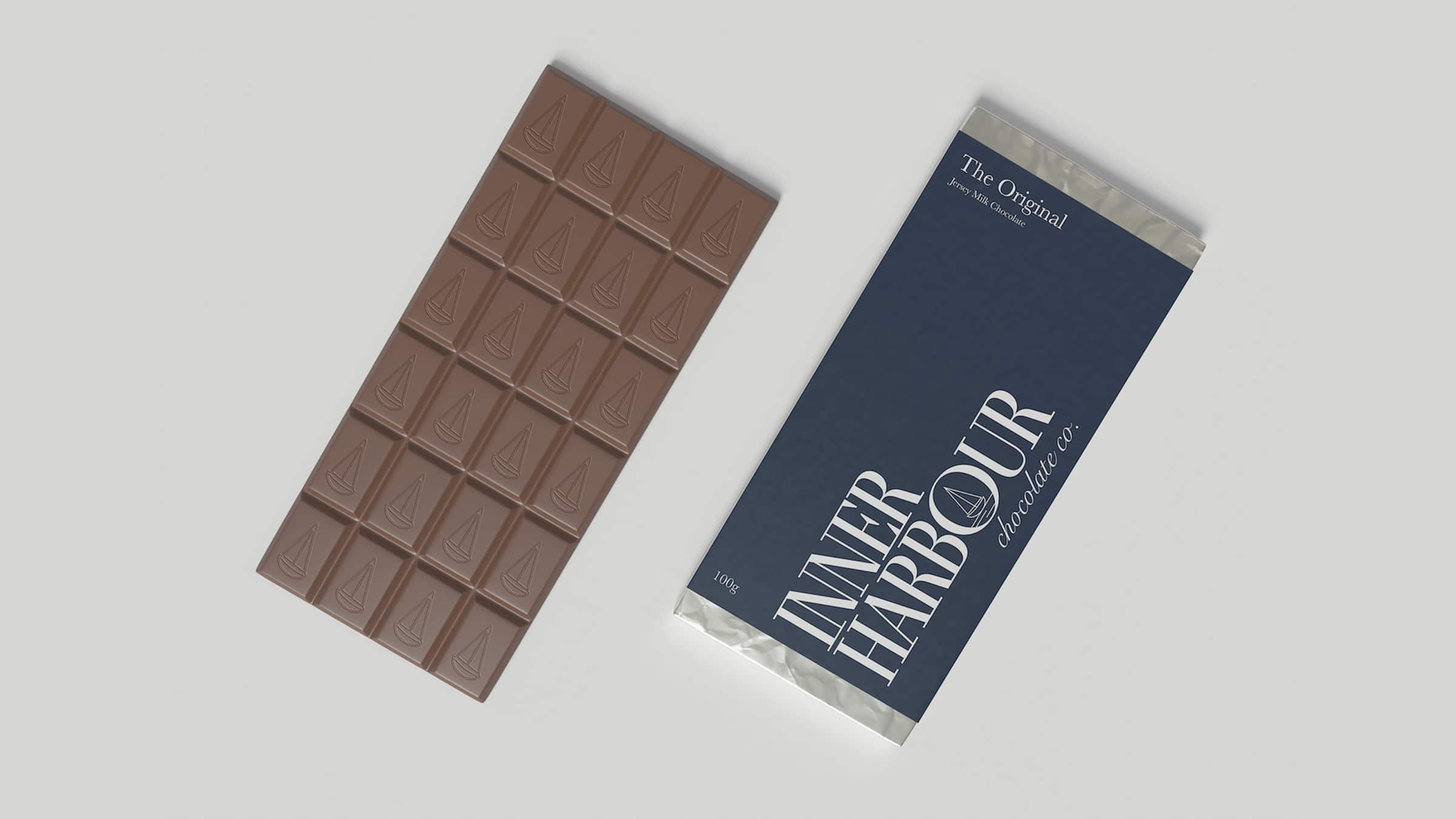
Product Mockups
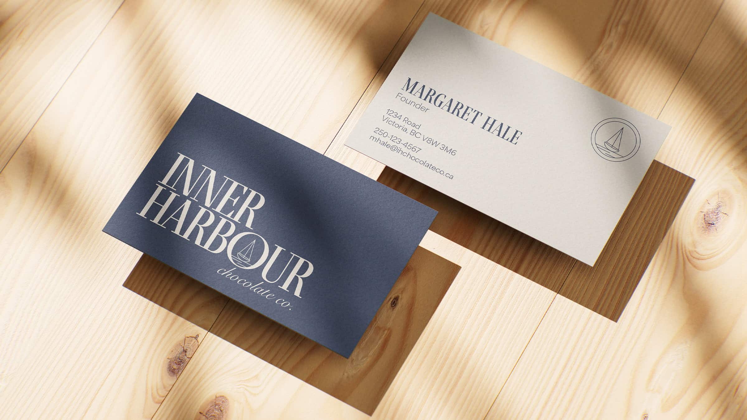
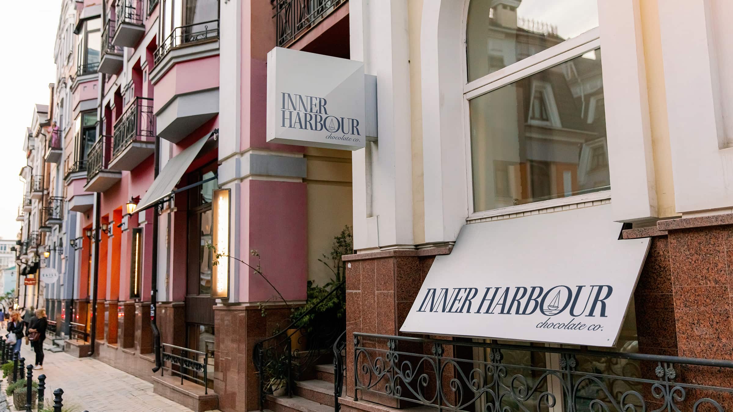
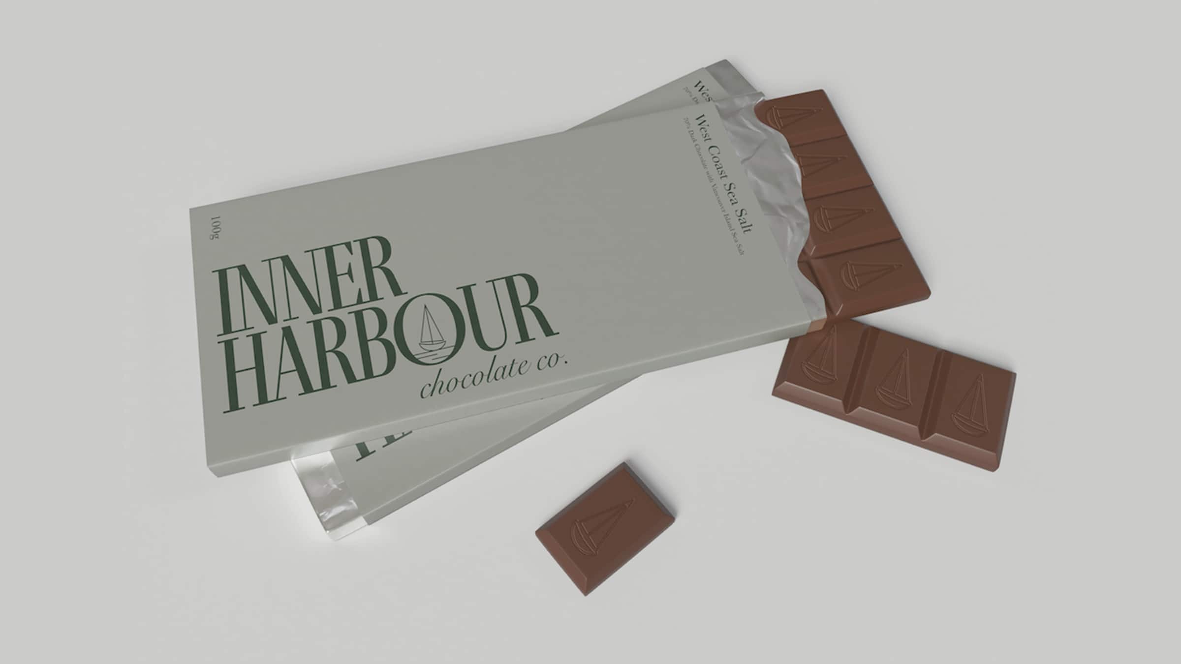
The product mockups were created to visualize the brand across real world applications, including chocolate packaging, a business card, and store signage. These mockups help demonstrate how the brand identity translates consistently across both print and environmental design.
All mockups were developed using Adobe Photoshop. The colour palette was applied consistently throughout each item to reinforce brand recognition and maintain a cohesive visual identity. Clean layouts and minimal design elements were used to reflect the brand’s calm and elegant aesthetic. The mockups showcase how INNER HARBOUR chocolate co. can be presented in a professional way across multiple touchpoints.
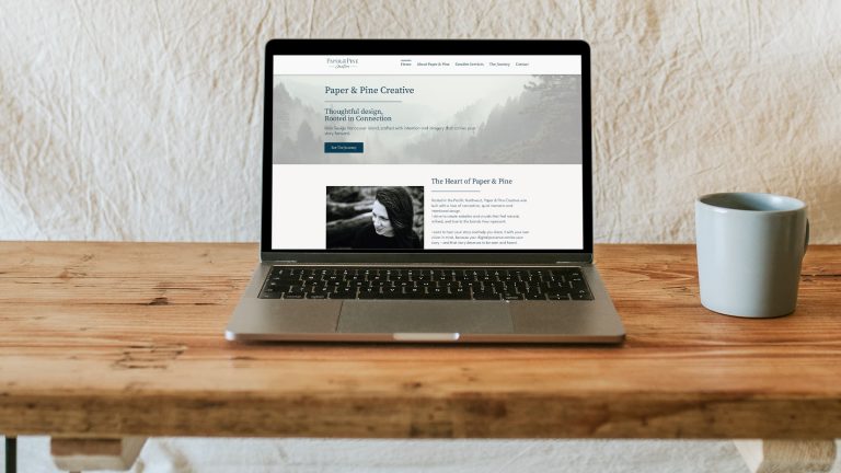
Website
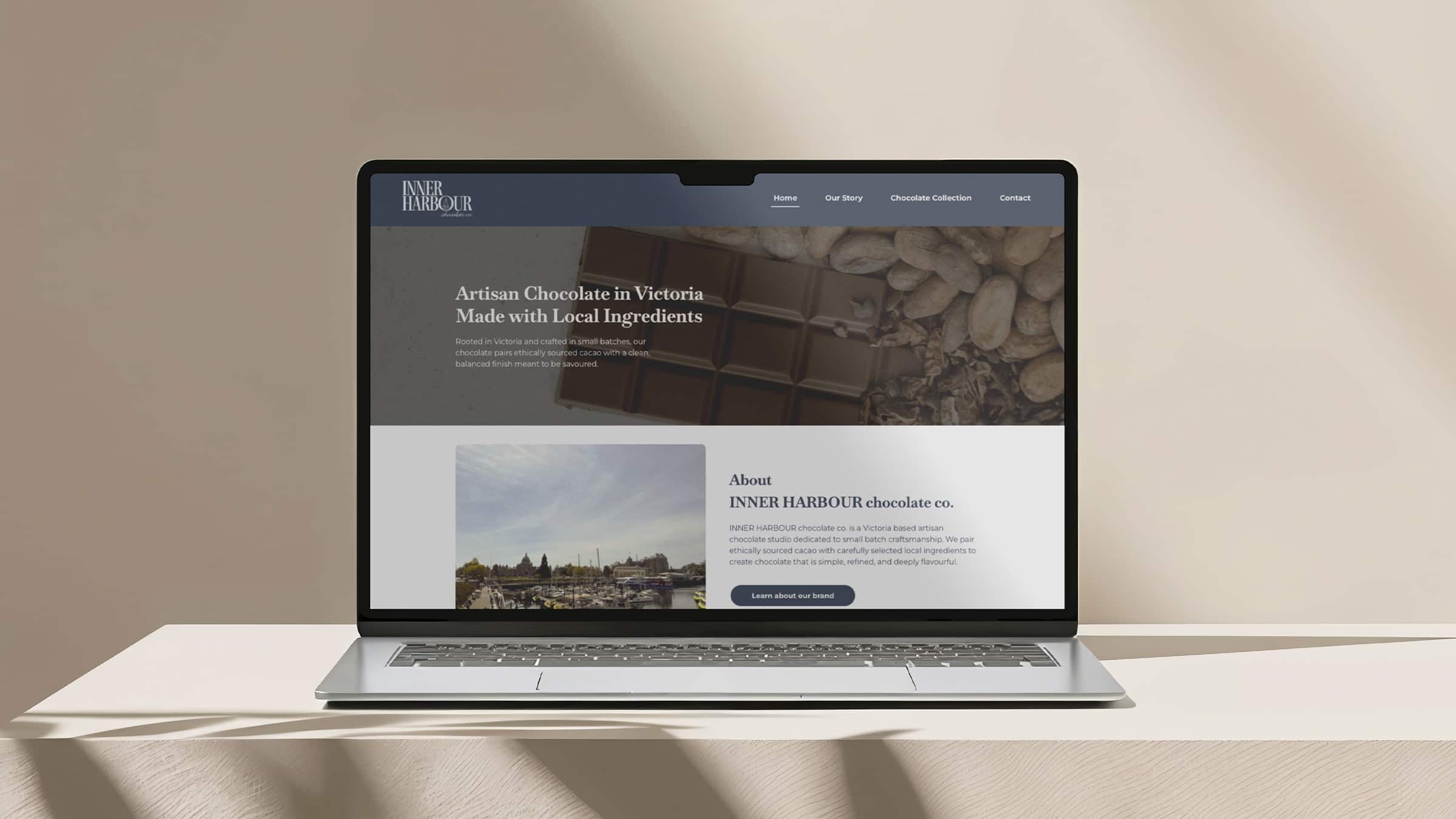
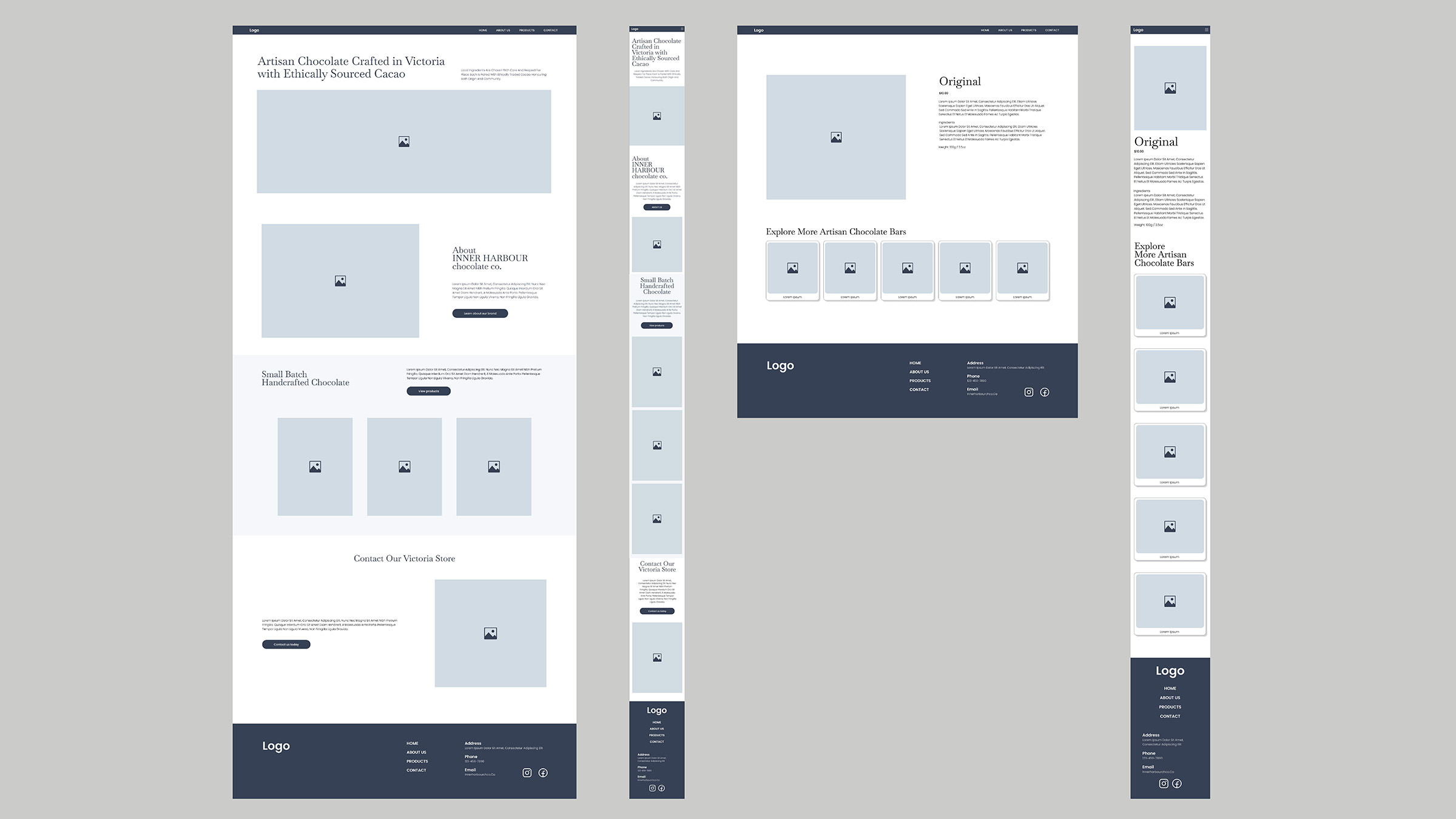
The brochure website was designed to present the brand in a clean and engaging way while communicating essential information. It includes four main pages, Home, Our Story, Chocolate Collection, and Contact. The Chocolate Collection page further leads to six individual product pages. Each page is structured to guide users naturally through the brand, from introduction to product exploration and inquiry.
The website was built using WordPress with the Elementor free version. Due to limitations in customizing the header and footer, additional CSS was implemented to achieve a more refined design. This allowed greater control over layout and visual consistency across the site.
On the product item pages, additional attention was given to storytelling and transparency. Each product includes information about the origin of its ingredients, helping users learn more about where the ingredients come from while reinforcing the brand’s focus on ethical sourcing and quality.
The design focuses on an intuitive and user-friendly interface while maintaining the brand’s calm and elegant personality. A minimal layout, consistent typography, and the established colour palette were applied throughout to reinforce brand identity. Clear navigation and content hierarchy help users easily access information and explore the chocolate collection.
Overall, the website strengthens the brand’s digital presence by combining usability with a consistent visual experience, creating a professional and trustworthy impression for both local customers and visitors.
View the launched website at ygoto.imgd.ca/capstone/.