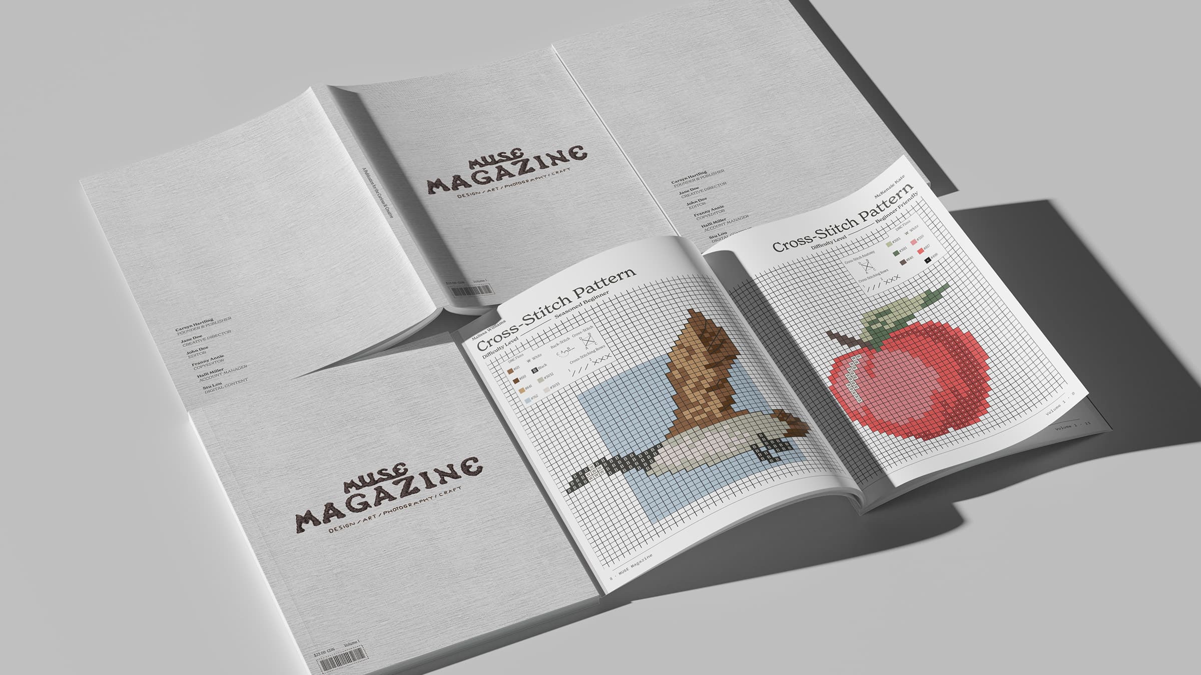
Muse Magazine
MUSE Magazine is a multi–media arts and crafts publication for the curious and creative. Featuring locally and globally sourced patterns in fibre, clay, photography, and more—readers can enjoy a wide variety of carefully crafted projects at their fingertips. Designed with intention, MUSE aims to foster an open canvas for the creative community of hobbyists who enjoy traditional craftsmanship but with a modern twist.
Using a blend of InDesign, Illustrator, and Procreate—MUSE Magazine was brought to life through a branded identity and, later, through iterative explorations on page and content layout design.
The final impression is designed to leave readers feeling inspired, creatively liberated, and calm. By balancing the fine line between style and substance, each pattern serves to best reflect the medium, the process, and the logical flow of information to optimize complex instructions for ease and approachability.
Check out the condensed digital version for yourself at flipHTML5.
Moodboard
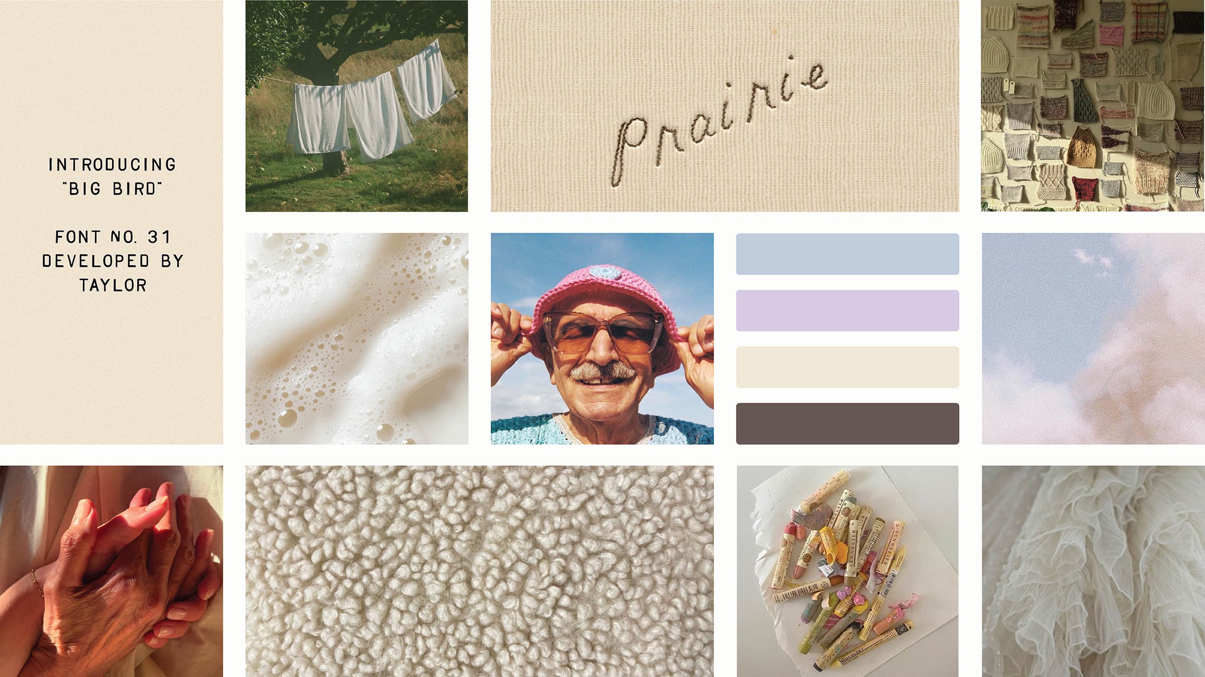
My initial vision for MUSE was inspired by the materiality of craft supplies, more specifically organic fibre arts. The soft textures, tones, and impression of touch in yarn and fabric were essential characteristics I sought to include when creating my moodboard. This also inspired me to consider emotional qualities that crafting is often associated with, such as the meditative or rhythmic state of mind.
Using Illustrator, I crafted a curated collection of imagery that implied the comforting and cozy environment so many fellow artists and crafters know and appreciate. In addition, I wanted to equally incorporate a sense of openness, tactility and the trace of hand, as well as an essence of control.
My initial color palette was muted, soft, and pastel. My intention was to create a self–limitation so that my text and layout are worked as the primary impression while ornamentation follows into a secondary role.
Branding
Starting with the Logotype, I created a full logo suite customized from the Flower Power fontface. My concept was geared towards themes of community, the handmade, and the power of imperfections. I modified spacing, texture and shape, as well as added a unifying baseline on MUSE to suggest these ideas.
Colour and typography were viewed as subtle sources of ornamentation. Although prioritizing font legibility, size, and variations—I sought styles that blended nostalgia with a modern lens. My goal was to let the beauty of the type speak for itself. As I envisioned a soft yet minimalistic aesthetic, my choices on colour and typography became essential in creating this impression. To reduce the sharpness of my colour values, I curated a creamier black and white monochromatic palette to soften the overall tone.
Lastly, custom patterns were a fun addition I was eager to experiment with and explore. My process started with hand illustrating icons in Procreate which were later translated into vector images in Illustrator and formatted into a pattern swatch for easy access as a branded asset.
Master Pages
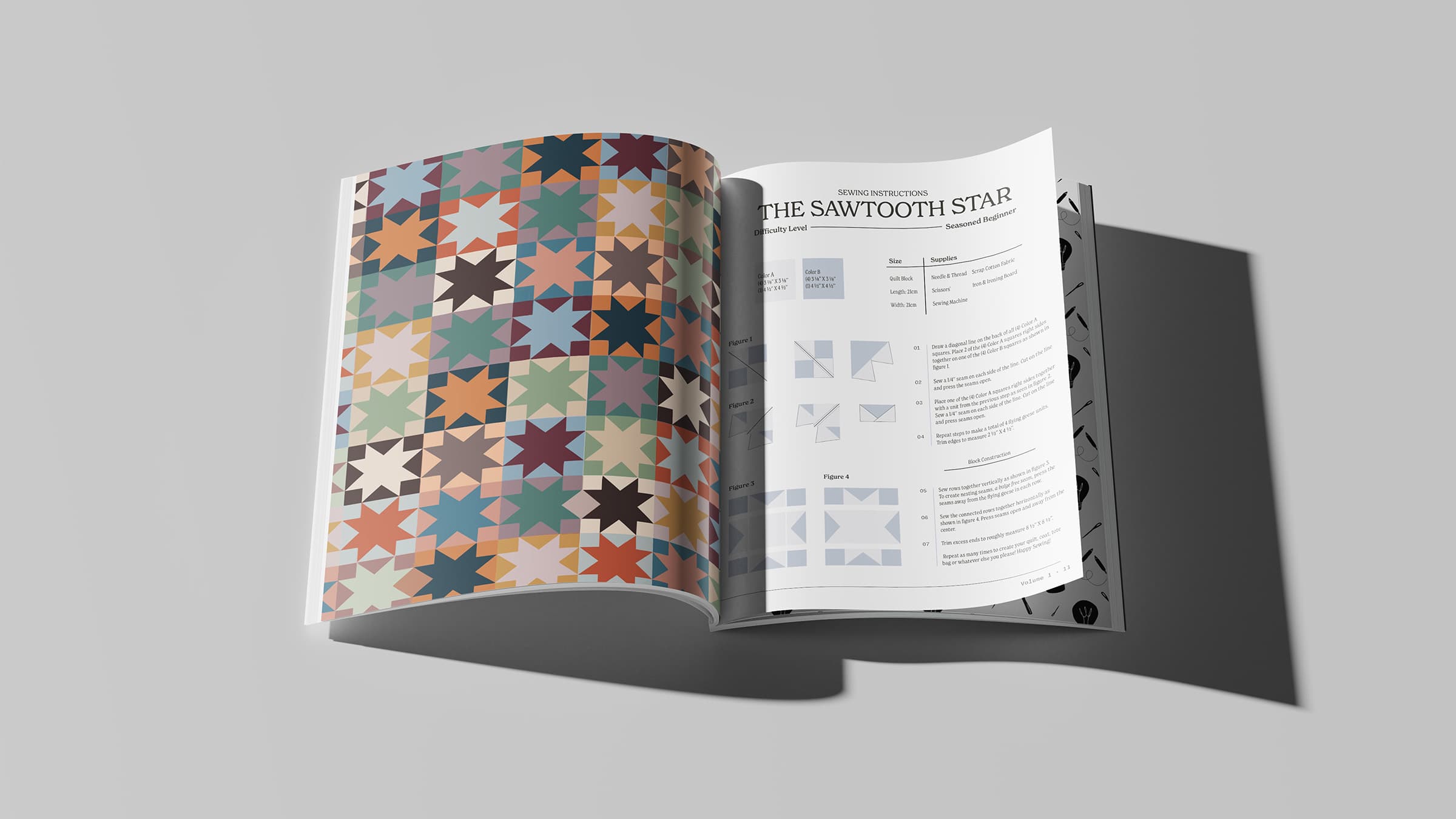
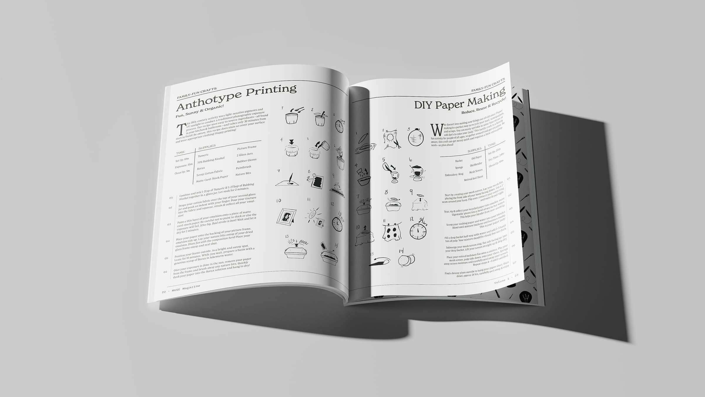
Having selected a subject that encompasses such a dynamic range in content, I had to carefully consider the ways in which layout can be used effectively and consistently. Hierarchy, visual flows, information types, and creative processes all merged together to define the role of each layout formula. For example, incorporating the pattern of a cross–stitch design looks and acts much differently than the written instruction of a knitting pattern. Or, a follow–along craft blends different instructional types than a sewing pattern. These characteristics can be considered obvious, but when handling the page layout with visual forms, styles, and supporting imagery, it requires a systematic approach.
This formula of varying visual instruction was a guiding principle when developing the master page layouts. Balancing clarity, logic, and impression were essential in establishing a clear brand identity.
Another major objective in my master pages was establishing simplicity. For me, the concept of less is more was a huge influence over my design process. Finding that fine line between style and substance was my gateway to branding the magazine with a sense of clarity and a state of ease.
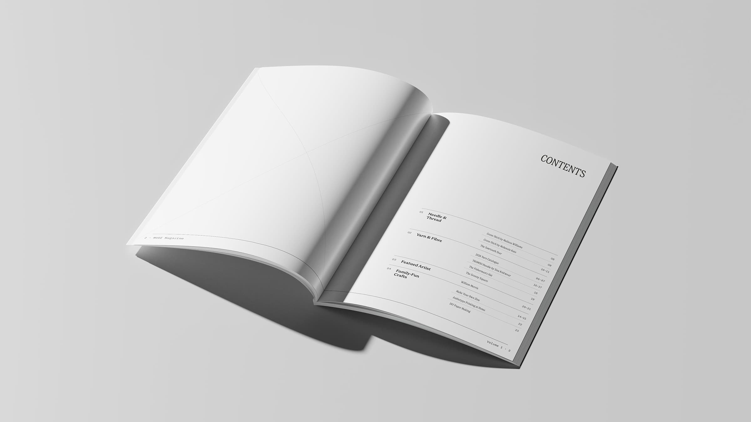
Content Layout
Now populating my template, I used a blend of personal past favourites that I’ve collected in my craft collection. From sewing to knitting, crochet, cross–stitching, and more—I blended a variety of fibre art patterns in conjunction with various family–orientated activities to try at home.
Although my goal is to encompass a larger variety of hobbies, my decision to refine this issue to fibre–specific medium was an accidental discovery. In fact, It led me to consider the lifespan of MUSE and how using mediums, topics, or materials can be guiding themes per an issue basis.
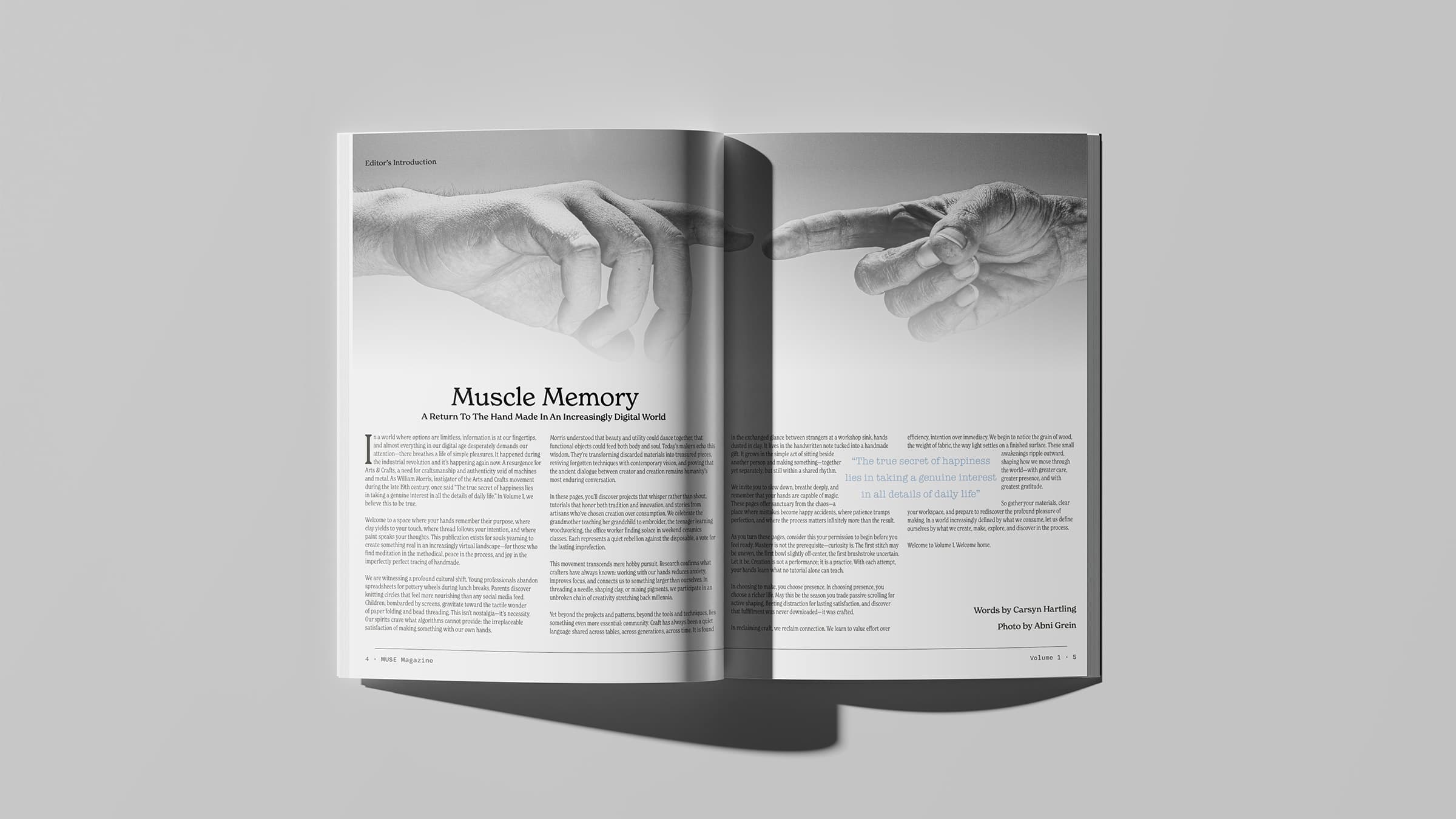
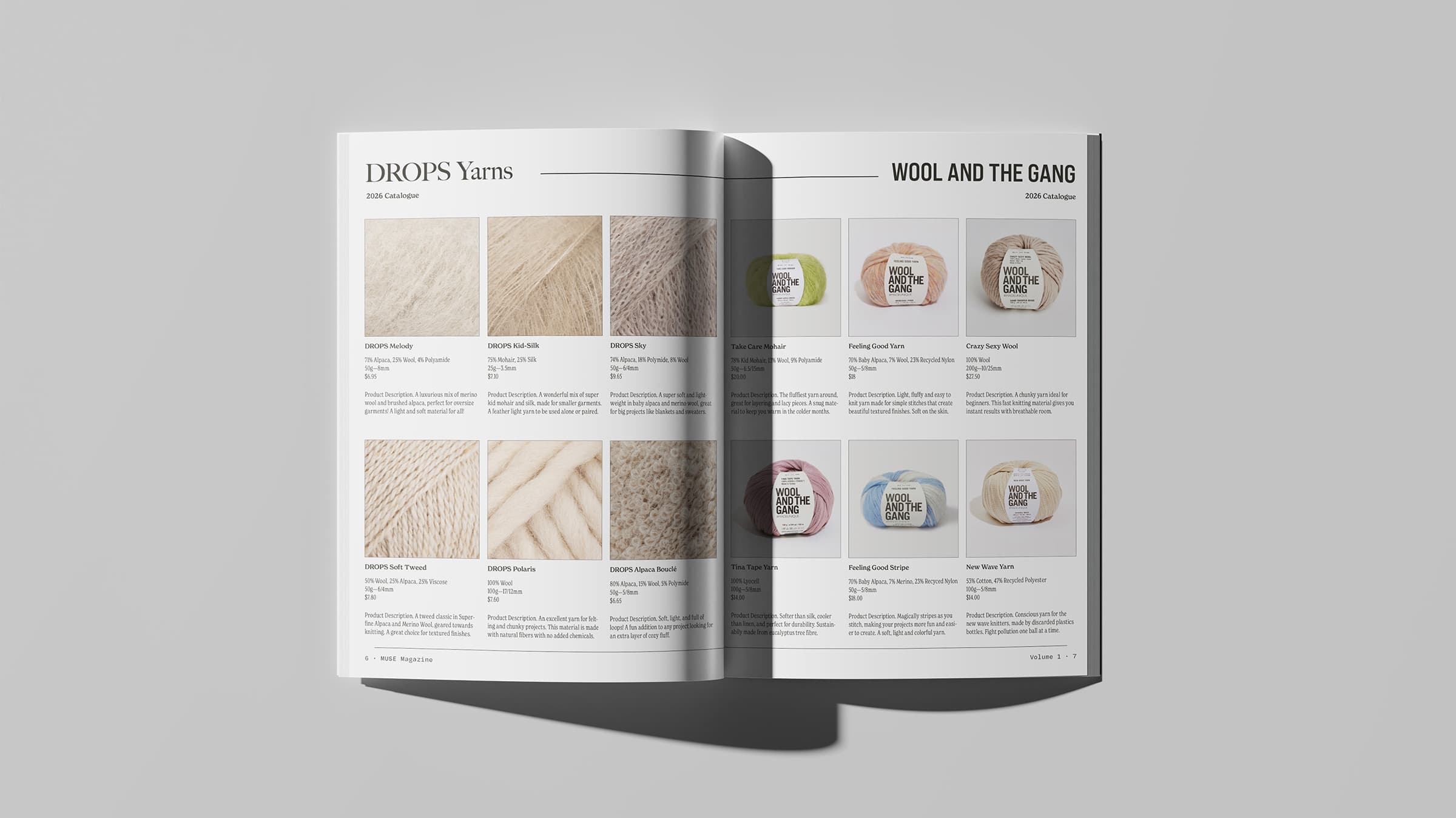
To accompany the craft patterns, I also included article formats and a catalogue for a visual break and content variety. This was a format I wanted to showcase my strengths in while exploring new layouts and content types that are slightly more imagery based.
Illustrations & Advertisements
The final touches were a matter of illustrations, which were worked on a page per page process, and advertisements.
A large portion of my illustrations were hand drawn in Procreate. These included drawn renditions of the knitting and crochet patterns as well as the step–by–step visual instructions across all the family–fun activities. Being able to translate my illustrations in these multi–purposeful ways was such an enjoyable creative liberty. As a new illustrator, I loved being able to balance the structured processes of layout with expressive moments of interpretation.
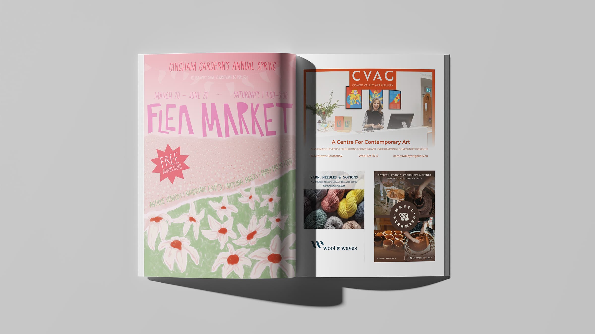
When designing for advertisements, I wanted to use a professional approach to best reflect my ability to execute such a task. Using brand–aligned businesses in the Comox Valley, I created three distinct advertisements. For a fun challenge, I also illustrated one full–page event ad of a fictional flea market. My goal was to include both functional and artistic renditions on advertisements to test their relative impression within a magazine.