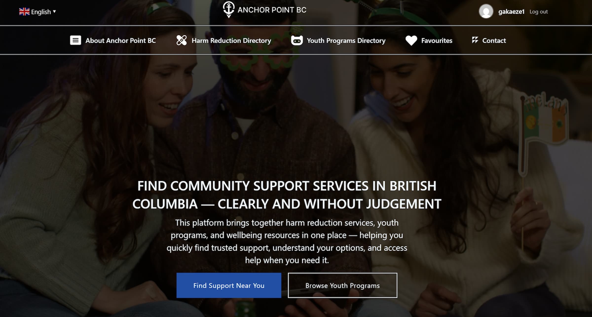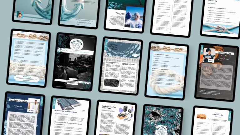
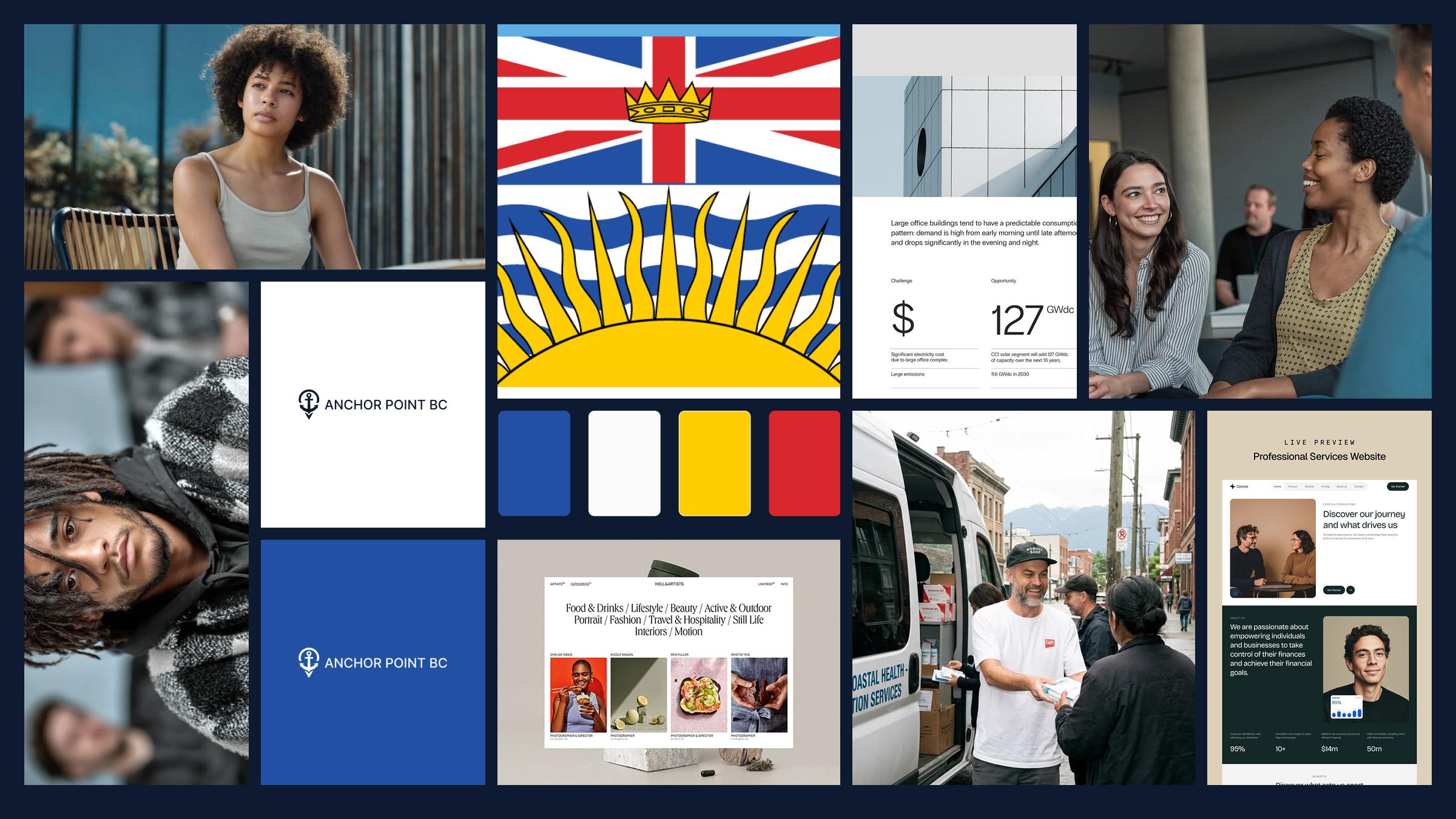
AnchorPoint BC

AnchorPoint BC is a WordPress site that helps people in British Columbia find harm reduction services and youth support programs. I work in this field, so I’ve seen firsthand how hard it can be for someone to find the right resource when they need it. Information is scattered across dozens of different websites, and many of them aren’t easy to navigate.
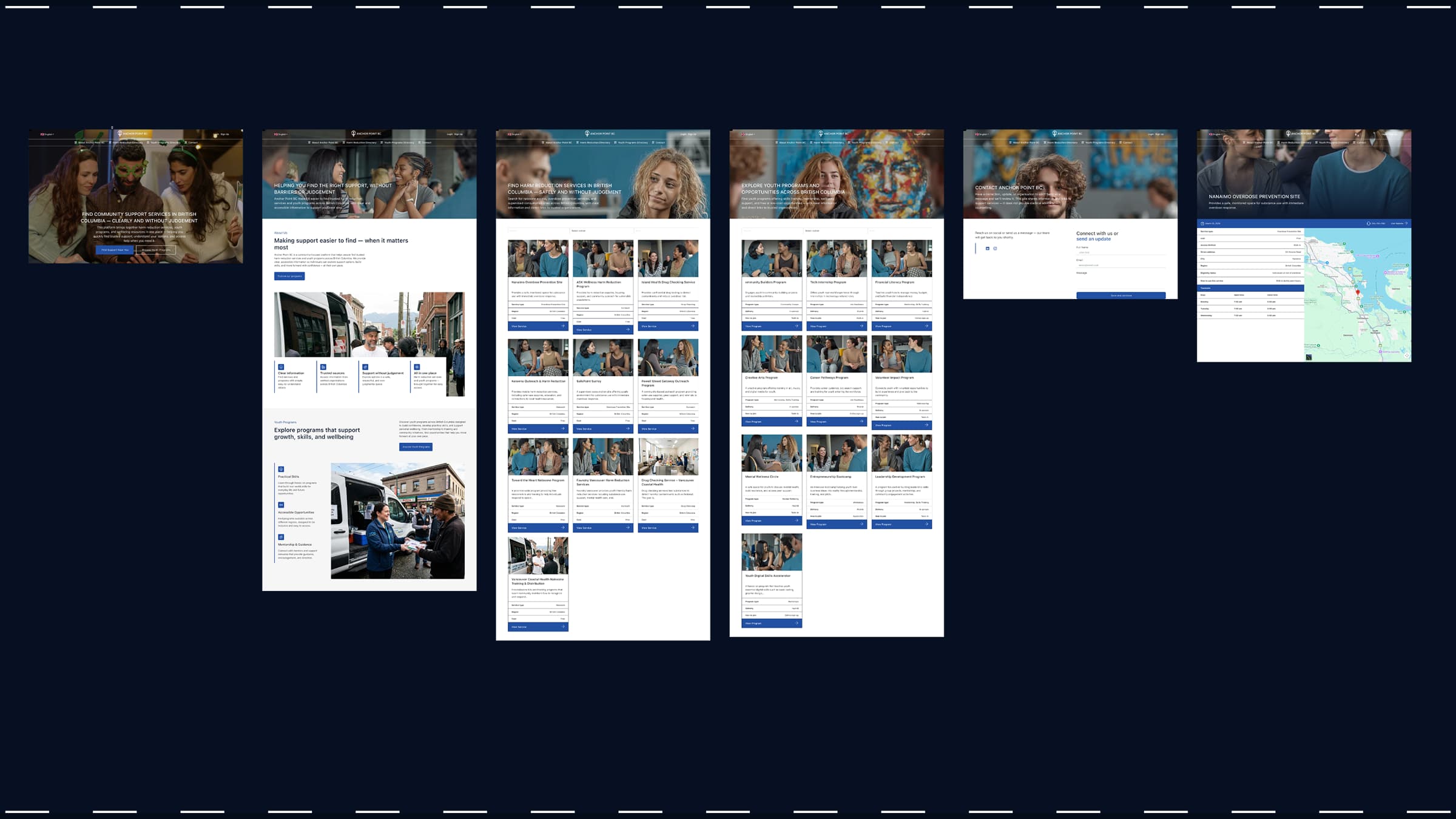
I built this site to bring everything together in one accessible place. It features comprehensive directories for harm reduction services and youth programs, including mentorship hubs that provide guidance, support, and positive role models for young people. Users can filter by region and service type to quickly find nearby help whether it’s naloxone access, crisis support, or youth mentorship opportunities.
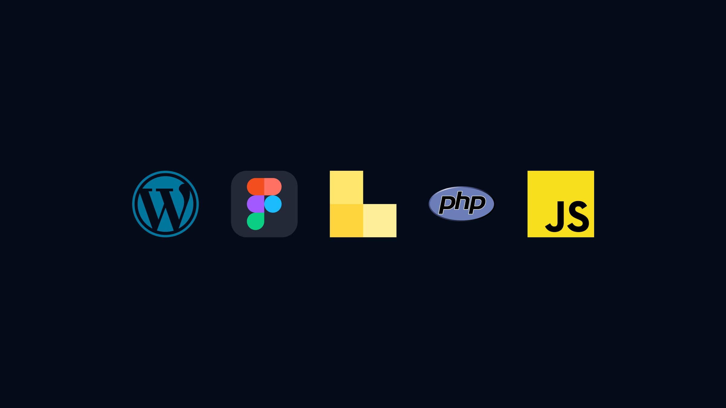
This site has directories for harm reduction sites and youth programs, with filters for region and service type. I designed the high fidelity wireframes in Figma, then built it in WordPress using Bricks Builder and custom post types. I also wrote a plugin from scratch in PHP to handle user accounts and let people save their favourite services.
The goal was simple: make it easier for people to find help without having to dig through ten different websites.
Tech Stack
Why This Project
I started by looking at what already exists like health authority sites, government listings, different organizations’ pages. I also talked to coworkers about what they hear from people trying to find services.
The same problems kept showing up. Most of these sites don’t work well on a phone, which doesn’t help when someone’s trying to look something up while they’re out. The language was too clinical stuff like “supervised consumption facility” instead of just saying what it is. And if you found something useful, you couldn’t save it. You’d have to screenshot it or hope you remember it later. Comparing a few options meant opening a bunch of tabs and switching back and forth.
So that’s what I focused on fixing.
Design
I designed everything in Figma before touching WordPress. This included the logo, the colour palette, the page layouts, and all the UI components like cards and buttons. I wanted it to feel calm and approachable not like a government form, but also not so casual that it loses credibility.
I made wireframes for the main pages: homepage, the two directories, individual service pages, and the user dashboard. The structure had to let someone land on the site and find what they need within a few clicks. Filters were important, people need to narrow things down by region or by what kind of service they’re looking for.
Building It
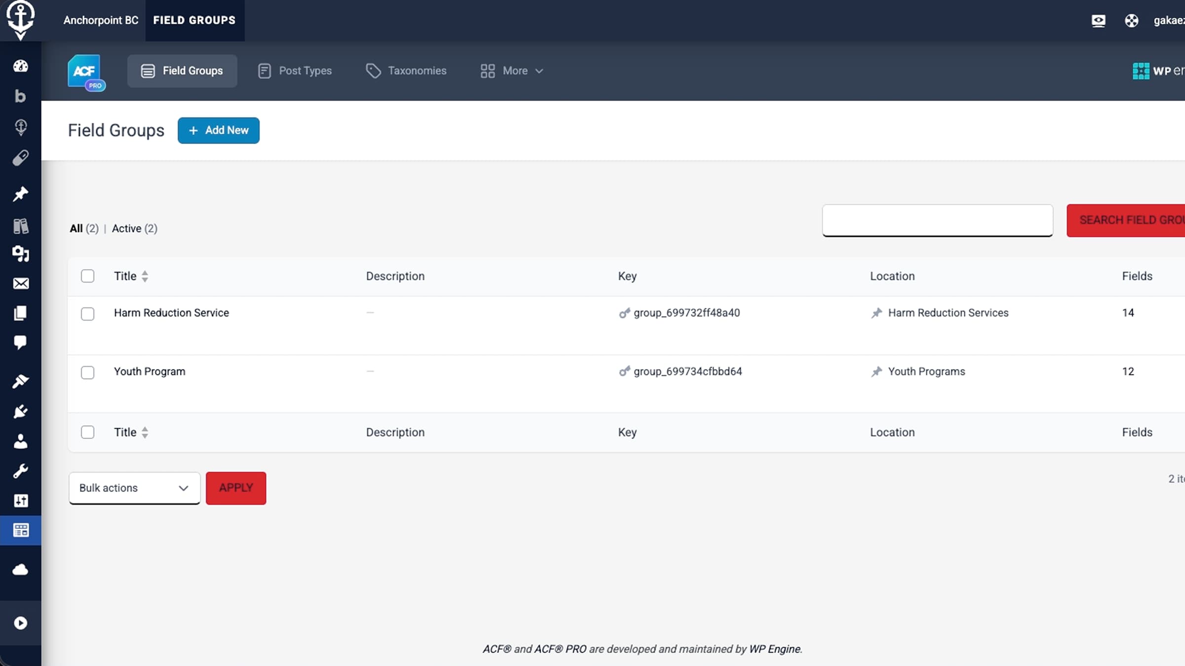
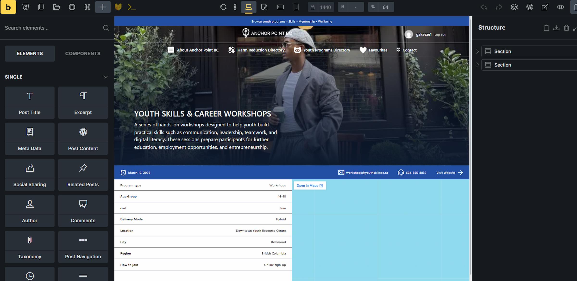
I used WordPress with Bricks Builder. Bricks let me create custom templates for the archive pages, the single service pages, and the cards that display each listing. I set up custom post types for harm reduction services and youth programs, then used Advanced Custom Fields to add all the specific information each listing needs: address, phone number, hours, what services they offer, accessibility info.
The queries pull in the right services based on what filters the user picks. I built custom cards in Bricks that display the key info at a glance, so people don’t have to open every single listing to see if it’s relevant to them.
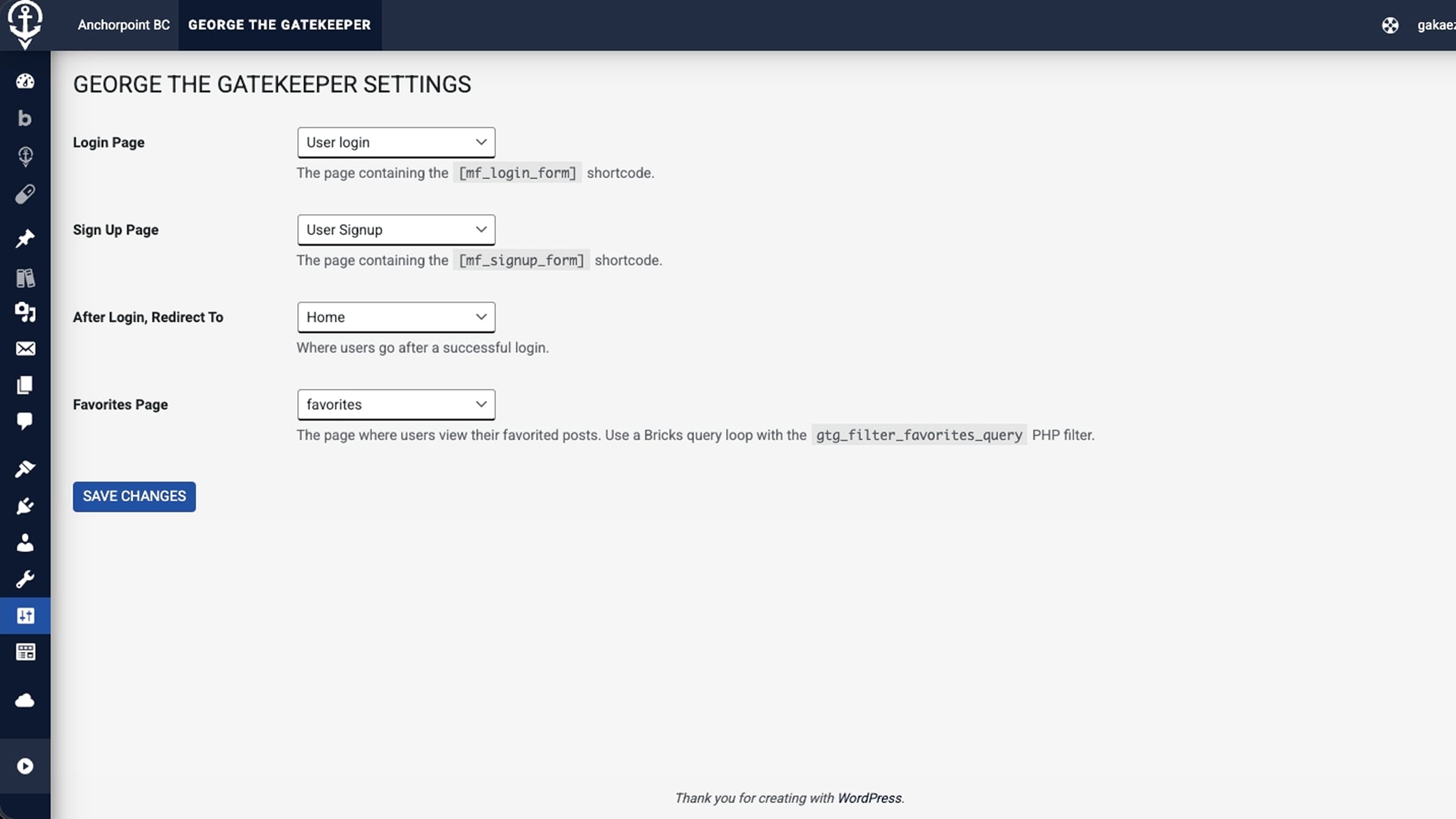
The Plugin: George the Gatekeeper
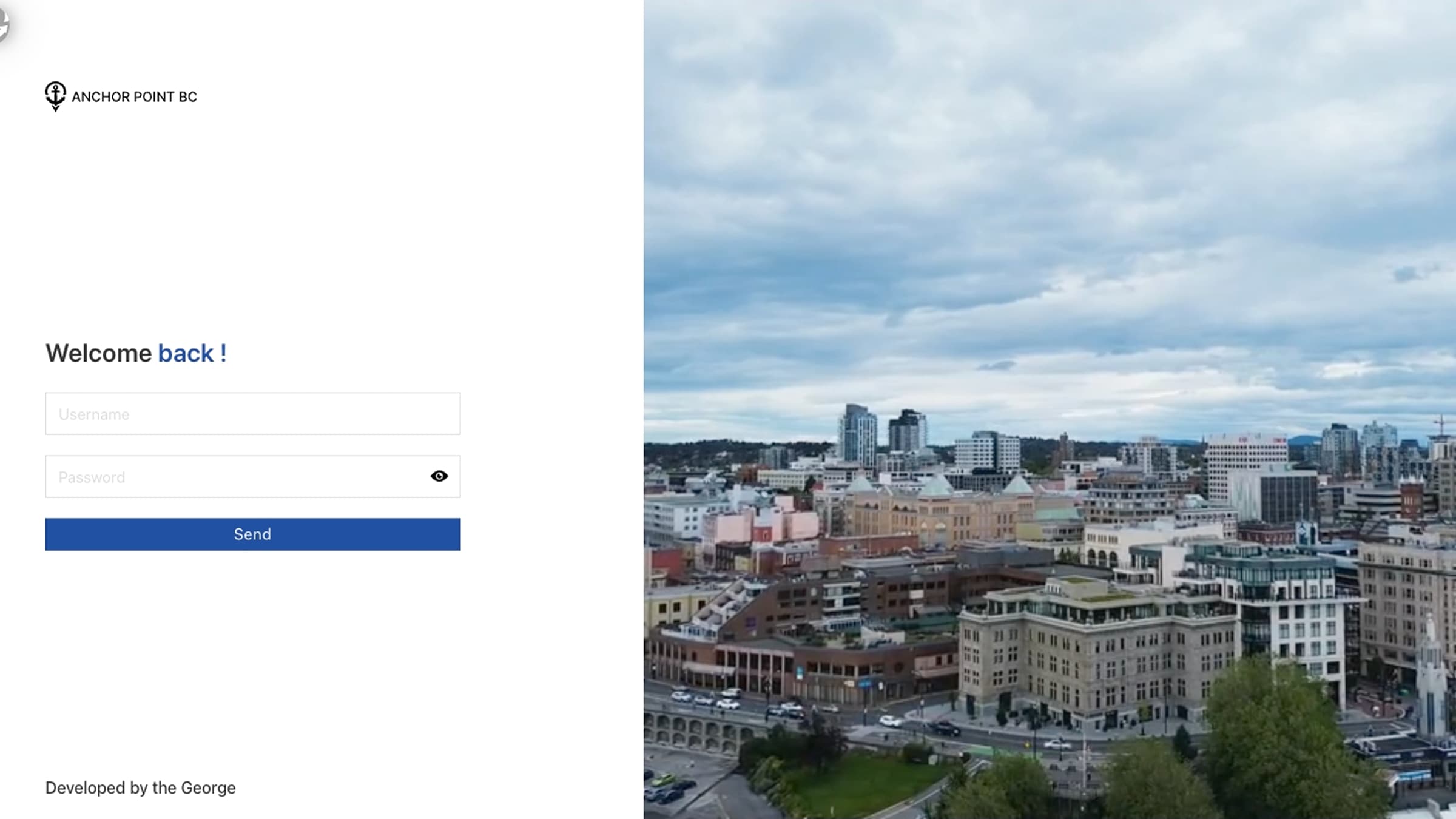
This was the hardest part of the whole project. I built a custom WordPress plugin to handle user registration, login, and a favouriting system. I called it George the Gatekeeper. George being my name, and the plugin guards the login. It made sense.
The plugin replaces the default WordPress login and registration pages with custom ones that match the site’s design. Users can create a profile and access their own data. The main feature I wanted was favouriting, people could save services they’re interested in and come back to them later. If you’re researching options, you don’t want to lose track of what you’ve already looked at.
Building this was frustrating. Getting the login system to work properly took a lot of trial and error. But the moment I figured out how to make the shortcodes work everywhere on the site so I could drop a favourite button on any card or page just by adding a short code that was when it all came together. That’s probably the part of this project I’m most proud of.
Testing
I tested the site for accessibility using WAVE and by navigating with just the keyboard. Given who this site is for people who might be stressed, in a hurry, or using assistive technology it had to work properly. I checked colour contrast, heading structure, and focus states on interactive elements.
Usability testing pointed out a few things I needed to fix. The filter labels weren’t clear enough, and some buttons didn’t stand out the way they should. I went back and made adjustments until the main tasks (finding a service, saving it, learning about harm reduction) felt quick and obvious.
What I Learned
Writing a plugin from scratch taught me more than anything else in this project. It’s one thing to use WordPress and install plugins other people made. It’s another thing to build the functionality yourself and figure out why it’s not working at 11pm.
I also got better at translating a Figma design into a real site. Bricks Builder is flexible, but getting things to match the design exactly, especially across different screen sizes, takes patience and attention to detail.
The project gave me a portfolio piece I actually care about. It’s connected to work I do in real life, and it solves a problem I’ve seen people deal with. That matters more to me than building something generic.