AFTER HOURS Digital Marketing Campaign
After Hours is a multi-platform digital advertising campaign and landing page experience designed to guide users from their very first interaction with the brand all the way to product purchase. The project spans the full promotional funnel, combining targeted ads, responsive layout design, and a cohesive visual identity to create a seamless journey across platforms. Users are first introduced to the brand through outdoor-inspired messaging, imagery and copy that communicate personal expression, and the feeling of stepping outside the 9–5 routine. From there, they are funnelled toward a conversion-focused landing page where they can sign up for early access and explore the new clothing collection.
Created using Figma, Canva, Adobe Illustrator, and Adobe Photoshop, the After Hours branding and campaign includes platform-specific digital ads, a responsive landing page, a three-column product collection grid, and a full suite of branded mockups. Every step of the project emphasizes clarity, consistency, and mood-driven storytelling. The goal was to create an immersive user experience that feels intentional and unified across all touchpoints, ads, visuals, products and landing page. After Hours is built around the idea of life outside the workday, the moments after work, on weekends, and during personal downtime when people feel most expressive, adventurous, and connected to their own identity.
Moodboard
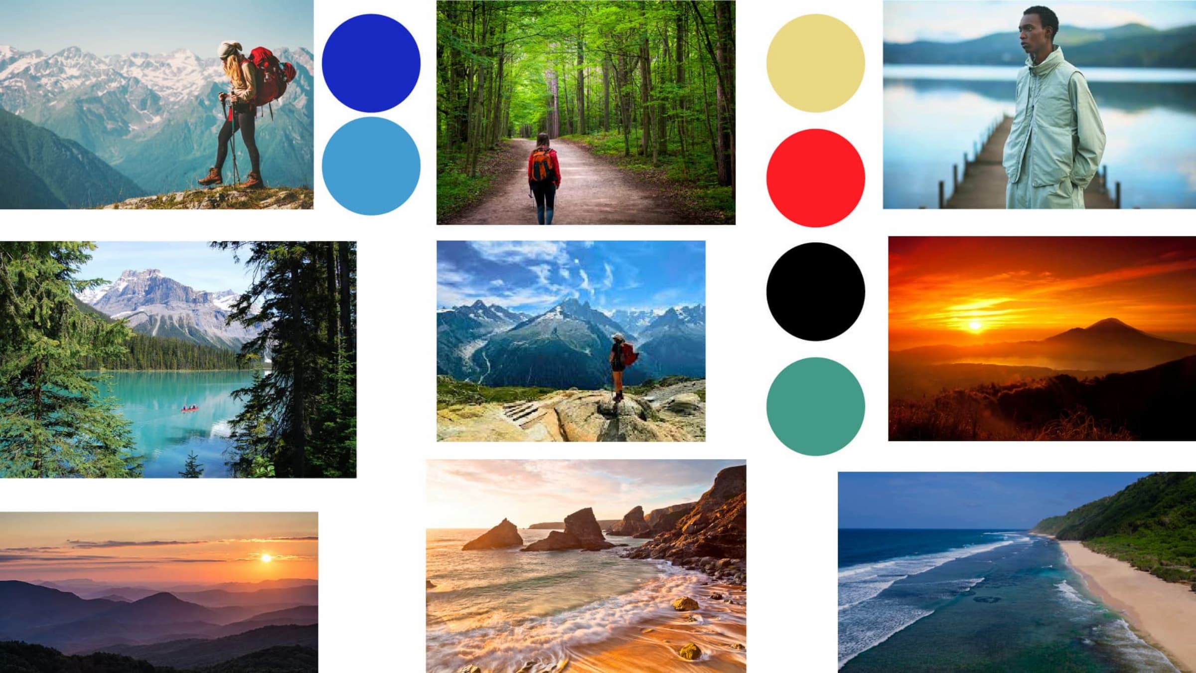
The first step in defining the After Hours brand was building a moodboard to establish the visual tone, emotional direction, and stylistic boundaries of the campaign. I curated imagery that captured an outdoorsy, expressive, and slightly adventurous energy. Cool tones, and photography that communicated movement and the freedom in nature. The images leaned heavily into moments spent outside after sunset, open spaces, nighttime exploration, and the in-between feeling of transitioning from work to freedom.
This stage shaped the entire visual foundation of the project. The moodboard guided my decisions around colour palettes, typography, composition, and lighting throughout the campaign. I wanted the brand to feel adventurous and expressive, but also clean and minimal enough to appeal to a wide audience.
Branding
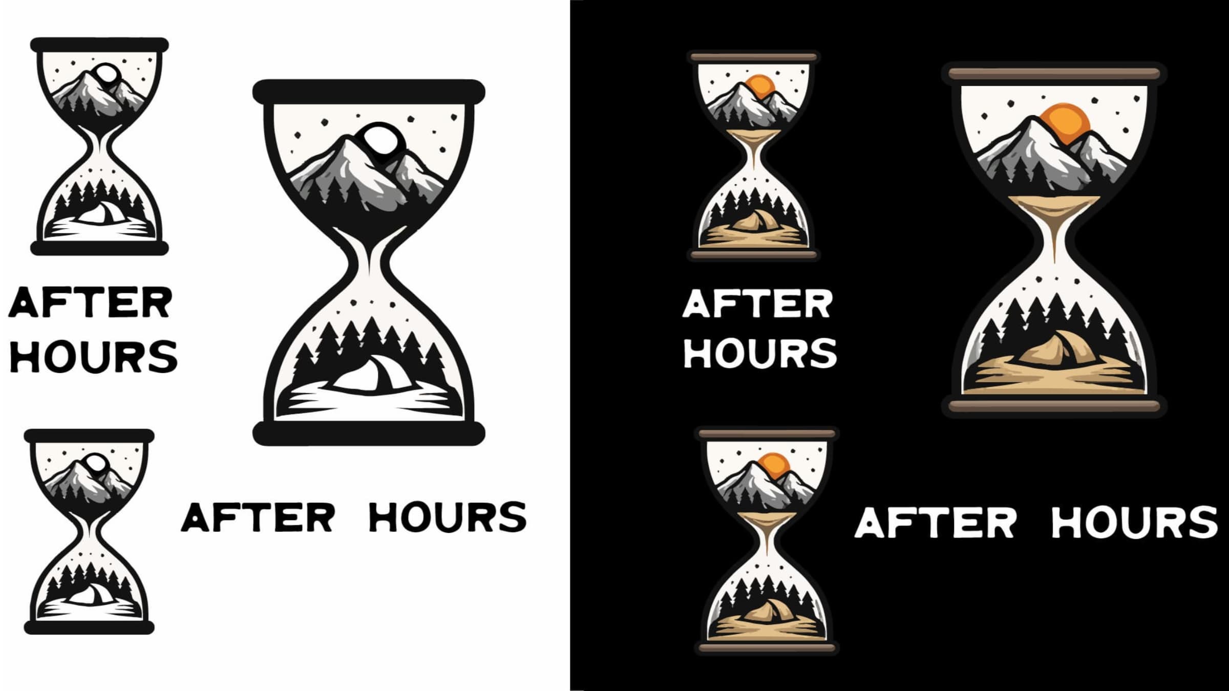
Developing the branding for After Hours meant solving a very specific design challenge. How to visually represent the mood of evenings, weekends, and personal expression while keeping everything modern, minimal, and versatile enough for an apparel line. The final visual identity blends a bit of artistic expression with a structured, contemporary edge.
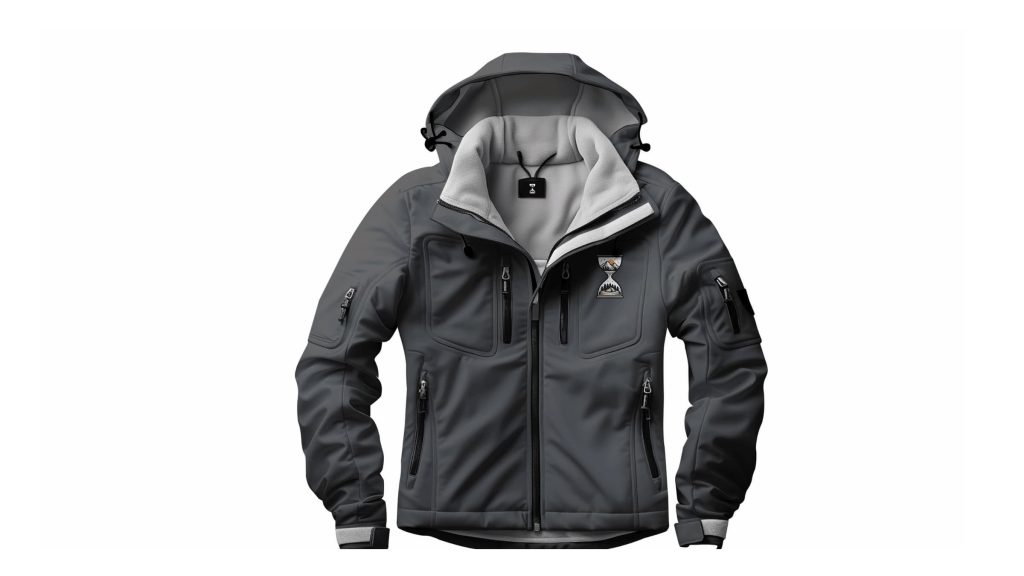
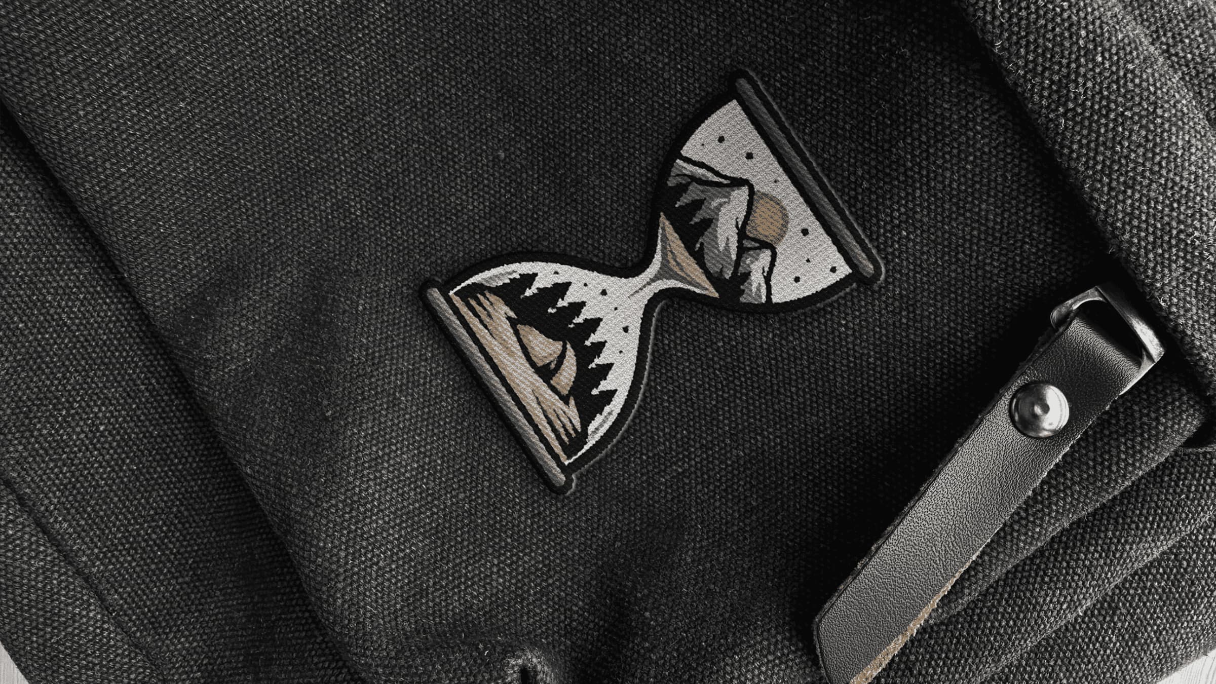
The logo features a clean, bold hourglass shape, symbolizing time, transition, and the shift between work hours and personal hours. Inside the hourglass, subtle adventurous design elements appear; these details are only visible at larger scales, such as clothing prints or display mockups. These small internal patterns help create depth and give the logo personality without sacrificing simplicity at smaller sizes.
The colour palette centers on black, grey, orange, white, sand, and deep yellow. These tones feel grounded, warm, and natural, evoking sunsets, campfire light, and the nighttime outdoor environment. They also work well with photography, allowing image-heavy layouts to feel cohesive yet spacious.
The tagline, “Life Starts After Hours,” became the campaign’s narrative centrepiece. It appears throughout the ads, landing page, and mockups, anchoring the story and reinforcing the core message: After Hours is the time when self-expression and personal style come alive.
View the style guide online.
Digital Ads
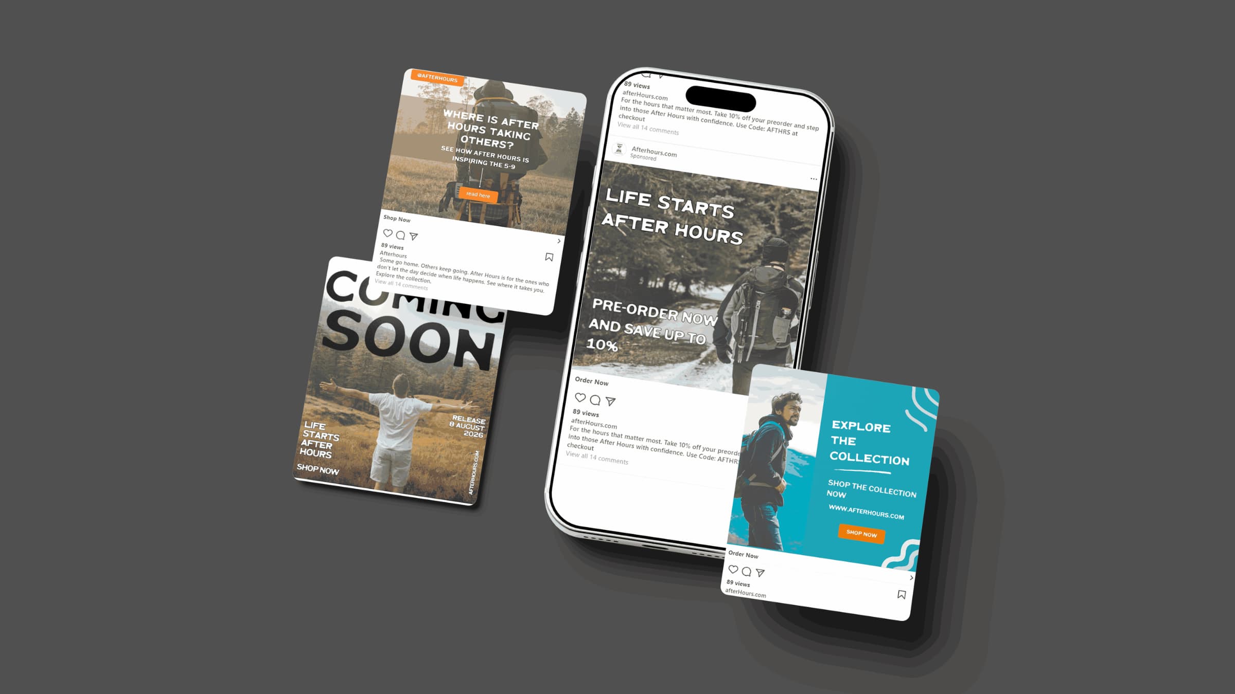
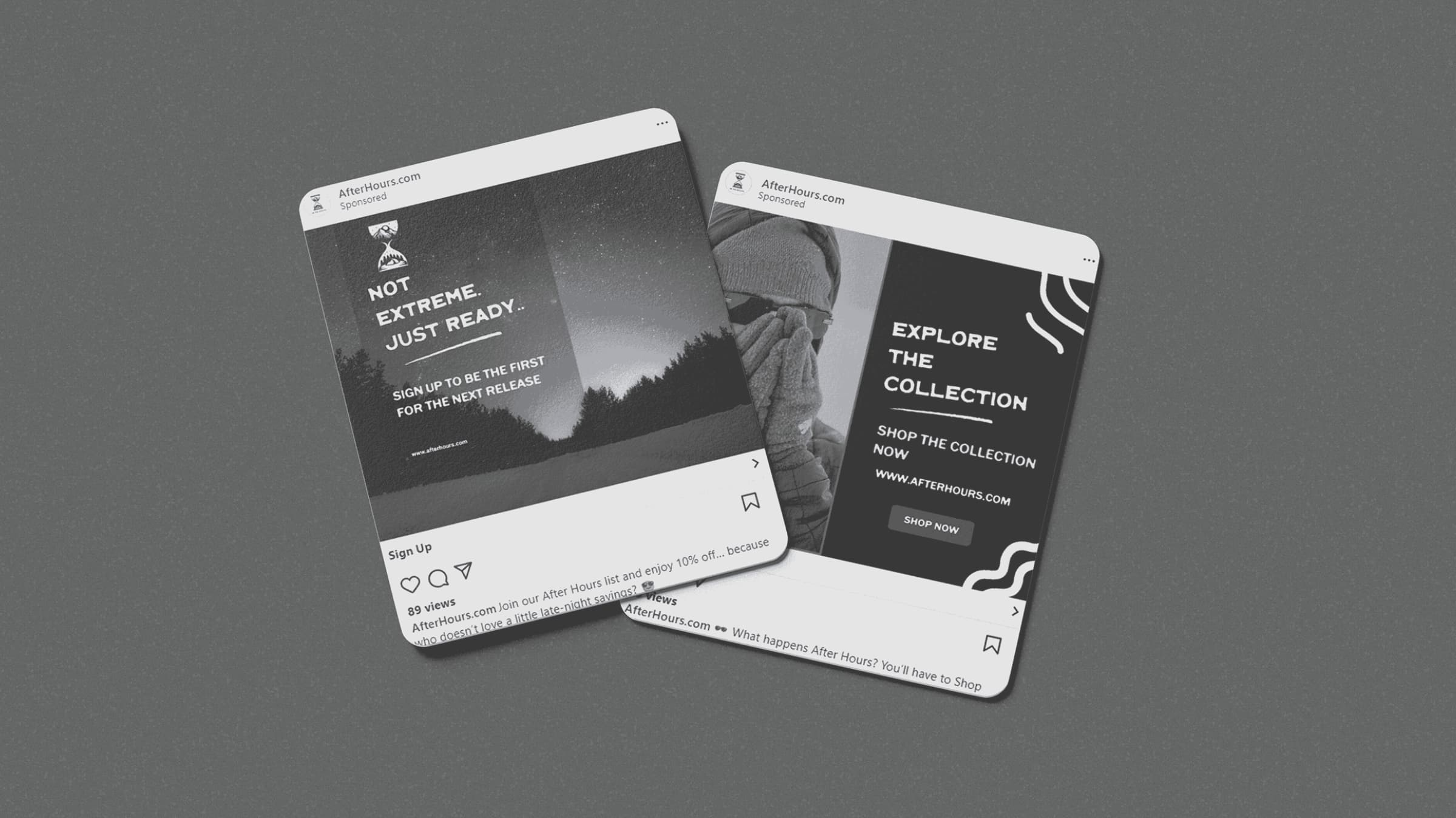
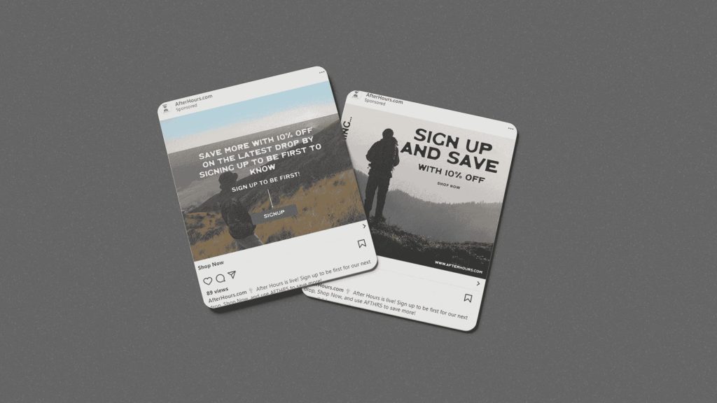
I created a series of digital advertisements for multiple platforms, focusing on funnel based messaging. Each platform used appropriate sizing, copy limits, and call to action variations. The ads progressed from minimal philosophical statements to more direct product focused messaging.
Examples include:
- Awareness: “Life Starts After Hours.”
- Engagement: “Where is after hours taking others?”
- Conversion: “Use Code AFTERHOURS at Checkout.”
The design remained visually consistent across all formats clean typography, and short, impactful copy.
Collection Mockups
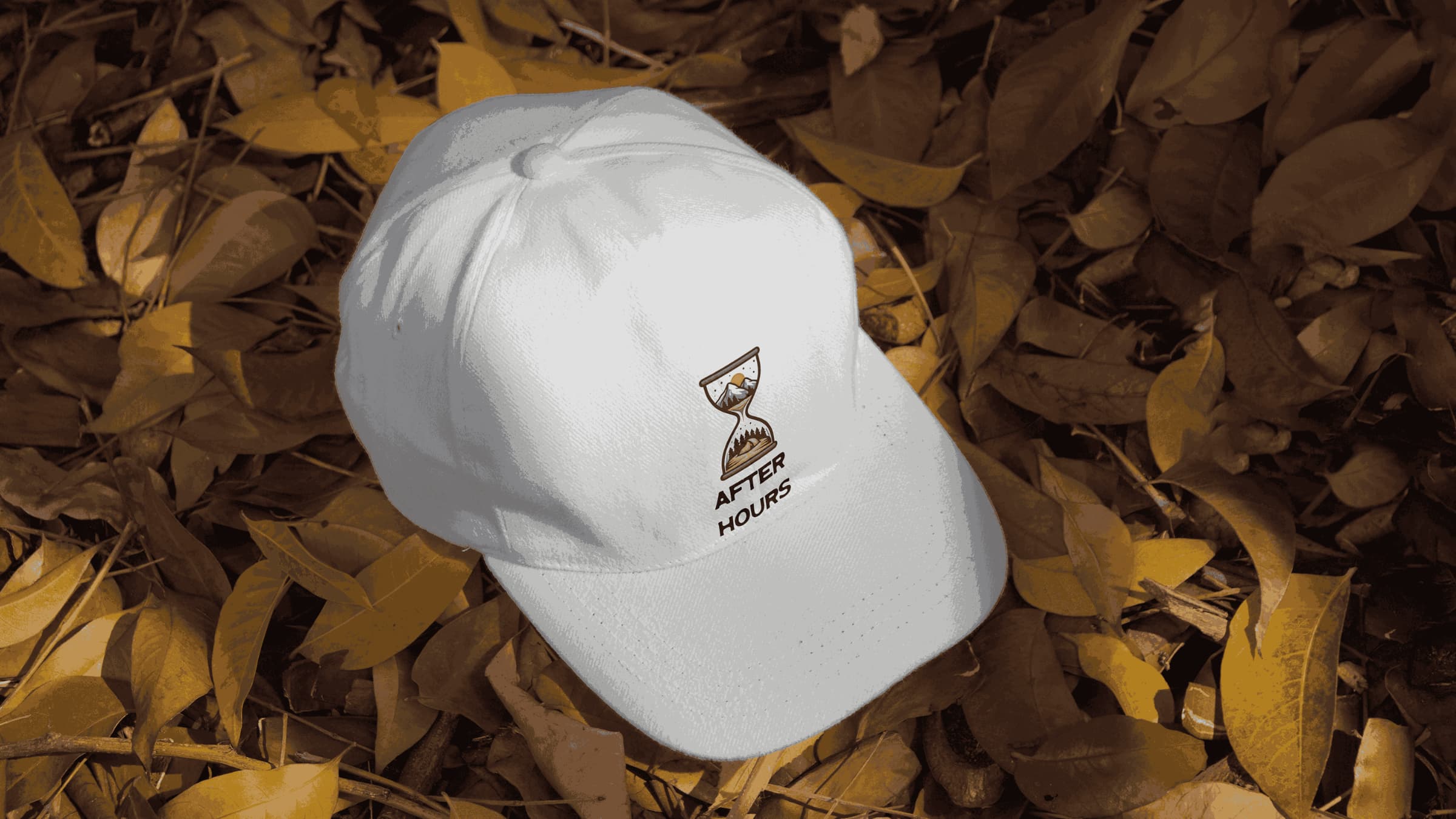
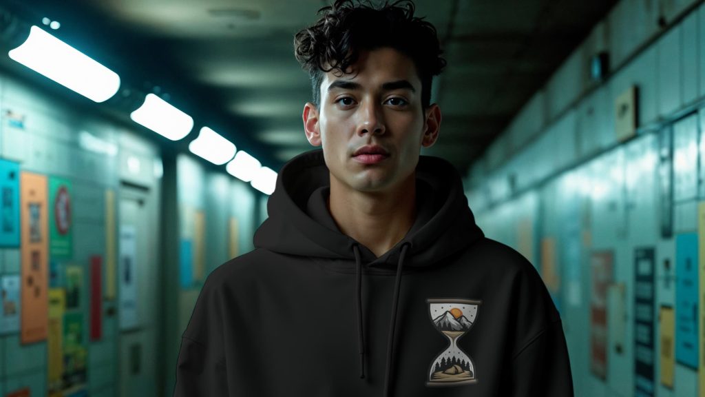
To bring the brand alive in a more tactile, real world way, I designed a series of product mockups featuring hoodies, caps, and outdoor inspired accessories. These mockups served multiple purposes. Showcasing how the branding functions on apparel, reinforcing the outdoor aesthetic, and providing visual content for ads and the landing page.
I selected scenes and lighting styles that matched the moodboard, cool-toned environments, soft shadows, and natural colors so that the mockups visually aligned with the rest of the campaign. This continuity made the collection feel like a cohesive real product line, rather than just standalone visuals.
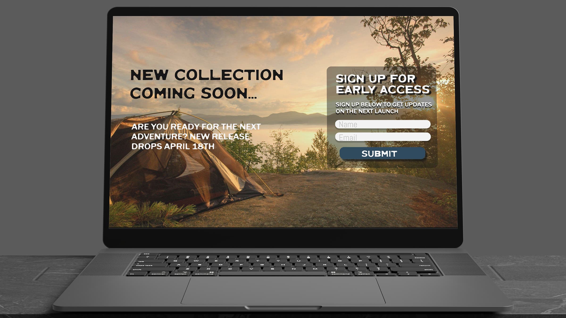
Landing Page
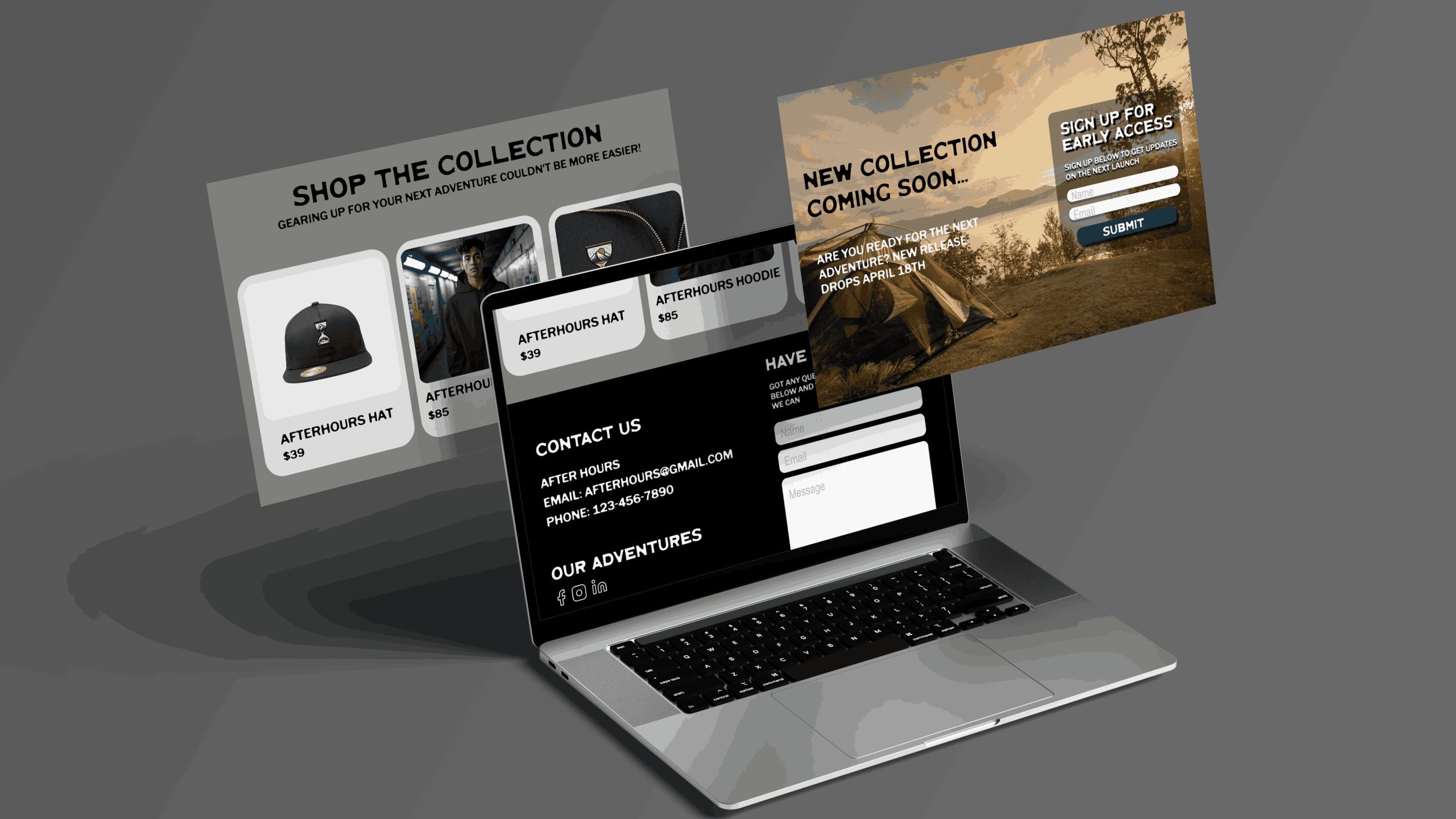
The landing page was one of the most critical components of the After Hours project. I designed it in Figma with a focus on responsiveness, clear CTA hierarchy, and narrative flow. The structure guides users step-by-step from introduction to exploration to conversion.
Key features include:
- A cinematic hero section with bold type and atmospheric photography
- Early access email sign-up to build interest and urgency
- A checkout code section offering immediate incentive
- A three-column product collection grid for browsing the line
- Darker theme matching the after work 5-9 feel
The landing page intentionally mirrors the messaging and style of the ad campaign, creating a smooth and predictable transition for users. This alignment ensures users who click through from an ad feel like they’re entering the same world, same tone, same visuals, and same narrative, this builds trust and strengthens recognition.