Beyond Boundaries
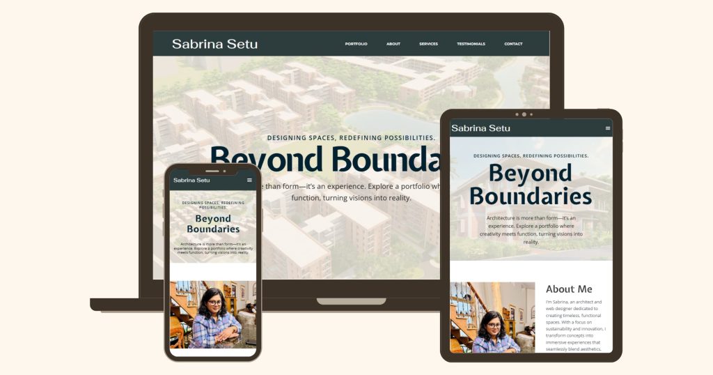
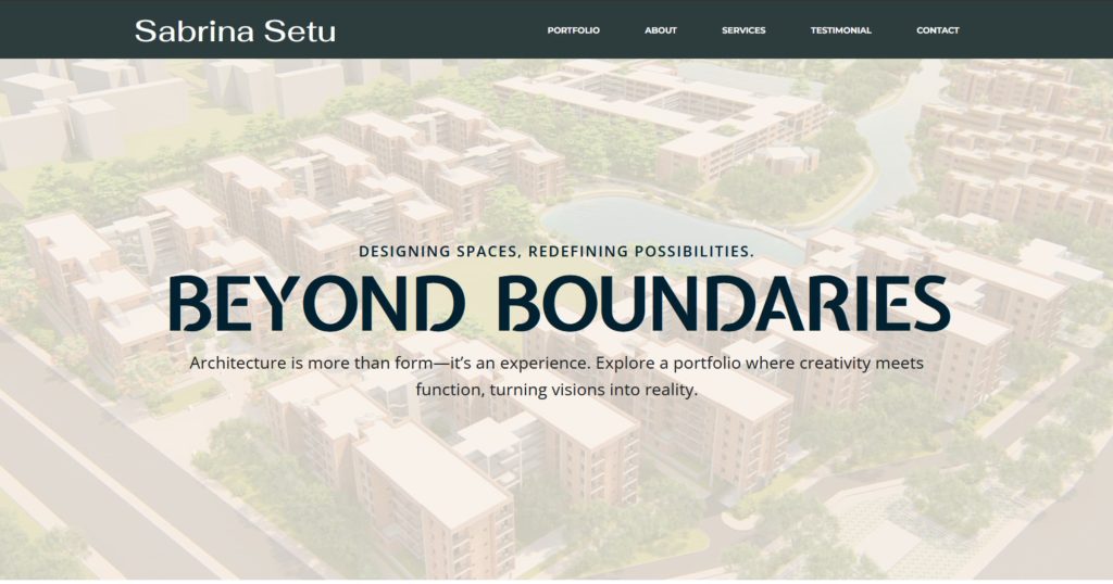
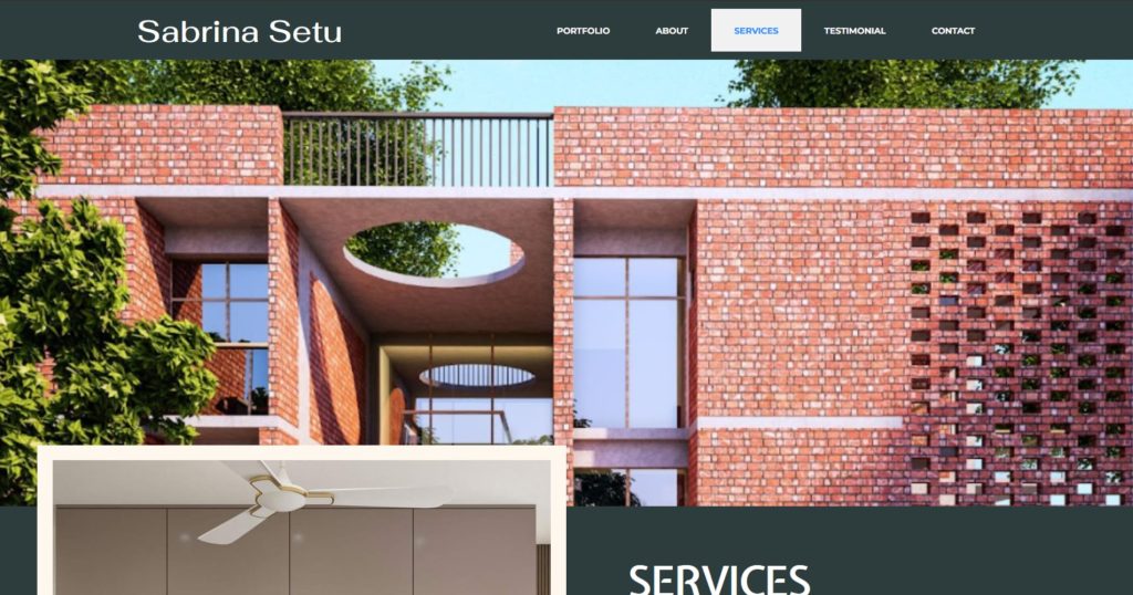
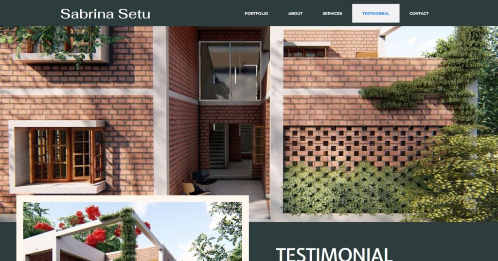
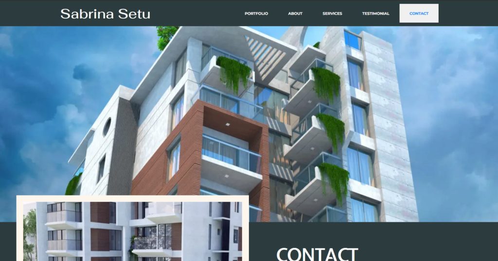
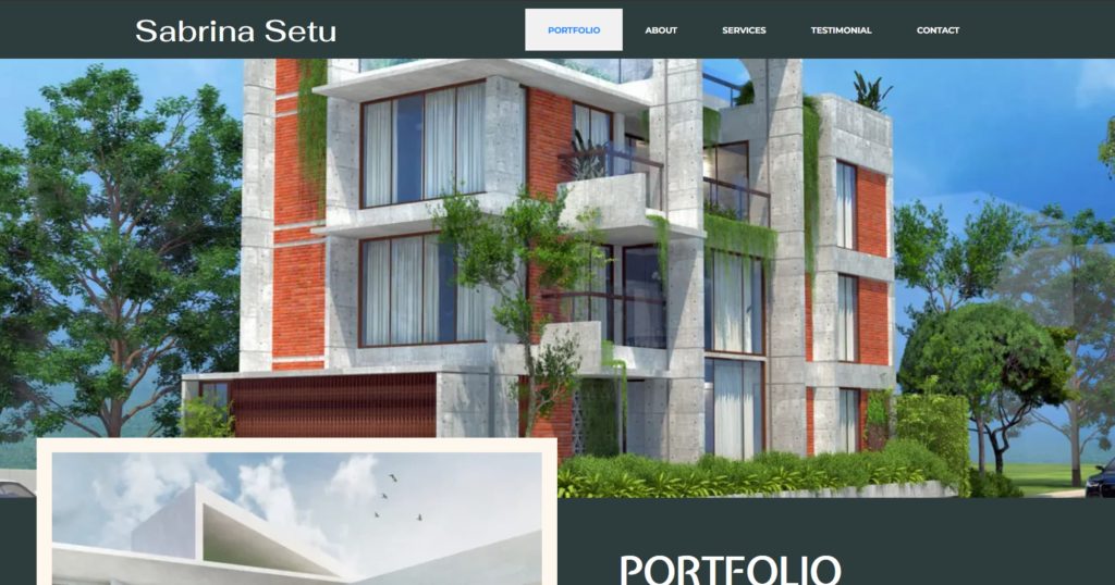
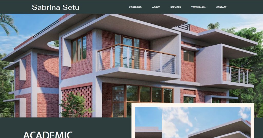
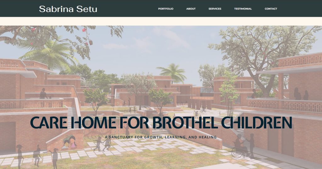
This project is a personal architectural portfolio website built using WordPress and Elementor Pro. It was created to showcase my work as an architect and interior designer in a clean, modern and professional format. The goal was to develop an online space that reflects my unique design style which allows potential clients to explore my work and helps me connect with employers for future job opportunities.
The website includes key sections such as a homepage, portfolio, services, testimonials and a contact page. Each section is thoughtfully designed to be user-friendly and visually engaging. This portfolio not only shares my design story but also highlights my creative process and passion for meaningful, functional spaces.
Planning & Research
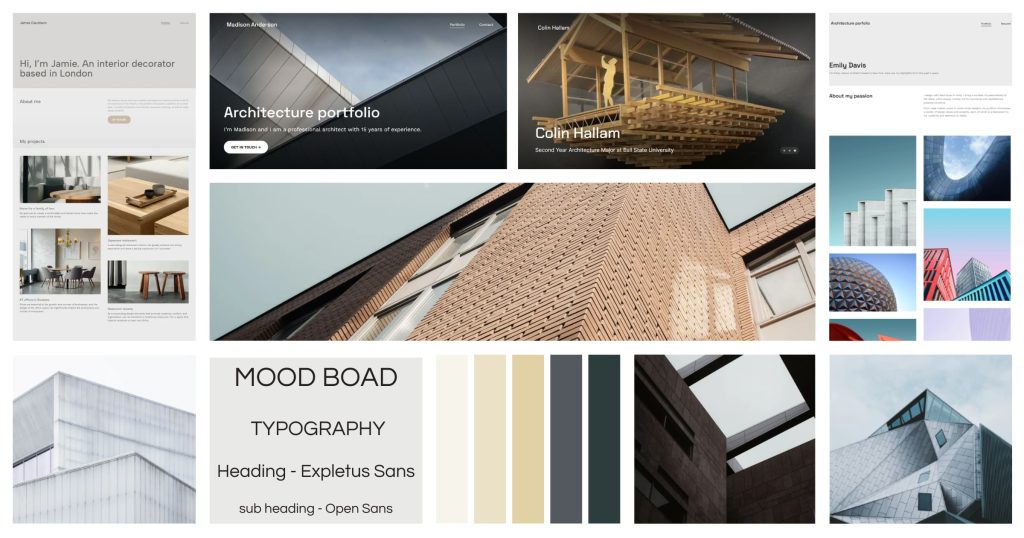
Before starting the design, I explored several architectural portfolio websites to gather inspiration and understand best practices. I paid close attention to layout choices, visual hierarchy and how content was structured. One thing that stood out was the importance of clean, minimalist designs with large images and clear navigation. These elements made the browsing experience easier and more enjoyable for users.
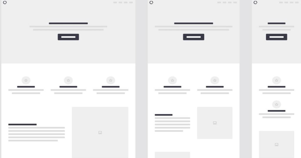
Based on this research, I began planning the structure of my own site. I listed out the key pages I needed: Home, Projects (for both academic and professional work), Services, Testimonials and Contact. I then created simple wireframe sketches to visualize the layout of each page, including how content like project titles, images, and client names would be grouped.
Design & Wireframes
My focus was to keep the design minimal so that the visuals could shine. I used a grid-based layout to ensure alignment and consistency across all pages. I planned the placement of featured project previews on the homepage and how the full project details would appear on individual pages. Each layout was designed to guide the viewer naturally from one section to the next, with space left for descriptions, project sizes, and key details.
Development in WordPress
I built the website using WordPress and Elementor Pro. Elementor’s drag-and-drop features made it easy to implement my wireframe layouts. I created each section using containers and columns, which helped organize the content effectively. I chose a neutral color palette with custom fonts to ensure that the focus stayed on the project visuals. Every project was given its own layout, with high-resolution images, short descriptions, and optional downloads.
To improve site performance and usability, I optimized the image sizes and made sure the design was responsive across all screen sizes.
Feedback & Revisions
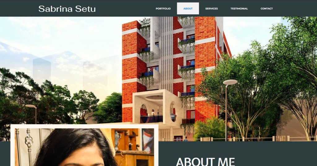
Once the first version was done, I shared the site with my instructor and peers for feedback. Based on their suggestions, I made several improvements. I fixed the scroll animation on the homepage, improved color contrast for readability, and refined the spacing between sections. I also edited the contact form to make it more user-friendly and tested the form submission on desktop and mobile. Another major change I made was to the About section. Originally, it was a general bio, but I revised it to include my design philosophy instead, which gave it more personal meaning and made the homepage flow better. These revisions helped polish the site and made it feel more professional, interactive, and aligned with my goals as an aspiring designer.
