MoodWee
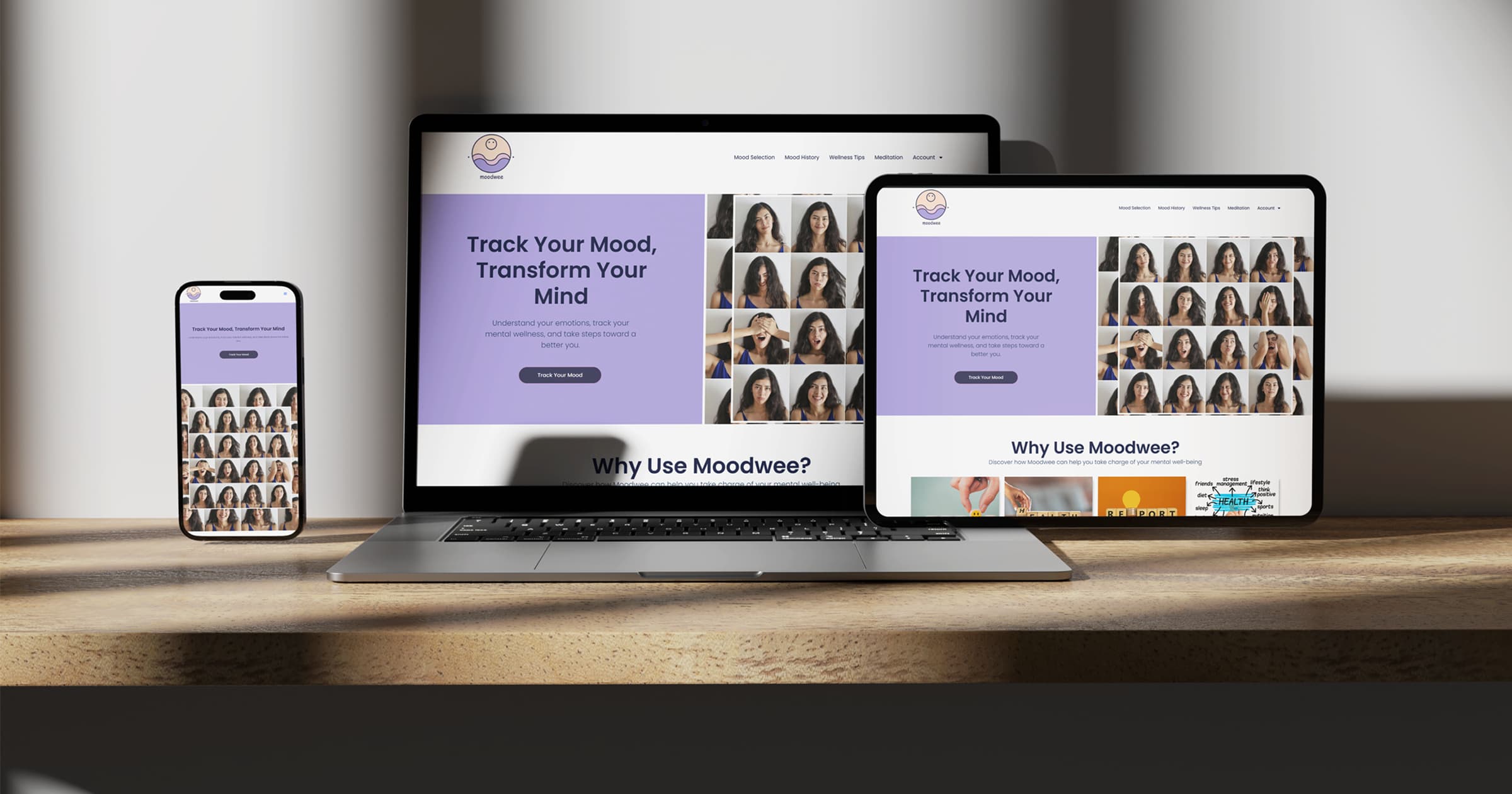
MoodWee is a responsive web application designed to help users track their emotional well-being through simple daily check-ins. It allows users to log their mood up to four times a day, view their mood history through animated bar charts, and download a personalized PDF report. The interface is intentionally minimal and calming, with a focus on accessibility and ease of use across all devices.
Built using WordPress, HTML, CSS, JavaScript, and PHP, MoodWee includes features such as mood scoring, streak tracking, and personalized wellness tips. The back end uses TCPDF to generate downloadable reports, while the front end leverages Chart.js for visual insights. MoodWee encourages users to pause, reflect, and better understand their emotional patterns.
Primary Logo
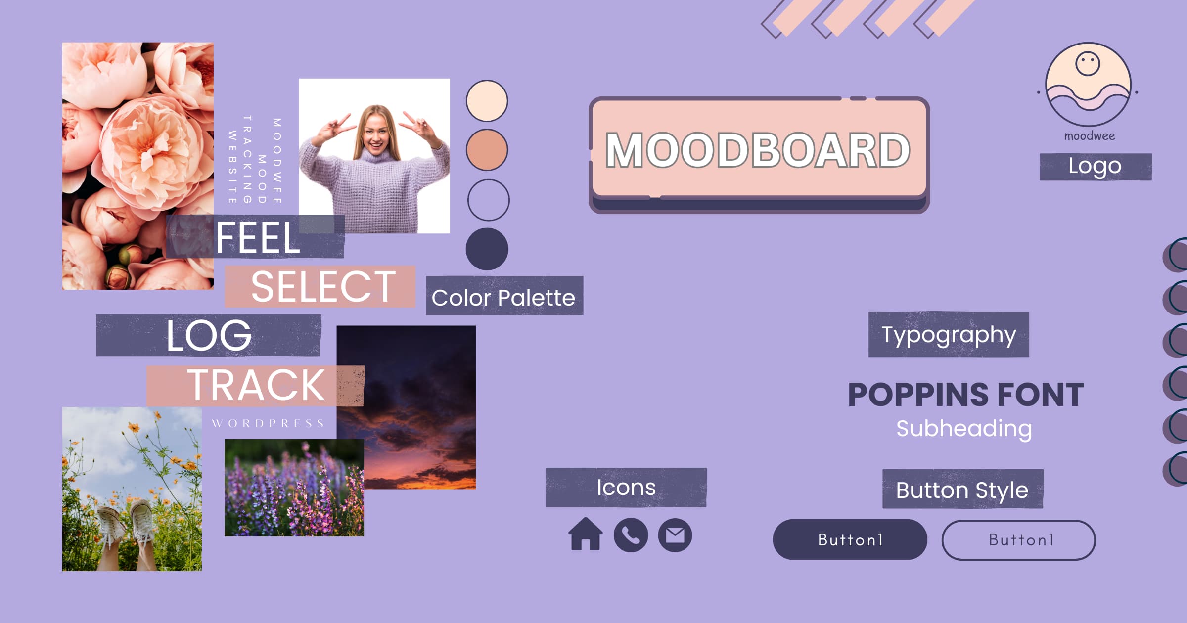
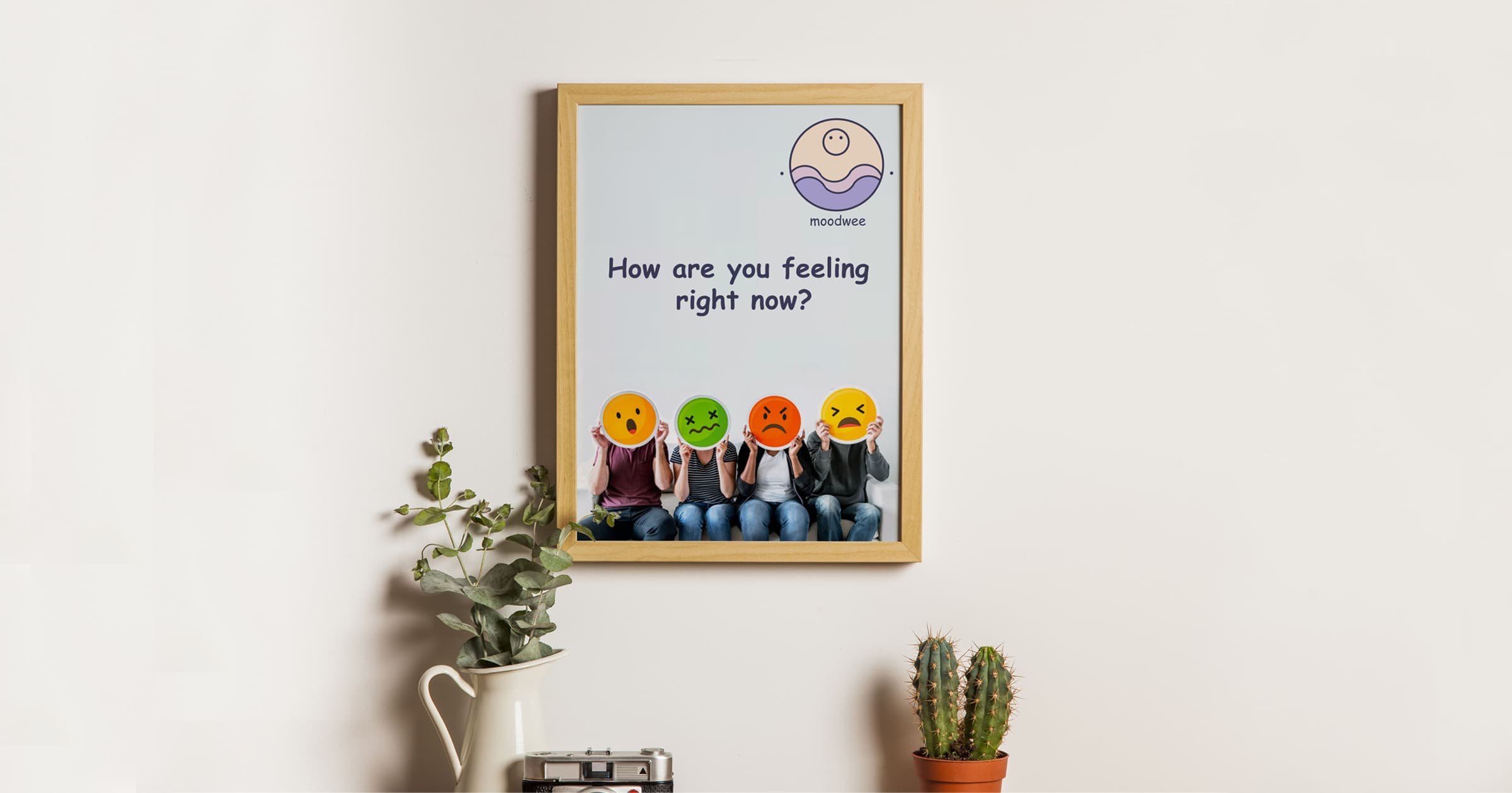
When I first started working on MoodWee, I knew I wanted the brand identity to feel calm, friendly, and supportive—like a quiet check-in with yourself. The name itself was created by blending “Mood” (our emotional states) with “Wee,” a playful nod to something small, light, and wave-like. Together, the name represents the gentle rise and fall of our emotions throughout the day.
I sketched the logo by hand, beginning with a circular face symbol to represent a user. I then added two curved wave lines to reflect emotional waves—ups and downs. These became the foundation for the visual identity: a simple, smiling face floating above gentle mood waves.
Colours & Typography
I chose a calming color palette that uses soft lavender, muted peach, and light gray tones. These colors are intended to soothe, reduce visual noise, and reflect the inner stillness the app encourages. Lavender, in particular, is associated with relaxation and mindfulness.
The typography is modern, rounded, and legible. I used a sans-serif typeface with friendly curves for headings and a clean, readable font for body content. This balance ensures that the content feels approachable while maintaining structure and hierarchy. Every design decision—color, spacing, type—was made with the user’s emotional comfort in mind.
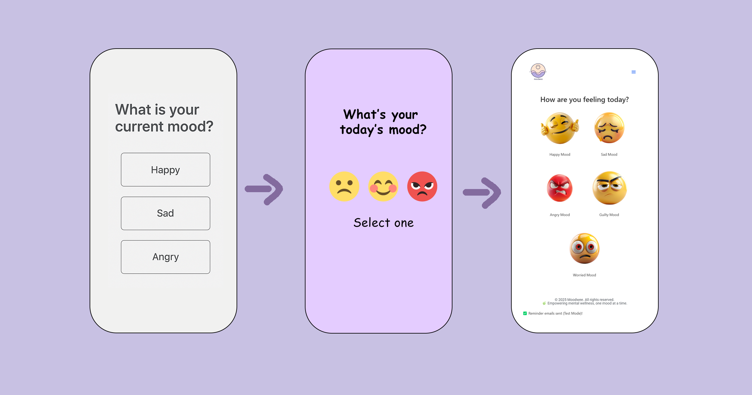
User Flow & Wireframes
I began by mapping out the user experience: logging a mood, viewing mood history, and accessing personalized wellness tips. I kept the navigation simple and labeled clearly—because when someone’s not feeling their best, the last thing they need is friction.
Each page follows a minimal layout to avoid overwhelming the user. I focused on mobile-first design with clear call-to-action buttons, large text, and enough spacing to allow breathing room between elements.
Wellness Tips Page
This section offers users helpful suggestions based on how they’re feeling. It’s designed as a calm space that feels more like a personal coach than an app screen. I kept the copy soft and encouraging, and supported it with lifestyle photography to humanize the experience.
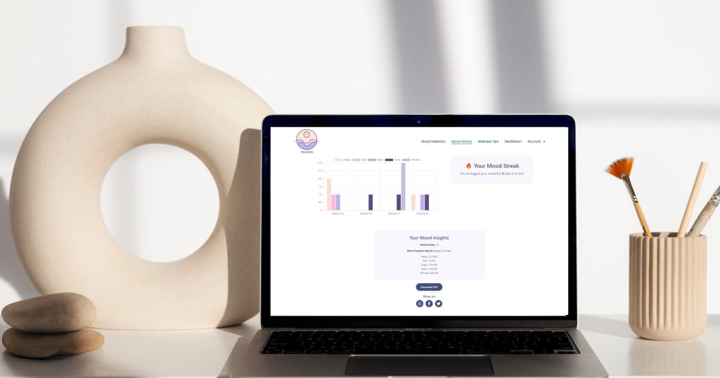
Mood History & Chart Visualization
One of the core features is the interactive bar chart that visualizes mood entries over time. I used Chart.js to animate this graph, making the insights dynamic but still easy to understand. Each mood is color-coded and styled to match the branding.
The Mood Insights box beneath the chart summarizes entries and highlights trends—like your most frequent mood. This helps users gain a sense of self-awareness without needing to analyze raw data.
PDF Report Feature
I wanted users to be able to take their data offline, so I implemented a PDF export feature using TCPDF in PHP. This generates a downloadable summary of the user’s mood entries, percentages, and timestamps. It’s designed to be clean and printer-friendly, allowing users to reflect on their month at a glance or share with a therapist or coach.
What I Learned
This project was a full-circle experience for me—from initial sketches to back-end integration. I learned how to blend emotional UX with technical features and how to keep a product feeling light even when it deals with serious topics. Working on MoodWee reminded me that design is not just about how something looks—it’s about how it makes people feel.
I’d love to expand MoodWee in the future with meditation features, journal prompts, or even community-based reflections. But for now, I’m proud of how thoughtful and intentional this first version turned out to be.