Centurion Digital Bank
Centurion Digital Bank is a cutting-edge online banking platform that offers secure digital banking services with advanced fraud protection systems. The bank’s innovative Cohort program creates a community where users can share experiences, receive educational resources, and engage with real-time fraud alert systems that ensure timely authority intervention. The project also includes comprehensive digital marketing strategies and a complete branding style guide to establish a strong and consistent brand identity and marketing campaign. With these initiatives, Centurion Digital Bank aims to provide not only a safe and seamless banking experience but also foster a proactive and informed community for enhanced customer security and engagement.
Branding Style-Guide: https://issuu.com/seanbabchuk/docs/centurion_brank_branding_and_style_guide
Process
MoodBoard
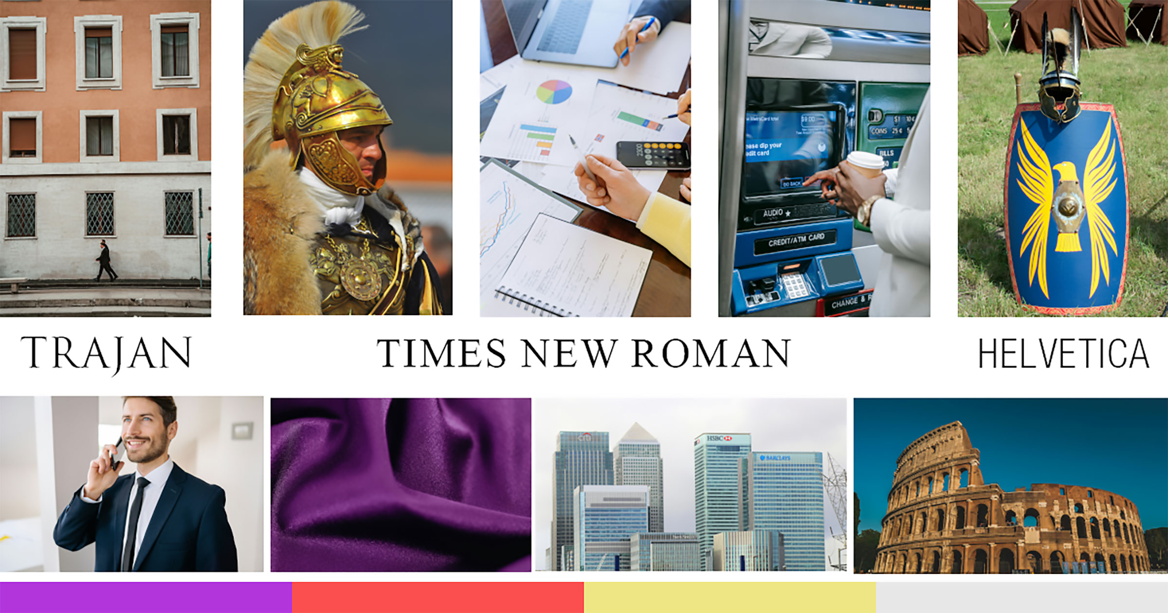
IDEATION! Designing a social media marketing campaign as well as a branding guide for a new bank is no easy task. Planning was required. First, I had to get the right feel for Centurion Digital Bank. What does it represent? What “feel” did I want it to have? Every major bank is backed by a colour. CIBC has red. Bank of Montreal has blue, and Toronto Dominion has green. All primary colors and very bold. How would I compete with this? How would I enter that market with a bold product that would stand out? The ideas began to flow, and I searched for branding opportunities in this stage. What do people attribute to Centurions and colour with? Royal Purple! What else do people attribute to the idea of ancient centurions? Security! How do we take that concept of royal purple and security and bring it into the public eye as a modern and digitally technical service in the eyes of users? This is the whole ideation process of the MoodBoard. To see it. To explore it. To feel it.
Social Media Marketing Plan
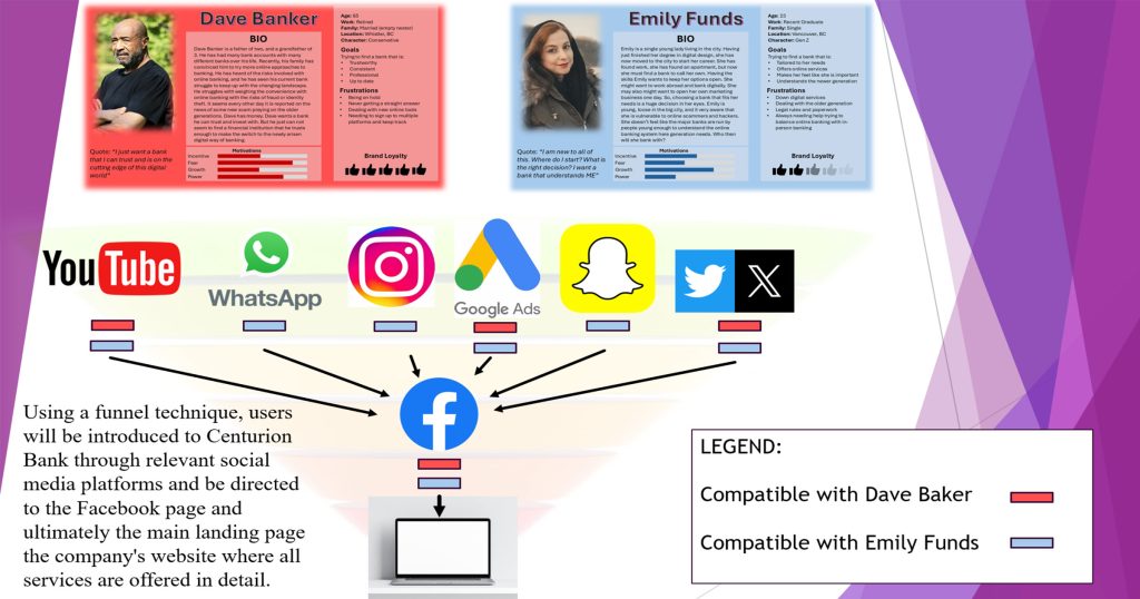
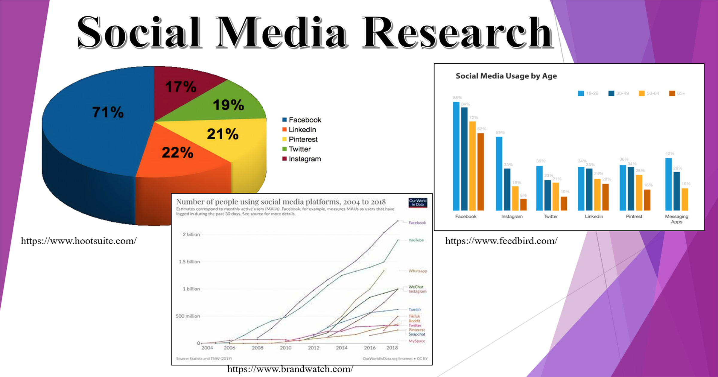
I started by creating a social media campaign structure that was carefully designed based on multiple user personas and extensive market research. My first step was to analyze the audience by developing two polar personas, each representing different segments of our target market. I then conducted in-depth market research to understand the platforms these personas were most active on and how they interacted with content. This allowed me to cross-reference both the user personas and market research to identify the social media apps that would best align with our campaign objectives.
Next, I chose platforms like Facebook, where we could reach our audience effectively. I developed tailored content that resonated with the specific interests and behaviors of each persona, ensuring that the messaging was personalized and relevant. Throughout the campaign, we would track key performance indicators (KPIs) such as engagement rates, click-through rates, and conversions, particularly on Facebook and the landing page, to measure success and adjust strategies in real time. The data will help refine my approach, allowing me to optimize the campaign for better results on the fly. By leveraging user personas and market research, I was able to create a highly targeted and effective social media campaign that met our goals and provided valuable insights for future campaigns.
Branding
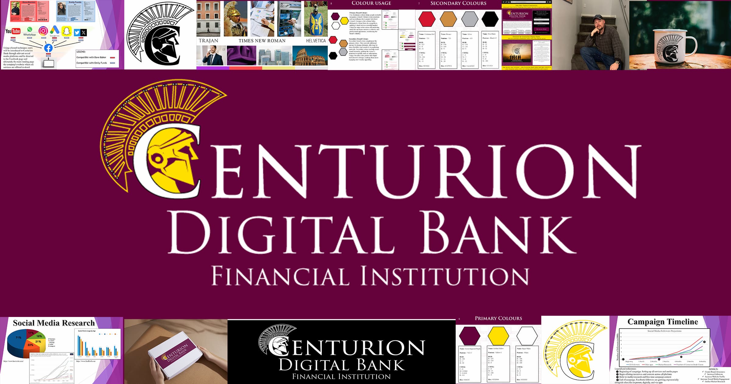
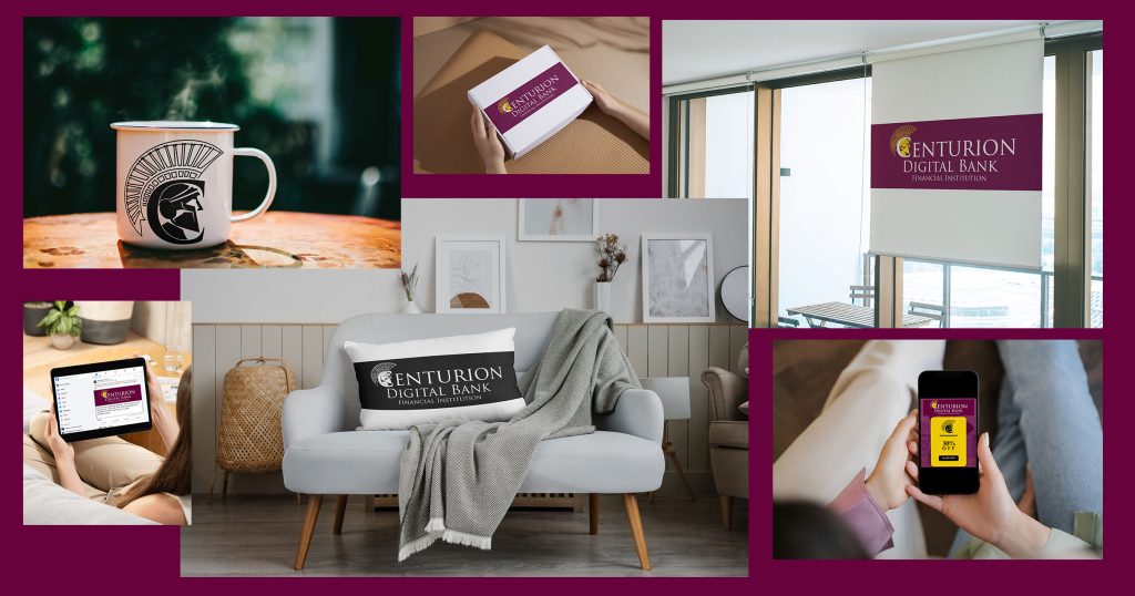
I had the opportunity to design the complete a brand identity for Centurion Digital Bank, which included the logo, color palette, typography, and brand rules. The vision for the brand was to create something that exuded strength, power, and protection, all while evoking a sense of timelessness. I knew that every element of the brand needed to speak to the values of the bank while creating a memorable impression.
Firstly, I set clear brand rules to ensure consistency across all touchpoints. The logo needed to be used with clear space around it, ensuring its prominence, while the color palette and typography guidelines were established to maintain uniformity across all digital and print materials. By blending these elements together, I was able to craft a brand that stood for both heritage and modernity, signaling Centurion Digital Bank’s commitment to security, strength, and a customer-focused future.
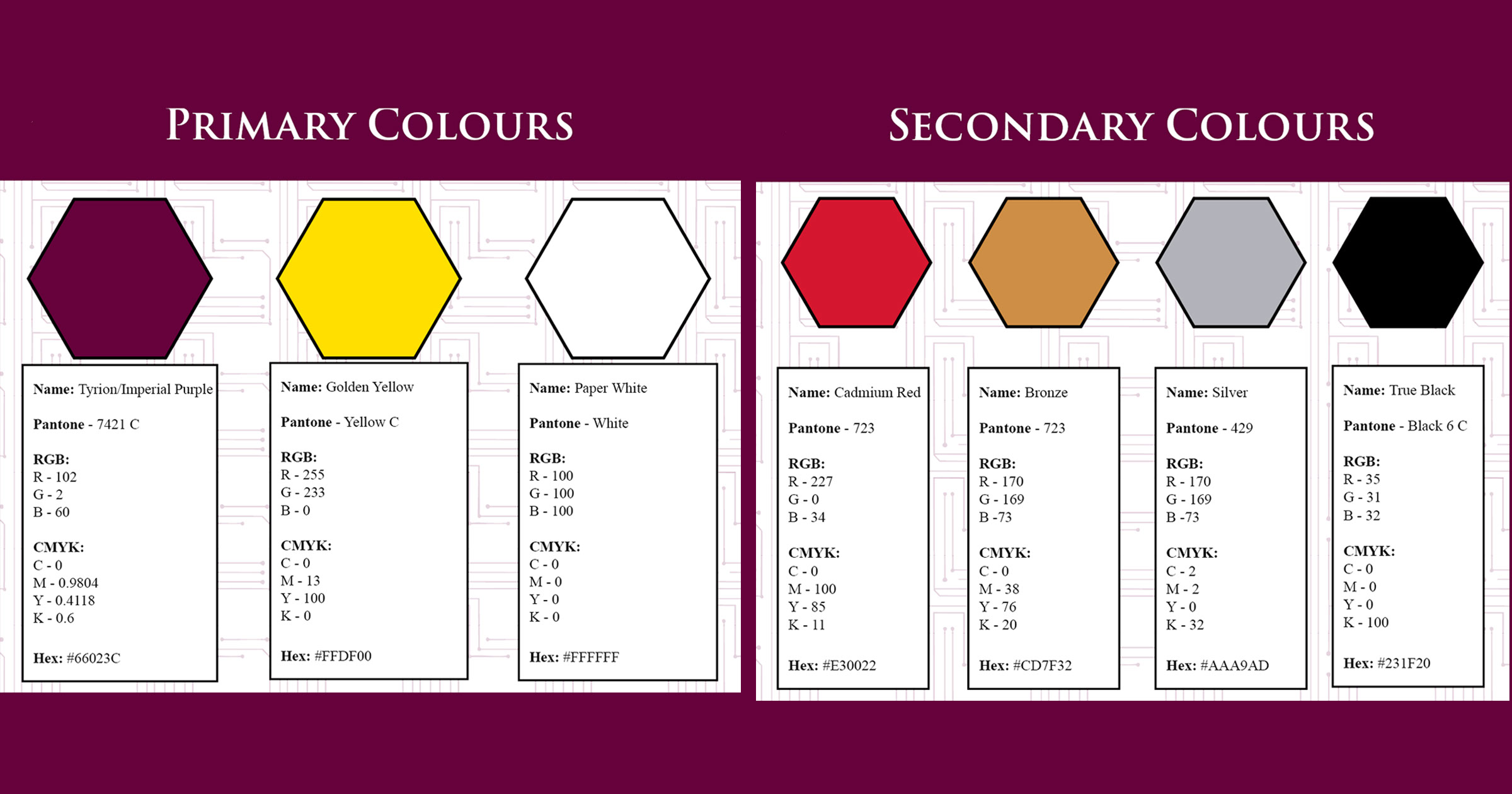
The color scheme was one of the first decisions I made. I chose rich purples as the main color, which not only felt luxurious but also subtly evoked the power and grandeur associated with ancient Roman nobility. The use of Tyrian purple tapped into the subconscious associations people may have with Roman emperors and their wealth, helping the brand feel both authoritative and elite. The deep hues of purple, complemented with softer accent tones, gave the brand a sense of balance between modernity and ancient sophistication.
For the typography, I selected a serif font that gave a nod to the classical era of Rome. The use of serifs added a sense of tradition and strength, and the font choice itself had a historical feel that aligned perfectly with the bank’s values. It was important that the typography reflected the feel of the brand, making it feel timeless, as if it had been built to last for centuries, much like the Roman empire itself.
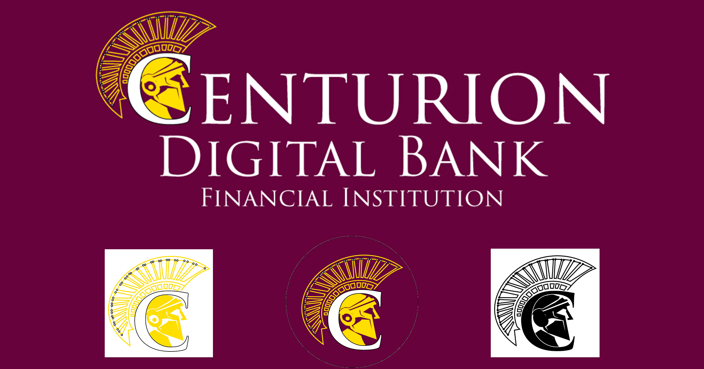
When it came to the logo, I wanted something that was both simple and highly recognizable. I designed a minimalist helmet symbol, drawn from the iconic Roman centurions, who were symbols of strength, leadership, and protection. The helmet was carefully crafted in Adobe Illustrator to convey authority, while also remaining modern and sleek. At the top of the helmet, I added a large crown, a symbol of power, dominance, and the bank’s commitment to protecting its clients. The crown’s bold presence was meant to reinforce the bank’s focus on security and stability, elements that are crucial in the financial sector.
See the full comprehensive style guide here:
Design assets and digital ads
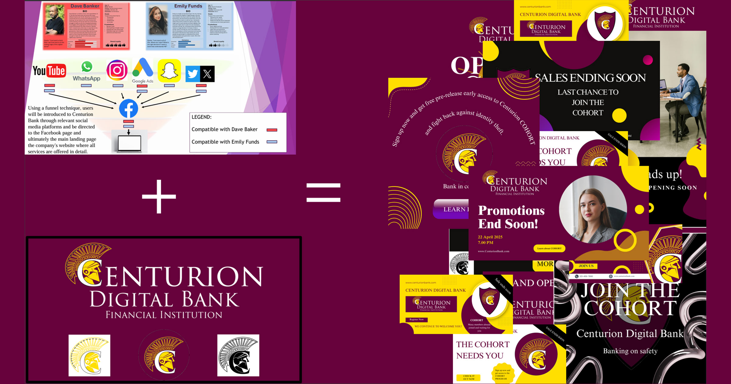
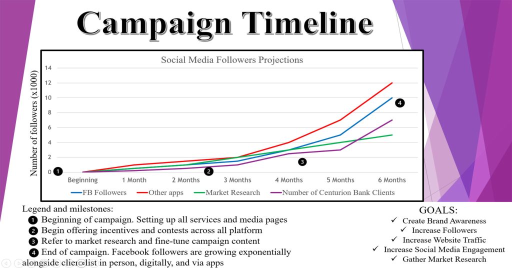
In this stage I designed and implement digital assets and ads that flowed seamlessly from the brand’s identity and style guide into a comprehensive digital marketing campaign. The branding elements—such as the logo, color palette, and typography—served as the foundation for all our digital assets, ensuring consistency across all platforms. The ads were created with a clear focus on both structure and style, blending creative visuals with the core messaging of Centurion Digital Bank’s services and directing attention to the incentive: Centurion Digital Bank’s Cohort Program.
The campaign was divided into two main streams: one for mass production across various platforms and one for more specific calls to action centered around the bank’s Cohort program. The mass-produced ads were designed to have a broad reach, incorporating general brand messaging that introduced Centurion Digital Bank’s services and established the bank’s identity. These ads were optimized for use across social media, display networks, and other online platforms to drive awareness and traffic.
The second stream of ads focused on promoting the bank’s Cohort program. This program was a key incentive for users to sign up for free, as it offered exclusive educational content and a community-driven experience. These ads were designed to not only drive sign-ups but also to enhance the bank’s email lists for future engagement. The Cohort-focused ads featured compelling calls to action that highlighted the program’s benefits and the bank’s dedication to security and customer education.
Additionally, I created customizable versions of the ads for different phases of the campaign: pre-launch, launch, and post-launch. The pre-launch ads-built anticipation, while the launch ads focused on driving immediate conversions. Post-launch, the ads aimed to reinforce the value of joining the Cohort program and maintaining engagement. By carefully integrating branding elements with targeted messaging, I was able to create a cohesive campaign that aligned with the bank’s goals and resonated with the audience.
Landing Page
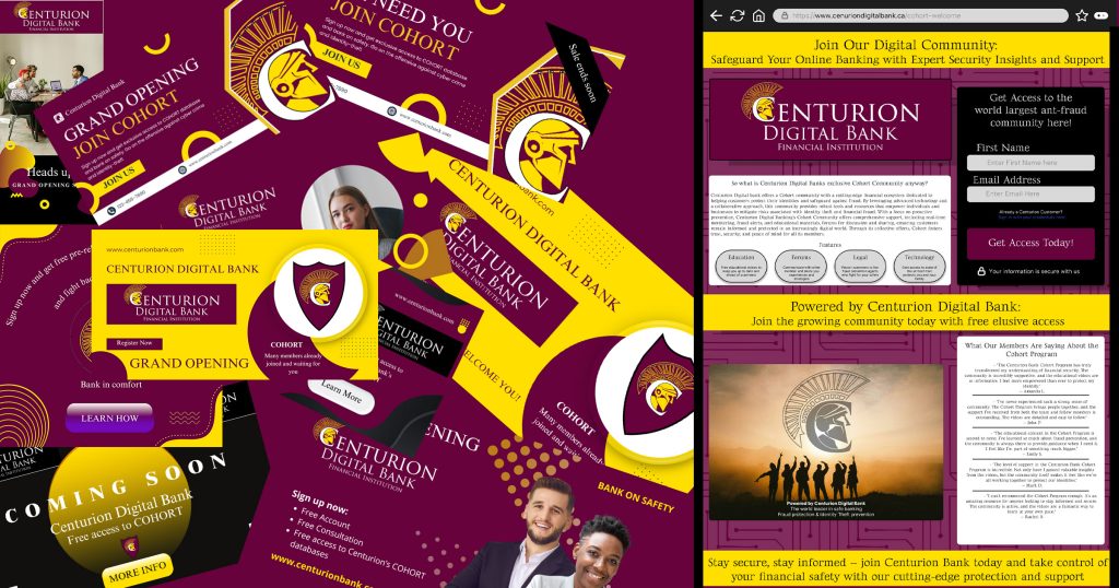
I designed the landing page for Centurion Digital Bank to be straightforward and conversion-focused, ensuring that users had a seamless experience after clicking on an ad. The primary goal was to funnel visitors toward a single action: signing up for the Cohort program for free. I wanted the page to be clean, simple, and effective, so I kept the design minimalistic with a strong emphasis on the call to action.
At the top, I included a brief, compelling headline that communicated the value of the Cohort program—highlighting its educational resources, community benefits, and exclusive content. Beneath that, I placed concise, easy-to-read information about the program’s advantages, making sure visitors understood exactly how it would enhance their experience with Centurion Digital Bank.
Since the page has only one option to click—signing up—I ensured that the sign-up button was prominent. I also incorporated an intuitive, easy-to-complete form for collecting email addresses, which would integrate users into the Centurion Digital Bank system and allow for future engagement.
The overall design stayed true to the brand’s identity, using the rich purples and serif typography to create a sense of trust and authority. The landing page was crafted to maximize conversions and introduce users to Centurion Digital Bank in a clear, engaging way.