Franya Counselling
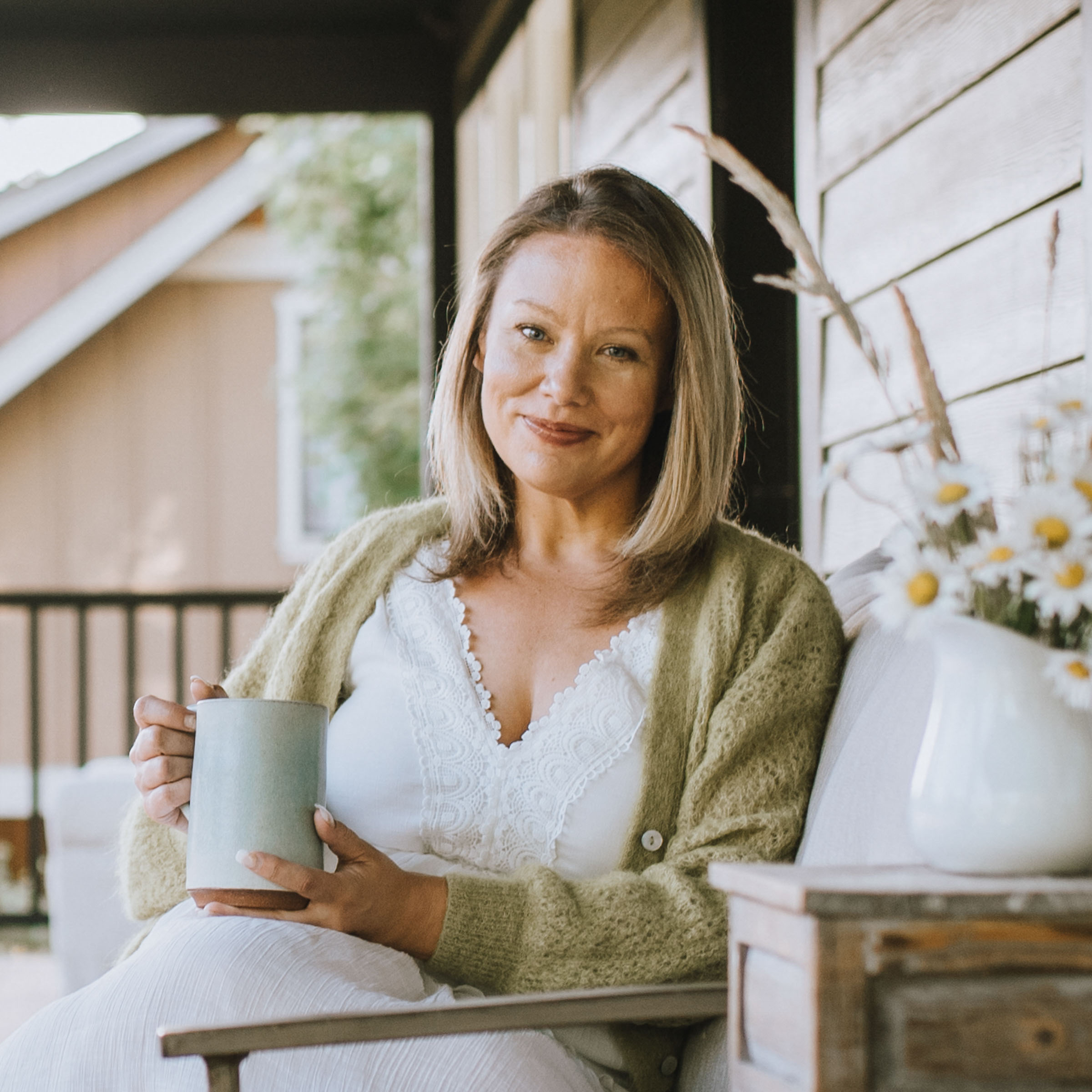
Franya is an online therapy group based on Vancouver Island, founded by Franya, a counsellor whose name means “a free woman.” As her practice grew from a solo venture into a small, trusted team, it was time for a new identity that could reflect that growth and represent who they are now. She wanted a brand that felt warm, welcoming, and rooted, offering a sense of safety and connection from the very first interaction.
The result is a thoughtful brand and a modern WordPress website that introduces her team, features a simple booking system, and reflects her deep value of inclusivity.
Process
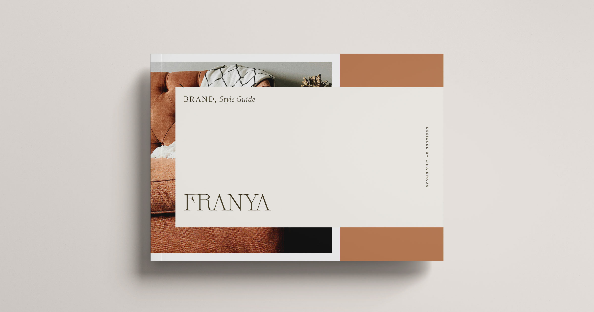
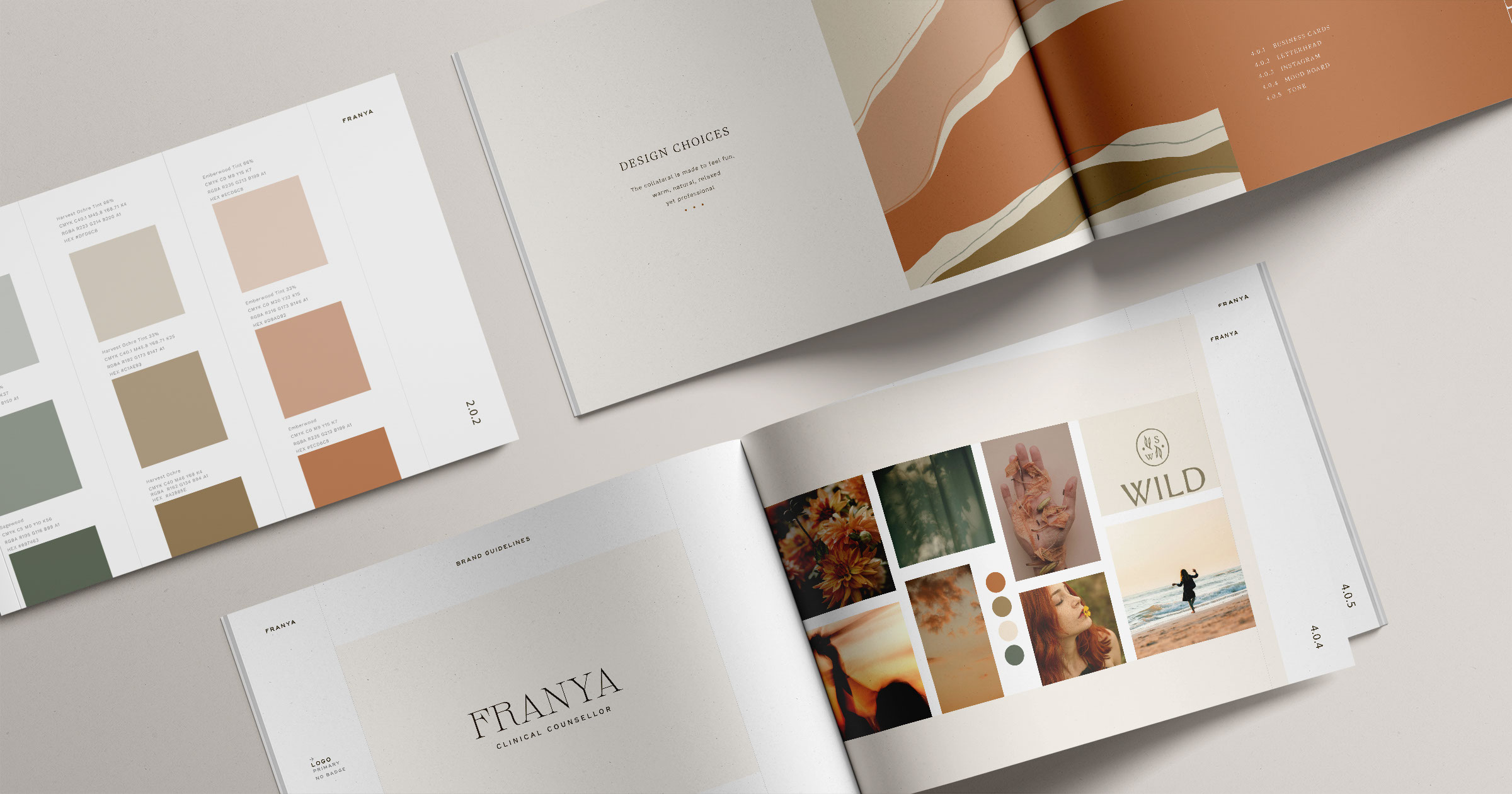
Style Guide
I began this project by creating a comprehensive style guide that includes logo variations, a colour palette, typography, business cards, a mood board, custom pattern, and defined brand voice. Each touchpoint was designed to carry the warm, authentic, and gently empowering essence of the Franya brand. You can view the full style guide on Issuu here.
Collateral
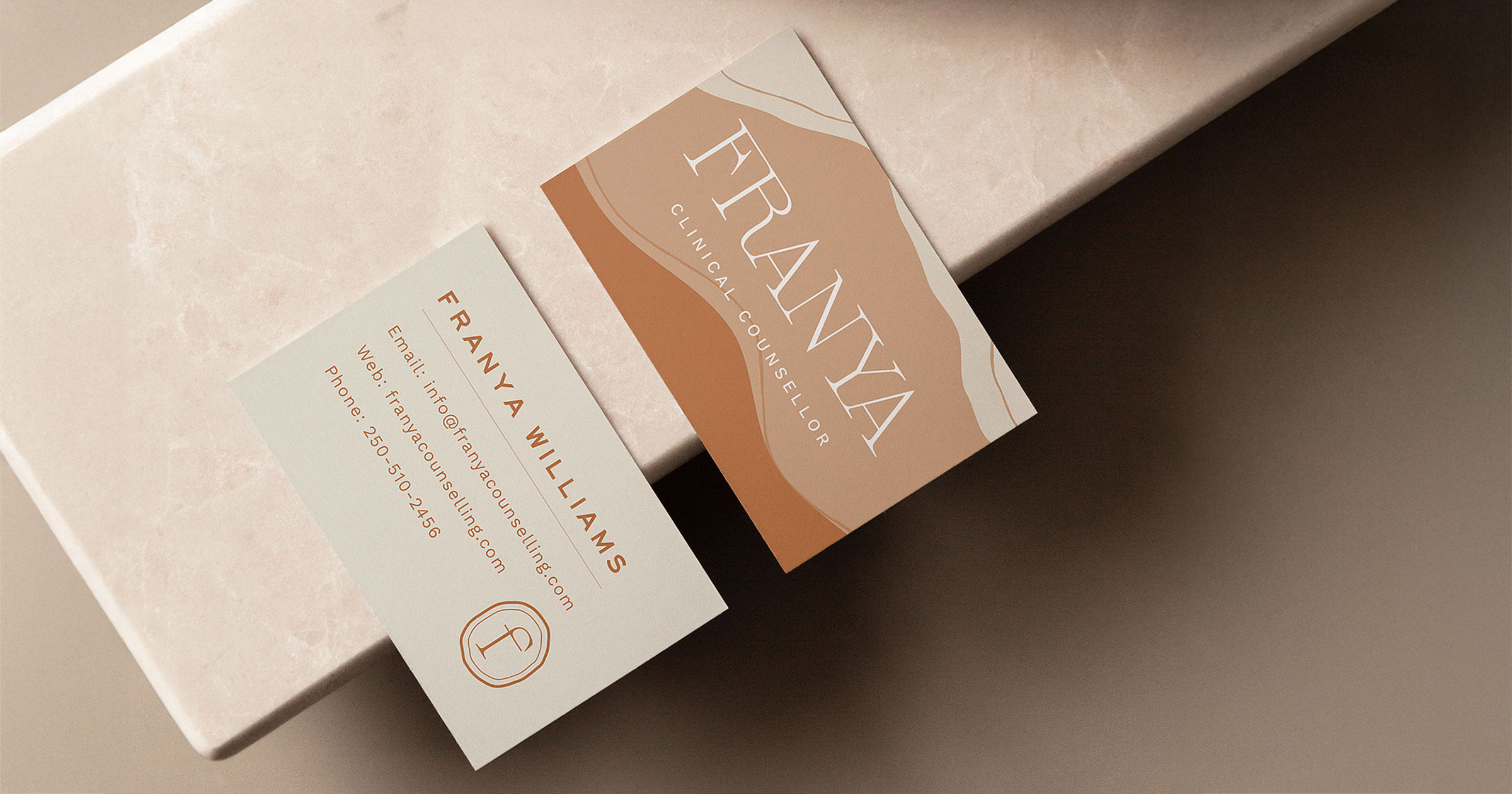
The custom pattern and icon created for Franya are carried across the brand’s collateral, bringing a sense of consistency and visual warmth. For the business cards, I set out to design something distinctive and memorable, something that would leave a lasting impression while reflecting the calm, grounded nature of the practice. The soft, earthy tones and flowing lines work together to express a brand that feels welcoming, rooted, and gently empowering.
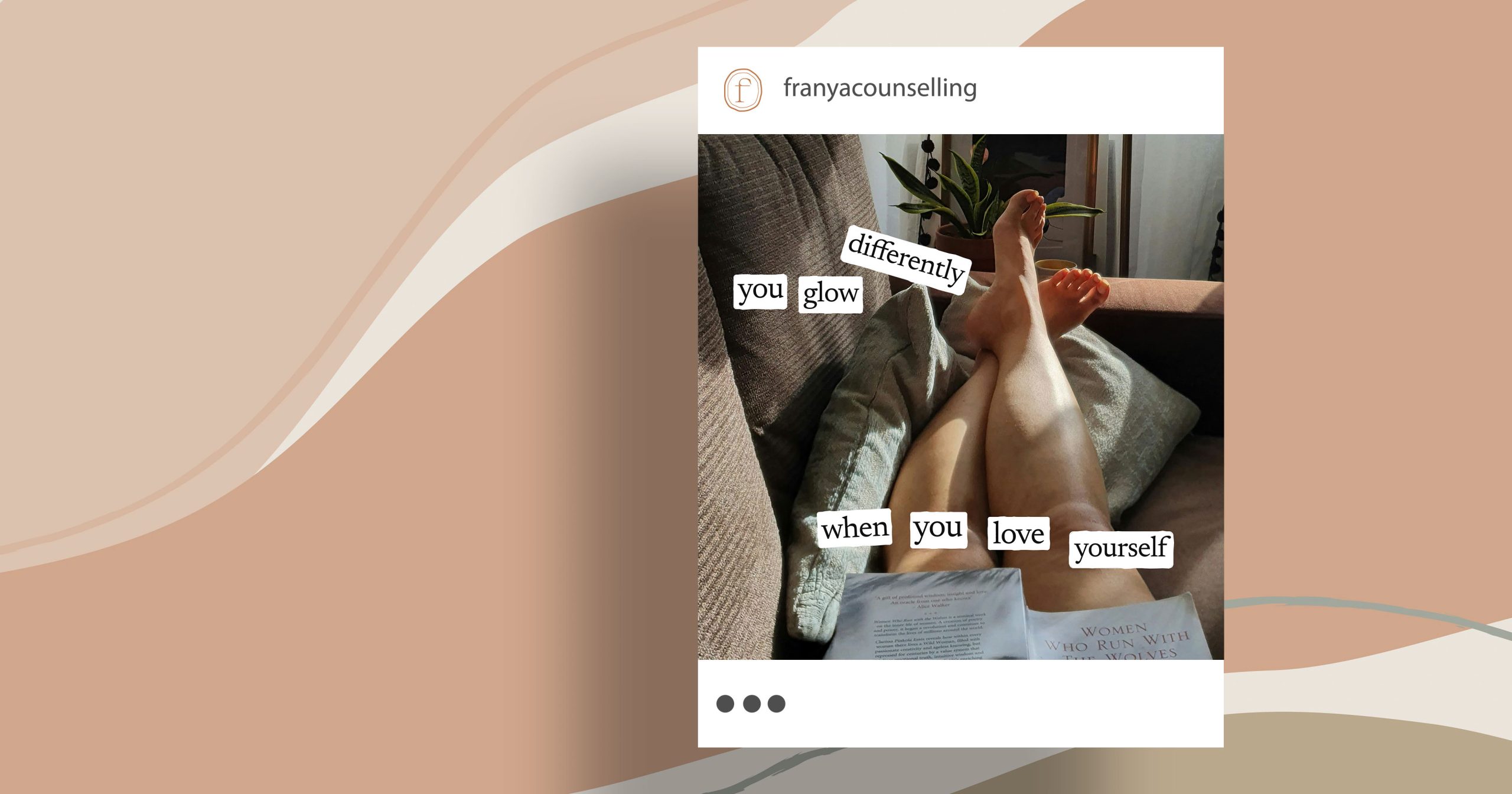
To bring this feeling into the digital space, I created an Instagram graphic inspired by the account Tiny Feelings, known for its vulnerable, affirming messages and playful collage style. Using a personal photo and typewriter-style cutout text, the post captures the heart of Franya’s work.
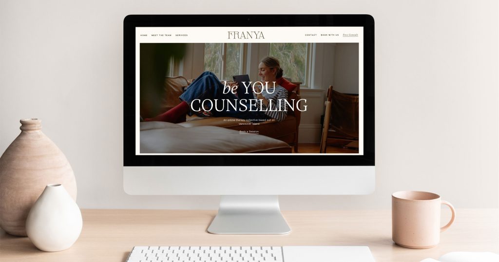
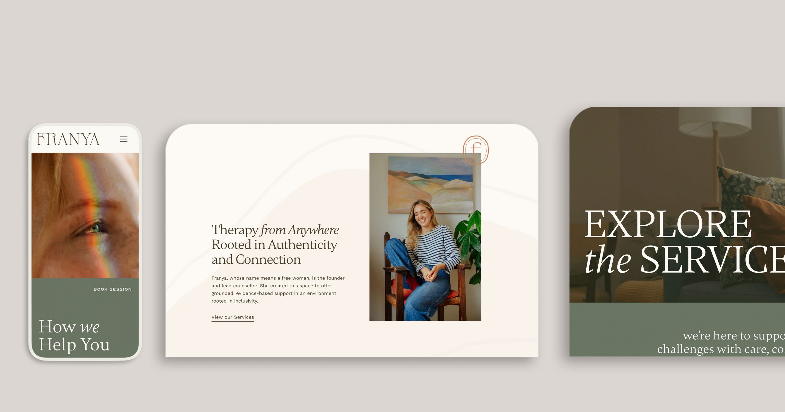
WordPress Website
I created the website in WordPress, which can be viewed at www.franyacounselling.com. I began with low-fidelity wireframes and developed a high-fidelity mockup of the homepage, which you can view here. The original design featured an orange background, which was later adjusted to white based on accessibility testing. The custom pattern and icon are repeated as brand touchpoints throughout the website, echoing the visual language used in the collateral.