PurelyYou
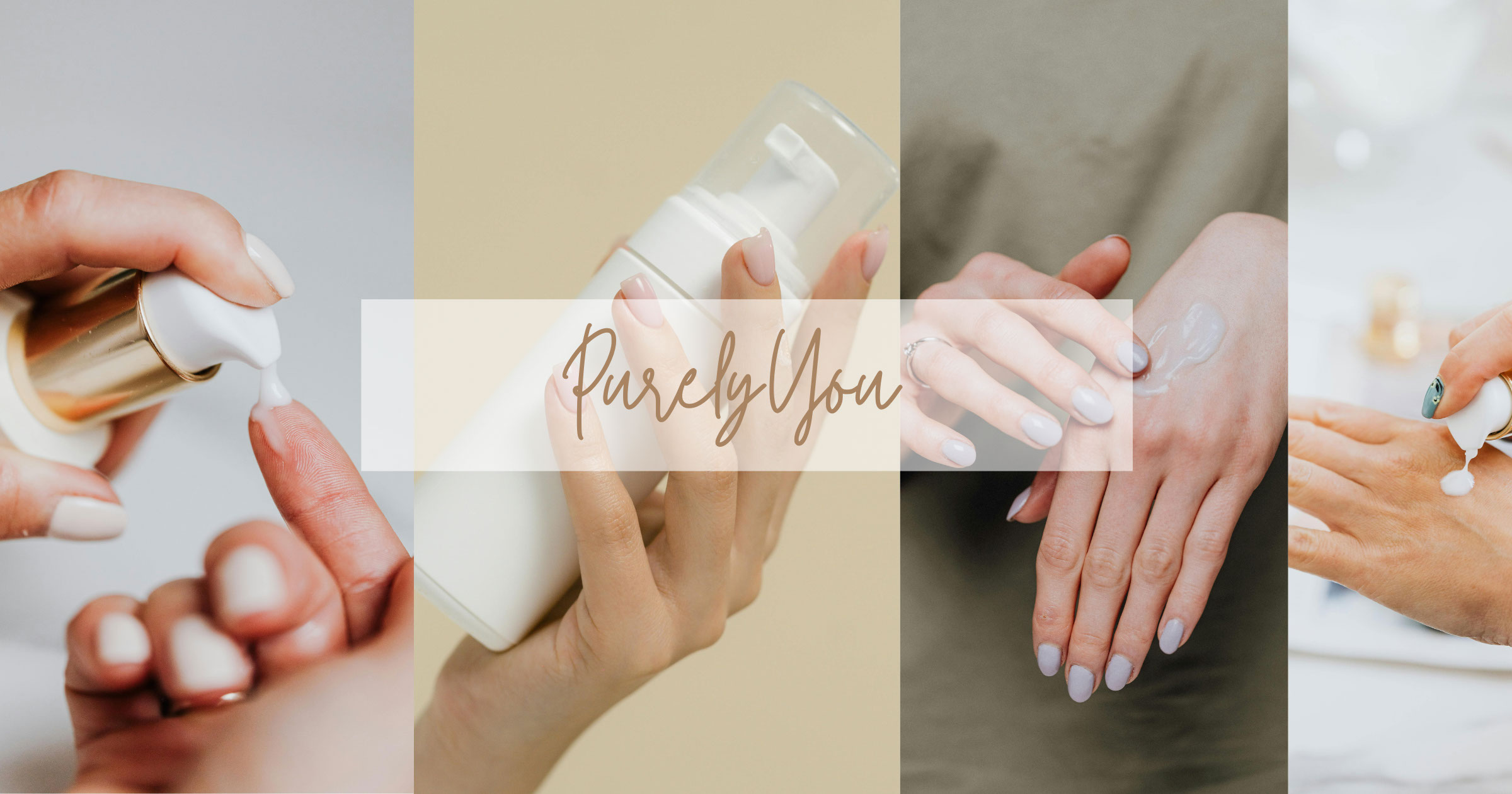
PurelyYou is a fictional skincare brand developed for an inclusive audience, offering affordable and vegan skincare products. The brand was designed to celebrate all skin types and promote a message of self-love and authenticity. The visual identity draws from natural, calming elements while keeping a clean and modern aesthetic.
The process included developing a detailed brand strategy, moodboard, style guide, packaging design, and a Landing page on Adobe XD. The final outcome reflects a minimalist and warm visual direction, aligning with PurelyYou’s mission to create gentle, effective skin care accessible to everyone.
Style Guide: https://issuu.com/avinic/docs/purelyyou_multi-page_style_guide
Process
MoodBoard
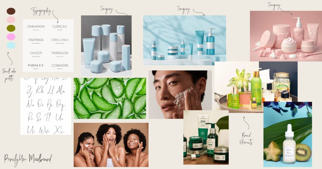
For PurelyYou, I wanted to capture a sense of calm, care, and confidence through a modern, inclusive visual tone. The moodboard blends soft, earthy brand colours—olive green, pale pink, pale blue, and warm brown—to reflect the brand’s commitment to gentle, affordable, and vegan skincare for all skin types.
I curated imagery of minimalist skincare products with clean, functional packaging to reflect the simplicity and accessibility of the brand. Photos of people from diverse backgrounds engaging in their skin care rituals reinforce PurelyYou’s mission to be inclusive and supportive of every individual’s self-care journey. I also included lush greenery and natural textures to highlight the vegan and plant-based nature of the product line, rooting the brand in honesty and sustainability. This moodboard shaped the tone for the entire visual identity, guiding the colour palette, type, and photography style used throughout the brand.
Branding
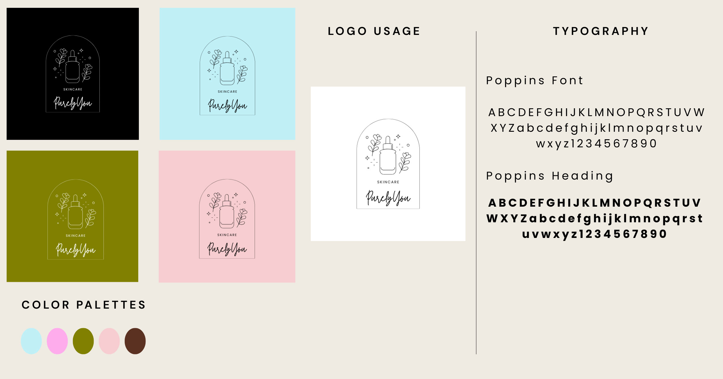
The brand’s logo features a simple, elegant and cursive wordmark to reflect clarity and trust. I opted for a typeface called Twister. This typeface which has rounded curves, expresses softness and approachability. The color palette includes soft, earthy brand colours—olive green, pale pink, pale blue, and warm brown, symbolizing nature, skin, and comfort. The brand’s voice and tone are friendly, inclusive, and empowering. The flowing script gives it a friendly, approachable feel, while still maintaining elegance and modernity.
Above the text, I designed a small icon featuring a skincare bottle surrounded by delicate leaves. This visual not only immediately signals the brand’s focus on skincare, but the leaves emphasize the vegan, plant-based nature of the product line. Together, the icon and type create a balance between clean design and organic charm.
Packaging
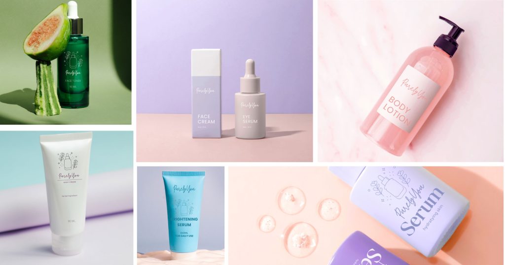
I created packaging mockups that reflect the minimalist and earthy identity of PurelyYou. The design is user-friendly, with clear labeling and soothing colors to stand out on shelves while staying true to the brand ethos. I used mockups in Photoshop to show how the products would appear in real-world contexts.
Landing Page
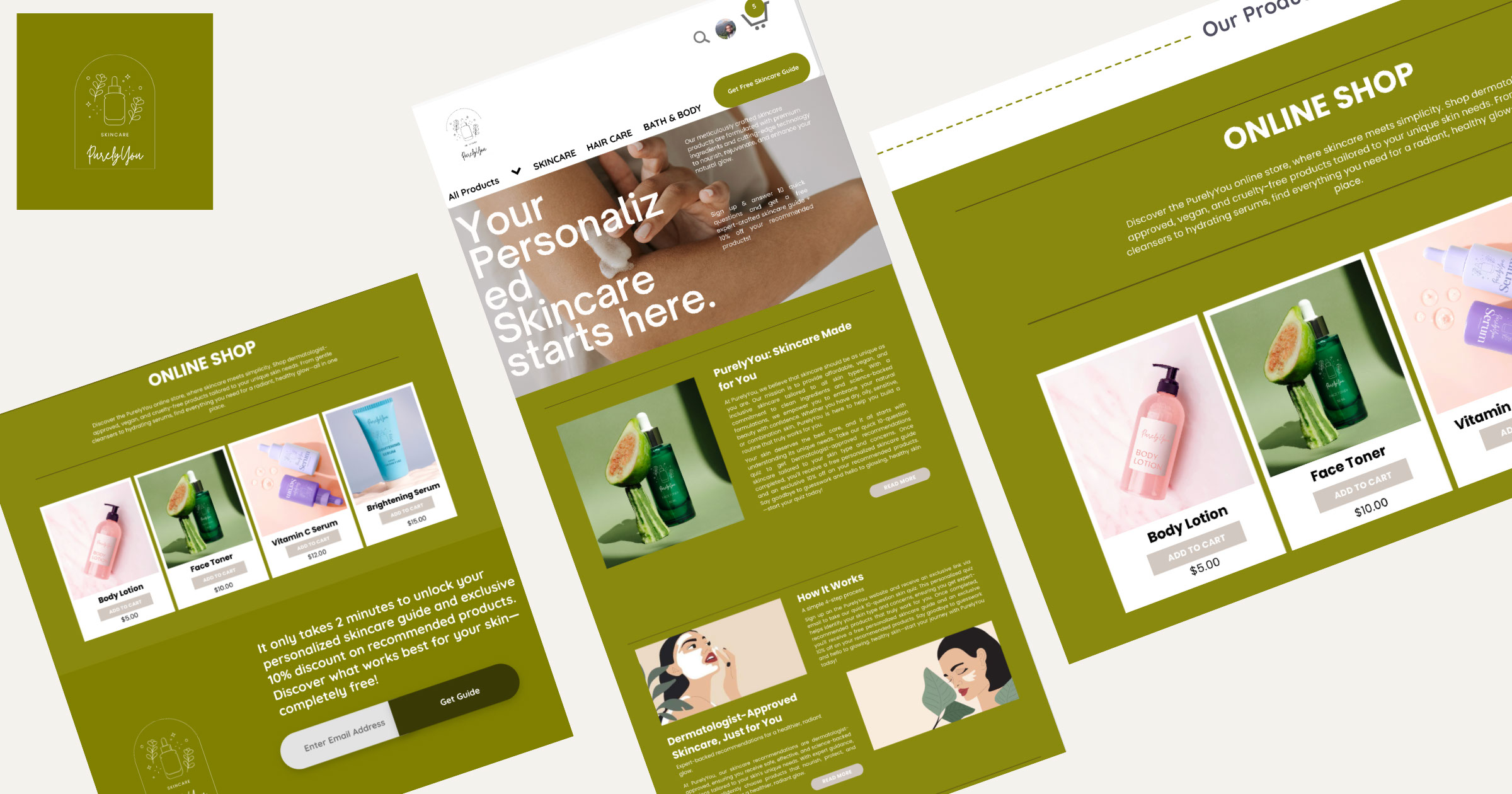
The landing page for PurelyYou was designed with one clear goal: engage users through personalization. The key feature of the page is a simple yet effective 10-question skincare quiz that helps customers identify their skin type, concerns, and goals. Once completed, users receive a personalized skincare guide along with tailored product recommendations—and a 10% discount to encourage conversion.
This approach allows users to feel seen and understood by the brand, making the experience more interactive and valuable. The clean layout, soft brand colors, and inviting calls-to-action help guide the user naturally through the process. By offering a freebie and discount in exchange for insights, the landing page builds trust while also growing the brand’s customer base.
This blend of data-driven personalization and emotional engagement sets the tone for the rest of the PurelyYou site and brand experience.