Charlson Meadows
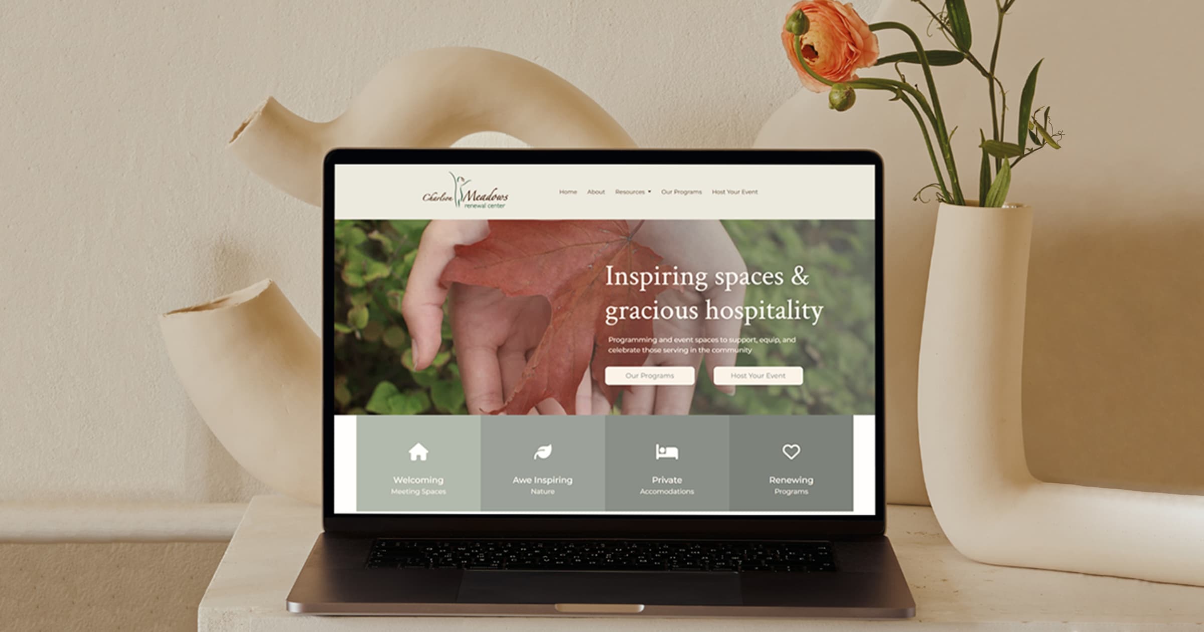
This project involves replicating the Charlson Meadows website, originally built with WordPress, using HTML, CSS, and JavaScript. The goal is to recreate the design as closely as possible, preserving the layout, fonts, and spacing from the original website. Each page, button, and navigation element is rebuilt to ensure an accurate reproduction of the original structure. Responsive CSS ensures the site adjusts to different screen sizes, while semantic HTML and JavaScript add interactivity.
All pages are carefully structured to match the original, including font choices, colors, and spacing. Any inconsistencies in the original design, such as varying fonts or alignment issues, are faithfully replicated. The project results in a clean, responsive, and visually consistent website built using modern technologies.
Rebuilding the Charlson Meadows Website
I chose to rebuild the Charlson Meadows website, which offers educational programs and hosts non-profit events. The goal was to replicate the design and layout while ensuring a structured and organized codebase. Each page was carefully recreated by analyzing the original site’s typography, colors, spacing, and navigation.
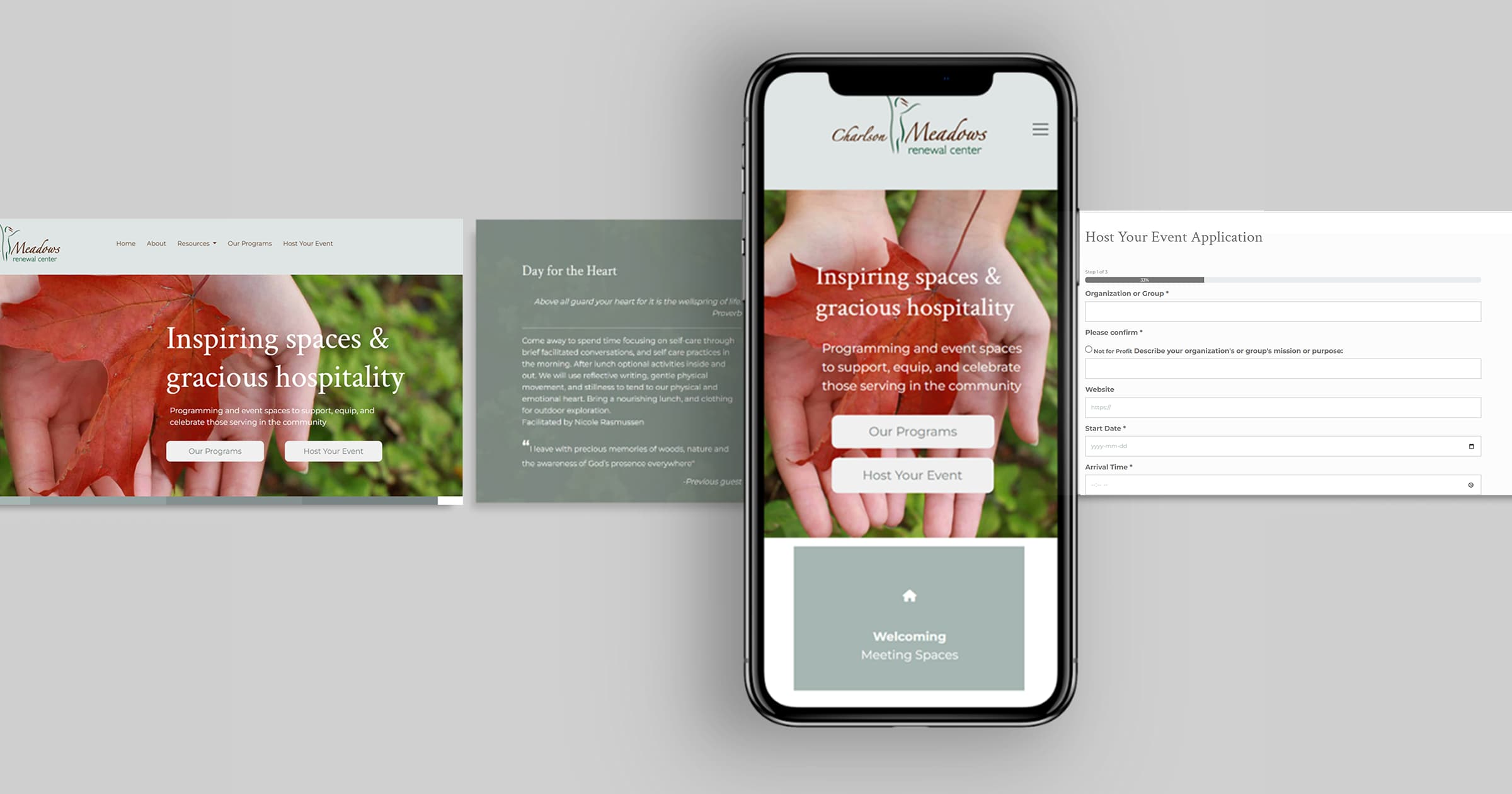
I started by creating a minimum viable product for the homepage. This included a navigation bar, a section displaying program and event details, and a footer with contact information. After receiving feedback, I refined the homepage by adding an interactive hero section with dynamic images for a more engaging experience.
Improving Design Consistency
One of my key priorities was ensuring visual consistency across all pages. I focused on refining typography, spacing, and layout to improve readability and overall aesthetics. The original website had uneven spacing, which made it feel disorganized. I adjusted these elements to create a cleaner, more structured design.
Developing the Main Pages
Once the homepage was finalized, I created the About, Blog, Events, and Programs pages.
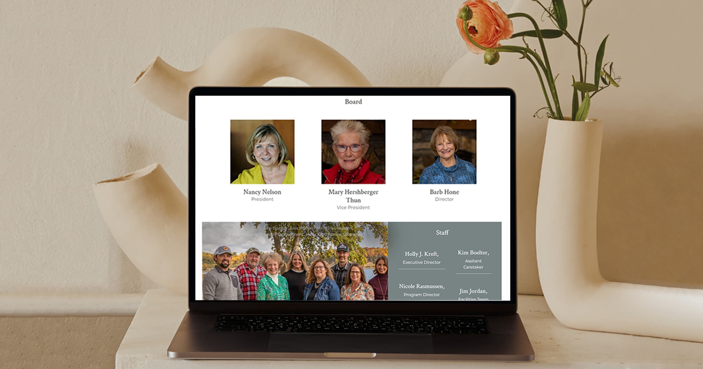
The About page introduces Charlson Meadows’ mission and vision, followed by a Board & Staff section with images and descriptions. I also included sections about the Founder and Funder, along with a footer containing social media links and contact details.
For the Blog page, I used a flex layout to display posts in card format, each with an image, title, date, and short description. Clicking on a post opens the full article.
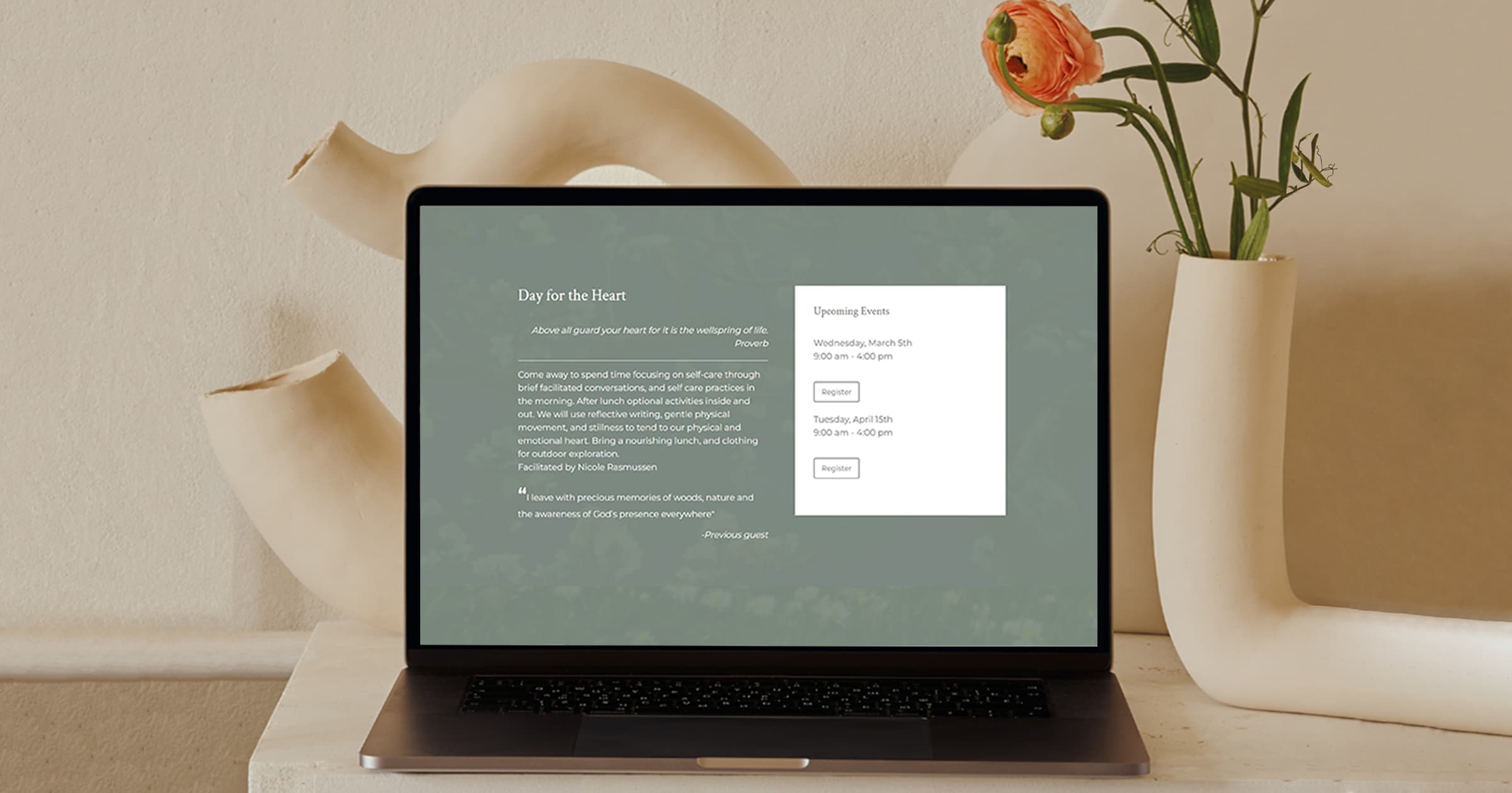
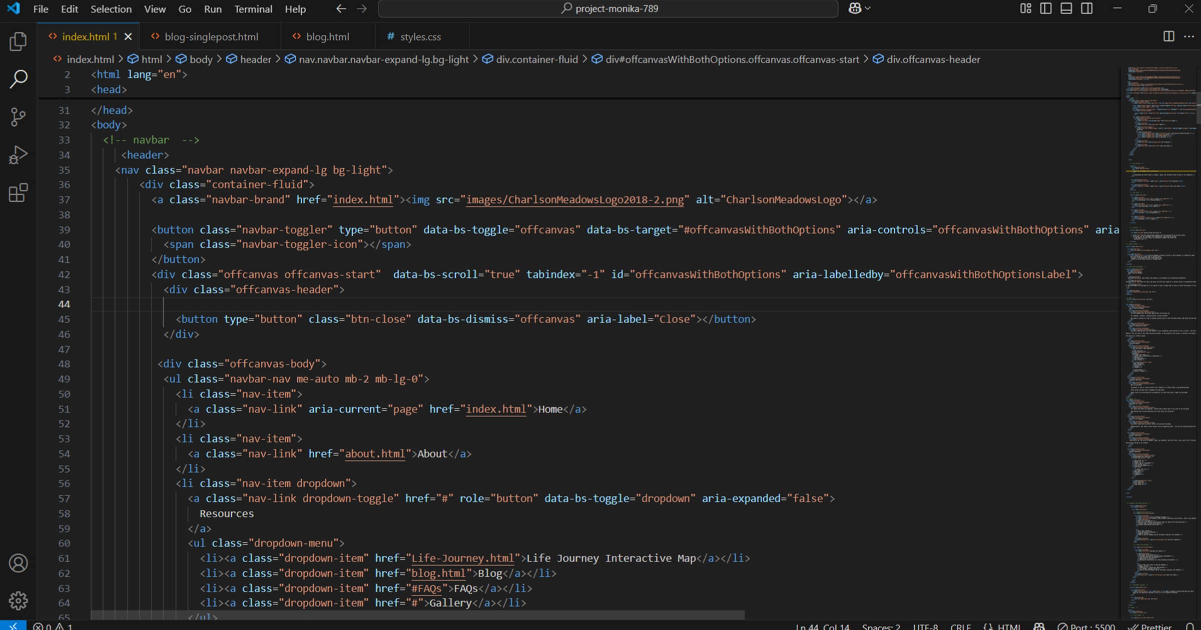
The Events page includes an event registration system. The hero section displays pricing and key details. Below, a modal popup informs users about the event application process. The most important feature is the multi-step application form, where users enter event details, dates, and participant information. I implemented Bootstrap form validation to ensure that the required fields were filled out correctly.
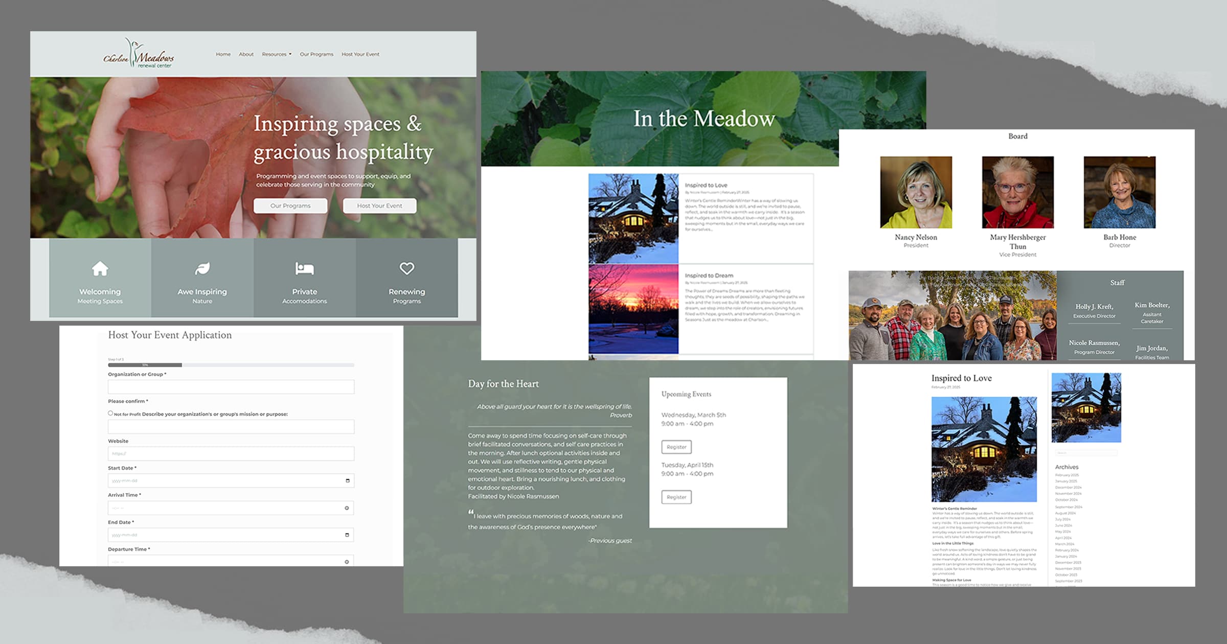
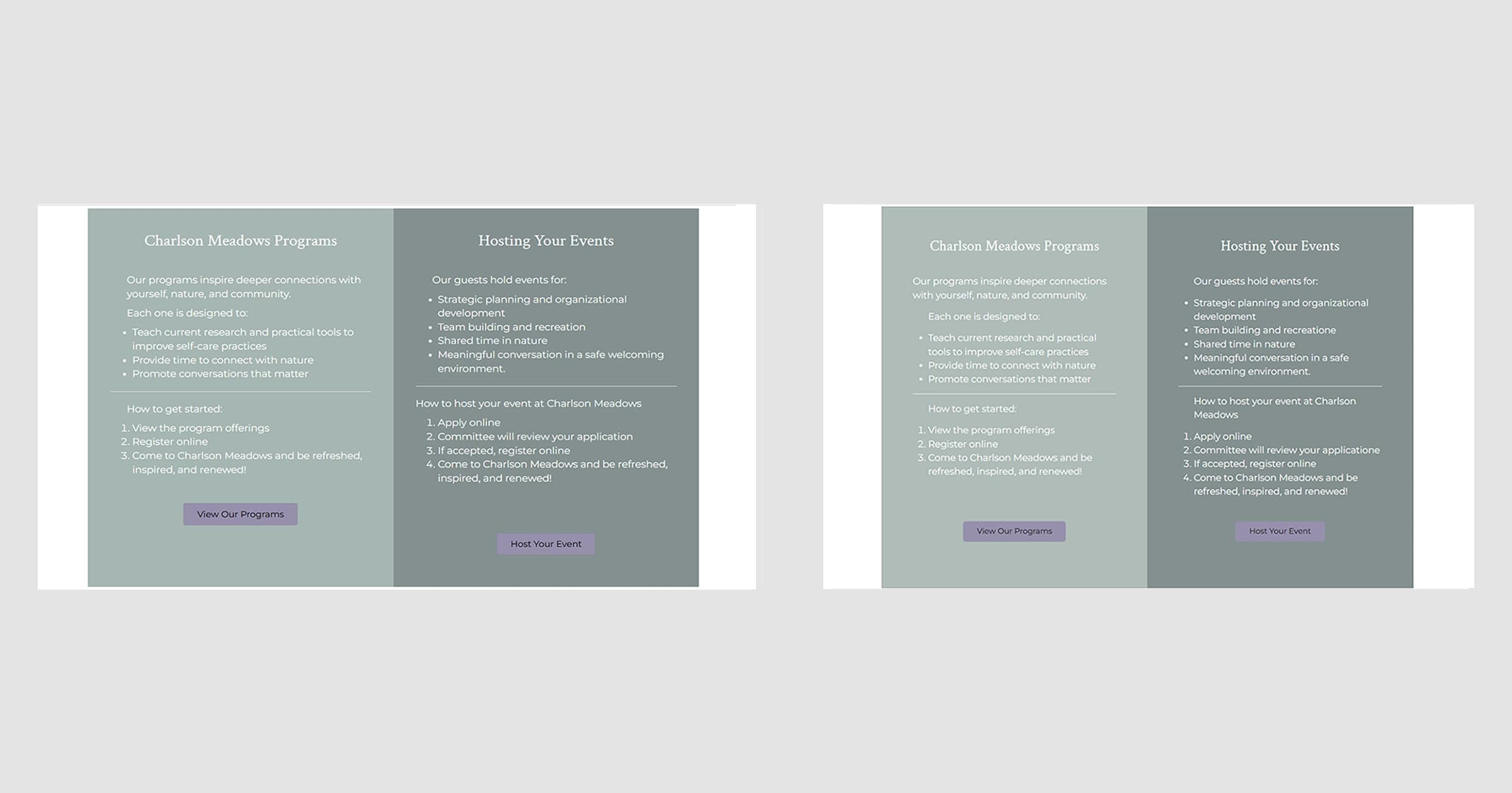
The Programs page follows the same layout as the other pages. Below the hero section, I created four program sections, each with a full-width background image. The left side contains the program title and description, while the right side features a registration card with session details, including day, time, and a “Register” button.
Testing & Validation
I conducted several tests to ensure the site was fully responsive and functional. Using Chrome DevTools, I checked how it appeared on various screen sizes, from desktops to mobile devices. I also tested buttons, forms, and links to ensure smooth user interaction.
I ran HTML and CSS validation using the W3C Validator to maintain code quality, ensuring no errors. I also performed accessibility testing, checking color contrast, alt text for images, and keyboard navigation. Additionally, I ran speed tests to measure page load times and optimized images for faster performance.
I created a clean, professional, and user-friendly website by following thorough testing. This redesign improved the website’s online presence and enhanced the user experience, making it more engaging.